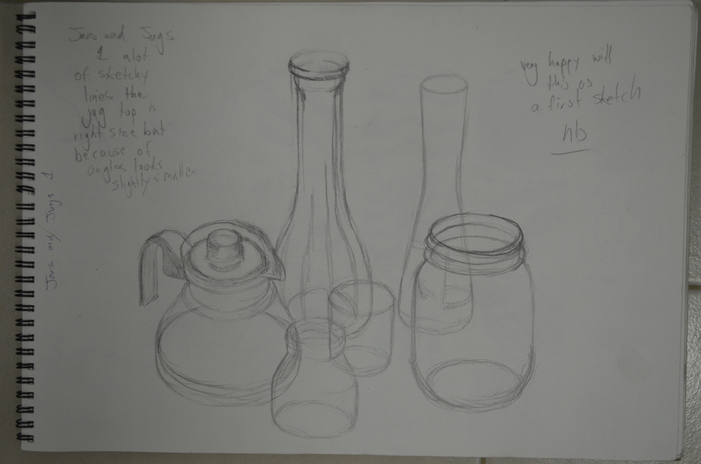
For this Jugs and Jars exercise I collected together 6 cylindrical objects including jars, vases, bottles and jugs as well as a glass and arranged them so I was looking slightly down at them. Then with a softish pencil I drew what I could see, then rearranged and drew them at a slightly different angle.
I flew through the pencil sketches in a matter of minutes as I had no fears of getting it wrong, knowing that I could always work the objects into shape with a few extra strokes.
1st Sketch HB
I then moved the objects around and drew them from different angles and again, I breezed through this part of the exercise and the only time I used an eraser was to restart drawing the first object as I worked from left to right and I started drawing the glass teapot a little too low that the small jug at the front would have been off the page.
2nd sketch HB change of angle
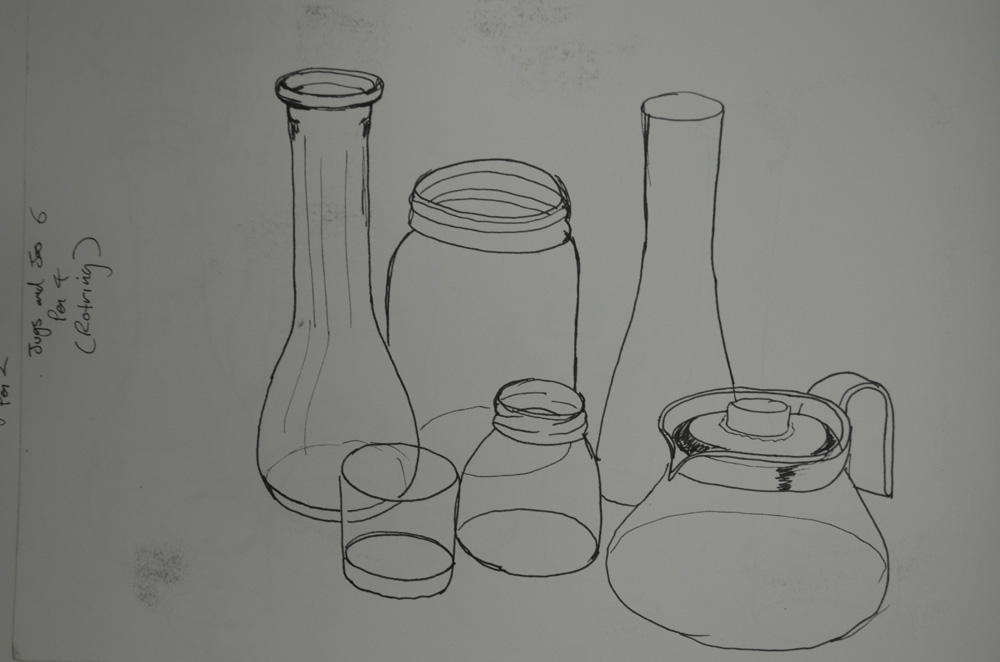
When it came down to drawing with pen I got nervous, knowing that I couldn’t erase anything, even though I hadn’t need to make real corrections while using the pencil and with this in my head I began to mess up and make some real mistakes. I drew the first couple of pen drawings with an Artline 0.3 Drawing pen and it was pretty crappy and scratchy, so I was forced to purchase a couple of Rotring Drawing pens.
1st Sketch with Artline Drawing Pen
I found it a lot easier and smoother to draw with the Rotring so it gave me some confidence back but it would still take a lot of practise to get it right first time with a pen without using any kind of scaling system or going through it in pencil first.
While looking for a Vincent van Gogh pen and ink drawing I came across his ‘Rocky Ground at Montmajour’ the finest example of this was on Bridgeman Education:
I chose this picture because it is a great example of how Van Gogh uses very simple marks to build up an intricate scene. The types of marks that he uses such as squiggles, dots and dashes are very clear in the picture and yet the image still has great volume and texture.
For the sand in the foreground Van Gogh uses small squiggles that almost resemble tiny letter m’s while for the boulders that separates the sand from the grass he has used larger more irregular shapes with squiggles and circles to indicate erosion marks in the rocks.
Van Gogh used different line lengths for the grass with short, close to vertical dashes for the shorter grass while the longer grass is made up of longer and sometimes thicker strokes drawn at different angles to give a sense of coarseness.
The smaller bushes and trees are made up of curved lines as is the bark of tree in the middle, however, he seems to have used a very loose form of squirkling (connected squiggles) for the leaves and branches of the tree in the middle. He has also gives the viewer a sense of distance when looking at the tree on the right of the picture by drawing long vertical lines that depict a distant field, while the colour of the ink in the rocks in the foreground is much darker to give a sense of closeness.
The clouds in the sky seem to be made up of long thin zigzags while the bird flying in the sky is has been drawn with two short thick strokes.
It really is inspiring to see how such simple marks can make up such a complex image and I can’t wait for the opportunity to occur when I can do something like this.
After enrolling on this course I realised how lucky I was to be working at a temple school with it’s open plan floors and Thai style roofs and architecture. So today I took time out to have a sit down and actually sketch what I see every day and I made a promise to myself that I will put pencil to paper every chance I get.
This was the first of what I hope will many sketches of this wonderful working environment and in 35 minutes I think I did quite well.
For this exercise of drawing a pile of six mixed boxes and books I decided that I would approach it from two different angles, with the easel and without, both with an hb pencil. Knowing that I would be rocking back and forth from the easel hence changing perspective I was intrigued to see how the drawing would turn out, plus I hadn’t had the easel out for a while.
my workspace for this exercise
After a play around with the books I optedto attempt drawing the books at probably one of the worst angles I could put them in with the back corners of all, almost in-line.
tower of boxes and books
I was right about using the easel, even though the stack of books and boxes were in perspective the finished sketch did not look like I had drawn it from the angle I had aimed for. I also drew from the bottom book up which I found was more difficult as it is easier to draw down.
drawing with easel from bottom book up
For my second go I packed up the easel and settled for the sketchbook on my knee approach, and drawing with my head back in the chair I managed to get the books in almost the right position every time. This time I drew from the top box down to the bottom book and turning my sketchpad around as I pulled the pencil towards me to get better lines and angles I sailed through it in about 25 minutes.
first drawing without easel top box down
This time I wanted to have another go without drawing the lines through, I could have just erased all the lines on the second drawing but i decided I needed the practise so started a fresh. I drew the top box a bit bigger than it should have been and so the angles were slightly out and I almost lost the bottom of the book, but I was still happy with the finished result and so I added to the drawing with a little bit of detail.
drawing without lines through, no easel, top down
Taking design and communication all those years ago at school paid off on this exercise but the true trick was to place a dot where the corners should be and then draw towards them, that way there is less line correction needed.
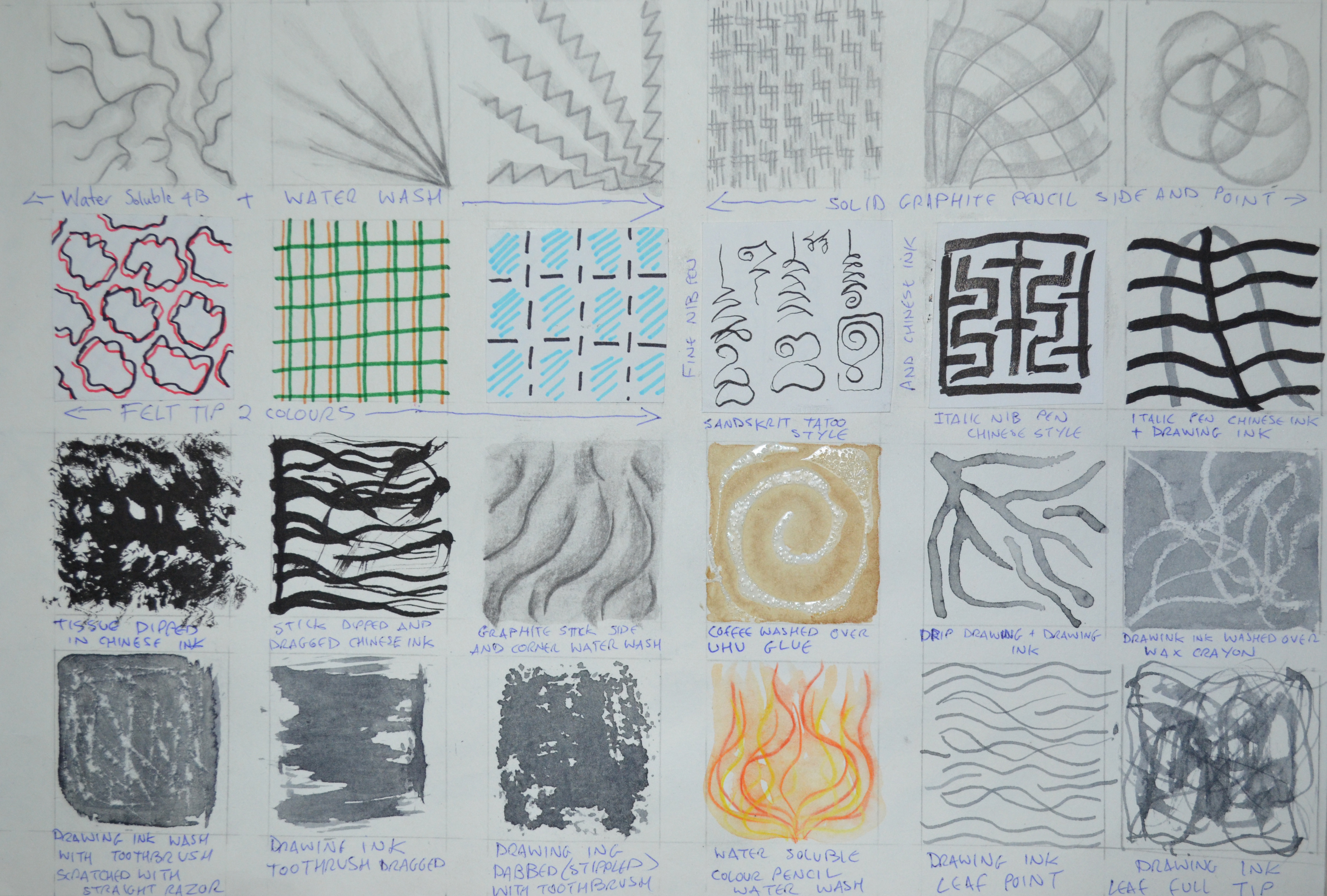
The object of this exercise was to draw lots of 5 cm squares in my sketchbook and fill them using pencils and pens practise several different marks in each square, thinking about intensity, texture, smoothness, pattern, length and repetition.
Now after reading the words ‘practise several different marks in each square’ there was a danger of either turning this exercise into another ‘Doodling’ exercise or making the squares look like swatches for a textile course. I wanted to avoid both so I looked a few different existing OCA Drawing 1 blogs to see how others had tackled this exercise.
The benefits of other students having their blogs online is that you can see how others have gone about completing each exercise, the drawbacks of this is that one can go look at someone’s blog and then feel a little bit restricted for risk of going too close to someone else’s work; but then it does force uniqueness or at least it did with me.
The materials I used for this exercise were, pencil, coloured pencil, bic, water soluble pencil, solid graphite pencil and graphite sticks as well as charcoal, Chinese ink, nip pens, marker, whiteboard marker, ArtLiner drawing pens and Chinese white pencil.
Pencil, Bic and Colour Pencil
I found that I used the HB pencil a lot until I came out of my comfort zone, it’s a tool that’s easy to rub out if I’m not happy with what I’ve done but then I realised at this stage I should allow for going overboard or getting sloppy as it is those little mishaps that will help me ‘learn’. I also found that I kept going back to shading and the hardest part of this exercise was trying not to repeat anything I had done in earlier exercises.
As I tried to move onto different media I kept realising that there were still other marks that I could do with pencil. Holding the pencil in different ways and at different angles gave me different effects, holding it in a writing position I created smooth, strong lines while holding it at the end gave me uncontrolled, sometimes smooth but then sometimes rough lines, depending on the direction I took.
Creating patterns through repetition was not only great for conveying a feeling of depth but was a good transition point to help me to move on to using other media, otherwise I could have been there all day (just a figure of speech, this actually took me three evenings).
Pencil, Drawing Pen, Charcoal, Graphite, Nib Pens and Ink
With the size of the squares (just 5 cm) I spent a lot of time practising on large sheets of paper not having the confidence to go straight into my sketchbook with the softer mediums such as charcoal and the messier mediums like ink.
Nib Pens – This time I had a lot more confidence with nib pens knowing exactly how much ink to put on them and how to ‘put pen to paper’ and what direction is best with each nib to give me different lines. I used two different nibs, 1 Italic which was nice and smooth and 1 very fine nib which was very scratchy and didn’t feel that comfortable with but it was great for doing the Khmer style marks in the third photo.
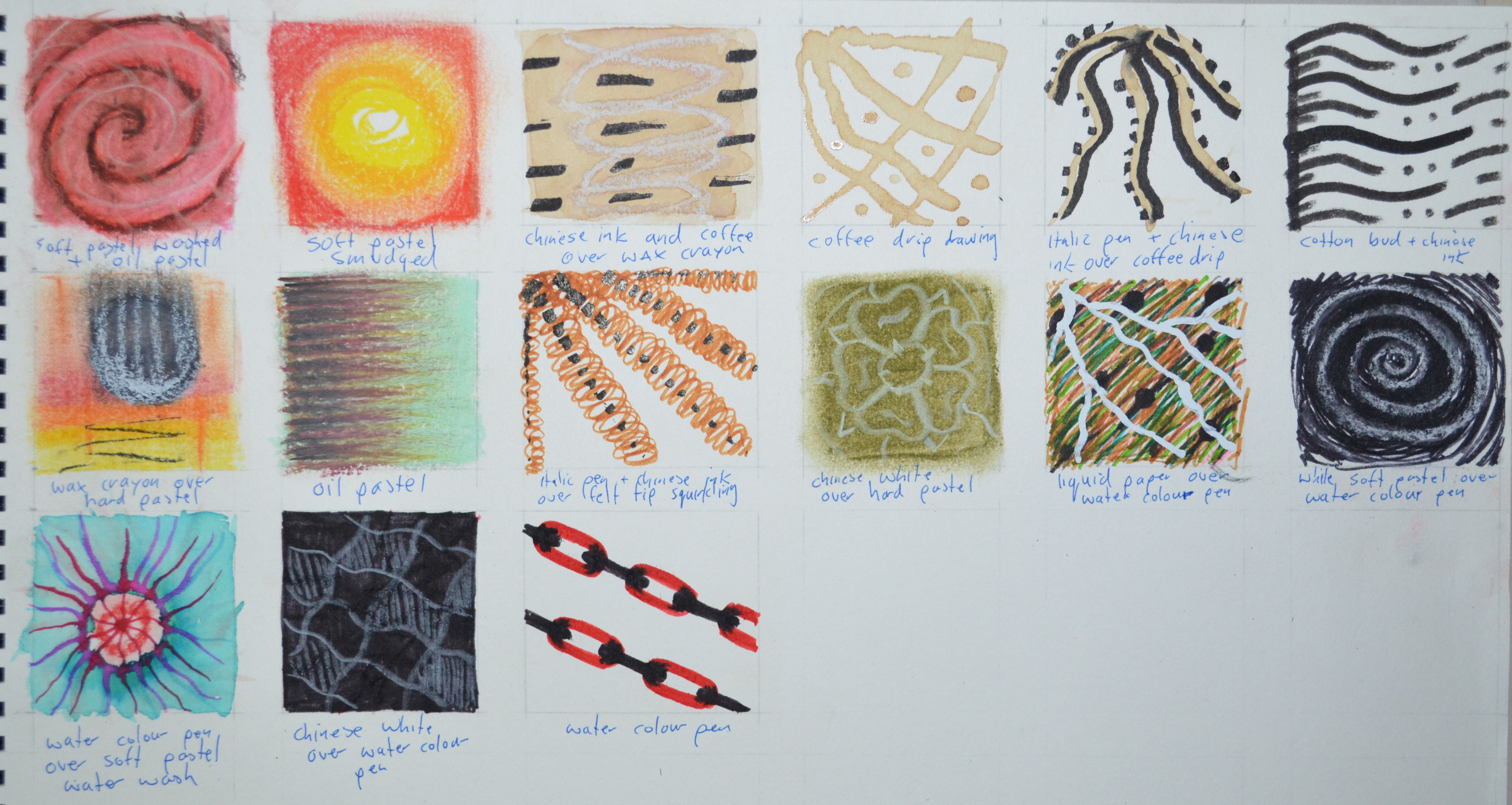
Trying New Media
Too be honest I wasn’t that eager to move onto other mediums, but once I did, I really started to enjoy myself. I was limited to what I had, it might take me forever to find a descent quill in Bangkok, but a walk in the communal garden on the 5th floor got me a leaf and a stick.
The new media I used for this were watercolour pens, water soluble coloured pencils, water soluble graphite pencils, coffee, drawing ink, hard pastels, oil pastels as well as wax crayon, solid graphite sticks, UHU glue, liquid paper and a Derwent Chinese white pencil. I also used several different drawing tools including a scrunched up tissue, nib pens, a stick, a leaf, a toothbrush and a straight razor plus a couple of new techniques such as drip drawing and washing over several of the new mediums with water and a fine brush.
Trying Other Media, Glue, Leaf, Stick and Straight Razor
It took me a good few squares to really get into this but my hunger for new mediums really started when I drew with the stick dipped in Chinese Ink, with just one stroke of the stick I made both thick strong lines and thin whipping lines which were both chaotic and rhythmic.
I had the idea of washing coffee over UHU glue while I was at the gym for some strange reason but I’m glad I did. I could have created many different patterns by doing this and practised a few times on large sheets of paper but the easiest one given the size of the square was the swirl which created a wonderful blended effect.
Coffee washed over UHU glue with a fine brush
Even after practising on large sheets of paper when it came to repeating it in the squares on my sketchbook I still messed up. The solution to this was either cut the successful practise from my large sheets and glue it into the squares or to try and make something else of it. When I tried brushing sideways with the toothbrush dipped in drawing ink I got nothing but a large dark grey surface, determined to get something out of this I attacked the surface with a straight razor. The result of this was very raw but it is something I can use later.
Pastels, Coffeee, Watercolour pen, Cotton Bud and Wax Crayon
I got some great results washing ink over wax crayon and in some ways it looked like the negative of a drip drawing which I also successfully pulled off in both ink and coffee.
I also really enjoyed the watercolour pens that I have been using as felt tips which gave me some great oil type patterns when drawn with on a wet surface, and drawing with liquid paper over mixed coloured felt tip lines produced very dramatic white lines.
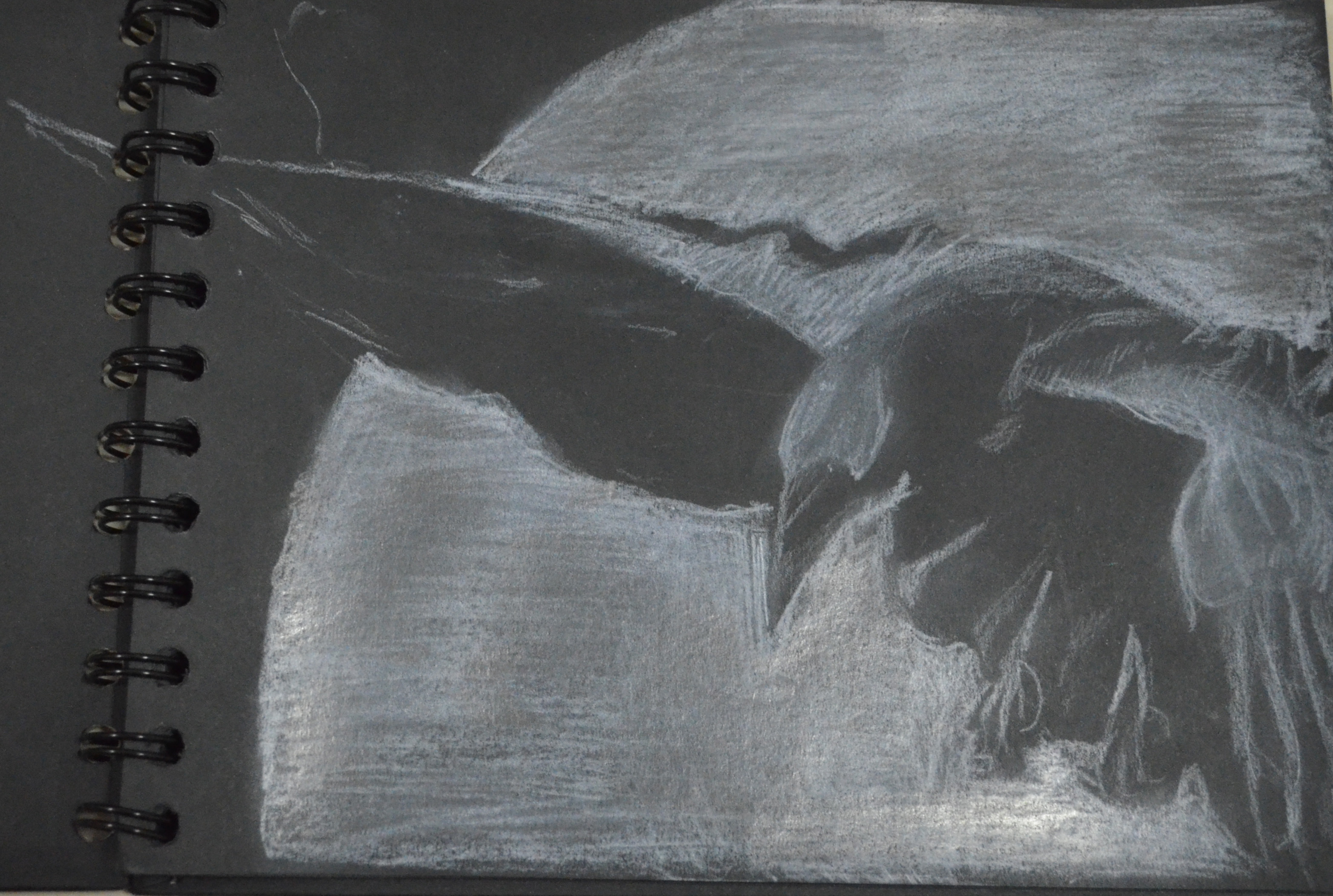
This was a quick sketch to christen my new black pad.The raven is my favourite animal and I wanted to know how it would look drawn on black paper with a Derwent Chinese White colour pencil. I completed the sketch in about 40 minutes (with distractions) and I would have rather have drawn this without the moon but without it it wasn’t recognisable as a and kind of bird. I have a feeling that this pad will be filled with crows by the time I’m finished.
In this exercise ‘Using Charcoal’ I experiment drawing lines of varying thickness, doing blocks of shading in different grades of darkness, creating patterns as well as using my putty rubber to create highlights.
I hadn’t used charcoal before starting this course and so was was eager to get on with this exercise as charcoal has some very appealing qualities. However the first lesson I learnt is that the patterns you create with the same stick of charcoal change according to the paper you are using it on. Before filling up the squares in my rough 150 gsm sketchbook I practised on a smooth 125 gsm large sheet of paper and as you can see below the outcome was completely different, especially with the charcoal being able to be smoothed more easily on the large sheets of paper. Another valuable lesson I learnt was that if there are any indentations paper in the caused by pencil on previous pages these will show up in the charcoal so you should start any work with charcoal on a fresh sheet.
Compressed Charcoal on Smooth 125 gsm Paper
I started this exercise with compressed charcoal not actually knowing the difference between the two types of charcoal I purchased or the different qualities they had. On the smooth paper the compressed charcoal produced smooth dark strokes that could be smoothed with the finger quite easy but on the rough paper the texture reminded me more of a wax crayon with less contact and more white space. I also had trouble producing defined highlights with the putty rubber on the rough paper. Using the edge of the tip of the compressed charcoal I could create a nice hatching effect over different shades of darkness as you can see in the bottom left box of the image below.
Working with Compressed Charcoal (Rough 150 gsm)
On the next page I filled in the first square again using the compressed charcoal before opening the second packet of charcoal I bought discovering it was what I now know to be willow charcoal. Willow charcoal is a lot lighter and a lot softer and worked well on the rough paper of my 150 gsm paper of my sketchbook, allowing me to use my putty rubber more easily to give me more defined marks.
Compressed Charcoal Compared to Willow Charcoal
Overall I like working with charcoal it can be very expressive and some of the patterns I created with it were almost 3D. I don’t think that it is so great for small detailed images but rather an excellent medium for drawing large scale images, both compressed charcoal and willow charcoal have a wonderful soft texture on all be it a different tooth of paper. I did also used a charcoal pencil for certain detail such as hatching, I have yet to make up my mind whether this would be great for small scale detailed drawings with charcoal.
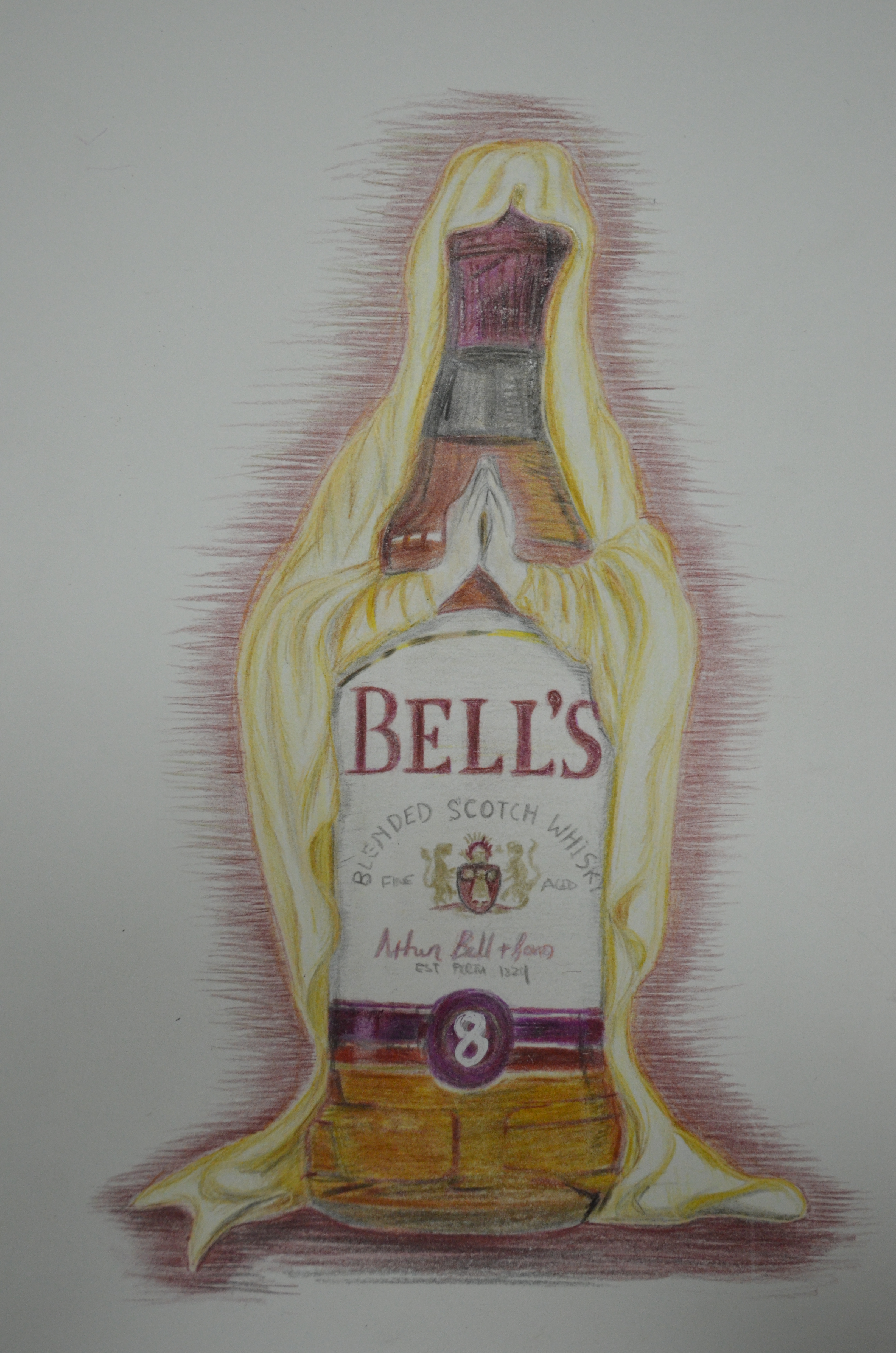
I have been wanting to create this image for the last year after seeing a statue of Mary on the TV and thinking that it had a similar shape to bottle of whisky. Originally it was planned for acrylic on canvas but after using colour pencils on the last exercise ‘Mark Making Techniques’ I decided to get it down on paper in coloured pencils while it was still fresh in my mind.
However, due to what I think is probably the standard of pencils I am using I had to press very hard on the paper to get the shadow in some spots removing some of the surface. I think it maybe would have been a better idea to produce this sketch in watercolour pencils.
Hell’s Bells – colour pencil on paper
I began by sketching it with pencil and then rubbing out the lines as I swapped them for a very light tan colour pencil and then started on the lighter tone. My only regret really is that I didn’t make the bottle longer, rather than cutting it shorter like I did, although it is still recognisable as a bells bottle the figure would have looked better with a longer bottle.
My weaknesses with colour pencils at this stage are completing the details such as the writing on the bottle, I made a total mess of the 8 at the bottom of the label but liquid paper came in very handy.
I’ve always stayed away from colour pencil sketches, I’ve always produced graphite pencil sketches and then put the best ideas on canvas but since starting this course I’ve realised that there’s more to art than just paint. After completing the ‘Mark Making Techniques‘ exercise I decided that I should spend more time using other mediums and so I decided to start by making a coloured sketch from a photo of a girl with red hair from one of my Facebook likes.
Everything was going great until I got to the lips when I gave the girl, who was supposed to have inviting full lips a pair of camel lips which ruined the whole sketch. Anyway I plodded on to finish the sketch which was in a bit of a state by now but I was determined to learn something from it, the first lesson I learnt was that I should have done this in my large sketch book, not my 6 x 9″ sketch book.
Realising that messing up the lips on a portrait can ruin the whole thing and when you are working with media that is difficult or impossible to erase that can be drastic, I used this as an opportunity to not just practise drawing lips but to practise drawing using coloured pencil. I did a number of sketches starting off drawing the outlines in graphite pencil then colouring in until I got confident then I produced further sketches using 100% colour pencil using techniques such as hatching, cross hatching and point shading.
This exercise of trying out various media and various techniques to see which mark making techniques work with best which media, was great for reintroducing me to techniques that I hadn’t used for quite some time.
The media I used for this exercise were a variety of graphite pencils, colour pencils, felt tips, Bic biros, Art Liner drawing pens, a 1mm Marker and Charcoal; plus a number of mark making techniques such as hatching, cross hatching, stippling, squirkling and point and side shading. I hadn’t used many of these techniques for a number of years so I was a bit rusty and need more practise with each medium.
My favourite medium at this stage has got to be pencil and so I began this exercise using various graphite pencils. However I soon learnt that I have a lot to learn about pencil usage and narrowed my choice of pencils down to 2 to 4B. Varying between 2B, 3B and 4B pencils I managed to use several different mark making techniques to fill up the boxes in my sketch book.
Mark Making Techniques Using Pencil
I found that graphite pencil was a generally good all rounder but particularly great for hatching, point shading, smoothing and squirkling, however to carry out stippling effectively it seems to help if you know which pencil to use with the weight and tooth of the paper. I can see how graphite pencils are also great for cross-hatching but unfortunately I need a lot more practise at this, it was a technique that I found difficult especially when applying long strokes to large areas where I had to make another stroke to carry on the line which was far from seamless. Another technique which my art teacher taught me at high school was shading with small circles that gradually get bigger, I found that this technique didn’t work well with graphite pencils and seemed to be reserved for pen drawing.
Mark Making Techniques, Pencil, Coloured Pencil, Bic
Colour pencils are also quite a good all-rounder and you can carry out most of the same techniques as you can with the graphite pencils but using 2 or three colours for hatching rather than applying pressure to the strokes give your drawings a better sense of depth. Stippling was also a pleasure especially when using two colours but the points had to be kept sharp or your pencil had to stay longer on the paper drawing the dots to create the stippled effect. I’ve always stayed away from colour pencils lacking the confidence to use them but this exercise inspired me to do my first colour sketches.
Mark Making Techniques, Bic, Drawing Pen and Marker
I moved onto pen starting off with Bic biros which I found were great for squirkling creating a very lively effect with good depth but again this is a medium that I need a lot more practise with and should have done so before filling in the squares I attempted two spheres with squirkling and hatching and failed on both, simply because the with the squirkling creating obvious rows between each row. Hatching with biro just shows how much I need to work at this technique not being able to cheat by smoothing the lines in. Biro was great however for shading with the gradual circles technique I learnt at school as were the Artliner drawing pens.
Mark Making Techniques, Drawing Pen and Felt Tip
The Artliner drawing pens were superb for stippling and I can see how they can be good for other techniques such as hatching and cross-hatching but again like the biro they showed me the bare truth, that I really need to work on my hatching technique. This was also true for the felt tips.
Felt tips were cool for stippling especially with two colours but with the hatching there is a risk of the two colours blotching where they strokes meet and creating a messy darker coloured dot,
Charcoal is a medium that I had never worked with until ‘Holding Pens and Pencils’ exercise but I do love the texture that each technique gives you, it’s a just a shame that when working on this exercise I only had large sticks of hardcompressed charcoal so was limited by this. Since then I have found a great art supplies shop at Silpakorn University so I am really looking forward to the next exercise.