How will your experiments with negative space help your observational drawing in the future?
Before I even started this course I was very aware of negative space but this course as made my awareness of it a lot more acute. I no longer just look at the negative space in and around the subject but the negative space between objects, Negative space plays a big part in all subjects whether it be a plant, landscape or the space between facial features in a portrait and being more aware of this will help to improve my observational skills with all.
What techniques did you use to ensure you drew your plants in proportion?
Negative space played a big part in this for me throughout this project I started at with one part of the subject and then worked my way around using the negative space between flowers and leaves piecing it together like a jigsaw. I then altered the shapes of the flowers and leaves where necessary.
How did you achieve an effect of three dimensional space in your drawings?
Firstly the way I arranged the flowers was a big help with the biggest at the front and the smallest at the back with the biggest flowers at the front acted as a focal point. The earlier exercise Still LIfe Group in Tone was also a big and drawing the overlapping plants and their cast shadows also helped me to create an effect three dimensional space.
In this exercise I used the same subjects as the Drawing Plants and Flowers in Coloured Pencil exercise and drew them in a variety of other coloured media, using Watercolour pencil, marker pens (fine and chisel nibs) and coloured pencil, watercolour pens, crayons and oil pastels.
Due to the choice of mediums and that I would be using them together I used watercolour paper for both of the drawings that I did in this exercise, knowing that the watercolour pencils and markers would react better with watercolour colour paper and hoping that the crayons and oil pastels would cling better to the rough texture of the papers surface.
Drawing with Crayons and Oil Pastels
I started the first drawing with the intention to use a lot more coloured media on this but it turned out to be a personal experiment to see the difference between oil pastels and wax crayons. With the wax crayons, I didn’t have much of a range of colours as I was using some I had bought from my kids a few months back but luckily enough there was enough colours for the subjects in my arrangement so I went through the arrangement flower by flower, leaf by leaf weighing up the advantages of each of the mediums. On the watercolour paper I found that the oil pastels clung to the paper a lot better than the wax crayons which left alot more white space than the pastels. I also found that the colours of the oil pastels were a lot more vivid. Layering over the top of the wax crayons with oil pastels was a lot easier than the other way round. It was also easier to get a better stroke with the oil pastels than with crayons as the tip of the crayons rounded off to easy. Nonetheless, both mediums, in my opinion, are better for the parts of the subject with less details such as the flowers rather than leaves; this would change with the size of the sheet of paper used.
Drawing with Markers, Water Coloured Pencils, Crayons and Water Coloured Pens
For my second drawing I used a wider variety of coloured media inluding marker pens (chisel and fine tips), coloured pencil, watercolour pencils as well as watercolour pens and wax crayons. Starting with the orchid flower like I did in the previous two pictures I worked my way around the arrangement. For the orchid I used markers mainly chisel tip and with no red available for the last layer I used coloured pencil which really worked well on top of the markers. I drew the other orchid flowers above in wax crayon an they looked somewhat drab against the bright colours of the markers.
The mixed mediums that impresssed me the most were the fine markers over the top of watercolour pencil for the red roses, the outcome of mixing these two mediums was a lot more impressive than coloured pencils in the last exercise.
The watercolour pens (watercolour felt-tip pens) which are actually quite bright when used by themselves were very dull over the top of damp watercolour pencil, however they did blend quite well, somewhat uncontrollable but I feel with a bigger sheet of paper and more practise they could be used quite well together or just the pens by themselves.
Watercolour pencils were suited to drawing the flowers but not so suited for the detail in the different leaves in the composition they were also a good base for using other mediums over the top.
I don’t really like wax crayons maybe because of the feel on the paper or that they seem to need a lot of hard work to get your drawing looking anything like you want it too but then this could be down to the type of paper used.
All in all I thought this exercise was a lot more time consuming than drawing in coloured pencil but that boiled down more to the thought process than anything else. I am not too happy with the results but it was great getting to know what the different mediums could do together.
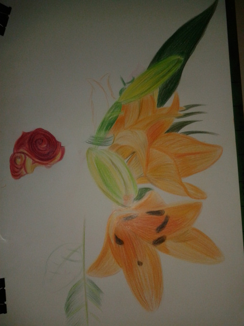
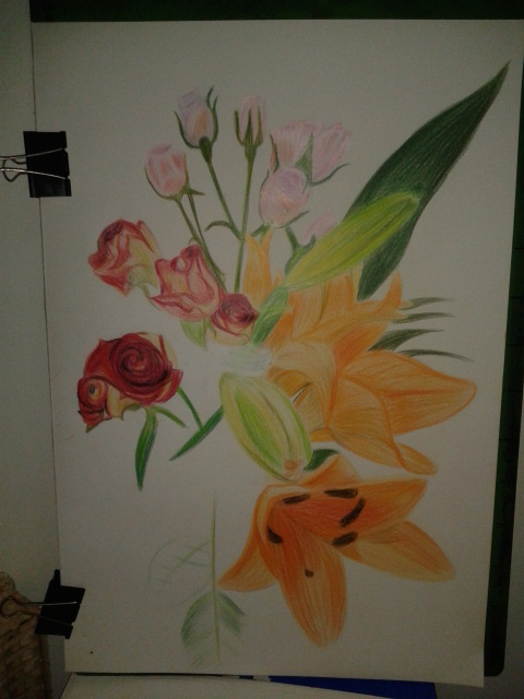
For this exercise I bought an assortment of flowers from the Tops supermarket while I was visiting my kids for a meal for my oldest daughters Birthday. The flowers I chose were orchids and some red and pink roses, I really was not thinking about shapes or colour when I purchased them but I am glad I made the choices that I did. On an A2 sheet of white paper I began to draw.
Roses and Orchids
Now the brief said to experiment with different methods of blending in my sketchbook first, however I thought I had had enough practise blending colour with colour pencils so far in this course so I put pencil straight to paper, for the flowers this was no problem but for the leaves I wish I had done as the brief said and practised a little more.
Drawing the Orchid
I began with a neutral colour for each subject starting with the orchid and working my way around the composition working on the most prominent flowers and leaves first keeping a careful eye on negative space.
Part way through the drawing I read the brief again to find out I had skipped over some valuable instructions:
Make the plant the focal point of your drawing but draw the background
Do not draw the plant in isolation
Draw in the context to give depth and substance to the drawing
The background I had chosen was a plane white wall with brown skirting boards and very pale floor tiles but I decided to carry on and I am glad I did. Using three different types of flowers with large leaves and petals on the orchid the composition and the vase I had placed them in made up the main subject and the background. Placing the largest flowers at the front and the smallest at the back helped me to create a nice three dimensional effect with the large orchid flower taking on the role as the focal point of the drawing.
I used different methods of blending for each of the flowers with layering used on all, the Still Life Group in Tone Exercise early on in this part of the course really helped using 3-4 colours on each flower but starting off with the lightest colour first and working my way to the darkest.
I used long strokes for the orchid to give it a stretching outwards feel and to me it almost seems like it as a life of its own.
Drawing in the Red Roses
For the red roses I coloured them in a spiral motion then layered the darkest colours over the top rubbing out the colour from time to time to let the lighter colours show through.
Flowers Complete
The pink roses were the most challenging of the lot with the colours and details being so delicate I decided to tackle them in a different way by hatching then squiggling over the top for the flowers where you can see the petals grouped together.
Aspects of the Drawing I am Satisfied with:
I am really happy with the 3 dimensional feel of the drawing and the way the different solutions I came up with to tackle each type of flower pad off. I am also very happy with way the drawing came together using the practise I had from the Negative Space in a Plant Exercise helped me to piece the drawing together like a jigsaw.
Plants and Flowers in Coloured Pencil
Aspects of the Drawing I am not happy with:
As always I wish I had read the brief again and again until I was clear on what I had to do but then this would have lead to a one or two plant composition which would have probably been a lot less challenging.
I wish I had practised blending colours in my sketch book if just for the leaves and stems, although not all the leaves and stems are clearly visible I can see that I definitely could have improved on the blending on those parts of the flowers.
The final drawing is very sketchy although this is a big difference from some of the final drawings in part 1 of this and I know I allowed the the sketchy artist I researched earlier to influence me in this exercise I would have preferred a more realistic finished drawing.
I don’t have any plants at all in my apartment and was quite worried about where I would get one from without having to travel to the outskirts of Bangkok to find a suitable pot plant for this exercise.
My Subject – Jasmine
Luckily it was mothers day here in Thailand (12th August – the Queen’s birthday) and while my girlfriend was shopping in Tesco she came across some Jasmine plants, Jasmine is the Queens flower and at only 49 baht (just over a pound) they were a bargain and I’d definitely picked the nest time of year to do this exerise.
I used my faithful ball point pen and an A3 sheet of paper, placed the plant in front of a large drawing that I am in the progress of doing for a friend in England and began to draw. Concentrating on the negative spaces, I started to draw the space within and around the pot plant beginning at the top and working my way down to the bottom.
Drawing Negative Space in a Plant 1st Attempt
My first attempt went really well until I got down to the bottom where the plant came out of the soil and I realised that the right of the plant would be well out, so to make the plant readable I drew in a few more negative spaces to even it up. I then began to finish it off by filling in the negative space in the drawing with some swirling psychedelic patterns.
Drawing Negative Space in a Plant 2nd Attempt
My second attempt was quicker and I think is also an improvement on the first, this time I crossed over a few lines along the way and when I had finished filled in the negative space with more conservative lines.