The first drawing I did for this exercise was a portrait of my daughter. I felt guilty that I have used my girlfriend as a muse for most of the figure drawing exercises in this course and so I decided to make it up for it with a tonal portrait of my oldest daughter.
For this portrait in pastel I used mostly diagonal single hatching on a dark blue Ingres paper. I am really happy with the finished drawing but I seem to be having the same problem with positioning as I didn’t draw an outline first I just went straight into building up the picture with hatching starting at the cheek.
1 – Angel in Tone
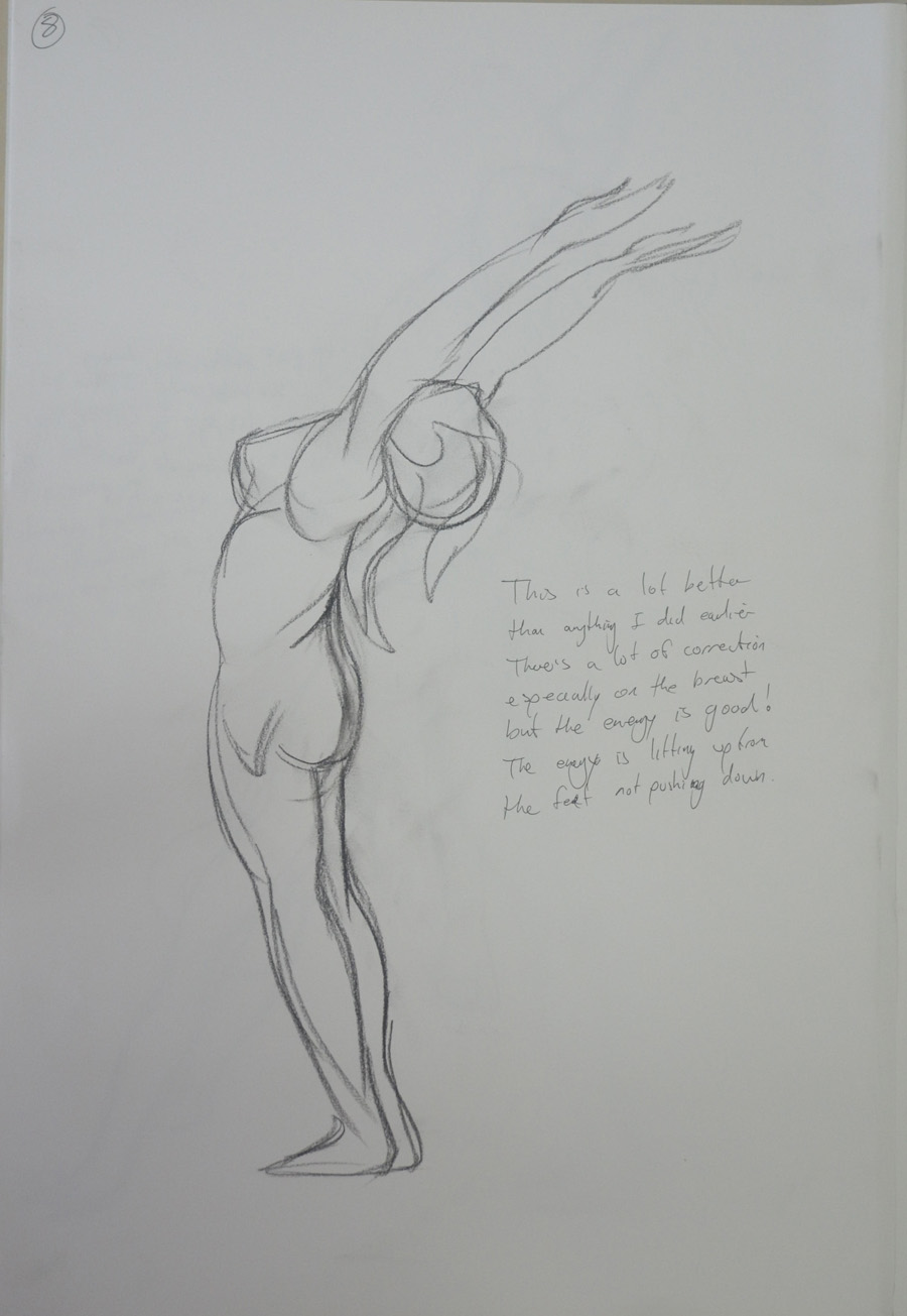
Ideally I should have done the next drawing in pencil, maybe on a thick watercolour paper but I decided to go with charcoal on a large sheet of paper. The proportions are good but…
You’ve delivered another strong submission Mark. The determination and enthusiasm you have shown throughout the past four parts of the module has clearly been of great benefit to you as you approach the final part of this module. It is your unerring interest in the subject of drawing and your resolve to advance in the process that will successfully see you through to the end of this course.
The first exercises looking at quick and long poses display good observational skills. Quick sketches of the figure are a wonderful way of loosening up before approaching longer, more studied pieces and allow the artist to look at the subject in a rapid way, to define what is integral as well as superfluous in the detail of the sketch in the given time and is important for honing the eye and hand. They are well-proportioned and show that you can handle – and understand – the process of measuring well. As these are your first experiments with drawing the figure from life I think you should feel very happy with the results. The more you do the more adept you will become with the process of looking and transposing what you see. Again the longer poses display good proportional observation as well as a good understanding of the portrayal of attitude.
I learnt a lot about measuring proportions from this exercise particularly how many heads distance it was from the crown of the head to the seat of the bum which was approximately 3.5.
The drawings you have produced for the essential shapes and elements exercises show good understanding of how to represent form and your decision to use charcoal was well founded both in the drawings of your girlfriend and in the series of your daughter. Proportion is well observed and rendered and elements such as foreshortening have been approached simply and successfully. You mentioned in the check and log for the proportion exercises that you feel a little frustrated with your abilities to represent a facial likeness in relation to the overall drawing – one step at a time Mark. With your focus and determination I am in no doubt that you will find that you’ll develop your own way to tackle the complexities of facial structure. Like the body it is all about proportion and form but with the face the detail is much more intricate. The ‘tightness’ you perceive when approaching the face is normal for this early stage of your practice. It is the pressure we put on ourselves to achieve a ‘true’ or life-like representation of the model’s features that often hinders progress and ‘puts us off’, especially when you are not only restricted by time but the desire to ‘get it right’ creates a kind of hurdle to what is normally free-flowing creative expression. For these exercises it is not necessary to produce fully formed portraits with intricate detail. Try to hint at the features by using simple tone to describe the shape of the face.
Charcoal on A3 PaperCharcoal on A4 Sketch Book
You have produced a vast array of work for the stance and energy exercises. It is good to see that you are pushing yourself with such enthusiasm Mark and the results show that you have a good eye for the depiction of weight and balance. The line you use in these sketches is particularly appropriate and successful: it is sure and confident and delineates the stance and energy of the poses without forsaking attention to detail such as proportion and anatomy.
I wasn’t as impressed with my energy drawings and so after I submitted my coursework I did some research on Gesture drawing as well as some reading, Force, Michael Mattesi and did a new set of drawings for this exercise, which I did submit to my tutor afterwards so maybe that is what he is taking about.
New Run at Gesture Drawings
You have approached the structure exercises with great enthusiasm and openness with regards the use of different techniques and media. There are some very slight issues with proportion in some but I don’t think you should be overly concerned here – it’s like you’ve concentrated too closely on specific detail rather than considering how each anatomical element relates and works together by looking at the subject as a whole.
Finished Anatomical Drawing Half and Half
I think my tutor was talking about the anatomical drawing above but I am not too sure. If so then I can say I wasn’t thinking about specific detail, I was thinking about how anatomical elements related to each other. At this stage we were a bit ‘shy’about nude drawings in detail but the choice of clothes for the model, my girlfriend, on this exercise was probably a bit poor and so it didn’t show off the structure as well and so I wasn’t able to.
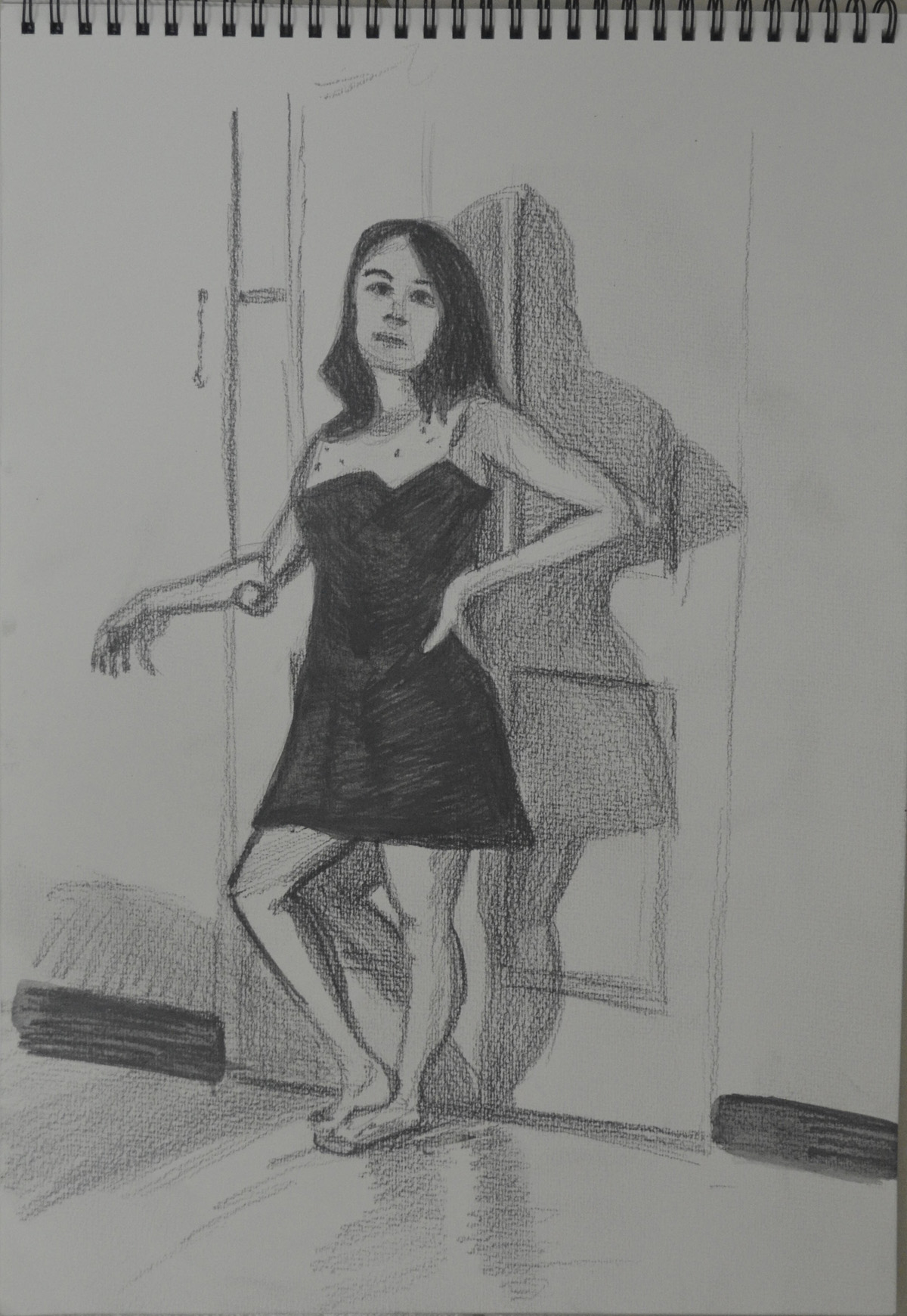
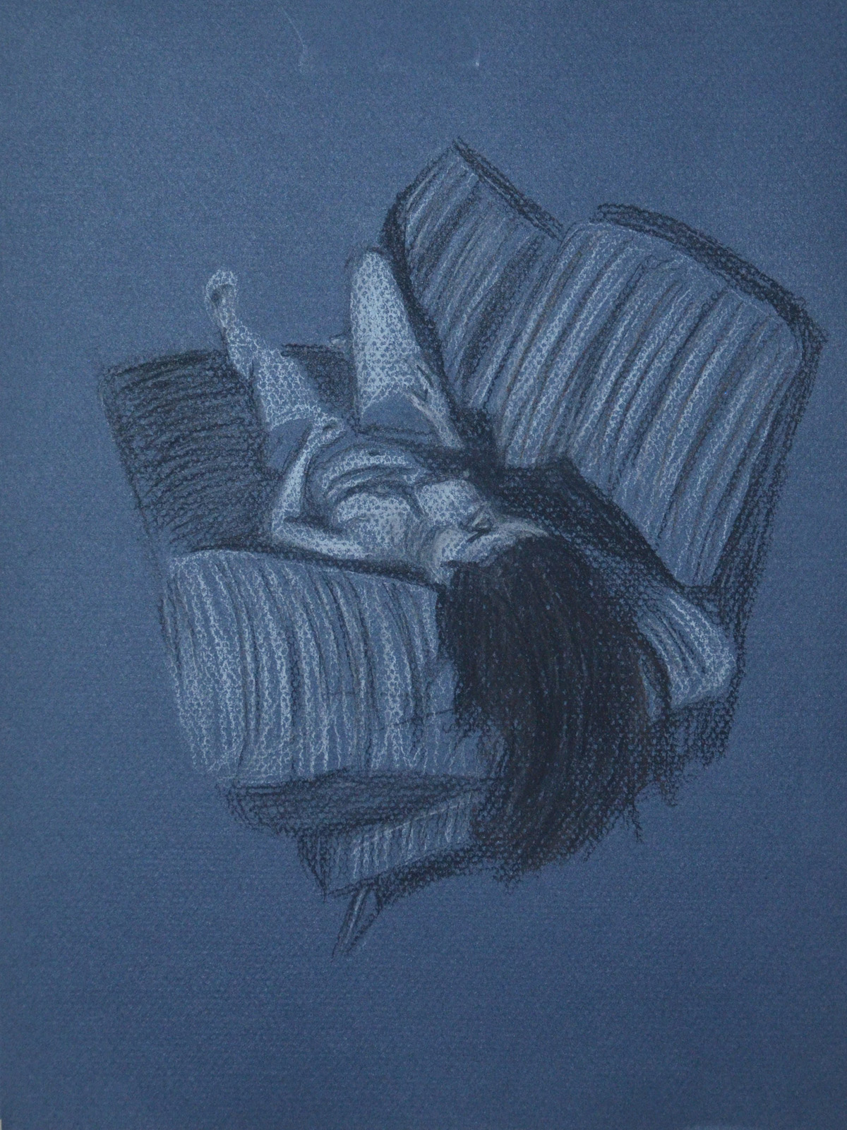
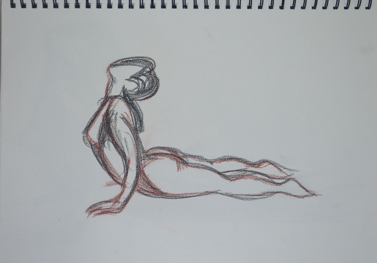
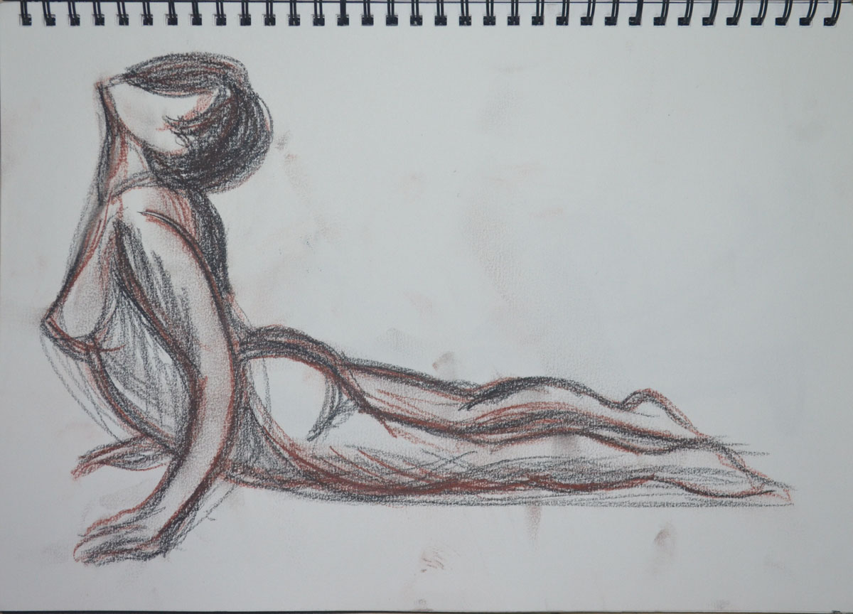
In the conté and charcoal drawing of the seated figure, the upper part of her right arm appears too thin in relation to the overall proportion, and in the drawing using white gel ball the arm resting on the door knob appears a little elongated. The foreshortened reclining pose in conté and charcoal however is very nicely observed and delineated in terms of proportion, form and structure. The depiction of foreshortening can often cause great problems and confusion but not in your case. You’ve produced a very well executed drawing here Mark.
Lying Down – Conte Stick and Compressed Charcoal
I am hitting the same problems all the time, I am producing my best work on a small scale, I love this drawing and yet I am not sure whether it will get me where I want to be in the assessment when framed.
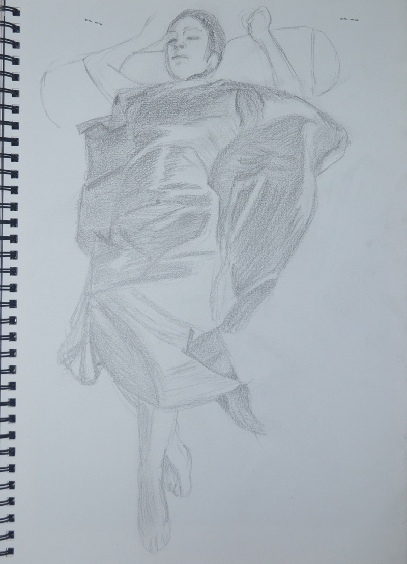
The drapery studies for the clothed figure exercises also show keen observational abilities. The manner in which you have portrayed the lightness and swathe of the fabric by utilising line following form and allowing the surface of the paper to describe highlights is very successful. The subtlety of tonal range in these drawings is also very well observed and this is particularly successful in the two drawings of the reclining figure using white pastel on black paper and the graphite version of the same pose (I must also say here that the face in this piece is beautifully rendered!). There is an undeniable believability in the way you have portrayed how the fabric drapes over the model’s body.
2 – White Pastel on Black paper1 – 6B Pencil in A4 Sketchbook
I shall be producing a finished piece for the exercise above from these sketches and the drapery studies.
You quick sketches for the sitting and waiting and fleeting moment exercises show good observational responses to what can be quite a difficult and pressurised way to work, especially for you in terms of the recent circumstances in Bangkok!
Walking Women in Oil Pastel
It is evident that you thrive on these set tasks Mark. The definite evidence of development as you work through the self-portrait exercises is clear. The determined and studied visual research for shape and proportion you have employed for this exercise has surely helped with this. From the slightly tentative first sketches for the ‘Drawing your face’ exercise to the surer, more ‘finished’ pieces in different media, you have once again produced a focused collection of work. I thought the eighth portrait in conté and Chinese white pencil particularly successful with good attention to incident and reflected light. I thought the portrait from memory of Vladimir Putin worked well and was definitely recognisable as the Russian leader.
Feedback on assignment Demonstration of technical and Visual Skills, Quality of Outcome, Demonstration of Creativity
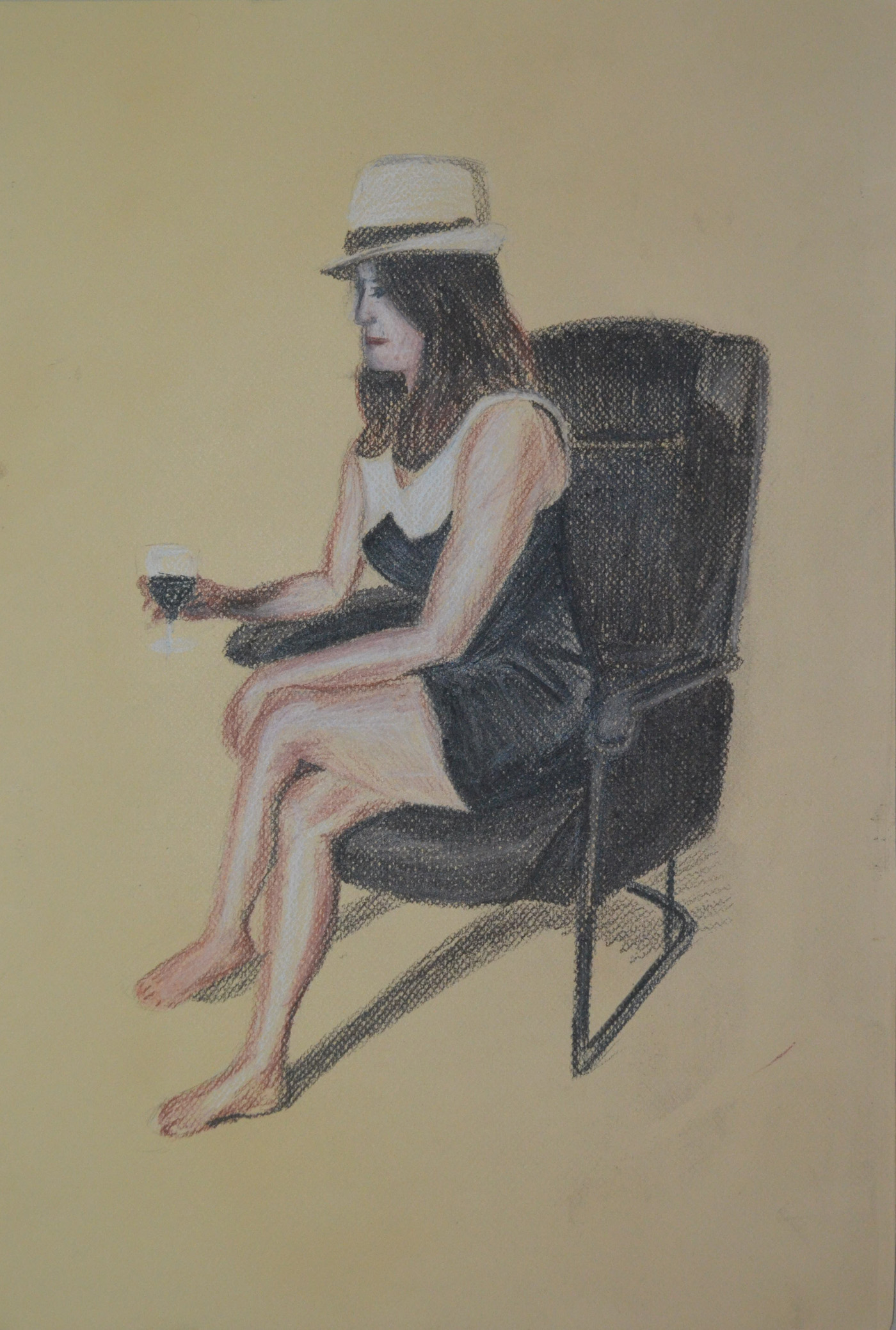
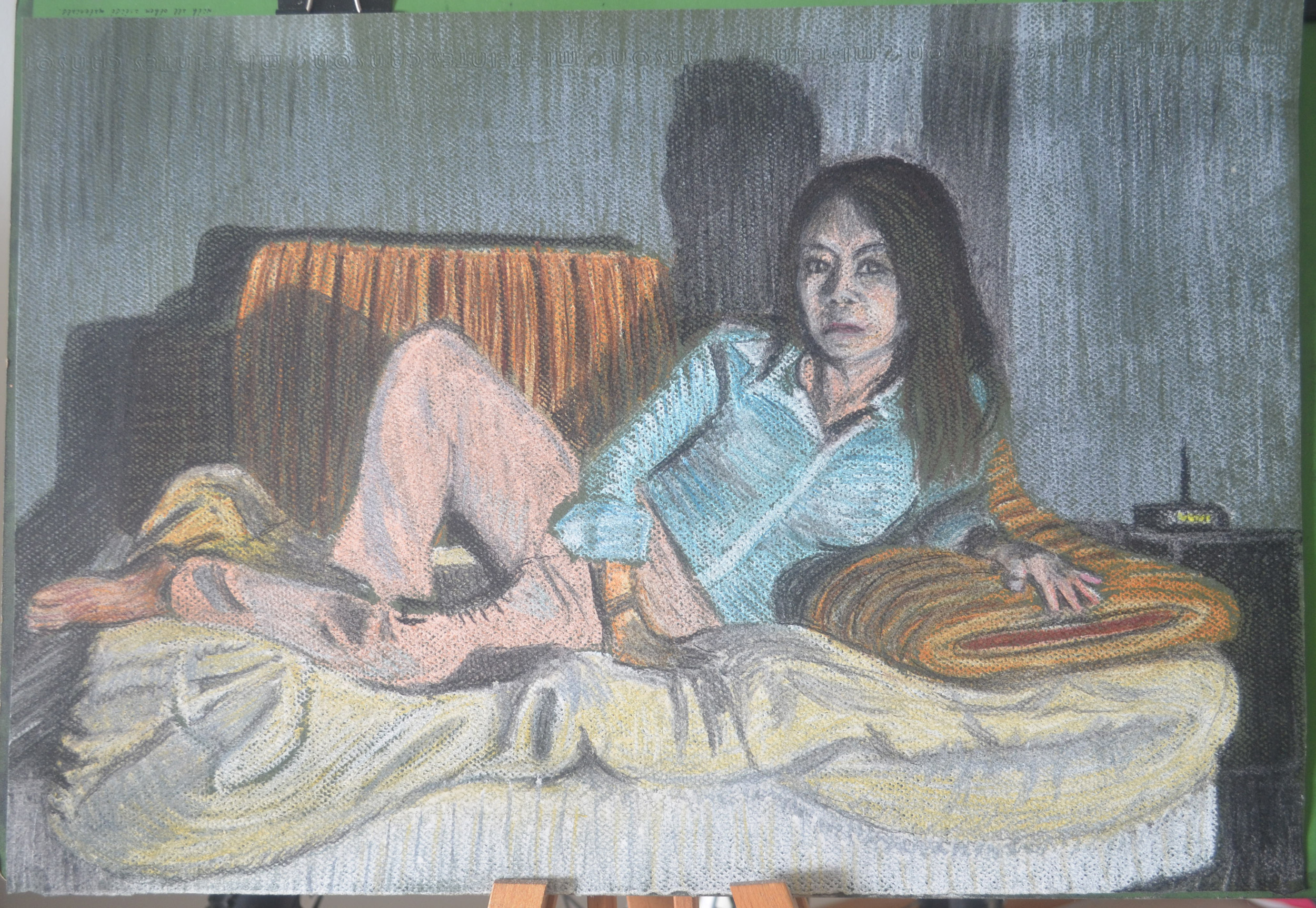
The assignment piece of your girlfriend reclining on the sofa in soft pastel was very well conceived, observed and executed. Once again you have handled the media successfully. The composition is well-balanced and the depiction and overall effect of light and shade makes for a very effective study – a nod to the reclining figure from the history of art, to Manet’s Olympia, Titian’s Venus of Urbino, Velázquez’s Rokeby Venus, Goya’s La maja desnuda, the list goes on? A very successful piece Mark!
Tone and Form – Finished Piece Soft Pastel, Green Ingres
This assignment was a breath of fresh air after the last one but there was a downside though that I hadn’t expected. The soft pastel colours were so bright until I used the fixative what I hadn’t anticipated was that the fixative would dampen it or blow the pastel dust away and allow so much of the green paper to show through making it murky, the upside of this of course is that it gives it a ancient/spooky look.
Final Drawing
Learning Logs or Blogs / Critical essays Context
As with your previous submissions you have delivered an honest, informative and thorough learning log for this part of the module. I enjoyed reading the piece on artists’ self-portraits and thought the manner in which it was written was fresh and personal – a welcome divergence from the usual heavily fact-based information we as tutors sometimes have to read! I am also very pleased to read that you are getting a lot out of Berger’s Ways of Seeing.
Sketchbooks
What I find encouraging about the way you work Mark is that you are rarely put off by new processes; in fact you appear to thrive on the challenge. You confront new disciplines fearlessly and with an open mind to technique and media. The evidence is here in your sketchbooks – the amount of work and the confidence displayed by the inclusion of work you are rightfully happy with as well as pieces you have considered not so successful has been beneficial to the progression of your practice. Sometimes it is the recognition of ‘success’ and ‘failure’ that will drive us forward to constructively face. Your overriding interest in the subject of drawing will stand you in good stead for the final part of this module and your future art practice. I am pleased that you have chosen the option of figure drawing on which to concentrate.
Suggested viewing/reading Context
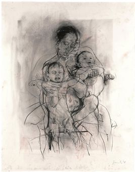
I’m sure I don’t need to mention it but try as much as you can to immerse yourself in the work of other artists. I have always found it exciting when discovering the oeuvre of ‘new’ artists, the influence of their work potentially beneficial to my own. A couple of artists you may find interesting are Jenny Saville and Alison Watt.
See examples of their work below:
Jenny Saville Mother and Child (After the Leonardo Cartoon) charcoal on watercolour paper, 2009.Alison Watt Part of the Phantom series, oil on canvas, 2007.
Demonstration of technical and visual skills – materials, techniques, observational skills, visual awareness, design and compositional skills
I think I was disillusioned as to what materials i would use for this assignment, I chose water soluble media thinking that they were suited to my ideas but proved me to be wrong. My design and compositional skills shone through in this assignment but were suited to a totally different medium to what I had planned but in the end everything came together.
Quality of outcome – content, application of knowledge, presentation of work in a coherent manner, discernment, conceptualisation of thoughts, communication of ideas
The journey was very different from what I imagined but I arrived at the same destination, depicting in my final piece the mood or atmosphere that I was determined to achieve from the start. I am very happy with the quality of the final piece and applied the knowledge that I had gained throughout the course to realize my thoughts of how it would turn out.
Demonstration of creativity – imagination, experimentation, invention, development of a personal voice
I demonstrated imagination, I experimented an I invented and as far as my personal voice is concerned something is happening but I’m not sure what as of yet.
Context – reflection, research, and critical thinking (i.e. learning blog)
My blog seems to go from strength to strength and my thirst for researching new artists is also getting stronger and with no library in the vicinity books are getting addictive and expensive. I am also spending more time to reflect on the work that I have done which shows in my blog entries.
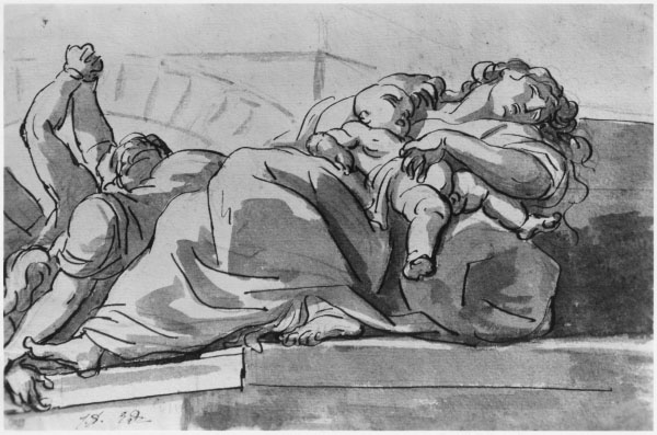
For this research point we were to look at the work of a range of artists, such as Ingres, David, Degas, Giacometti and Hockney and make notes about their use of line.
I have already started the line drawing exercise and so far I have produced drawings in ballpoint, drawing pen and even ink, a medium that I have been struggling with. For now the drawings I have produced for this exercise are ‘nice’ but nothing special and so I decided to hit this research point early to see how studying different artists’s use of line effects my line drawings from this point on.
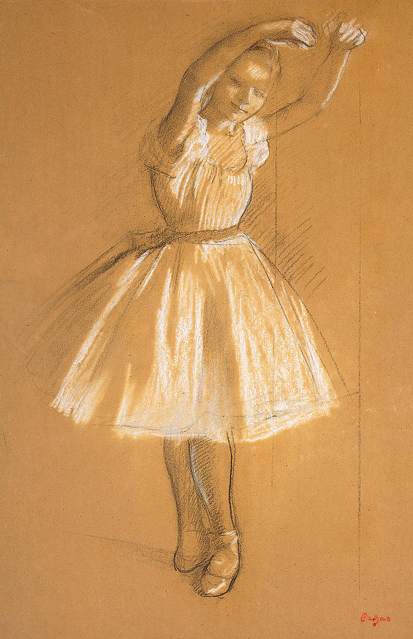
Edgar Degas
I already researched Edgar Degas before starting on the last part of this course, Part 4, Drawing Figures and so I had already experienced Degas’s Use of line.
Most of Degas’s drawings were studies for finished paintings and most of these finished paintings such as his ballet dancers were able to depict energy and movement. His line drawings seemed to be experiments that helped him to achieve this.
Edgar Degas -Little Dancer
With Little dancer above it seems like the line acts as a frame to contain the minimal detail between them. If you take away those lines the figure would be difficult to make out and yet with the lines around the chalk and pastel, they help to contain enough detail to depict an ‘effortless gliding figure’ while the double lines in certain places help to capture movement.
With the dancer at the bar above he seems to have corrected his position while drawing the dancer in order to get a better prospective, however he hasn’t erased the lines from the corrected drawing, he chose to leave the lines rather than correct them which depicts the dancer’s former position and therefore ‘movement’.
Edouard Manet, Bust-Length Portrait, 1864-65
The bust length portrait of Edouard Manet above is something completely different, the flat line drawing of the suit helps to emphasize the more detailed head drawn with thicker lines, helping it to stand out.
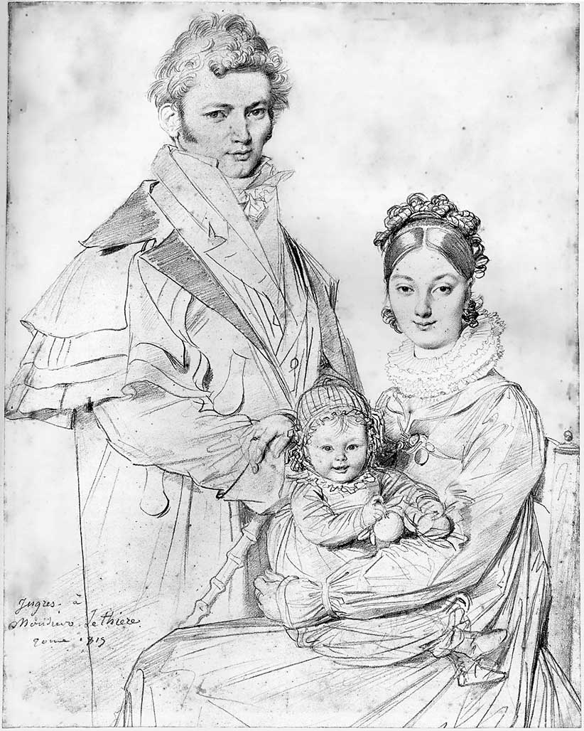
Jean-Auguste-Dominique Ingres
Whenever I come across an artist that I am not familiar with I get excited and seeing the line drawings of Ingres was no different.
Unlike Degas who preferred chalk, graphite and pastel on wove, laid and eggshell paper etc. Ingres preferred a sharp graphite pencil on smooth white paper for his drawings.
Also unlike Degas his lines were smoother, cleaner and seemed to be more planned out. It’s hard to know which was drawn first, the figure or the faces, as like the Bust Length Portrait of Manet above the lines of the bodies in the drawing below seem to do the same job, to support the detailed faces.
Jean Auguste Dominique Ingres Portrait Drawing
Ingres not only uses heavier lines on the head to give a sense of three dimension but looking at the body of the figures he uses a darker heavier line on one side of the body and a thin crisp line on the other by doing this he manages to depict form and weight. This is something I had never even thought about.
The Alexandre Lethiere Family 1819
Gustav Klimt
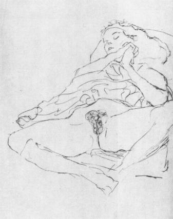
Would it be wrong to look at Klimt’s erotic line drawings of seated women revealing themselves for this research point? In these drawings he captures his model in intimate and secret moments before ‘concealing them in his paintings beneath Sparkling Ornaments’ – Klimt, Gilles Neret.
Klimt’s erotic drawings are drawn with wobbly, unfinished lines that continue to double over the top of each other to create a sense of writhing in ecstasy.
Klimt Seated Semi-Nude RecliningKlimt Woman Seated with Thighs Apart
Alberto Giacometti
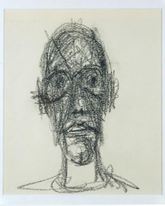
Giacometti was a Swiss, sculptor, painter, print maker and draughtsman and probably one of the first artist’s who’s drawings make me feel as uncomfortable as the annoying buzz of an electric light on a horror movie.
I love surrealist paintings but I find surrealist sculptor makes me feel kind of tense and that’s what I feel when I look at Giacometti’s portraits of Sartre and Diego below where he has built up the 3D
form of the face with expressive, straight heavy lines, making sure he defines the shape of the eye sockets.
Alberto Giacometti, Jean-Paul Sartre, 1946Alberto Giacometti, Portrait de Diego,1958
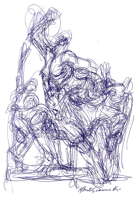
On the other hand I really like the ballpoint drawing below where he has used a continuous wire like line to build up the 3D form.
Alberto Giacometti, ballpoint on paper. Giacometti House, Paris
David Hockney
After browsing the works of Alberto Giacometto with their intense, awkward lines, researching the line drawings of David Hockney is a breath of fresh air. To me Hockney draws with what I would describe as relaxed baggy lines and creates a sense of three dimension by using space and perspective, leaving more space between the lines that form the shapes of the body parts that appear to be in the foreground, and in some cases, exaggerating shapes such as line drawing 2 and 5 below.
Line Drawing David Hockney 1Line Drawing David Hockney 2Line Drawing David Hockney 3Line Drawing David Hockney 4Line Drawing David Hockney 5
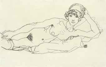
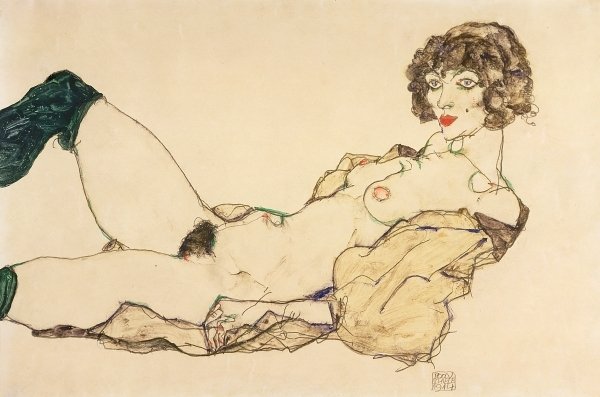
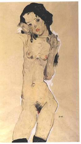
Egon Schiele
Egon Schiele used rickety lines to describe skinny, almost anorexic women in sexy poses. It seems like he was describing not only the complexity of the human skeleton but also the frailty of these female figures and in doing so capturing what he found sexy or erotic about them.
Egon Schiele Reclining NudeEgon Schiele Reclining Nude in Green StockingsEgon Schiele Reclining Woman with Legs Apart 1914Egon Schiele Standing Female Nude with Black Hair 1910
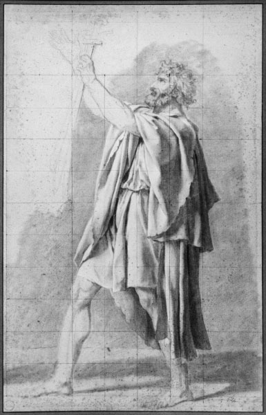
Jacques-Louis David
At the first look at the line drawings of Jacques-Louis David below it seems that the four drawings are in two different styles, while all all of them serve one purpose and that is as studies towards a finished piece.
Study for The Oath of Horatii
The study for The Oath of Horatii above and the Father of Horatii below use fine pencil lines to frame figures with little or no tone, but on the other hand the tone and form of folds on the figures are wearing are well detailed like he almost intended them to be manikins for the drapery which helps to describe the 3D form of the figures more than the lines around them.
Father of the HoratiiDeath of Meleager
For the Death of Meleager above and the Plague Episode below it seems to be the opposite. He has drawn thick ink lines that act as a container for the ink wash shadows cast be the folds of the drapery and figures of the plague victims.
I really think I could have done a lot better in the Gesture project in the last part of this course, my Energy drawings left a lot to be desired and so I decided that I wanted to start this part of the course with a fresh try at drawing with energy.
Drawing 1
I previously only browsed through ‘Force’ by Michael D Mattesi, this time I read it and utilized it. One of the first issues that he talks about in his book was the types of lines and I had been using the infamous hairy line in my drawings and it was time to do something about it.
Drawing 2
Using photos I had taken earlier I was determined to draw with smoother, confident lines putting what I had learnt from the book into practice, concentrating on directional and applied force and the road of rhythm. The results were far better than my previous attempts at gesture drawing and rarely did the hairy line raise it’s ugly head.
I am still waiting for tutor feedback from Assignment 4 but I’m not expecting anything special. I feel there were a couple of exercises that I could have done a lot better on and therefore choosing Option 4, Drawing Figures will keep me focused on drawing figures and therefore allow me to get a bit more practice on those areas that I think I failed on the first time, particularly ‘Gesture Drawing’. Even after a couple of attempts at this, my gesture drawing needed a lot to be desired
My first attempt at Quick Poses was also a bit shabby and I think I can do a lot better especially for the ten minute poses. The first exercise of Part 5, Option 4 is also Quick poses and I am looking forward to tackling them again.
The first thing I did after completing Assignment 4 was to go to Asia Books and pick up Klimt by Gilles Néret, I have some ideas for assignment 5 and I am looking for some inspiration, which I think Klimt will give me.
It’s hard not to watch people in Thailand, I’ve been here 14 years and I can’t say there hasn’t been a day gone buy where I haven’t studied them, scrutinized them, complained about them. The speed they walk, how loud they talk, picking noses plus a multitude of other habits that makes the Thai race just what it is, unique!
Last Friday was one of the best opportunities I had to sit down and make notes about what I saw. In the school holidays, February to May, I work at the language centres, which are in shopping malls and in one of the malls, ‘the Central Plaza’ they usually have sales in a roundish area by the entrance on the basement floor right outside Macdonald’s, but on Friday the whole area was clear for the first time in months, so I grabbed myself a Mac-fish set and sat at a table right at the open entrance of the fast food restaurant so I could see people coming and going.
From where I was sat I could see people going up escalators, people going down them, people meeting their friends but mostly people dawdling about in slow-motion staring at their mobile phones, they were probably very active in their online social world but to the bystander, me, the scene that was coming together in the empty floor space reminded me of AMC’s Walking Dead.
I made quite a few notes about my findings, as you can see below however in my notes I stated that Thais have less types of walks than westerners. To be truthful they probably have more. All the gaits that you’d find in the UK plus a good few of their own as I mentioned below, You just don’t see many people walking fast in Thailand.
1st Notes People Watching
Although it it could be fare to say that technology is making people walk slower all over the world as they spend more time looking at the screen while they’re walking down the street.
2nd Notes – People Watching\
I also mentioned in my notes that the locals actions and mannerisms make them seem more immature than those in the west but then again, how do I know, I’ve been in Thailand 14 years, I look on Facebook and see photos were the subjects can’t pose without making hand gestures, and I’m not sure whether it’s insecurity or immaturity brought on by technology. I know it makes me act younger.
2nd Notes – People Watching
One thing I do find here in Thailand is that there is a unique class of people who I have named the ‘drama queens’ a group of young woman who dress, act, walk and talk like the characters on Thai soap operas, over-the-top-characters that have had a massive influence on teenagers and young women, not just in the way they act but in everything else.
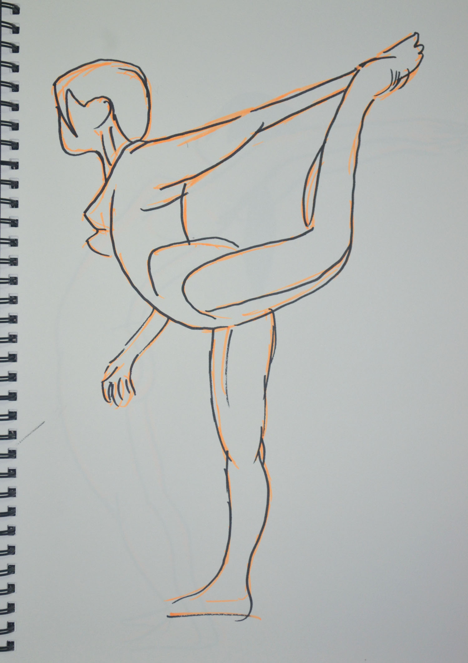
In the instructions for this exercise we were to ask the model to adopt a dynamic pose such as lifting an arm, twisting the hips, turning the head stretching the arms or walking. I had an idea of what I would be doing for this exercise from the start, so I asked my girlfriend to do the sun salutation for me and to hold certain poses that I thought may work well I stayed close with my A4 sketchpad.
Warrior 1 6B on A4
Warrior 1 was easy to draw with the 6B pencil on the textured paper and as can be seen in the enlarged photo . However, I can never seem to use long flowing lines but am really sketchy and use lots of broken lines when faced with the task of drawing quickly within a time frame. The drawing itself would probably would not have expressed energy that we’ll so i added more pencil lines to depict movement.
Warrior 2 in Conte on A4
This was the same for Warrior 2, which was drawn a lot faster and with more energy but I just think it needed a little something so spiced it up a bit.
Cobra Pose 1 Faber Castell Ballpoint on A4
The next pose was the Cobra Pose which after drawing the first one in Faber Castell Ballpoint I decided it was a pose that could be drawn with lots of energy and depict movement quite well if done right so with the girlfriend taking a short break after each one.
Cobra Pose 2 Faber Castell BallpointExploring Cobra Pose in ConteLarger Cobra Pose in Conte
There were a couple that were ok and a couple that were totally out of proportion. The thing about the Cobra Pose is that the legs look longer in the pose especially with mygirlfriend who has quite a short body, or high backside as can be seen in the upward salute below.
Upward salute 6B on A4
I did a quick sketch with my girlfriend in the ‘upward salute’ pose, starting from the waste I worked down to the feet. I should have done it the other way around and drawn the top first because by the time I got to drawing the top she had eased off the bent back position.
Upward salute Back Bent Further Back
The second drawing of the same pose was a lot easier for us both and this time I started with longer lines from the waist to the breast then from the breast to the wrist then worked my way down to the floor. Her hair flicked back gave me an idea and so i decided to add some trail lines to both drawings, successfully adding energy and movement to the drawings. For the next two drawings we chose the ‘Knees, chest and chin pose’ as I thought, like the Cobra Pose, drawing with energy I may be able to depict movement in the following sketches. This maybe true for the Conte sketch in two colours but not the drawing in charcoal.
Knees, chest and chin pose CharcoalKnees, chest and chin pose, Conte pencils
That was it for the first day but the next day I had some time to kill between lessons at the language centre, so I thought I would try something a bit different. With 6B pencil in my A4 sketch book and working from two photos I had taken from the bed with my tablet the night before I quickly sketched my girlfriend and then distorted the body parts that had been caught in action (moving) in the two photos.
Experimenting with Moving Limbs 1, 6B on A4
In the first photo from what I can remember she was on her way to the toilet lifting her left leg up and swishing her damp hair to one side after making a start on blow drying it. In the second photo she was cooking her log up, maybe scratching the back of the right leg with the top of her left foot.
Experimenting with Moving Limbs 2, 6B on A4
The next day I cycled back up to my girlfriend’s home sketchbook in bag but this time armed with my felt tip pens and my girlfriend went through a few more poses to see which would be best as drawings.
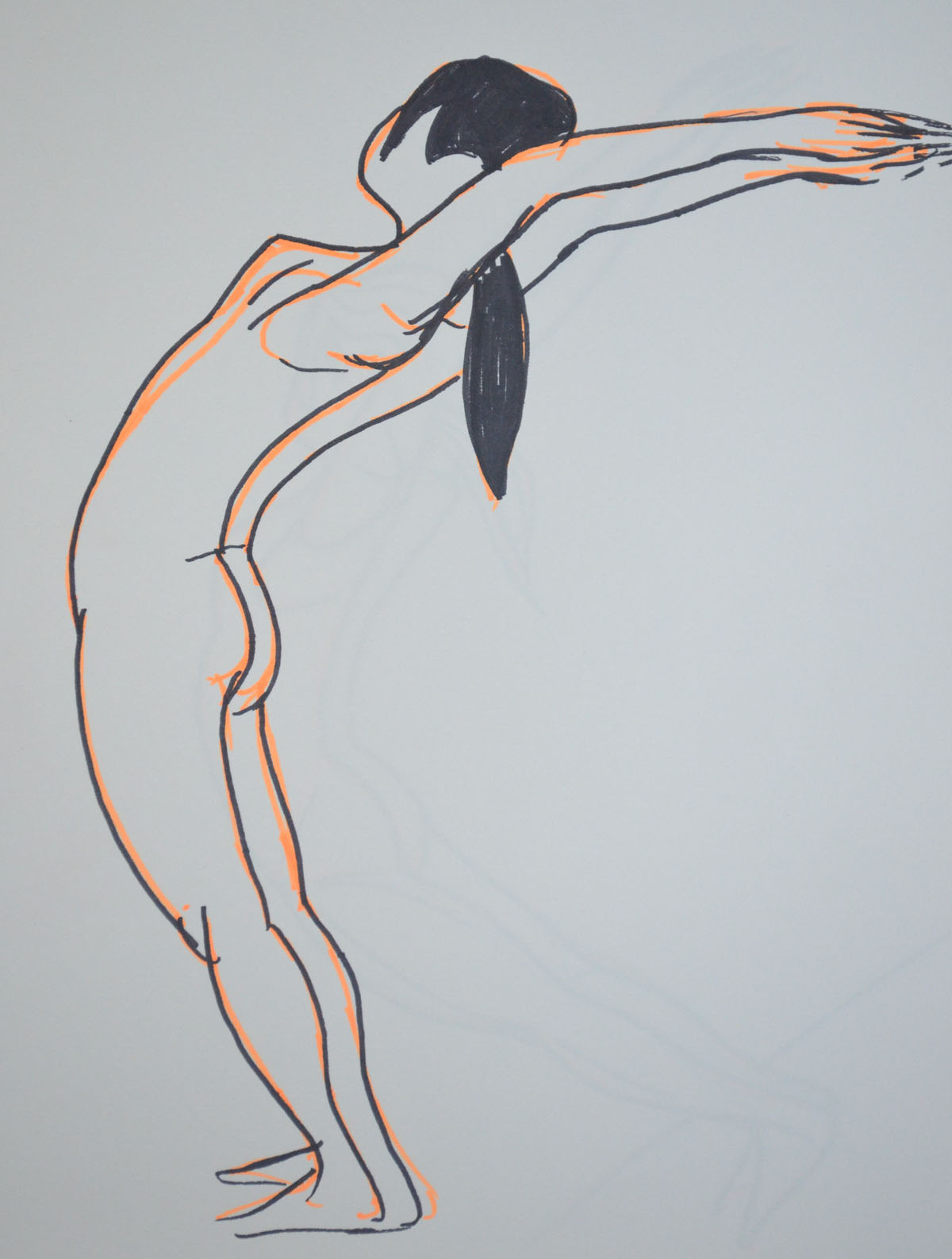
Felt Tip Pens Shiva dancing pose
Actually it doesn’t say felt tip pens on the box, it says wwatercolour Pens and the colours are far more vibrant than felt tip pens.
The Shiva Dancing Pose above is a very static pose but I thought by using the vibrant orange to sketch in the form first before I went over it in black it would give it some energy. I don’t think it does, my students think it does, nonetheless it does remind me of Degas’s ballerinas.
Felt Tip Pens standing salute pose
The last two drawings of my girlfriend were again of her in the ‘standing salute’ pose but drawn from a photo her back was bent so far back that I couldn’t ask her to stay like that for any length of time without her falling over especially with her hands together. The first drawing wasn’t in Proportion as her body ws too long and her arms were too short in order to fit her on the page.
The second drawing was drawn at an angle in order toner her in Proportion and git yer on the page.
Felt Tip Pens standing salute pose at an angle
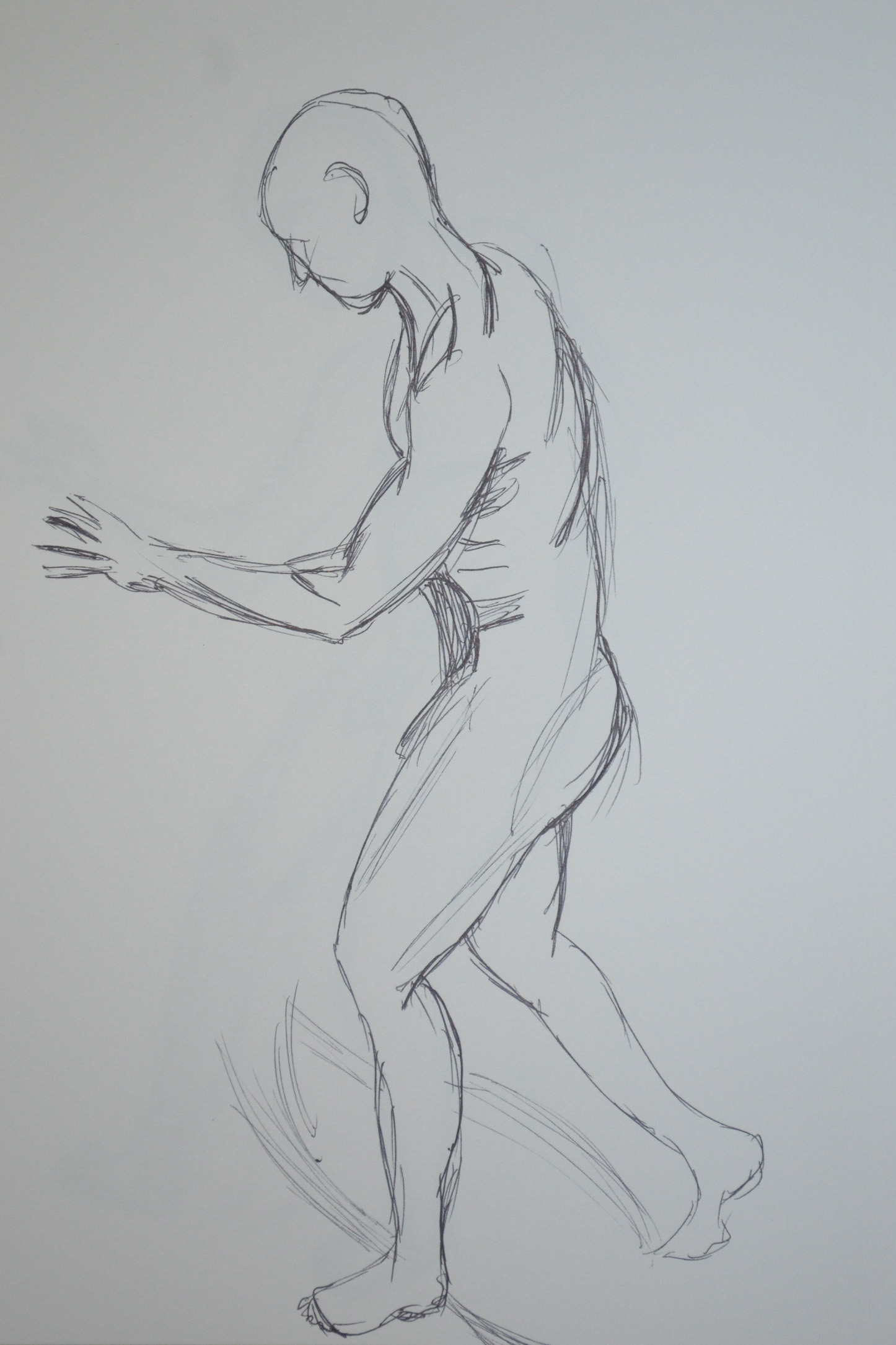
At the end of our second session I got the girlfriend to take some shots of me in various poses, the following sketches drawn in ballpoint pen was the result. A quick sketch, full of energy and reminding me somewhat of a Scheile painting.
Were you able to maintain a focus on proportion at the same time as creating a sense of weight and three dimensional form?
In the first exercise essential shapes I believe I managed this quite well apart from the first sketch, which was more of a trial, working with charcoal on A3 paper for figure drawing for the first time. In the second exercise essential elements there was a couple of times I messed up with proportions and coincidentally they were both when I was looking down at my daughter in a standing position, these are the second and 6th drawing . In the second drawing I made the head too small and then when I corrected it, it went off the paper.
Which Drawing gives the best sense of the pose and Why?
This is a difficult question to answer. To make a start on narrowing it down I would go for poses in the essential elements exercise as my daughter was uncomfortable posing for me and I think I have managed to depict this in these poses. Then I would probably say I think I would probably have to say the third drawing. She has the same arched back as me and I have managed to capture this in the drawing.
Was there any movement or gesture away from the model’s central axis? if so did you manage to identify this and put it in your drawing?
In the third and fifth drawing of the essential shapes exercise my girlfriend’s backside was cocked to one side maybe because she was a little uncomfortable at the length of time she had been sat there and I have definitely managed to capture this in the drawings but this, was done without noticing and it had been pointed out by her afterwards. But then, in the essential elements exercise, drawing 3, I haven’t done a great job of identifying this and I think it is down to the shadow on the legs.
In what way did you simplify and select in your study? Were you able to focus on simple shapes and patterns amid all the visual information available to you?
For me these two questions are intertwined I was able to simplify and select by putting everything into group shapes in the sketches and or blocks of colour in the larger study.
How did you create a sense of distance and form in your studies?
I created a sense of distance by using stronger shading or colour in the foreground with lighter shading or colour in the background to make the background look generally more misty. I also used softer pencils in the foreground or in sketches where I used pens I created a sense of distance by drawing simpler and smaller shapes between the more dominant ones to make them look like they are at the back.
How did you use light and shade? Was it successful?
A Sketch book Walk Fourth and Final Sketch : Charcoal Pencil, EE and HB
In the sketch above I made the tree solid black and put the shadows in the foreground to depict the sun shining behind the tree then drew the leaves of the tree in a lighter pencil to show light shining through the trees. The result was definitely a success.
What additional preliminary work would have been helpful towards the larger study?
Like I said in the exercises, for me and where I am, to do the drawing trees exercises before the final study would have been a great help.

 1 – Angel in Tone