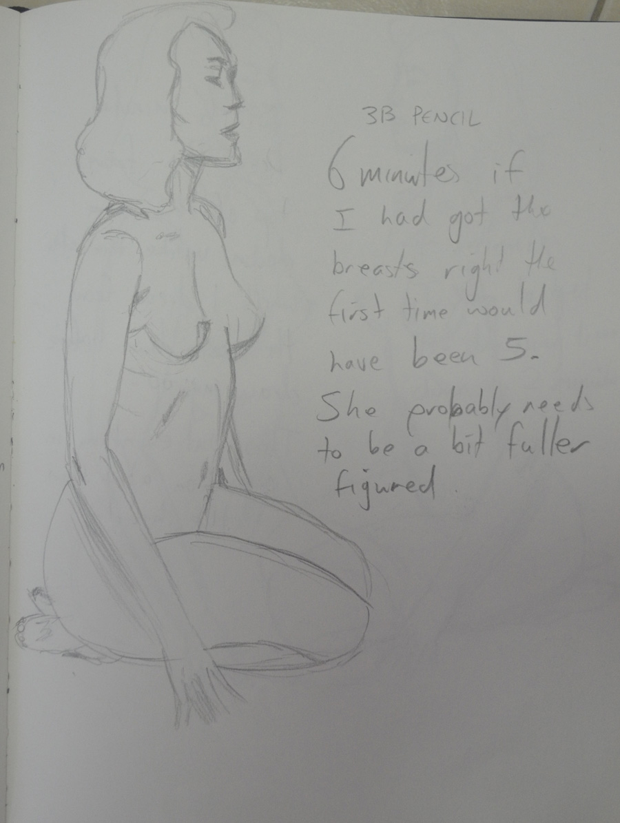
I hadn’t managed to get out to a life drawing class during the drawing figures part of the course due to the unrest here in Bangkok but I wasn’t quitting, prior to going home for my second visit in 15 years last month I had arranged to meet a friend in my hometown Wakefield who would take me to a life drawing class.
After choosing my medium, soft charcoal I set up my easel for the first pose which was a 15 minute pose. I was quite nervous and very self conscious, it being the first life drawing class I had ever been to and due to this I seemed to forget everything I had learnt and tried to hard to make a picture.
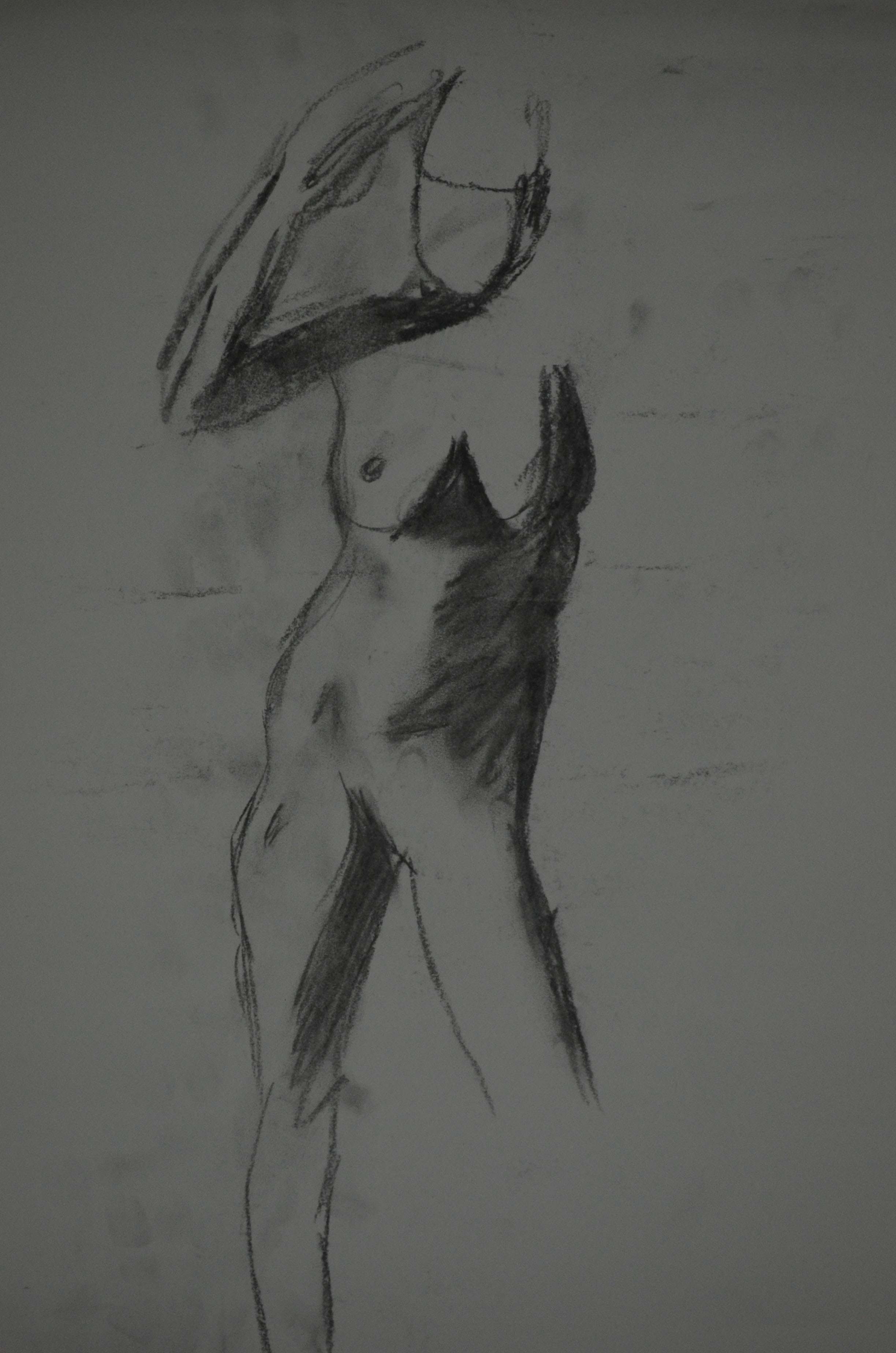
1st Pose 15 Minutes
On the second pose, the first of three 5 minute poses I was still in 15 minute pose mode and went at it it too slow, what I should have done here is smoother longer lines focusing on the essential shapes and elements.
2nd Pose 5 Minutes
By the third pose I had settled in and was putting most of what I had learned from the figure drawing sections of the course into practise, I was loosening up and you can tell by the drawing I was starting to put some of what I had learned into practise.
3rd Pose 5 Minutes
By the fourth drawing the lines were getting smoother and I was thinking how addictive life drawing could be focusing on the essential elements but still going at it quite slow.
4th Pose 5 minutes
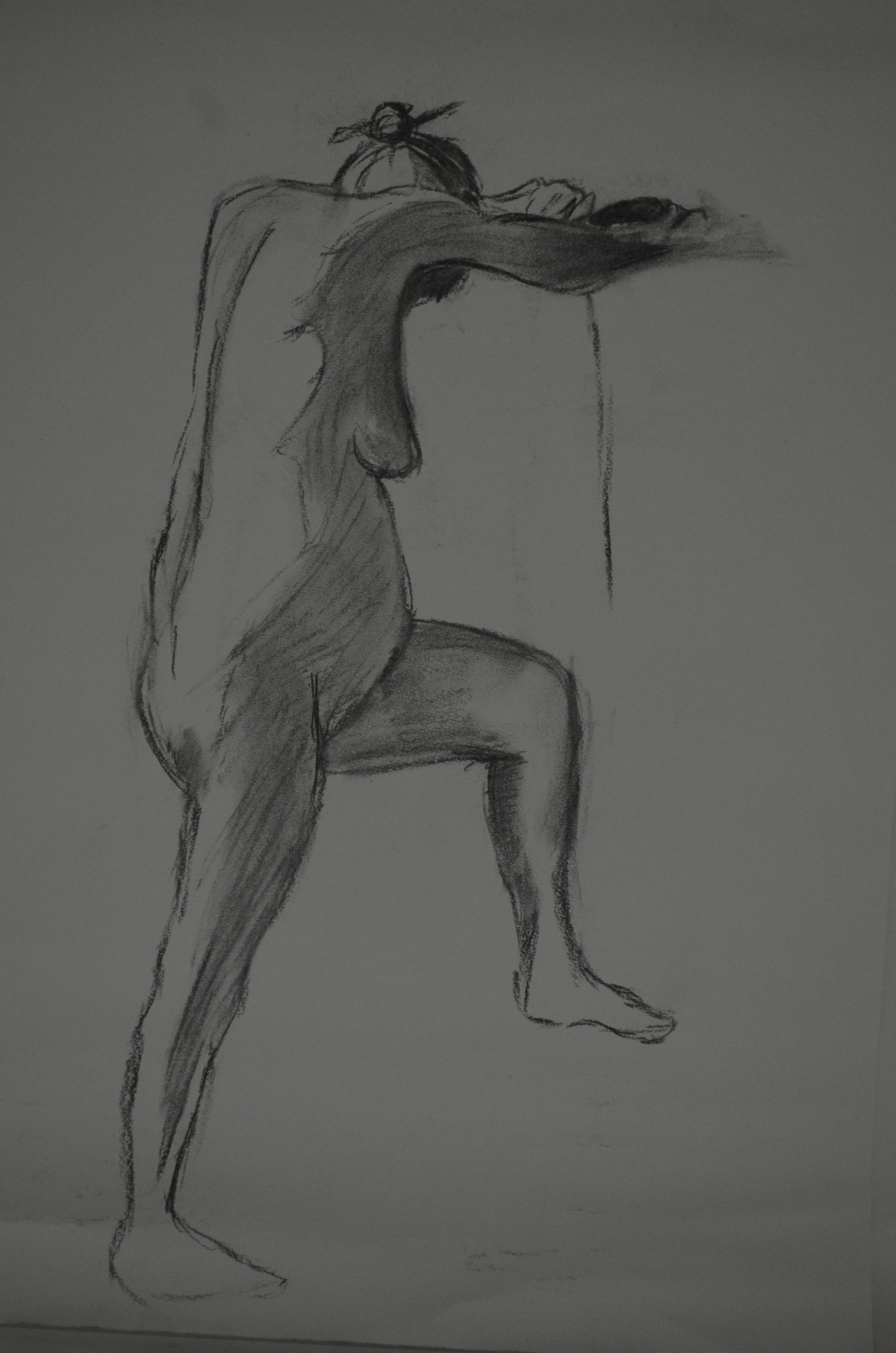
From here it was back to a 15 minute pose and my favourite out of the five drawings, I focuded on all the essential shapes and elements as well as stance and force which I had learnt to do in my earlier gesture drawings but the pose helped.
5th Pose 15 Minutes
Like most of my figure drawing, the quality of the drawings I produce depends on whether I like a certain pose or not and this also applied in the life drawing class. I will be returning to England next year for good and will hopefully be attending life drawing classes on a regular basis.
It is never easy to change tutor at assignment 5 but this is the situation that we find ourselves in. The task has fallen to me to give you feedback on what you have produced for assignment 5. You will have to bear with me as I have not seen anything of what you have done until this point.
Due to my tutor not being available until further notice because of family matters I was contacted and asked whether I would need a replacement tutor. So close to the end of my first course I thought it was important to find a replacement tutor. There was an extreme contrast between my previous tutor feedback’s which can be viewed below and this one.
Demonstration of technical and Visual Skills, Quality of Outcome, Demonstration of Creativity
I see that you have chosen Option 4, the figure. Students can often find it difficult when working from the figure mainly due to preconceptions as to what a drawing should look like and particularly a work made from the figure.
For the most part the quickly made drawings in the quick sketches work are weak; you have generalised far too much instead of drawing what you have seen. This has resulted in some poor understanding of proportion and how bodies engage with the space around them. The interpretation of the hands and feet in this series of work needs thinking about. It is important to make changes as you draw correcting and changing to get the whole operating cohesively. Writing on a drawing what is wrong with it or what needs to be done to it will not benefit you at this stage. Change the drawing!
Quick StudiesQuick Studies
I agree that some of these quick studies were weak, out of proportion etc and said so in the learning log. Others were strong with a 100% resemblance and correct proportions. What needs to be realised here is that I am drawing figures of a ‘different race’, i.e. If I was drawing Japanese models, legs would be shorter. I made notes on drawings before making a fresh, I was drawing quick and so I thought this was a better approach than spending so long editing the drawing. These notes helped me to capture my thoughts at the time.
Varying the speed that you draw can often open up new ways of seeing as can holding your drawing implements differently or using your ‘wrong’ hand. Quickly executed drawings can be good and bad. Drawings made more slowly likewise. It is the intent and nature of the outcome in reference to what your subject is and the quality of the drawing itself that matters.
Now interestingly the batch of ‘more gesture’ drawings mostly made in pencil are really well seen and interpreted for the most part; working quickly has worked for you here! The works from the female model are full of life and movement; the proportions are very believable as is the weight distribution through the figure and the stances in general. Some of the male studies demonstrate some good understanding of foreshortening through some quite difficult poses.
For me here you have investigated as you have been drawing and it has allowed you to interpret the figure much more successfully through the use of the media itself. This approach has negated some of the repeated faults that your work can have i.e. too large heads and poorly articulated extremities. When an approach is working it is important to capitalise on it and build on both the methods and the look of the outcomes
My idea of a gesture drawing and a quick study are two different things. For me a quick study is a quick study in the style of my ‘would be’ finished piece, if he had looked at the previous assignment he would have seen the quick studies were closer to the way I finish a drawing. However, the ‘more gesture’ drawings were more satisfying and so maybe I am looking in the wrong place to find myself.
It is imperative that you look hard at all times at your subject; look draw, alter, draw again, change, look, you need to build up a dialogue between yourself, the subject and the particular medium that you are using. Different media require different approaches as do different subjects. It is good to build your drawings in this way.
You included lots of work which in itself is fine, however, it is very important to us some objective discernment both as you are working and as you look at a completed body of work. Interestingly the drawing in line of the ‘woman playing with her phone’ is the most successful of this group of works. The proportions are fine and come together and form a believable figure in action. You have this marked as ‘out of proportion’, it isn’t! This tells me you are not seeing things clearly enough as you look; look at this drawing closely and try to recognise how you have articulated the figure in space; how well the head sits; how you have changed sizes of parts of the body as they recede (foreshortening in other words). You have been looking here and not generalising. The shaded version of this pose is not as successful as the line version; it is stiff and lifeless by comparison. I will talk more about discernment later in the report.
Playing with Phone – Out of ProportionPlaying with Phone A3
I have to disagree here, this drawing was from a photo as I didn’t have time to do a life drawing in this pose. My girlfriend is only 5 foot and the second drawing is ‘spot on’. I like the first drawing in just line but it is as I said out of proportion.
The tonal studies revert back to generalisation for the most part; you are forgetting to ‘look’ here and are trying far too hard to make a picture instead of investigating your subject. As a result proportions are out again; heads too big, feet and hands and legs too small. Some of the drawings are somewhat kitsch also which is a look you should avoid at this stage in your development.
I submitted drawings here that others would have left out, mainly because the folders I have submitted digitally from my computer contains everything. Below is a photo of a very spontaneous easel drawing that was neither planned out or marked. It shouldn’t have been submitted but it was and as since been omitted from my learning log. However, there are positive drawings in this exercise, that were not generalised, were not drawn quick and were a result of looking. The tutor has nothing positive to say about any of these and that’s annoying. The ‘kitsch’ he talks of is a result of depicting tone using colour, the results were spontaneous not planned.
Drawing that shouldn’t have been submittedA2 Tonal Drawing in Pastel Pencil on Ingres
I will be reproducing this in charcoal pencil.
Drawing with Angled EaselTonal Study with White PastelAngel in Tone
The work that you did for the assignment piece itself is actually much better. The understanding of proportion is better and the use of tone is quite successful also. The ‘looking at the door handle’ in water soluble pencil looks to be working better than some others as does the more expressive version in watercolour pencil which you have marked ‘Sad Attempt’. The expression that this study has could be pushed even further.
Sad attempt in watercolour pencil
The tutor and I obviously have different tastes, styles and understanding of what I was trying to do in this assignment, the above drawing was not it.
The larger drawing is a reasonable resolution on what you were trying to do. The sense of isolation within the figure is present and the pose supports the idea also. The relationship of the figure to the background maybe needs some more attention to get the areas of the drawing reacting together more.
Maybe the figure looking at the door handle would be sufficient as a concept to carry both the pose and idea. The pastel one maybe over done.
It is always good practice to work on more than one version of assignment pieces; this will give you much more scope to select when the time comes and it will also help you explore your ideas and methods more also. Remember this for the future.
I wasn’t trying to create a sense of isolation within the figure, I was trying to create a feeling of anxiety and fear, which I think the oil pastel, ‘over done’ drawing did well. The larger drawing in Gouache, watercolour and watercolour pencil was a second version of the assignment piece and if I preferred it to the oil pastel would have been submitted as such.
Sketchbooks
Demonstration of technical and Visual Skills, Demonstration of Creativity
I presume that you have been keeping sketchbooks through out the course. The more investigative the more useful they will be. Bear this in mind for the future.
Learning Logs or Blogs/Critical essays
Context
The blog is far too descriptive. You need much more critical comment on what you look at and indeed more of an in-depth comment on your practice and methods. Say more about why more often rather than how. More comparative statements about the quality of your work and how you think that you could improve it. It needs to be less descriptive and more of an analytical tool that you can use in your practice in a real sense.
This should have been pointed out to me at an earlier stage instead of getting pats on the back, is it too late to change?
Generally a learning log/Blog should contain objective and comparative comments on your own work and development. Comments on work of other artists relevant to what you are doing. Evidence of art you have seen, in the flesh in books or on the web – with images, annotated where necessary. The log should also contain the set theoretical studies from the course and your tutor reports.
Suggested reading/viewing
Context
Look at drawn figure work by Manet and Cezanne to see how they use their media fluidly and openly, Seurat’s drawings are good examples of inventive use of tone. Look at Degas for his use of pastel and inventive composition and Van Gogh for his use of mark making and line. Picasso and Matisse have both made exhaustive drawings in line which would be beneficial to see as would some of Rodin’s work from the figure in line also.
Other
Discernment is going to be very important for you as you select for your assessment submission. You will have to do this as I can see that you have a lot of examples of work some of course more successful than others. You need to pick out the more successful work.
Some of the work throughout a all five assignments will not be quite as successful as others so you will need to select well. Look through all your reports to help you select. Spread all your work out in front of you and remove the less successful ones until you have a coherent group which satisfies the submission criteria. Put the best drawings in as the assignment pieces i.e. re designate them if you need to. Pick out your most successful pieces as support work also. You will find the submission criteria in your course book and check out the OCA website for tips on submission. You need the right balance; not to much but not too little either. Present your work in its best light.
You’ve delivered another strong submission Mark. The determination and enthusiasm you have shown throughout the past four parts of the module has clearly been of great benefit to you as you approach the final part of this module. It is your unerring interest in the subject of drawing and your resolve to advance in the process that will successfully see you through to the end of this course.
The first exercises looking at quick and long poses display good observational skills. Quick sketches of the figure are a wonderful way of loosening up before approaching longer, more studied pieces and allow the artist to look at the subject in a rapid way, to define what is integral as well as superfluous in the detail of the sketch in the given time and is important for honing the eye and hand. They are well-proportioned and show that you can handle – and understand – the process of measuring well. As these are your first experiments with drawing the figure from life I think you should feel very happy with the results. The more you do the more adept you will become with the process of looking and transposing what you see. Again the longer poses display good proportional observation as well as a good understanding of the portrayal of attitude.
I learnt a lot about measuring proportions from this exercise particularly how many heads distance it was from the crown of the head to the seat of the bum which was approximately 3.5.
The drawings you have produced for the essential shapes and elements exercises show good understanding of how to represent form and your decision to use charcoal was well founded both in the drawings of your girlfriend and in the series of your daughter. Proportion is well observed and rendered and elements such as foreshortening have been approached simply and successfully. You mentioned in the check and log for the proportion exercises that you feel a little frustrated with your abilities to represent a facial likeness in relation to the overall drawing – one step at a time Mark. With your focus and determination I am in no doubt that you will find that you’ll develop your own way to tackle the complexities of facial structure. Like the body it is all about proportion and form but with the face the detail is much more intricate. The ‘tightness’ you perceive when approaching the face is normal for this early stage of your practice. It is the pressure we put on ourselves to achieve a ‘true’ or life-like representation of the model’s features that often hinders progress and ‘puts us off’, especially when you are not only restricted by time but the desire to ‘get it right’ creates a kind of hurdle to what is normally free-flowing creative expression. For these exercises it is not necessary to produce fully formed portraits with intricate detail. Try to hint at the features by using simple tone to describe the shape of the face.
Charcoal on A3 PaperCharcoal on A4 Sketch Book
You have produced a vast array of work for the stance and energy exercises. It is good to see that you are pushing yourself with such enthusiasm Mark and the results show that you have a good eye for the depiction of weight and balance. The line you use in these sketches is particularly appropriate and successful: it is sure and confident and delineates the stance and energy of the poses without forsaking attention to detail such as proportion and anatomy.
I wasn’t as impressed with my energy drawings and so after I submitted my coursework I did some research on Gesture drawing as well as some reading, Force, Michael Mattesi and did a new set of drawings for this exercise, which I did submit to my tutor afterwards so maybe that is what he is taking about.
New Run at Gesture Drawings
You have approached the structure exercises with great enthusiasm and openness with regards the use of different techniques and media. There are some very slight issues with proportion in some but I don’t think you should be overly concerned here – it’s like you’ve concentrated too closely on specific detail rather than considering how each anatomical element relates and works together by looking at the subject as a whole.
Finished Anatomical Drawing Half and Half
I think my tutor was talking about the anatomical drawing above but I am not too sure. If so then I can say I wasn’t thinking about specific detail, I was thinking about how anatomical elements related to each other. At this stage we were a bit ‘shy’about nude drawings in detail but the choice of clothes for the model, my girlfriend, on this exercise was probably a bit poor and so it didn’t show off the structure as well and so I wasn’t able to.
In the conté and charcoal drawing of the seated figure, the upper part of her right arm appears too thin in relation to the overall proportion, and in the drawing using white gel ball the arm resting on the door knob appears a little elongated. The foreshortened reclining pose in conté and charcoal however is very nicely observed and delineated in terms of proportion, form and structure. The depiction of foreshortening can often cause great problems and confusion but not in your case. You’ve produced a very well executed drawing here Mark.
Lying Down – Conte Stick and Compressed Charcoal
I am hitting the same problems all the time, I am producing my best work on a small scale, I love this drawing and yet I am not sure whether it will get me where I want to be in the assessment when framed.
The drapery studies for the clothed figure exercises also show keen observational abilities. The manner in which you have portrayed the lightness and swathe of the fabric by utilising line following form and allowing the surface of the paper to describe highlights is very successful. The subtlety of tonal range in these drawings is also very well observed and this is particularly successful in the two drawings of the reclining figure using white pastel on black paper and the graphite version of the same pose (I must also say here that the face in this piece is beautifully rendered!). There is an undeniable believability in the way you have portrayed how the fabric drapes over the model’s body.
2 – White Pastel on Black paper1 – 6B Pencil in A4 Sketchbook
I shall be producing a finished piece for the exercise above from these sketches and the drapery studies.
You quick sketches for the sitting and waiting and fleeting moment exercises show good observational responses to what can be quite a difficult and pressurised way to work, especially for you in terms of the recent circumstances in Bangkok!
Walking Women in Oil Pastel
It is evident that you thrive on these set tasks Mark. The definite evidence of development as you work through the self-portrait exercises is clear. The determined and studied visual research for shape and proportion you have employed for this exercise has surely helped with this. From the slightly tentative first sketches for the ‘Drawing your face’ exercise to the surer, more ‘finished’ pieces in different media, you have once again produced a focused collection of work. I thought the eighth portrait in conté and Chinese white pencil particularly successful with good attention to incident and reflected light. I thought the portrait from memory of Vladimir Putin worked well and was definitely recognisable as the Russian leader.
Feedback on assignment Demonstration of technical and Visual Skills, Quality of Outcome, Demonstration of Creativity
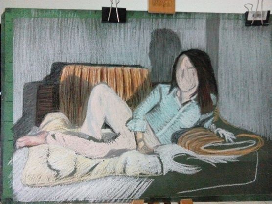
The assignment piece of your girlfriend reclining on the sofa in soft pastel was very well conceived, observed and executed. Once again you have handled the media successfully. The composition is well-balanced and the depiction and overall effect of light and shade makes for a very effective study – a nod to the reclining figure from the history of art, to Manet’s Olympia, Titian’s Venus of Urbino, Velázquez’s Rokeby Venus, Goya’s La maja desnuda, the list goes on? A very successful piece Mark!
Tone and Form – Finished Piece Soft Pastel, Green Ingres
This assignment was a breath of fresh air after the last one but there was a downside though that I hadn’t expected. The soft pastel colours were so bright until I used the fixative what I hadn’t anticipated was that the fixative would dampen it or blow the pastel dust away and allow so much of the green paper to show through making it murky, the upside of this of course is that it gives it a ancient/spooky look.
Final Drawing
Learning Logs or Blogs / Critical essays Context
As with your previous submissions you have delivered an honest, informative and thorough learning log for this part of the module. I enjoyed reading the piece on artists’ self-portraits and thought the manner in which it was written was fresh and personal – a welcome divergence from the usual heavily fact-based information we as tutors sometimes have to read! I am also very pleased to read that you are getting a lot out of Berger’s Ways of Seeing.
Sketchbooks
What I find encouraging about the way you work Mark is that you are rarely put off by new processes; in fact you appear to thrive on the challenge. You confront new disciplines fearlessly and with an open mind to technique and media. The evidence is here in your sketchbooks – the amount of work and the confidence displayed by the inclusion of work you are rightfully happy with as well as pieces you have considered not so successful has been beneficial to the progression of your practice. Sometimes it is the recognition of ‘success’ and ‘failure’ that will drive us forward to constructively face. Your overriding interest in the subject of drawing will stand you in good stead for the final part of this module and your future art practice. I am pleased that you have chosen the option of figure drawing on which to concentrate.
Suggested viewing/reading Context
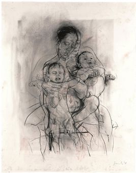
I’m sure I don’t need to mention it but try as much as you can to immerse yourself in the work of other artists. I have always found it exciting when discovering the oeuvre of ‘new’ artists, the influence of their work potentially beneficial to my own. A couple of artists you may find interesting are Jenny Saville and Alison Watt.
See examples of their work below:
Jenny Saville Mother and Child (After the Leonardo Cartoon) charcoal on watercolour paper, 2009.Alison Watt Part of the Phantom series, oil on canvas, 2007.
I started off this part of the course with a fresh try at drawing with energy as my attempts at gesture drawing in Part 4 – Drawing Figures where rather crap and so I read more of ‘Force’ by Michael D. Mattesi. So with a Chinese marker, larger sheets of drawing paper and my new found knowledge of applied force and road of rhythm, I set out to create more quick and dynamic figure drawings. Not only were these energetic drawings a vast improvement on any of my quick figure drawings in Part 4 but they were a great inspiration for the next few exercises.
Drawing with Energy
I had been struggling in the Quick Poses exercise in the last module but the Quick Studies exercise in Part 5 was a breeze due to the fresh practice at energy drawings and also applying what I had learnt, unlike the hairy sketches in Part 4 the quick studies in this part were smoother and with a new found confidence I drew faster and faster sometimes getting the drawing time down to 3 minutes.
Quick Studies
After researching how famous artists used line I took that new found confidence and applied it to the second part of this research where I had a go at using line in the style of famous artists. The results weren’t that great, I’m not sure if drawing in the style of Klimt or Schiele resembled the two artists’ work but I was pretty happy with drawing in the style of Hockney, Ingres and Giacometti, particularly the last two artists.
5 – Drawing in the Style of Ingres6 – Drawing in the Style of Giacometti
I’m not sure whether I did enough drawing with colour in the using colour exercise but I do feel that I did ample experimenting with mixed media particularly the collage work which I was quite happy with, producing the drawing below was particularly satisfying but I may have to go over the hair in black.
3 – Collage with Black Felt Tip
This drawing in oil pastel below gave me some very interesting ideas for Assignment 5, which I will reflect on in the next post.
1 – Oil Pastel with Robe and Squiggles
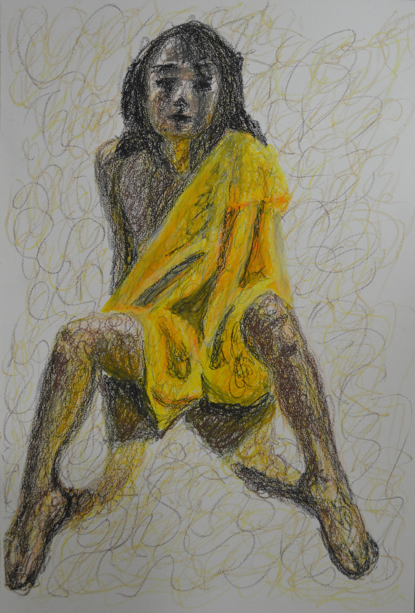
I was trying not to get sucked into producing nudes for the rest of this module but that’s the direction I felt I was going in as I knew there was so much I could do with the nude figure and so many drawing tools I could use for them, I was especially happy with the drawing below in hard pastel that I produced for the Tonal Studies exercise which I will also send off for assessment. I love the way that I used contrasting colours to build up the tone and form of the sitter with very fluid hatching.
7 – A2 Tonal Drawing in Pastel Pencil on Ingres
This module gave me enough ideas and time to reflect on the type of piece I wanted to produce for Assignment 5, I knew I wanted to produce a full figure drawing, I knew the sitter would not be totally nude as I wanted to draw folds in cloth again but what I hadn’t decided on was if it was going to be an expressive figure drawing or analytical study or what medium I would be using for the assignment.
For this exercise I started off working with the model and from there I moved onto sketches. Last weekend was a big public holiday here in Thailand, mothers day, the Queens birthday which was actually on the 12th but the Thais have 4 days holiday.
I had previously tried to draw in the style of Alberto Giacometti; although I wasn’t too impressed with a lot of his work, which I had said in a previous post made me feel uncomfortable and a little anxious, I did like some of his work. and I rather enjoyed drawing in his style in the second part of the research point which I think reflects in the first piece for this exercise below. The ability to create a 3D form from squiggles is just too appealing to me and oil pastel felt like the perfect medium for this drawing. I am already starting to think about my final assignment and this was basically a practice piece for the upcoming assignment trying to produce an expressive (maybe), erotic nude, with some type of cloth covering part of the figure.
1 – Oil Pastel with Robe and Squiggles
The second piece should have been bigger, also in oil pastel I tried to produce an expressive drawing with a different technique rather than a different medium. The technique I chose for this was a very contrasting technique to the squiggles above, horizontal hatching. The pose was also very different, this time the model wore no cloth at all and was laid down with her head towards me. The problem here though was trying to produce some shadow below her head to show that her hair is actually spread out across the floor, as looking at the finished piece below it looks like the head is floating.The other problem with this drawing is that the figure should fill the plane however when I was drawing the figure was happy with the outline and therefore I didn’t want to change it. So I filled the paper with furniture.
2 – Oil Pastel with Horizontal Hatching
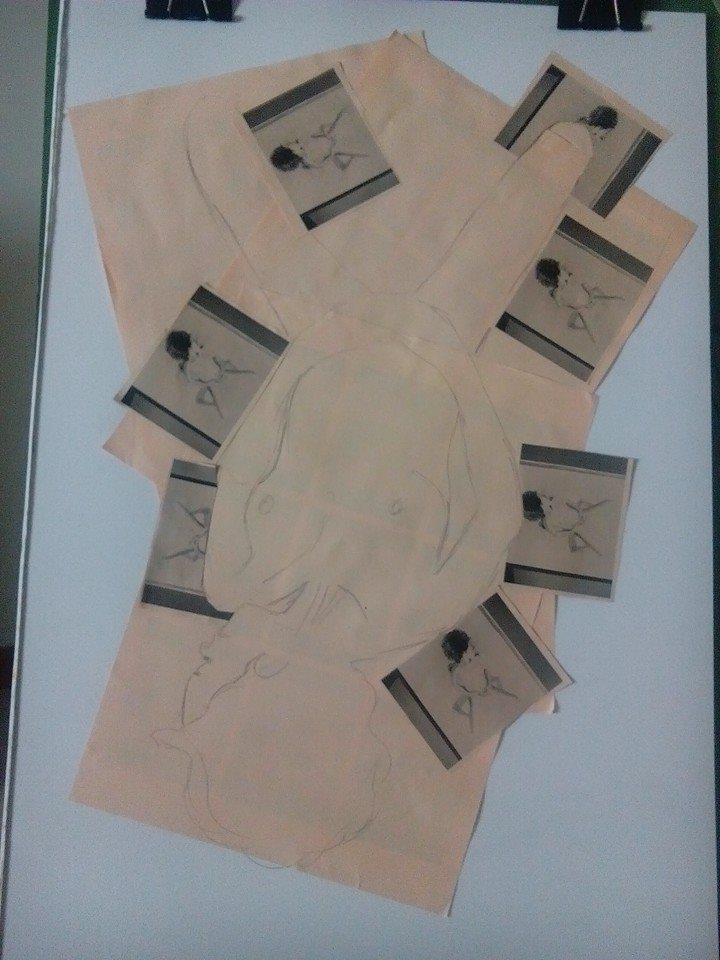
At this stage I had an idea for the next piece. Firstly I uploaded the several photos of different drawings to Facebook so I could print them off at work later that evening and see which ones look best ripped or cut up as a collage.
I bought three packs of different coloured paper, orange, yellow and peach (I think) I then printed the picture out at 9 copies to a sheet to see which looked best. I decided on drawing 2 above and the photo below shows how it looked printed out.
Drawing Printed on Paper
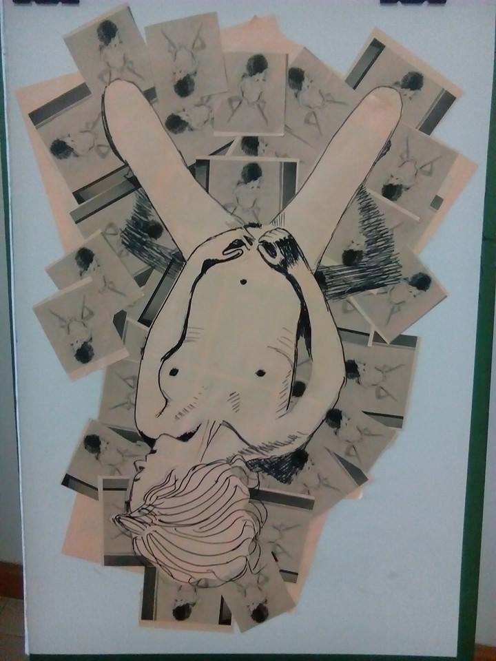
The net day was my birthday and I spent the afternoon getting creative:
Collage Step 1Collage Step 2Collage Step 3Collage Step 4Collage Step 53rd Piece – The finished Collage with Black Felt Tip
The next challenge was to create a collage piece using the printed sheets of paper for the cloth draped over the model. I chose to do this drawing on watercolour paper and to draw the model in watercolour pen.
Firstly I drew the whole shape of the model with cloth draped over her in pencil and then with a black pen I drew around the shape of the cloth so I could see it through the paper enabling me to draw shapes in pencil to be cut out. Unfortunately the lines made by the black pen were too wide and so I had to make the shapes bigger to cover up the lines around the left arm which now looks withered.
From there I started to cut out and glue on small pieces of orange paper to depict the shadow in the folds of the cloth but I decided that I would probably mess up and and instead to finish these details in an orange watercolour pen with the darker shadows in green. After I finished with the cloth I finished of the shoulders, head, arms and knees, the vibrant lighter colour pens really made the darker colours stand out. I think because of the thin left arm the knees look two fat, this is my only regret here.
4 – Collage with Watercolour Pen on Watercolour Paper
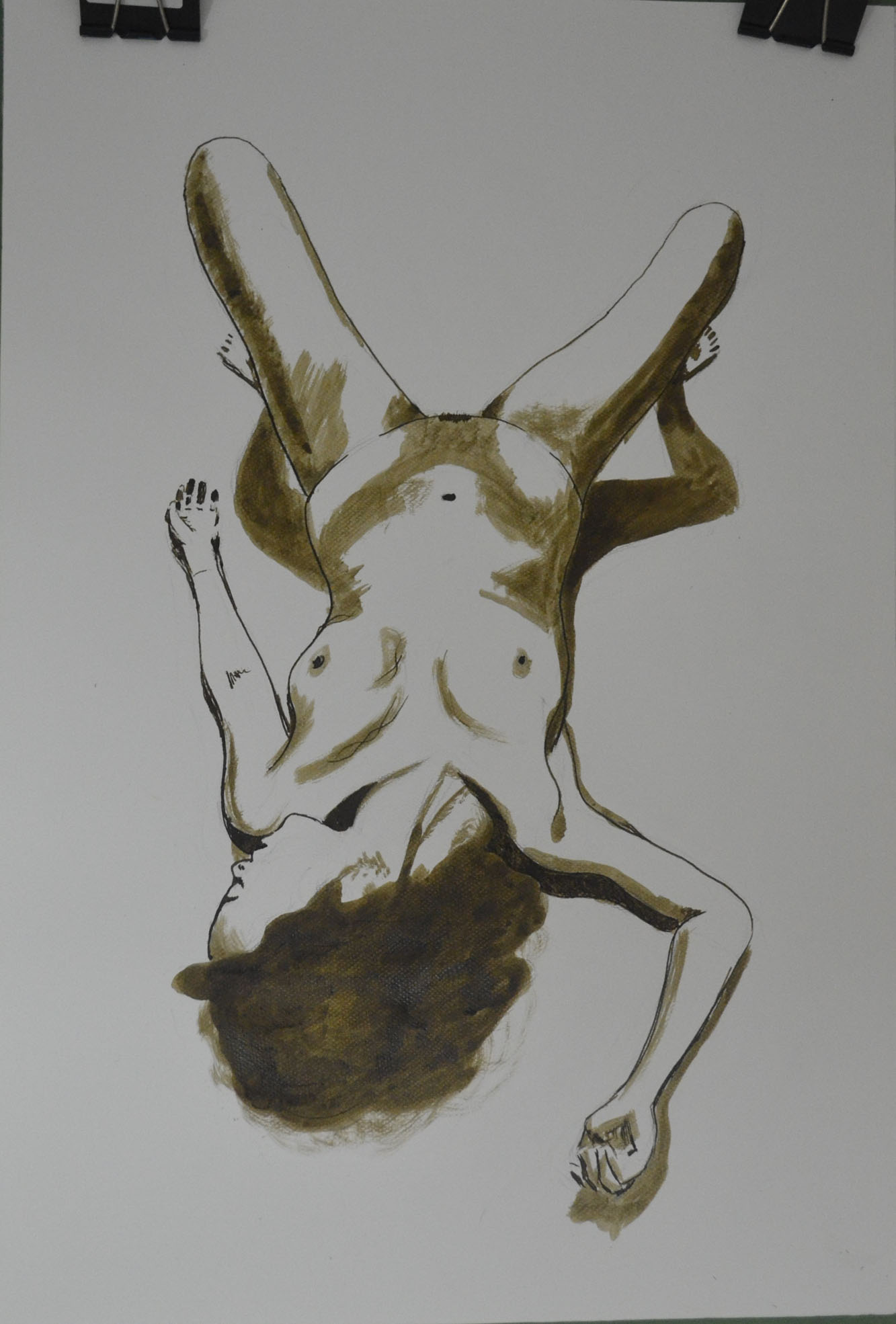
For the next piece I chose sepia ink with a dip pen and brush as my drawing tool of choice, I originally wanted to do a different coloured wash over the top but decided against it as I loved the plain and simple finished piece too much.
5 – Ink with Nib Pen and Brush on Watercolour paper
In this research point for this part of the course, Part 5, option 4 Drawing Figures we were asked to look at the different artists’ use of line which I did in my last post. However, I wanted to take it one step further and decided to try and ‘Draw in the style of’ some of those artists. Note I said ‘try’.
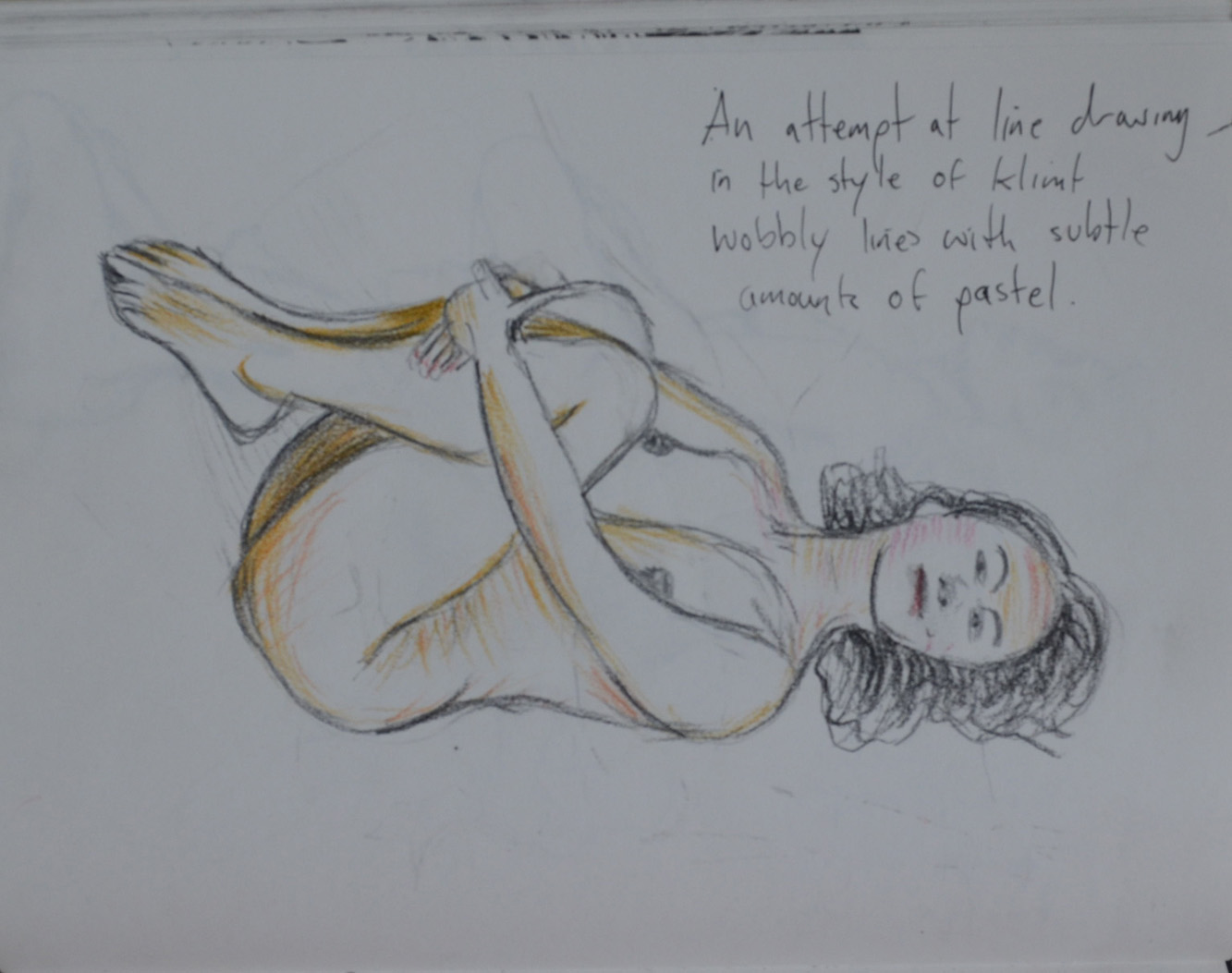
The first artist I tried to draw in the style of was Gustav Klimt, I thought drawing, not in the style of his bejeweled paintings but in the style of his erotic sketches would be easy, not at all, my lines just don’t flow that great and the drawing seems rather dull.
1 – Drawing in the Style of Klimt
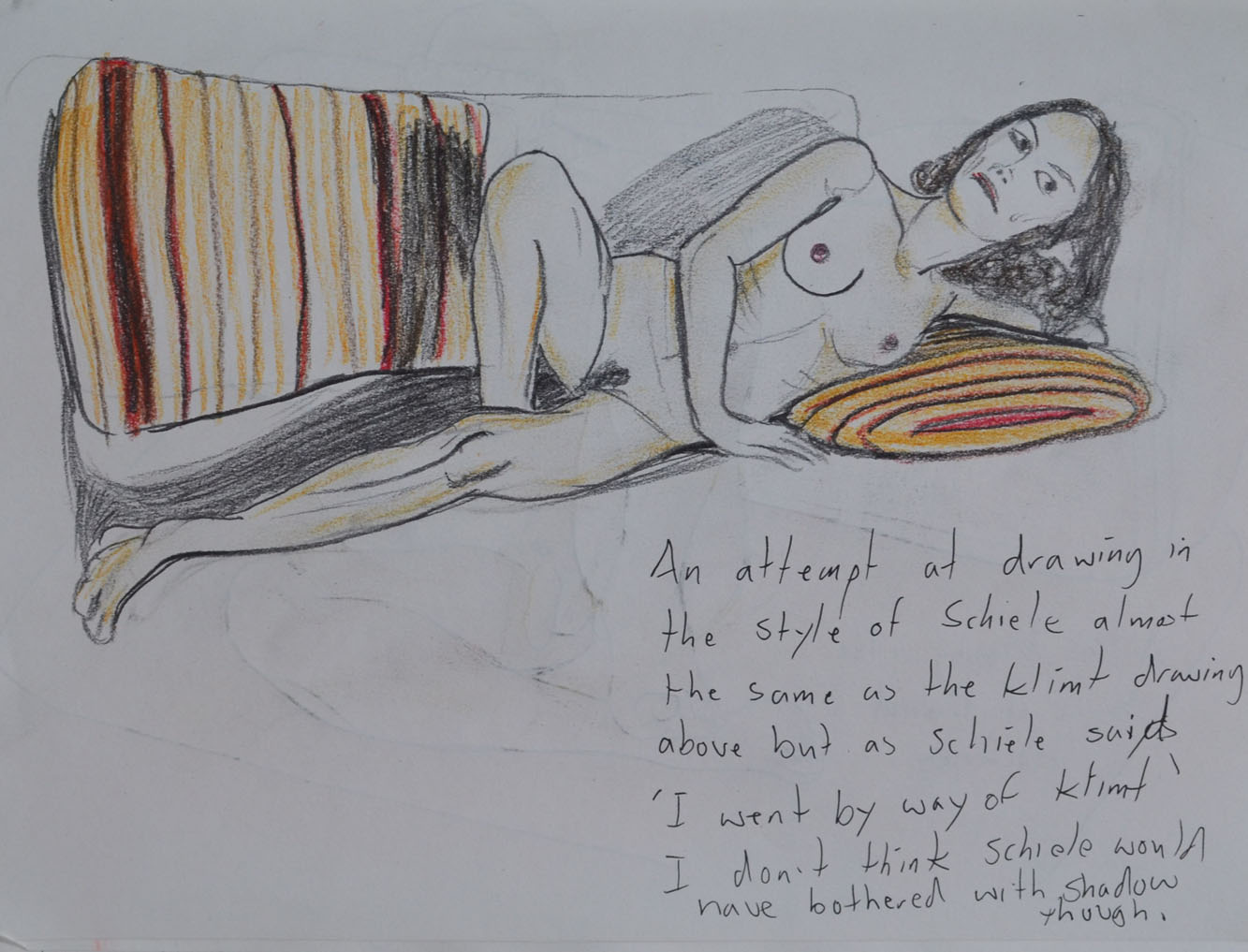
The second artist I decided to try and draw in the style of was Egon Schiele, I tried to imitate the jaggered lines of Schiele but I just didn’t get them quite right. it was hard to try and imitate Schiele when my model was a different build to the ones he drew. I’m not sure whether these first two drawings could pass for erotic art either.
2 – Drawing in the Style of Schiele
I do feel that in the third drawing that I was successful in the task that I set out to do and that was to produce something in a similar style to David Hockney. Using myself as the model and drawing from the photograph it was much easier to try and get it right, having time to think about each line.
3 – Drawing in the Style of Hockney
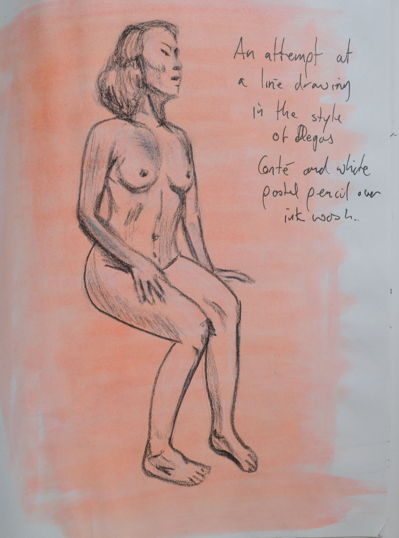
I don’t think that anyone could guess that I was trying to Draw in the style of Edgar Degas in the next drawing. I chose to draw with Conte pencil and white pastel over a pinkish wash in my sketchbook when I should have really been drawing on ingres paper which I had run out of. A clothed standing pose would have also been a better decision.
4 – Drawing in the Style of Degas
I think the 5th drawing, in the style of Jean-Auguste-Dominique Ingres was a decent attempt but again I would have been better with a different medium a sharp pencil on A3 or A2 drawing paper rather than 0.3 and 0.5 tip Rotring drawing pens in my sketchbook. However, I think I did quite well with the details and folds of the dress.
5 – Drawing in the Style of Ingres
The first attempt (on the right in drawing 6) was probably my favourite drawing out of all these in this piece of research, producing something that was similar to the artist’s work and yet I believe, developing on it.The second attempt on the right however was not so great.
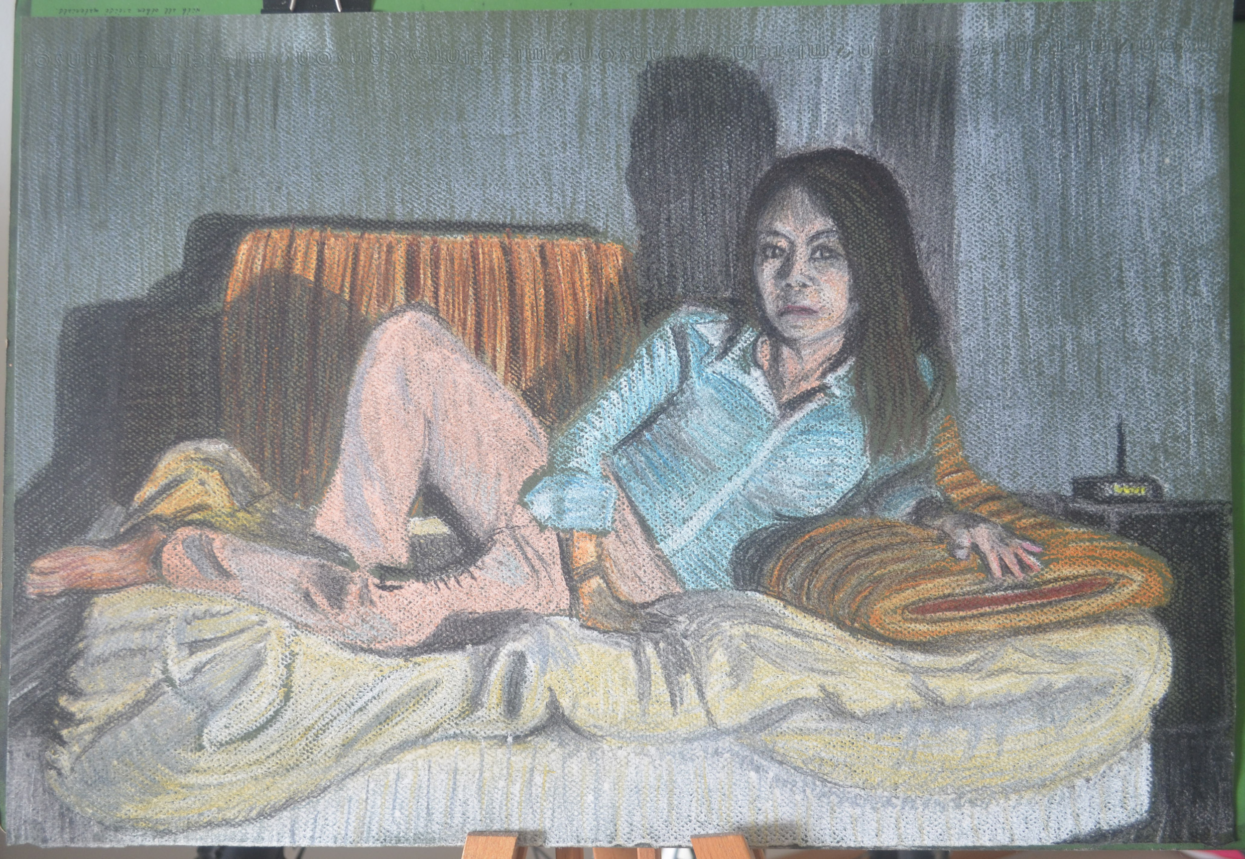
For this part of the assignment I had to pose my model in a reclining position, such as lying back in an arm chair or with feet up extended on the sofa. That’s about all you can do really living in a one bedroom condominium with not much furniture you can lay down on, the choice was either bed, lay-z-boy or sofa, I went for the recliner.
We were instructed to dress the model in contrasting clothes,light top, dark pants etc. she wore the same white top as in the first part of this assignment but this time put on a pair of dark blue stretched pants.
Tone and Form – 1st Drawing a study in Marker Pens
My first quick sketch was in marker pens, using the same Chisel tipped marker pens that I used for both the using Markers and Dip Pens exercise and the Patrick Caulfield Research point. Even though they are nice and vibrant I decided against using them for this part of the assignment after just a quick study of her face and upper body.
Tone and Form – 2nd Drawing Conte Pencils on Ingres Paper
I liked my self portrait in Conte Pencils on blue ingres paper so much that I thought it would be a great medium to have a go with for this part of the assignment. But after a small 30 minute sketch with these on a A4 size sheet of the same blue ingres I decided they weren’t blending well enough for my liking. Also the pose that I chose for the drawing which was looking at her from the front and just slightly to the side didn’t show her form off as much as I should be doing in this part of the assignment.
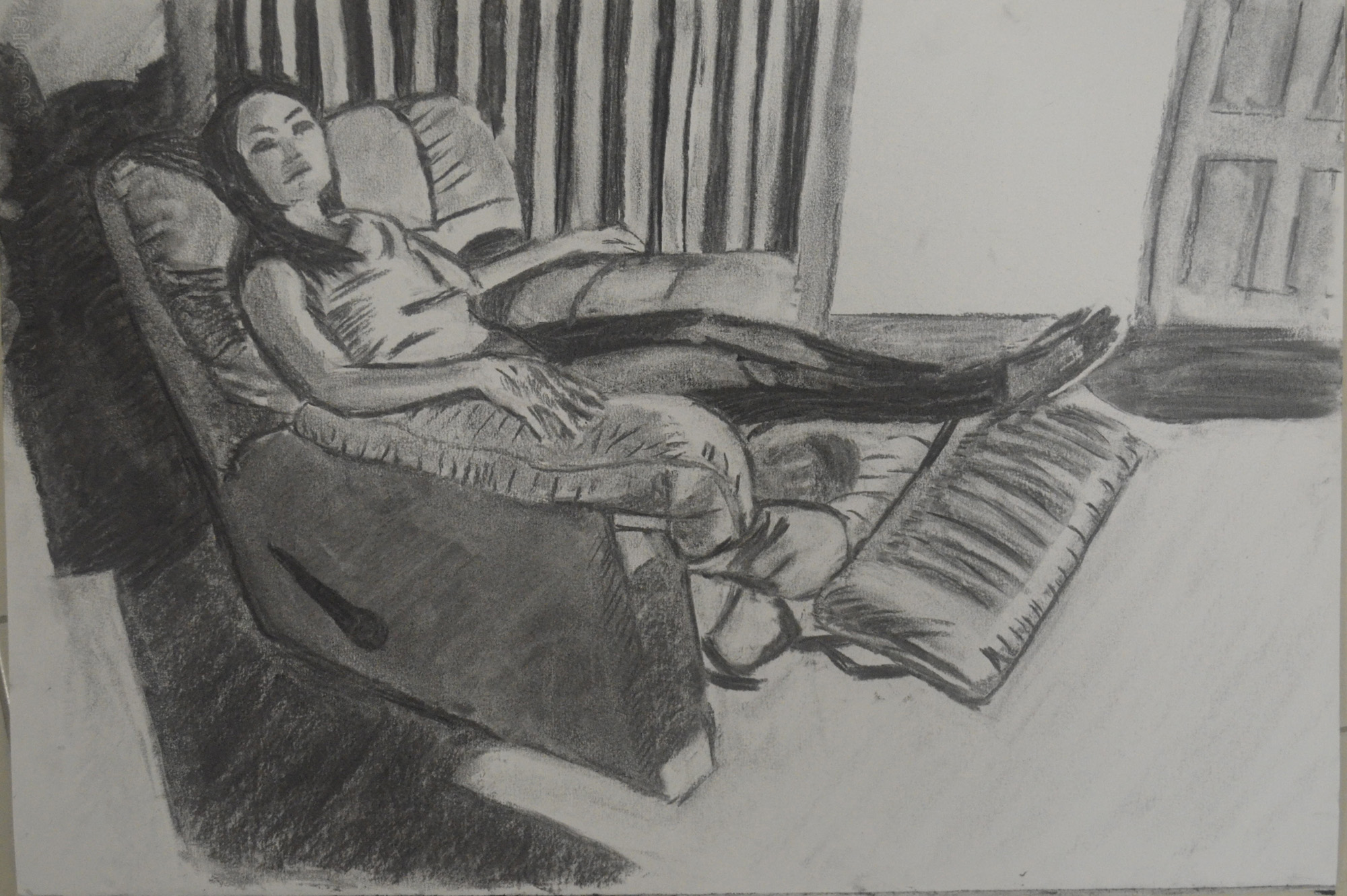
Tone and Form – 3rd Drawing Compressed Charcoal A3
The next drawing was in compressed charcoal on A3 paper this time I sat on a chair almost to the side of her with my light source (my bendy lamp) placed on the floor and facing her from an angle slightly to her left.
Although I was happier with both the medium and the angle, I wasn’t happy with not being able to hatch over small areas with a clumsy medium, she needed to be bigger or at a more ‘full on’ angle so I could see more of her.
Tone and Form – 4th Drawing Fine Marker Pens
The next study was in my A4 sketchbook with fine nib marker pens, although her face turned into some kind of cat woman the four colours that I chose worked well together although I did mess up on the arm of the chair but this was about describing tone and form and I still wasn’t satisfied that reclining poses in this chair was were allowing me to do that.
I gave up on it for a couple of days so I could think things through, my bed was against a plain white wall so I didn’t think the background would be interesting enough in there so I thought it might be worth drawing some poses on the sofa, However I had already used the sofa twice already in the three drawings exercise and essential elements and I needed a pose that would fill more of the paper.
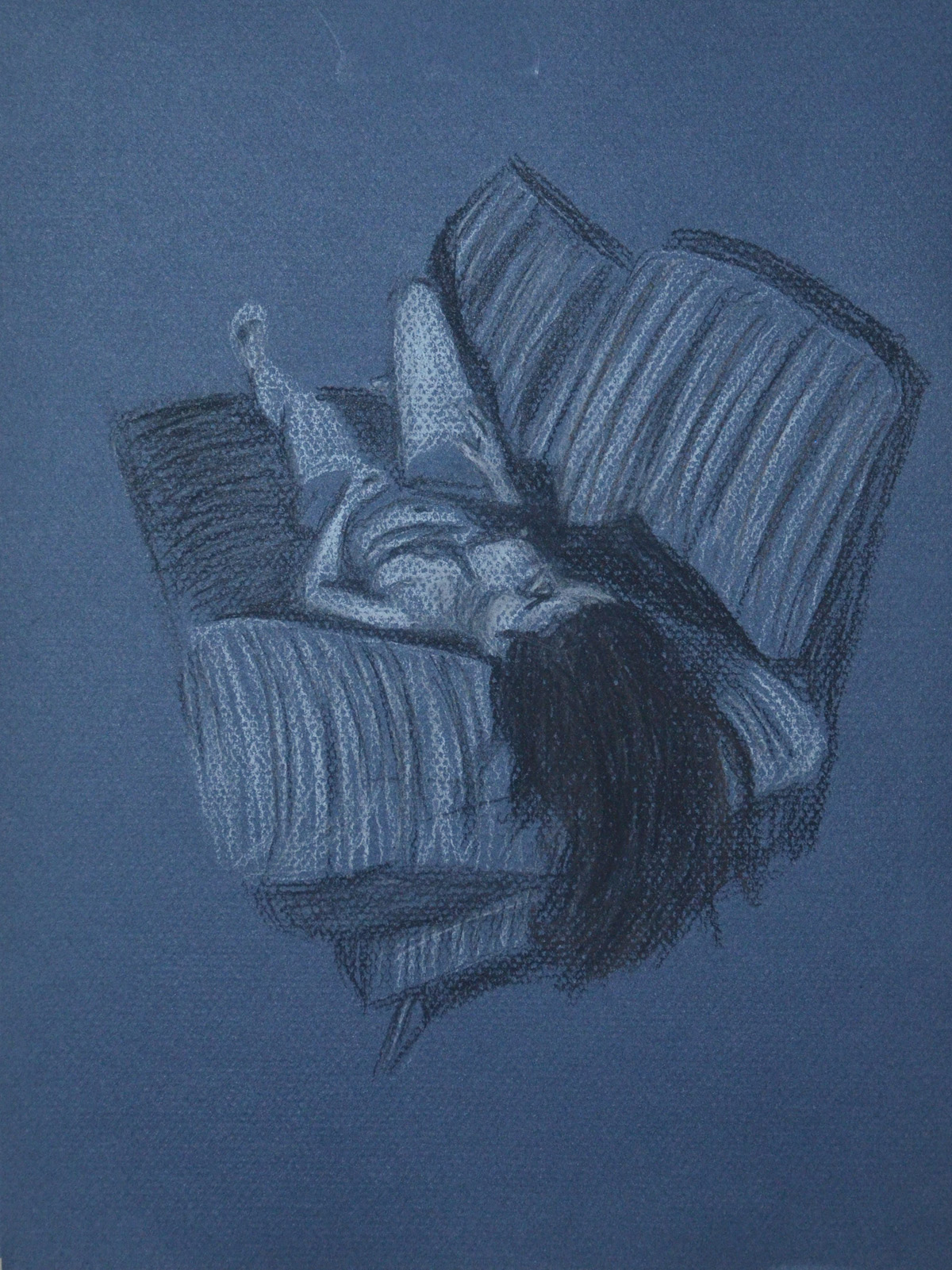
Two days later I was washing the covers of the sofa when my girlfriend came to visit again. As the sofa covers were in the wash I had a yellow quilt over the white cushion, my girlfriend was wearing a blue striped shirt with white collars and pink trousers and the three colours looked great together.
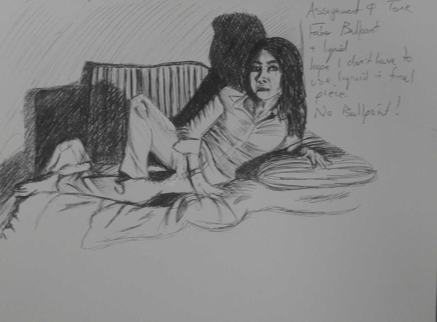
I placed the light sauce on the glass table in front of the sofa so I could create some nice shadows behind her and did a quick 20+ minute drawing in ballpoint pen. After a bit of tampering with Tipex I was satisfied that this was the perfect pose for this assignment.
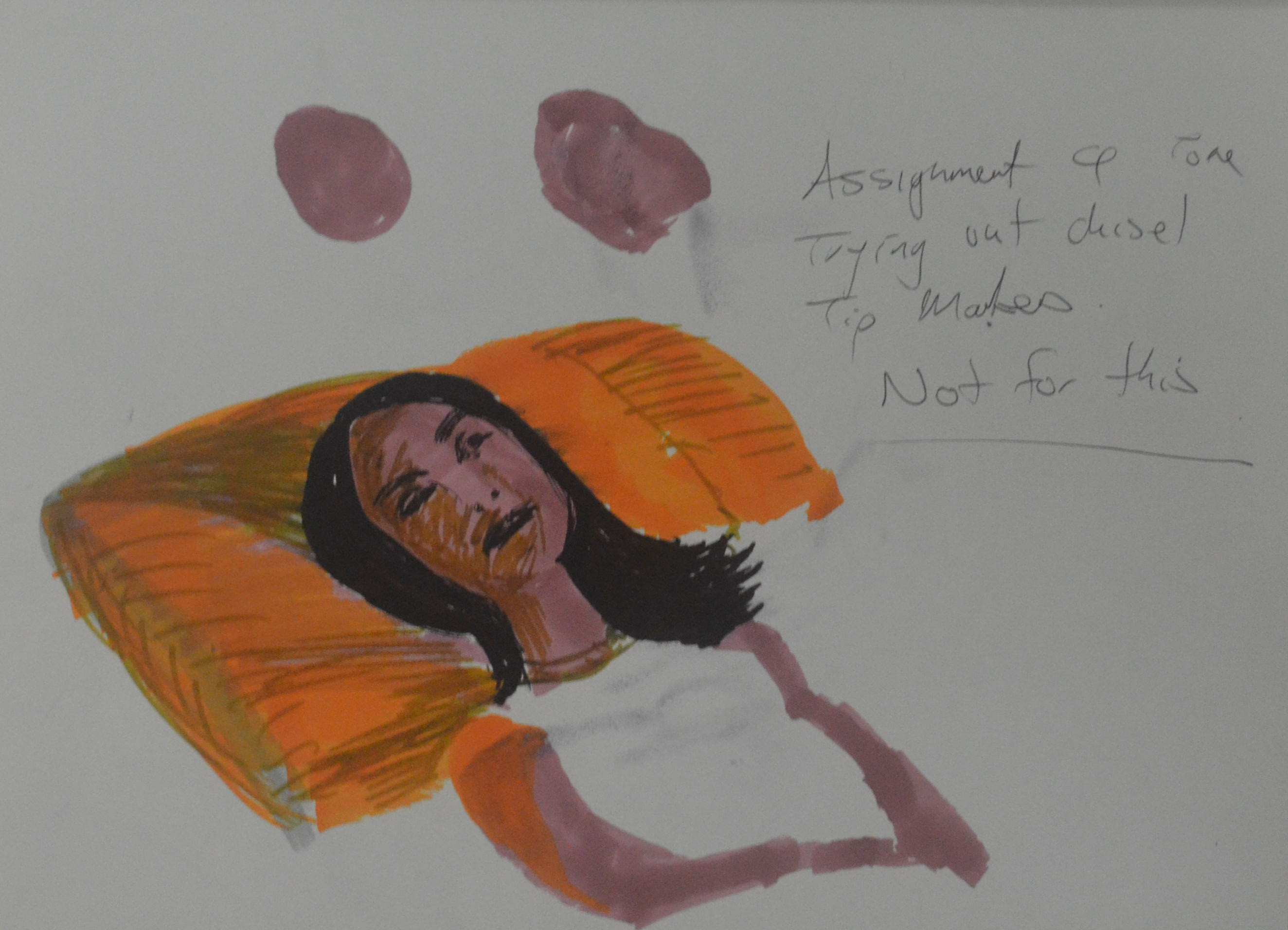
Tone and Form – 5th Ball Point PenT one and Form – 5th Ball Point Pen
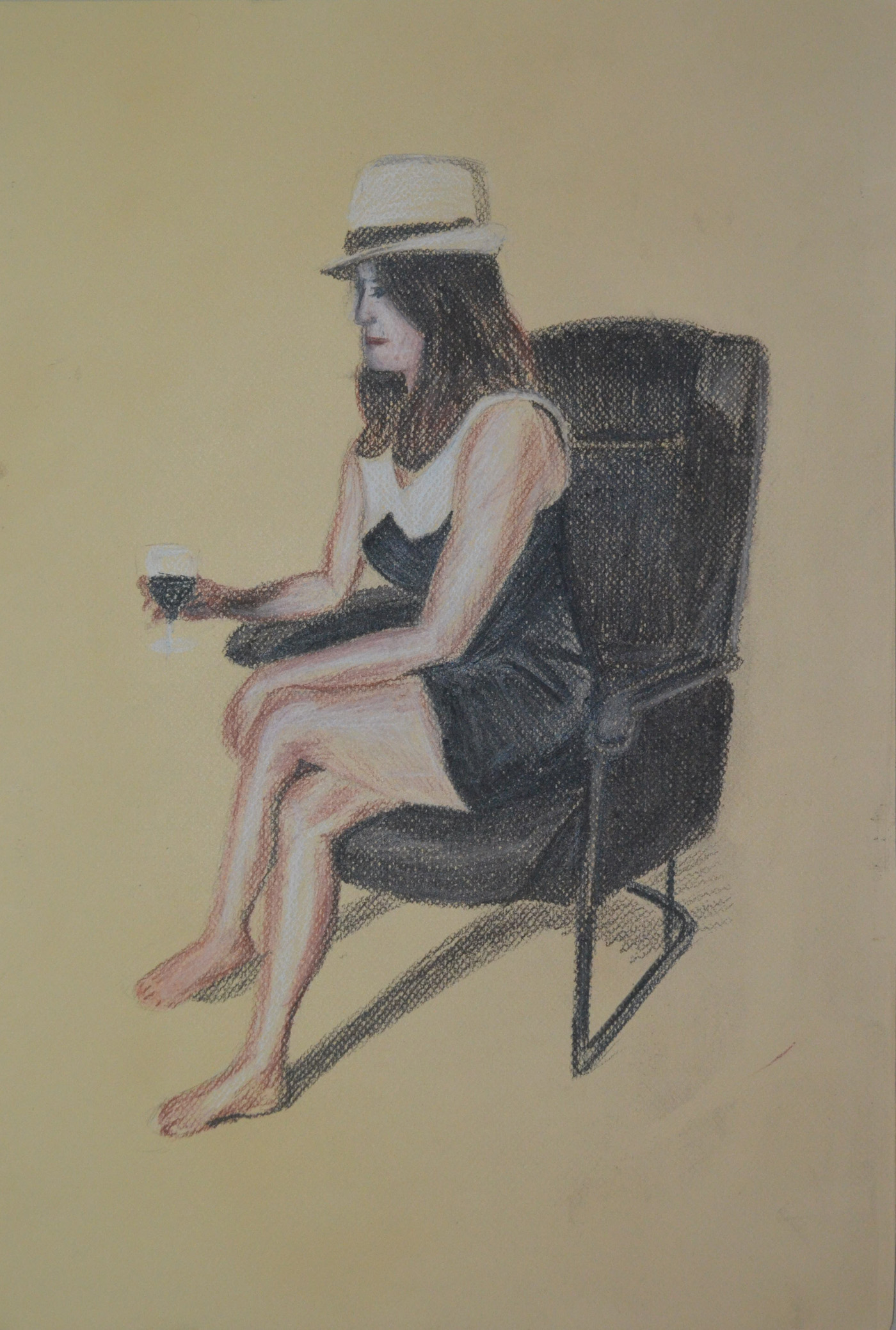
For this drawing I wanted to use a medium that I had only experimented with before, soft pastel. I chose a dark green ingres paper but I didn’t think it would make a difference to how the picture looked as I thought I would be covering every bit of the paper with pastel, this changed as I started hatching realizing that the green of the paper still showed through the pastel strokes which changed the mood of the drawing to how actually imagined it.
Tone and Form Final Drawing Before Fixatives
I completed the whole drawing using hatching and soft pastel except for on the hands and face which I left to last and completed the details in pastel paper.
Tone and Form – Finished Piece Soft Pastel, Green Ingres
Things I am not happy with…
Well I completed this drawing at the end of the month and with hardly any money left I chose to use hair spray as my fixative. I would rather have just framed it behind glass as I thought it was very vibrant before I started spraying away. Nonetheless, it had to be fixed as I presume they have to be sent to England for formal assessment. For now it looks good, the hairspray has aged the drawing and added some character but can it be preserved like it is.
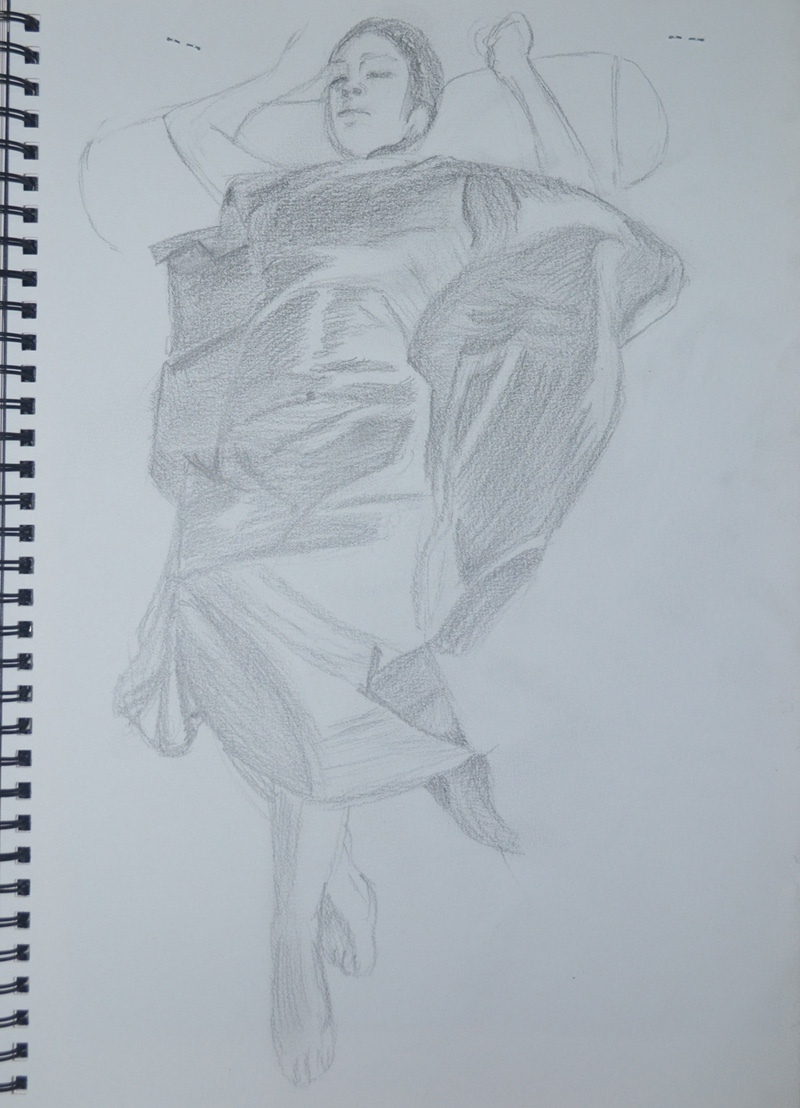
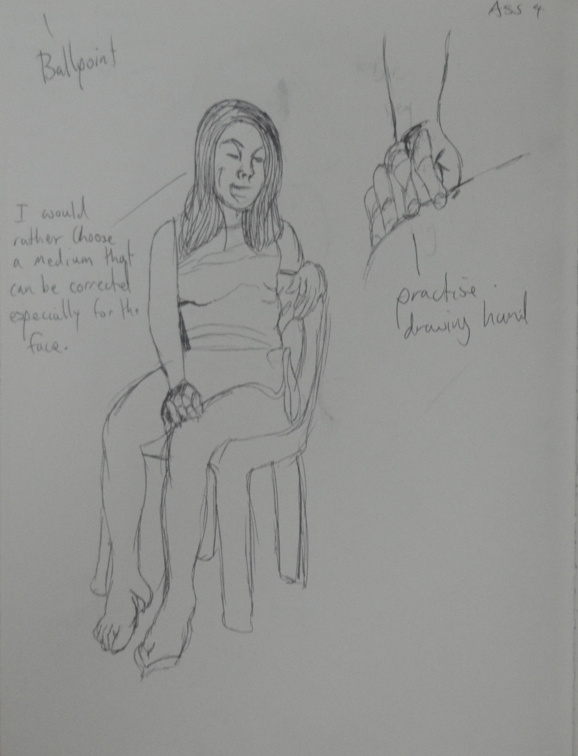
For the first part of this assignment, assignment 4 we were to produce a final piece using line and shape. Instructed to take particular note of the proportions of the figure we were to describe details such as hands and facial features and find ways of describing the folds of the clothes with line rather than tone. As I have done in the other exercises for part 4 I asked my girlfriend to model for me and so I could get a good sense of form I asked her to wear shorts and a sleeveless white knitted top.
Line and Shape 1st Drawing Ballpoint
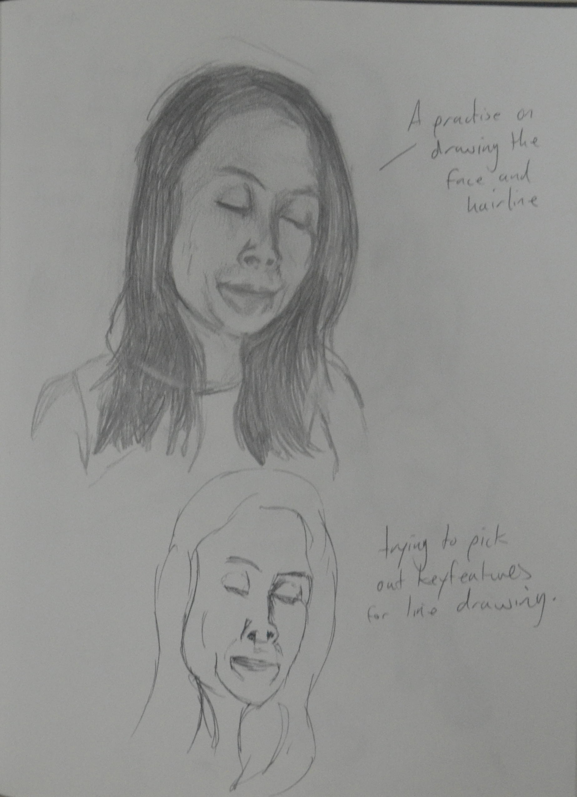
I started off by making sketches in line in my sketchbook. After the first sketch I realized that the face was going to be a problem, as I stated earlier I found it quite difficult to draw my girlfriend’s face and as this drawing was going to be in soft pencil, pen or some other permanent medium then I had to get it right the first time. The next drawing was of her face, not in line but in tone at first and from there I tried translating the key features of her face into a line drawing.
Line and Shape 2nd Drawing
I asked her to change pose for the second drawing. This pose was very elegant, it made her neck longer and her legs more womanly, at this stage I thought it would be a pose I would come back to for the finished line drawing.
Line and Shape 3rd Drawing – soft pencil
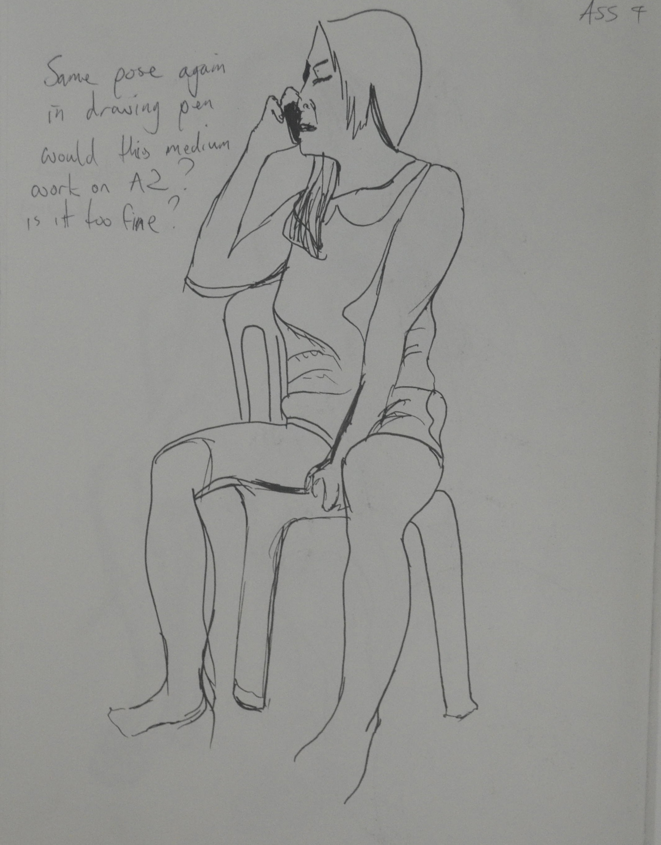
During changing poses for the next drawing her son called her, I thought was a pose I could use and so I asked her to stay in that position, with phone to her ear for the next two drawings in both conte pencil and charcoal pencil.
Line and Shape 4th Drawing conte pencil
I decided that these two mediums (charcoal pencil and Conte pencil) were a bit too sloppy for my liking to be used in the final line drawing and so I decided on using either Drawing pen, ballpoint or soft pencil.
Line and Shape 5th Charcoal Pencil
The next sketch put me off using pencil, it would be too easy to start hatching and messing the final drawing up, drawing pen or ballpoint would be much cleaner.
Line and Shape 6th Drawing Soft Pencil
Going on the fact that ballpoint can look a bit too scratchy at times though and was probably ok for smaller drawings not at A2 size I journeyed over to Silapakorn University shop to buy a 0.3 and a 0.5 Rotring pen, both of which I would use for the final drawing.
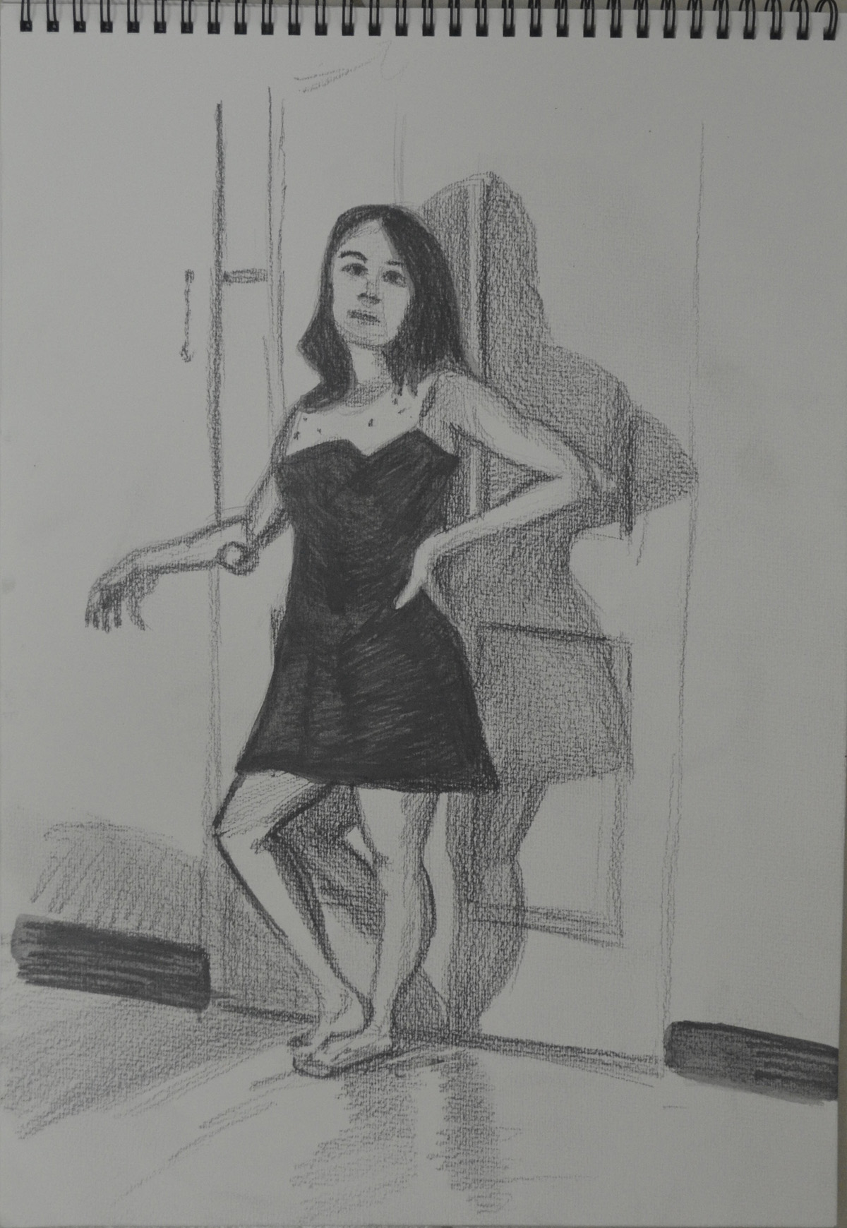
Line and Shape Finished Drawing
The pose I chose for my final drawing was a fluke, she was trying to find the pose that I drew in the second preliminary sketch when this pose just jumped right out at me. It had everything, legs, arms, shoulders, elegant neck and goof hand positions.
Firstly I drew in the outline in an H2 pencil so I could erase it later, I was afraid that I would make too many mistakes drawing with pen first as I always seem to mess up [when the pressure’s on]. It turns out that this was a good decision, I had no problem drawing the legs, waist and hands but when I drew from her elbows up to her head everything was out of proportion and it made her look like she was leaning forward in the chair rather than sitting with her back against the back rest. I did take photos of the process to compare but sadly I deleted them by accident.
After I had corrected the proportions and completed her full outline, I quickly sketched in the door and shadows on the wall and floor, I really only had one shot at this great pose so tried to draw everything in to its proper place just in case she was getting uncomfortable or needed to go to the toilet.
The Face
From there I went over her whole figure in a 0.5 Rotring pen and then drew in her face in 0.3. With her face I kept it simple, initially in pencil I drew in a lot more details but when it came to going over her face in pen I just left in the key features. With her chin raised and slightly looking up I managed to capture the parts of her face in a way that created the best likeness, small nose almond shaped eyes and juicy top lip.
Hair
For the hair I used three pens, both Rotring pens and a fine marker to create a sense of depth.
Hands
In this pose the hands were at a great angle and very simple to draw, again, like the face I kept things nice and simple, drawing hands from the Bidgman’s Guide to Drawing from Life earlier in this part of the course was a great help. I used block shadow as well as some hatching on the hands to create a sense of three dimension.
Clothes
Thinking of drawing techniques to describe the creases and folds in the clothes was a hard one and so I settled for block shadow and short pen strokes for the knitted top and block shadow and squiggly lines for the shorts. The shorts, however turned out looking like silk Thai boxing shorts instead of cotton, 70s style boxer shorts.
Background
For me there could only be one type of background and it had to be detailed and either in charcoal or soft pencil. I went for 4B and 5B pencils. Charcoal may have been a better medium for adding depth to the drawing but to draw in the reflections and shadows on the floor that I had in mind it had to be done in pencil.
Things I am not (quite) happy with in this part of the assignment..
I probably could have done a lot more experimenting but with line and different backgrounds but a busy seven days a week schedule holds me back sometimes. Some of the exercises can be done on the go but this was something I wanted to do while the model was in front of me and not from a photo.
On the left arm (her right) I have taken the line too far over at the joint which has separated the forearm from the top of the arm, Because I am aware of it, it looks bad but I don’t know how others would see it.
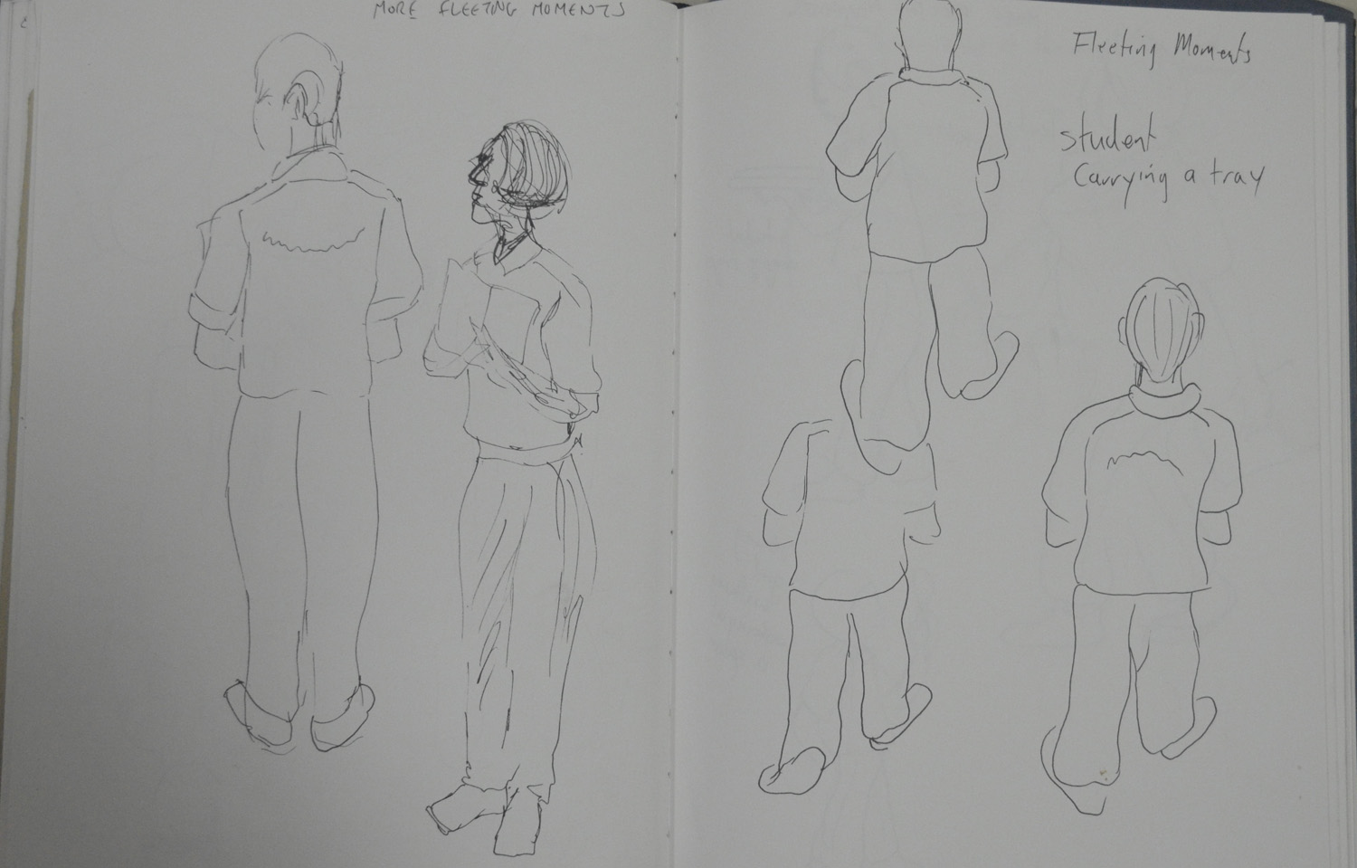
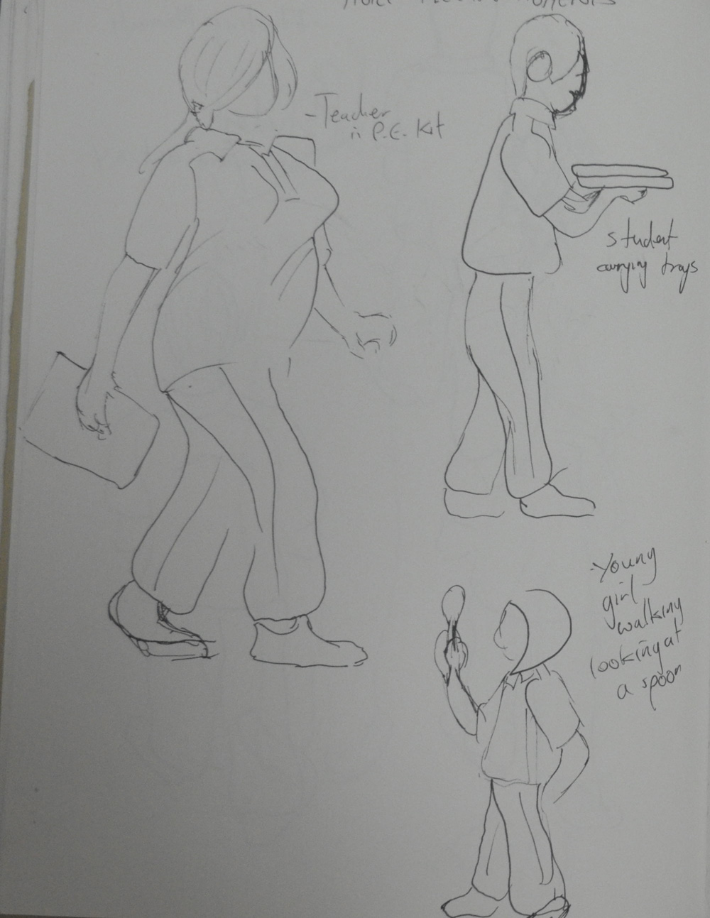
After the army cleared away the protesters that have been camped out on the streets of Bangkok for the last few months the school finally opened and with me being around so much movement, I thought I would have another go at the fleeting moments exercise in the last project the Moving Figure. This time I tried to use as few lines as possible to suggest the person’s movement.
1 – Fleeting Moments – Students Being Naughty2 – Fleeting Moments – Students Testing3 – Fleeting Moments – Students and Teachers Walking
For this exercise I was to take every opportunity to practise drawing people. Looking at magazines and TV to get the practise that I need. After sitting and studying people in my last research point ‘People Watching‘ I thought I would get out and try and sketch some real live moving people, how hard could it be?
My girlfriends son was in Bangkok for the school holidays so we decided to take him to the railway park that I had visited for ‘A Sketchbook Walk‘. After a few laps on the bicycles he was ready for some ice-cream and I was ready for some drawing, so while his mum fed him in a nearby restaurant I sat down on a mound focusing on a part of the path where bicycles weren’t allowed to be pedaled and tried to draw as many people as possible.
The easiest to draw were the ones doing absolutely nothing of course or standing around stretching. I really struggled with the ones walking around because…they were moving!
1st Drawing Suan Rod Fai Pencil
After ten minutes of being bitten by ants and getting cheesed off with people walking round the back of me to see what I was doing. I decided that it was best to go home and do some practising from the newspaper.
2nd Drawing Suan Rod Fai Pencil
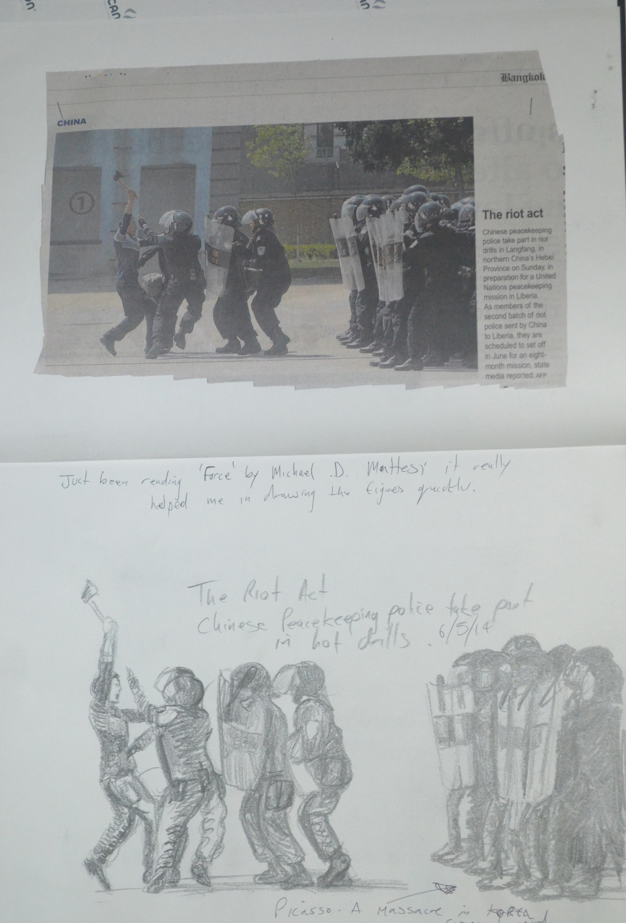
The next day at work I went through a copy of the Bangkok post and cut out what I thought were the best photos I could find for practising drawing the moving figure.
3rd Drawing the Riot Act Bangkok Post 6B
The first newspaper article was from the international news section, about the riot police in China having drills, so in a 6B pencil I tried recreate the image depicting as much movement as possible,
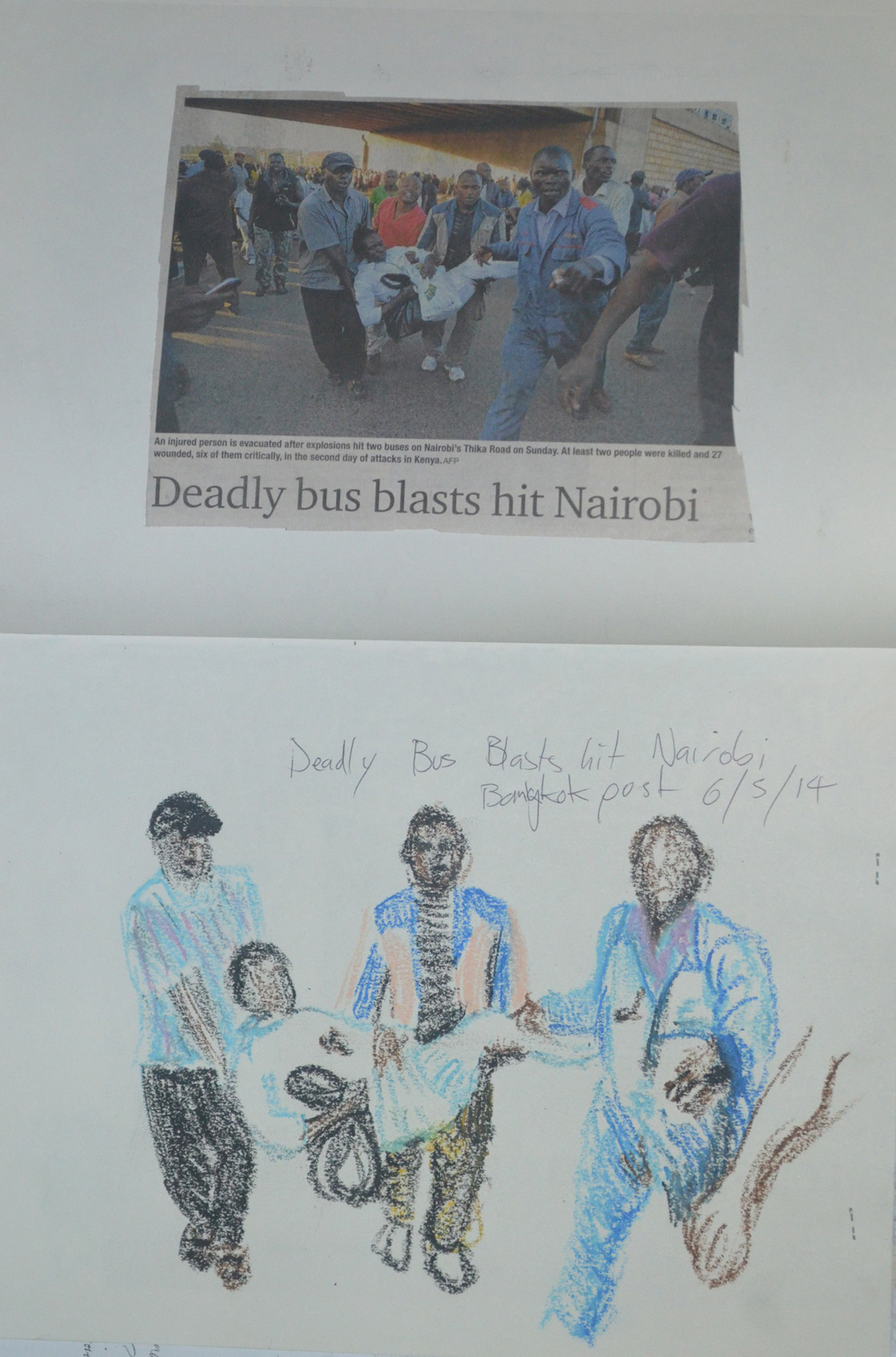
4th Drawing Nairobi Bomb Blast – Bangkok Post
The second scene was a bombing in Nairobi, three rescuers carrying a possible fatality away from the blast. I chose to draw this in oil pastel as fast as possible and I think I did quite well to depict movement in the very rough sketch.
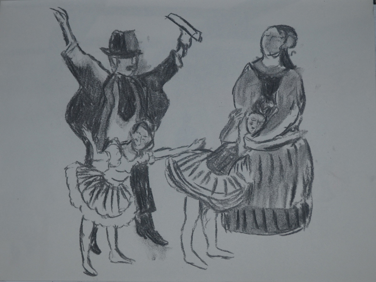
5th Drawing Nutcracker in Bangkok
The next drawing was about the Nutcracker ballet in Bangkok I chose charcoal but I reckon with a more appropriate medium I could have done a lot better.
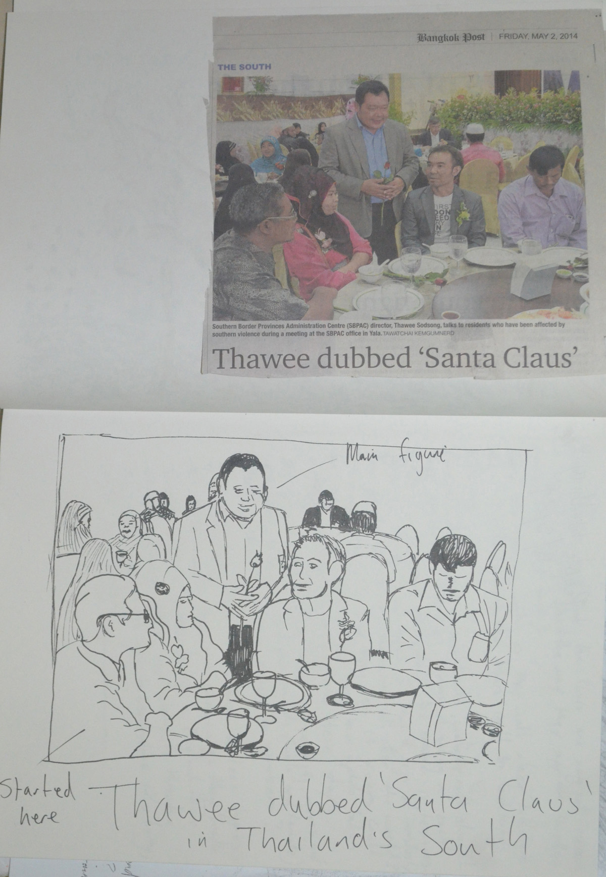
6th Drawing – Santa Claus of the South – Rotring Pen
The next drawing was from a news article about some politician being nicknamed Santa Claus in Thailand’s troubled south. I built up the scene from the guy in the bottom right hand corner and worked my way around the table, from there I drew in the main character, hence not in proportion and then went onto draw the background.
7th Drawing – Burma Fire Brigade – Bangkok Post
The next newspaper article was about the Burmese fire brigade dressed up as civilians for some demonstration or other. I worked very quickly in oil pastel again with this one and then went onto draw in the background.
Tesco Lotus Shopping Center
In Thailand, Tesco is known as Tesco Lotus, Lotus being the Thai partner and the supermarket is usually always in a shopping mall. On Sunday I work at the language centre on the 4th floor. Last week my first afternoon student cancelled so I decided to sit outside for two hours and draw the passers-by.
8th Drawing – Tesco Lotus – 2 Hour Observation
It took me about twenty minutes to draw the shop fronts inside the mall across from the language centre then in colour pencil I began to sketch people as they walked past, a lot of the time having to remember how they were stood seconds before as I couldn’t draw them fast enough.
I tried drawing in both colour pencil and pen this worked well superimposing the shape of one of the Thai teachers over the top of the other people. But then I made the mistake of drawing two people in the very background in pen, as they should have looked more faded than the others so I went over them in a white pen to fade them out a bit.
The worse mistake I made here was trying to draw the ceiling in afterwards which was a network of suspended panels ,lights and pipes.