Part 5, Option 4, Reflection

Large Tonal Drawing in Colour Pastel

I started off this part of the course with a fresh try at drawing with energy as my attempts at gesture drawing in Part 4 – Drawing Figures  where rather crap and so I read more of ‘Force’ by Michael D. Mattesi. So with a Chinese marker, larger sheets of drawing paper and my new found knowledge of applied force and road of rhythm, I set out to create more quick and dynamic figure drawings. Not only were these energetic drawings a vast improvement on any of my quick figure drawings in Part 4 but they were a great inspiration for the next few exercises.

Drawing 2
Drawing with Energy


I had been struggling in the Quick Poses exercise in the last module but the Quick Studies exercise in Part 5 was a breeze due to the fresh practice at energy drawings and also applying what I had learnt, unlike the hairy sketches in Part 4 the quick studies in this part were smoother and with a new found confidence I drew faster and faster sometimes getting the drawing time down to 3 minutes.

Drawing 30 - Kneeling 3B Pencil
Quick Studies

After researching how famous artists used line I took that new found confidence and applied it to the second part of this research where I had a go at using line in the style of famous artists. The results weren’t that great, I’m not sure if drawing in the style of Klimt or Schiele resembled the two artists’ work but I was pretty happy with drawing in the style of Hockney, Ingres and Giacometti, particularly the last two artists.

5 - Drawing in the Style of Ingres
5 – Drawing in the Style of Ingres
6 - Drawing in the Style of Giacometti
6 – Drawing in the Style of Giacometti

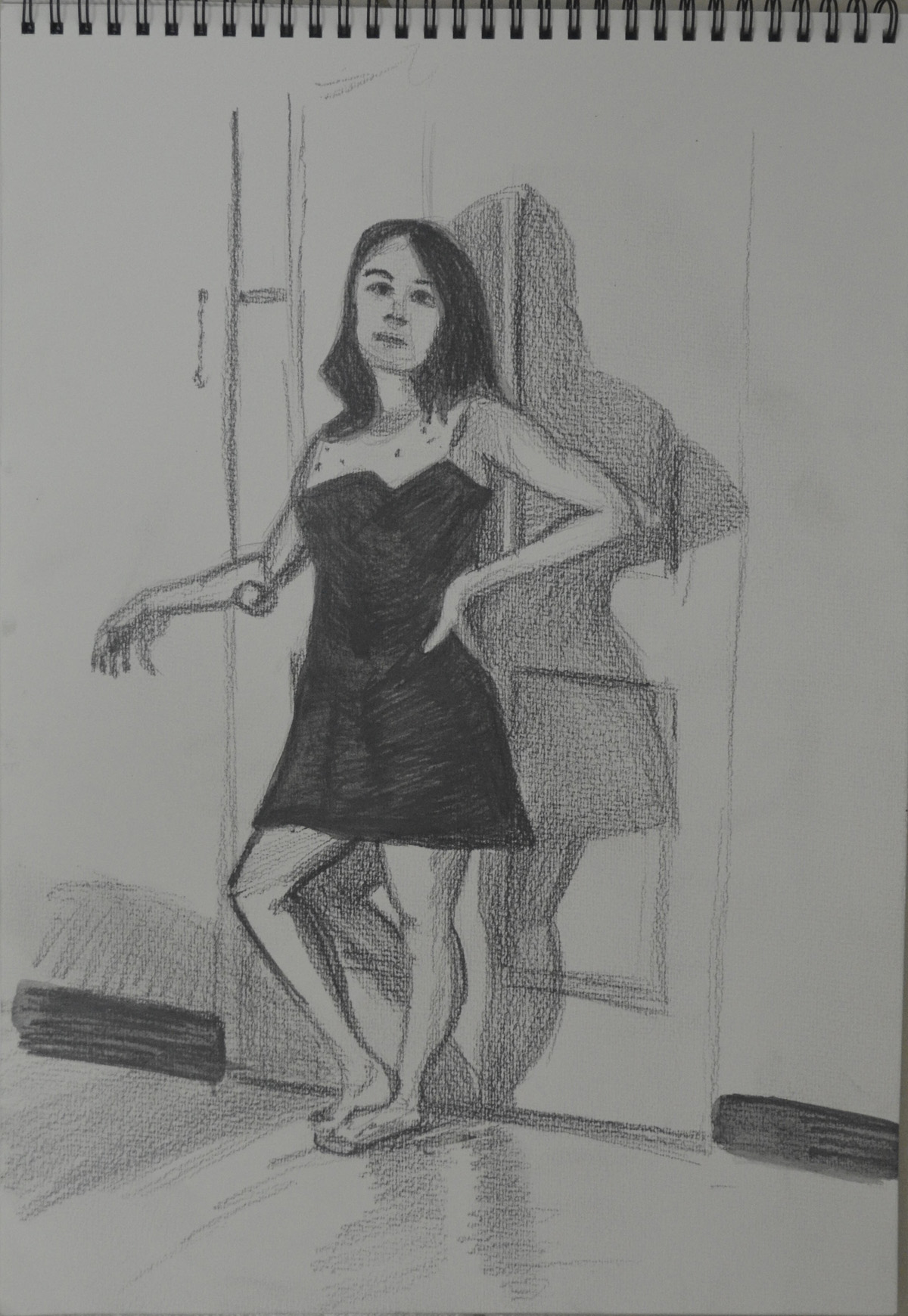
I’m not sure whether I did enough drawing with colour in the using colour exercise  but I do feel that I did ample experimenting with mixed media particularly the collage work which I was quite happy with, producing the drawing below was particularly satisfying but I may have to go over the hair in black.

3 - Collage with Black Felt Tip
3 – Collage with Black Felt Tip

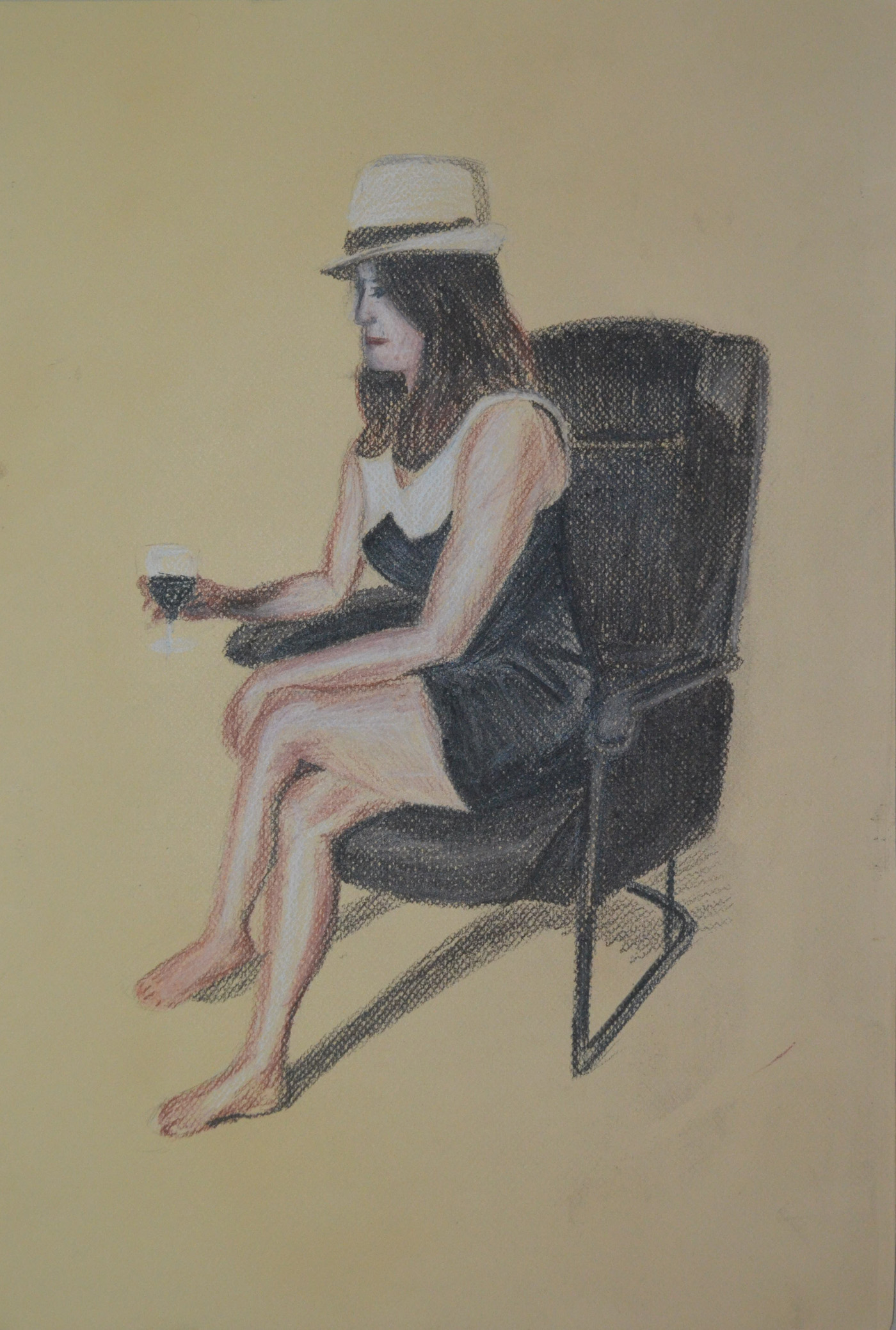
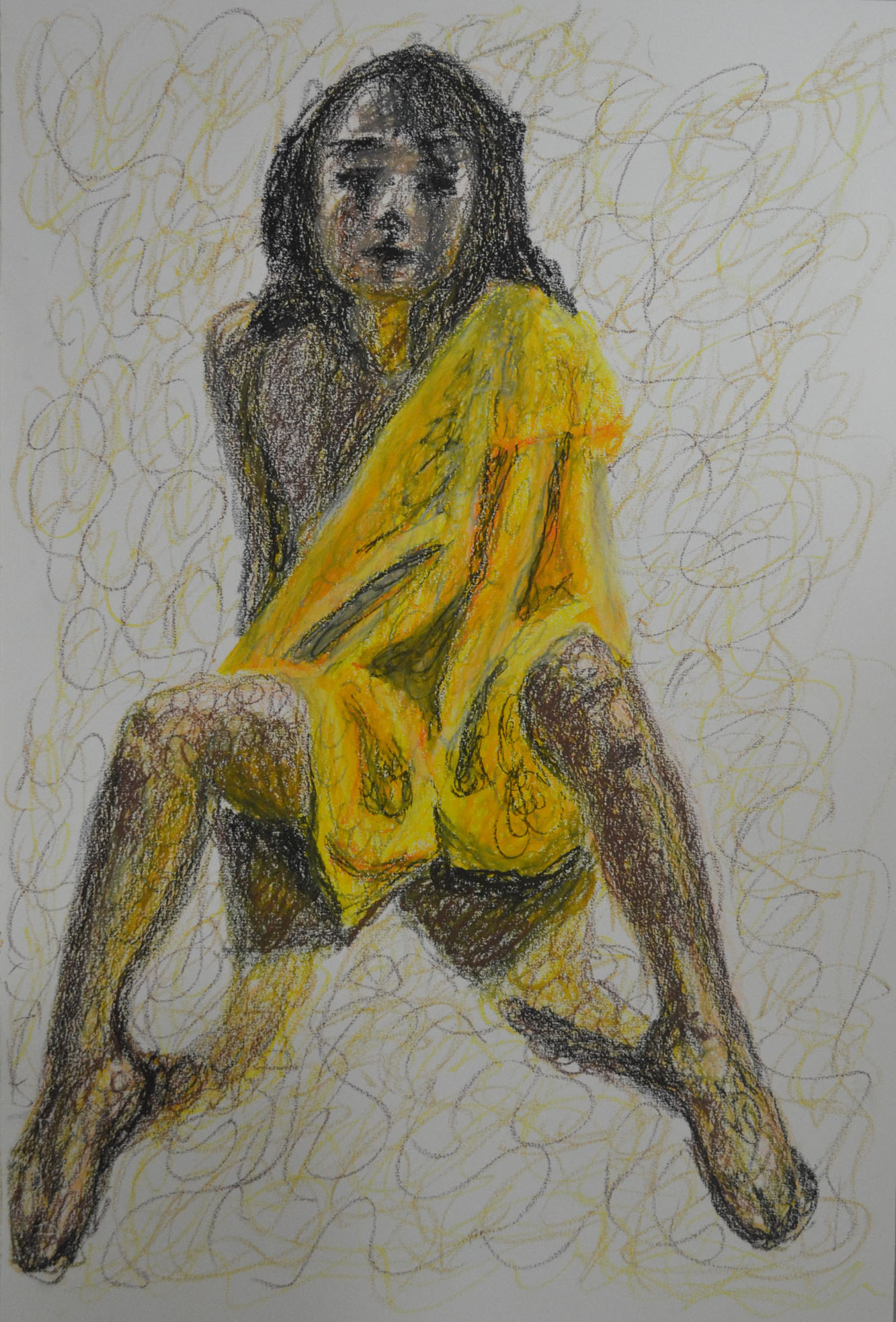
This drawing in oil pastel below gave me some very interesting ideas for Assignment 5, which I will reflect on in the next post.

1 - Oil Pastel with Robe and Squiggles
1 – Oil Pastel with Robe and Squiggles

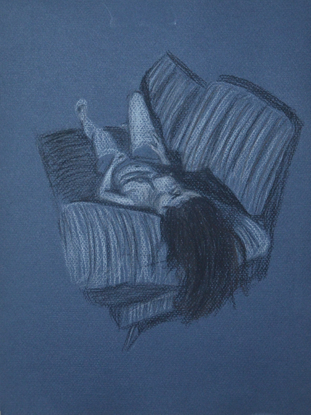
I was trying  not to get sucked into producing nudes for the rest of this module but that’s the direction I felt I was going in as I knew there was so much I could do with the nude figure and so many drawing tools I could use for them, I was especially happy with the drawing below in hard pastel that I produced for the Tonal Studies exercise which I will also send off for assessment. I love the way that I used contrasting colours to build up the tone and form of the sitter with very fluid hatching.

Large Tonal Drawing in Colour Pastel
7 – A2 Tonal Drawing in Pastel Pencil on Ingres

This module gave me enough ideas and time to reflect on the type of piece I wanted to produce for Assignment 5, I knew I wanted to produce a full figure drawing, I knew the sitter would not be totally nude as I wanted to draw folds in cloth again but what I hadn’t decided on was if it was going to be an expressive figure drawing or analytical study or what medium I would be using for the assignment.

Project The Moving Figure – Exercise : Fleeting Moments

7 - Follow up Drawing of Man and a Woman Pushing Stall

On the day I started this exercise I woke up to the first day of my second coupe d’etat while I’ve been in Thailand. Not bad going. The TV wasn’t exactly blank, there were 5 military logos on there with some old be proud of Thailand, very fascist sounding music on from a bygone era. The whole country was on curfew and I was wondering if it was safe to go out. If you ever want to know what it feels like to be on curfew at the start of a coupe d’etat, watch iRobot, because the ‘stay in your homes’ scene is quite close.

1st day of Tha Coupe d'etat
1st day of Tha Coupe d’etat

So anyway, while I was on lockdown, that first morning a memory came into my head that I thought I would try and get down on paper, It was the first day I met my girlfriend, September last yea, to be exact. I remember what we were both wearing, where we were and if she was the first up the escalators from the underground train or not. I just couldn’t quite pull it off in an abbreviated drawing, But it was worth a try.

1 - Drawing a Memory from Last Year
1 – Drawing a Memory from Last Year

That morning I was supposed to be teaching 3 students in a private class but everyone had cancelled, luckily for me I had made some very quick pencil sketches of the three students the day before noting their height and frame and how they were sitting and decided to go over them with a more detailed sketch from what I could remember, clothes, hairstyle etc. I haven’t taught them since so I haven’t been able to check if there was any likeness there.

2 - Sketch of 3 Students over outline
2 – Sketch of 3 Students over outline

All but one class had cancelled, which was my 4-6 pm, so I decided to take my spare computer down for repair in the early afternoon and just as I was having some breakfast preparing to get ready the army allowed the first TV broadcast of the day.

The scene on the TV was the yellow shirts who had been occupying the area near my school for the last 7 months, being cleared off by the army and their was a small, chubby, Chinese/Thai guy doing the reporting. The thing that made me want to draw him was that everything about him was that even though he was fat, which you would associate with being round, everything about him seemed to be square from his head to his microphone. After making a quick square sketch of him, I tried to draw him exactly how I remembered him but changed him a few times as his head wasn’t in proportion and I wasn’t sure if he was holding the mic with two hands or not.

3 - News Reporter 1st Day Thai Coupe
3 – News Reporter 1st Day Thai Coupe

That afternoon on my way to taking my computer to repaired I got my first glimpse of the army, stationed (or hiding from the sun) under the flyover at Pinklao intersection, two of them stood on top of the bridge with their backs to me and three of them stood by a Chinese knock off of a hummer. I made a quick drawing of what I remembered about the three stood by the hummer while the guy checked to see if my computer was worth repairing.

4 - Sketch of Soldiers under Pinklao Bridge
4 – Sketch of Soldiers under Pinklao Bridge

The sketch wasn’t up to much so I made a larger drawing with watercolour pencil in my sketch book the next evening. It was really messy, but by then so was my memory of the whole scene.

5 - Quick Watercolour Pencil Drawing from Sketch
5 – Quick Watercolour Pencil Drawing from Sketch

On my way back from my 4-6 pm private I decided to take a taxi, only to find that their was a traffic jam, after 20 minutes of sat in very slow traffic I got to find out what the hold up was, a man and a woman taking their market/food stall out for a jog.

6 - Quick Sketch - Man and a Woman Pushing Stall
6 – Quick Sketch – Man and a Woman Pushing Stall

I made a really quick sketch of them while I was still in the taxi and the following night I tried to replicate the scene with a better drawing.

7 - Follow up Drawing of Man and a Woman Pushing Stall
7 – Follow up Drawing of Man and a Woman Pushing Stall

Finally the last drawing was of two of two motorbike Taxi riders who I have known for the best part of 12 years, I made a very quick sketch of them while I was at the motorbike taxi rank and improved on it when I got home. Unlike the others I went over the top of the initial sketch so you can still see the rough sketch underneath.

8 - Motorbike Taxi Riders Waiting
8 – Motorbike Taxi Riders Waiting

Project Structure – Three Drawings

3 - Lying Down - Conte Stick and Compressed Charcoal

For this exercise I was to make three drawings, 1 seated, 1 Standing up and 1 laid down looking down the body at a slight angle from behind the head.   I was to try and use a different medium for each drawing.

Again, my girlfriend volunteered to be my model for this exercise and for the first drawing, which I decided to do on the Canson pastel paper I had left over from my last research point, an anatomical drawing, she decided she needed some props,  a glass of wine and her trilby.

1 - Sitting, Conte, Charcoal, Conte Pencil
1 – Sitting, Conte, Charcoal, Conte Pencil

I have had no success so far at drawing her profile and this drawing wasn’t any different. I really need to practise drawing profiles. The drawing is on A3 and the thing that consumed the most time was not drawing my girlfriend but the chair she was sat on. I moved around her before starting looking for the best position and even though drawing from the front may have been better for drawing her face, I think that the angle that I chose was the best  or showing all the things we were asked to notice in the brief.

The next drawing was the standing pose and for this I really wish I had had some white charcoal, as my girlfriend in the lamp light against the door looked quite spooky.

2nd Pose 2 - Using Watersoluble Pencils for the first time
2nd Pose 1 – Using Watersoluble Pencils for the first time

I made two attempts in a medium I hadn’t used since I bought them over a year ago, water-soluble pencils. I would have been happy with one but someone decided she looked ugly in the first drawing, the second however, looked a hell of a lot better in every way.

2nd Pose 3 - Water Soluble Pencils Better Proportions
2nd Pose 2- Water Soluble Pencils Better Proportions

For me, the third drawing was the easiest drawing for just about everything. I know I was to try using different tools for each drawing, but I couldn’t think of any other drawing tool that would help me capture the mood as much as pastel on blue paper.

3 - Lying Down - Conte Stick and Compressed Charcoal
3 – Lying Down – Conte Stick and Compressed Charcoal

Just like the first drawing, I spent most of the 1 hour that it took me to draw in the sofa, I was very lucky to get the shadows across the belly, breasts and rib cage right, as they didn’t take much adjusting.

Drawing Cloud Formations

1 - Cloud Formation in Oil Pastel

For this exercise I had to draw comprehensive tonal studies of cloud formations in charcoal, oil pastel and conte with the aid of a putty rubber.

It’s in the transition from rainy season to dry season here in Thailand but most of the rain happens in the afternoon and as I drew most of the following around mid day most of the clouds seemed to be developing into rain clouds.

I probably went about this exercise the wrong way, instead of drawing sketches in my sketchbook as it seemed a lot of other students have done I used separate sheets of paper and tried filling them up with not just the clouds but the blue skies behind the clouds to try and capture how the rays of light bouncing of the clouds effected the skies around them, and what a task.

1 - Cloud Formation in Oil Pastel
1 – Cloud Formation in Oil Pastel

My first drawing was started in the morning from the car park at the Tesco Lotus shopping mall where I teach. I’m still really new to oil pastel so I started the drawing by drawing in the blue skies giving me the silhouette of the cloud then drawing in the dark parts of the cloud after. I could see it was going to take me a long time but luckily there was no strong winds, which is usually the norm here in Thailand during the rainy season, as the clouds just seem to form slowly through the course of the day, so I took a photo  and finished the drawing at home.

The hardest part was depicting the sun shining behind the top of the clouds, I think I managed to do this by making the shadow of the cloud a lot darker in that area, so the white would look brighter.

I wasn’t going to be able to any more drawings until the next day so that night I decided to do something different. It was about 9 o’clock in the evening and I could see the moon shining through the sun so I took a photo of it from my window, When taking a photo of the night skies the camera seems to capture a lot more than what the eyes can see, I live on the 26th floor and I’ve often noticed that when taking photos of Bangkok at night clouds appear on photos that I didn’t think were there.

2 - Clouds at Night in Hard Pastel on Black Paper
2 – Clouds at Night in Hard Pastel on Black Paper

I originally thought that I could do the drawing just in conte but I only had three colours a dark brick, black and white but then as I started to draw more and more colours began to appear so I highlighted the moon and the clouds in yellow and orange hard pastel, a move that would change the course of the exercise.

A Photo of the Moon at Night

The next drawings was done from my apartment window it was about half past two in the afternoon and the clouds were really starting to form now. One particular cloud caught my eye and because of the lack of wind I managed to get two drawings of it one using hard pastel for the blue skies.

3 - Cloud Formation in Charcoal
3 – Cloud Formation in Charcoal

To be honest I don’t think I captured the full body of the cloud very well in charcoal and it could have looked a lot fluffier than what it did. The next drawing in hard pastel was a lot better.

4 - Cloud Formation in Hard Pastel and Charcoal
4 – Cloud Formation in Hard Pastel and Charcoal

The next three drawings were done in my sketchbook in soft pastel. a medium that I wasn’t instructed to use in the brief but I really wanted to have ago in another medium as I wasn’t very keen on oil-pastel and because of the soft cloud formations and blue skies outside my window I thought it was very suitable, plus I haven’t done much work in soft pastel so far so it gave me a chance to use it.

6 - Sketchbook Drawng in Soft Pastel
6 – Sketchbook Drawng in Soft Pastel
5 - Sketchbook Drawing in Soft Pastel
5 – Sketchbook Drawing in Soft Pastel

The final drawing was done in the early evening and it looks like wain was on the way but it was a really nice evening the problem was lack of selection of colours in the soft pastel set that I bought so this is something I have to correct.

7 - Sketchbook Drawing in Soft Paste (Evening)
7 – Sketchbook Drawing in Soft Paste (Evening)

I haven’t done as many studies I would have liked to in this exercise but with the amount of work I have had on lately I’ve slipped right behind and I want to get moving with the final exercise in this module but I’ll hopefully be doing more cloud studies throughout this part of the course and adding them later.


Drawing Using Oil Pastel

Drawing Using Oil Pastel - Finished drawing

For this exercise I used approximately 13 different colours of oil pastel and a white textured sheet of A3 watercolour paper and I’m kicking myself now reading the brief where it says use coloured paper. However further down the page it does say leave gaps to let the white break through so it’s easy to see how I got confused.

I set up a colourful group of fruit which included a quarter of watermelon, a red apple and two ramhutan or ‘gno’ as they are known in Thai, concentrating on creating a group of contrasting colour and texture I set them on a stainless steel reflective plate which I bought with the intention to use in the earlier exercise ‘Shadows and Reflected Light and Shade‘, and placed the composition on a piece of folded cloth used to make Thai monks robes.

Drawing Using Oil Pastel - Chosen Composition
Drawing Using Oil Pastel – Chosen Composition

First of all I lightly sketched in the main shapes of the group doing my best to fill the paper including the main shapes of the cast shadows on the cloth underneath, I think this was my best attempt at filling the paper so far.

I then started to block in the darkest areas using a sketchy hatching technique, I’m trying to be more fluid in this part of the course and I think I’m doing well so far. From there I went on to sketch the light areas in a different colour, on the watermelon and apple at least.

Once the initial layers of colour were blocked in I worked back over them to strengthen the tone using related colours on each object to strengthen the tone.

Drawing Using Oil Pastel - Finished drawing
Drawing Using Oil Pastel – Finished drawing

Approximate breakdown of colours used on objects

Watermelon:

On the flesh of the watermelon I used pink, red, a very dark red and a dark blue to create shadow as well as black and white for the seeds. For the skin I used a dark green a light yellow and a grey-blue colour.

Red Apple:

For the red apple I used ultramarine, red, orange and pink for the skin and green, yellow and orange for the core, these colours worked really well together.

Rambutan:

On the rambutan I worked from light to dark then back again and they were probably the hardest thing I’ve drawn so far. For these two objects I used all of the above colours but it took me a very long time to build up the layers and to get them looking anywhere near they did in real life. Although they are not perfect I really love the effect I have created while working on them. They are a very irregular shape and yet I have still managed to make them look round and spiky.

The Plate:

Same again on the plate, because it was so reflective I used a lot of the colours utilized for the fruit plus a light blue, grey and white.

This is the first time I have worked with oil pastels other than experimenting and I found that you have to know when enough is enough for danger of messing up your drawing.

I’m very impressed with the finished picture, but what is worrying me now is how I am going to preserve it, I have sprayed it a few times with an expensive fixative already but I used cheap pastels by Pentel and it doesn’t look like the fixative is not going to do any good…

Assignment 1 – Made Objects

Assignment 1 - Made Objects - finished A2

I originally had the idea to to use traditional Buddhist items for this part of the assignment such as yellow cloth, a candlestick, temple type money box and did go out and purchase them. The medium I chose for the original composition was coloured pencil, but as I laid down watching the girlfriend iron in front of the electric fan with the white wall of my apartment I had a better idea.

Assignment 1 - Made Objects - finished A2
Assignment 1 – Made Objects – finished A2

I wanted to show something about my life in Thailand and I felt that the new objects set out in the right composition would describe my life perfectly, a normal working-class life in a tropical country. With 13 years in the country and the last few years living alone I knew these objects intimately but the fan would prove to be something of a challenge..

Assignment 1 - Made Objects - composition studies
Assignment 1 – Made Objects – composition studies

I began with composition studies in my A3 sketchbook, I found it difficult to come up with more than two variations as I was locked into how i felt the objects should be presented from the start. How every I did vary the composition slightly with the iron laying down in the first composition which I think was actually my first idea and then the iron stood up proudly in the second. The ironing board was lifted up on the table and I was almost laid down drawing the second composition sketch which I liked so much that I decided this would be the one to develop and decided that I would be there for a while so raised the ironing board higher with the ironing board on top of a table on top of another table. We had to do without a place to eat for the next few days.

Assignment 1 - Made Objects - Photo of Original Composition
Assignment 1 – Made Objects – Photo of Original Composition

At this stage I did things a little bit in reverse with the composition studies just finished I decided to develop the composition in pencil to get a feel of how it would look in that medium before looking at others. One of the main reasons for doing so was being insecure about whether or not I would be able to demonstrate the techniques especially pencil holding techniques that I had practiced in the first part of this course. I then concentrated on enlarging the image by drawing a grid over the top of the composition ready for enlarging for the finished drawing.

Assignment 1 - Composition Development and Enlargement grid
Assignment 1 – Composition Development and Enlargement grid

At this stage I was still not so sure about what medium I would use for the finished drawing, so as instructed on an A2 sheet I practiced with colour pencils and charcoal.

Assignment 1 - Charcoal and Colour Pencil Studies
Assignment 1 – Charcoal and Colour Pencil Studies

Charcoal would have been great for the towel and even the water bottle and possibly the iron but on an A2 sheet which I was planning to use this medium proved itself too messy for the electric fan. I did love the way the water bottle looked in charcoal though, rather like stencil street art. Colour pencil wasn’t too bad but didn’t look solid enough for me, I was still trying to get practice with this medium and didn’t feel like I could carry it off in any other medium than graphite pencil and so that was my final decision.

assignment 1 made objects
Fan Almost Complete

At this stage i decided the composition still needed more work and moved the squirty bottle further in to create less negative space to fill the rectangle shape of the paper. The layout of the fan was very technical it helped that there was no front on it but still took well over an hour and a compass and ruler for the cage. After everything was sketched out my insecurity about not being able to show the various techniques that I practiced in the first part of the course disappeared as I got into it, swapping between 3B and 4B pencils using different pencil holding techniques and several different forms of hatching.

The squirty bottle was pretty straight forward and quite easy to show tone and form on…eventually after I managed to get the shoulders of the bottle right after several goes, as I had moved the bottle in since the composition development work. This was completed mainly by hatching and cross hatching.

The iron allowed me to use several different drawing techniques including hatching, smudging and drawing the patterns on the blade with a putty rubber. However the shape of the iron varies slightly from the photo above I was having double vision when it came to the iron as my left eye is quite bad but refused to work from the photo.

The towel and the ironing board itself allowed me to draw with texture using short, lines dots and a putty rubber on the towel to dry and fluff it up and cross hatching for cloth ironing board cover.

I’m satisfied that I have managed to make reference to most of the aspects of drawing that have been covered in the first part of the course in this part of my assignment from holding pens and pencils to enlarging an image. Drawing the fan allowed me to demonstrate different pencil holding techniques, the bottle allowed me to demonstrate tone and form while the iron allowed me to show both tonal variation as well as reflected light on the blade. The towel was also a great idea which I originally added to raise the iron and didn’t realise it would help me to demonstrate techniques for drawing with texture.

,

Experimenting with Texture part B – Frottage

Experimenting with Frottage - Crayon

The technique of Frottage was invented by Max Ernst in 1925 and involves placing paper over a rough surface such as grained wood and rubbing with a crayon or pencil. In this exercise I experimented with the technique of Frottage (which I always thought was just called rubbing) to see what kind of patterns and textures rubbing over certain surfaces gave me.

Up until this exercise I had done all of the coursework in my apartment and most of it at night, due to early evenings and work finishing times, this was a great opportunity to get outside and do something in the daylight.

Armed with charcoal and pencils I headed out to the swimming pool to experiment on tree bark, stone-chip floors and wooden sun chairs only to find that the paper in my new sketchbook was too thick or too rough and it wasn’t giving me any patterns/texture whatsoever.

It was another day before I finally got going on this exercise or should I say the next evening (fated to working at night) I took some pages out of my small sketch book, a white paper with less tooth and started with charcoal.

Experimenting with Frottage - Charcoal
Experimenting with Frottage – Charcoal

I tried the technique on stone chip floor, my apartment door, floor and even the draining board and then again with different colour crayons before heading downstairs to the lobby,

Experimenting with Frottage - Crayon
Experimenting with Frottage – Crayon

Unfortunately the bark of the trees outside did not give me good results which was both surprising and disappointing and down to the bark being very smooth (difficult to find great trees in Thailand). I did get some nice rubbings off other surfaces though including the joint of a breeze block wall, which looking at it now resembles a crucifix in the sunshine but the best results using both charcoal and coloured crayon were got from the grain of the wooden door of my apartment with different panels giving me different patterns.

Experimenting with Texture – Part A

Experimenting with Texture 1

In this exercise I gathered together a a range of objects with different surfaces, some I bought and some I already had. The objects that I used were a takraw (Siamese football), shaggy teddy bear, a towel, mop mitten and  Scotch-Brite brillow sponge as well as a woven basket, PVC chair, wire wool, toilet roll and leather Lay-Z-Boy (not the whole thing) plus a couple of other different surfaces.

Experimenting with Texture 1

In my sketchbook I made a series of approximately 5 cm squares and used both pens and pencils to depict the textures in the squares. To depict the surfaces I used several different techniques such as hatching (takraw ball), irregular hatching squiggles and stippling (Scotch-Brite sponge) and very short hatching (towel) as well as some very irregular marks for my leather look PVC chair and the creases in the arms of my Lay-Z-Boy armchair. I also tried stippling with felt tips for a toilet roll tube but I could not get it to look anything like.

Experimenting with Texture 2

One surface that created something of a challenge was the shaggy teddy bear fur and so I chose this as well as the woven basket for the exercise ‘A Drawing with Textures’.

Study of Light Reflected from one Object to Another

The brief was to ‘Arrange two three objects ,  at least one of which has a shiny reflective surface, side by side with a small space in between them. Place a light source so that it is to one side of your (two) objects to cast clear shadows. Sit so that you can easily see the shadow on one side of the objects and the light on the other’.

Objects with Coloured Paper Background

The first sentence said two or three and the second paragraph said two but the example students drawing had quite a few objects so I want for four, which were a ceramic bowl, a pearlescent vase, a Chinese style vase and a glass teapot. The glass teapot had a chrome band around it but it didn’t cover a large area so I filled it up with a very strong black coffee in order to make the glass more reflective

The sample student drawing was on coloured paper which gave me an idea, so I bought some large sheets of orange coloured paper and set one as the background and did the drawing on the other. The medium I chose for this exercise was hard pastel by Cretacolor, I had never drawn with hard pastel before and this was the perfect chance to lose my virginity.

I was instructed to draw the main shadow pattern created by the light source first then add the reflective light and shadow patterns to the drawing. I followed the instructions drawing it in graphite pencil first as I knew that when it came to add the shadow patterns and reflective light with the hard pastel I would have to work on an object at a time due to how much work blending in this medium needed especially on the coloured paper that I chose.

A Close up of my Finished Drawing in Hard Pastel

I found that I bit off more than I could chew and it took me about 6 hours to finish the exercise, and the colours on the objects in the drawing were quite different from real life, I find blending most mediums quite difficult and really need to spend more time experimenting before working on a piece.

Although happy with the finished drawing I feel I have let myself down and could have gone out of my way to find better objects that were more reflective, although the teapot reflected the colour of the other objects quite well over the small reflective area, the pearlescent vase also did quite a good job.

I could have also done a better job of positioning the objects on the paper which was approximately A3 with about a third of the paper gone to waste.

The valuable lessons that I have learnt from this are that I should choose my mediums and objects wisely and  to use more of the paper next time.

Bad Example of Paper Wastage