Assignment 5, Option 4, Drawing Figures

18 - Assignment 5 Final Piece

Over the last two months I kept looking at the brief for this final assignment and I was wondering how I could demonstrate a significant amount of new skills I had learnt not just i this last part, part 5 but throughout the course.

My strongest idea was a full figure semi nude sitter in the shadows of a lamp lit apartment I did for a brief moment think about a self portrait stood in the kitchen with the sky and clouds behind me, but in the rainy season that wasn’t a good idea.

I was definitely including the background and I wanted to use the background to create a unique mood, to try and influence the drawing as much as possible. I imagined my subject sitting against a wall with long shadows depicting how small and insignificant she was to her surroundings, like Gerald Scarfe’s illustrations of the main character in Pink Floyd’s The Wall.

As this module was all about experimenting, what was I going to experiment with? What techniques was I going to use? And would I use experimental techniques in my final drawing?

I decided that I would try to experiment more with water soluble media, pencils, watercolour pencils, watercolour paint, and gouache and see where that took me, I bought the book ‘Drawing and Painting with Water Soluble Media by Fiona Peart’ just to give me some ideas.

Fiona Peart Drawing and Painting with Water Soluble Media

I had plenty of low quality watercolour paper to mess around on and but not so many different types of water soluble media but I thought I’d have a go at some of the techniques in the book to see if I could use any in my final piece.

1 - Salt on Watered down Ecoline Wash
1 – Salt on Watered down Ecoline Wash

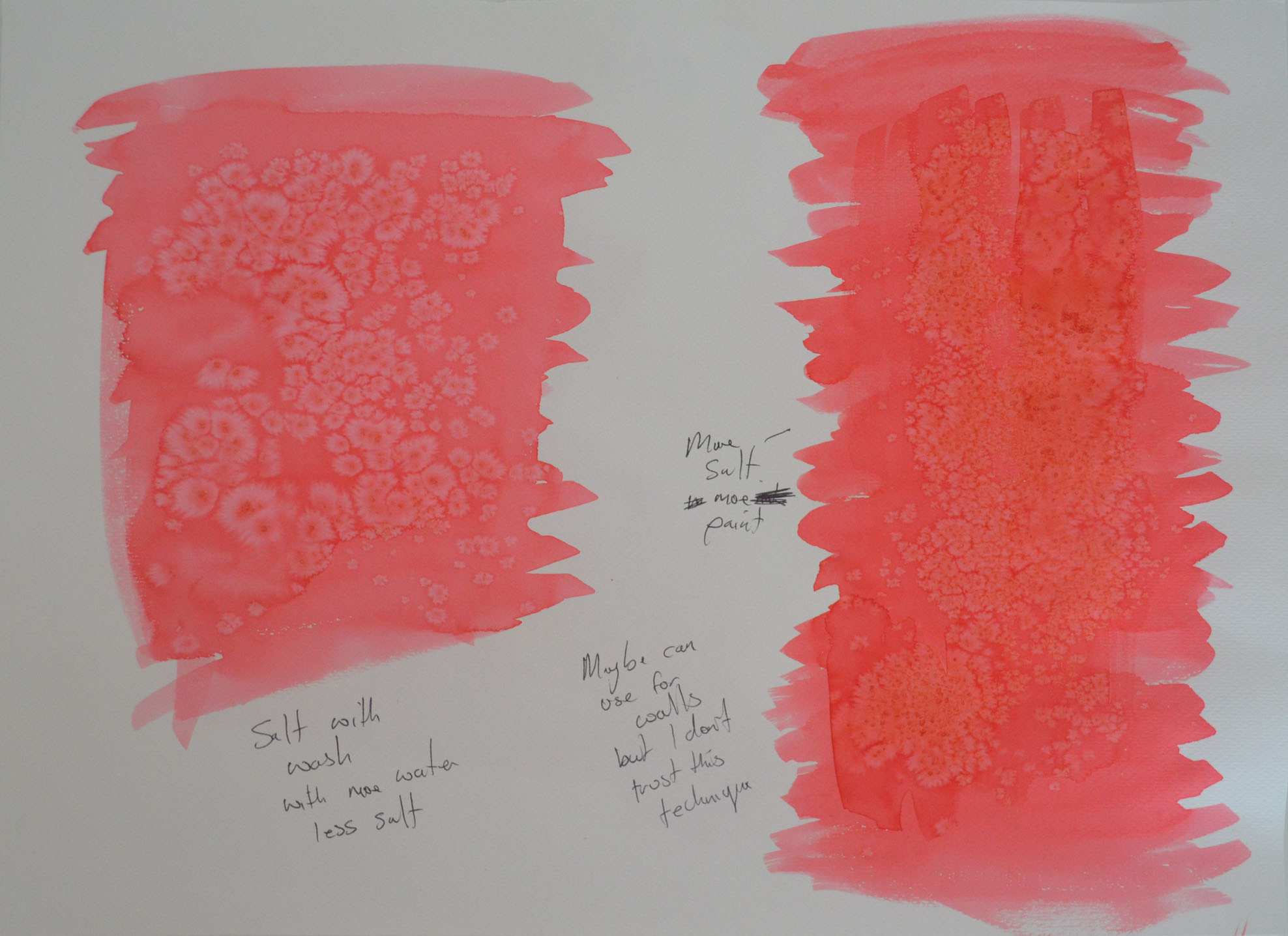
The first technique I tried was dropping salt granules on to a watercolour wash, see above. I had several bottles of Ecoline liquid watercolour so I dropped some in a jar and watered it down. I haven’t done much messing about or drawing with watercolour (probably haven’t been brave enough) so I still have a lot to learn about how much water to use in a wash etc. So I did a wash (the one on the right) in 30+ degrees heat and it seemed to start drying as soon as my brush left the paper, then i started to try and drop single granules of salt onto the wash. They didn’t do much and so I rubbed my hands and let the lot fall over the top of the wash. The result was a discoloured blotch effect that looked like fungus.

I decided to water the wash down some more and start again. this time I sed less salt and as you can see above the results are a bit better. However I wasn’t sure how I would use this technique in the finished piece.

2 - Dried Soap Suds on Watered Down Ecoline Wash
2 – Dried Soap Suds on Watered Down Ecoline Wash

The second technique  I used was soap suds. On the left I used a small amount of soap suds scooped up and placed on a watercolour wash, this time with more water added. The results were very different to what she had in the book where she had used them to depict pebbles on a beach, the patterns that mine made (after 2 hour of drying) resembled a cloudy sky.

3 - Soap and Suds on Ecoline Liquid Watercolour
3 – Soap and Suds on Ecoline Liquid Watercolour

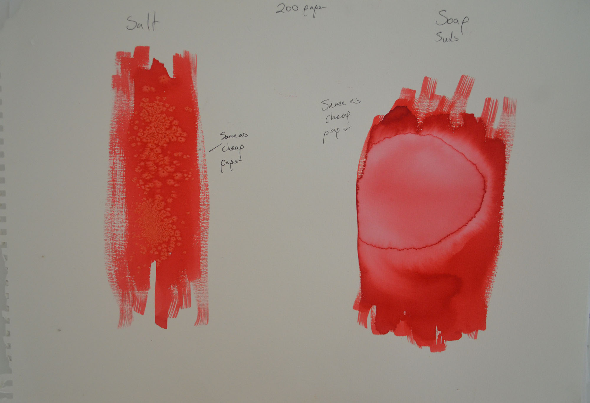
I wasn’t sure whether it was the paper I had been using or whether my washes were too thin that made my experiments look nothing like anything in the book so I had another try with a thicker wash on a higher quality 200 g/m2 watercolour paper, the results were almost the same.

My girlfriend came round that evening so I decided to stop with the experimenting for the night to do a series of sketches of sketches in water soluble pencil to see which worked best.

4 - Soluble Pencil on 200 gm2 Paper
4 – Soluble Pencil on 200 gm2 Paper

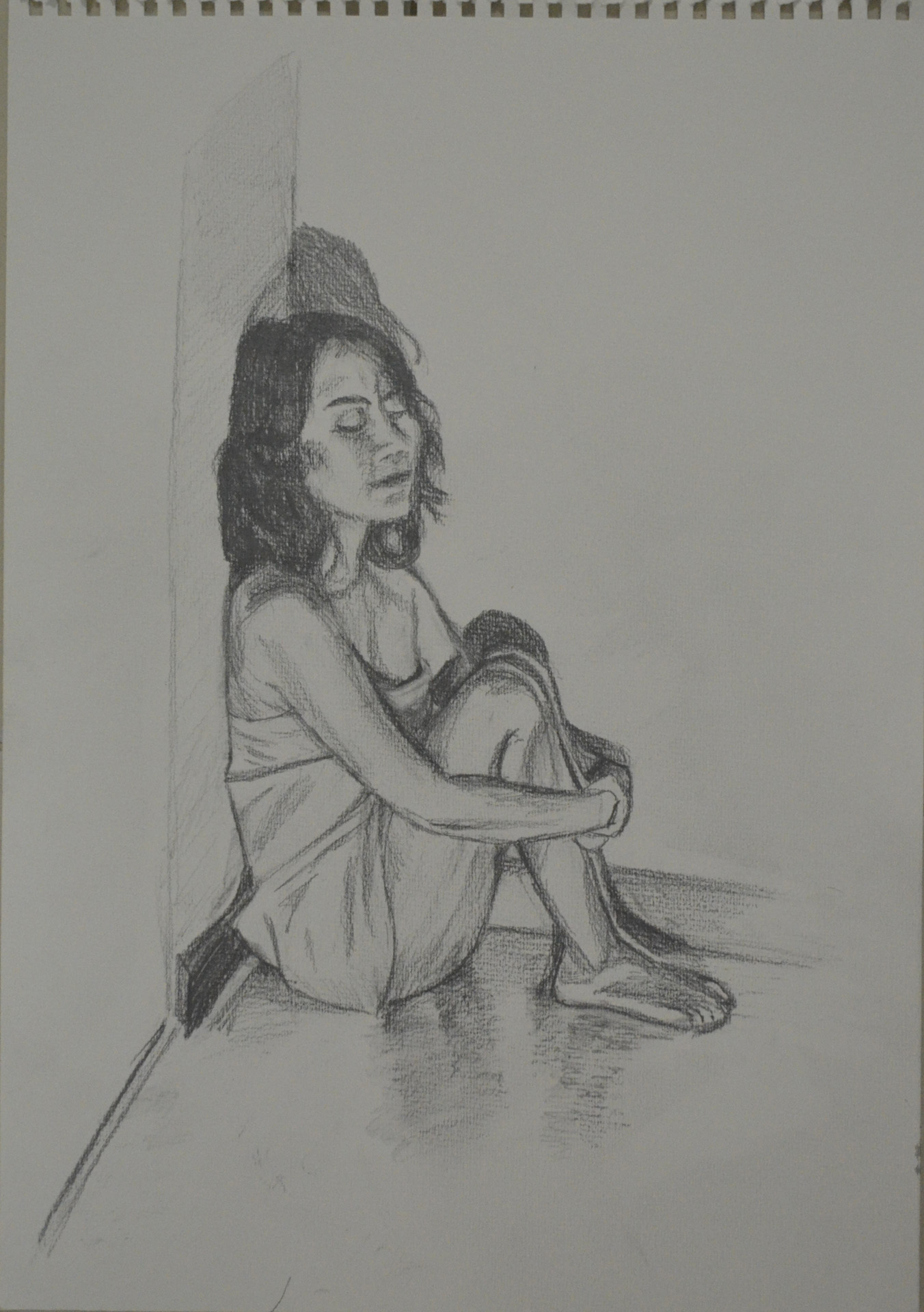
My first sketch was a very sorry effort indeed, I did exactly what I’ve been trying to stop myself doing in this last section, misuse the paper. I wanted to use the background but the figure still had to be a good size on the paper.

5 - Another Try at First Pose Water Soluble Pencil
5 – Another Try at First Pose Water Soluble Pencil

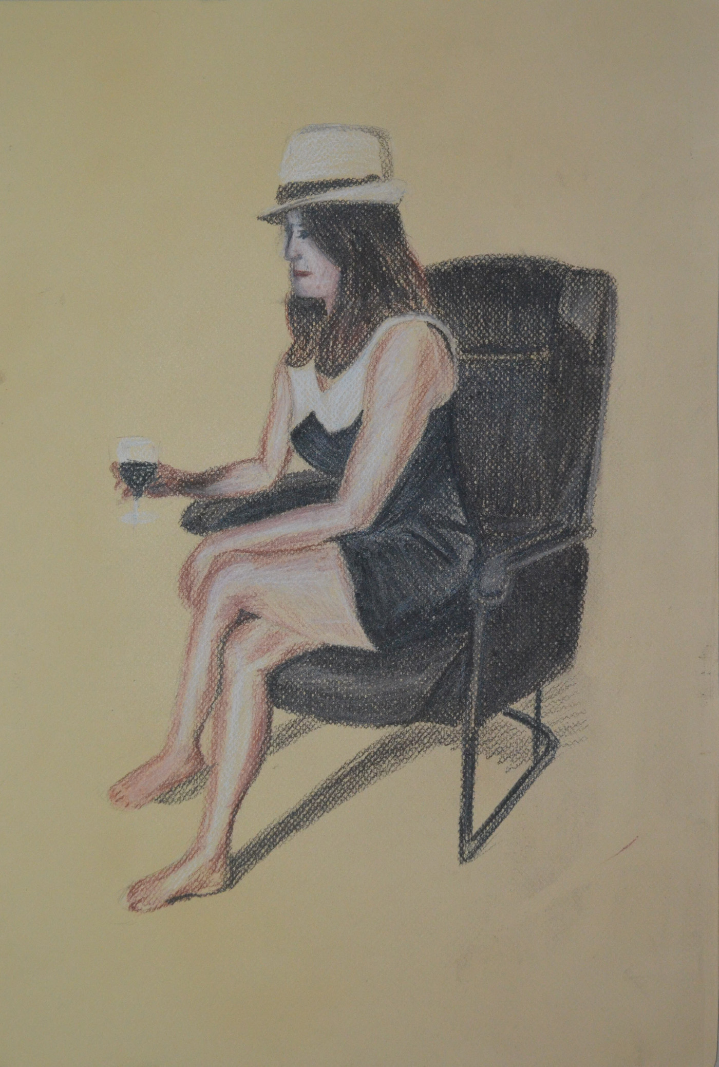
The second sketch was better but was still not that great and by now I decided that her clothes would be replaced with the orange cloth. The third sketch was a lot better and probably one of the best so far over the last two modules and the face was almost spot on which was an added bonus. However, I really wanted the background to play a bigger role in the finished piece.

6 - Semi Nude with Monks Robe Cloth
6 – Semi Nude with Monks Robe Cloth

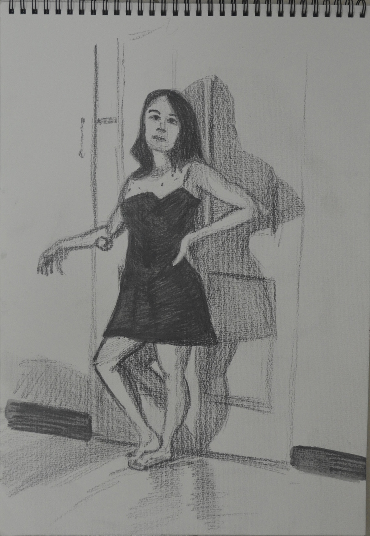
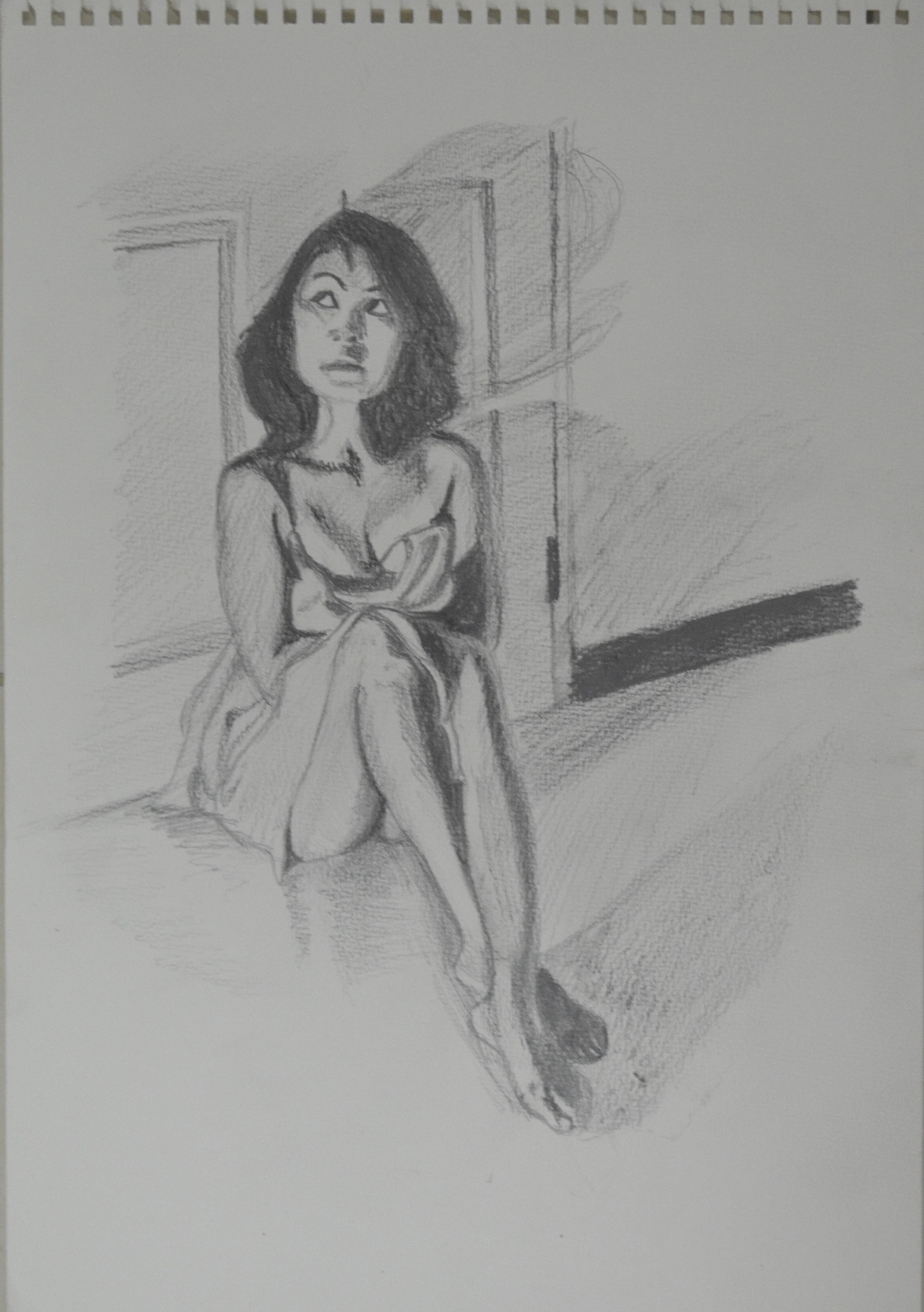
The next one was even better but I stopped at drawing the door, even though I knew this one would work it was a different mood to what i wanted to depict in the final piece. To me the pose in the drawing below was warm, welcoming, even romantic like she was waiting for her lover to come home, I wanted a totally different mood altogether for the final drawing.

7 - Semi Nude with Bent Knee
7 – Semi Nude with Bent Knee

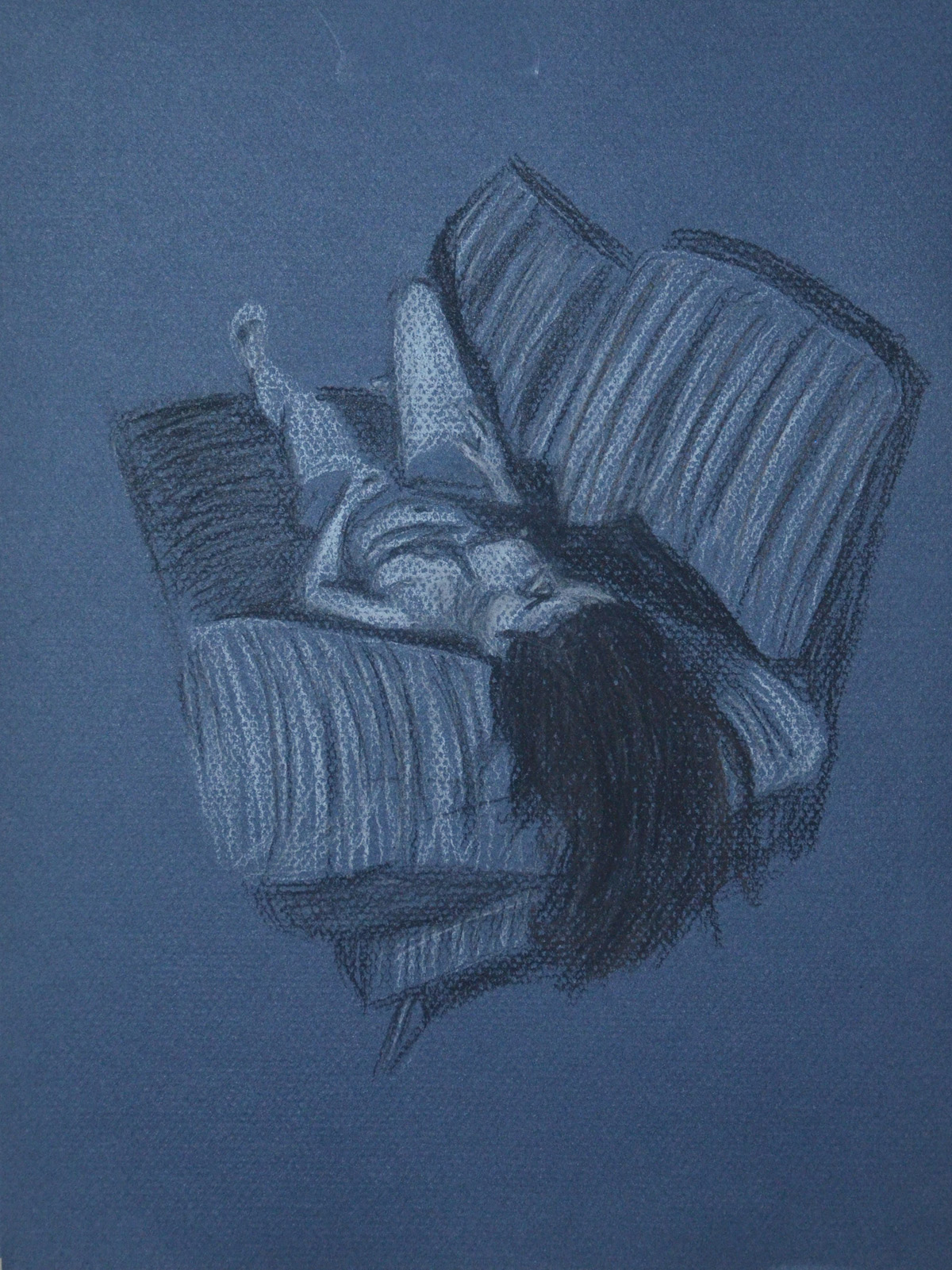
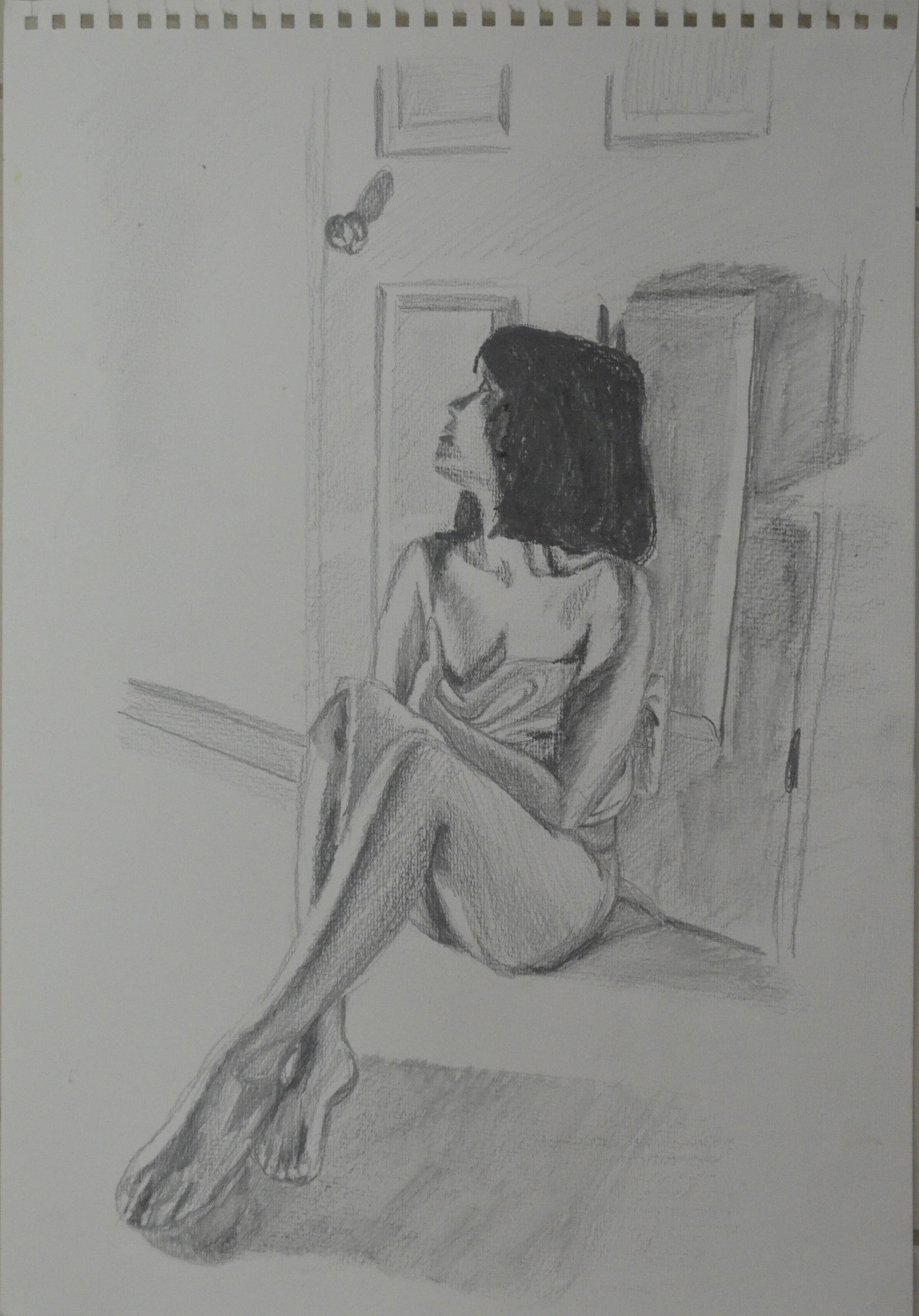
By now I was working towards the pose that I had my mind set on and the next pose below was pretty close but still it looked like she was waiting for someone rather than hiding from someone which is what I really wanted to show in the ideal pose. Because this was a 100% perfect in looks, proportion, the long shadows and everything else I nearly went with this but I decided to squeeze just 1 more sketch out.

8 - WaterSoluble Pencil Sketch with Door Handle
8 – WaterSoluble Pencil Sketch with Door Handle

In this last sketch I decided I had got the pose that I wanted, it still looked like she was waiting for someone to come through the door rather than hiding behind it but I decided to go with it in the hope that the medium and technique that I chose to complete the assignment piece would help me to depict the mood that I wanted.

9 - WaterSoluble Pencil Looking at Door Handle
9 – WaterSoluble Pencil Looking at Door Handle

To give my girlfriend a break I decided to do some colour drawings working from the sketch above, the first one was a total abomination. Until now, apart from the Fish on a Plate exercise I had used my watercolour pencils dry, as a substitute to my Derwent colour pencils which I wasn’t keen on the waxy feel of, the awful attempt at being artistic below was a very tired try at sketching with wet watercolour pencils. I decided that was it for one day.

10 - Sad attempt in watercolour pencil
10 – Sad attempt in watercolour pencil

At this stage I wanted to have ago at painting this in watercolour but basically I wasn’t ready for drawing in a painting medium and so I had another go at watercolour pencil to get myself ready for a more permanent medium, this was drawn from the water soluble sketch.

11 - Watercolour Pencil Drawing from Sketch
11 – Watercolour Pencil Drawing from Sketch

That afternoon I went and bought some Louvre watercolour paints, a jar of white Gouache and some brushes. I still really didn’t have a clue what I was doing with the paints which were in tubes and so I decided to take minimum risks and draw the figure in watercolour pencil  and use the watercolour paint for the floor and walls.

After completing the figure with watercolour pencil and wet brush I painted the shadows on the floor with watercolour paint using a brush and then dragged the paint off with the paper with a tissue, I’m not sure if there’s a special name for that technique. I painted the rest of the floor and the walls with a brush but I needed to show the light reflecting off both and so when the watercolour paint was dry I stippled the gouache paint over the top with the same brush. From there I finished the door off hatching with watercolour pencils then going over them with a wet brush.

I wasn’t worried that I hadn’t used any of the experimental techniques that I played around with earlier as this was an experiment just on its own but I wasn’t satisfied with how this turned out, it was stagnant there was no mood to it and I decided to change to a different type of painting medium.

12 - Watercolour Pencil, Watercolour Paint and Gouache
12 – Watercolour Pencil, Watercolour Paint and Gouache

I wanted to make a bigger connection between the door handle and the figure and i wanted to do it with a visible energy field and swirling hatching came to mind and the perfect medium for this would be oil pastel. And so I went from water soluble mediums to oil pastel.

I knew I would need a lot of white oil pastel as I planned to draw it on an A2 size paper and so this was my first experiment at trying to get the lines that I needed without using the valuable white. I really don’t know what I was doing here and it started to look more like a kids drawing from an horror movie.

13 - Oil pastel - Too dark - Trying not to Use White
13 – Oil pastel – Too dark – Trying not to Use White

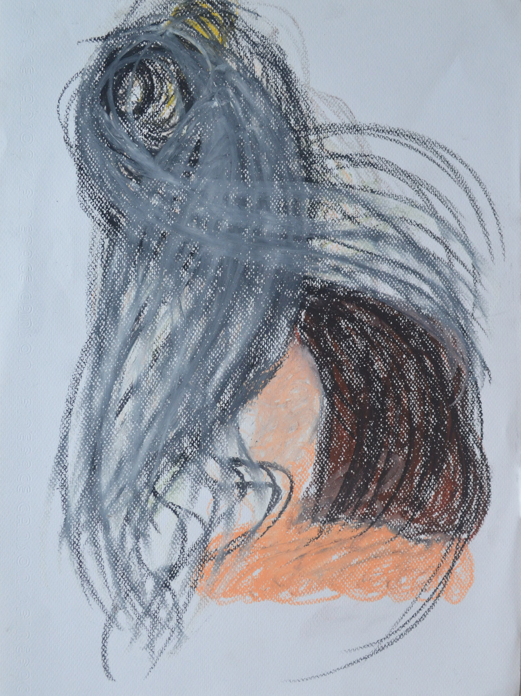
The second experiment was with much lighter colours using more of the white and trying as many different techniques together to see which one worked. From this it was obvious that the only one that was going to work and join everything together was circular hatching, or at least that’s what I call it, like a vortex drawing, spiraling out from the door handle connecting everything, or spiraling in.

14 - Trying a Few Different Techniques
14 – Trying a Few Different Techniques Together

I bought some dark grey Ingres paper and taped it to my largest drawing board with masking tape at the corners. I was still drawing from previous sketches including the latest watercolour/watercolour pencil drawing.

Two hours in and  something was beginning to form but it was more like the blurred image in a dream than anything else. I started with black for the hair plus pinks and various oranges for the skin, cloth and skirting board then white circular swirls for the walls and floor, with the white lines further apart for the darker shaded areas to let the grey show through. I wasn’t hatching in the same circular motion for everything but I kept going over the top with white to give the impression of doing so and only two hours in I was already on my second stick of white oil pastel.

15 - Drawing after First Two Hour
15 – Drawing after First Two Hour

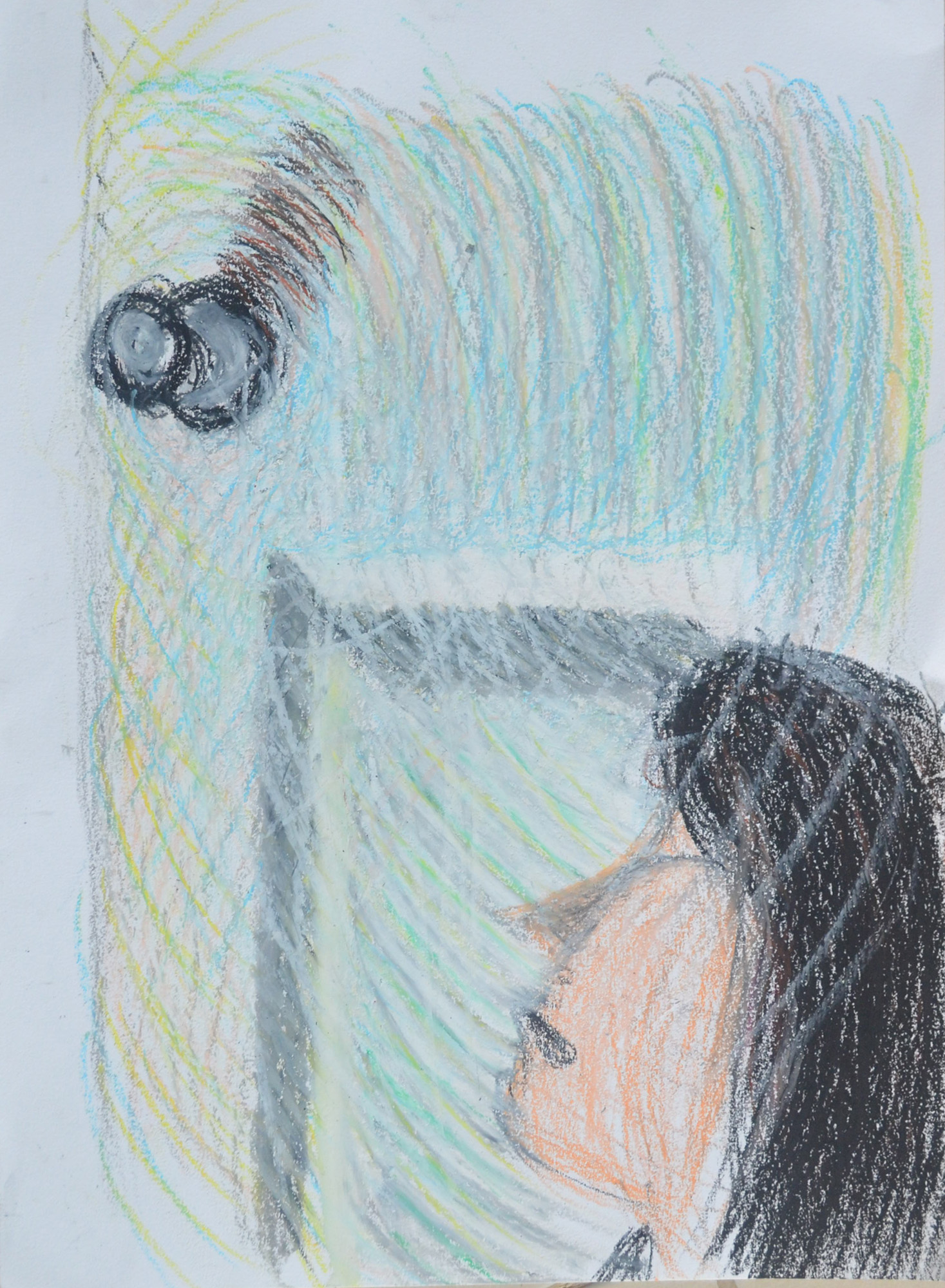
The next day and a few hours in and the picture was looking a bit too light as I added more and more colours to the vortex including pinks, yellows, greens and blues, I liked where it was taking me as long as i could darken it eventually. The figure looked unnatural and out of proportion and also two far away from the door but I wasn’t worried, I knew eventually she would be right where I wanted her. The most worrying thing at this point was that the door handle was too low and had to be lifted up and that was the starting pint of my vortex so everything had to be reworked.

16 - Fnal Piece Second Stage
16 – Final Piece Second Stage

After about a good few hours it was proving to be a very long process but  knew the end results would be worth it. by now I had got everything marked out and re-positioned the door knob and I was starting to draw in the shadows which would tell me if the figure was too far to the right or not on the paper…It was. What was niggling me at this stage though was if I should draw the face or leave it blur as at this stage it reminded me a bit of Francis Bancon’s work, still blurred between the point where the face was and where I had moved it to.

17 -After about ten hours
17 -After a good few hours

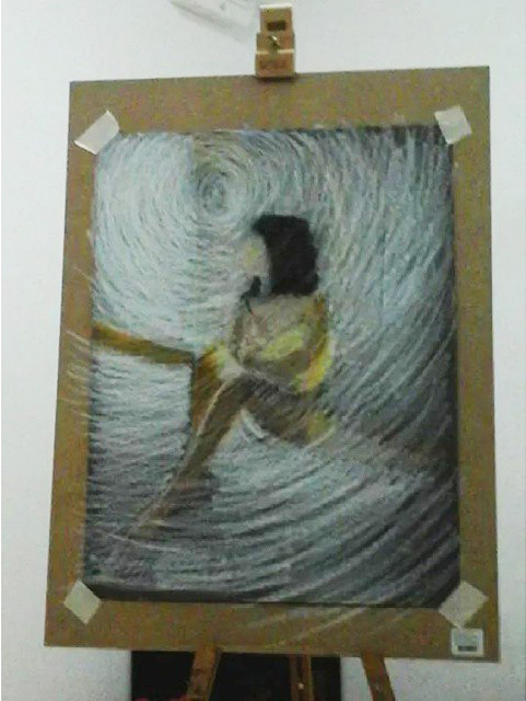
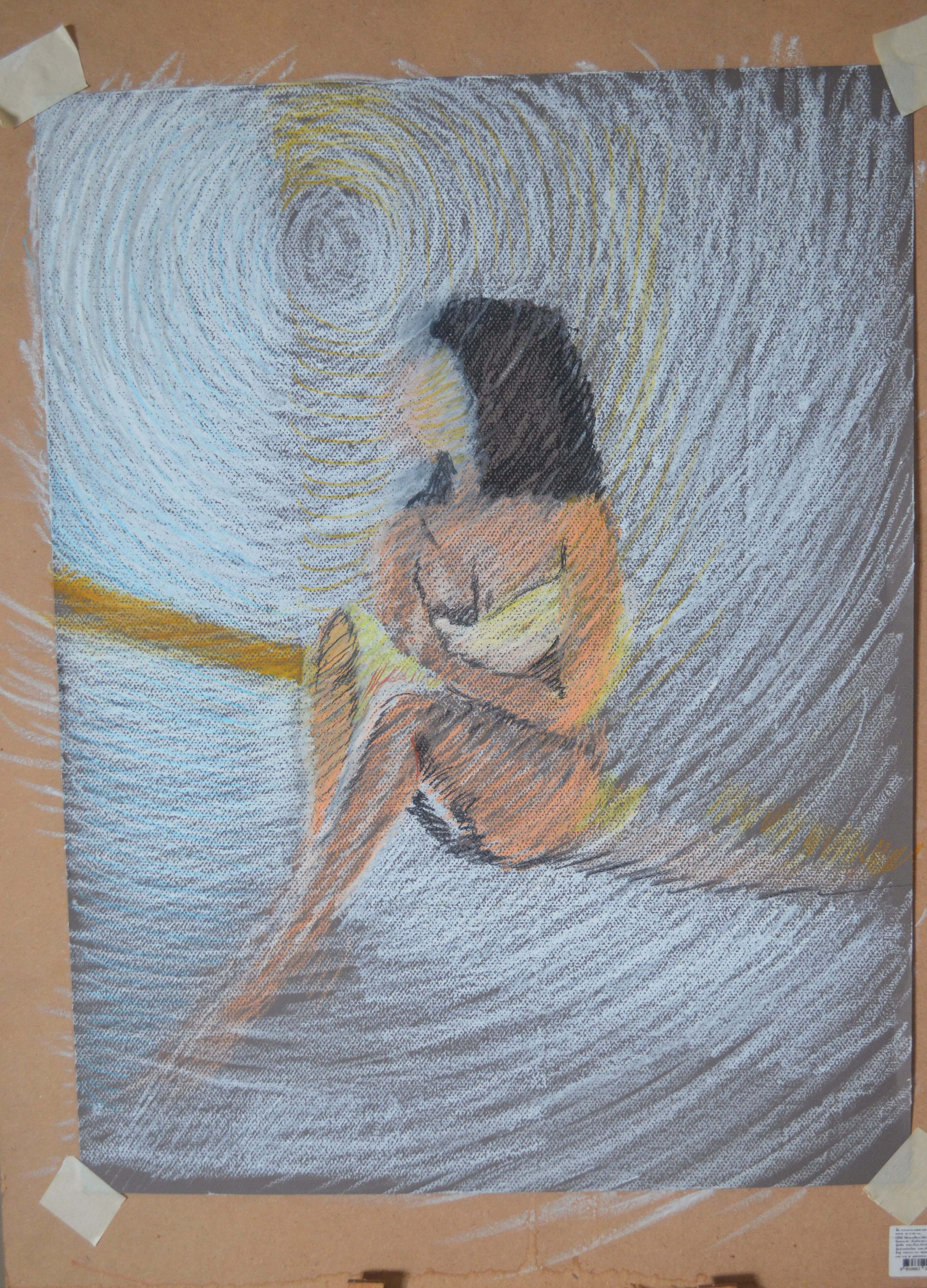
It took me a few hours longer to finish the drawing and as you can see between the drawing above and the drawing below a lot more work went into this piece, moving her even more so she was in a more natural position against the door but that’s not where all the work went. No longer is there any grey from the paper showing through the oil pastel, the darker parts are darker layers of oil pastel on top of the lighter ones and the shadows took at least two hours to correct.

I would say in all this piece took me the best part of twenty hours to complete. No sure if it was all drawing though, there was a lot of thinking during the process, as with any lengthy process like this I tend to get lost in my thoughts as I step back and look at the drawing from different angles.

18 - Assignment 5 Final Piece
18 – Assignment 5 Final Piece

I chose to do something completely different with her face, so far I’ve only managed to get my girlfriend’s face right with a pencil or water soluble pencil, I wasn’t taking any chances and used the face to help me create the vortex effect, instead of just circular hatching, all the way to the door handle.

Things I’m Happy with

I like the way it turned out.

Things I’m not happy with

It didn’t turn out the way I expected it to.

Project Structure – Three Drawings

3 - Lying Down - Conte Stick and Compressed Charcoal

For this exercise I was to make three drawings, 1 seated, 1 Standing up and 1 laid down looking down the body at a slight angle from behind the head.   I was to try and use a different medium for each drawing.

Again, my girlfriend volunteered to be my model for this exercise and for the first drawing, which I decided to do on the Canson pastel paper I had left over from my last research point, an anatomical drawing, she decided she needed some props,  a glass of wine and her trilby.

1 - Sitting, Conte, Charcoal, Conte Pencil
1 – Sitting, Conte, Charcoal, Conte Pencil

I have had no success so far at drawing her profile and this drawing wasn’t any different. I really need to practise drawing profiles. The drawing is on A3 and the thing that consumed the most time was not drawing my girlfriend but the chair she was sat on. I moved around her before starting looking for the best position and even though drawing from the front may have been better for drawing her face, I think that the angle that I chose was the best  or showing all the things we were asked to notice in the brief.

The next drawing was the standing pose and for this I really wish I had had some white charcoal, as my girlfriend in the lamp light against the door looked quite spooky.

2nd Pose 2 - Using Watersoluble Pencils for the first time
2nd Pose 1 – Using Watersoluble Pencils for the first time

I made two attempts in a medium I hadn’t used since I bought them over a year ago, water-soluble pencils. I would have been happy with one but someone decided she looked ugly in the first drawing, the second however, looked a hell of a lot better in every way.

2nd Pose 3 - Water Soluble Pencils Better Proportions
2nd Pose 2- Water Soluble Pencils Better Proportions

For me, the third drawing was the easiest drawing for just about everything. I know I was to try using different tools for each drawing, but I couldn’t think of any other drawing tool that would help me capture the mood as much as pastel on blue paper.

3 - Lying Down - Conte Stick and Compressed Charcoal
3 – Lying Down – Conte Stick and Compressed Charcoal

Just like the first drawing, I spent most of the 1 hour that it took me to draw in the sofa, I was very lucky to get the shadows across the belly, breasts and rib cage right, as they didn’t take much adjusting.

Study of Several Trees

My finished Study of Several Trees

While in the park browsing unique trees for the last two exercises I came across this group of trees and just had to take a photograph. I have no idea what kind of trees they are but they seem to be the same tree as the Banyan in the last exercise at the early stages of being latched on by the strangler fig, I don’t know why but they made me think of wailing banshees.

My chosen group of trees

Being in a great location with a European style bridge visible in the background and some nice reflections in the water behind them, I had no doubt at all that it would be these trees that I would be drawing for this exercise until it came down to choosing the medium. Given the trees surroundings oil pastels were ideal but on A3 quite clumsy and so I thought twice about them. I also thought twice about drawing these trees and started to look at other photos I had taken.

My finished Study of Several Trees

In the end I did like the brief suggested and zoomed in on the three trees in the centre until I thought they were large enough to work on in oil pastel and give some texture through hatching rather than clumsily sketching from a distance. Being late with my third assignment I was dying to rush through this piece but I decided to take it steady and use a second sheet to get colours and blends right before committing to the final piece. There would have been nothing worse than getting half way through the drawing and messing up.

testing oil pastelsI love the final drawing, which, because of the texture of the paper seems to be made up of little dots which reminds me of a George Seurat painting and has given me some ideas for my assignment piece.


Check and Log – Perspective

2 Study of Landscape Using Line 2nd Attempt

What problems did you find in executing perspective drawings?

I thought I would fly through this project as I’ve always been quite good with perspective, having studied design and communication at school but I struggled with the Angular Perspective exercise and did quite a lot of line correction, mostly due to the irregular shape of the temple roof and getting that wrong threw everything out.

Another problem I had was lining the wall up  at the side and to the front of the temple which was like drawing another level at the same perspective.

My biggest problem is trying to get everything perfect rather than trying to keep the right perspective while simplifying the drawings.

Make notes on the merits of using, or not using, rulers to guide you.

I think that using a ruler for me would have to be the final solution for a smaller drawing but maybe a necessity for larger drawings.

For smaller drawings taking your pencil from A to B without wobbling all over the place isn’t that difficult and once you have the basic shape of the subject it can be developed with some correction and modeled to almost perfection.

I feel that using rulers on the other hand for anything other than technical or larger drawings, for me especially, may lead to overworking the drawing and even more correction trying to find the right angles, right lengths etc.

Masters of Detailed Drawing 1, 19th Century, Thomas Hartley Cromek

Study of Plants, Ariccia Watercolour, over traces of a pencil underdrawing.

For this research point I was asked to find two artists who exemplify mastery of detailed drawing.

I used to have a reproduction painting site and am familiar with the works and lives of quite a few but since starting this course I’ve been introduced to new artists and new techniques so I thought I’d carry that on by typing in a few keywords on Google to see where they took me.

The first artist I found was a 19th century artist called Thomas Hartley Cromek and after seeing that his place of death was Wakefield, my home town, I made the decision to research this artist a little more.

Born in London in 1809 Thomas Hartley Cromek was the son of Robert Hartley Cromek the  engraver and art dealer who allegedly cheated William Blake out of potential profits. In his childhood he moved from school to school starting off his education at Enoch Harrison’s school in Wakefield and then onto the Moravian School in Fulneck. He then moved back to Wakefield to study at the grammar school there before returning to Harrison’s.

Thomas Hartley Cromek received his first art lessons from a Wakefield based portrait painter, James Hunter but then in 1826 he moved to Leeds study landscape painting under Joseph Rhodes, while studying in Leeds Thomas also taught himself anatomical drawing.

He travelled to Italy in 1830 to study the old masters and spent most of the next 20 years within the country mainly in Florence eventually reaching Rome where he attracted much attention for his ‘excellence in drawing and his careful colouring’ – Wikipedia. While in Rome he gave drawing lessons to several distinguished visitors including the British artist and poet, Edward Lear.

Between 1831 and 1849 Thomas Cromek spent most of his time drawing the major buildings in Rome as well as Greece but then was forced to leave Rome with the outbreak of the first Italian War of Independence.

There’s not much information about Thomas Hartley Cromek online about techniques, ideas, influences etc but I did find quite a few images.

Study of Plants, Ariccia Watercolour, over traces of a pencil underdrawing.
Study of Plants, Ariccia
Watercolour, over traces of a pencil underdrawing.

I found many of his works online but it was the drawing above that caught my eye and I thought it was quite relevant to this module. The drawing itself is only 7 1/4 x 8 1/8 in in size and yet his brilliant use of shadow amplifies the detail of the drawing. I enlarged this image on my computer to the size he would have worked at and was amazed how much detail he has got into such a small drawing with what I still regard to be a messy medium, for me that is anyway. He has managed to depict some very thin leaves and blades of grass and makes this picture seem a lot bigger than what it is.

THE TEMPLE OF ANTONINUS AND FAUSTINA, FORUM, ROME - WATERCOLOUR 18 1/4 X 13 INCHES
THE TEMPLE OF ANTONINUS AND FAUSTINA, FORUM, ROME – WATERCOLOUR 18 1/4 X 13 INCHES

 Just like his drawing of plants and flowers his watercolour paintings of buildings such as the Temple of Antoninus above shows brilliant detail and colour as well as amazing shadows which really amplify the bulkiness of the stone structure.

Bibliography

Wikipedia

Stephen Ongpin Fine Art

Scaling Tools for Enlarging an Image – Acetate Grids

Acetate Grids for Enlarging an Image - My new scaling tools

For this project of ‘Enlarging an Image‘ I was instructed in the course materials that I needed two acetate grids, one with small squares across it and the other with large squares printed on it.

As instructed I went out and bought a roll of acetate and card and made myself two acetate grids, one small and one big and glued them to card so I could use them as view finders. I managed to slice my finger open with a Stanley knife while making the big one so you can see the dodgy line where the CD marker hit the big chunky bandage.

Acetate Grids for Enlarging an Image - My new scaling tools
Acetate Grids for Enlarging an Image – My new scaling tools

Unfortunately I didn’t get to use them as I didn’t really need to because I was also instructed to draw a grid with an HB pencil over the small image, where as I could have placed the small grid over the image in my A5 sketchbook instead; but I can see they will be getting plenty of use in the future. The size of the squares on the small grid are 2cm, the size of the squares on the large grid are 4cm, I think I also need to make those 2cm as well.

Using Texture – Check and Log

Yellow crayon on breeze block wall

Have you discovered any new ways of using your drawing tools to depict surface and texture?

Not as much as I wished I had, there were a few things that I couldn’t find here in this part of Bangkok such as a chunky sponge, I would have loved to have tried dripping or splashing ink for the texture of this. However I did discover new ways of hatching for as in the the fur of the teddy bear, hatching with small strokes in flowing patterns. I also discovered new ways of using my putty rubber to show texture such as twisting for the mop rug underneath my composition.

a Drawing with Textures - Second Drawing
a Drawing with Textures – Second Drawing

How successful were you at implying form with little or no tonal hatching?

I seemed to use some kind of hatching for nearly everything except the mop rug. The technique that I used to depict the mop strings (as I would call them) showed real depth. This was a mixture of squiggles, circles smudging and twisting with a putty rubber and it worked well.

What are your impressions of frottage as a drawing technique?

I really love the idea of using this as a drawing technique and I love the way that a surface of one thing can give you a totally different result to what you thought it would and how something as simple as the joint of 4 breeze blocks can give you an idea for a drawing of a crucifixion or graveyard scene. The best thing about frottage is that you can use it for texture in drawing you are already working on or it can give you an idea for a new drawing.

Yellow crayon on breeze block wall


Enlarging an Existing Image

Enlarging an existing image 1

For this exercise I drew a thumbnail drawing of my favourite coffee cup roughly 10 cm square in my small A5 sketchbook, which I’ve barely put to use so was good to fill a page or 2. Once I had finished the thumbnail drawing I drew a grid of 2 cm squares with an HB pencil over my thumbnail sketch.

Enlarging an existing image 1
Enlarging an existing image – A5 sketchbook

In my A4 sketchbook I drew 3 cm squares, deciding they were a perfect size for this object on this size paper, with a larger more detailed composition I would have probably needed smaller squares in both sketchbooks.

Enlarging an existing image - A4 Sketchbook
Enlarging an existing image – A4 Sketchbook

To make it easier for myself to identify which squares I would be drawing in I labelled the squares with letters down the left hand side and numbers across the top. However the drawing was quite low in my A5 sketchbook so in my A4 sketchbook I started at B instead of A lifting the drawing up 1 square.

Enlarging an existing image using grids
Enlarging an existing image – side by side

I loved this ‘Enlarging an Existing Image’ exercise, it was like piecing together a jigsaw puzzle but a hell of a lot easier and as the squares weren’t that big quite easy to judge where  a line curves or which point of the grid they would meet. Admittedly I did do a little bit of rubbing out with an eraser but not that much.