What are the difficulties in separating cast shadow from reflected Light and shade?
The difficulty in separating cast shadow from reflected light and shade is that there is very little tone difference between them and makes it hard to determine which is which. However the fact that they fall in opposite directions does help to determine which is which.
The reflected shadow and light follows the contours of the objects how have you shown this in your drawing?
To show how how reflected light follows the contours of the objects I used fluid strokes and hatching techniques as well as following the contours with a putty rubber.
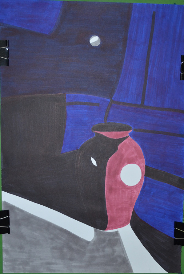
The brief for this was to make a drawing in a similar style to Patrick Caulfield White Ware screen prints, it wasn’t that easy. I decided that I wasn’t going to keep looking at his images so after I finished my part 1 of this research point, researching him, I thought I could remember enough about his prints and paintings to work in a similar style.
I decided to work on an A2 sheet from my larger sketchbook which is too big to work with felt tips and I wanted to show as little pen or brush strokes as possible so I went out and bought some Kurecolor graphic design markers, which were very expensive but well worth the money.
I used the vase that I used in an an earlier exercise ‘Study of Light Reflected from one Object to Another’ and placed it in the chair that I would usually sit in to do my work. I wanted to shine a more acute light on my subject so instead of using the bendy light that I used before I used a torch that I got free from the local western supermarket. I knew that the batteries in the torch wouldn’t last that long so I turned all the lights off found the right angle for the torch to shine at and took a photo, then I worked completely from the photo.
Photo with Torch, vase and Chair
I started by drawing the shadow on the vase, then instead of using white I used colour for the other half, I purchased the markers day before but I swapped vases so the colour did not match but I wasn’t worried about that, I just wanted to know if I could draw something in the similar style as Patrick Caulfield, I highlighted the light reflected from the vase vase by leaving those areas blank.
Drawing after first Two Colours
I used grey for the light that spread from the torch beam as I had I didn’t want the drawing to be completely dark and I had seen Patrick Caulfield also use grey in his paintings, this paid off.
Finished drawing
I cut down on the detail in my drawing and over exaggerated the detail that was left, after adding colour to the vase shadows and foreground I stopped looking at the photo and worked completely from memory hence the various differences like the position of the door handle and seams in the chair positioning where I thought they would look best rather than where they should be.
I was really happy with the finished drawing and even though it doesn’t resemble any 1 particular Caulfield style of painting you can tell he is the inspiration behind it.
Patrick Caulfield (29 Jan 1936 – 29 Sept 2005) was an English painter and printmaker who started his formal education as an artist at the Chelsea School of Art in 1956. He then studied from 1960-1963 at the Royal College of Art where he was one year below students who were credited with starting the UK pop art movement.
As a student he was influenced by abstract painters such as Mark Rothko and Jackson Pollock even though he only experimented in abstract painting for a short time. His bold, colourful prints and paintings are deemed to be Pop Art even though Caulfield himself was wary of being connected with any such movements. His association with the movement with ‘Pop Art’, mainly due to exhibiting alongside David Hockney, Allen Jones and R B Kitaj at the ‘New Generation’ exhibition in 1964.
Unlike the American Pop Artists his works depicted ordinary every day subjects such as a vase, buildings or interiors rather than images of popular culture such as celebrities or advertising products. It is the way he treats his subject that that gives his work a Pop Art feel, creating ambiguity by treating fine art subjects in an unrealistic and stylised manner.
When I first looked at Caulfield’s work it seems to me that the negative space plays just as much an important role in his paintings as positive space. In some of his images he uses negative space to sculpture the objects which in some cases are an abstract image but we get the sense that we are looking at the whole thing subject.
In the ‘White Ware’ screen prints he has managed to balance out the level of importance between negative space, reflected light and what we automatically presume is the main subjects such as a vase. With this he leaves the viewer trying to imagine what the light source maybe or what could be causing the shadows in his images. He also creates a good sense of distance between the foreground objects and what’s happening in the background by using very simple shapes to depict reflected light for example.
In some of these prints he has inserted a second object behind the main subject, this is made up of one or two shapes and difficult to work out what it is but is just as important as the main subject. I love some of his other paintings and in the future I would very much like to paint something in the style of ‘After Lunch 1975’ due to the simplicity of my Bangkok apartment and the technical city scape outside. For now I will concentrate on the task at hand and make a drawing in the style of his ‘White Ware’ screen prints for this research point.
In this exercise I was instructed to ‘Use charcoal, a putty rubber and pick two objects with shiny reflective surfaces. Decide on the size of the composition, use A1 or A2 paper so that you can do bold strokes. Try to fill the paper with your objects showing the reflected light and shade of one object falling on another and try to leave very little background space.’
Photo of Chosen Objects, Sieve and Ladle
I went out and purchased a few objects specifically for this exercise, after putting them together in pairs to see how they reflected off each other I settled for what I think is some kind of sieve and a ladle. I chose A2 for the composition because my drawing board wasn’t big so an A1 size drawing board will be my next purchase. The brief said to leave very little background but I wanted to show some of the handle of the ladle and the shadow that it cast but to be honest I could have shown a lot less and made the objects bigger.
Drawing Pattern of Shadow
I sketched an outline with an H3 pencil then as instructed I drew the basic pattern of shadow first with sweeps of charcoal. I did try hatching but the charcoal seemed to leave too darker marks on the paper even trying the charcoal at different angles, this may have been down to the smoothness of the Carson paper that I used.
I tried to stay away from smudging the charcoal as it said nothing about it in the brief but when I did resort to smudging my finger took too much off so I used a stump that I forgot I had. It was great for smudging the charcoal without taking too much off as well as drawing solid outlines. I think if I had used A1 sized paper I could have probably had a better chance of completing the drawing using hatching.
Finished Drawing, Shadows and Reflective Light and Shade
I did start off with the darker tones on the ladle but just on the inner shadows to make sure I was drawing the correct shape (hopefully in time I’ll get more confident with charcoal) and then once everything was fine I switched to the mid tones and then built up to the darker tones.
For the lightest tones and the light reflected from the bendy lamp I used a putty rubber to erase the charcoal. I bought a couple of Conte knead-able erasers which were much better quality than the ones I bought when starting off the course which stuck to everything in the Bangkok heat and left debris on the paper.
I enjoyed the exercise and proud of the result but I am still lacking the confidence with charcoal. I seem to still have a lot more to know about the different types of charcoal, if time allowed I would have liked to have done this again on an A1 sheet of paper to see if I can do the whole exercise without smudging.
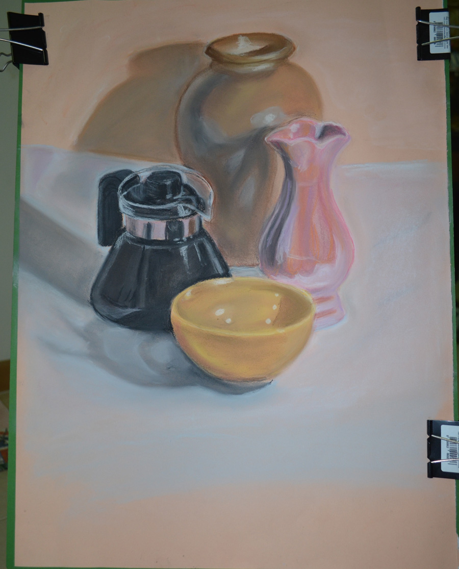
The brief was to ‘Arrange two three objects , at least one of which has a shiny reflective surface, side by side with a small space in between them. Place a light source so that it is to one side of your (two) objects to cast clear shadows. Sit so that you can easily see the shadow on one side of the objects and the light on the other’.
Objects with Coloured Paper Background
The first sentence said two or three and the second paragraph said two but the example students drawing had quite a few objects so I want for four, which were a ceramic bowl, a pearlescent vase, a Chinese style vase and a glass teapot. The glass teapot had a chrome band around it but it didn’t cover a large area so I filled it up with a very strong black coffee in order to make the glass more reflective
The sample student drawing was on coloured paper which gave me an idea, so I bought some large sheets of orange coloured paper and set one as the background and did the drawing on the other. The medium I chose for this exercise was hard pastel by Cretacolor, I had never drawn with hard pastel before and this was the perfect chance to lose my virginity.
I was instructed to draw the main shadow pattern created by the light source first then add the reflective light and shadow patterns to the drawing. I followed the instructions drawing it in graphite pencil first as I knew that when it came to add the shadow patterns and reflective light with the hard pastel I would have to work on an object at a time due to how much work blending in this medium needed especially on the coloured paper that I chose.
A Close up of my Finished Drawing in Hard Pastel
I found that I bit off more than I could chew and it took me about 6 hours to finish the exercise, and the colours on the objects in the drawing were quite different from real life, I find blending most mediums quite difficult and really need to spend more time experimenting before working on a piece.
Although happy with the finished drawing I feel I have let myself down and could have gone out of my way to find better objects that were more reflective, although the teapot reflected the colour of the other objects quite well over the small reflective area, the pearlescent vase also did quite a good job.
I could have also done a better job of positioning the objects on the paper which was approximately A3 with about a third of the paper gone to waste.
The valuable lessons that I have learnt from this are that I should choose my mediums and objects wisely and to use more of the paper next time.