Still Life Group Using Line

Still Life Group Using Line 2

In the brief for this exercise I was to set up a still life group out of objects at my disposal, either objects that naturally connect together or deliberately contrast. For this I did a supermarket shop and purchased onions, a big chunk of knobbly Asian pumpkin and a red cabbage thinking about three objects that gradually went from rough to smooth.

I had to think about the following questions: ‘How will I treat the objects?’, ‘How will their connections be clear?’, ‘How will I capture the differences between the objects?’, ‘How do the objects relate to their background? and ‘How will I reference the colour in the group in this drawing?.

Then with these questions in mind I had to select a medium such as pen and ink, marker pens or fine black pen and A3 paper and begin to draw; which is exactly what I did. I wanted to use pen and ink for this drawing as I have kept delaying it but when i saw I would be using them in the next project I decided to use a Rotring 0.3 drawing pen.

My objects had already been in the fridge a couple of days so they wouldn’t last long once I took them out and my SD card for my camera kept locking due to me removing it too often so I had to work fast as I couldn’t get a photo to work from in case I didn’t finish before evening came.

 Still Life Group Using Line 1st Drawing
Still Life Group Using Line 1st Drawing

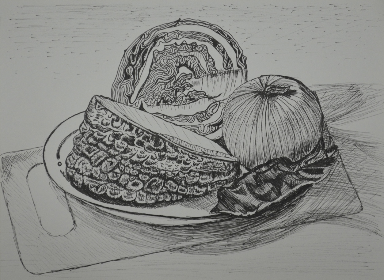
There was no drawing this out in pencil first for me, I wanted to do start as I meant to go on and and put my Rotring drawing pen to paper. I started on the outline of the three objects together rather than drawing them individually then when the outline was complete I finished the shape of each object individually.

From there I started on the lines of the onion which were fairly simple and while I worked my way around the onion with a variation of light and dark lines (applying different pressures) I thought about how I was going to approach the different objects. Working from right to left I tackled the red cabbage next and it was extremely difficult; trying to view the patterns as a whole and then working on the lines individually was enough to drive me crazy.

The pumpkin was the next obstacle and because this was a still life group using line I had to exaggerate the texture of the pumpkin at certain parts where there was no real pattern at all. It looks like I have tried my hardest to depict tone here but actually I wasn’t thinking about tone at all. I was just trying to complete the surface of the pumpkin with as many different line as possible, squiggly lines, short strokes, anything that came to mind.

The cabbage leaf on the right of the drawing was probably the most difficult object in this drawing and was very difficult to draw without hatching to depict it’s smoothness which I wasn’t very successful in doing so.

Then when I finished the composition I ruined the whole picture by doing some stupid speckle background and so I decided to have another go.

Still Life Group Using Line 2

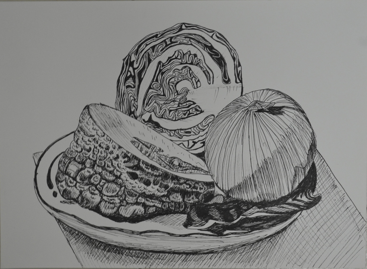
This time I tried a slightly different angle and the finished drawing was cleaner but there are a lot more things that I am unhappy with. For one I don’t know how the cutting board got so out of shape the cabbage leaf didn’t turn out that great and the pumpkin surface was a little too exaggerated but certain parts of the pumpkin surface turned out a lot better.

Research – Antonio López García

Antonio López Torres’ House, 1972-75

My tutor suggested that I should look at the works of Antonio López García a Spanish painter and sculptor known for his realistic style. As usual I started my research by popping onto Wikipedia to see if I could find some valuable keywords that could take me elsewhere and seeing that he is still alive I looked on YouTube to see if I could find a documentary or interview and i found a small part of an interview here.

http://www.youtube.com/watch?v=s2rXX2FhUeI

It’s not only good to hear the artists voice but it’s also good to check any contradictions.

Antonio López García was born into a farming family in Tomelloso 1936 and was probably expected to carry on the family tradition as a farmer until his uncle, Antonio Lopez Torres a local landscape painter took an interest in his drawing when he was 13 years old.

As he says in his interview “…at 12 and 13 he didn’t pay much notice of me, I did the kind of drawings that all children do and he didn’t pay much attention to me…at 13 he saw something that made him intervene. He told me not to copy illustrations, that this was not good and I should do things directly from nature”

Antonio moved to the Spanish capital in 1949 to study so that he could qualify for entrance to the Real Academia de Bellas Artes de San Fernando, which he did and won a number of prizes while studying at the school from 1950-1955. While attending the school he met his future wife and several friends who would later form a realist group together in Madrid. In 1955 he won a scholarship which enabled him to travel to Italy where he studied paintings from the Renaissance.

From the moment i saw the examples of his works that my tutor sent me I realised why my tutor suggested that I look at this artist. Facebook can be a bit of a demon sometimes and since I started this course I’ve been receiving regular posts from various hyperrealism pages which I think have had a big influence on my finished pieces. As a painter I seem to follow a more surrealistic path but this course has taken me in a very different direction. However the negative side of this like my tutor says is that I tighten up while working on the finished pieces.

Antonio López García was regarded by the critic Robert Hughes to be ‘the Greatest Realist alive’ with his style sometimes deemed hyperrealistic and yet his works are still very fluid, something that my drawings lack at this time.

López García has devoted himself to creating images of everyday subjects such as buildings, plants, his bathroom and even the red brick wall in his backyard but then he expresses them in such away that make them both beautiful and captivating.

As the artist explains, “the pictorial nucleus begins to grow and you work until the whole surface has an expressive intensity equivalent to what you have before you, converted into a pictorial reality.“-Wikipedia

At this time I can genuinely say that I can see this artist having an influence on my future work especially now i have discovered new mediums and I  am beginning to develop my drawing skills. I have had very similar ideas from time to time but lack of skills and knowledge of mediums have prevented me from putting my ideas on canvas or paper. Two of his works that particularly stand out to me at this time are ‘Antonio López Torres’ House, 1972-75’ which my tutor sent to me in the sample of his works and ‘Sink and Mirror, 1967’.

Antonio López Torres’ House, 1972-75
Sink and Mirror, 1967

Enlarging a Simple Flat Image

Enlarging a simple flat image - Side by Side

This exercise was aimed to give me further practice in enlarging original drawing with a slightly more complicated structure. For this exercise I chose a fancy jar of face cream (borrowed from my girlfriend), a roll on deodorant and a plastic Nasol bottle.

Enlarging a simple flat image -
Enlarging a simple flat image – initial sketches

To get familiar with the objects I did a quick 3 minute drawing of each one before putting them together for the composition in my A5 sketchbook. This helped me to recognise problem areas on the objects such as the top of the Nasol bottle that would have looked a mess too wide or too narrow.

Enlarging a simple flat image - A5 sketchbook
Enlarging a simple flat image – A5 sketchbook

As in the previous exercise ‘ Enlarging an Existing Image’ I drew the composition of three objects in my A5 sketchbook and drew a grid of 2 cm squares over the top of the composition with an HB pencil. Just as in the previous exercise I labeled the squares by writing numbers across the top and letters down the right hand side to stop any confusion to which squares I would be drawing in.

From there I drew a grid of 3 cm squares in my A4 sketchbook, again moving the composition up the page by taking away the A row in the grid then reproduced the drawing on a larger scale.

Enlarging a simple flat image - englarged sketch
Enlarging a simple flat image – englarged sketch

Again, I really loved this exercise it was so simple and easy, I erased the odd line due to points of contact on the grid being slightly wrong, but the results of drawing these 3 objects were actually better than in the first object. I think this  was down to viewing all three at once rather than trying to look for faults on the angles and curves of one single object.

Enlarging a simple flat image - Side by Side
Enlarging a simple flat image – Side by Side

Research Point – Patrick Caulfield (Part 2)

drawing in the style of in the chair that I would patrick caulfield

The brief for this was to make a drawing in a similar style to Patrick Caulfield White Ware screen prints, it wasn’t that easy. I decided that I wasn’t going to keep looking at his images so after I finished my part 1 of this research point, researching him, I thought I could remember enough about his prints and paintings to work in a similar style.

I decided to work on an A2 sheet from my larger sketchbook which is too big to work with felt tips and I wanted to show as little pen or brush strokes as possible so I went out and bought some Kurecolor graphic design markers, which were very expensive but well worth the money.

I used the vase that I used in an an earlier exercise ‘Study of Light Reflected from one Object to Another’ and placed it in the chair that I would usually sit in to do my work. I wanted to shine a more acute light on my subject so instead of using the bendy light that I used before I used a torch that I got free from the local western supermarket. I knew that the batteries in the torch wouldn’t last that long so I turned all the lights off found the right angle for the torch to shine at and took a photo, then I worked completely from the photo.

drawing in the style of in the chair that I would patrick caulfield
Photo with Torch, vase and Chair

I started by drawing the shadow on the vase, then instead of using white I used colour for the other half, I purchased the markers day before but I swapped vases so the colour did not match but I wasn’t worried about that, I just wanted to know if I could draw something in the similar style as Patrick Caulfield, I highlighted the light reflected from the vase vase by leaving those areas blank.

drawing in the style of in the chair that I would patrick caulfield
Drawing after first Two Colours

I used grey for the light that spread from the torch beam as I had I didn’t want the drawing to be completely dark and I had seen Patrick Caulfield also use grey in his paintings, this paid off.

drawing in the style of in the chair that I would patrick caulfield
Finished drawing

I cut down on the detail in my drawing and over exaggerated the detail that was left, after adding colour to the vase shadows and foreground I stopped looking at the photo and worked completely from memory hence the various differences like the position of the door handle  and seams in the chair positioning where I thought they would look best rather than where they should be.

I was really happy with the finished drawing and even though it doesn’t resemble any 1 particular Caulfield style of painting you can tell he is the inspiration behind it.