Drawing Animals: Fish On a Plate

Completed Exercise - Fish on a Plate

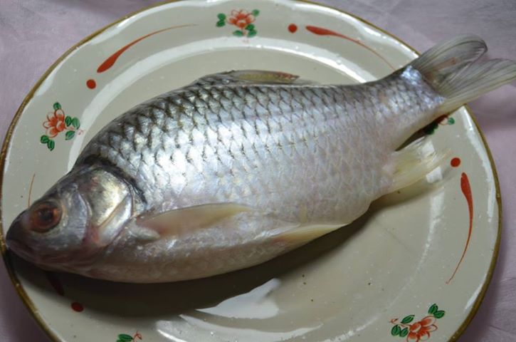
In this exercise I was to buy a fish and put it on a decorative plate, setting the plate in a neutral context. Ideally using water-soluble pencils to draw the fish, paying special attention to the , way the light catches the fish’s eye, mouth, gills, body and tail.

Well my first obstacle was to buy a fish as we have a totally different variety of fish here in Thailand than the UK so I chose a fish called a Pla Tha Pien which maybe a Java Barb or Gold Foil Barb. It wasn’t a very attractive fish but it did a really good job of catching light.

Completed Exercise - Fish on a Plate
Completed Exercise – Fish on a Plate

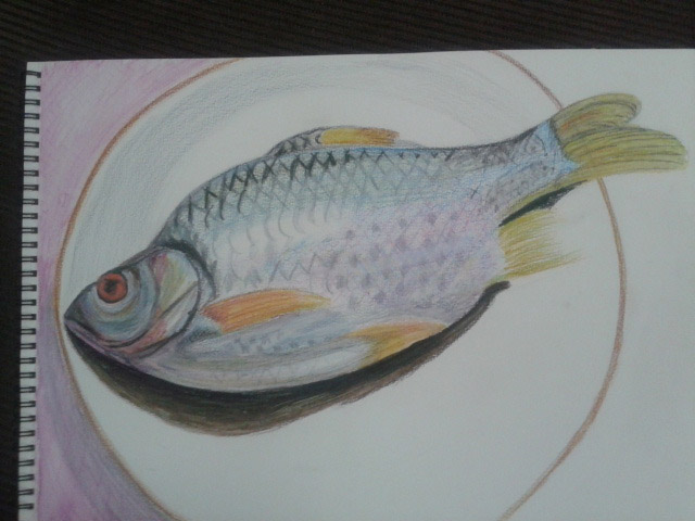
I didn’t have a really nice plate either in fact I am a bit of a minimalist and only had one plate until last week so I used the same plate as I had used in other exercises.

Photo of Subject - Barb on a Plate
Photo of Subject – Barb on a Plate

The next obstacle was the paper, I couldn’t find any Bockingford paper and the closest I could find to it was a Canson Cotton paper that was over 50 pounds for a pad and on my budget that just wasn’t happening, so I bought a cheaper Canson paper that stated ‘Wet and Wet Technique’ and ‘re-workable’ on the front, at only 420 Baht or 8 pounds for 20 I thought that was reasonable, slightly smaller than A3, A3 being the size of the really expensive next step up.

I wasn’t very clear on the ‘water-soluble pencils’ it said in the brief for the exercise, I have a small pack of Derwent water-soluble sketching pencils, water-soluble colour pencils by Masterart and a pack of Watercolour pencils by Faber-Castell, so I used the latter.

I tried wetting the paper first and it warped like hell and after an attempt at drawing on it I decided that it would be best to draw, go over it with the brush and then draw again while the paper was still wet, this technique worked.

With a limited pallet of colours but not too limited and the way I positioned the bendy light over both fish and plate it was easy to see what colours I should use on the different parts of the fish, the only problem I could see was how I would go about drawing the texture of the scales on the fish’s body.

Fish on a Plate - head

The head was easy enough and didn’t take long to complete, I used 5 colours in total on the head drawing dry then going over with a wet brush to blend and then re-working where necessary and I am pretty pleased with the results on the head which I think looks very like my subject.

Fish on a Plate - body
Fish on a Plate – body

From there I worked on the underneath of the gills and the belly and then up through the fins to its top side. On the side of the fish I used very similar colours as I did for the head but a very different drawing technique, I found that hatching in a light blue, light green and light pink over the top of each other created an almost scaly texture which I then went over with a wet brush and then filled in some of the diamonds with a dark grey.

Fish on a Plate - detail
Fish on a Plate – detail

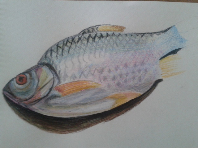
The most difficult bit of the fish was the top and the front of the dorsal fin as when water touches black it becomes a bit too dark especially for a drawing like this. I have looked at several tutorials which say if you have to use black use a dark blue , which would not be suitable for this fish. In the end I did use black but over the top of an already damp paper and then went over it with a cotton bud to catch some of the colour.

Fish on a Plate - fish complete
Fish on a Plate – fish complete

The finished drawing is not brilliant but for the time I spent on it I’m quite happy with the results. The only part of this picture I am not happy with is that I rushed the completion of the violet coloured cloth that I used for a background.

Line Drawing Detail

Exercise - Line Drawing Detail Second Subject 2

For this exercise I was to select an object with interesting detail such as a sliced through red cabbage or a fir cone. Then on a sheet of A4 paper create a line drawing of the object that I set up, taking time and effort to really look at the patterning, thickness of line, texture and shape of the overall composition. The brief also said that I was to position the drawing well on the paper and fill the paper effectively with a continuous line drawing and no shading which is what I TRIED to do…

I made a few attempts at this with two different subjects, both of which were green peppers but in the Bangkok heat they go off pretty quick. With the first pepper every attempt was a continuous drawing with minimum detail, I used the thick nib of a double tipped felt pen and although the subject fit well on the paper, I didn’t give it a strong enough light source to pick up all the detail and too be honest the finished drawings at that line thickness all looked somewhat pathetic.

Exercise - Line Drawing Detail First Subject
Exercise – Line Drawing Detail First Subject

I gave it a week with another exercise in between before I had another go at this exercise. Visually the drawings with the second subject look a lot better, I used the finer nib of the felt pen and this time after I completed what I could do continuously without taking my pen off the paper I decided to add the detail which were the ribs on the inside of the pepper that I could see from wisely using a light source this time.

Exercise - Line Drawing Detail Second Subject 1
Exercise – Line Drawing Detail Second Subject – Image A

I probably did go a bit overboard and it does look like I have had a go at shading the object but this is all down to the closeness off the lines on the inside of the pepper. However I am quite happy with the results.

Exercise - Line Drawing Detail Second Subject 2
Exercise – Line Drawing Detail Second Subject – Image B

The thing that I am not happy with however is the positioning on the paper and how much space I left to the sides and underneath it. When drawing an object such as a pepper with a very irregular shape I think it’s best if you know where to start, in Image A above I started at the core just above the seeds. With Image B I started at the tip of the stem Starting near the center of the image was better with this object but that would differ with something like a cabbage.

Assignment 1 – Made Objects

Assignment 1 - Made Objects - finished A2

I originally had the idea to to use traditional Buddhist items for this part of the assignment such as yellow cloth, a candlestick, temple type money box and did go out and purchase them. The medium I chose for the original composition was coloured pencil, but as I laid down watching the girlfriend iron in front of the electric fan with the white wall of my apartment I had a better idea.

Assignment 1 - Made Objects - finished A2
Assignment 1 – Made Objects – finished A2

I wanted to show something about my life in Thailand and I felt that the new objects set out in the right composition would describe my life perfectly, a normal working-class life in a tropical country. With 13 years in the country and the last few years living alone I knew these objects intimately but the fan would prove to be something of a challenge..

Assignment 1 - Made Objects - composition studies
Assignment 1 – Made Objects – composition studies

I began with composition studies in my A3 sketchbook, I found it difficult to come up with more than two variations as I was locked into how i felt the objects should be presented from the start. How every I did vary the composition slightly with the iron laying down in the first composition which I think was actually my first idea and then the iron stood up proudly in the second. The ironing board was lifted up on the table and I was almost laid down drawing the second composition sketch which I liked so much that I decided this would be the one to develop and decided that I would be there for a while so raised the ironing board higher with the ironing board on top of a table on top of another table. We had to do without a place to eat for the next few days.

Assignment 1 - Made Objects - Photo of Original Composition
Assignment 1 – Made Objects – Photo of Original Composition

At this stage I did things a little bit in reverse with the composition studies just finished I decided to develop the composition in pencil to get a feel of how it would look in that medium before looking at others. One of the main reasons for doing so was being insecure about whether or not I would be able to demonstrate the techniques especially pencil holding techniques that I had practiced in the first part of this course. I then concentrated on enlarging the image by drawing a grid over the top of the composition ready for enlarging for the finished drawing.

Assignment 1 - Composition Development and Enlargement grid
Assignment 1 – Composition Development and Enlargement grid

At this stage I was still not so sure about what medium I would use for the finished drawing, so as instructed on an A2 sheet I practiced with colour pencils and charcoal.

Assignment 1 - Charcoal and Colour Pencil Studies
Assignment 1 – Charcoal and Colour Pencil Studies

Charcoal would have been great for the towel and even the water bottle and possibly the iron but on an A2 sheet which I was planning to use this medium proved itself too messy for the electric fan. I did love the way the water bottle looked in charcoal though, rather like stencil street art. Colour pencil wasn’t too bad but didn’t look solid enough for me, I was still trying to get practice with this medium and didn’t feel like I could carry it off in any other medium than graphite pencil and so that was my final decision.

assignment 1 made objects
Fan Almost Complete

At this stage i decided the composition still needed more work and moved the squirty bottle further in to create less negative space to fill the rectangle shape of the paper. The layout of the fan was very technical it helped that there was no front on it but still took well over an hour and a compass and ruler for the cage. After everything was sketched out my insecurity about not being able to show the various techniques that I practiced in the first part of the course disappeared as I got into it, swapping between 3B and 4B pencils using different pencil holding techniques and several different forms of hatching.

The squirty bottle was pretty straight forward and quite easy to show tone and form on…eventually after I managed to get the shoulders of the bottle right after several goes, as I had moved the bottle in since the composition development work. This was completed mainly by hatching and cross hatching.

The iron allowed me to use several different drawing techniques including hatching, smudging and drawing the patterns on the blade with a putty rubber. However the shape of the iron varies slightly from the photo above I was having double vision when it came to the iron as my left eye is quite bad but refused to work from the photo.

The towel and the ironing board itself allowed me to draw with texture using short, lines dots and a putty rubber on the towel to dry and fluff it up and cross hatching for cloth ironing board cover.

I’m satisfied that I have managed to make reference to most of the aspects of drawing that have been covered in the first part of the course in this part of my assignment from holding pens and pencils to enlarging an image. Drawing the fan allowed me to demonstrate different pencil holding techniques, the bottle allowed me to demonstrate tone and form while the iron allowed me to show both tonal variation as well as reflected light on the blade. The towel was also a great idea which I originally added to raise the iron and didn’t realise it would help me to demonstrate techniques for drawing with texture.

,

Scaling Tools for Enlarging an Image – Acetate Grids

Acetate Grids for Enlarging an Image - My new scaling tools

For this project of ‘Enlarging an Image‘ I was instructed in the course materials that I needed two acetate grids, one with small squares across it and the other with large squares printed on it.

As instructed I went out and bought a roll of acetate and card and made myself two acetate grids, one small and one big and glued them to card so I could use them as view finders. I managed to slice my finger open with a Stanley knife while making the big one so you can see the dodgy line where the CD marker hit the big chunky bandage.

Acetate Grids for Enlarging an Image - My new scaling tools
Acetate Grids for Enlarging an Image – My new scaling tools

Unfortunately I didn’t get to use them as I didn’t really need to because I was also instructed to draw a grid with an HB pencil over the small image, where as I could have placed the small grid over the image in my A5 sketchbook instead; but I can see they will be getting plenty of use in the future. The size of the squares on the small grid are 2cm, the size of the squares on the large grid are 4cm, I think I also need to make those 2cm as well.

Using Texture – Check and Log

Yellow crayon on breeze block wall

Have you discovered any new ways of using your drawing tools to depict surface and texture?

Not as much as I wished I had, there were a few things that I couldn’t find here in this part of Bangkok such as a chunky sponge, I would have loved to have tried dripping or splashing ink for the texture of this. However I did discover new ways of hatching for as in the the fur of the teddy bear, hatching with small strokes in flowing patterns. I also discovered new ways of using my putty rubber to show texture such as twisting for the mop rug underneath my composition.

a Drawing with Textures - Second Drawing
a Drawing with Textures – Second Drawing

How successful were you at implying form with little or no tonal hatching?

I seemed to use some kind of hatching for nearly everything except the mop rug. The technique that I used to depict the mop strings (as I would call them) showed real depth. This was a mixture of squiggles, circles smudging and twisting with a putty rubber and it worked well.

What are your impressions of frottage as a drawing technique?

I really love the idea of using this as a drawing technique and I love the way that a surface of one thing can give you a totally different result to what you thought it would and how something as simple as the joint of 4 breeze blocks can give you an idea for a drawing of a crucifixion or graveyard scene. The best thing about frottage is that you can use it for texture in drawing you are already working on or it can give you an idea for a new drawing.

Yellow crayon on breeze block wall


Enlarging a Simple Flat Image

Enlarging a simple flat image - Side by Side

This exercise was aimed to give me further practice in enlarging original drawing with a slightly more complicated structure. For this exercise I chose a fancy jar of face cream (borrowed from my girlfriend), a roll on deodorant and a plastic Nasol bottle.

Enlarging a simple flat image -
Enlarging a simple flat image – initial sketches

To get familiar with the objects I did a quick 3 minute drawing of each one before putting them together for the composition in my A5 sketchbook. This helped me to recognise problem areas on the objects such as the top of the Nasol bottle that would have looked a mess too wide or too narrow.

Enlarging a simple flat image - A5 sketchbook
Enlarging a simple flat image – A5 sketchbook

As in the previous exercise ‘ Enlarging an Existing Image’ I drew the composition of three objects in my A5 sketchbook and drew a grid of 2 cm squares over the top of the composition with an HB pencil. Just as in the previous exercise I labeled the squares by writing numbers across the top and letters down the right hand side to stop any confusion to which squares I would be drawing in.

From there I drew a grid of 3 cm squares in my A4 sketchbook, again moving the composition up the page by taking away the A row in the grid then reproduced the drawing on a larger scale.

Enlarging a simple flat image - englarged sketch
Enlarging a simple flat image – englarged sketch

Again, I really loved this exercise it was so simple and easy, I erased the odd line due to points of contact on the grid being slightly wrong, but the results of drawing these 3 objects were actually better than in the first object. I think this  was down to viewing all three at once rather than trying to look for faults on the angles and curves of one single object.

Enlarging a simple flat image - Side by Side
Enlarging a simple flat image – Side by Side

Enlarging an Existing Image

Enlarging an existing image 1

For this exercise I drew a thumbnail drawing of my favourite coffee cup roughly 10 cm square in my small A5 sketchbook, which I’ve barely put to use so was good to fill a page or 2. Once I had finished the thumbnail drawing I drew a grid of 2 cm squares with an HB pencil over my thumbnail sketch.

Enlarging an existing image 1
Enlarging an existing image – A5 sketchbook

In my A4 sketchbook I drew 3 cm squares, deciding they were a perfect size for this object on this size paper, with a larger more detailed composition I would have probably needed smaller squares in both sketchbooks.

Enlarging an existing image - A4 Sketchbook
Enlarging an existing image – A4 Sketchbook

To make it easier for myself to identify which squares I would be drawing in I labelled the squares with letters down the left hand side and numbers across the top. However the drawing was quite low in my A5 sketchbook so in my A4 sketchbook I started at B instead of A lifting the drawing up 1 square.

Enlarging an existing image using grids
Enlarging an existing image – side by side

I loved this ‘Enlarging an Existing Image’ exercise, it was like piecing together a jigsaw puzzle but a hell of a lot easier and as the squares weren’t that big quite easy to judge where  a line curves or which point of the grid they would meet. Admittedly I did do a little bit of rubbing out with an eraser but not that much.

A Drawing with Textures

a Drawing with Textures - Second Drawing

For this exercise I was determined to get outside and draw so I took a few objects with different surfaces  onto the balcony and tried them in different compositions. Originally I planned to use objects that I used in the ‘Experimenting with Texture‘ exercise and what I had in mind was a reel of red and white string, a Siamese football, a mesh dishcloth, mop mitten and a teddy bear so moved them around in different composition to see how they looked. After much thought I headed down to the shop to buy some money type bags and cotton wool and came up with the following composition.

A Drawing with Textures - Composition
A Drawing with Textures – Composition

Because of the texture of the mop mat I chose graphite stick on watercolour paper to complete this exercise and started out with some more experimenting to see how each object would look.

More experimenting with textures

I must have not been myself that day because I did a quick sketch of each objects texture with a soft graphite stick and thought everything looked great so grabbed my drawing board and went ahead with the drawing.

Drawing with Textures - first drawing
Drawing with Textures – first drawing

I wasn’t too worried about perspective as it was about depicting the texture rather than anything else. The drawing took me no time at all and when I had finished I packed up, confident that I had done great. I must have been in some kind of trance because when I woke up the next day I looked at again and realised not only did the drawing look awful but was too smudged and I had done a bad job in depicting any texture that was in the composition apart from the woven basket. So I made the decision to change the medium and the paper and  start again.

a Drawing with Textures - Second Drawing
a Drawing with Textures – Second Drawing

This time I did something I had never done before, instead of drawing everything first and then going over it again with texture and detail the only thing I drew in advance was the shape of the bears head and completed the rest of the picture stroke by stroke, The drawing took me quite a few hours and due to not drawing the outlines of the objects first the perspective was off but again I wasn’t too worried about the perspective.

Medium used: graphite pencil – b, hb, 2b, 4b, 7b and white hard pastel

Paper: A3 Canson drawing paper

Technique used:

  • Teddy Bear – Small flowing hatching
  • Bears clothes – cross hatching
  • Woven Basket – hatching, smudging
  • Mop Mat – loops, circles, smudging, putty rubber (twisting)
  • Cotton wool balls – hatching, smudging
  • Cotton wool in plastic bag – putty rubber (twisting and erasing lines) and hatching

I changed the length of the mat as it did get a bit tedious but I am happy I got to show the depth of the mat, my only regrets are 1, that I didn’t get to do the drawing in a different medium such as pen and 2, I didn’t leave the cotton wool in the plastic bag the colour of the paper instead of trying to use a white medium which got a bit messy as I tried a few on the actual drawing before using fixative and going over in white pastel which still looks cream.

Experimenting with Texture part B – Frottage

Experimenting with Frottage - Crayon

The technique of Frottage was invented by Max Ernst in 1925 and involves placing paper over a rough surface such as grained wood and rubbing with a crayon or pencil. In this exercise I experimented with the technique of Frottage (which I always thought was just called rubbing) to see what kind of patterns and textures rubbing over certain surfaces gave me.

Up until this exercise I had done all of the coursework in my apartment and most of it at night, due to early evenings and work finishing times, this was a great opportunity to get outside and do something in the daylight.

Armed with charcoal and pencils I headed out to the swimming pool to experiment on tree bark, stone-chip floors and wooden sun chairs only to find that the paper in my new sketchbook was too thick or too rough and it wasn’t giving me any patterns/texture whatsoever.

It was another day before I finally got going on this exercise or should I say the next evening (fated to working at night) I took some pages out of my small sketch book, a white paper with less tooth and started with charcoal.

Experimenting with Frottage - Charcoal
Experimenting with Frottage – Charcoal

I tried the technique on stone chip floor, my apartment door, floor and even the draining board and then again with different colour crayons before heading downstairs to the lobby,

Experimenting with Frottage - Crayon
Experimenting with Frottage – Crayon

Unfortunately the bark of the trees outside did not give me good results which was both surprising and disappointing and down to the bark being very smooth (difficult to find great trees in Thailand). I did get some nice rubbings off other surfaces though including the joint of a breeze block wall, which looking at it now resembles a crucifix in the sunshine but the best results using both charcoal and coloured crayon were got from the grain of the wooden door of my apartment with different panels giving me different patterns.

Still Life Sketches of Made Objects

exercise: still life of man made objects

The aim of this exercise was to create a small still life composition from a small themed selection of made objects, of which I chose personal hygiene as my theme and the objects that I chose were, a tube of toothpaste, a toothbrush, a Bic Razor and a bottle of mouthwash.

Then with a pen, pencil, or ballpoint use a technique such as hatching. I used a 3H and a HB pencil (to show the darker shadows).

Then I had to draw two or three thumbnail sketches in my sketchbook of different arrangements from different view points, using my light source to help create strong lights and dark shadows on the surfaces of the objects. I had to include tonal values to indicate form in my sketches as well as shadows seeing as they can also play an important part of a still life composition.

Then I was to make notes on or around my sketches about the technique I used and why I had used it. And make notes on anything else I felt was important.

I did two initial drawings that I have to admit were not exactly thumbnail size, I think this was down to miscalculating proportions of the first objects I started on in each composition and then having to keep up proportions,

exercise: still life of man made objects
First attempt at this exercise

In the first drawing I started on the toothpaste tube as I always end up working clockwise, I think this is force of habit. However, because of this I misjudged how much paper I would need for the mouthwash so squashed the lid to fit the rest in; so when I came to the second drawing I worked from  the mouthwash down.

On the first attempt I forgot what I was instructed to do in the exercise. Instead of writing down about the techniques I used I totally ripped the sketches apart fault by fault, only actually remembering what I was supposed to do after I took the photo to upload to my working log. I decided to do the exercise again and this time do it right.

In my second attempt I scaled the drawings down and was less worried about every detail. My hatching technique also seemed to improve a lot in my second attempt, using a variation of cross, vertical and horizontal hatching as well as swooping lines to follow the contours of certain objects.

exercise 2 still life of made objects
Second Attempt at this exercise was much better

This exercise was probably the first time that I made no attempt of smudging in the pencil lines instead I practiced the pencil holding techniques I used earlier in this course, from the tip, from the end etc…

The hardest thing to draw in the composition were the toothbrush and razor and I felt like abandoning the objects and using something easier to draw but stuck at it and did a reasonably good attempt at getting proportions and details right all 4 times.