In my tutor feedback recommended that I look at 2 new artists the English artist Jenny Saville and Scottish artist Alison Watt. After a quick glance at some of their art work I decided to look at the paintings of Alison Watt first.
Alison Watt OBE is a Scottish painter, born in Greenock on 11 December 1965. She studied at Glasgow School of Art, graduating in 1988. Prior to graduating she won the John Player Portrait Award and as a result was commissioned to paint a portrait of the Queen Mother. Her first pieces to become famous were bluntly painted figurative canvases, more often than not female nudes, within light filled interiors.
In 1997 in an exhibition entitled simply ‘Fold’ she introduced fabric alongside these figures for the first time. In 2000 she was offered a solo exhibition at the Scottish national Gallery of Modern Art and was the youngest ever artist to be given this chance. This exhibition was called Shift and it consisted of 12 huge paintings that featured just fabric.
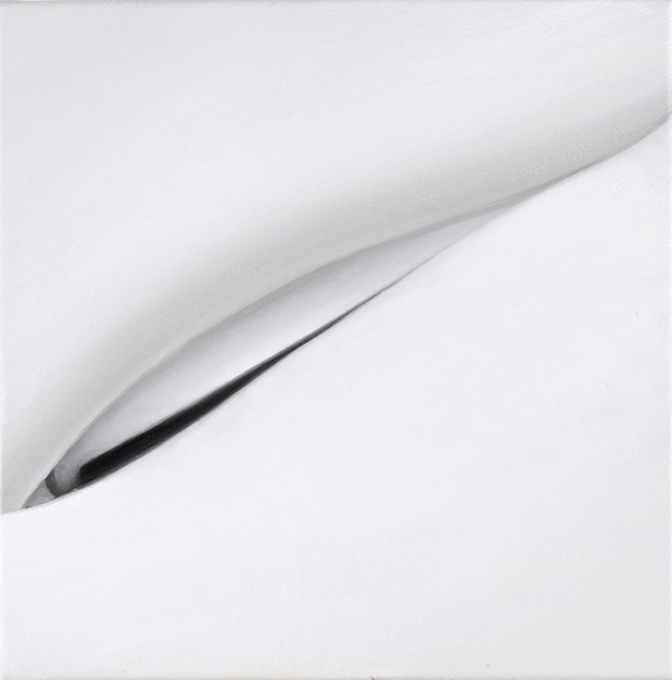
Alison Watt – Fold Exhibition
I’ve looked at many of her paintings and I wanted to say something like this ‘her early paintings seemed to be of the piece of fabric as a whole, the creases, the folds and the patterns that they make all on one canvas, painting cloth as a hyper-realist (if that makes sense) but it seems as though as she has developed, she has taken the same approach to painting fabric as Georgia O’Keeffe did with plants, flowers and other natural forms, moving towards painting more abstract with almost sexual qualities. In fact some of Alison Watts paintings echo the painting style of O’Keeffe.’
Looking at Alison Watts’ Paintings it seems like her earlier paintings of figure and fabric helped her to see something in the folds, their beauty, energy, individuality and even sexual characteristics with each individual fold expressing something different.
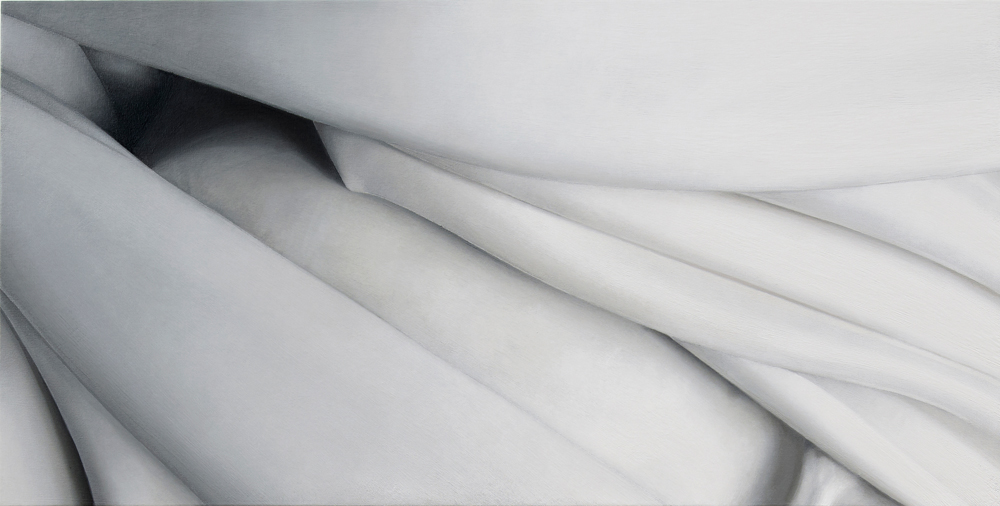
Alison Watt – Echo
The colour of the fabric in the paintings is something we take for granted in photos. We just see white because that’s what our eyes tell us it is, white fabric. If we look closer at Echo above for example, we can see blue, orange, pink and all the other colours that make up the light and shadows.
I had already thought about how I could draw a white door for example using lots of different colours and I think this maybe something I should try in my final assignment.
After seeing Degas’s Study for a portrait of Manet in the introduction to part four of this course I thought I would take a look at some more of Degas’s drawings. I was already familiar with his ballet dancer and horse paintings but it was really inspiring to see some of his studies and drawings.
Edgar Degas (1834–1917) Dancer with Arms Outstretched, ca. 1878. Black and white chalk, on tan paper
The drawing above was one of the first pictures that caught my eye, the black and white chalk really make the figure stand out on the tan paper. The girl’s pose is both simple and graceful and I can only see the upper part of her body I can imagine how her feet would be poised.
Three Studies of a Dancer’ (ca. 1880)
I noticed there was a project called stance coming up so the next picture I decided to look at was Three Studies of a Dancer above, Degas again uses black and white chalk on tan paper but this time draws his subject from side, front and back in the same pose. My girlfriend who is also a yoga teacher has agreed to pose for me on some of the exercises and like ballet yoga has some graceful movements so it is nice to get some ideas from Degas’s drawings.
Lying Nude Edgar Degas
The third drawing that caught my eye was ‘Lying Nude’ a very simple half clothed nude lying on her back. Even though you only see part of the models chest stomach and one of her arms the pose allows your brain to fill in the rest.
Seated Dancer Adjusting Her Shoes
Looking at the Seated Dancer Adjusting Her Shoes it is easy to see why Degas was so interested in painting ballet dancers with so many interesting positions and stance in their everyday dancing and training routines. In the drawing above something as simple as a ballet dancer adjusting her shoes before a lesson has allowed Degas to draw his subject in another very unique pose.
For this exercise we were given a copy of the pencil drawing ‘Rome’ by Sir Muirhead Bone, a drawing that uses perspective to draw the viewers eye along the street to create a busy street drawing rather than an architectural drawing.
We were instructed to copy a simplified version of the drawing into our sketch books to check the accuracy of the drawing.
Well to do this I realized that on completion of my copied version of his drawing I wouldn’t be checking the accuracy of his drawing but actually the accuracy of my copied version so I did both. I always enjoy producing very rough sketches so I made use of this by producing a very rough reproduction of the original drawing.
Rome – Sir Muirhead Bone – My Version
I checked the accuracy of my drawing first and was unable to find any common vanishing points to obviously mine wasn’t that accurate at all.
Rome – Sir Muirhead Bone Pencil
On checking the original I discovered that it was very accurate with the baseline of the building, third floor window ledge and roof all sharing the same vanishing point which is probably the reason he is able to bring the viewers attention to the street.
For this research point I was to look at artists who worked in Series such as Monet, Pissarro or Cézanne and make notes in my learning log about the challenges they faced and how they tackled them.
Camille Pissarro
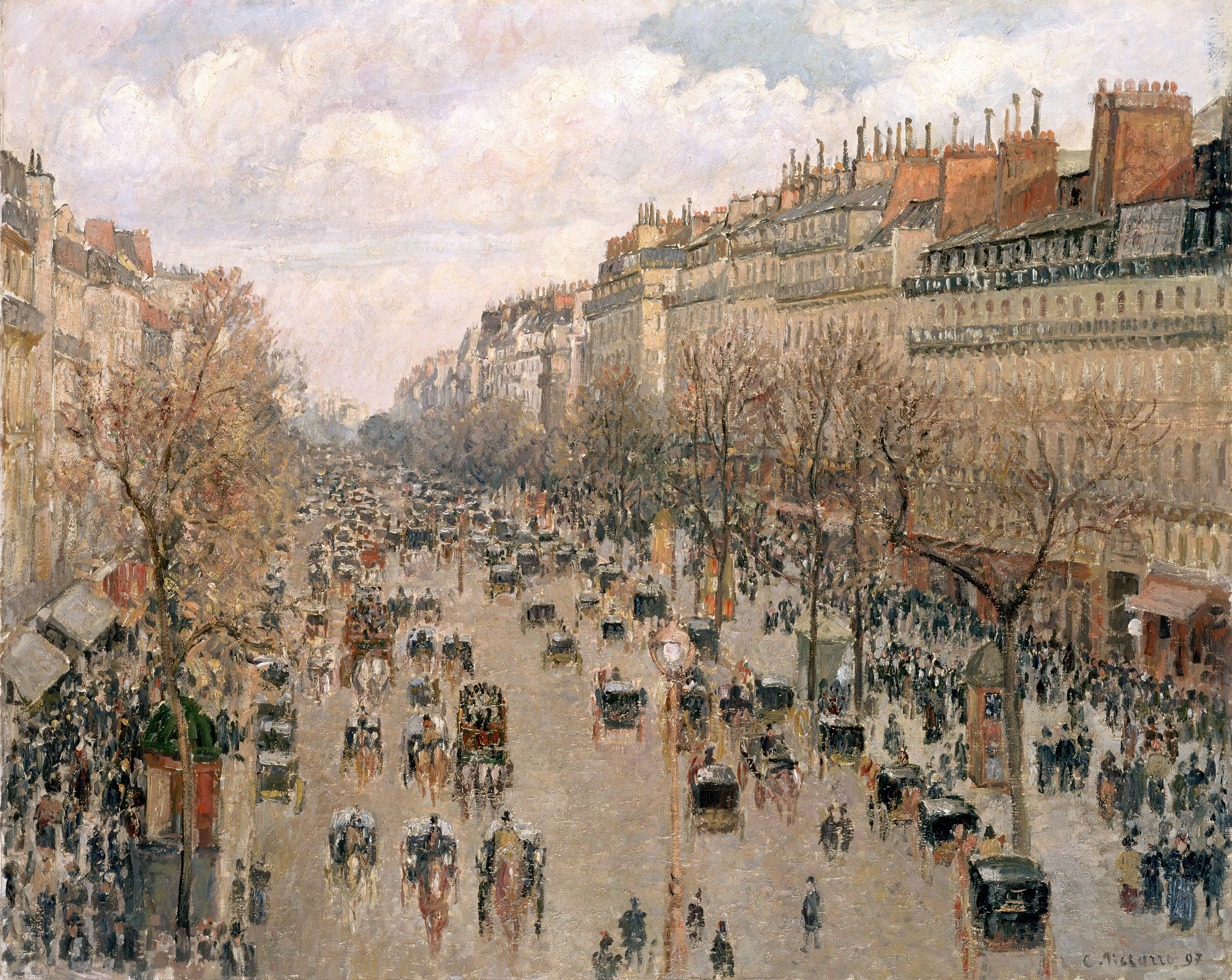
I thought I would look at Camille Pissarro first as I remembered his various paintings of The Boulevard Montmartre through different seasons and different times of day.
The Boulevard Montmartre 1897
I suspect that the first painting in this series would have been the Boulevard Montre 1897 above which from the shadows on the chimneys on the right looks like the scene is set in late afternoon or early evening.
Looking at the Boulevard Montre in Spring below I think it’s obvious that Pissarro’s biggest challenge was depicting the weather and he has tackled this by using a totally different colour pallet barring the chimneys on the right. Another challenge that I’m guessing he would have been thinking about while he was painting this would be duplicating the buildings so they seem to appear the same as in the original painting, however with different shadows and light shining from different directions he could add shadows where necessary to correct the shape of the buildings.
The Boulevard Montmartre Spring 1897
With Boulevard Montre in Spring Rain Below the biggest challenge for him would have been to make it look like the floor was wet, to give the effect of water it looks like he may have used a pallet knife as well as using colours that he has used in the sky so that it looks like it is reflective. With this painting it seems he has taken shelter lower to street level maybe with the balcony he was painting in earlier paintings above him to shield him from the rain but I’m wondering how long it took him to paint this and where his starting point was. If he has started from the flooded road he may have been painting in his original spot finishing at the rooftops and so the buildings look higher.
The Boulevard Montmartre Spring Rain
The Boulevard Montre at Night below seems to have been painted on a wet rainy night and it looks like he has used a palette knife for the entire painting in order to get that effect.
Boulevard Montmartre at Night
In The Boulevard Montre in Cloudy Weather below he has used a similar technique completing the painting with thicker brushstrokes and palette knife (I think) to create a blurry effect. I have also noticed that on clouded days some of the colours you see are a lot deeper probably due to lack of light being reflected off the buildings he seems to show this by using deep colours in certain places such as the rooftop on the right.
The Boulevard Montmartre Cloudy Weather
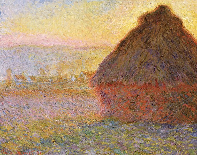
Claude Monet
Really spent quite a while trying to continue what I had been doing in earlier research points and that is finding new artists to look at, unfortunately my keyword searches let me down this time so I went with the recommendations from the brief and looked at Claude Monet’s Series of paintings ‘Haystacks’. This series of 25 paintings were painted in the fields near his home in Giverny, France, he begun painting them at harvest time (end of summer) 1890 and continued painting through to the Spring of 1891.
Grainstacks in the Sunlight, Morning Effect, 1890
The challenge that Monet faced, like Pissarro was to depict the different times of day as well as the different seasons, while still maintaining the texture of the haystacks and portraying the landscape in the background, he tackled this with a clever use of colour, different size brushstrokes and palette knife.
Haystacks, (Midday), 1890-91Wheatstacks, Snow Effect, Morning, 1891Haystacks on a Foggy Morning, 1891Grainstack. (Sunset.), 1890-91
For the first research point in this part of the course, ‘Drawing Outdoors’ We were asked to look at different artists depictions of landscapes, for example Albrecht Dürer, Claude Lorrain and L.S. Lowry.
Albrecht Dürer
Albrecht Dürer 1471-1528 gave us some of the earliest and finest works of the ‘Northern Renaissance’ with some wonderful landscape paintings, however, with the next exercise ‘a sketchbook walk’ coming up, I decided to look for some of Dürer’s more sketchy works.
The first painting I came across was a painting called Quarry, I searched on Google to try to find more information on this painting but to no avail, all I found was other paintings in colour of the same name. Looking at the painting at a first glance I thought it was a drawing in pencil but then realized it was a watercolour but it does look like he may have used other media such as pencil to finish the piece. The mark making techniques he has used in the painting are very simple and yet he has managed to create a good sense of three dimension with thin strong lines for the turfs of grass and weeds in the foreground to the wide, smudged brush strokes for the trees in the background and everything else in between. I particularly like the mark making techniques he has used for the leafs of the trees as he has depicted what we see has very complex objects with a series of simple shapes.
Quarry – Albrecht Durer
Another painting that I really liked was ‘Forest Glade with a Walled Fountain by which Two Men are Sitting’. I haven’t found the details of this drawing but it looks more like a drawing in pen and ink than a drawing. At first I couldn’t determine whether the artist had no time to finish the painting or if he had deliberately left it unfinished but then I realized that he was trying to show the light shining in through the trees on the left hand side of the picture and the dark forest in the background.
Forest Glade with a Walled Fountain by Which Two Men are Sitting 1505 Albrecht Durer
Again, like the first painting he has used many different mark making techniques using hatching and cross hatching for the fountain, as well as the two men and various hatching techniques to show the density of the forest behind. I can also see that he has used the same simple marks for the leaves on the trees as the first painting which works really well.
L.S. Lowry (1 November 1887 – 23 February 1976)
Laurence Stephen Lowry, was born in Stretford, Lancashire in 1887 and as a northerner as always been a favourite of mine.
Lowry is famous for his paintings depicting life in various industrial districts in the Northwest of England in a very distinctive style of painting.
Because of his use of stylised figures and the lack of weather effects in many of his landscapes he is sometimes characterised as a naïve “Sunday painter”, although this is not the position of the galleries that have organised retrospectives of his works. – Wikipedia.
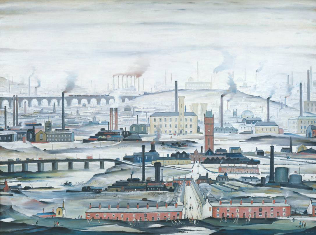
L.S. Lowry Industrial Landscape 1955
The oil painting, Industrial Landscape 1955, below is a great example of Lowry’s industrial landscape paintings. What I like about Lowry’s paintings especially this one is that the building, bridges, houses etc. are made up of very simple shapes, mostly rectangles and squares and yet he still manages to create feeling in his paintings with the help of factory smoke and dismal skies plus the background that fades to almost nothing helps not only to create a sense of distance but of smog and pollution being caused by the factory chimneys. Although the perspective is not perfect he creates a sense distance by painting the landscape lighter and lighter as he moves into the background eventually fading to a blue-grey; as well as painting objects like trees, bushes, chimneys and spires with simpler and smaller shapes so that they appear far-off.
L.S. Lowry An Industrial Landscape 1958
I tried to find a larger image of the following painting but to no avail. Also titled An Industrial Landscape the painting was bought for 300 GBP in 1959 and sold for 600,000 GBP in 2007. Again you can see how he paints the buildings in lighter and lighter shades in the background to give the impression they are disappearing into an industrial smog.
Finding a Substitute for Claude Lorrain
I noticed that I would be researching Claude Lorrain again later on in this module and so I set out to find a substitute. I first searched for Claude Lorrain on Google which took me to the Baroque period from there I clicked on a link to Landscapes which took me to page of wonderful landscapes on Wikipedia with Landscape Paintings of artists from all different periods.
The first painting that jumped out at me was a painting by Caspar David Friedrich, titled Wanderer above the Sea of Fog, 1818, which is a classic image from German Romanticism. I recently watched a series of documentaries about German art on the BBC and this painting was used in the credits. My kind of painting really, simple and yet the landscape he has painted catches the imagination wondering what is below the peaks, and below the cloud line. Again as in paintings by the other artists in this research point the trees on the mountain ridges are made up of very simple squiggles and other shapes but its not something you notice straight away. I love the way he has used what I think are long twisted brush strokes with a darker colour over the lighter colour in the background to create the effect of mist rolling down the ills to the center of the picture.
Caspar David Friedrich: The wanderer above the Sea of Fog 1818
The next image that caught my attention was a painting by Frederic Edwin Church titled The Heart of the Andes, 1859. Unlike the previous painting this is by no means simple, I couldn’t even begin to think about where this guy started or what techniques he used, say, for the trees, but the mountains in the background are pure inspiration. They seem to be layers and layers of colour painted over the blue sky background making their way to ground level with the white snowcapped mountains in the background taking your mind on a journey around the mountains in front to get to them.
Research point: Look at how Renaissance masters such as Leonardo and Dürer depicted animals
During the Renaissance period (14th-17th centuries) Europe became the academic heart of the world with Renaissance scholars absorbing the knowledge acquired from other older cultures such as vanishing the Islamic world. Like many other areas of study during this period, both biology and natural science became progressively more specialized and began to take on their own identity.
The Renaissance began a cultural revolution that seemed to be driven by art and science at this time was no different, in fact it was the artists and sculptors of the Renaissance period seeking perfect realism in their work that brought anatomy and biology to the forefront of all scientific areas.
Renaissance artists were the first to dissect plants and animals for a better understanding of the living world. From this artists were able to create more energetic and realistic works of art and make the connection between the structures of animals and humans; Leonardo da Vinci was undoubtedly one of the first scholars to do just this.
Leonardo da Vinci (1452-1519)
These days described as the first animal rights activist Leonardo da Vinci would often go to the markets and buy caged animals to set them free. In several of his works Da Vinci combined art with science. This combination of art and science is especially clear in his depiction of animals.
To render the animals in his works with scientific precision Leonardo not only studied the anatomy of the animals but also their physiology. But too really depict them with scientific precision he performed dissection on a number of animals as well as studying their movement in their natural habitat.
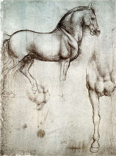
Cavillo di Leonardo – 1490 c
Nowhere is it more obvious as in his ‘Cavillo di Leonardo ’ (Leonardo’s Horse 1490 c) right. Not only has he managed perfectly reproduce the animals stance and bowed head but the wonderful muscle tone and folds around the neck.
Leonardo da Vinci “Study of horses”, red chalk on paper, 1504-6
In ‘Study of horses’ red chalk on paper 1504-6 which I think is actually a ‘ A Study for the Battle of Anghiari’ he focuses on the horse’s hind legs especially on how the defined muscles and tendons giving an impression the horse’s legs are buckling under weight. To me this is a prime example of how his scientific studies helped him to achieve this standard of realism.
Albrechct Durer (1471-1528)
Born in 15th century Nuremberg, Germany into the Northern Renaissance period, Albrecht Dürer was the son of a goldsmith who taught his son to draw, hence Albrecht’s appreciation of fine detail. Dürer is undoubtedly one of the greatest oil painters of the Northern Renaisssance but is also famous for his superb watercolours as well as woodcut prints and engravings.
Until the superb quality of George Stubbs’s work elevated animals in art in the 18th century animals were not thought of to be ideal subjects and the drawing of animals was considered to be merely a demonstration of an artist’s technical skill. However almost two centuries before Stubbs, Dürer began to view animals with the attention they deserved and demonstrating this with an array of watercolours and woodcut prints that over time have become increasingly popular and widely reproduced.
Albrecht Dürer Wing of a Blue Roller 1512
Albrecht Dürer was a familiar name to me and I was especially familiar with his painting ‘Wing of a Blue Roller 1512′ an image I have come across time and time again, and it’s a always been a goal of mine to create something similar being inspired by this wonderful piece.
The painting Is a perfect example of his exceptional drawing skill, ‘he uses watercolor to delicately blend the soft graduating color of the plumage and overpaints linear detail with gouache (an opaque watercolor) to pick out the jagged edges of the feathers.’ [3] He has managed to capture the contrasting textures of the feathers and down of the wing perfectly with so much realism that you can almost feel it.
Albrecht Dürer Rhinoceros 1515 pen and ink drawing
Dürer created this pen and ink drawing of the Indian rhinoceros based on notes and a sketch by an unknown artist from Lisbon who had obviously been a traveler and seen the animal with his own eyes. However Dürer had never seen this animal for himself and recreated the drawing enhancing the anatomy of the animal by adding an extra horn to the Rhino’s back. The rhinoceros had not been seen in Europe since Roman times and Dürer’s image of the animal was generally accepted as being anatomically correct until the 18th century. Again, even though he had never seen the animal for himself, he has almost managed to recreate the exact texture of the animal.
Born in to an artistic family in Denham, Buckinghamshire in 1894 Ben Nicholson was the son of artists William Nicholson and Mabel Pryde. In 1896 the Nicholson family moved to London where Ben was educated at the Tyttenhangar Lodge Prepatory School in Seaford before becoming a boarder at the Gresham’s School for boys in Holt, Norfolk. Ben Nicholson began his training as an artist in London at the Slade School of art, where he studied from 1910 – 1911, then from 1912 to 1914 he travelled between France, Spain and Italy.
In 1920 Nicholson married is first wife, painter Winifred Roberts to whom he had three children, two sons, Jake and Andrew and a daughter Kate, who also became a painter. From 1923 Ben and Winifred split their time between England and Switzerland spending their winters in the southern Swiss town of Lugano and the rest of the year was divided between Cumberland, where they made their home for that decade and London While In London following an exhibition with his wife Winifred he was invited to join the 7 & 5 Society, he was made chairman of the society in 1926.
Nicholson’s early paintings were still-lifes influenced by the works of his father but then after his first solo show at the Twenty-one gallery he began experimenting with abstract painting influenced by Synthetic Cubism which he implied in all his works thereafter. His works throughout the 1920s were of deceptively simple table top still-life’s and landscapes painted in Switzerland, Cumberland and Cornwall, making his first visit there in 1928.
While visiting France in 1932 and 1933, Nicholson became familiar with the works of artists such as Hans Arp, Joan Miro, Piet Mondrian and Alexander Calder who had settled in Paris in the 1920s. Nicholson was successful in fusing the European trends into a new style that would become identified as his own.
He made these visits to Paris with Barbara Hepworth; Winifred and Ben were divorced in 1938 a break up that was brought on by his growing relationship with Wakefield born sculptor. Hepworth had kids to Nicholson in 1934, three triplets and after his divorce in 1938 she would become his second wife.
Together they moved to Cornwall in 1939 and in 1943 he joined the St. Ives society of artists. Following the Second World War Nicholson lost faith in the ‘utopian promise of geometric abstraction’ and resumed painting landscapes adding colour to his abstract reliefs to emphasize the fundamental unity between nature and abstraction. Hepworth and Nicholson were divorced in 1951.
Throughout the 1950s he achieved international recognition as an artist through a series of awards which included the first Guggenheim International Painting Prize in 1956 and the International Prize for Painting at the São Paulo Biennale in 1957. From 1954 – 1961 retrospective exhibitions of his work were held throughout Europe including shows at the Venice Biennale and Tate Gallery and in several cities in the USA in the 60’s and 70’s.
Nicholson married his third wife, German photographer Felicitas Vogler in 1957 and the two moved to Ticino in Switzerland in 1958 where he again began to concentrate on painted reliefs. In 1968 Queen Elizabeth awarded him the O.M. (Order of Merit) and in 1971 after the end of his third marriage he moved back to England where he died in London in 1982 at the age of 87.
Researching this Artist
I used many different websites researching this artist as the information I found was confusing and contradictory, with information differing from site to site and so I chose to gather information from the websites of establishments that I found out at shown his work, The British Council, Tate Gallery and the Guggenheim comparing the details with the biography www.oxfordartonline.com.
I have never heard of Ben Nicholson before although his second wife Barbara Hepworth is very familiar to coming from Wakefield I have seen her works in West Bretton (Yorkshire Sculpture Park). Since I have been living in Thailand they have opened the Hepworth Center in her name in my home town so it was interesting to read about their relationships, both personal and professional.
Why does he simplify still life forms and negative space and superimpose them on a Cornish Landscape?
I think the answer to this lies in the above text where it says Nicholson ‘resumed painting landscapes and added colour to his abstract reliefs to show the fundamental unity between nature and abstraction’. Which maybe reflected in what he said in a letter from Nicholson to Patrick Heron (9 February 1954) ‘All the “still lifes” are in fact land-sea-sky scapes to me.’
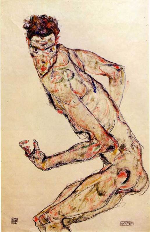
For this research point I was to find two artists who work in contrasting ways: from tight, rigorous work to a more sketchy style. For the artist who worked in a sketchy style I had already researched Egon Scheile in Part A so now it was time to find an artist who did more tight, rigorous work.
I was all ready to research a modern artist for this part of this research point and discovered Grant Wood while looking at Egon Schiele’s work, but then on a last minute search I found another artist that was just as new to me.
While searching for images I came across a picture that I had seen many times and for some obvious reason I thought was a picture of Johnny Depp in one of his movie rolls. I was surprised to find out that it was a self-portrait called ‘A Desperate Man’ by an artist called Gustave Courbet, the father of realism and even more interesting the artist that first coined the phrase.
Born in Ornans, France to a wealthy family, Gustave Courbet went to Paris in 1841 with the intention of studying law but soon decided that he would study painting and did so by copying the paintings of the French, Flemish and Spanish masters in the Louvre.
His style was shaped near the start of his career when he chose direct his paintings to observed reality, among his early paintings were self portraits portraying himself in various roles he also painted seascapes, still-lifes and figurative compositions.
Courbet’s figurative work was somewhat controversial because he addressed social issues in his paintings portraying subjects that were considered vulgar at the time such as rural hierarchy, peasants and the poor working conditions of the underprivileged.
Courbet’s style became known as realism however instead of using perfect line and form in his paintings he dealt with realism with spontaneous brush strokes and a rough handling of paint achieving a sense of direct observation by the artist while depicting the inconsistency in nature.
Although Gustave Courbet and Egon Schiele are artists of two different movements living at two different times their lives are very similar in that they seem to demonstrate freedom of expression in their art by painting subjects that were pornographic or controversial at that time. The poses by Courbet’s nudes such as La Femme Aux Bas Blancs, (Woman with White Stockings), 1861 and The Origin of the World (L’Origine du monde) (1866) remind me very much of Schiele’s paintings; as though Schiele could have been influenced by the artist. Both artist’s also served time in prison.
I’m not particularly turned on by the works of the old masters and so there are a lot of Gustave’s paintings that I don’t find appealing, but there are two or three that I think are brilliant simply because I can imagine how sensational they were at that time being so ‘real’ when photography was still in it’s infancy.
For this research point I was to find drawings by two artists who work in contrasting ways: from tight, rigorous work to a more sketchy style.
I decided to research the artist who works in a sketchy style first. While I have tried to find new artist so far in this module for this part of this research point I decided to research an artist I was already familiar with as when I saw the words ‘sketchy style’ he was the first artist that popped into my head and rightly so.
Austrian Expressionist painter Egon Schiele was born in Tulin in 1890. His father Adolph Schiele was the station master at Tulin Railway station and as a child Egon was fascinated by trains and would spend many hours drawing them. It is said that his passion for drawing started at the early age of 1 and a half years old and this led his father to believe is son would become an engineer and so at eleven years old was sent off to attend a Realgymnasium 25 miles away from his home town. Due to lack of friends and lack of interest in his studies he was a poor student and was kept back two years. When his father died of syphilis in 1905 family problems made his situation worse and eventually was politely asked to leave school by his teachers
In 1906 he asked his mother and uncle to allow him to apply at the Vienna Academy of Fine Arts and in the summer of that year, passed the tough entrance exam to became the youngest student ever to attend his class. Although he was passionate about art he showed a resistance to the strict regimen at the academy. As a brilliant draughtsman he would get through projects in minutes that would take other students in his class hours to complete but his early works were heavy handed and his soulless depictions of professional models did not amuse his tutors who simply gave him grades of ‘satisfactory.’
Schiele’s early work showed traits of Gustav Klimt and then in 1908 after a visit to a the large art show known as the ‘Kunstschau’ where a room full of the artists’ paintings were on show the influence of Klimt emerged full blown in Schiele’s paintings. He saw himself as the new Klimt and paraded round Vienna calling himself the ‘Silver’ Klimt and against the Academy’s authority accepted invitations to exhibit at the ‘Kunstschau’. In 1909 Schiele and a few of his like-minded class mates handed over a formal letter of protest to the academy expressing their disapproval at the academy’s rigid rules and withdrew themselves from the school.
By 1910 Egon Schiele’s unique expressionist style had gotten him many admirers including Gustav Klimt himself who bought several of his paintings and also offered to exchange some for his own. Klimt also introduced him to patrons and collectors and he thought that leaving the academy had turned out to be a wise career move but that wasn’t to be the case. Klimt was very vain and expected his works to be snapped up by the patrons who he had hoped would show him devotion but the truth was they didn’t find him the least bit cooperative and found his commissioned works, far too sexually explicit. Feeling let down he left Vienna for the countryside.
Egon Schiele led a short life dying at the early age of 28 of the Spanish flue in the epidemic that swept Europe in 1918 but his short life was somewhat controversial. At 21 years old he was imprisoned for seducing an underage girl and during his arrest the officials destroyed many of his drawings that were regarded at the time as pornographic due to the nature of his subjects. He spent a total of only 24 days in custody but during that time he a created a ‘series of 12 paintings depicting the difficulties and discomfort of being locked in a jail cell’ – Wikipedia.
His work was shaped by World War I during which he was drafted up and stationed in a Russian prisoner of war camp; however he still continued to paint and was even given a disused store room to be used as a studio where he painted captured Russian officers.
His style changed over the years he was influenced by Klimt and Oskar Kokoschka and his early works from 1907 to 1909 resembled those of Klimt but in 1010 began experimenting with nudes and began developing his own unique style that we know today, pasty soulless doll like figures with strong overtones. Many view his works as pornographic, twisted or erotic depicting death, sex and discovery and yet I see his works as simply brilliant and way ahead of their time; paintings that have influenced so many artists since.
I first came across Schiele’s work in the music room at my secondary school, a poster of his ‘Self Portrait of Saint Sebastian’ but it wouldn’t be til many years later that i would find out the name of the artist or what the painting was called.
Egon Schiele – Self Portrait as Saint Sebastian
My favourite paintings by Schiele have got to be the Fighter 1913 and Seated Woman with Bent Knee 1917, although I have to admit I do love a nude or two of his which are simple, crude but very erotic.
Egon Schiele – Seated Woman with Bent Kneee 1917Egon Schiele – Fighter, 1913
I love the way he has clearly thought hard about the subjects (maybe a bit too hard from what we know of Schiele) and yet his paintings are no more than coloured sketches on a plain background, allowing him to show movement and even though some regard his subjects as being ‘soulless’ I don’t think they can be accused of being lifeless. I can see how it is easy to be influenced by an artist such as Schiele and I know that his paintings will come to mind in the ‘Drawing Figures’ part of this course.
For this research point I was asked to find two artists who exemplify mastery of detailed drawing.
I used to have a reproduction painting site and am familiar with the works and lives of quite a few but since starting this course I’ve been introduced to new artists and new techniques so I thought I’d carry that on by typing in a few keywords on Google to see where they took me.
The first artist I found was a 19th century artist called Thomas Hartley Cromek and after seeing that his place of death was Wakefield, my home town, I made the decision to research this artist a little more.
Born in London in 1809 Thomas Hartley Cromek was the son of Robert Hartley Cromek the engraver and art dealer who allegedly cheated William Blake out of potential profits. In his childhood he moved from school to school starting off his education at Enoch Harrison’s school in Wakefield and then onto the Moravian School in Fulneck. He then moved back to Wakefield to study at the grammar school there before returning to Harrison’s.
Thomas Hartley Cromek received his first art lessons from a Wakefield based portrait painter, James Hunter but then in 1826 he moved to Leeds study landscape painting under Joseph Rhodes, while studying in Leeds Thomas also taught himself anatomical drawing.
He travelled to Italy in 1830 to study the old masters and spent most of the next 20 years within the country mainly in Florence eventually reaching Rome where he attracted much attention for his ‘excellence in drawing and his careful colouring’ – Wikipedia. While in Rome he gave drawing lessons to several distinguished visitors including the British artist and poet, Edward Lear.
Between 1831 and 1849 Thomas Cromek spent most of his time drawing the major buildings in Rome as well as Greece but then was forced to leave Rome with the outbreak of the first Italian War of Independence.
There’s not much information about Thomas Hartley Cromek online about techniques, ideas, influences etc but I did find quite a few images.
Study of Plants, Ariccia Watercolour, over traces of a pencil underdrawing.
I found many of his works online but it was the drawing above that caught my eye and I thought it was quite relevant to this module. The drawing itself is only 7 1/4 x 8 1/8 in in size and yet his brilliant use of shadow amplifies the detail of the drawing. I enlarged this image on my computer to the size he would have worked at and was amazed how much detail he has got into such a small drawing with what I still regard to be a messy medium, for me that is anyway. He has managed to depict some very thin leaves and blades of grass and makes this picture seem a lot bigger than what it is.
THE TEMPLE OF ANTONINUS AND FAUSTINA, FORUM, ROME – WATERCOLOUR 18 1/4 X 13 INCHES
Just like his drawing of plants and flowers his watercolour paintings of buildings such as the Temple of Antoninus above shows brilliant detail and colour as well as amazing shadows which really amplify the bulkiness of the stone structure.


