Tutor Feedback – Assignment 1

Assignment 1 - Enlargement Grid

Overall Comments

You have made a particularly good start to the module Mark. You have displayed an encouraging talent for observational studies, showing a good and competent technique and a willingness to try new media. You do however tend to tighten up when producing the final finished pieces. As time goes on and your confidence builds I have no doubt that you will produce some very fine work.

‘Tighten up when producing final finished pieces’ This was so true, most of the techniques I had learnt in this first part of the course were all about fluidity, a relaxed hand, using the pencil in ways that would have probably made these two finished final pieces look very different. However, I did use a lot of these techniques in my final pieces, I just think that they are not visible enough.

Assignment 1 - Made Objects Finished Piece
Assignment 1 – Made Objects Finished Piece

Feedback on assignment Demonstration of technical and Visual Skills, Quality of Outcome, Demonstration of Creativity

The first assignment is treated as a diagnostic tool to allow the tutor to see where help may or may not be needed with regards your future drawing endeavours. The amount and quality of preliminary work you have included in your sketchbooks clearly outlines that you have a focussed and deliberate way of working. The drawings show a willingness to confront and question the suitability of materials to the subject matter you aim to portray and have been honestly contemplated, and this shows in your final pieces. The two finished studies are thoroughly researched and considered in terms of compositional structure, materials, colour palette and technical application.

Composition Development
Composition Development Study
Assignment 1 - Natural Forms - A Study in Colour Pencil
Assignment 1 – Natural Forms – A Study in Colour Pencil

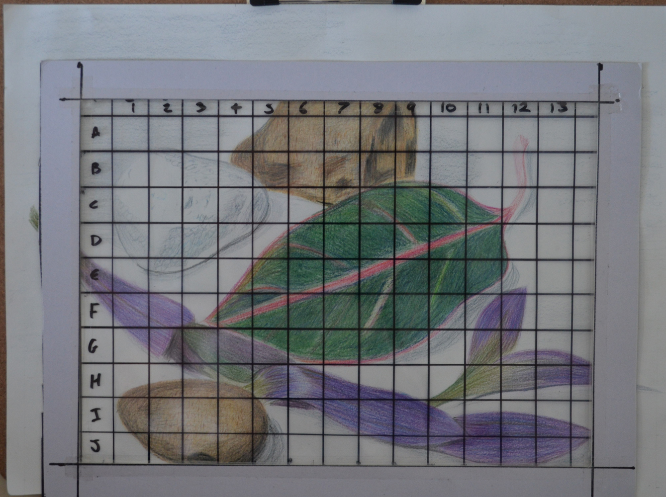
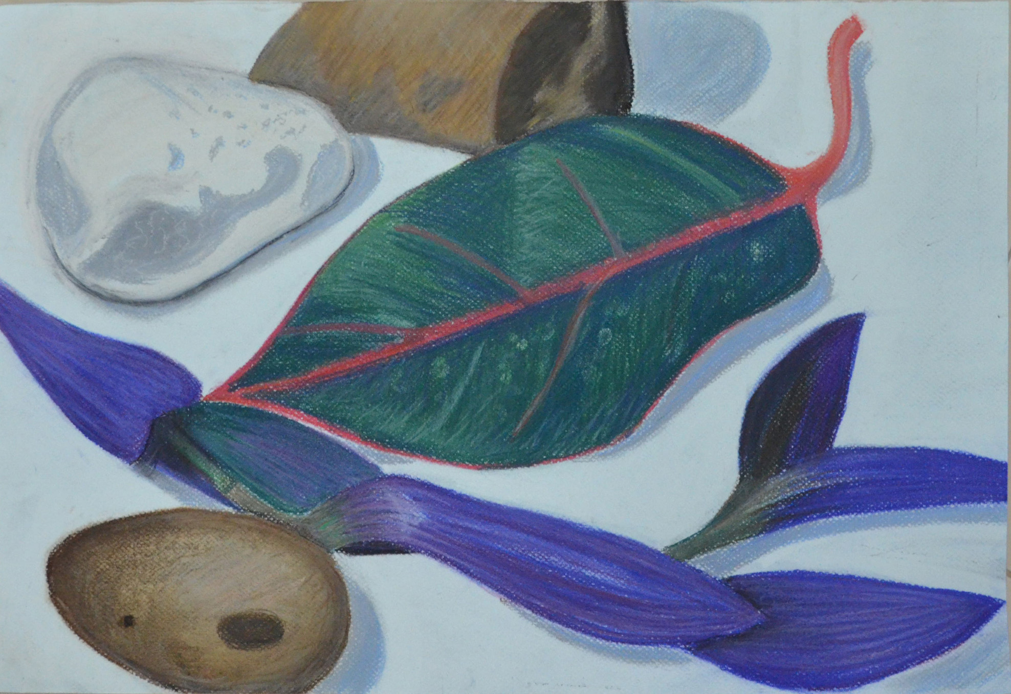
The natural object study has a balanced compositional arrangement and successful harmonic colour palette however I feel it has been cropped a little too tightly. The composition as a whole would benefit from a larger area of negative space, especially at the upper framing, around the pebble or rock in the background. The addition of this negative space would accentuate a sense of perspective or feeling of receding. Looking back on your preliminary work in relation to this piece I found that the compositional development sketch in colour pencil worked a little better. It has vivacity and more space to breathe and this I feel is missing from the finished piece. The development sketch possesses a more gestural and immediate rendering whereas the finished piece appears more guarded, as if you were slightly hampered or aware that it needed to be ‘finished’. The pressure we put on ourselves to produce something that is finished and ‘special’ can often hold us back, impeding a more direct and fluid representation.

Yes, I totally agree here that the finished piece was a little too cropped, I had been following other students’ blogs and thefeedback they had received from their students, leaving too much background space etc. and I wanted to fill up the paper, however if I had positioned what I drew in the study better I would have accomplished this as well as not omitting important negative space.

Assignment 1 - Natural Forms - Finished Drawing a2
Assignment 1 – Natural Forms – Finished Drawing A2

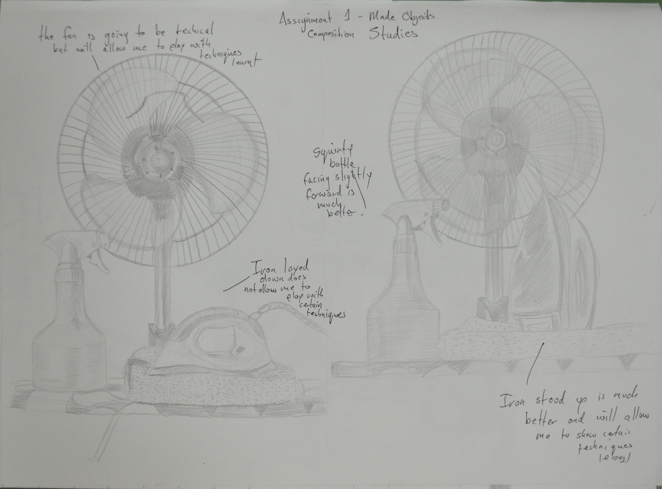
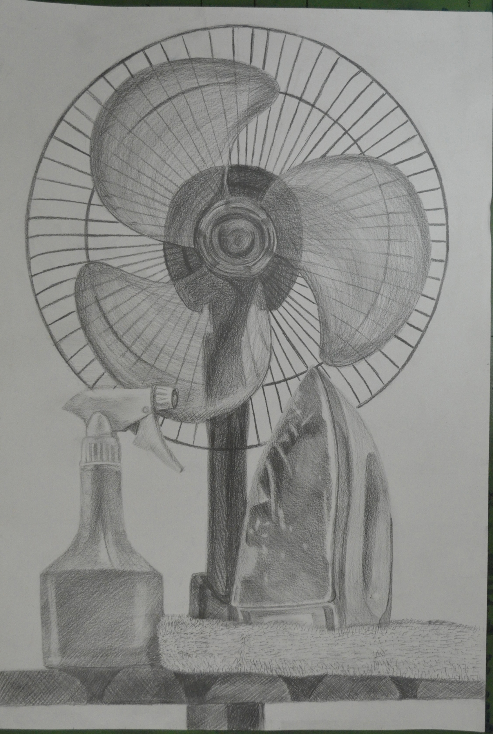
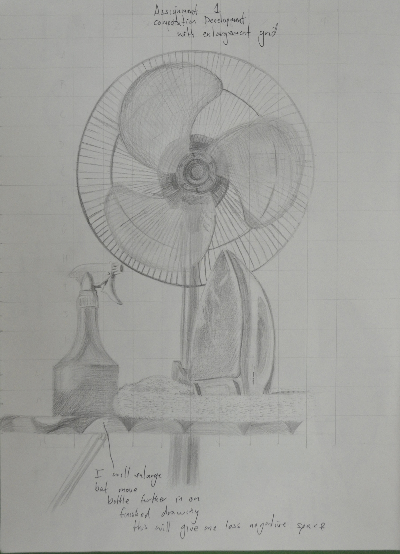
As with the natural object study the preparatory research you have done for the man-made piece demonstrates a true motivation to understand your subject. You have thought long and hard about its conception and have displayed excellent indicators and developmental information, in the form of preliminary sketches and annotation, to describe the creative process. It was interesting to read your considerations for choosing the subject matter for this piece and also to read the reasoning for discarding your original compositional idea of the traditional Buddhist items. I would have quite liked to have seen a quick sketch of the latter, maybe even a combination of the two cultural elements – in visual terms it would have been a nice juxtaposition. Having said that, I feel your finished piece for the man-made study worked very well. It is evident that you are dexterous with graphite pencil and have delineated the objects with sensitivity, and portrayed their material properties observantly. The composition has a comfortable rhythm to it. I particularly liked the way you reconsidered the placement of the plastic spray bottle to improve the composition thus alleviating the possibility of it ‘kissing’ the cage of the fan. The drawing has good differentiation of tone and representation of volume. The manner in which you have rendered the transparency of the fan blades is particularly well observed. I must admit however having seen the colour photograph of the composition I feel the addition of the limited colour palette would have made for an interesting drawing, with reflected colour on the base of the iron, spray bottle, towel and base and blades of the fan. Try not to be held back by insecurity when using a new medium – you have the skill and adventurous spirit to overcome this Mark.

‘juxtaposition’ and ‘limited colour palette are two new art terms that I learnt from this. The reason for not going with the Buddhist items was that I wanted to work in pencil as a contrast to the hard pastel on the natural objects, I tried colour pencil on the Buddhist objects but the colour wasn’t strong enough. The fact is I should have used pastel on the made objects and colour pencil on the natural objects. I do have some preliminary sketches of the Buddhist items which I will include for assessment.

Learning Logs or Blogs / Critical essays Context

Your investigation into the research points in this first part of the drawing module has been delivered meticulously and with great enthusiasm. You have written your thoughts articulately and with obvious interest in the subjects and have offered reflective opinion on other artists’ work and how it relates to your own. This research and in turn practical discoveries into the artists’ work –artists you were not familiar with – will expand your critical thinking as well as enhance your drawing skills.

Sketchbooks

Your sketchbooks are full of some very promising work Mark. It is plain to see that you are committed not only to the course but to learning and the development of your art practice. You have shown an open-minded dedication to experimentation with different materials and media as well as a determined approach to new methodologies and conceptual constructs. This trait will stand you in good stead for future modules. Your drawing is thoughtful and investigative and shows a good ability and understanding of the fundamentals of composition and perspective.

These are inspiring words, I personally thought at this stage my keeping sketchbooks weren’t up to scratch, to read positive words words like this is definitely a push in the right direction.

The exercises have been considered honestly, with a clear view to getting the most out of the projects. I could see in your mark-making and doodling exercises a direct influence of two of the artists you researched: Max Ernst and Odilon Redon. I also felt encouraged by the inspiration you absorbed of both Patrick Caulfield and Van Gogh. The example of where you work in the style of Caulfield for instance shows good observational skills and an understanding of the artist’s oeuvre by taking that inspiration and producing a piece that represents his style but at the same time maintains your own creative integrity.

I have enjoyed researching new artists and have absorbed pieces of them, I know this to be true. I do feel though that the research points are in the wrong place in the coursework and so have to read ahead to the research is helpful in the right modules. 

The basic shapes and fundamental form exercises (books and boxes, jugs and jars and supermarket shop) have been tackled diligently and with determination. You have a keen sense of observation and focus but can sometimes lose the rhythm when being overly careful with your finished pieces – check the ellipses on the jars and cans in the supermarket shop drawings.  The still life of fruit and veg could do with a little more depth in the cast shadows. Try to be a little more expressive with colour; see how the reflected colour of the table plays on the green and red peppers and how the yellow of the third pepper is cast on the surface of the plate. You have observed and delineated this especially well in the reflected light exercise.

still life natural forms 2 still life natural forms 6

So true, the tightening up as mentioned earlier is probably the cause of this losing rhythm, that and my relief when a drawing goes the way I like and fear that I will mess up if I go further. One thing I do have to say here is that if I hadn’t shown the photo of the composition the colour of the table wouldn’t have been known. Because I made this into a mixed media drawing I felt that I could depict the reflected light while omitting the colour. I do agree with the shadows should have been a lot darker though and shall go over them as I feel this is a piece that could be submitted for assessment.

All exercises have been methodically researched and thought through and I have no doubt that if you maintain this determination and enthusiasm you will see a steady and confident progression in your work.

Suggested viewing/reading Context

It is good to hear that you have now discovered the joys of art galleries! It is imperative that you immerse yourself in current and historical examples of visual art. It will be interesting to see if inspiration develops from these excursions, especially any Thai influences. Already, with the introduction to new artists, you have broadened your own visual vocabulary. Gather as many references as you can. One practitioner I think you may find interesting is the Spanish artist Antonio López García. Below are a couple of examples of his work:


Pumpkins, 1994-95. Pencil on cardboard. Fundación ICO, Madrid, Spain.


Antonio López Torres’ House, 1972-75. Pencil on paper. Fundación Sorigué, Lérida, Spain.

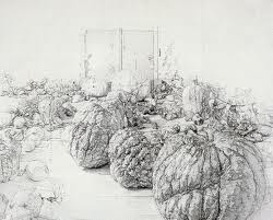
Here is the research point for Antonio López Garcia .


Pointers for the next assignment

Continue to work just as you have been doing Mark but try not to get bogged down or tighten up when faced with the final piece. Maintain a loose and fluid hand. The next assignment gives you the opportunity to further experiment with different media but is also about observation in nature – be prepared to capture movement.

Assessment potential (after Assignment 1)

You may want to get credit for your hard work and achievements with the OCA by formally submitting your work for assessment at the end of the module. More and more people are taking the idea of lifelong learning seriously by submitting their work for assessment but it is entirely up to you. We are just as keen to support you whether you study for pleasure or to gain qualifications. Please consider whether you want to put your work forward for assessment and let me know your decision when you submit Assignment 2. I can then give you feedback on how well your work meets the assessment requirements.”

I am hoping to work through the B.A. (Hons) painting so I will be submitting my work for assessment.

Assignment 1 – Reflection on Assessment Criteria

Assignment 1 - Charcoal and Colour Pencil Studies

Demonstration of technical and visual skills – materials, techniques, observational skills, visual awareness, design and compositional skills

Throughout this first part of the Drawing 1 course I have continued to use more and more different materials and drawing media often going back to certain drawing materials to develop my skills with them further. I am aware that my skills need to and will continue to develop further.

My observations skills have become more acute from where they were when starting this course. I am now fully visually aware of things that I never took much notice of before such as shadows and reflective light. My ability to depict tone and form has improved and will continue to do so.

I have also learnt that composition studies are an important part of the process and the best way to compose objects to make use of negative space and how objects interact with each other.

Quality of outcome – content, application of knowledge, presentation of work in a coherent manner, discernment, conceptualisation of thoughts, communication of ideas

I have become more aware of how others see my work. I can now walk myself through the ideas that I have and reflect on those looking at aspects to consider that will help me improve on the quality of the outcome of my artwork. I am able to communicate those ideas and describe exactly why those changes are taking place.

Demonstration of creativity – imagination, experimentation, invention, development of a personal voice

I believe I am continuing to show imagination in the work that I have done in this part of the course so far but it is something I do need to improve on. I am continuing to experiment with drawing techniques and materials that I never thought I would use or previously did not feel comfortable in doing so. As far as invention goes I think that I have shown this using mixed media for the first time and I am continuously thinking about what mediums I can use together and what part each medium will play in my artwork. I feel I have yet to develop a personal voice if this means finding my own style.

Context – reflection, research, and critical thinking (i.e. learning blog)

Since starting this course I am now doing things I never took the chance to do before such as visiting art galleries even though there is not much of a choice of galleries here in Bangkok. I am also trying to make use of various size sketchbooks sketching at any chance I get so I can hopefully develop those ideas later on in this course. I have enjoyed researching the various artists that have been mentioned in the first module of this course, especially drawing in the style of Patrick Caulfield and I feel I can make reference to some of those artists in my work. I have yet to develop critical thinking as I have spent more time critisisng my own work at this stage. The blog as helped me to reflect on my own ideas that will help me to develop my skills in the future.


Assignment 1 – Check and Log

Assignment 1 - Natural Forms - Variations and Materisla Used

Did you do enough preliminary work before starting on your final pieces?

Yes definitely, the preliminary work not only helped me decide on the best composition for the final piece but helped me to decide which mediums I should use. In both parts of this assignment it changed my mind about what mediums I would use and also the layout of the composition for the final piece. I probably could have done more with regards to colour blending and make more notes on which colours to use for the Natural Objects.

Do your large drawings give an accurate interpretation of the still life groups? If not, what went wrong?

The large drawing for Made Objects I believe was a very accurate interpretation of the still life group even after playing down certain details such as the amount of bars on the electric fan cage. However I I’m not too happy with the interpretation of the still life group in the large drawing for the Natural forms. There are certain shapes on the edge of the drawing that I know are not the same as the actual objects this was due to moving the objects about trying to find the composition that I chose to develop, then having to work from the drawings I had already done and photos that I had taken.

Did you make a good selection of objects or did you try to include too much?

I believe I made a good selection of objects for both parts of this assignment with a minimum amount of objects in mind as I set out on each project.

Do your drawings fit well on the paper, or could they be improved by working on a larger sheet of paper?

The drawings do fit well on the paper but I do feel that both compositions may have been improved on a larger A1 sheet of paper because of the objects that I chose for the Made Objects and for the medium that I chose for the Natural Forms.

Did you have problems with drawing, or find hatching too difficult?

I don’t feel that I have any problems with drawing, any problems that do have are probably from the lack of experience with certain mediums. In the Natural forms part of the assignment I thought I did quite well in developing my hatching skills with hard pastel.

Assignment 1 – Natural Forms

Assignment 1 - Natural Forms - Finished Drawing

Getting started with this part of the assignment was quite difficult as it is hard to find good natural forms in Bangkok and did not have time to leave the city for the countryside. So I  collected pebbles from the car park of my apartment and in front of the office block where my language centre is and also went out with a pair of scissors and took a couple of cuttings from plants in the garden downstairs. Overall I was quite happy with the objects I chose.

Assignment 1 - Natural Forms - Finished Drawing
Assignment 1 – Natural Forms – Finished Drawing

After the very technical composition of the made objects I wanted to show a complete variation with something more simple and the objects I chose allowed me to do so. I originally intended to do the finished drawing in colour pencil but as I began the project things took a different path.

Assignment 1 - Natural Forms - Composition Studies
Assignment 1 – Natural Forms – Composition Studies

Working on the composition studies it was like a breath of fresh air compared to the composition studies of the made objects so much so that I may have moved a bit too quickly with fast strokes and very sketchy outlines. The leaves the plants that I had brought in to draw were not going to wait for me as they had started to wither as soon as they felt the air-conditioning of my living room, so working quickly was very necessary. I tried a few compositions with three and four pebbles eventually settling for one of the easiest compositions possible and so worked on it a little more and got it ready for enlargement.

Assignment 1 - Natural Forms - Composition Development
Assignment 1 – Natural Forms – Composition Development

The next step was to experiment with different mediums to help me decide exactly which one I would be using for the finished piece. By this stage the plants were well on their way to the grave, so I took several shorts with my camera so that they would help me later, unfortunately I did not take a photo of the composition I had chosen this would prove to be a problem later.

Assignment 1 - Natural Forms - Variations and Materisla Used
Assignment 1 – Natural Forms – Colour Pencil and Hard Pastel

I actually wanted to try soft pastel but then when I opened the box up I realised I had purchased a portrait set which would be no good for this project.So I tried both colour pencil and hard pastel. I don’t like the feel of colour pencil on paper, they are ok for lighter work but for work that needs more darker tones you have to press on and it makes me feel uptight as the pencil drags across the paper. Hard pastel is different on different types of paper on the Canson sketching paper it can not be smudged but is great for sketching. I decided that I would develop the composition in colour pencil and use hard pastel for the finished drawing.

assignment 1 - Natural Forms - Composition Development - Colour Pencil
assignment 1 – Natural Forms – Composition Development – Colour Pencil

Drawing a grid onto another A3 sheet from my sketchbook I enlarged the drawing and completed it in colour pencil to see how it would look. I was satisfied with how it looked but I wasn’t satisfied with the waste of paper around the edges. There was a very minimum amount of shadow in this composition and so I had to take advantage of the negative space between the objects and cropping the composition would help me to do just that. I had already erased the grid I drew when enlarging the previous drawing so it was a great chance to use the acetate grid I made in the Enlarging an Image module.

Assignment 1 - Enlargement Grid
Assignment 1 – Enlargement Grid

By this time the plants had withered up and I had forgotten to take the photo of this composition so I was working between this drawing in colour pencil and various photos. I was worried that I would just be smudging on this piece especially with my chosen medium and not be able to demonstrate anything I have learnt in the first part of the course but apart from smudging on the rocks and pebbles I managed to resist the temptation of smudging and complete it with some nice hatching and fluid strokes.

Assignment 1 - Natural Forms - Finished Drawing
Assignment 1 – Natural Forms – Finished Drawing

There are certain parts of the finished drawing that I am not happy with mainly the rock and the pebble in the top left they don’t look two bad but the shape is out on the sandy coloured rock and I couldn’t play with it that much for fear of messing up  the leaf and the white pebble which I did and used fixative before going over it again.

However, I am satisfied that I managed to make reference to certain projects in the first part of the course such as negative space, enlarging an image, tone and form, hatching and lines and other marks and managed to demonstrate quite a lot of these in the leaf and the purple plant alone. I do wish the rocks would have been more sketchy though but with the pastel paper that I used it was hard to do so without the paper underneath showing through.

composition of natural objects

Assignment 1 – Made Objects

Assignment 1 - Made Objects - finished A2

I originally had the idea to to use traditional Buddhist items for this part of the assignment such as yellow cloth, a candlestick, temple type money box and did go out and purchase them. The medium I chose for the original composition was coloured pencil, but as I laid down watching the girlfriend iron in front of the electric fan with the white wall of my apartment I had a better idea.

Assignment 1 - Made Objects - finished A2
Assignment 1 – Made Objects – finished A2

I wanted to show something about my life in Thailand and I felt that the new objects set out in the right composition would describe my life perfectly, a normal working-class life in a tropical country. With 13 years in the country and the last few years living alone I knew these objects intimately but the fan would prove to be something of a challenge..

Assignment 1 - Made Objects - composition studies
Assignment 1 – Made Objects – composition studies

I began with composition studies in my A3 sketchbook, I found it difficult to come up with more than two variations as I was locked into how i felt the objects should be presented from the start. How every I did vary the composition slightly with the iron laying down in the first composition which I think was actually my first idea and then the iron stood up proudly in the second. The ironing board was lifted up on the table and I was almost laid down drawing the second composition sketch which I liked so much that I decided this would be the one to develop and decided that I would be there for a while so raised the ironing board higher with the ironing board on top of a table on top of another table. We had to do without a place to eat for the next few days.

Assignment 1 - Made Objects - Photo of Original Composition
Assignment 1 – Made Objects – Photo of Original Composition

At this stage I did things a little bit in reverse with the composition studies just finished I decided to develop the composition in pencil to get a feel of how it would look in that medium before looking at others. One of the main reasons for doing so was being insecure about whether or not I would be able to demonstrate the techniques especially pencil holding techniques that I had practiced in the first part of this course. I then concentrated on enlarging the image by drawing a grid over the top of the composition ready for enlarging for the finished drawing.

Assignment 1 - Composition Development and Enlargement grid
Assignment 1 – Composition Development and Enlargement grid

At this stage I was still not so sure about what medium I would use for the finished drawing, so as instructed on an A2 sheet I practiced with colour pencils and charcoal.

Assignment 1 - Charcoal and Colour Pencil Studies
Assignment 1 – Charcoal and Colour Pencil Studies

Charcoal would have been great for the towel and even the water bottle and possibly the iron but on an A2 sheet which I was planning to use this medium proved itself too messy for the electric fan. I did love the way the water bottle looked in charcoal though, rather like stencil street art. Colour pencil wasn’t too bad but didn’t look solid enough for me, I was still trying to get practice with this medium and didn’t feel like I could carry it off in any other medium than graphite pencil and so that was my final decision.

assignment 1 made objects
Fan Almost Complete

At this stage i decided the composition still needed more work and moved the squirty bottle further in to create less negative space to fill the rectangle shape of the paper. The layout of the fan was very technical it helped that there was no front on it but still took well over an hour and a compass and ruler for the cage. After everything was sketched out my insecurity about not being able to show the various techniques that I practiced in the first part of the course disappeared as I got into it, swapping between 3B and 4B pencils using different pencil holding techniques and several different forms of hatching.

The squirty bottle was pretty straight forward and quite easy to show tone and form on…eventually after I managed to get the shoulders of the bottle right after several goes, as I had moved the bottle in since the composition development work. This was completed mainly by hatching and cross hatching.

The iron allowed me to use several different drawing techniques including hatching, smudging and drawing the patterns on the blade with a putty rubber. However the shape of the iron varies slightly from the photo above I was having double vision when it came to the iron as my left eye is quite bad but refused to work from the photo.

The towel and the ironing board itself allowed me to draw with texture using short, lines dots and a putty rubber on the towel to dry and fluff it up and cross hatching for cloth ironing board cover.

I’m satisfied that I have managed to make reference to most of the aspects of drawing that have been covered in the first part of the course in this part of my assignment from holding pens and pencils to enlarging an image. Drawing the fan allowed me to demonstrate different pencil holding techniques, the bottle allowed me to demonstrate tone and form while the iron allowed me to show both tonal variation as well as reflected light on the blade. The towel was also a great idea which I originally added to raise the iron and didn’t realise it would help me to demonstrate techniques for drawing with texture.

,