Demonstration of Technical and Visual Skills materials, techniques, observational skills, visual awareness, design and compositional skills.
I used several different drawing materials in this assignment and used a wide range of techniques in several different studies. I examined several different compositions until I found one that I liked the best and from there I explored different mediums until I found one that I thought was perfect for the finished piece.
Quality of Outcome content, application of knowledge, presentation of work in a coherent manner, discernment, conceptualisation of thoughts, communication of ideas.
To me my work in this assignment displayed all of the above qualities.
Demonstration of Creativity imagination, experimentation, invention, development of a personal voice.
This was the first assignment piece where imagination played a big part in the finished drawing, and indeed the studies and for the first time I can see there is a personal voice developing here.
It is never easy to change tutor at assignment 5 but this is the situation that we find ourselves in. The task has fallen to me to give you feedback on what you have produced for assignment 5. You will have to bear with me as I have not seen anything of what you have done until this point.
Due to my tutor not being available until further notice because of family matters I was contacted and asked whether I would need a replacement tutor. So close to the end of my first course I thought it was important to find a replacement tutor. There was an extreme contrast between my previous tutor feedback’s which can be viewed below and this one.
Demonstration of technical and Visual Skills, Quality of Outcome, Demonstration of Creativity
I see that you have chosen Option 4, the figure. Students can often find it difficult when working from the figure mainly due to preconceptions as to what a drawing should look like and particularly a work made from the figure.
For the most part the quickly made drawings in the quick sketches work are weak; you have generalised far too much instead of drawing what you have seen. This has resulted in some poor understanding of proportion and how bodies engage with the space around them. The interpretation of the hands and feet in this series of work needs thinking about. It is important to make changes as you draw correcting and changing to get the whole operating cohesively. Writing on a drawing what is wrong with it or what needs to be done to it will not benefit you at this stage. Change the drawing!
Quick StudiesQuick Studies
I agree that some of these quick studies were weak, out of proportion etc and said so in the learning log. Others were strong with a 100% resemblance and correct proportions. What needs to be realised here is that I am drawing figures of a ‘different race’, i.e. If I was drawing Japanese models, legs would be shorter. I made notes on drawings before making a fresh, I was drawing quick and so I thought this was a better approach than spending so long editing the drawing. These notes helped me to capture my thoughts at the time.
Varying the speed that you draw can often open up new ways of seeing as can holding your drawing implements differently or using your ‘wrong’ hand. Quickly executed drawings can be good and bad. Drawings made more slowly likewise. It is the intent and nature of the outcome in reference to what your subject is and the quality of the drawing itself that matters.
Now interestingly the batch of ‘more gesture’ drawings mostly made in pencil are really well seen and interpreted for the most part; working quickly has worked for you here! The works from the female model are full of life and movement; the proportions are very believable as is the weight distribution through the figure and the stances in general. Some of the male studies demonstrate some good understanding of foreshortening through some quite difficult poses.
For me here you have investigated as you have been drawing and it has allowed you to interpret the figure much more successfully through the use of the media itself. This approach has negated some of the repeated faults that your work can have i.e. too large heads and poorly articulated extremities. When an approach is working it is important to capitalise on it and build on both the methods and the look of the outcomes
My idea of a gesture drawing and a quick study are two different things. For me a quick study is a quick study in the style of my ‘would be’ finished piece, if he had looked at the previous assignment he would have seen the quick studies were closer to the way I finish a drawing. However, the ‘more gesture’ drawings were more satisfying and so maybe I am looking in the wrong place to find myself.
It is imperative that you look hard at all times at your subject; look draw, alter, draw again, change, look, you need to build up a dialogue between yourself, the subject and the particular medium that you are using. Different media require different approaches as do different subjects. It is good to build your drawings in this way.
You included lots of work which in itself is fine, however, it is very important to us some objective discernment both as you are working and as you look at a completed body of work. Interestingly the drawing in line of the ‘woman playing with her phone’ is the most successful of this group of works. The proportions are fine and come together and form a believable figure in action. You have this marked as ‘out of proportion’, it isn’t! This tells me you are not seeing things clearly enough as you look; look at this drawing closely and try to recognise how you have articulated the figure in space; how well the head sits; how you have changed sizes of parts of the body as they recede (foreshortening in other words). You have been looking here and not generalising. The shaded version of this pose is not as successful as the line version; it is stiff and lifeless by comparison. I will talk more about discernment later in the report.
Playing with Phone – Out of ProportionPlaying with Phone A3
I have to disagree here, this drawing was from a photo as I didn’t have time to do a life drawing in this pose. My girlfriend is only 5 foot and the second drawing is ‘spot on’. I like the first drawing in just line but it is as I said out of proportion.
The tonal studies revert back to generalisation for the most part; you are forgetting to ‘look’ here and are trying far too hard to make a picture instead of investigating your subject. As a result proportions are out again; heads too big, feet and hands and legs too small. Some of the drawings are somewhat kitsch also which is a look you should avoid at this stage in your development.
I submitted drawings here that others would have left out, mainly because the folders I have submitted digitally from my computer contains everything. Below is a photo of a very spontaneous easel drawing that was neither planned out or marked. It shouldn’t have been submitted but it was and as since been omitted from my learning log. However, there are positive drawings in this exercise, that were not generalised, were not drawn quick and were a result of looking. The tutor has nothing positive to say about any of these and that’s annoying. The ‘kitsch’ he talks of is a result of depicting tone using colour, the results were spontaneous not planned.
Drawing that shouldn’t have been submittedA2 Tonal Drawing in Pastel Pencil on Ingres
I will be reproducing this in charcoal pencil.
Drawing with Angled EaselTonal Study with White PastelAngel in Tone
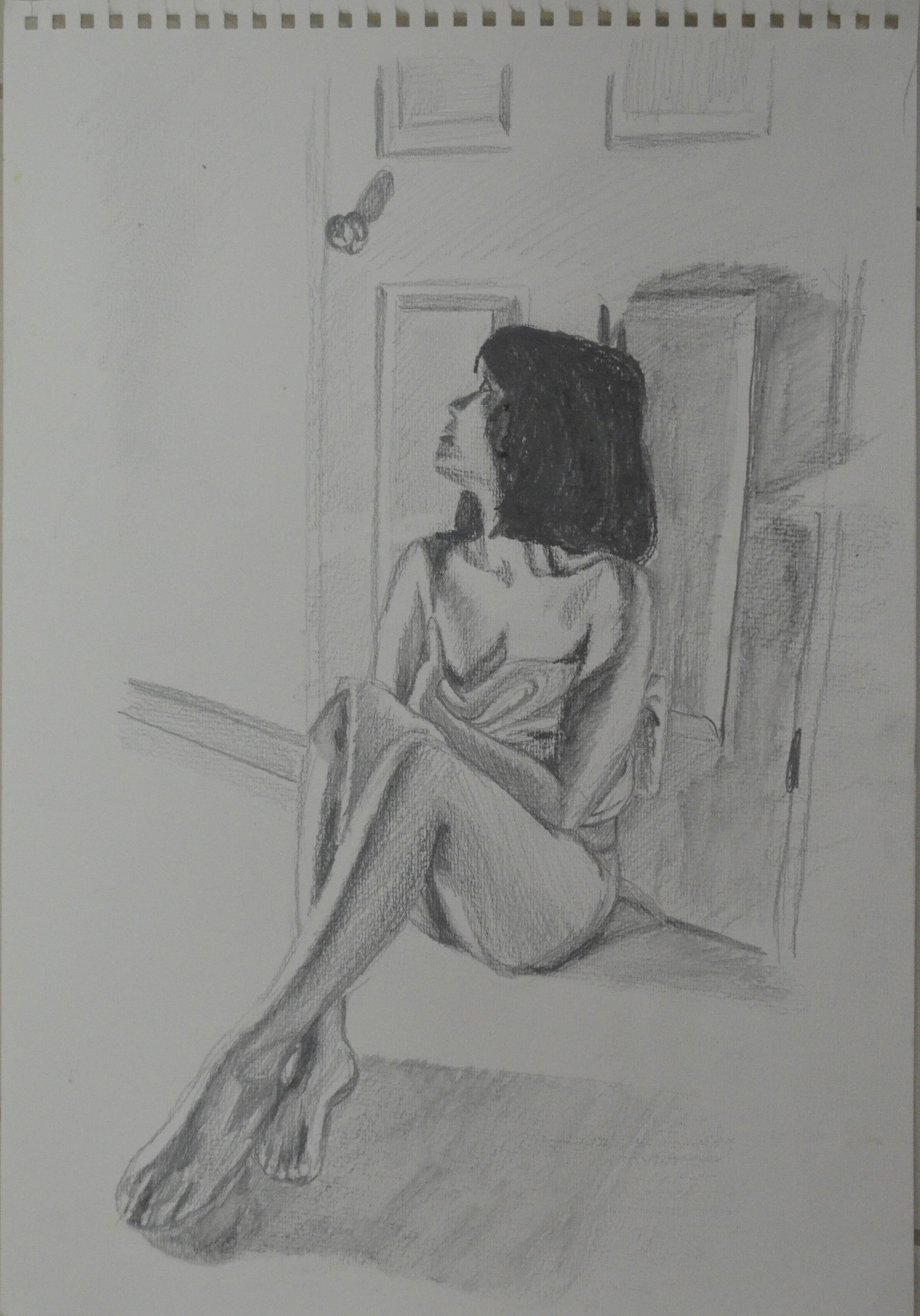
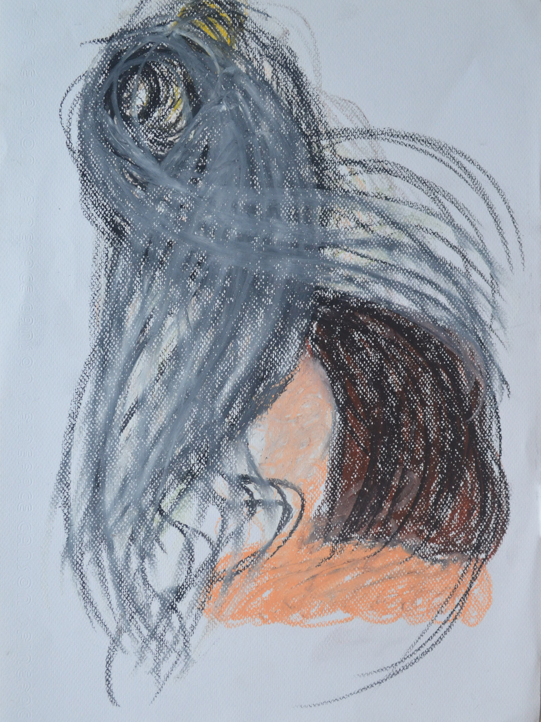
The work that you did for the assignment piece itself is actually much better. The understanding of proportion is better and the use of tone is quite successful also. The ‘looking at the door handle’ in water soluble pencil looks to be working better than some others as does the more expressive version in watercolour pencil which you have marked ‘Sad Attempt’. The expression that this study has could be pushed even further.
Sad attempt in watercolour pencil
The tutor and I obviously have different tastes, styles and understanding of what I was trying to do in this assignment, the above drawing was not it.
The larger drawing is a reasonable resolution on what you were trying to do. The sense of isolation within the figure is present and the pose supports the idea also. The relationship of the figure to the background maybe needs some more attention to get the areas of the drawing reacting together more.
Maybe the figure looking at the door handle would be sufficient as a concept to carry both the pose and idea. The pastel one maybe over done.
It is always good practice to work on more than one version of assignment pieces; this will give you much more scope to select when the time comes and it will also help you explore your ideas and methods more also. Remember this for the future.
I wasn’t trying to create a sense of isolation within the figure, I was trying to create a feeling of anxiety and fear, which I think the oil pastel, ‘over done’ drawing did well. The larger drawing in Gouache, watercolour and watercolour pencil was a second version of the assignment piece and if I preferred it to the oil pastel would have been submitted as such.
Sketchbooks
Demonstration of technical and Visual Skills, Demonstration of Creativity
I presume that you have been keeping sketchbooks through out the course. The more investigative the more useful they will be. Bear this in mind for the future.
Learning Logs or Blogs/Critical essays
Context
The blog is far too descriptive. You need much more critical comment on what you look at and indeed more of an in-depth comment on your practice and methods. Say more about why more often rather than how. More comparative statements about the quality of your work and how you think that you could improve it. It needs to be less descriptive and more of an analytical tool that you can use in your practice in a real sense.
This should have been pointed out to me at an earlier stage instead of getting pats on the back, is it too late to change?
Generally a learning log/Blog should contain objective and comparative comments on your own work and development. Comments on work of other artists relevant to what you are doing. Evidence of art you have seen, in the flesh in books or on the web – with images, annotated where necessary. The log should also contain the set theoretical studies from the course and your tutor reports.
Suggested reading/viewing
Context
Look at drawn figure work by Manet and Cezanne to see how they use their media fluidly and openly, Seurat’s drawings are good examples of inventive use of tone. Look at Degas for his use of pastel and inventive composition and Van Gogh for his use of mark making and line. Picasso and Matisse have both made exhaustive drawings in line which would be beneficial to see as would some of Rodin’s work from the figure in line also.
Other
Discernment is going to be very important for you as you select for your assessment submission. You will have to do this as I can see that you have a lot of examples of work some of course more successful than others. You need to pick out the more successful work.
Some of the work throughout a all five assignments will not be quite as successful as others so you will need to select well. Look through all your reports to help you select. Spread all your work out in front of you and remove the less successful ones until you have a coherent group which satisfies the submission criteria. Put the best drawings in as the assignment pieces i.e. re designate them if you need to. Pick out your most successful pieces as support work also. You will find the submission criteria in your course book and check out the OCA website for tips on submission. You need the right balance; not to much but not too little either. Present your work in its best light.
Over the last two months I kept looking at the brief for this final assignment and I was wondering how I could demonstrate a significant amount of new skills I had learnt not just i this last part, part 5 but throughout the course.
My strongest idea was a full figure semi nude sitter in the shadows of a lamp lit apartment I did for a brief moment think about a self portrait stood in the kitchen with the sky and clouds behind me, but in the rainy season that wasn’t a good idea.
I was definitely including the background and I wanted to use the background to create a unique mood, to try and influence the drawing as much as possible. I imagined my subject sitting against a wall with long shadows depicting how small and insignificant she was to her surroundings, like Gerald Scarfe’s illustrations of the main character in Pink Floyd’s The Wall.
As this module was all about experimenting, what was I going to experiment with? What techniques was I going to use? And would I use experimental techniques in my final drawing?
I decided that I would try to experiment more with water soluble media, pencils, watercolour pencils, watercolour paint, and gouache and see where that took me, I bought the book ‘Drawing and Painting with Water Soluble Media by Fiona Peart’ just to give me some ideas.
Fiona Peart Drawing and Painting with Water Soluble Media
I had plenty of low quality watercolour paper to mess around on and but not so many different types of water soluble media but I thought I’d have a go at some of the techniques in the book to see if I could use any in my final piece.
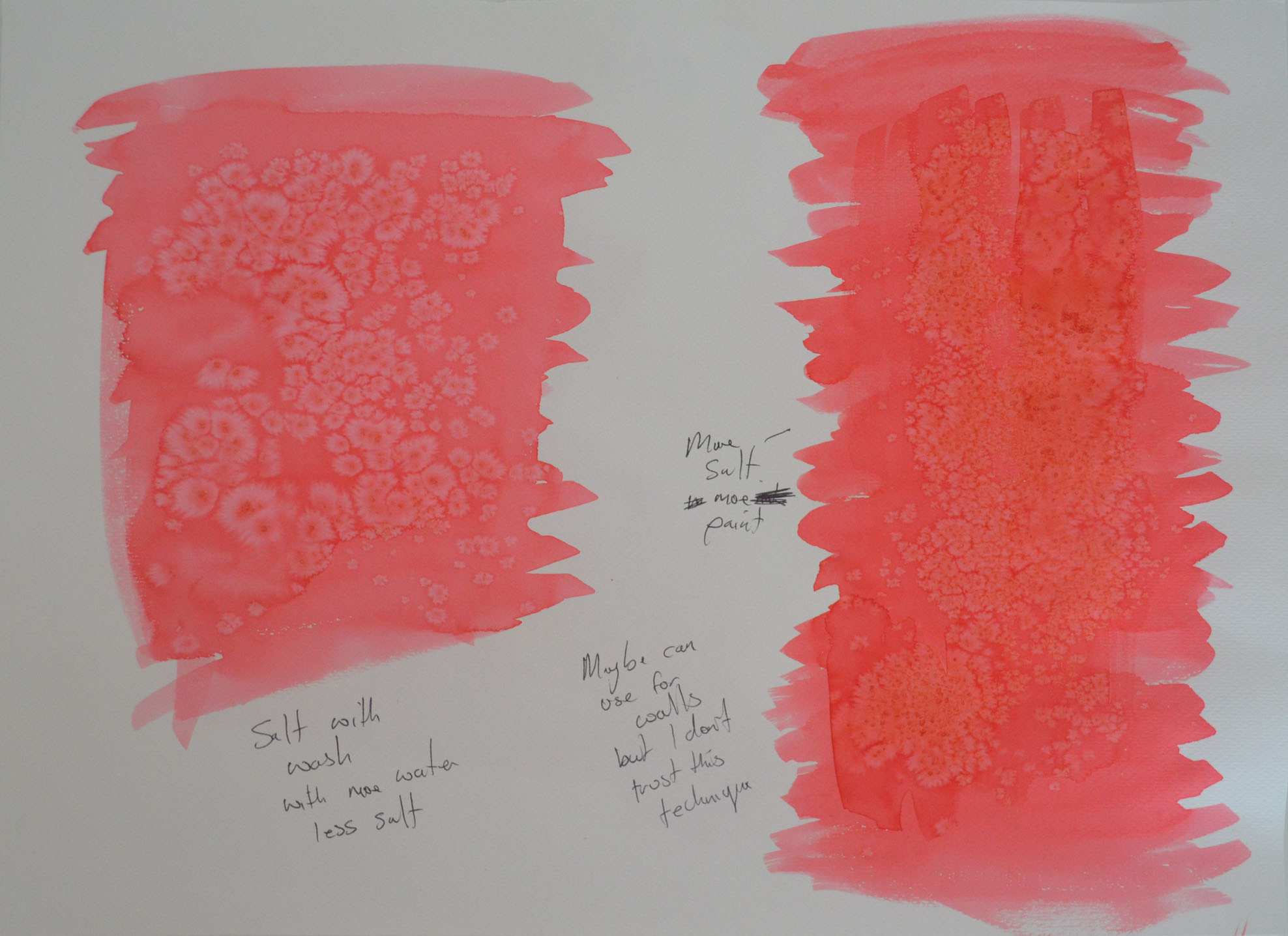
1 – Salt on Watered down Ecoline Wash
The first technique I tried was dropping salt granules on to a watercolour wash, see above. I had several bottles of Ecoline liquid watercolour so I dropped some in a jar and watered it down. I haven’t done much messing about or drawing with watercolour (probably haven’t been brave enough) so I still have a lot to learn about how much water to use in a wash etc. So I did a wash (the one on the right) in 30+ degrees heat and it seemed to start drying as soon as my brush left the paper, then i started to try and drop single granules of salt onto the wash. They didn’t do much and so I rubbed my hands and let the lot fall over the top of the wash. The result was a discoloured blotch effect that looked like fungus.
I decided to water the wash down some more and start again. this time I sed less salt and as you can see above the results are a bit better. However I wasn’t sure how I would use this technique in the finished piece.
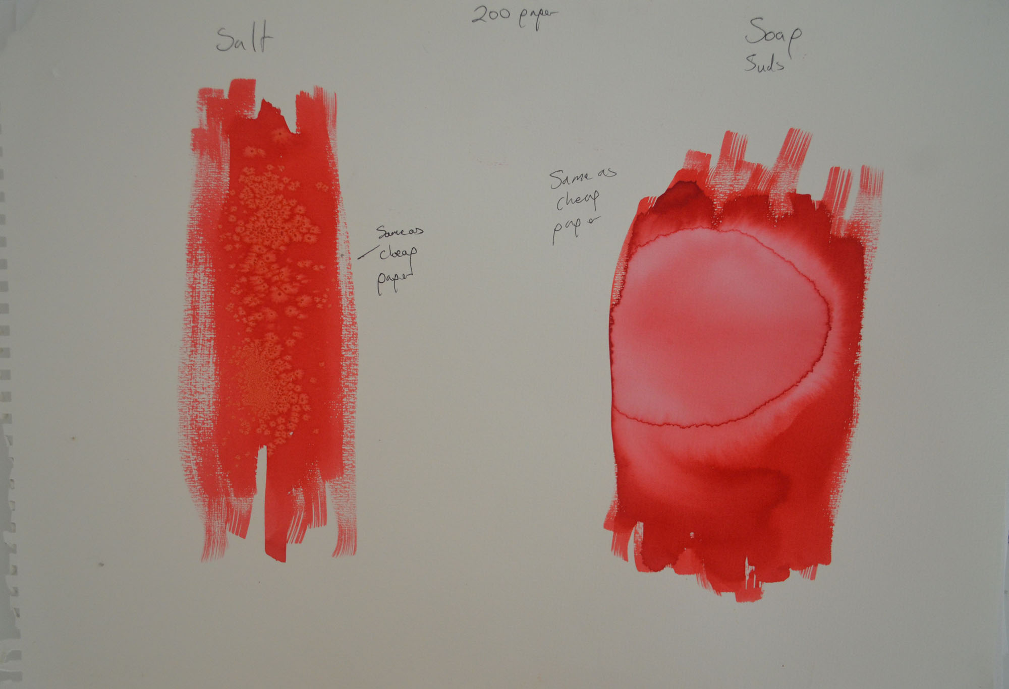
2 – Dried Soap Suds on Watered Down Ecoline Wash
The second technique I used was soap suds. On the left I used a small amount of soap suds scooped up and placed on a watercolour wash, this time with more water added. The results were very different to what she had in the book where she had used them to depict pebbles on a beach, the patterns that mine made (after 2 hour of drying) resembled a cloudy sky.
3 – Soap and Suds on Ecoline Liquid Watercolour
I wasn’t sure whether it was the paper I had been using or whether my washes were too thin that made my experiments look nothing like anything in the book so I had another try with a thicker wash on a higher quality 200 g/m2 watercolour paper, the results were almost the same.
My girlfriend came round that evening so I decided to stop with the experimenting for the night to do a series of sketches of sketches in water soluble pencil to see which worked best.
4 – Soluble Pencil on 200 gm2 Paper
My first sketch was a very sorry effort indeed, I did exactly what I’ve been trying to stop myself doing in this last section, misuse the paper. I wanted to use the background but the figure still had to be a good size on the paper.
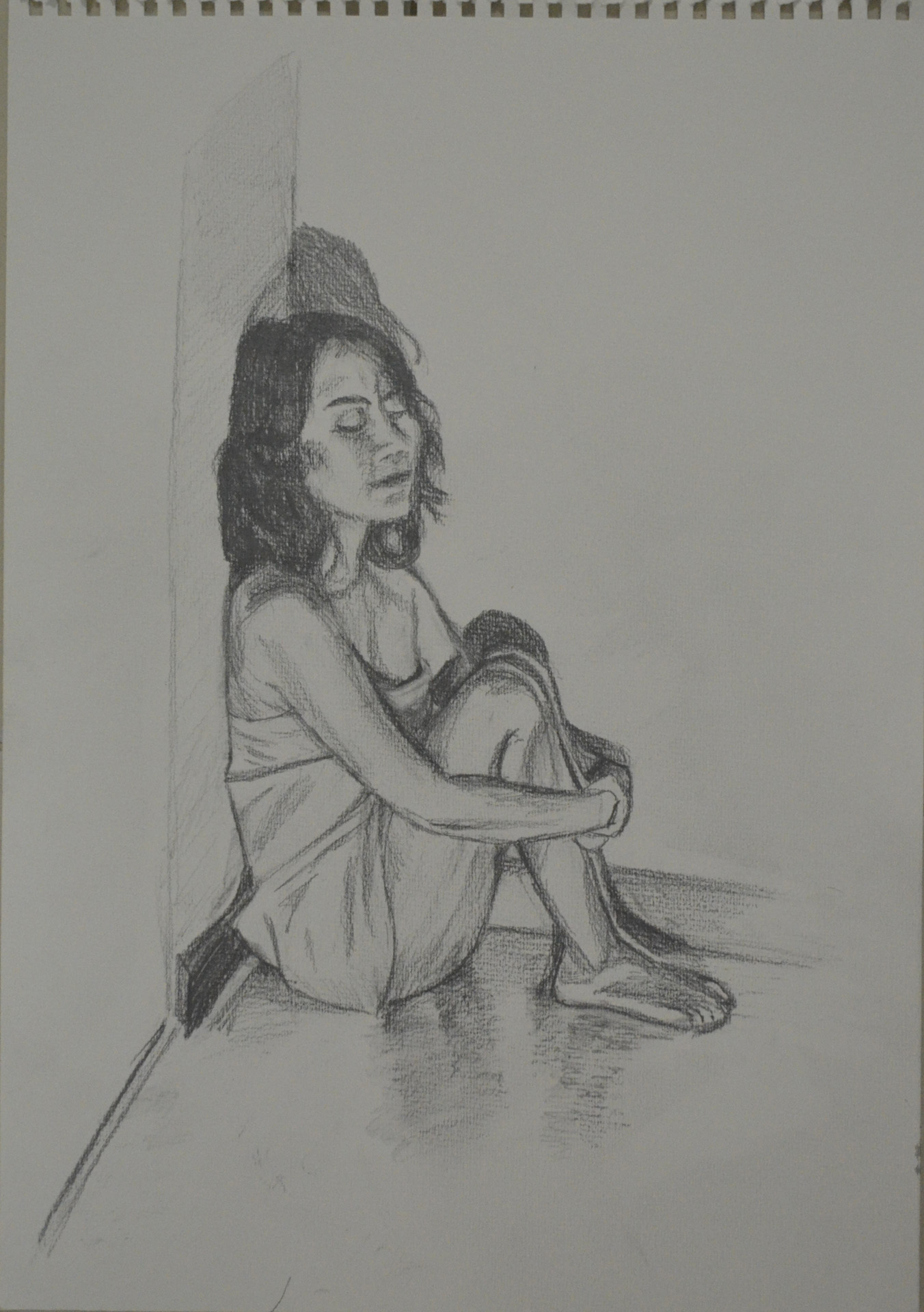
5 – Another Try at First Pose Water Soluble Pencil
The second sketch was better but was still not that great and by now I decided that her clothes would be replaced with the orange cloth. The third sketch was a lot better and probably one of the best so far over the last two modules and the face was almost spot on which was an added bonus. However, I really wanted the background to play a bigger role in the finished piece.
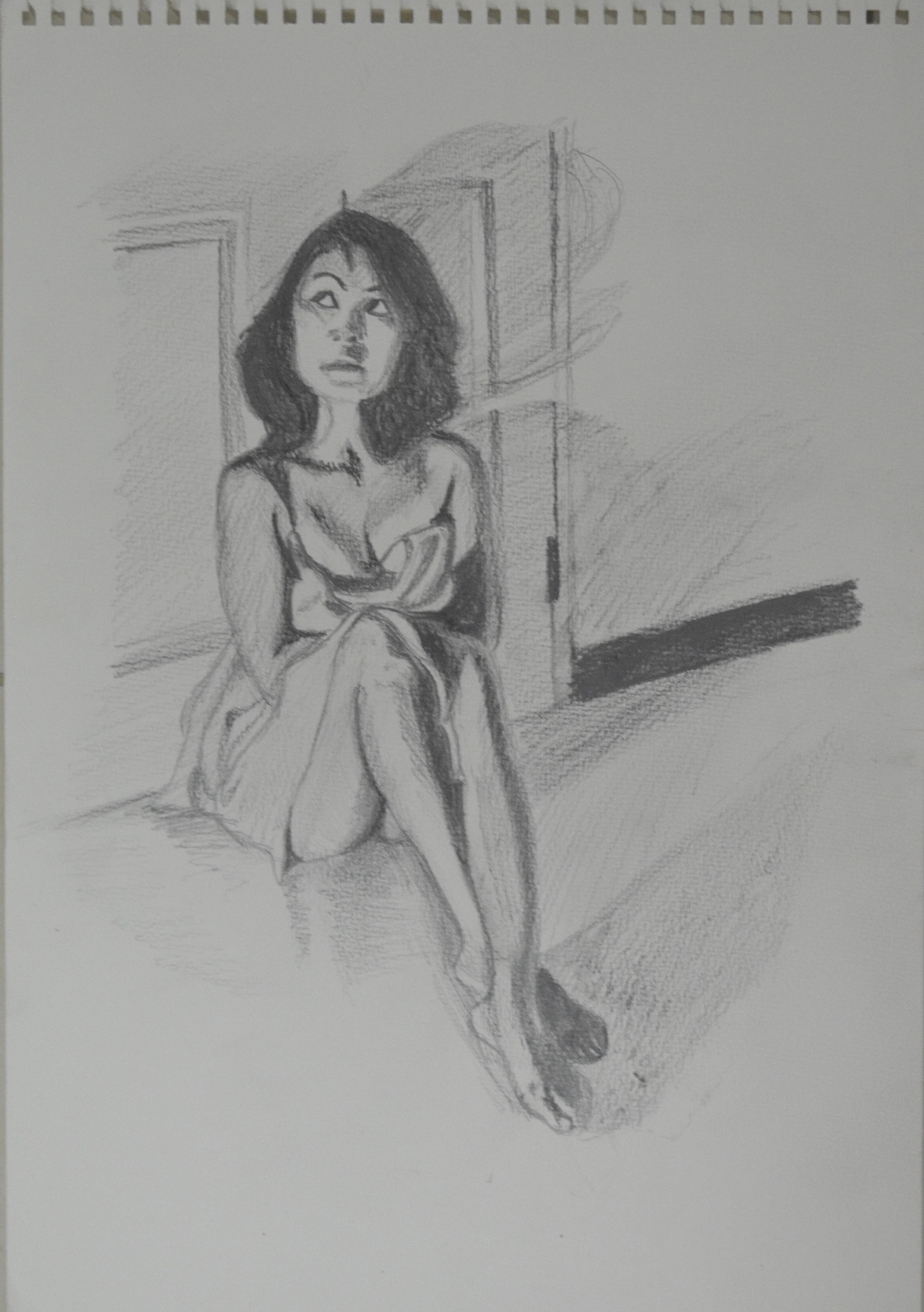
6 – Semi Nude with Monks Robe Cloth
The next one was even better but I stopped at drawing the door, even though I knew this one would work it was a different mood to what i wanted to depict in the final piece. To me the pose in the drawing below was warm, welcoming, even romantic like she was waiting for her lover to come home, I wanted a totally different mood altogether for the final drawing.
7 – Semi Nude with Bent Knee
By now I was working towards the pose that I had my mind set on and the next pose below was pretty close but still it looked like she was waiting for someone rather than hiding from someone which is what I really wanted to show in the ideal pose. Because this was a 100% perfect in looks, proportion, the long shadows and everything else I nearly went with this but I decided to squeeze just 1 more sketch out.
8 – WaterSoluble Pencil Sketch with Door Handle
In this last sketch I decided I had got the pose that I wanted, it still looked like she was waiting for someone to come through the door rather than hiding behind it but I decided to go with it in the hope that the medium and technique that I chose to complete the assignment piece would help me to depict the mood that I wanted.
9 – WaterSoluble Pencil Looking at Door Handle
To give my girlfriend a break I decided to do some colour drawings working from the sketch above, the first one was a total abomination. Until now, apart from the Fish on a Plate exercise I had used my watercolour pencils dry, as a substitute to my Derwent colour pencils which I wasn’t keen on the waxy feel of, the awful attempt at being artistic below was a very tired try at sketching with wet watercolour pencils. I decided that was it for one day.
10 – Sad attempt in watercolour pencil
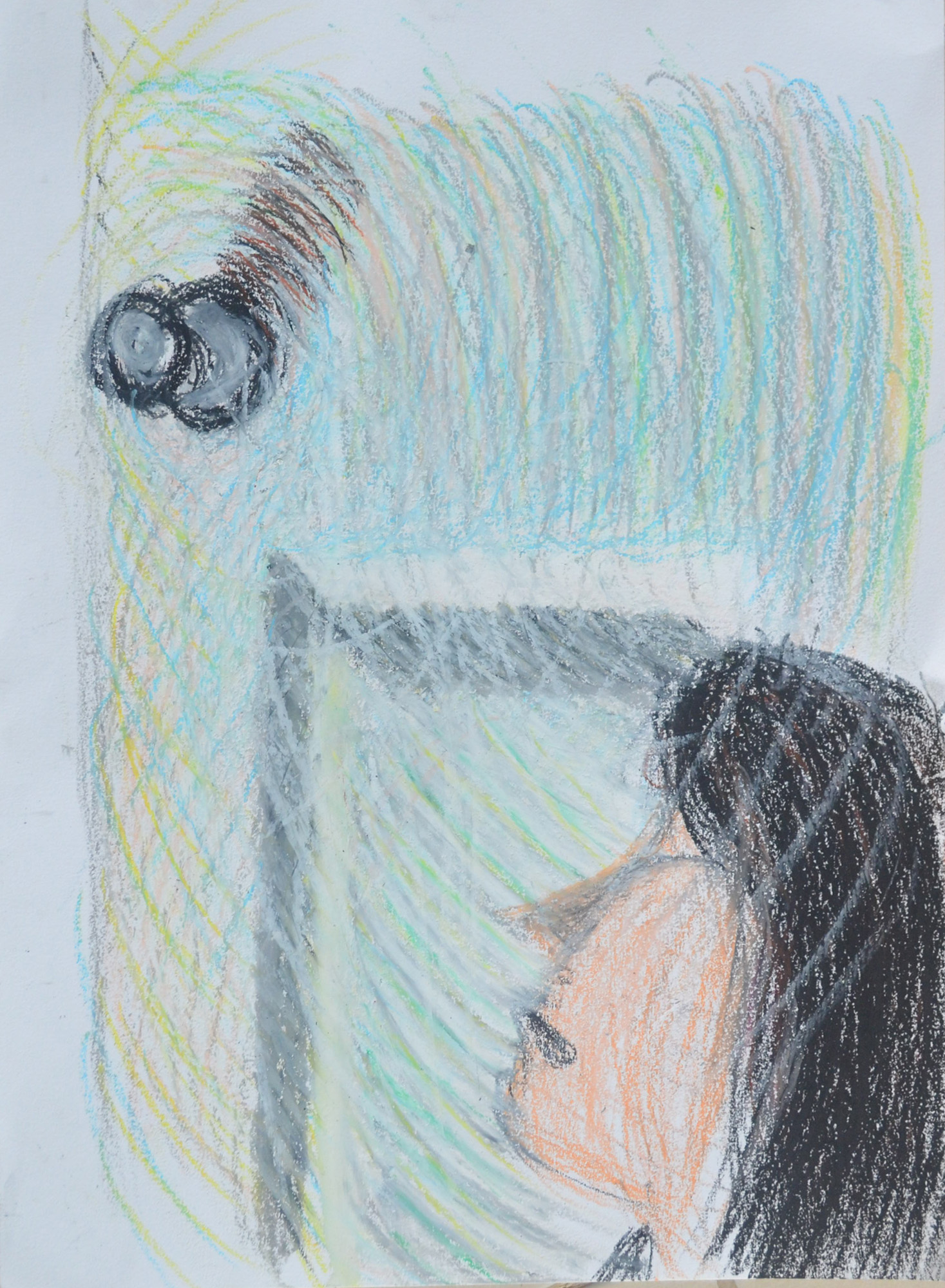
At this stage I wanted to have ago at painting this in watercolour but basically I wasn’t ready for drawing in a painting medium and so I had another go at watercolour pencil to get myself ready for a more permanent medium, this was drawn from the water soluble sketch.
11 – Watercolour Pencil Drawing from Sketch
That afternoon I went and bought some Louvre watercolour paints, a jar of white Gouache and some brushes. I still really didn’t have a clue what I was doing with the paints which were in tubes and so I decided to take minimum risks and draw the figure in watercolour pencil and use the watercolour paint for the floor and walls.
After completing the figure with watercolour pencil and wet brush I painted the shadows on the floor with watercolour paint using a brush and then dragged the paint off with the paper with a tissue, I’m not sure if there’s a special name for that technique. I painted the rest of the floor and the walls with a brush but I needed to show the light reflecting off both and so when the watercolour paint was dry I stippled the gouache paint over the top with the same brush. From there I finished the door off hatching with watercolour pencils then going over them with a wet brush.
I wasn’t worried that I hadn’t used any of the experimental techniques that I played around with earlier as this was an experiment just on its own but I wasn’t satisfied with how this turned out, it was stagnant there was no mood to it and I decided to change to a different type of painting medium.
12 – Watercolour Pencil, Watercolour Paint and Gouache
I wanted to make a bigger connection between the door handle and the figure and i wanted to do it with a visible energy field and swirling hatching came to mind and the perfect medium for this would be oil pastel. And so I went from water soluble mediums to oil pastel.
I knew I would need a lot of white oil pastel as I planned to draw it on an A2 size paper and so this was my first experiment at trying to get the lines that I needed without using the valuable white. I really don’t know what I was doing here and it started to look more like a kids drawing from an horror movie.
13 – Oil pastel – Too dark – Trying not to Use White
The second experiment was with much lighter colours using more of the white and trying as many different techniques together to see which one worked. From this it was obvious that the only one that was going to work and join everything together was circular hatching, or at least that’s what I call it, like a vortex drawing, spiraling out from the door handle connecting everything, or spiraling in.
14 – Trying a Few Different Techniques Together
I bought some dark grey Ingres paper and taped it to my largest drawing board with masking tape at the corners. I was still drawing from previous sketches including the latest watercolour/watercolour pencil drawing.
Two hours in and something was beginning to form but it was more like the blurred image in a dream than anything else. I started with black for the hair plus pinks and various oranges for the skin, cloth and skirting board then white circular swirls for the walls and floor, with the white lines further apart for the darker shaded areas to let the grey show through. I wasn’t hatching in the same circular motion for everything but I kept going over the top with white to give the impression of doing so and only two hours in I was already on my second stick of white oil pastel.
15 – Drawing after First Two Hour
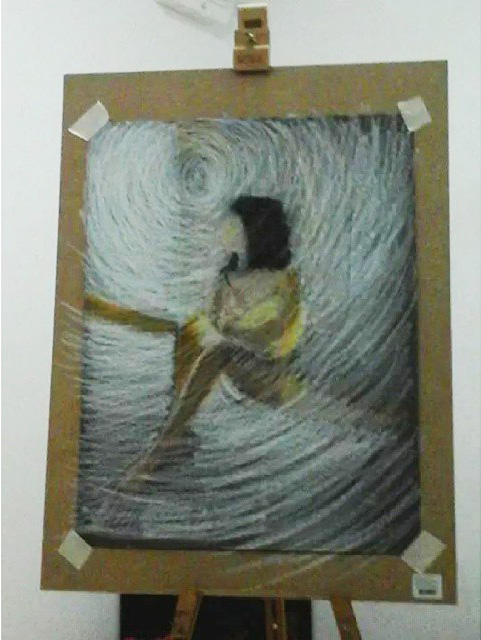
The next day and a few hours in and the picture was looking a bit too light as I added more and more colours to the vortex including pinks, yellows, greens and blues, I liked where it was taking me as long as i could darken it eventually. The figure looked unnatural and out of proportion and also two far away from the door but I wasn’t worried, I knew eventually she would be right where I wanted her. The most worrying thing at this point was that the door handle was too low and had to be lifted up and that was the starting pint of my vortex so everything had to be reworked.
16 – Final Piece Second Stage
After about a good few hours it was proving to be a very long process but knew the end results would be worth it. by now I had got everything marked out and re-positioned the door knob and I was starting to draw in the shadows which would tell me if the figure was too far to the right or not on the paper…It was. What was niggling me at this stage though was if I should draw the face or leave it blur as at this stage it reminded me a bit of Francis Bancon’s work, still blurred between the point where the face was and where I had moved it to.
17 -After a good few hours
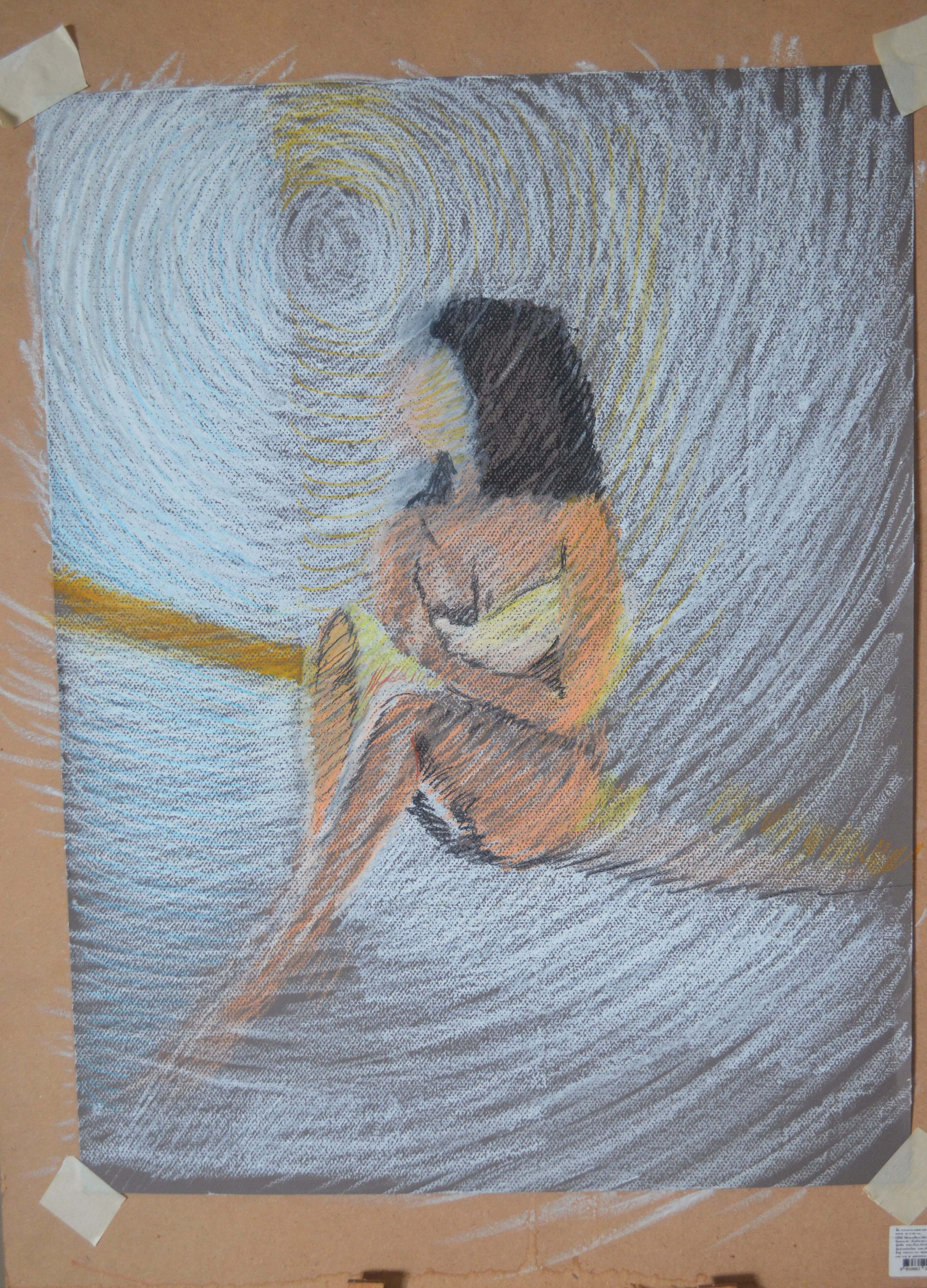
It took me a few hours longer to finish the drawing and as you can see between the drawing above and the drawing below a lot more work went into this piece, moving her even more so she was in a more natural position against the door but that’s not where all the work went. No longer is there any grey from the paper showing through the oil pastel, the darker parts are darker layers of oil pastel on top of the lighter ones and the shadows took at least two hours to correct.
I would say in all this piece took me the best part of twenty hours to complete. No sure if it was all drawing though, there was a lot of thinking during the process, as with any lengthy process like this I tend to get lost in my thoughts as I step back and look at the drawing from different angles.
18 – Assignment 5 Final Piece
I chose to do something completely different with her face, so far I’ve only managed to get my girlfriend’s face right with a pencil or water soluble pencil, I wasn’t taking any chances and used the face to help me create the vortex effect, instead of just circular hatching, all the way to the door handle.