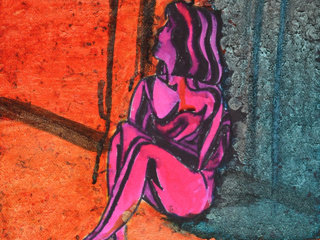
I have spent the last three weeks getting ready for assessment, preparing my portfolio, piecing everything together and taking a fresh look at my work coursework as well as having another try at any exercises that weren’t up to scratch; this was one of them.
The last part of the course was drawing and experimenting, I’d done plenty of drawing but not much experimenting, so I had another look through Vitamin D: New Perspectives in Drawing for some ideas. Having a fresh look at the book after following the course was very refreshing, but rather than being influenced by any works in particular I was inspired by how the artists had let themselves go and freed themselves from any chains that had previously bound them. This is what I needed to do.
I had just finished having another go at the Quick Studies exercise and was due to do some more experimenting with colour. However, there were a few pages that I couldn’t use due to the black fine marker blotching on the reverse side of the pages, this gave me an idea.
I took out some of the coloured chisel pointed markers that I had purchased earlier in the course and coloured in the back side of one of the quick sketches, first in red then in green followed by a dark blue. Turning over the page I was very happy with the very random results apart from where I had coloured in with the dark blue but there were some light spaces so went over again with a yellow.
I was really happy with what I had created but I wasn’t going to stop there, just like I did in the Doodling exercise in the very first project in this course I freed my mind and let go.
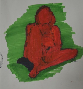
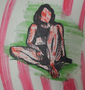
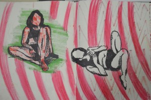
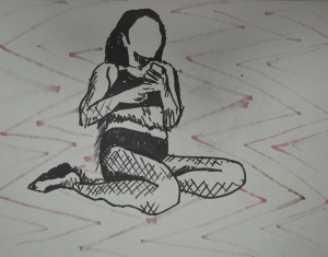
The first few experiments in this fresh try at using colour were basically drawing on the reverse side of, or over the top of existing marker pen studies with either marker or oil pastel but the studies weren’t that great and so I started the next 4 drawings from scratch.
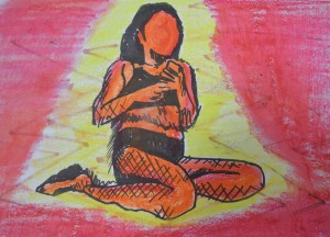
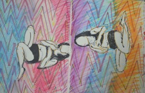
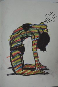
I began the next drawing by laying down random marker lines and then filling in the white gaps with pink, from there I drew a fresh pose from a series of photos that I took on the beach. Then I drew a similar pose on a plain page and then drew within the shape of the body with darker colours.
Both of these drawings worked out great, the first drawing looks like the the model is absorbing sunlight, while the second, even though it was a very similar pose with similar colours, albeit a tan instead of yellow looked very different indeed. This time the subject looked like a tanned figure and to add to it I drew a breath cloud. Thinking about it now they could actually look like before and after figures, tanning and burnt.
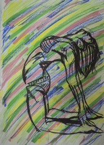
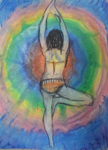
I started the next drawing by drawing in circles with the oil pastels and then blending them with my finger. I knew I would draw a figure over the top but i wasn’t sure which pose or how i would finish the experiment. I don’t know why I chose the pose below but it worked out well. To complete the drawing I first sprayed the bottom layer with hairspray then I drew the figure in a fine black marker before filling the figure in white oil pastel and then drawing in the details. I love the way her back glows due to the yellow in the centre of the bottom layer.
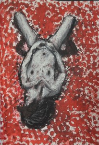
In the last experiment I drew the figure with the same fine marker then applied red liquid watercolour around the figure then brown inside but because I had freshly drawn the outline the black of the marker smudged into the red and brown making the figure impossible to determine so I went over the body in white oil pastel then the outline again in black. The end result looks (to me) like a rotting corpse on either blood splatters or rose petals.
More Experimenting
I realised that I could never do enough experimenting with colour and I came back for another play, only this time I worked on an existing piece, which turned out to be a bad idea but it seemed to be the start of something that I can could come back to develop in the future and I did.
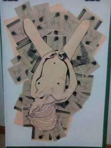
The collage that I made earlier seemed a bit bare and I thought that I could maybe do something else with it. The last experiment that I did in my exercise book gave me an idea. The red liquid watercolour over black and Iooked like blood or rose petals and I wondered if I could work on that idea over the top of the collage.
The problem was I had no red liquid water colour left and so decided to work with acrylic paint, although not a drawing medium it was worth a try to see what it would come out like. I first applied black acrylic with bubble wrap wrapped round a spray can lid that I could use like a stamp, then over the top of that I applied a layer of burnt sienna, followed by a layer of brilliant red, hopefully this would give me a shadow under the red. It turned out looking nothing like what I wanted it to and so I just kept on playing.
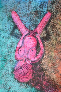
The paint I already applied was just too dark and ugly and so I went over it white acrylic paint and once that had dried or near enough dry I applied ink and liquid watercolour over the top. From bottom right I worked in a clockwise direction first applying green, then blue, red, orange and yellow and let them all drip into each other, finally i went over the figure in pink. The finished picture didn’t look that great but it had potential so I took a photo before it fell apart and unfortunately, got binned. I really lied the way the ink over the acrylic applied with bubble wrap looked like a very colourful snake skin and so I would come back to this.
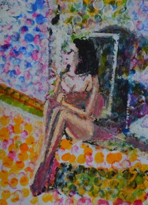
For the next picture I applied ink and liquid watercolour with a wine bottle cork, this was on an A3 sheet of paper so it looked better than I could possible imagine, I used white gouache over certain parts add light to the figure and the door.
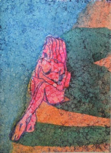
I decided to have another go at the acrylic>bubble wrap> ink technique as I wasn’t happy that I had to throw away the drawing and so I did a little bit more experimenting before trying to have a go at a finished piece. This time the colour order didn’t suit the pose as the lighter colours should have been on the left of the figure. I also made the mistake of applying white acrylic to the figure then going over it with pink ink and marker, these didn’t take well over the acrylic and so I decided to have one last try.
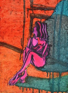
On the third try I drew the figure with marker and then went over it in pink ink before applying the acrylic this looked patchy as the marker bled into the ink but it still didn’t look that bad. From there I went threw the process of applying the acrylic but this time I added too much white so when it came to painting with the ink over the top it didn’t have the same effect.
When it came to applying the cooler ink colours. I applied a dark turquoise instead of blued which I rubbed off with a paper towel before applying the blue then let the colours bleed into each other. This time the blue dripped over the orange instead of bleeding into each other and so I tried to drip draw the door as well.
Conclusion
Every drawing in this final experiment turned out completely different the first looking like snake skin while the last a stain glass window and even though I haven’t managed to complete a final drawing using this new technique I feel it is something that can be developed further.
