
While preparing my coursework and portfolio for formal assignment there were a few exercises that I wasn’t satisfied with and so made fresh attempts at the exercises to increase my chances of passing this first course. Like those exercises this assignment was one that I felt wasn’t up to scratch mainly because of the limited choice of views that I had to draw and the medium I chose to draw the finished piece. I found myself asking these questions: Was the dry watercolour pencil the best choice for this assignment? and if not which medium would be more suitable?

For the Study of Several Trees exercise I had used oil pastel and was really happy with the natural, loose feel of the finished drawing. I tried to imagine the above dry watercolour pencil drawing in the clumsier, thicker medium and the paintings of Vincent van Gogh came to mind, because this assignment included buildings as well as trees I decided to take a look at paintings of buildings by van Gogh.
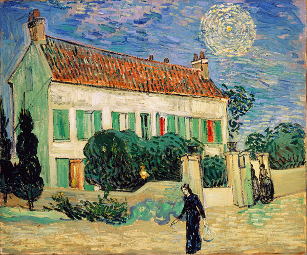

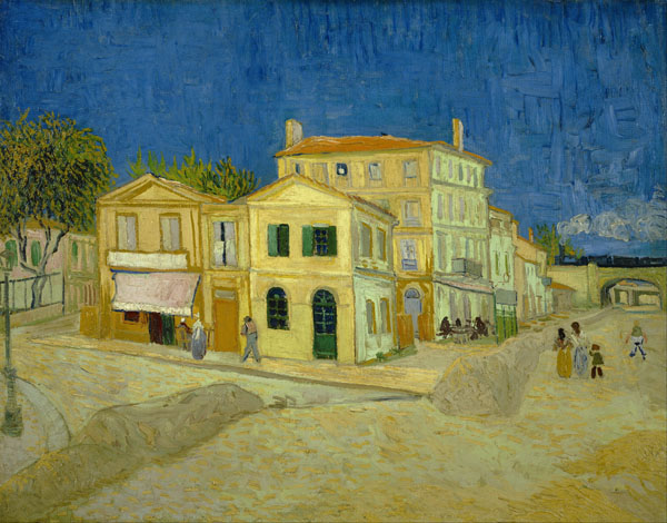
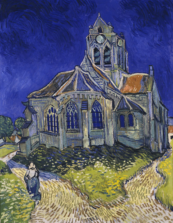
What I like about van Gogh’s paintings of buildings is that they aren’t just blocks with roofs on or basic shapes, they paintings look like that he has painted part of the building and then kept adding to it so that the buildings look wonky a bit like the way they build buildings here in Bangkok and indeed how they built extensions onto old country cottages.
Being a bulkier messier medium than the colour pencil I used in the original finished piece it was guaranteed that the parts of the buildings that show in the oil pastel drawing would turn out looking wonky but looking at van Gogh’s paintings this wasn’t necessarily going to be a negative.
The finished drawing in oil pastel below was drawn from the original photo, it isn’t the best work I have produced but it isn’t a let down either. The colours are a lot more vivid than the colour pencil drawing and I feel that that the drawing itself is a lot stronger with more character, you can also see a lot more of the temple through the trees than the original picture.
The most difficult part of the drawing was the window on the left which took a lot of scarping and redrawing to get it looking anything like the original drawing, with the bulkier medium I had to sacrifice the fourth pain of glass in the window and with the constant redrawing of the window and the wonky lines it makes it look almost van Goghlike.
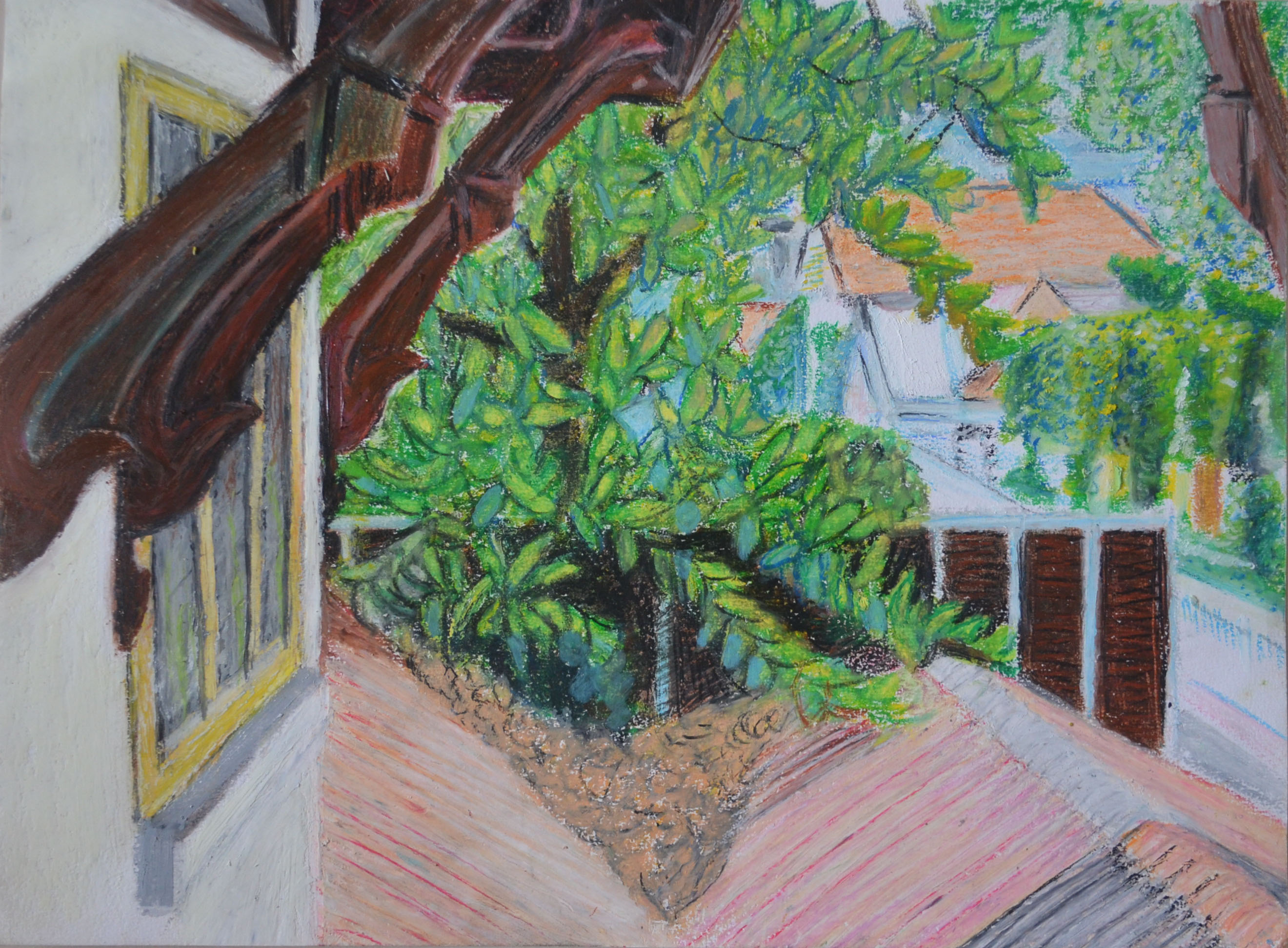
The down side is though, because I don’t feel that the window on the left doesn’t show confidence with this medium, i shall still only be submitting this drawing as an additional study and not a finished piece, but one thing is certain, it was a study that needed to be done.
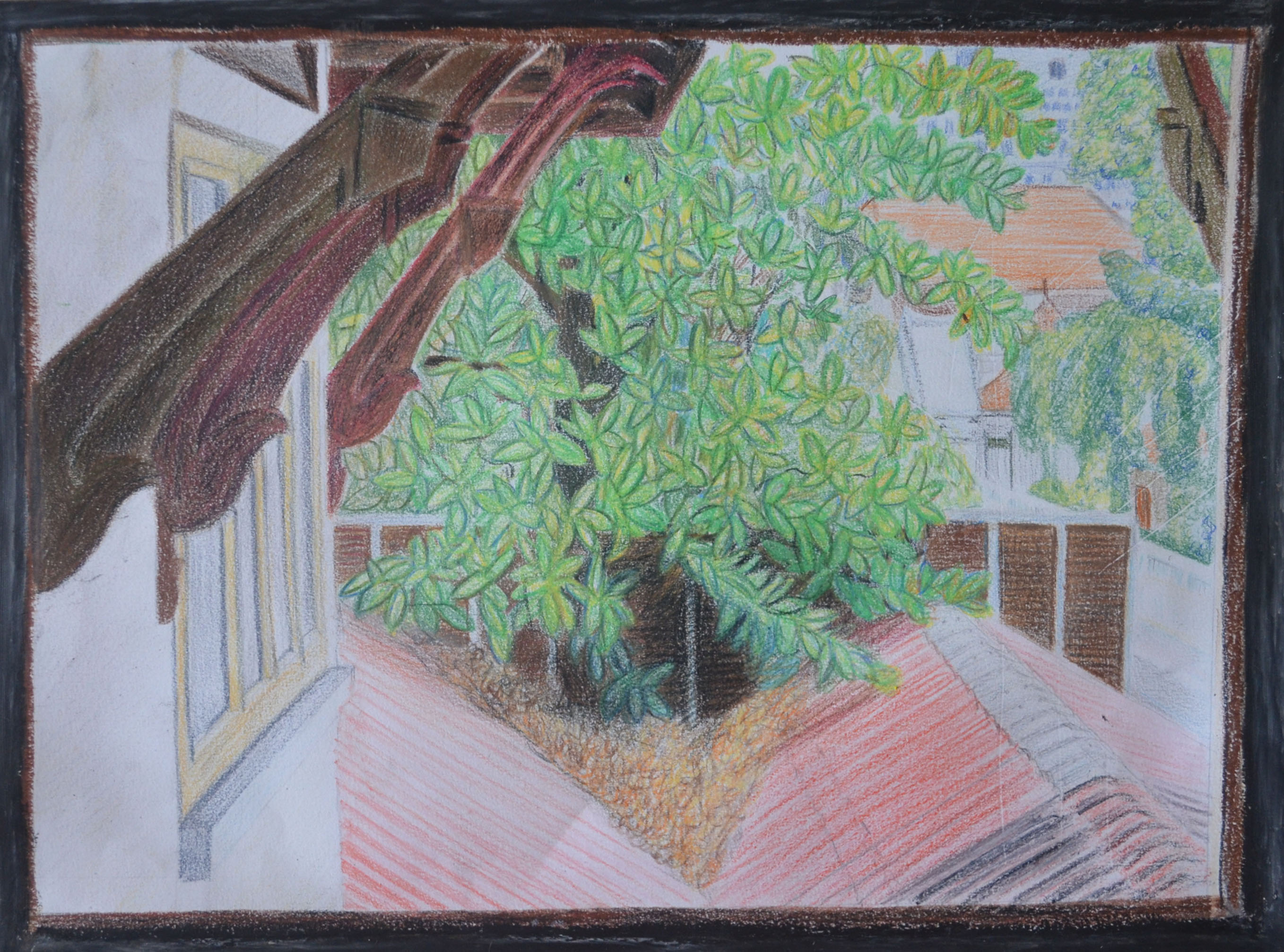
On my tutor’s advice to be a little bit bolder in the depiction of the light and shade created by the layers of leaves I attempted to go over the leaves in the original picture with coloured pencil to try to depict light and shade. Because I had already used fixatives they didn’t layer very well. In the original drawing I had used grey oil pastel as a frame to try to depict the dirty inside walls of the school which I don’t think worked very well, the paper was also torn where I had removed it from the sketchbook, I went over the grey in black and trimmed the paper.
