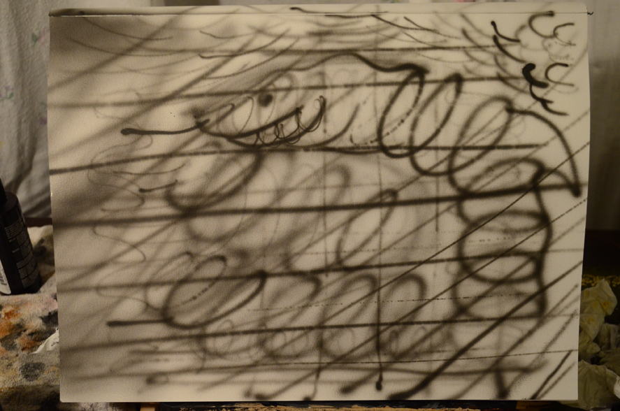
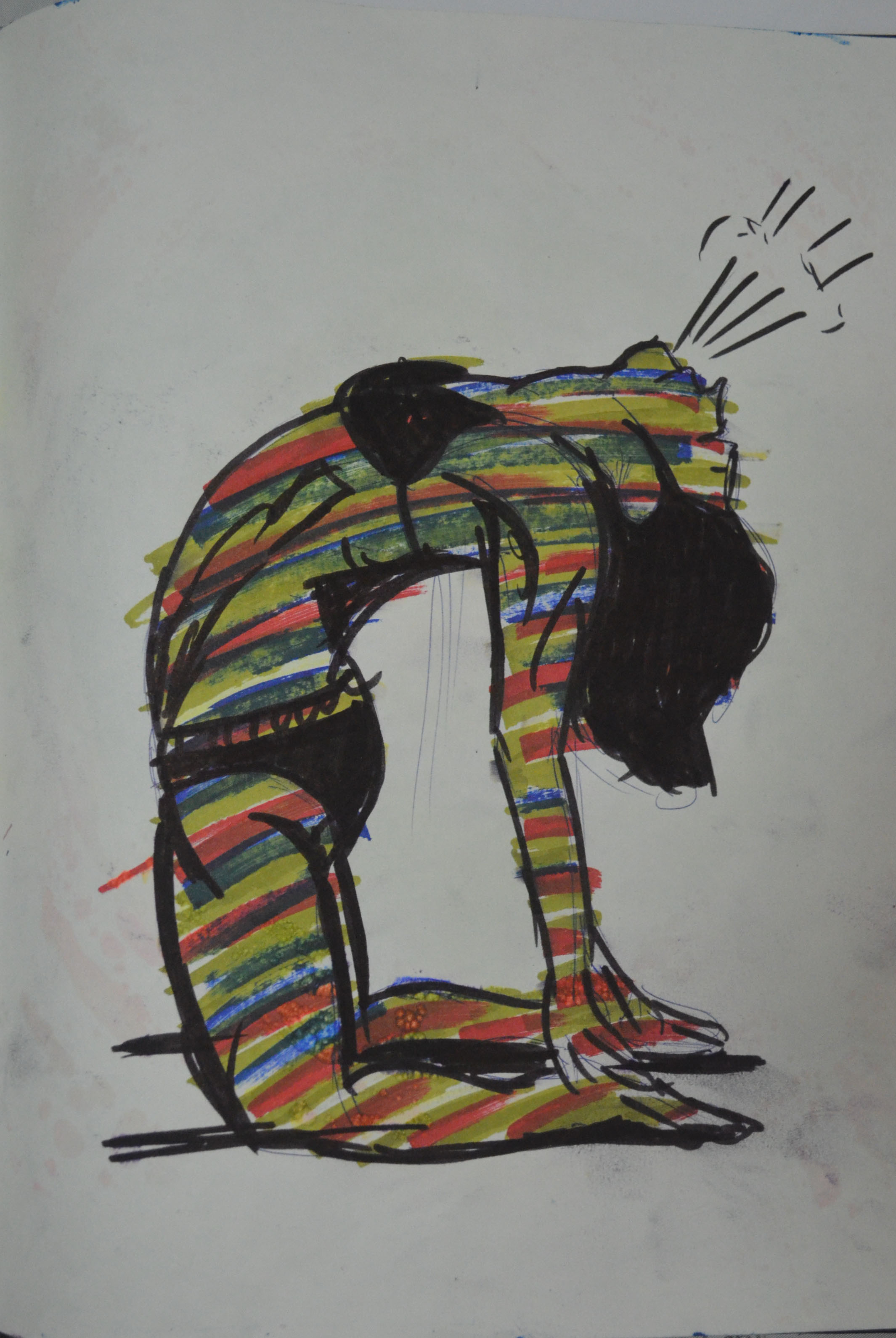
So in this exercise my aim was to try and gain some control over my new drawing tool. Until now I had only drawn lines going back and fourth over the paper. I knew how far from the paper I needed to be and how much pressure I needed to put on the trigger for darker lines but I still had no real control over the Eclipse HP-CS so it was time to take the bull by the horns.
On the first sheet of paper I drew lines moving from the top left corner to the bottom right starting off with heavy pressure on the trigger and close to the paper and then continuing to move the airbrush away from the surface and taking releasing pressure. It was almost a continuation of the last exercise.
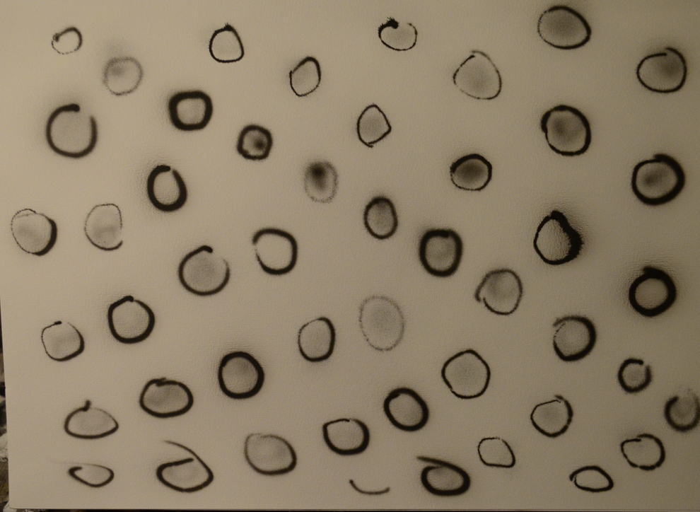
Drawing Circles
On the next sheet I drew a series of circles, by doing this, my intention was to try and make the circles as smooth and as round as possible
2 Controlling the Airbrush Circles
and to this I had to keep my wrist steady. I didn’t do a very good job of this but there are some circles that are much better than others.
From there I moved my hand further away from the paper and attempted to fill the circles with a wider spray. Although I did mostly keep the paint inside the circles there were times where the paint came out uneven or didn’t touch the border lines at all.
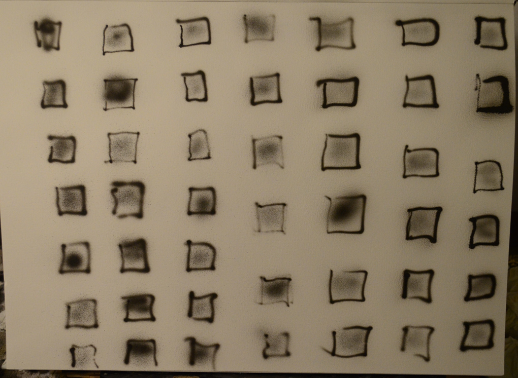
Drawing Squares
Controlling The Airbrush Squares 1
From there I did the same again but this time instead of drawing circles I drew squares, I made two attempts at drawing squares both of which were pretty poor. However this did give me an idea for another exercise, to actually draw the squares and shapes in pencil first and follow the lines with the airbrush like a child would when learning top write letters.
In this exercise I followed similar steps to those in the first exercise of the drawing course. The aim was to see what marks I could make wit the airbrush and record what I did to make those marks.
Unlike the pencil where you can hold it at different angles with your fingers at different distances away from the tip or press down with varying pressure to get lots of types of marks, with a gravity feed airbrush it always has to be upright. Nonetheless, you can still achieve different marks.
Materials used for this exercise
Iwata Eclipse HP-CS
Badger Air Compressor
Sealer Dark
190 gsm drawing paper
My Findings
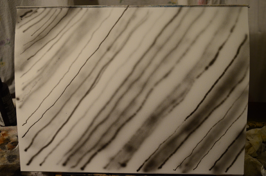
Thin Lines – If I held the airbrush close to the paper with minimum pressure on the trigger (pulling back) I created light, thin lines. If I applied more pressure I created dark, thin lines. If I applied to much pressure then to much paint come out and the lines smudged. Although thin lines would be good for drawing outlines I’m not sure if an airbrush artist would draw first in airbrush… would he draw in pencil or chalk first?
2 Holding the Airbrush
Broad lines – Broader lines are made in much the same way as the thin lines but with more distance between the airbrush and the surface being painted on. However if used to fill in blocks of colour or shading it is pretty difficult to layer the paint evenly, this will take a lot of practise.
Covering large areas – The Eclipse HP-CS seems to be for finer detail, although I bought it believing it was a good all rounder. It doesn’t seem to cover large areas very well so a larger spray gun will probably be needed.
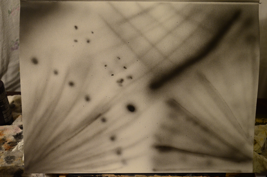
Spots and dots – As above with thin lines and broader lines the same effects can be achieved with spots, with the airbrush close to the paper it makes a more defined spot, moving the airbrush away from the paper for a larger spread.
Conclusion
3 Holding the Airbrush
A wide range of marks can be made with the airbrush, which with a bit of practice can create some really smooth lines and effects but at this stage what I am lacking is control.
Due to lack of funds and earning a wage less than what i needed to live, I returned from Thailand last June in the hope that I would earn more money and be able to continue my degree in the UK where the course fees would be cheaper. Unfortunately I missed my assessment deadline on my painting course and had to drop out of the painting degree programme.
However, I’m not one to be held back by something like that and will do everything I can to continue my art journey, wherever that will take me, and for now that seems to be in the direction of airbrush art work.
While in Thailand I came up with an idea to do custom paintwork for motorbikes, helmets and snowboards etc with a friend of mine, so prior to my departure from the land of smirks I bought some airbrush equipment and paints and had them to delivered to my friends house who had a year to practise with them before my arrival.
The equipment I purchased was an Iwata Eclipse HP-CS along with a Badger Air compressor, Auto-Air Colors water-based paints, various cleaning equipment and Artool Freehand stencils. Still, the challenge is that I have never used an airbrush and before being able to produce work for paying clients, I have to become not just competent but excellent with this this type of media.
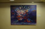
And so I will start this drawing course again using the airbrush as my chosen drawing tool in the hope that I will develop my skills with a tool that so far I seem to have no control over, as can be seen in my first airbrush piece above.
Nevertheless, I don’t just plan to be a commercial artist, I still want to continue experimenting and try to find my own style so that I can continue top produce contemporary paintings as well, hopefully airbrush can play apart in those.
Demonstration of Technical and Visual Skills materials, techniques, observational skills, visual awareness, design and compositional skills.
I used several different drawing materials in this assignment and used a wide range of techniques in several different studies. I examined several different compositions until I found one that I liked the best and from there I explored different mediums until I found one that I thought was perfect for the finished piece.
Quality of Outcome content, application of knowledge, presentation of work in a coherent manner, discernment, conceptualisation of thoughts, communication of ideas.
To me my work in this assignment displayed all of the above qualities.
Demonstration of Creativity imagination, experimentation, invention, development of a personal voice.
This was the first assignment piece where imagination played a big part in the finished drawing, and indeed the studies and for the first time I can see there is a personal voice developing here.
While preparing my coursework and portfolio for formal assignment there were a few exercises that I wasn’t satisfied with and so made fresh attempts at the exercises to increase my chances of passing this first course. Like those exercises this assignment was one that I felt wasn’t up to scratch mainly because of the limited choice of views that I had to draw and the medium I chose to draw the finished piece. I found myself asking these questions: Was the dry watercolour pencil the best choice for this assignment? and if not which medium would be more suitable?
Original Finished Piece
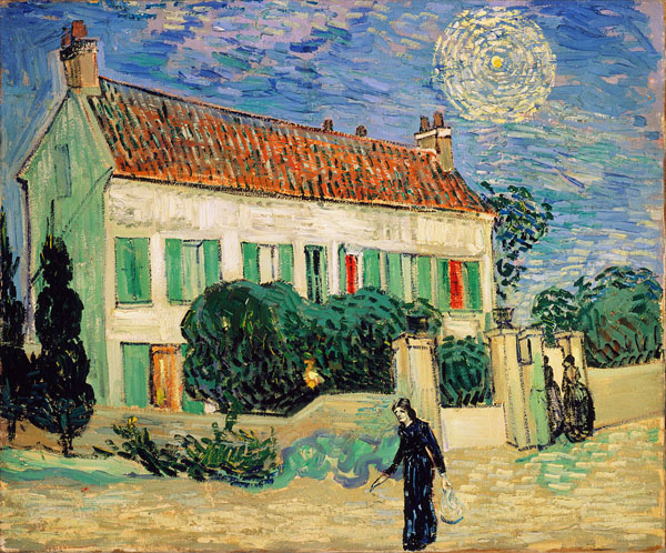
For the Study of Several Trees exercise I had used oil pastel and was really happy with the natural, loose feel of the finished drawing. I tried to imagine the above dry watercolour pencil drawing in the clumsier, thicker medium and the paintings of Vincent van Gogh came to mind, because this assignment included buildings as well as trees I decided to take a look at paintings of buildings by van Gogh.
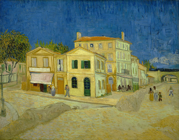
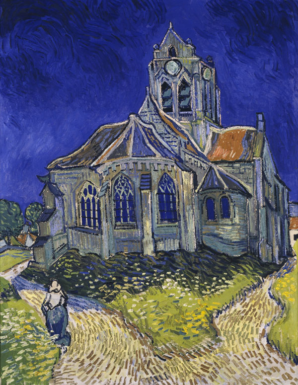
Van Gogh: White House at Night, Hermitage Museum2 – Vincent van Gogh Houses at Auvers3 – Vincent van Gogh The Yellow House – The Street4 – Vincent van Gogh The Church in Auvers sur Oise, View from the Chevet
What I like about van Gogh’s paintings of buildings is that they aren’t just blocks with roofs on or basic shapes, they paintings look like that he has painted part of the building and then kept adding to it so that the buildings look wonky a bit like the way they build buildings here in Bangkok and indeed how they built extensions onto old country cottages.
Being a bulkier messier medium than the colour pencil I used in the original finished piece it was guaranteed that the parts of the buildings that show in the oil pastel drawing would turn out looking wonky but looking at van Gogh’s paintings this wasn’t necessarily going to be a negative.
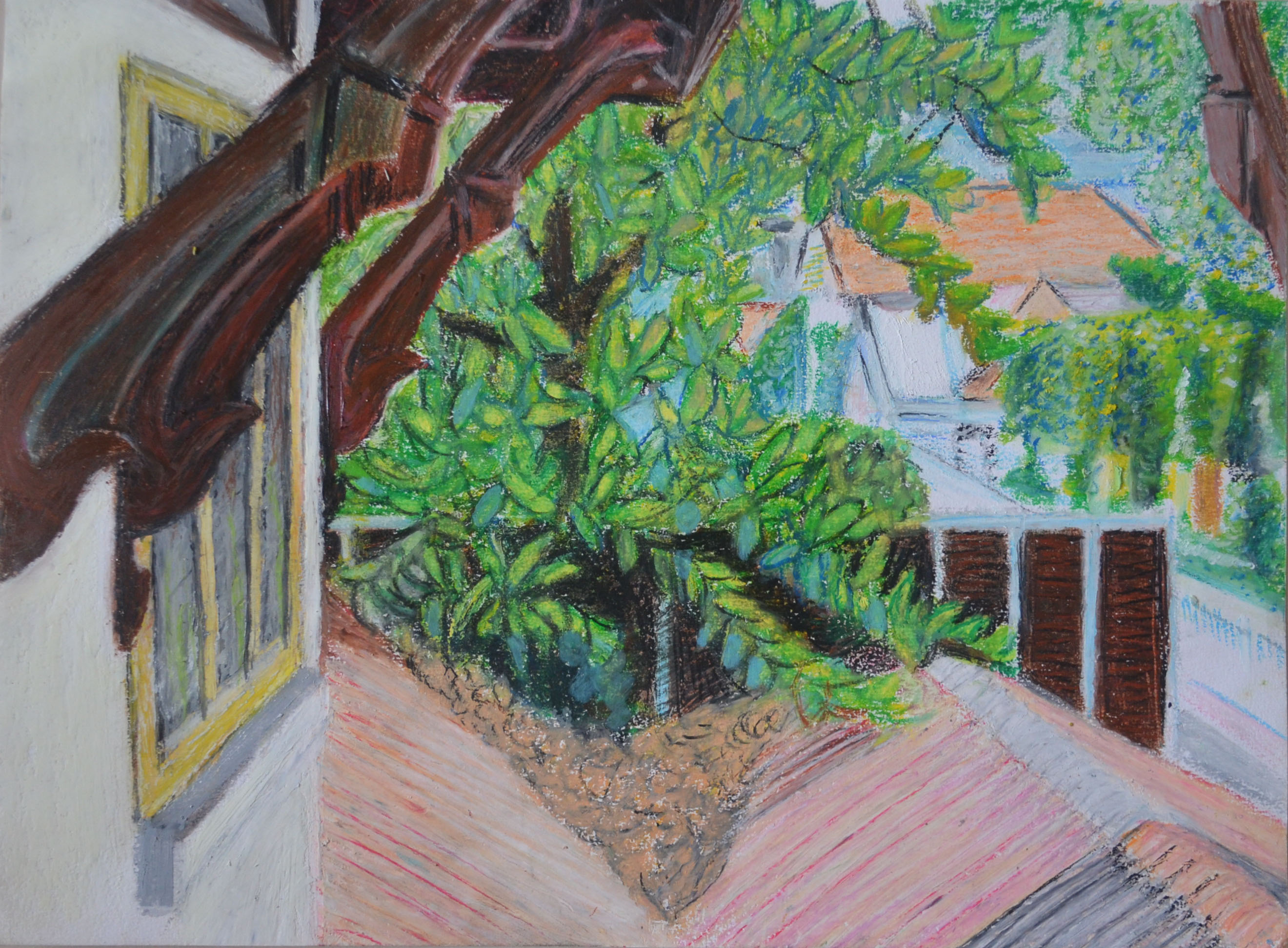
The finished drawing in oil pastel below was drawn from the original photo, it isn’t the best work I have produced but it isn’t a let down either. The colours are a lot more vivid than the colour pencil drawing and I feel that that the drawing itself is a lot stronger with more character, you can also see a lot more of the temple through the trees than the original picture.
The most difficult part of the drawing was the window on the left which took a lot of scarping and redrawing to get it looking anything like the original drawing, with the bulkier medium I had to sacrifice the fourth pain of glass in the window and with the constant redrawing of the window and the wonky lines it makes it look almost van Goghlike.
Assignment 3 – Alternative Drawing in Oil Pastel
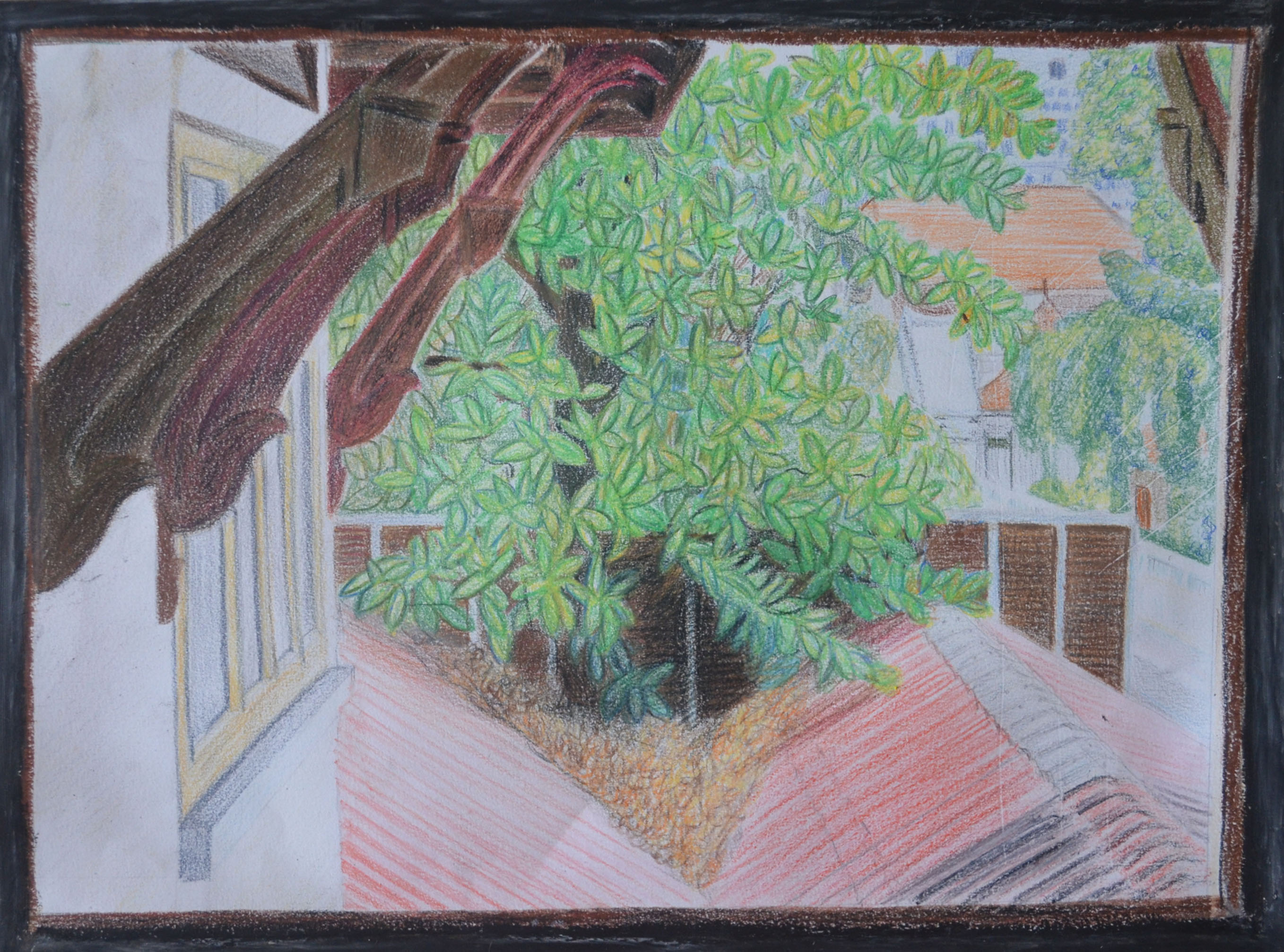
The down side is though, because I don’t feel that the window on the left doesn’t show confidence with this medium, i shall still only be submitting this drawing as an additional study and not a finished piece, but one thing is certain, it was a study that needed to be done.
Finished Piece Edited and Trimmed
On my tutor’s advice to be a little bit bolder in the depiction of the light and shade created by the layers of leaves I attempted to go over the leaves in the original picture with coloured pencil to try to depict light and shade. Because I had already used fixatives they didn’t layer very well. In the original drawing I had used grey oil pastel as a frame to try to depict the dirty inside walls of the school which I don’t think worked very well, the paper was also torn where I had removed it from the sketchbook, I went over the grey in black and trimmed the paper.
I have spent the last three weeks getting ready for assessment, preparing my portfolio, piecing everything together and taking a fresh look at my work coursework as well as having another try at any exercises that weren’t up to scratch; this was one of them.
The last part of the course was drawing and experimenting, I’d done plenty of drawing but not much experimenting, so I had another look through Vitamin D: New Perspectives in Drawing for some ideas. Having a fresh look at the book after following the course was very refreshing, but rather than being influenced by any works in particular I was inspired by how the artists had let themselves go and freed themselves from any chains that had previously bound them. This is what I needed to do.
I had just finished having another go at the Quick Studies exercise and was due to do some more experimenting with colour. However, there were a few pages that I couldn’t use due to the black fine marker blotching on the reverse side of the pages, this gave me an idea.
I took out some of the coloured chisel pointed markers that I had purchased earlier in the course and coloured in the back side of one of the quick sketches, first in red then in green followed by a dark blue. Turning over the page I was very happy with the very random results apart from where I had coloured in with the dark blue but there were some light spaces so went over again with a yellow.
I was really happy with what I had created but I wasn’t going to stop there, just like I did in the Doodling exercise in the very first project in this course I freed my mind and let go.
1 Markers on the Back of a Quick Study2 Quick Study with Marker Showing through3 Two quick studies that I experimented with colour on4 Another Quick Study in MarkerOil Pastel Over Quick Study5 Drawing over the back of the reverse side of two marker pen quick studies
The first few experiments in this fresh try at using colour were basically drawing on the reverse side of, or over the top of existing marker pen studies with either marker or oil pastel but the studies weren’t that great and so I started the next 4 drawings from scratch.
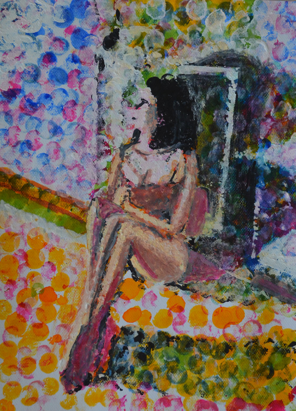
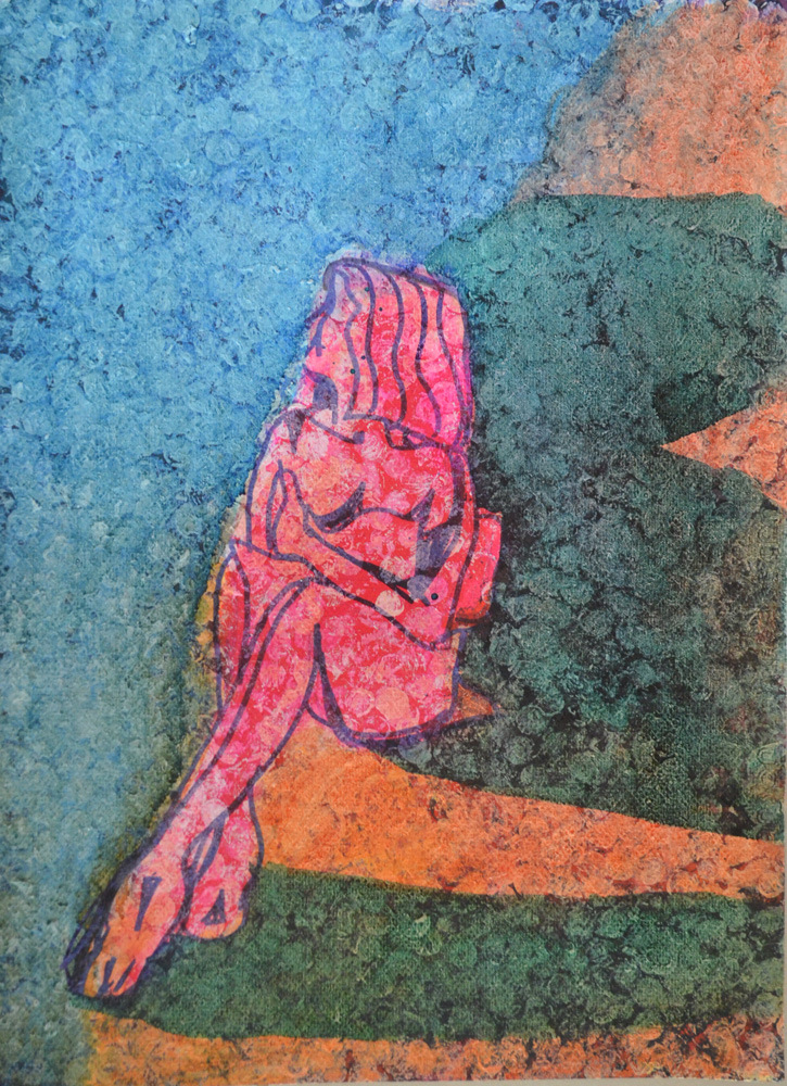
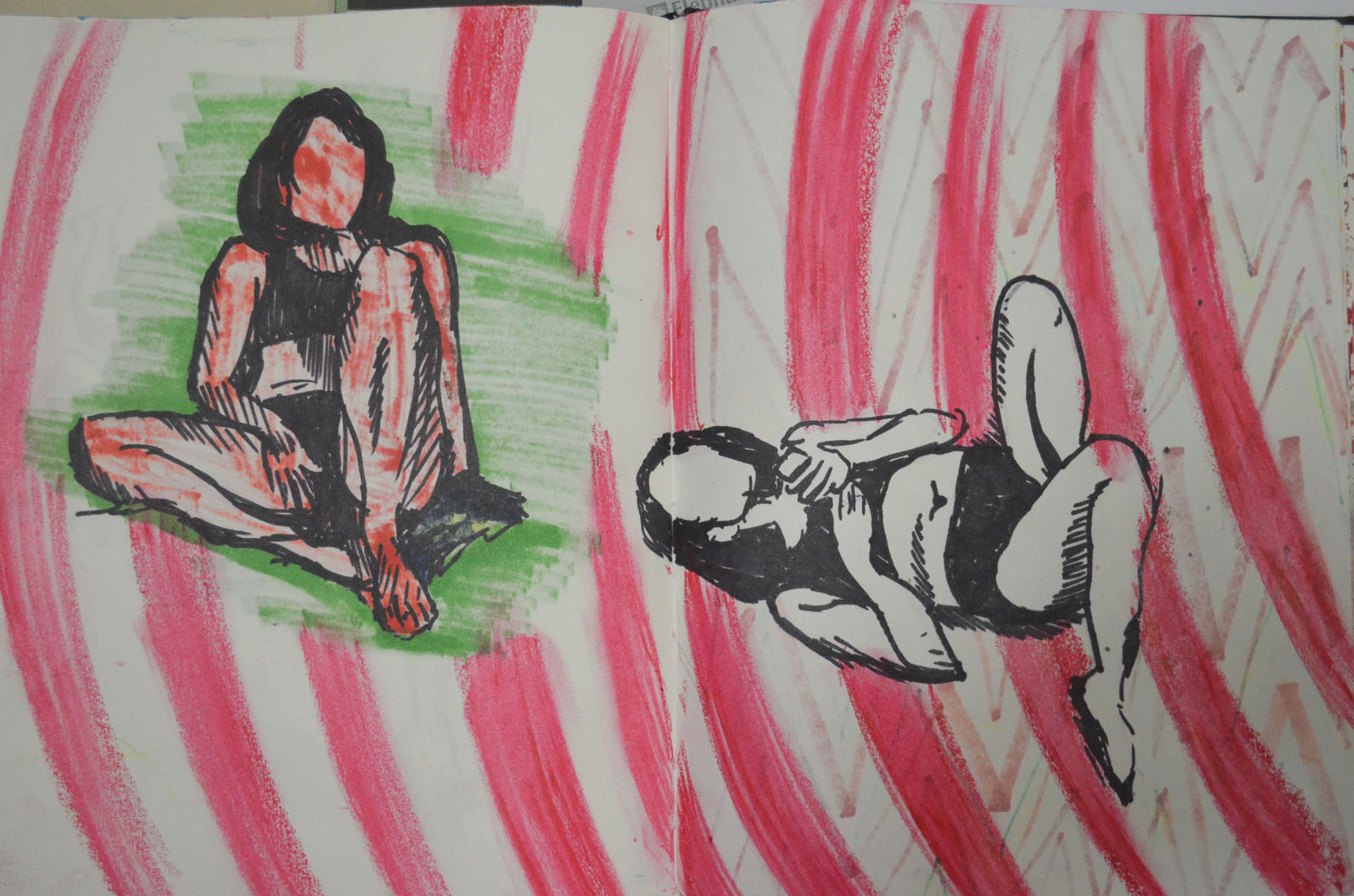
I began the next drawing by laying down random marker lines and then filling in the white gaps with pink, from there I drew a fresh pose from a series of photos that I took on the beach. Then I drew a similar pose on a plain page and then drew within the shape of the body with darker colours.
Both of these drawings worked out great, the first drawing looks like the the model is absorbing sunlight, while the second, even though it was a very similar pose with similar colours, albeit a tan instead of yellow looked very different indeed. This time the subject looked like a tanned figure and to add to it I drew a breath cloud. Thinking about it now they could actually look like before and after figures, tanning and burnt.
5 Quick fine marker over chisel coloured marker6 Chisel Marker Pen inside fine black marker sketch
I started the next drawing by drawing in circles with the oil pastels and then blending them with my finger. I knew I would draw a figure over the top but i wasn’t sure which pose or how i would finish the experiment. I don’t know why I chose the pose below but it worked out well. To complete the drawing I first sprayed the bottom layer with hairspray then I drew the figure in a fine black marker before filling the figure in white oil pastel and then drawing in the details. I love the way her back glows due to the yellow in the centre of the bottom layer.
7 Oil Pastel and Marker Drawing Over Oil Pastel
In the last experiment I drew the figure with the same fine marker then applied red liquid watercolour around the figure then brown inside but because I had freshly drawn the outline the black of the marker smudged into the red and brown making the figure impossible to determine so I went over the body in white oil pastel then the outline again in black. The end result looks (to me) like a rotting corpse on either blood splatters or rose petals.
8 Oil Pastel and Marker Pen Over Bubblewrap Applied Watercolour
More Experimenting
I realised that I could never do enough experimenting with colour and I came back for another play, only this time I worked on an existing piece, which turned out to be a bad idea but it seemed to be the start of something that I can could come back to develop in the future and I did.
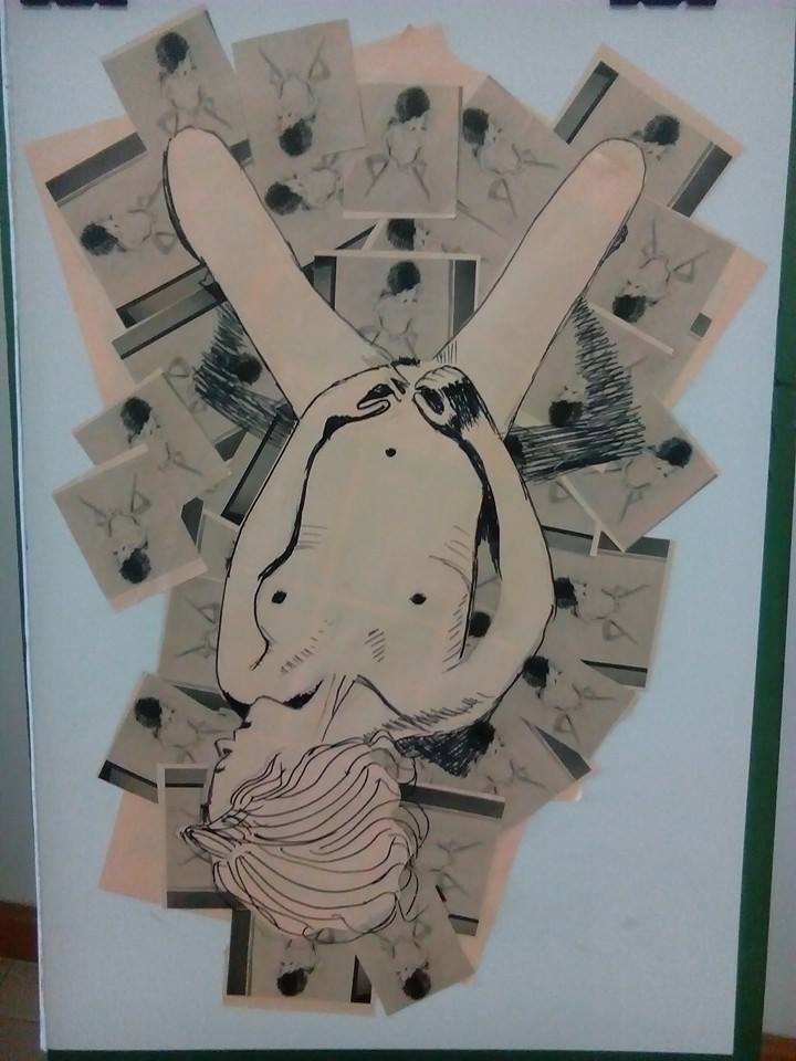
Earlier Collage
The collage that I made earlier seemed a bit bare and I thought that I could maybe do something else with it. The last experiment that I did in my exercise book gave me an idea. The red liquid watercolour over black and Iooked like blood or rose petals and I wondered if I could work on that idea over the top of the collage.
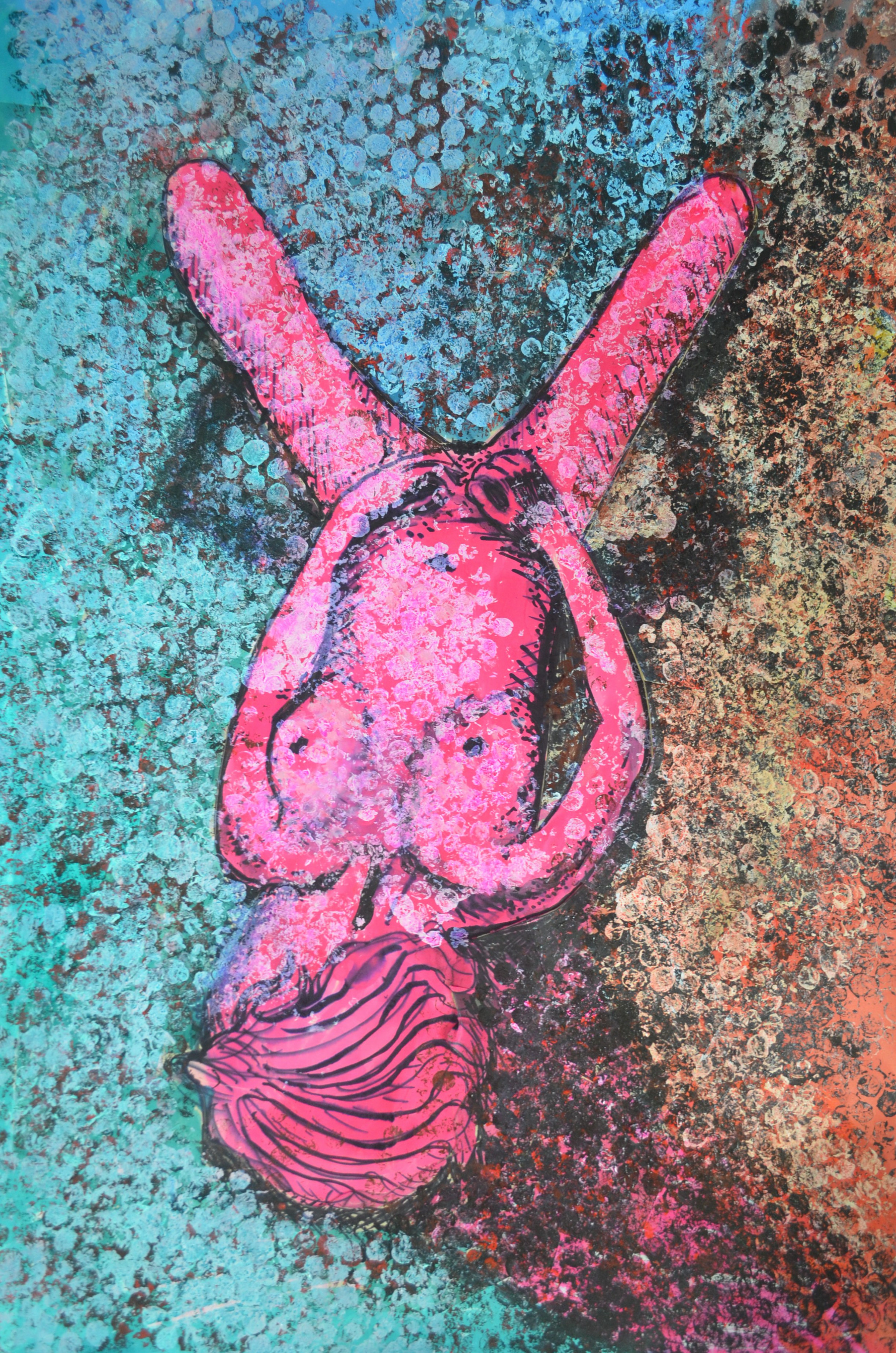
The problem was I had no red liquid water colour left and so decided to work with acrylic paint, although not a drawing medium it was worth a try to see what it would come out like. I first applied black acrylic with bubble wrap wrapped round a spray can lid that I could use like a stamp, then over the top of that I applied a layer of burnt sienna, followed by a layer of brilliant red, hopefully this would give me a shadow under the red. It turned out looking nothing like what I wanted it to and so I just kept on playing.
Finished Picture
The paint I already applied was just too dark and ugly and so I went over it white acrylic paint and once that had dried or near enough dry I applied ink and liquid watercolour over the top. From bottom right I worked in a clockwise direction first applying green, then blue, red, orange and yellow and let them all drip into each other, finally i went over the figure in pink. The finished picture didn’t look that great but it had potential so I took a photo before it fell apart and unfortunately, got binned. I really lied the way the ink over the acrylic applied with bubble wrap looked like a very colourful snake skin and so I would come back to this.
Ink and Liquid Watercolour Applied with a Cork
For the next picture I applied ink and liquid watercolour with a wine bottle cork, this was on an A3 sheet of paper so it looked better than I could possible imagine, I used white gouache over certain parts add light to the figure and the door.
Second Try with ink on Acrylic Paint
I decided to have another go at the acrylic>bubble wrap> ink technique as I wasn’t happy that I had to throw away the drawing and so I did a little bit more experimenting before trying to have a go at a finished piece. This time the colour order didn’t suit the pose as the lighter colours should have been on the left of the figure. I also made the mistake of applying white acrylic to the figure then going over it with pink ink and marker, these didn’t take well over the acrylic and so I decided to have one last try.
Third Try and a lot Better
On the third try I drew the figure with marker and then went over it in pink ink before applying the acrylic this looked patchy as the marker bled into the ink but it still didn’t look that bad. From there I went threw the process of applying the acrylic but this time I added too much white so when it came to painting with the ink over the top it didn’t have the same effect.
When it came to applying the cooler ink colours. I applied a dark turquoise instead of blued which I rubbed off with a paper towel before applying the blue then let the colours bleed into each other. This time the blue dripped over the orange instead of bleeding into each other and so I tried to drip draw the door as well.
Conclusion
Every drawing in this final experiment turned out completely different the first looking like snake skin while the last a stain glass window and even though I haven’t managed to complete a final drawing using this new technique I feel it is something that can be developed further.
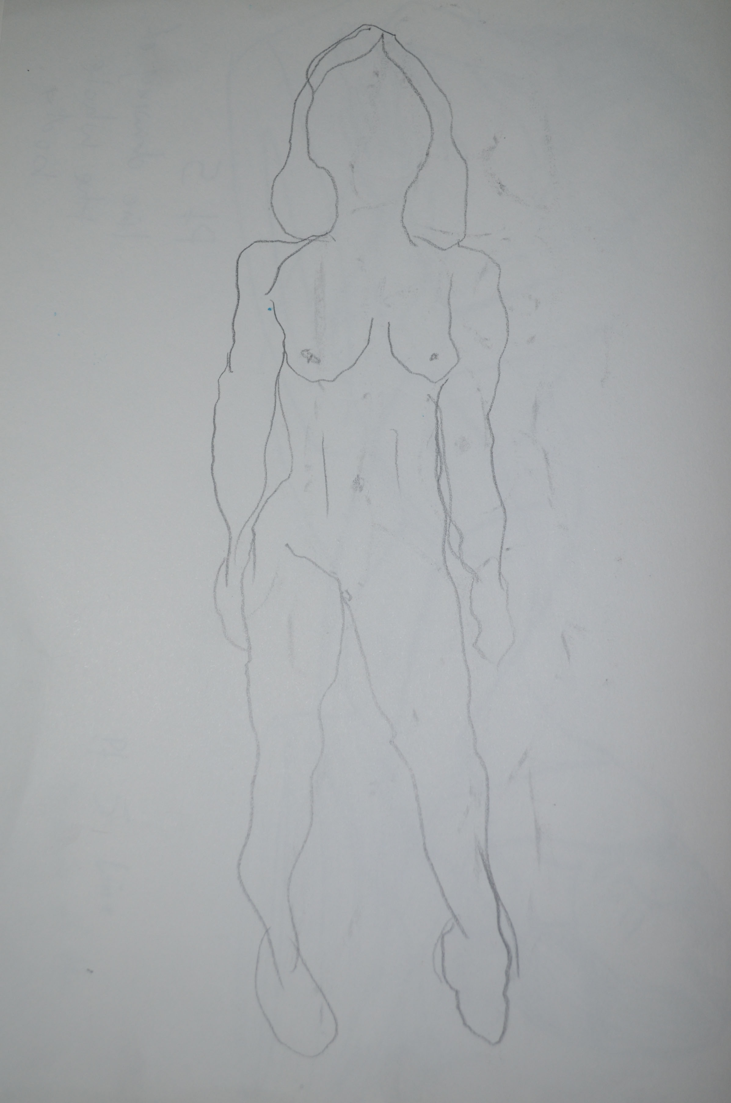
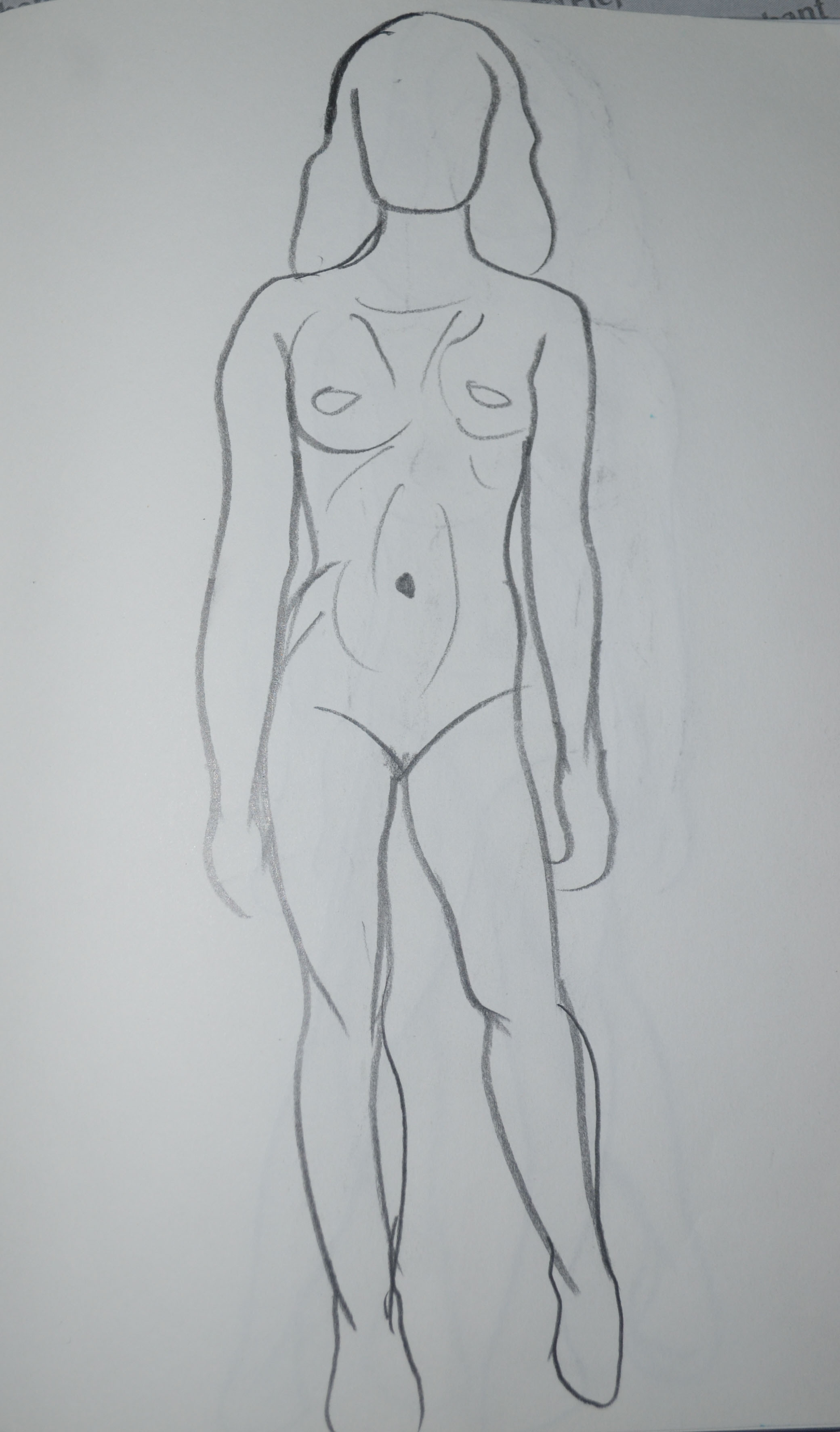
The feedback from my replacement tutor for Assignment 5 that said my original quick studies were weak and that my drawings for a fresh try at gesture drawings were a lot better I decided to have another go at the Quick Poses exercise with both of these in mind. This time though, I stayed away from drawing faces and just concentrated on the essential elements and shapes, structure, stance and applied force.
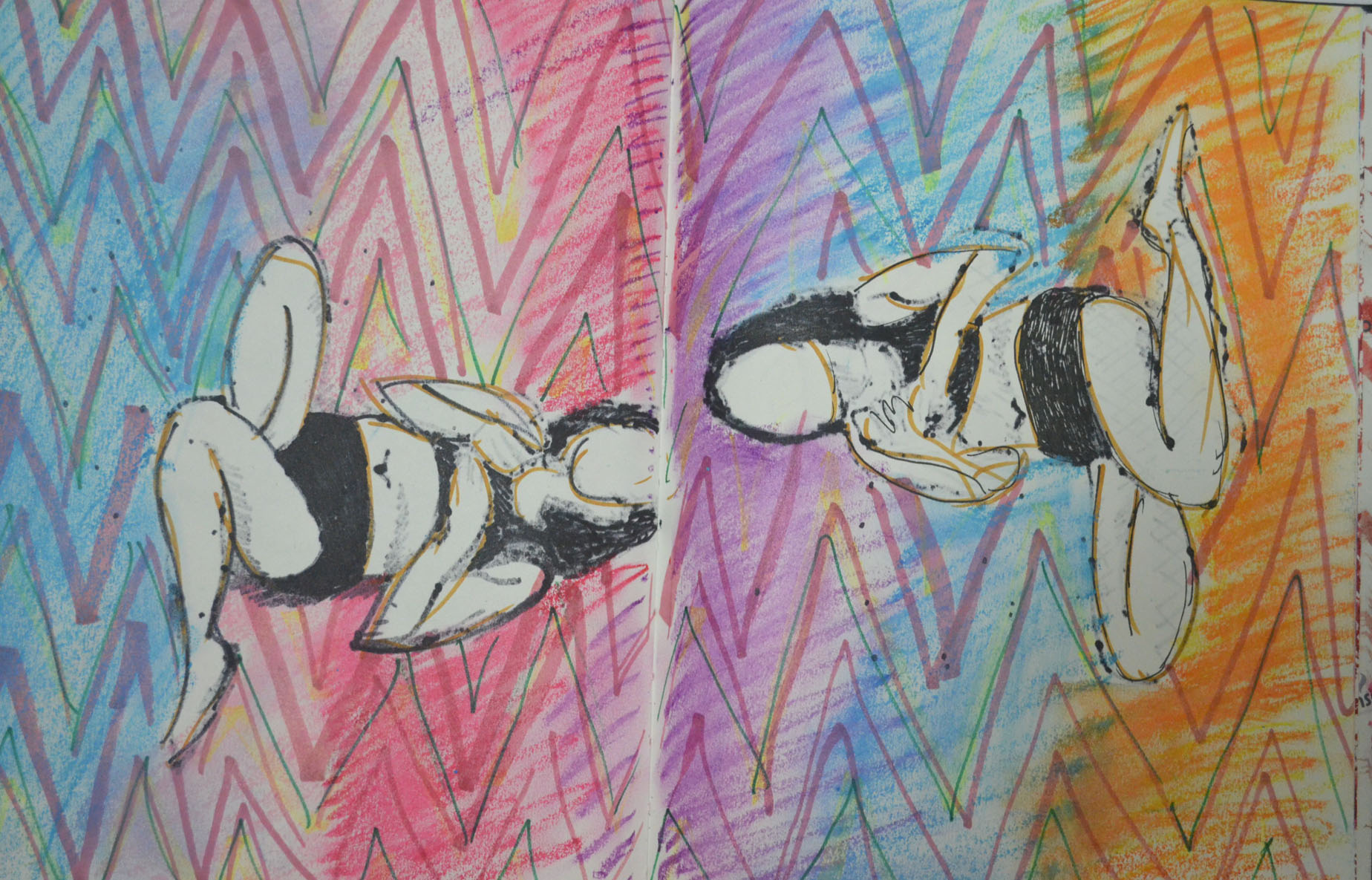
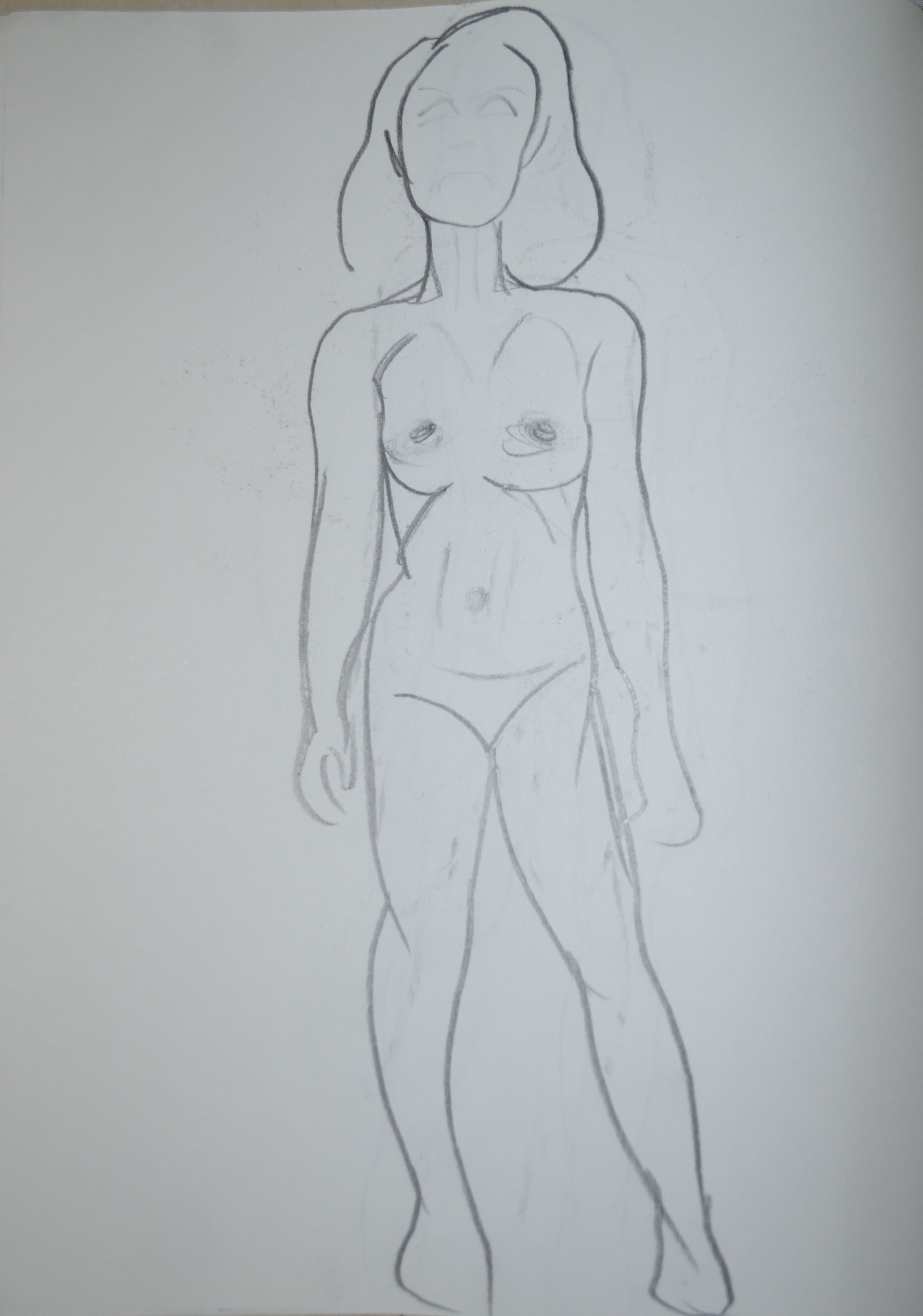
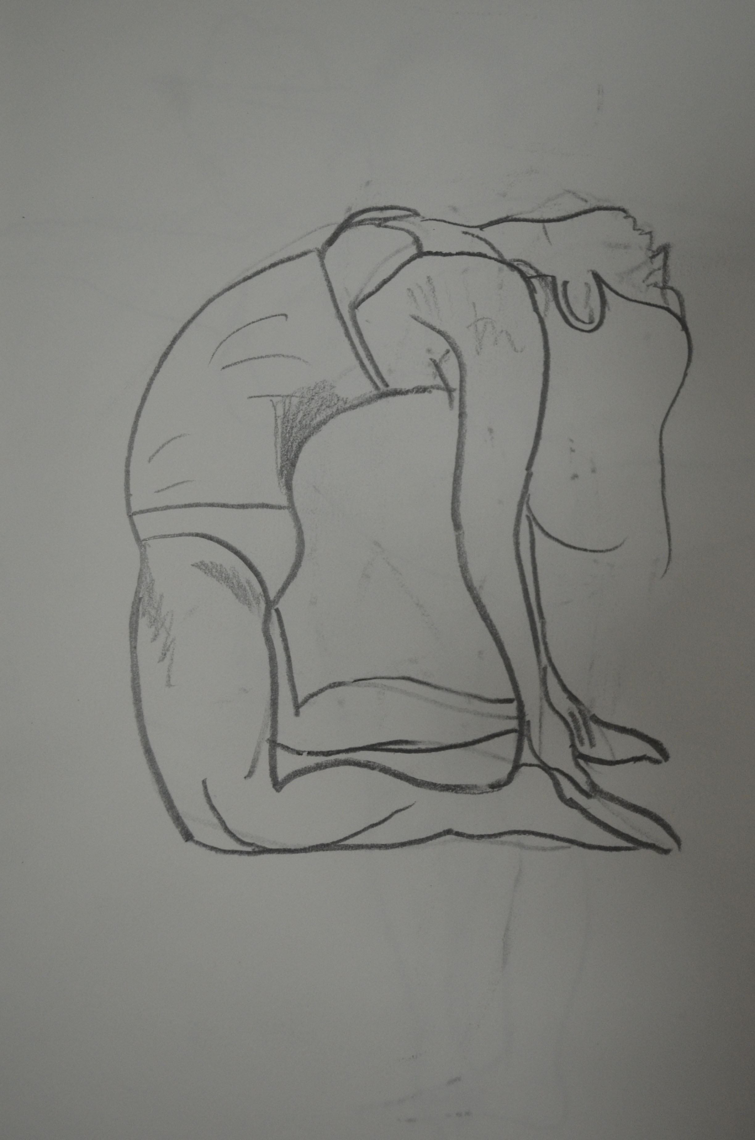
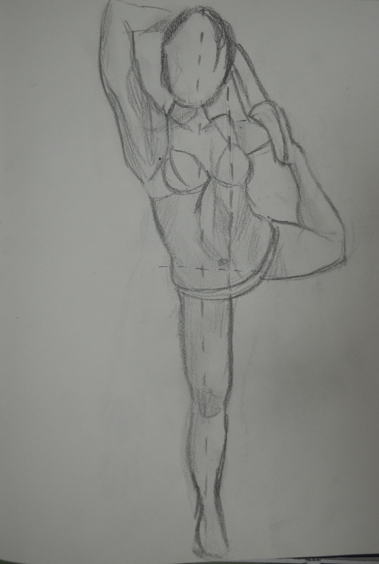
1 Drawing with wrong hand2 Quick Study of Standing Pose3 Quicker Study of Standing Pose4 More Correct Standing Pose Study5 Another Quick Study6 Another Quick Study7 One Legged Standing pose8 Quick Study Different Pose9 two More Quick Poses10 Quick Study More Difficult Pose11 Another Quick Study
In the first set of drawings I used 2B pencil but this time I used a 5B pencil which is softer and gave me stronger lines, switching to a fine marker for the last few drawings which I then used for more experimentation with colour.
Two quick studies that I experimented with colour onDrawing over the back of the reverse side of two marker pen quick studies
I had passed the Queen’s Gallery literally thousands of times ( I used to work across the road) and never realised it was actually a real art gallery. I used to think it was an art gallery styled gimmick to get money off tourists never entering thinking that they would charge the earth.
For the last two years i had been visiting the national gallery, which has an appauling colection in its permanent exhibition to say they charge tourists 300 baht or somewhere near and the temporary exhibitions are not very often.
After reading tripadvisor and finding out it was only 30 baht admission and it was allegedly even better than the museum of contemporary art I ventured down to see what was on. The sign reàd the 4th Asia Plus Art Exhibition ‘Rhythm of Light and Colour’ 2nd October to 30th November, this is what I found on the internet.
Asia Plus Security PCL showcases the best 56 paintings from the 4th Asia Plus Art Contest under the theme of ‘Rhythm of Light and Colour’ – 6 award-winning works and 50 additional pieces that received notable praise at the contest. The theme of the annual art contest was picked to encourage younger generations of artists to be more imaginative and creative in the composition of their work. There were 5 floors in total at the gallery, the first floor at last year’s winners on, I think as they had rosettes on and this contest was far from over.
Painting on First FloorPainting on First Floorpainting on First Floor
On the second floor there was a collection of entries from the first lot of competiton. From what I could make out they had been given a choice of themes for their paintings and a guess I would say they were Surrealism, Abstract, Politics, Thai culture, Modern Culture/architecture and Landscape, I say this because these kept repeating themselves in the paintings as I walked around the gallery.
The third floor was closed and then on the 4th and 5th floor there were the next lot of competitors starting work on their submissions. It would have been good to have gone back while they were full steam to take a look at them using different techniques but time hasn’t allowed me to. I am hoping to go back and see the work that the next lot of artists produced. The quality of work produced by these young Thai art students was excellent and very inspiring, I particularly like paintings of the traditional Thai houses. I am hoping to be able to get out and draw/paint some similar works over the duration of this course.
Either artists have become uninterested in exhibiting their work at the national gallery or I have picked poor times to visit, the last time I visited the gallery, there had been nothing in the temporary exhibitions luckily I used that time for drawing statues. I thought I was destined to spend my student days in the permanent exhibition of royal paintings by unknown artists until I discovered the Queens Gallery which I will talk about in the next gallery visit.
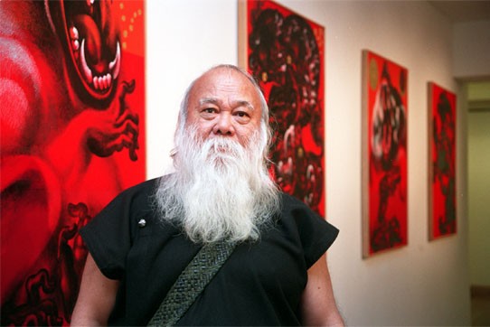
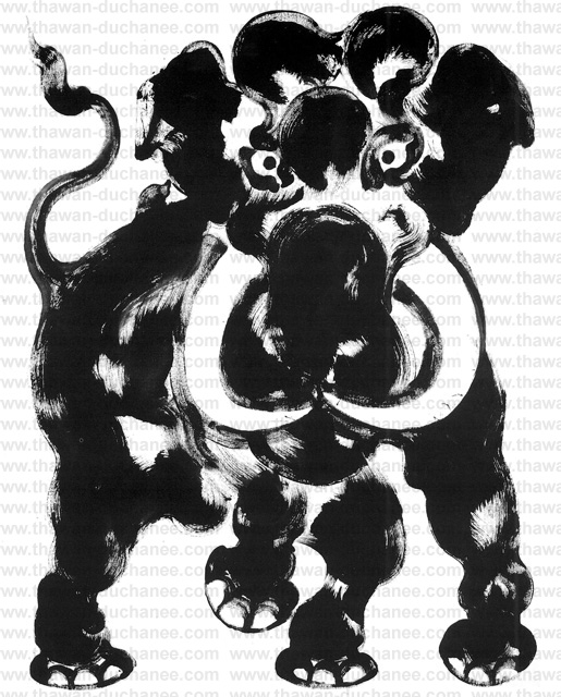
Anyway, a fortnight ago I ventured over to the National Gallery to see if there was anything on that would introduce me to some new Thai or western artists and I noticed that the permanent gallery had expended by one room displaying work my two contemporary artists. The paintings that really caught my eye work works by an artist named Thawan Duchanee, so I decided do some investigating into why his work had made it to the permanent exhibits with paintings of the royal family as neighbours.
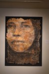
Photo of Thawan Duchanee
I discovered that the distinguished national artist Thawan Duchanee recently died on 3rd September this year, 2014 at the age of 74. He was born on 24th September, 1939, in Chiang Rai, Thawan and studied at the Poh Chang Art and Craft College in Bangkok. From there he then studied at the Faculty of Painting, Sculpture and Graphic Art at Silpakorn University, where he was mentored by the late professor Silpa Bhirasri. Thawan also earned a doctorate degree in metaphysics and aesthetics from the Royal Academy of Visual Arts, Amsterdam, Holland, under scholarship of the ministry of education. From 1964 to 1974 Thawan had a number of one man shows in France, the Netherlands and the U.S.A including Hawaii and various venues around Thailand, including Chiang Mai university and the British Council in Bangkok. In 1982 and 1983 he was commissioned to paint murals for the Bank of Thailand and the Shell Company respectively before embarking on a study tour of the Mount Everest region in search of yaks and Buddhist art in several Nepalese villages. Over the next thirty years he had numerous solo exhibitions around Asia, Europe and the U.S.A. as well as representing Thai Artists at many international events and art fairs including the “Art Beyond Borders” exhibition at the Museum of contemporary Art in Lisbon, Portugal. In 2001 Duchanee was declared the Thai National Artist and that same year saw the Grand Opening of the artist’s residence and gallery the Black House Museum of Art in Chiang Mai attended by 1,000 artists from 23 countries across the globe. Various media houses reported that Thawan Duchanee died of hepatitis although his 4 sons failed to reveal the cause of death. Interestingly enough I was reading ‘This is Modern Art’ by Matthew Collins in the book he talked about the myths of modern artists, maybe this is his.
The four paintings above are in the national gallery next to the older section of paintings of the royal family. The last of the four paintings is the earliest of the lot and since I can’t find a more descriptive biography telling me the reasons for his change of subjects I will draw my own conclusions from the subject in the paintings and the timeline of events on his website (a little gift from John Berger’s Ways of Seeing). The painting of ‘Two Boats’ above is dated 1963 so it was painted during his time at Silpakorn university so it may have even been part of his coursework. The subject of the ‘Two Boats’ and the first painting ‘Farmer’ are not that far apart though as both depict Thai rural life.
The connection between ‘Farmer’ and ‘Suwanna Some’ is also present, both are figurative paintings and both depict the human form as muscular male figures. The first painting however seems to be a study for a mural of sorts as it reminds me of a stained glass window, the thin strips of grey that depict movement and rigid shapes in the painting look like the lead strips in a church window.
The paintings below were images i found from different sites on the internet mainly from his own site which seems to display work from his gallery and residence, the Black House Art Museum, Chiang Mai.
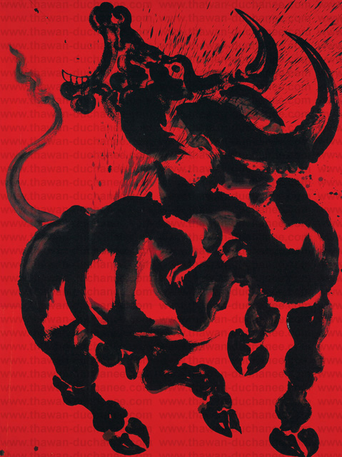
He developed his works in to a simple but unique style of painting that is strictly Asian but seems to take elements from art of different parts of Asia most notably Chinese and Thai but there seems to be other Asian influences in there which is probably the result of study trip around the Mount Everest region of the Himalayas.
What I like about these more simpler works is that he manages to depict the beast’s anatomy and muscles with a few simple brush strokes and in some places even long continuous brush strokes that often resemble clouds adding to the mythical feel of the paintings.
Thawan Duchanee – BuffaloThawan Duchanee – ElephantThawan Duchanee – Horse Real Name UnknownThawan Duchanee – Horse Real Name UnknownThawan Duchanee – Name Unknown
It is difficult to tell which painting tools he uses as he seems to change throughout his career some of the later pieces look as though parts of them could have been painted with an airbrush.
Thawan Duchanee – Power of Land SeriesThawan Duchanee -Power of Land SeriesThawan Duchanee Tiger and Monkey
Now and again I do find Thai artists that I get inspired by and Thawan Duchanee is one of them. I asked a few Thais what they new about him and what most of them seemed to say is that ‘He liked Black’, perhaps it will be a study visit to the Black House for me this winter. http://www.thawan-duchanee.com/http://englishnews.thaipbs.or.th/www.cakechooser.com
It is never easy to change tutor at assignment 5 but this is the situation that we find ourselves in. The task has fallen to me to give you feedback on what you have produced for assignment 5. You will have to bear with me as I have not seen anything of what you have done until this point.
Due to my tutor not being available until further notice because of family matters I was contacted and asked whether I would need a replacement tutor. So close to the end of my first course I thought it was important to find a replacement tutor. There was an extreme contrast between my previous tutor feedback’s which can be viewed below and this one.
Demonstration of technical and Visual Skills, Quality of Outcome, Demonstration of Creativity
I see that you have chosen Option 4, the figure. Students can often find it difficult when working from the figure mainly due to preconceptions as to what a drawing should look like and particularly a work made from the figure.
For the most part the quickly made drawings in the quick sketches work are weak; you have generalised far too much instead of drawing what you have seen. This has resulted in some poor understanding of proportion and how bodies engage with the space around them. The interpretation of the hands and feet in this series of work needs thinking about. It is important to make changes as you draw correcting and changing to get the whole operating cohesively. Writing on a drawing what is wrong with it or what needs to be done to it will not benefit you at this stage. Change the drawing!
Quick StudiesQuick Studies
I agree that some of these quick studies were weak, out of proportion etc and said so in the learning log. Others were strong with a 100% resemblance and correct proportions. What needs to be realised here is that I am drawing figures of a ‘different race’, i.e. If I was drawing Japanese models, legs would be shorter. I made notes on drawings before making a fresh, I was drawing quick and so I thought this was a better approach than spending so long editing the drawing. These notes helped me to capture my thoughts at the time.
Varying the speed that you draw can often open up new ways of seeing as can holding your drawing implements differently or using your ‘wrong’ hand. Quickly executed drawings can be good and bad. Drawings made more slowly likewise. It is the intent and nature of the outcome in reference to what your subject is and the quality of the drawing itself that matters.
Now interestingly the batch of ‘more gesture’ drawings mostly made in pencil are really well seen and interpreted for the most part; working quickly has worked for you here! The works from the female model are full of life and movement; the proportions are very believable as is the weight distribution through the figure and the stances in general. Some of the male studies demonstrate some good understanding of foreshortening through some quite difficult poses.
For me here you have investigated as you have been drawing and it has allowed you to interpret the figure much more successfully through the use of the media itself. This approach has negated some of the repeated faults that your work can have i.e. too large heads and poorly articulated extremities. When an approach is working it is important to capitalise on it and build on both the methods and the look of the outcomes
My idea of a gesture drawing and a quick study are two different things. For me a quick study is a quick study in the style of my ‘would be’ finished piece, if he had looked at the previous assignment he would have seen the quick studies were closer to the way I finish a drawing. However, the ‘more gesture’ drawings were more satisfying and so maybe I am looking in the wrong place to find myself.
It is imperative that you look hard at all times at your subject; look draw, alter, draw again, change, look, you need to build up a dialogue between yourself, the subject and the particular medium that you are using. Different media require different approaches as do different subjects. It is good to build your drawings in this way.
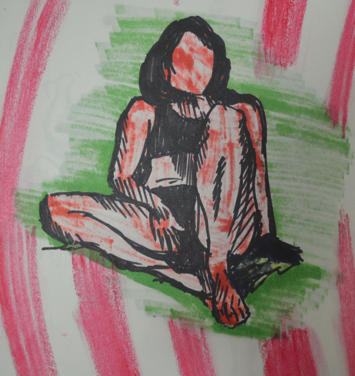
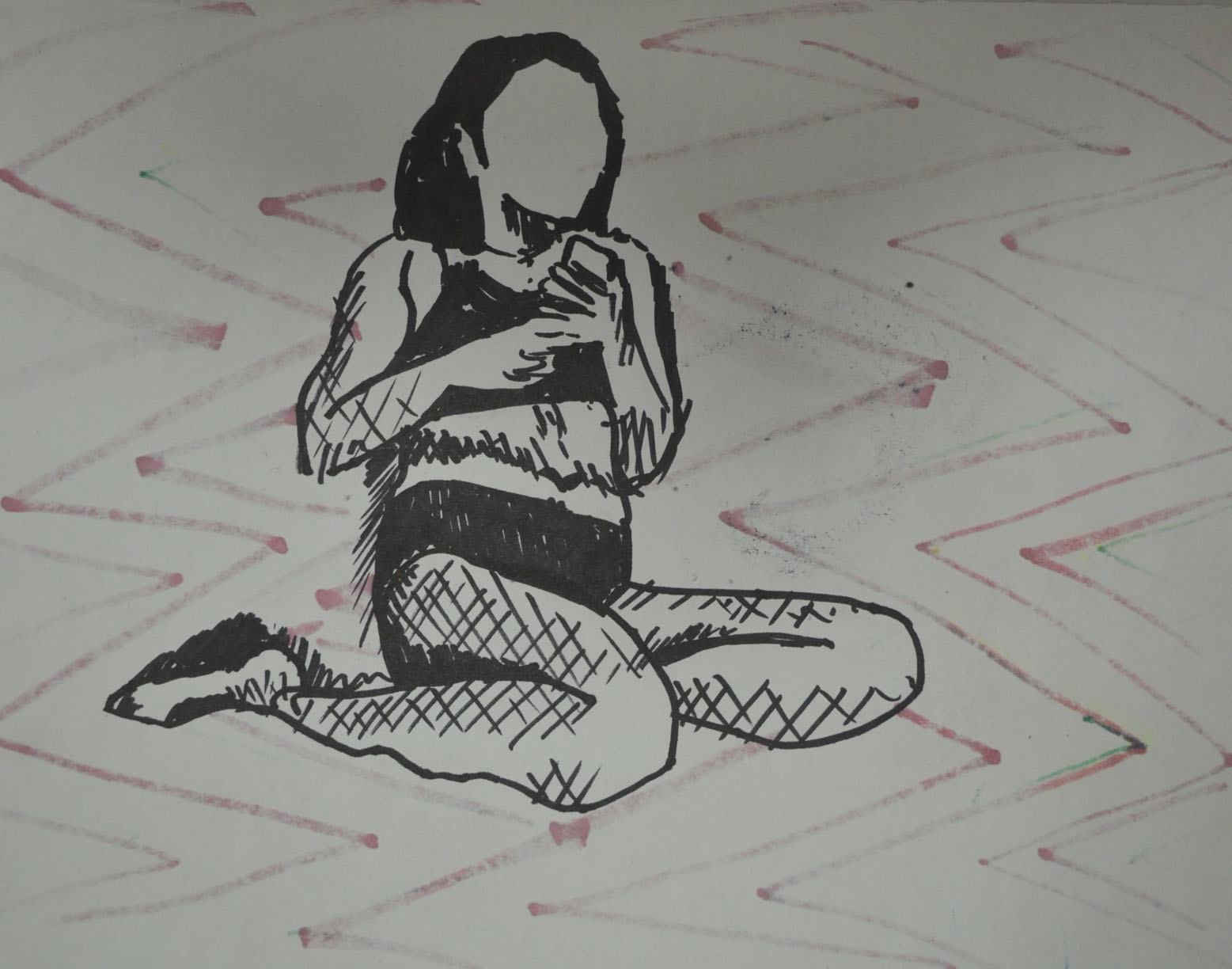
You included lots of work which in itself is fine, however, it is very important to us some objective discernment both as you are working and as you look at a completed body of work. Interestingly the drawing in line of the ‘woman playing with her phone’ is the most successful of this group of works. The proportions are fine and come together and form a believable figure in action. You have this marked as ‘out of proportion’, it isn’t! This tells me you are not seeing things clearly enough as you look; look at this drawing closely and try to recognise how you have articulated the figure in space; how well the head sits; how you have changed sizes of parts of the body as they recede (foreshortening in other words). You have been looking here and not generalising. The shaded version of this pose is not as successful as the line version; it is stiff and lifeless by comparison. I will talk more about discernment later in the report.
Playing with Phone – Out of ProportionPlaying with Phone A3
I have to disagree here, this drawing was from a photo as I didn’t have time to do a life drawing in this pose. My girlfriend is only 5 foot and the second drawing is ‘spot on’. I like the first drawing in just line but it is as I said out of proportion.
The tonal studies revert back to generalisation for the most part; you are forgetting to ‘look’ here and are trying far too hard to make a picture instead of investigating your subject. As a result proportions are out again; heads too big, feet and hands and legs too small. Some of the drawings are somewhat kitsch also which is a look you should avoid at this stage in your development.
I submitted drawings here that others would have left out, mainly because the folders I have submitted digitally from my computer contains everything. Below is a photo of a very spontaneous easel drawing that was neither planned out or marked. It shouldn’t have been submitted but it was and as since been omitted from my learning log. However, there are positive drawings in this exercise, that were not generalised, were not drawn quick and were a result of looking. The tutor has nothing positive to say about any of these and that’s annoying. The ‘kitsch’ he talks of is a result of depicting tone using colour, the results were spontaneous not planned.
Drawing that shouldn’t have been submittedA2 Tonal Drawing in Pastel Pencil on Ingres
I will be reproducing this in charcoal pencil.
Drawing with Angled EaselTonal Study with White PastelAngel in Tone
The work that you did for the assignment piece itself is actually much better. The understanding of proportion is better and the use of tone is quite successful also. The ‘looking at the door handle’ in water soluble pencil looks to be working better than some others as does the more expressive version in watercolour pencil which you have marked ‘Sad Attempt’. The expression that this study has could be pushed even further.
Sad attempt in watercolour pencil
The tutor and I obviously have different tastes, styles and understanding of what I was trying to do in this assignment, the above drawing was not it.
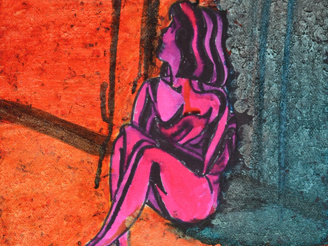
The larger drawing is a reasonable resolution on what you were trying to do. The sense of isolation within the figure is present and the pose supports the idea also. The relationship of the figure to the background maybe needs some more attention to get the areas of the drawing reacting together more.
Maybe the figure looking at the door handle would be sufficient as a concept to carry both the pose and idea. The pastel one maybe over done.
It is always good practice to work on more than one version of assignment pieces; this will give you much more scope to select when the time comes and it will also help you explore your ideas and methods more also. Remember this for the future.
I wasn’t trying to create a sense of isolation within the figure, I was trying to create a feeling of anxiety and fear, which I think the oil pastel, ‘over done’ drawing did well. The larger drawing in Gouache, watercolour and watercolour pencil was a second version of the assignment piece and if I preferred it to the oil pastel would have been submitted as such.
Sketchbooks
Demonstration of technical and Visual Skills, Demonstration of Creativity
I presume that you have been keeping sketchbooks through out the course. The more investigative the more useful they will be. Bear this in mind for the future.
Learning Logs or Blogs/Critical essays
Context
The blog is far too descriptive. You need much more critical comment on what you look at and indeed more of an in-depth comment on your practice and methods. Say more about why more often rather than how. More comparative statements about the quality of your work and how you think that you could improve it. It needs to be less descriptive and more of an analytical tool that you can use in your practice in a real sense.
This should have been pointed out to me at an earlier stage instead of getting pats on the back, is it too late to change?
Generally a learning log/Blog should contain objective and comparative comments on your own work and development. Comments on work of other artists relevant to what you are doing. Evidence of art you have seen, in the flesh in books or on the web – with images, annotated where necessary. The log should also contain the set theoretical studies from the course and your tutor reports.
Suggested reading/viewing
Context
Look at drawn figure work by Manet and Cezanne to see how they use their media fluidly and openly, Seurat’s drawings are good examples of inventive use of tone. Look at Degas for his use of pastel and inventive composition and Van Gogh for his use of mark making and line. Picasso and Matisse have both made exhaustive drawings in line which would be beneficial to see as would some of Rodin’s work from the figure in line also.
Other
Discernment is going to be very important for you as you select for your assessment submission. You will have to do this as I can see that you have a lot of examples of work some of course more successful than others. You need to pick out the more successful work.
Some of the work throughout a all five assignments will not be quite as successful as others so you will need to select well. Look through all your reports to help you select. Spread all your work out in front of you and remove the less successful ones until you have a coherent group which satisfies the submission criteria. Put the best drawings in as the assignment pieces i.e. re designate them if you need to. Pick out your most successful pieces as support work also. You will find the submission criteria in your course book and check out the OCA website for tips on submission. You need the right balance; not to much but not too little either. Present your work in its best light.