In this exercise I followed similar steps to those in the first exercise of the drawing course. The aim was to see what marks I could make wit the airbrush and record what I did to make those marks.
Unlike the pencil where you can hold it at different angles with your fingers at different distances away from the tip or press down with varying pressure to get lots of types of marks, with a gravity feed airbrush it always has to be upright. Nonetheless, you can still achieve different marks.
Materials used for this exercise
Iwata Eclipse HP-CS
Badger Air Compressor
Sealer Dark
190 gsm drawing paper
My Findings
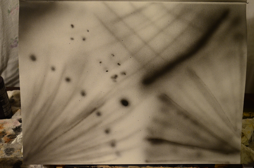
Thin Lines – If I held the airbrush close to the paper with minimum pressure on the trigger (pulling back) I created light, thin lines. If I applied more pressure I created dark, thin lines. If I applied to much pressure then to much paint come out and the lines smudged. Although thin lines would be good for drawing outlines I’m not sure if an airbrush artist would draw first in airbrush… would he draw in pencil or chalk first?
2 Holding the Airbrush
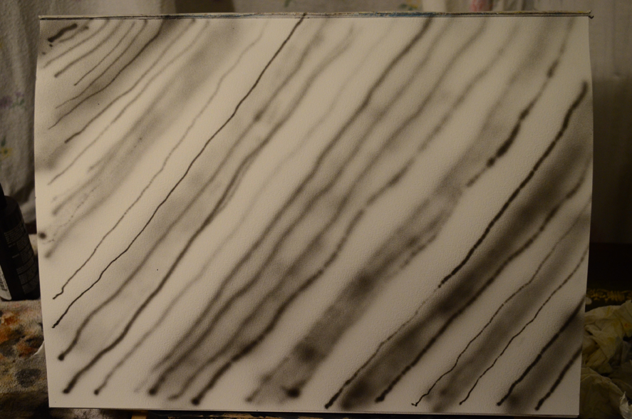
Broad lines – Broader lines are made in much the same way as the thin lines but with more distance between the airbrush and the surface being painted on. However if used to fill in blocks of colour or shading it is pretty difficult to layer the paint evenly, this will take a lot of practise.
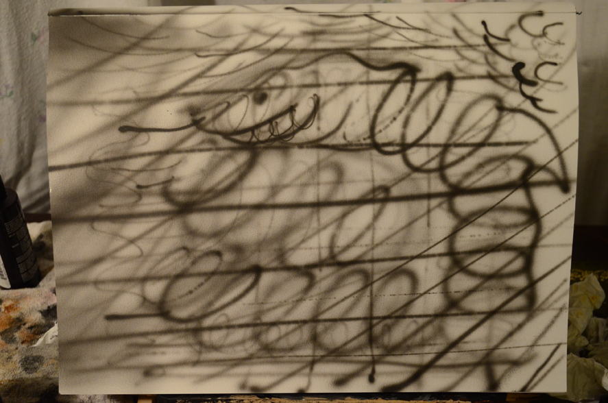
Covering large areas – The Eclipse HP-CS seems to be for finer detail, although I bought it believing it was a good all rounder. It doesn’t seem to cover large areas very well so a larger spray gun will probably be needed.
Spots and dots – As above with thin lines and broader lines the same effects can be achieved with spots, with the airbrush close to the paper it makes a more defined spot, moving the airbrush away from the paper for a larger spread.
Conclusion
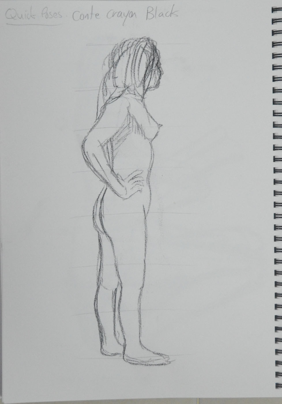
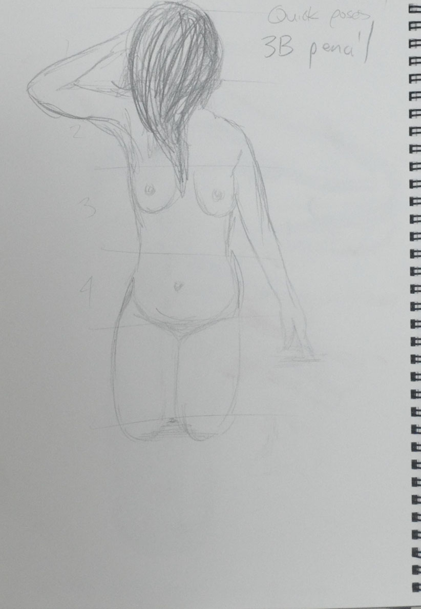
3 Holding the Airbrush
A wide range of marks can be made with the airbrush, which with a bit of practice can create some really smooth lines and effects but at this stage what I am lacking is control.
How accurately did you depict the overall proportions of the figure?
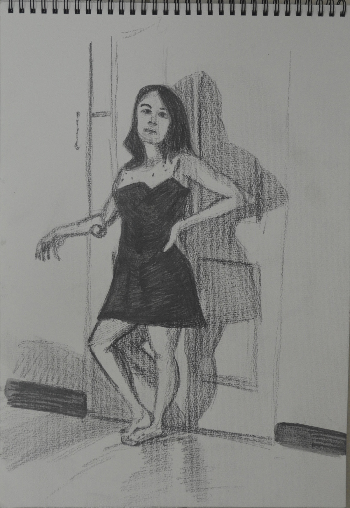
There was only one drawing where the proportions weren’t that accurate and that was the first drawing for the standing pose in the Three Drawings Exercise. I made a second attempt at the drawing and was completely satisfied.
Standing Pose 1- Using Water soluble Pencils for the first time
For all the other drawings in this exercise, I feel that I managed to depict the overall proportions of the figure, very accurately.
Standing pose 2 – Water Soluble Pencils Better Proportions
Did you try to imagine the sitters skeletons and muscles?
Yes I did, but the skeleton and muscles weren’t that obvious in the the three drawings exercise, mainly because the figure was clothed. I have not had that much chance to draw nude figures as it’s the school holidays and the kids have been about while I am drawing but I have chose clothing that still allows me to see the shape and limbs of the subject, which has helped a lot.
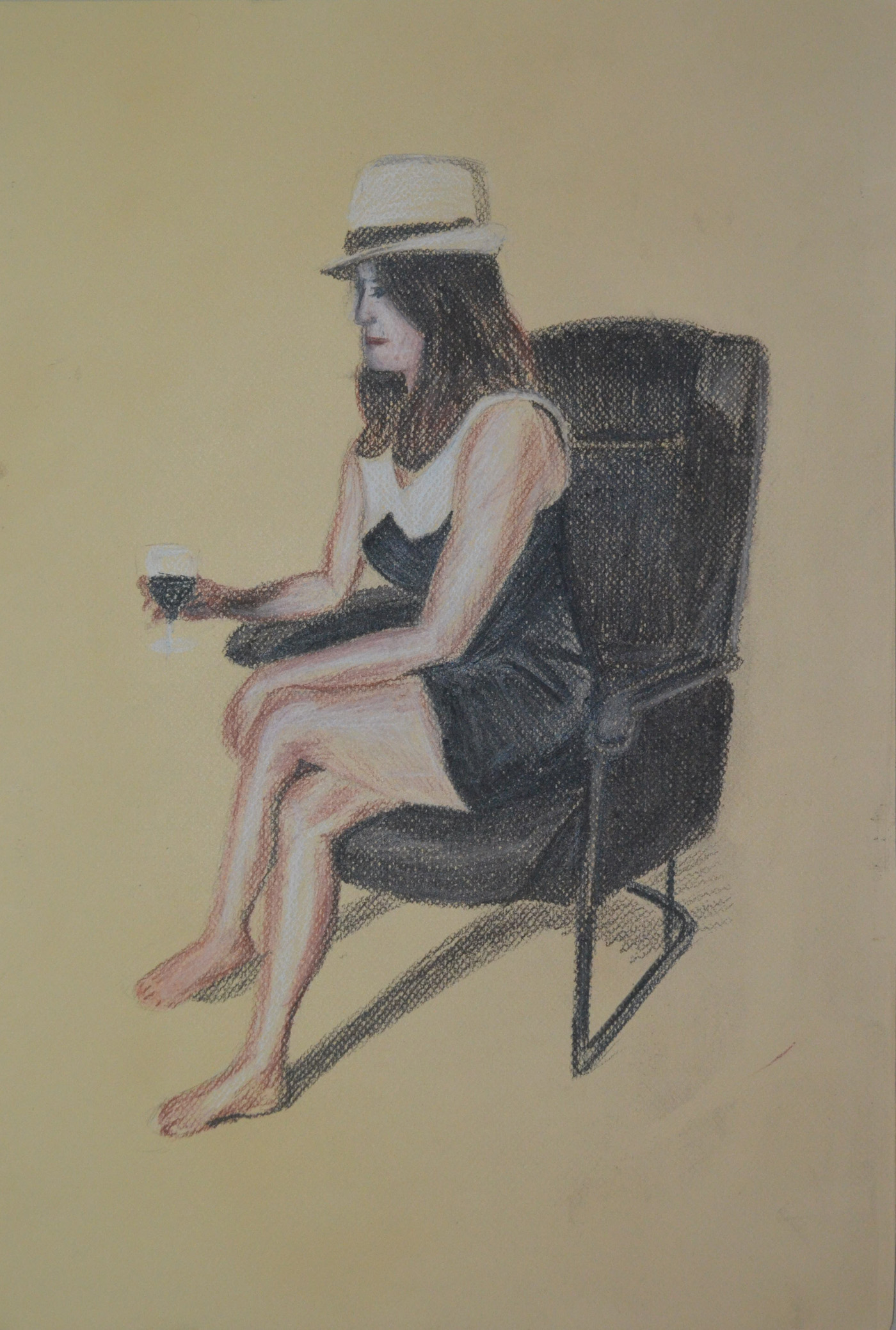
1 – Sitting, Conte, Charcoal, Conte Pencil
Did imagining underlying anatomy help convey structure and form?
Yes, very much so, particularly in the shoulders, chest, hips and arms. Anatomy is a subject that I would really like to continue to learn about and I have enjoyed reading through books on the subject such as Bridgman – A Guide to Drawing From Life and Burne Hogarth – Dynamic Anatomy.
This was only the second time working with my girlfriend as a life model and so it was a nice little exercise to introducing her to posing for me for longer periods of time.
1st Drawing – A Practise with Charcoal
I started with a practise sketch to get me used to drawing with charcoal on the large A2 pad. For this I let the girlfriend sit on the floor with her back against the bed. She lives in a studio apartment which is basically a bedsit. The proportions were out as there wasn’t much measuring going what I really wanted to know from this trial drawing was how well I was going to work with compressed charcoal on the large sheets of paper.
The introduction to this project pointed out ‘basic shapes are used to construct three-dimensional fundamental forms…The head is a sphere, arms and legs are cylinders, and the feet and hand are ellipses’ and with that I decided to puppetize my girlfriend.
With me being new to life-drawing I decided to start with a simple pose where there was only a slight twist in the central axis, this first pose with arms straight down, parralel to the edge of the paper helped me to ‘establish the bulk of the drawing in relation to the space around it’ as suggested in the brief.
2nd Drawing Sat on Bed A2
The second pose was very similar to one that I didn’t do a great job on in the ‘Quick Poses‘ exercise but this time with ample time to measure, using the head as a marker and remembering what I learnt earlier that the head fit into the torso approximately 4 times to the seat of the backside on the seated figure, the results were satisfying.
3rd Drawing Sat on Bed 1 Leg Up A2
My girlfriend is very small in height, just over 5 foot so for the next sketch I asked her to sit very close to the edge of the mattress so I could draw both her feet on the floor. I started by using a sanguine conte pencil but realised it was pretty permanent and couldn’t mess about with it as much as I could the Conte, the lines wouldn’t erase but it didn’t matter too much and I decided to go over it in Charcoal. The result of this gave me an idea for depicting movement which may come in handy later on.
4th Drawing Charcoal over Conte
I picked up the wrong stick of charcoal for this next drawing that was rather scratchy and almost impossible to smudge in with my fingers but I decided to keep going. This time I thought I would have a go at drawing a face, wish I hadn’t, not in this medium anyway. The girlfriend has an unusual face, she comes from Thailand’s most northern province and probably most northern town and she has a very ‘Thai’ face not like the Bangkok/Chinese faces I’ve been used to seeing over the last 15 years and so any attempt at a face would have to be in a medium that I could play around with.
5th Drawing – Compressed Charcoal and an Atempt at a face
Again I added a few more details toes, fingers, ankles but worked fast and kept the sketch nice and scratchy with squiggly hatching.
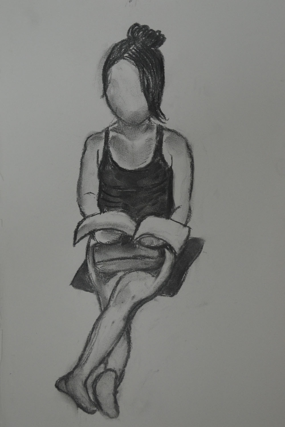
6th Drawing in Hard Pastel on A3
The last drawing was from a photo in hard pastel, I was teaching at the language center and popped upstairs to the art store where there were Nouvel Carre Pastels on sale and wanted to see what they were like and also needed to see what could be done in hard pastel in this part of the course.
It was a nice refreshing change after the last assignment to do some quick drawings so I went into this exercise feeling quite optimistic. I had already done some quick 2 minute and a 10 minute sketch at school in my last sketch book from a life drawing site, so I was eager to get on with it. I was lucky to have my girlfriend come to visit me as she is a yoga teacher and a very willing model.
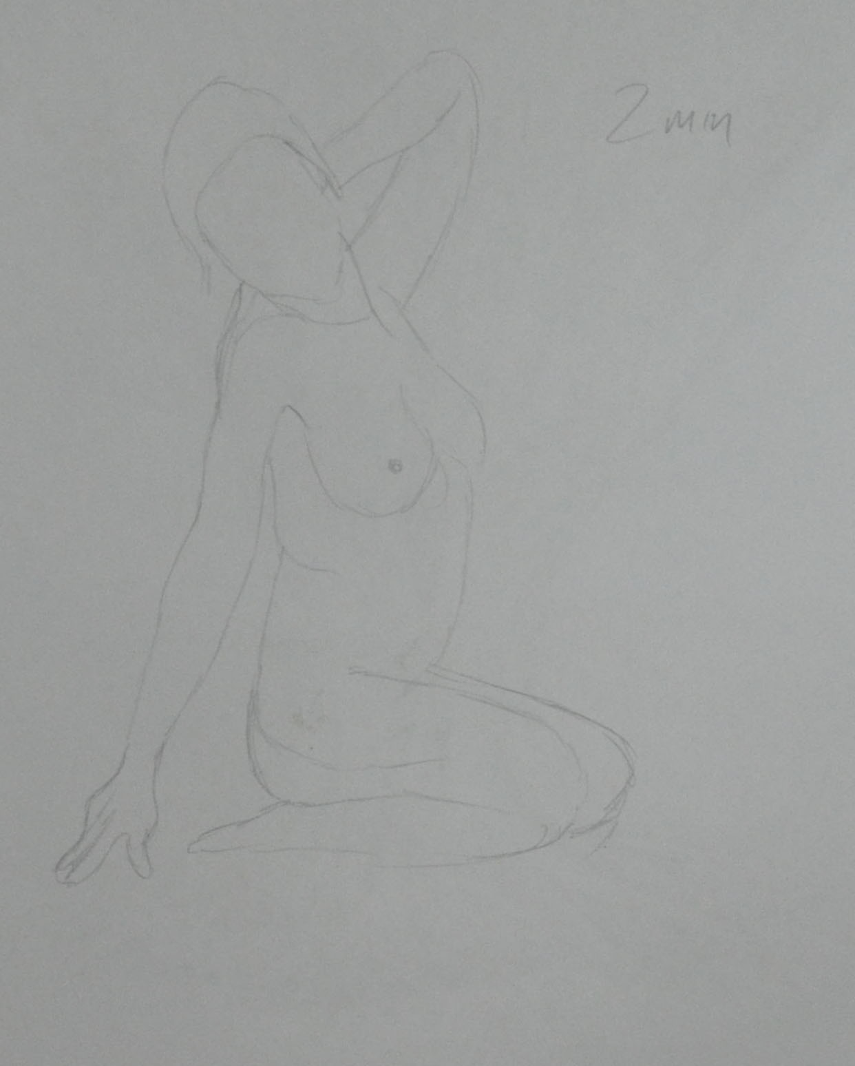
1st 2 minute drawing graphite pencil
We left the yoga poses alone for now and just started with some simple poses, that turned out to be not so easy. Like I said earlier I did some quick sketches at school from a life drawing site and they really were quite easy. It was very different with a model stood in front of me swaying about.
2nd 2 Minute Drawing Black Conte Pencil
I did as the brief said and started out drawing from the middle of the body then out to the head and feet and used the black end of my Mars Lumograph pencil for measurement.
3rd 2 Minute Drawing Sanguine Conte
The most challenging thing for me here was finding a pose that I could actually I draw and trying different mediums made me realize just how rubbish I actually was at figure drawing. I had always worked from memory or photographs when drawing the human body.
4th 2 minute drawing Sanuine Cinte
An other big problem I had at this stage was drawing my girlfriends profile and any of her facial features. So at this stage I scrapped even trying to draw facial features and went for drawing the outline of the face.
5th 2 Minute Sketch 3B Pencil
After experimenting with different mediums (graphite pencil, black Conte and Sanguine Conte ) I went back to drawing with a 3B pencil until I got my confidence up.
6th 2 Minute Drawing 3 B Pencil
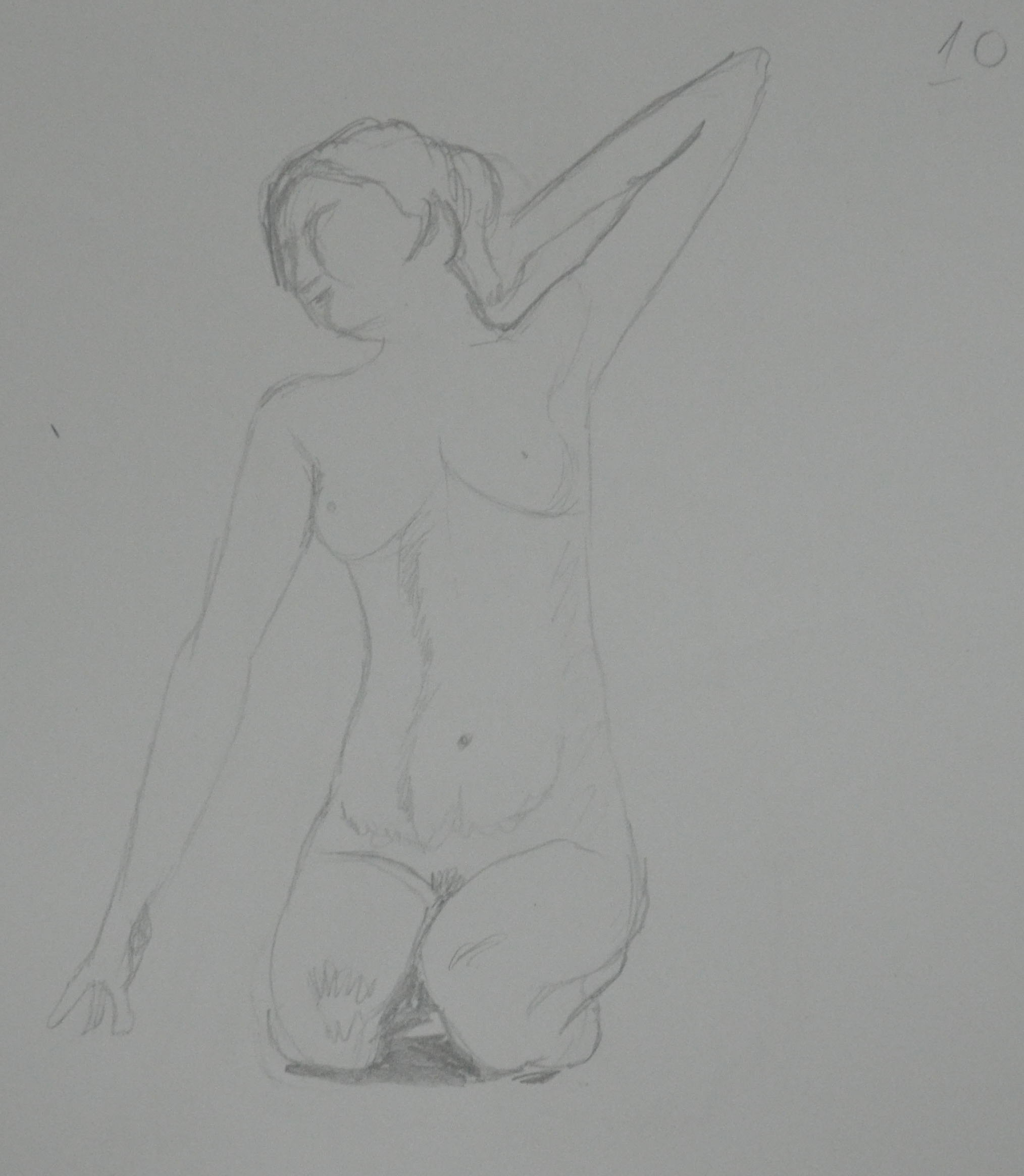
After 6 x 2 minute drawings I settled for a seated pose for the girlfriend for two reasons, 1 because she was doing a fair bit of wriggling and 2 because I didn’t want to put her off posing for me in future exercises.
I completed 2 x 10 minute drawings in graphite pencil and compressed charcoal, which I was quite pleased with as they did actually look like my girlfriend in shape and height.
Felt Tip Pen continuous Drawing
From there I started to do a bit of experimenting trying 1 continuous drawing in felt tip pen which the girlfriend was quite pleased with as it made her look slim.
My Findings
From measuring while drawing and also measuring after drawing with lines on the sketches I found that the girlfriend’s head fit into her body four times to the bottom of the backside in a seated position if the girlfriend is willing to help me on future exercises then this knowledge will come in quite handy.
Earlier Drawings
The following drawings were drawn using a life drawing site while I was at school just before the summer holidays.
1st Drawing at School 2 Minutes2nd Drawing at School 2 minutes3rd Drawing at School 2 minutes4th Drawing at School 10 minutes
With the threat of protests shutting the roads down around my school I had to move quickly with this exercise. I decided to use the square sketchbook that I had purchased from the school suppliers especially for the last exercise ‘Study of a Townscape Using Line‘ which I completed in drawing pen.
The sketchbook wouldn’t have been my first choice for pencil sketches as the paper is very smooth with no tooth at all but as part of the learning process I decided to go with it to see what results I would get putting drawing pencil to paper.
For this exercise the brief told us to, ‘carefully select a viewpoint that gives you somewhere to sit comfortably while you are sketching and making notes. Focus on one particular building, for example a corner site or a building facade, and notice how the other buildings support your main focus.
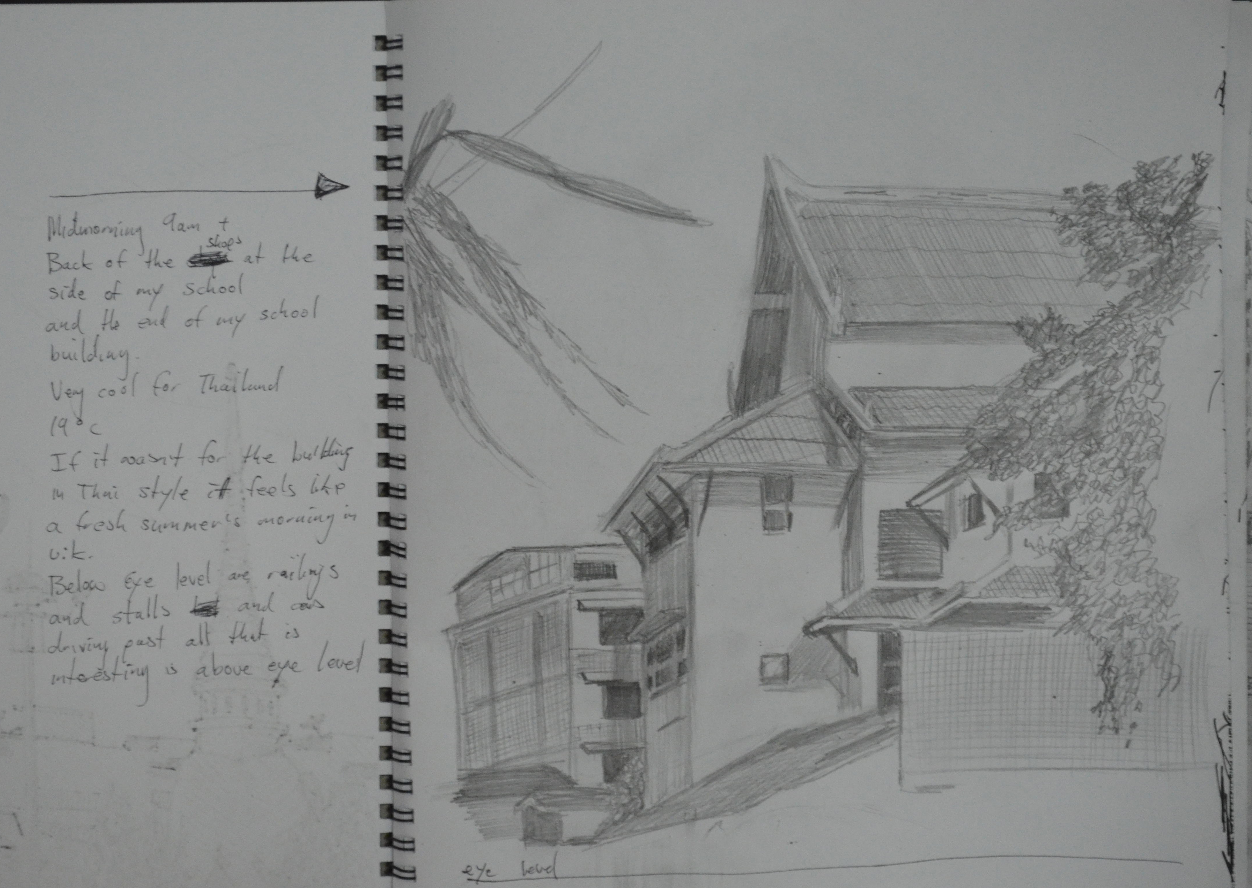
‘It was 9 a.m. and one of the coolest mornings we had experienced in Bangkok for a long time, probably the first morning of the cold season and at 18 degrees it was really quite cold for Bangkok. There were activities in the morning so I took my camera with me to school so I could take some photos of the buildings around the school at what is the best time of the day. From 9-11 the buildings and roads around the school are saturated with the shadows of the trees around the temple. On this fresh morning the area reminded me of a road close to my house in Wakefield, which made me quite home sick as I’ve only been back once in 14 years..
After taking some photos that I could use for reference later I took a chair out to settle down and make some sketches. My first sketch was of my school itself, which is a temple school and therefore built in the same style as a temple and with its external roof beams it looks similar to a building from the middle ages, when viewed at certain angles
1 – Sketch of School in H pencil w notes
I chose an angle that captured the best part of the school with its tiled roofs sloping in different directions, framed by trees at either side and an old apartment block to the back. I didn’t take the drawing all the way to the road as at this stage I thought I woulds be spending more time drawing around the corner.
Sketch of Temple Gates in H Pencil w Notes
There are plenty of opportunities to make sketches that capture the contrast between old and new within a stone throw of the school grounds. My next sketch was of the temple wall, including two of the temple’s gates and part of the Prathom (secondary) school opposite the primary school where I work.
Sketch of Ginnel in H Pencil w Notes
From there I made a sketch of the ginnel at the side of the school with the shop on the corner. I left out a lot of detail in this drawing while still trying to include the most important parts, which was a real lesson that helped with the next few sketches.
By now I was beginning to find my feet around the area and I had worked my way round to the back of a group of shops that really caught my attention when taking the photos unfortunately I didn’t have enough time to continue outside so the next few sketches were done at home.
Back of the Shops in H Pencil w Notes
It’s amazing how far I am into this course and yet I’m still having problems fitting the subject on the canvas but then again drawing the buildings here that have been built then added onto year after year, are made up of lots of irregular shapes and are definitely not that easy to draw.
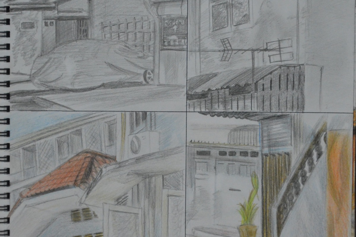
10 cm Squares Tonal and Detail Drawings with 3B and Colour Pencils
The brief for this exercise also instructed me to make a 10 cm drawing of a detailed part of the building and then another 10 cm tonal drawing depicting how the light falls across the building. I found it difficult to draw detail without drawing the shadows on the building and so I did two 3B pencil drawings and 2 coloured pencil drawings showing both. The drawings turned out rather like a comic strip.
Back of the Shops in 3B Pencil and Dry Watercolour Pencils
I have never liked the waxy feel of the Derwent colour pencils and so the next sketch was done 3B and dry water colour pencils. I really thought that this would be the sketch that I would use for the next exercise but when I finished it I wasn’t that satisfied that I could do that good a job with a limited palette and so did another drawing of the school this time in 3B and colour pencil.
Section of School in 3B and Dry Watercolour Pencils
I loved working on this which was a lot easier to draw than the very awkward shapes in the last drawing, which is why the final sketch looks a lot stronger and so i thought it was an ideal piece to reproduce in a limited palette for the next exercise.
What problems did you find in executing perspective drawings?
I thought I would fly through this project as I’ve always been quite good with perspective, having studied design and communication at school but I struggled with the Angular Perspective exercise and did quite a lot of line correction, mostly due to the irregular shape of the temple roof and getting that wrong threw everything out.
Another problem I had was lining the wall up at the side and to the front of the temple which was like drawing another level at the same perspective.
My biggest problem is trying to get everything perfect rather than trying to keep the right perspective while simplifying the drawings.
Make notes on the merits of using, or not using, rulers to guide you.
I think that using a ruler for me would have to be the final solution for a smaller drawing but maybe a necessity for larger drawings.
For smaller drawings taking your pencil from A to B without wobbling all over the place isn’t that difficult and once you have the basic shape of the subject it can be developed with some correction and modeled to almost perfection.
I feel that using rulers on the other hand for anything other than technical or larger drawings, for me especially, may lead to overworking the drawing and even more correction trying to find the right angles, right lengths etc.
When I first started this course I went upstairs to the third floor of my school for a bit of sketching practise and did a couple of drawings of the outside of the school building from the balcony. When this exercise came up it was a good excuse to get back up there as the school has a great view of the temple next door.
I actually completed this exercise well over a month ago but for the last couple of months I have been concentrating on drawing rather than my online log as Townscapes as been quite a long project for me with the irregular shapes of Thai architecture making this part of the course quite difficult but also very interesting.
So anyway it was the start of the cool season and clouds were getting less and less in the sky and the only chance I got to go out on the balcony was 1:30 pm and the sun was beating almost straight down.
Study of Townscape Using Line first Drawing
The first preliminary drawing took me a little over 25 minutes with a Rotring Tikky Graphic 0.3 and even though it was quite messy I felt that that could have been the final drawing for this study. And reminded me of a couple of the pen drawings in the Urban Sketching Handbook, particularly Singapore by Kampong Glam by Paul Heaston and Nanjing Fuzimiao by Frank Ching, the latter drawn in 30 minutes roughly about the same time as my drawing.
2 Study of Landscape Using Line 2nd Attempt
The second drawing took me from a flowing line drawing to something a bit more technical, with the first drawing everything flowed, I didn’t worry about the marks I was making and I wasn’t trying at all, with the second drawing I started to think about perspective the marks I was making the shapes I was drawing, negative space and everything went wrong. Instead of drawing objects I was familiar with I started to draw them like I was seeing them for the first time and everything went wrong. One of the biggest notable errors is the spire of the temple in the second drawing making it look like a Tibetan temple rather than a Thai temple.
Study of Landscape Using Line – Final Study
The final study was drawn from both of the preliminary drawings, using the temple from the first drawing and the school building from the second drawing every thing else was a mixture of both.
I never had any doubts about what I would use for the fore, middle and background but what lines and marks to use was always going to stress me out. This is the second time I have had to do line drawings in an exercise and the second time I have found it hard not to hatch and even though I know a degree of hatching was needed I know I went over the top with it.
I’m not sure whether I did the second part of this exercise correctly but with the very positive results of the second part of this exercise I chose not to change it and to leave it how it was.
Firstly the brief of this exercise was to draw an interior view through a door a doorway inside a building I chose to draw to draw the view in my apartment from the bedroom into the living room. I placed a rug in front of the doorway as instructed but thinking about it now I think I got the ‘wrong front’ with the rug in front of the doorway facing the other way.
I drew in line as well as tone, the main reason for this being that I found it quite difficult drawing straight lines without a ruler and using tone helped me to get the space right between the lines. I didn’t do much erasing and correcting lines as I was quite happy with the first attempt apart from the rug which seemed a bit wide. I realised afterwards that the reason why the rug seemed wide is because I made the door-frame wider than what it actually is and the negative space took the rug wider. This also meant that everything on the right and left of the door-frame was further apart but I didn’t think erasing and restarting was that much of an emergency so carried on.
Parallel Perspective – An Interior View
I live in a small 1 bedroom apartment in Bangkok with all the doors in irregular positions so the only real view I could draw was from the Bedroom into the Living room with the patio door into the kitchen on the right hand side, I didn’t think it would give me as many lines as it did but with the air-conditioning the open door and the patio door it gave me a great perspective.
Parallel Perspective an Interior View with Superimposed lines
When it came to the second part of this exercise the brief kind of confused me so the way I did things next probably conflicted with the brief in the coursework. I had a pack of gel-ball point pens in different colours. I used one colour to draw in the eye-level and then different colours for the groups of lines that met at different vanishing points.
I was very surprised by how accurate the angle of my lines were in the drawing I was also very surprised to to see which lines in the drawing met at the various vanishing points across the eye level line.
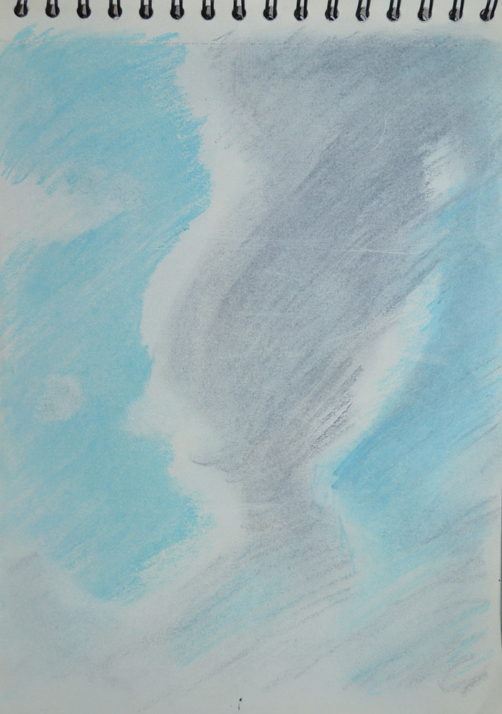
For this exercise I had to draw comprehensive tonal studies of cloud formations in charcoal, oil pastel and conte with the aid of a putty rubber.
It’s in the transition from rainy season to dry season here in Thailand but most of the rain happens in the afternoon and as I drew most of the following around mid day most of the clouds seemed to be developing into rain clouds.
I probably went about this exercise the wrong way, instead of drawing sketches in my sketchbook as it seemed a lot of other students have done I used separate sheets of paper and tried filling them up with not just the clouds but the blue skies behind the clouds to try and capture how the rays of light bouncing of the clouds effected the skies around them, and what a task.
1 – Cloud Formation in Oil Pastel
My first drawing was started in the morning from the car park at the Tesco Lotus shopping mall where I teach. I’m still really new to oil pastel so I started the drawing by drawing in the blue skies giving me the silhouette of the cloud then drawing in the dark parts of the cloud after. I could see it was going to take me a long time but luckily there was no strong winds, which is usually the norm here in Thailand during the rainy season, as the clouds just seem to form slowly through the course of the day, so I took a photo and finished the drawing at home.
The hardest part was depicting the sun shining behind the top of the clouds, I think I managed to do this by making the shadow of the cloud a lot darker in that area, so the white would look brighter.
I wasn’t going to be able to any more drawings until the next day so that night I decided to do something different. It was about 9 o’clock in the evening and I could see the moon shining through the sun so I took a photo of it from my window, When taking a photo of the night skies the camera seems to capture a lot more than what the eyes can see, I live on the 26th floor and I’ve often noticed that when taking photos of Bangkok at night clouds appear on photos that I didn’t think were there.
2 – Clouds at Night in Hard Pastel on Black Paper
I originally thought that I could do the drawing just in conte but I only had three colours a dark brick, black and white but then as I started to draw more and more colours began to appear so I highlighted the moon and the clouds in yellow and orange hard pastel, a move that would change the course of the exercise.
A Photo of the Moon at Night
The next drawings was done from my apartment window it was about half past two in the afternoon and the clouds were really starting to form now. One particular cloud caught my eye and because of the lack of wind I managed to get two drawings of it one using hard pastel for the blue skies.
3 – Cloud Formation in Charcoal
To be honest I don’t think I captured the full body of the cloud very well in charcoal and it could have looked a lot fluffier than what it did. The next drawing in hard pastel was a lot better.
4 – Cloud Formation in Hard Pastel and Charcoal
The next three drawings were done in my sketchbook in soft pastel. a medium that I wasn’t instructed to use in the brief but I really wanted to have ago in another medium as I wasn’t very keen on oil-pastel and because of the soft cloud formations and blue skies outside my window I thought it was very suitable, plus I haven’t done much work in soft pastel so far so it gave me a chance to use it.
6 – Sketchbook Drawng in Soft Pastel5 – Sketchbook Drawing in Soft Pastel
The final drawing was done in the early evening and it looks like wain was on the way but it was a really nice evening the problem was lack of selection of colours in the soft pastel set that I bought so this is something I have to correct.
7 – Sketchbook Drawing in Soft Paste (Evening)
I haven’t done as many studies I would have liked to in this exercise but with the amount of work I have had on lately I’ve slipped right behind and I want to get moving with the final exercise in this module but I’ll hopefully be doing more cloud studies throughout this part of the course and adding them later.
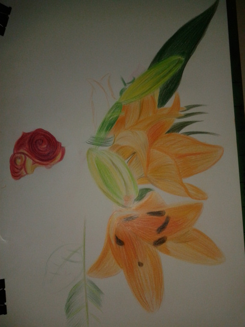
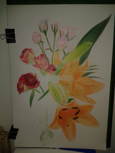
For this exercise I bought an assortment of flowers from the Tops supermarket while I was visiting my kids for a meal for my oldest daughters Birthday. The flowers I chose were orchids and some red and pink roses, I really was not thinking about shapes or colour when I purchased them but I am glad I made the choices that I did. On an A2 sheet of white paper I began to draw.
Roses and Orchids
Now the brief said to experiment with different methods of blending in my sketchbook first, however I thought I had had enough practise blending colour with colour pencils so far in this course so I put pencil straight to paper, for the flowers this was no problem but for the leaves I wish I had done as the brief said and practised a little more.
Drawing the Orchid
I began with a neutral colour for each subject starting with the orchid and working my way around the composition working on the most prominent flowers and leaves first keeping a careful eye on negative space.
Part way through the drawing I read the brief again to find out I had skipped over some valuable instructions:
Make the plant the focal point of your drawing but draw the background
Do not draw the plant in isolation
Draw in the context to give depth and substance to the drawing
The background I had chosen was a plane white wall with brown skirting boards and very pale floor tiles but I decided to carry on and I am glad I did. Using three different types of flowers with large leaves and petals on the orchid the composition and the vase I had placed them in made up the main subject and the background. Placing the largest flowers at the front and the smallest at the back helped me to create a nice three dimensional effect with the large orchid flower taking on the role as the focal point of the drawing.
I used different methods of blending for each of the flowers with layering used on all, the Still Life Group in Tone Exercise early on in this part of the course really helped using 3-4 colours on each flower but starting off with the lightest colour first and working my way to the darkest.
I used long strokes for the orchid to give it a stretching outwards feel and to me it almost seems like it as a life of its own.
Drawing in the Red Roses
For the red roses I coloured them in a spiral motion then layered the darkest colours over the top rubbing out the colour from time to time to let the lighter colours show through.
Flowers Complete
The pink roses were the most challenging of the lot with the colours and details being so delicate I decided to tackle them in a different way by hatching then squiggling over the top for the flowers where you can see the petals grouped together.
Aspects of the Drawing I am Satisfied with:
I am really happy with the 3 dimensional feel of the drawing and the way the different solutions I came up with to tackle each type of flower pad off. I am also very happy with way the drawing came together using the practise I had from the Negative Space in a Plant Exercise helped me to piece the drawing together like a jigsaw.
Plants and Flowers in Coloured Pencil
Aspects of the Drawing I am not happy with:
As always I wish I had read the brief again and again until I was clear on what I had to do but then this would have lead to a one or two plant composition which would have probably been a lot less challenging.
I wish I had practised blending colours in my sketch book if just for the leaves and stems, although not all the leaves and stems are clearly visible I can see that I definitely could have improved on the blending on those parts of the flowers.
The final drawing is very sketchy although this is a big difference from some of the final drawings in part 1 of this and I know I allowed the the sketchy artist I researched earlier to influence me in this exercise I would have preferred a more realistic finished drawing.