How did you use a limited colour palette to create a sense of depth?
Firstly I chose three colours that I knew would go well together, chocolate brown pastel pencil, Black and Sanguine Conté pencils and a Derwent Chinese white drawing pencil. I used the three colours together to create a sense of depth when drawing the trees then on the buildings, shadows etc. I used the pencils at different pressures to create light and dark tones. The Chinese white helped to relieve the colour if I put too much pressure on on the first attempt. Hatching and cross hatching also helped me to take the colours even deeper.
Did your preliminary sketches give you enough information for your final pieces of work?
Undoubtedly yes, they also helped me to eliminate details that I did not need and simplify more difficult parts of the buildings and scenes for the final pieces.
Would you approach this task differently another time?
Yes, most definitely scale is one thing I am very aware of and I believe that all buildings in the drawings are to scale.
Have you captured the colour and atmosphere in your drawings? How did you do this?
In the pencil sketches I think I captured the atmosphere quite well with use of shadow. As I said in the ‘A sketchbook of townscape drawings exercise’ it was a fresh morning and with the shadows cast from the trees around the temple it reminded of me of a road near my home in Wakefield, for me the sketches still arouse these emotions. However, the limited palette study does not seem to depict the brightness and freshness of the day and I’m left wondering what I could have done differently.
It has been a bit hard to get around Bangkok the last few weeks and the ‘mob’ protesters have shut off the main road entrances into the city. You can still get around, they aren’t preventing pedestrians but there has been numerous grenade attacks and shootings over the last few weeks; so unfortunately I had to stick to the national art gallery and in and around school.
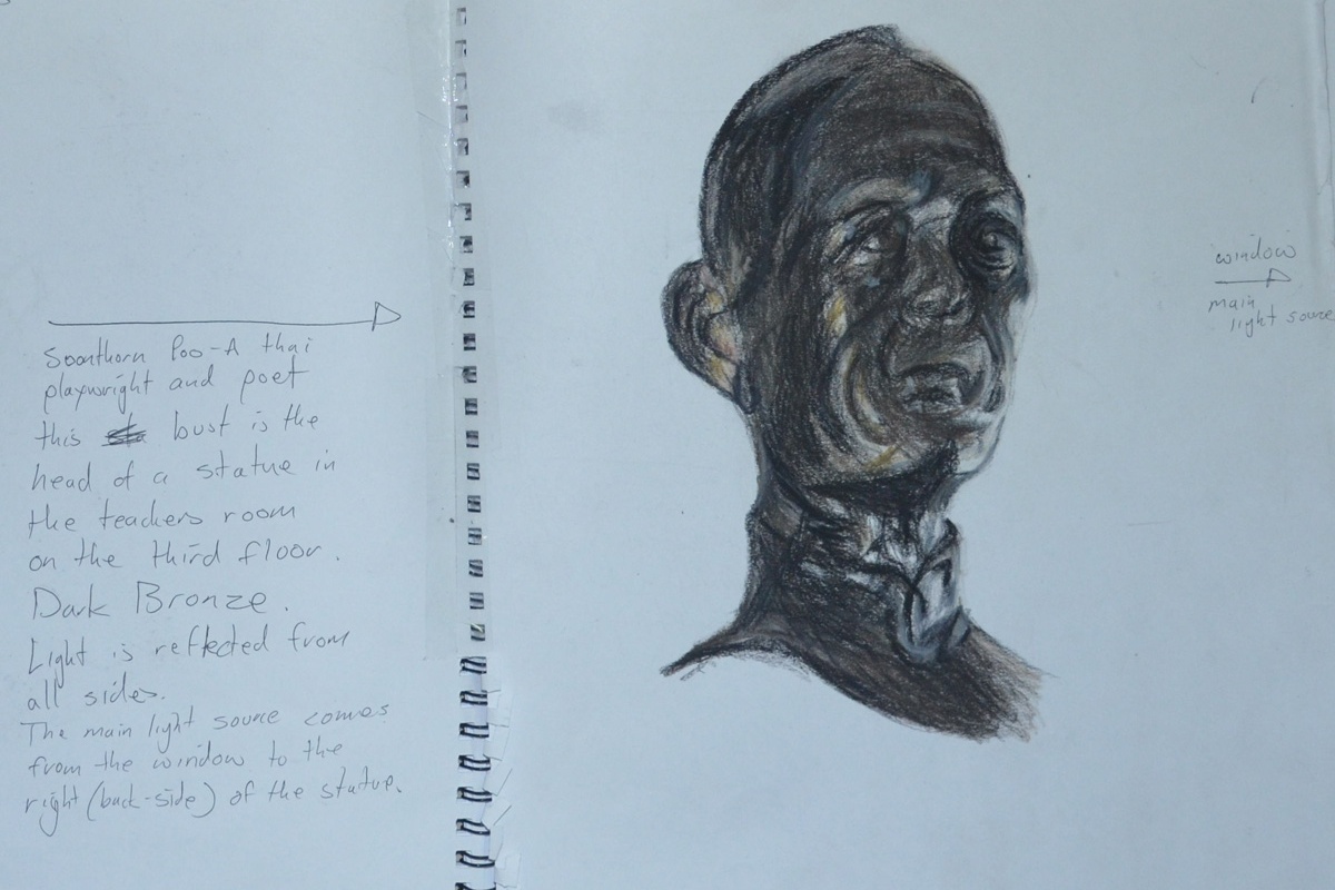
My first drawing was in Conté and hard pastel. I liked using them in the last exercise a limited palette study from your sketches and i thought that the three colours that I used in that exercise would be great for Bronze. In the teacher’s room on the third floor of the school, there was a reproduction bronze statue of the Thai playwright and poet Soonthornpoo (so highly regarded in Thailand that he has his own day).
Soonthornpoo Conte and Pastel Pencil
Surprisingly the three colours worked very differently together in this exercise as the subject was very dark and I had to bring in a yellow and orange pastel pencil.
My next drawings were done at the national art gallery, I was due a visit and I also planned to get some drawings of statues done while I was there. The protesters had been camped out round the corner from the gallery for the last three months which probably put everyone off exhibiting anything at the gallery so there was only one artist exhibiting. There were some nice statues in the permanent exhibition though.
The next subject was a statue of a naked young girl that caught my eye because of the smoothness and colour of the statue but after about 5 attempts in pastel pencil, that ended up in the bin, I gave up trying in colour and did two successful drawings in 4B pencil. Well not quite that successful as it was quite difficult to get the body and facial proportions right of a girl at that age, Drawing the kids heads at school has helped.
Statue of a Young Girl in 4B pencil
The next drawing in pastel and Conté of a women’s head in the gallery was the last drawing I did in the gallery, this particular statue caught my eye because of the strong contrast in colours of the light and shadow caused by being placed in the corner of the not-so-well lit statue exhibition. Disappointingly the finished drawing does not look like the statue, although it does look female, it does look Asian and the colours are spot on, the original statue’s face looked more primate-looking with the face stretching forwards and big cheeks.
Bust of a Thai Woman National Art Gallery
I was back at school on the Monday and so I had time to draw a statue depicting one of the 7 faces of Buddha (I think that’s how many there are). Phra Mahanchanok and the other 6 faces are depicted in different scenes around Wat (temple) Makut near the school and are statues molded from a cement time mixture around a metal frame. This was a disappointing effort as the drawing just looks flat.
Phra Mahanchanok Outside Temple in 4B
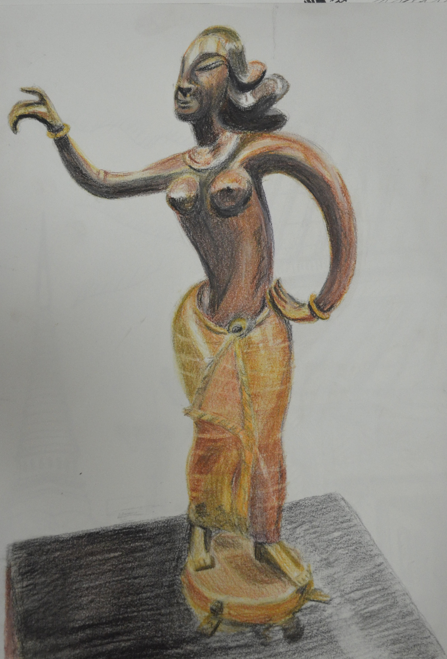
The last statue was of a southern Thai style female figure in bronze, from a photo that I took in the art gallery, I loved bronze appeared to be different colours in different parts of the statue due to the contrast in curves and textures, I thought it was the perfect subject for a larger drawing and so I completed her in pastel pencil and Conté on an A3 sheet of paper.
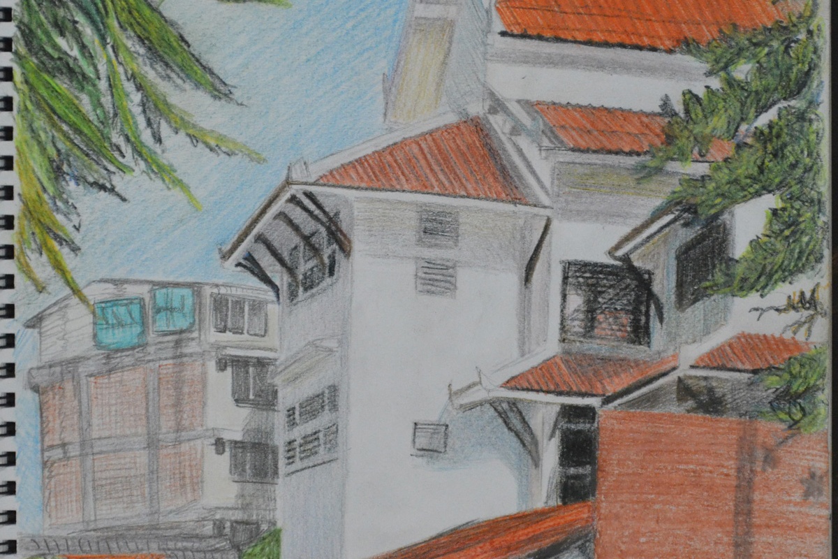
For this exercise I was to make a limited palette study from the sketches in my previous exercise ‘a Sketchbook of Townscape Drawings‘ in 2-3 colours. I used a chocolate pastel pencil, sanguine and black Conté pencils and a Derwent Chinese White drawing pencil.
I had already done a pencil sketch of my school in the last exercise as well as a drawing of the same school in colour pencil and knowing that it would work for this exercise I decided to develop those sketches into a larger drawing with a limited palette.
Sketch of School in H pencil w notesSection of School in 3B and Dry Watercolour Pencils
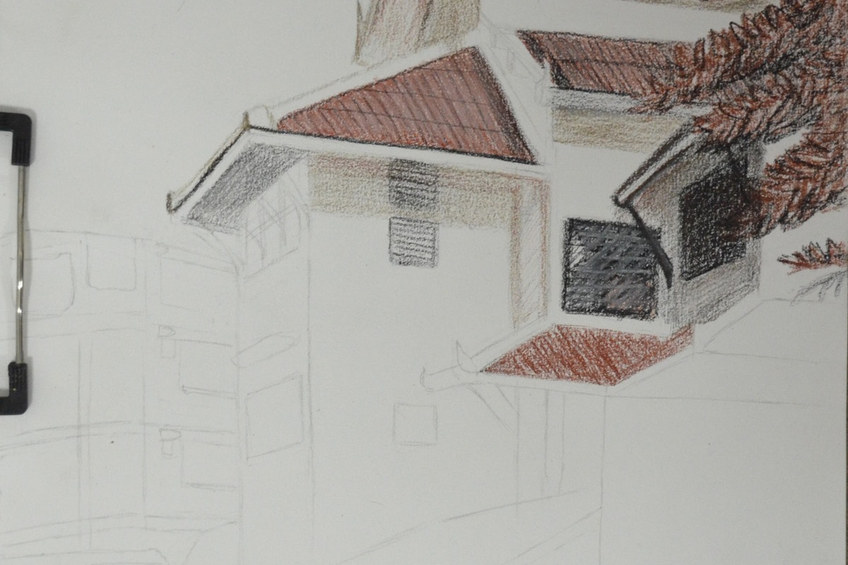
I followed the instructions of this exercise, drawing in the strongest verticals first, which were the corners of the main school building. From there I drew in the diagonals which were the many roofs of the school building and most of everything else.
Adding Colour
Drawing in the detail was quite easy simply because I got the verticals and diagonal lines right the first time but if not then drawing in the windows, roof beams etc. could have been a disaster.
A Limited Palette Study in Conte, Pastel and Chinese White
The colours that I chose for this exercise went very well together and so the roll of each colour i.e. light, dark and mid-tone swapped over in different parts of the picture with the most prominent colours being the Sanguine and the Black Conté simply because they helped me depict how bright and fresh the day was.
The chocolate colour pastel pencil was mainly used for shadow along with the black Conté at minimum pressure. The Chinese white was grade for toning down the Conté and also adding 3D properties to the tiled roofs.
I have to be honest and say I love the finished study which does remind me of some drawing from an history lesson at school.
With the threat of protests shutting the roads down around my school I had to move quickly with this exercise. I decided to use the square sketchbook that I had purchased from the school suppliers especially for the last exercise ‘Study of a Townscape Using Line‘ which I completed in drawing pen.
The sketchbook wouldn’t have been my first choice for pencil sketches as the paper is very smooth with no tooth at all but as part of the learning process I decided to go with it to see what results I would get putting drawing pencil to paper.
For this exercise the brief told us to, ‘carefully select a viewpoint that gives you somewhere to sit comfortably while you are sketching and making notes. Focus on one particular building, for example a corner site or a building facade, and notice how the other buildings support your main focus.
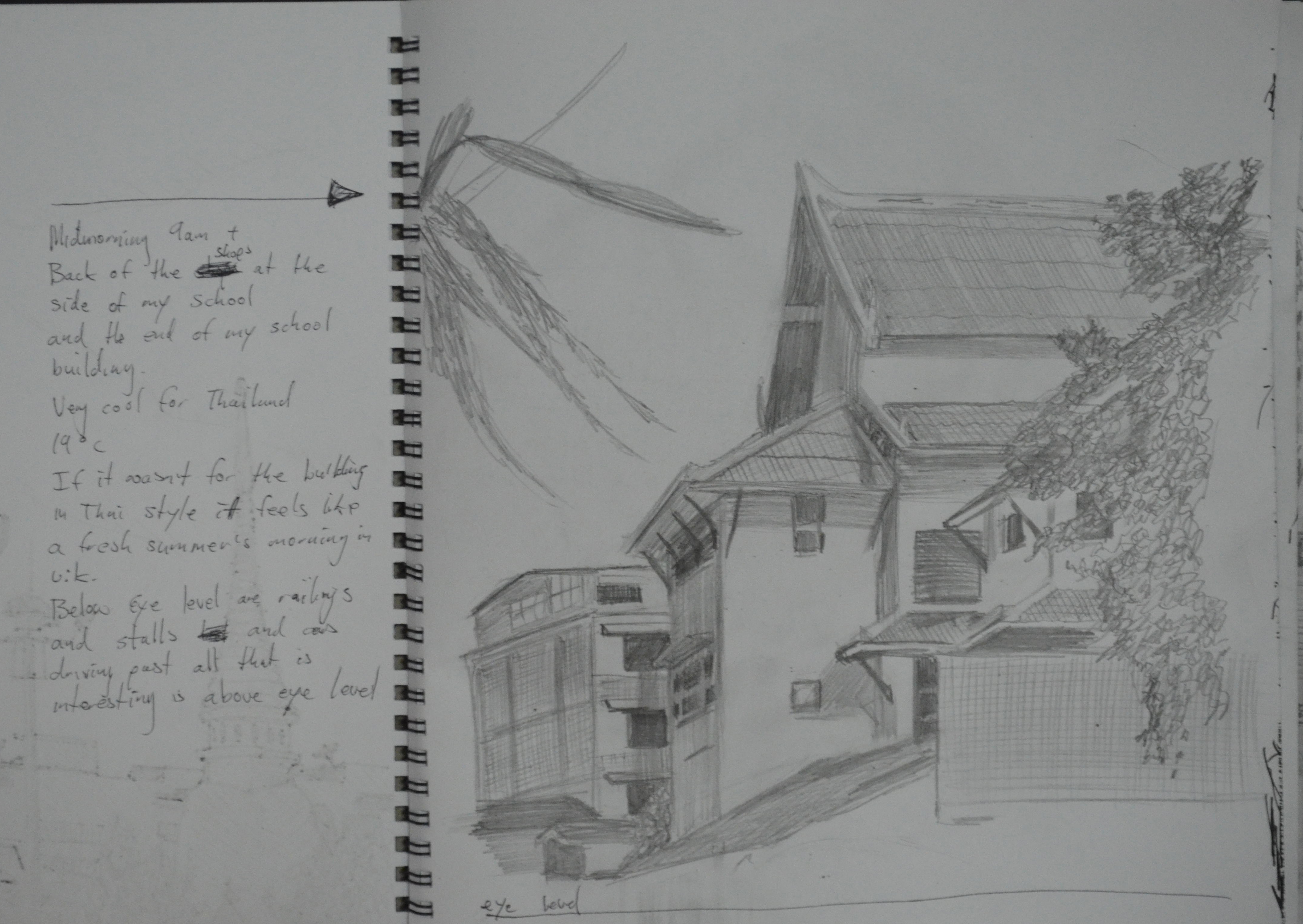
‘It was 9 a.m. and one of the coolest mornings we had experienced in Bangkok for a long time, probably the first morning of the cold season and at 18 degrees it was really quite cold for Bangkok. There were activities in the morning so I took my camera with me to school so I could take some photos of the buildings around the school at what is the best time of the day. From 9-11 the buildings and roads around the school are saturated with the shadows of the trees around the temple. On this fresh morning the area reminded me of a road close to my house in Wakefield, which made me quite home sick as I’ve only been back once in 14 years..
After taking some photos that I could use for reference later I took a chair out to settle down and make some sketches. My first sketch was of my school itself, which is a temple school and therefore built in the same style as a temple and with its external roof beams it looks similar to a building from the middle ages, when viewed at certain angles
1 – Sketch of School in H pencil w notes
I chose an angle that captured the best part of the school with its tiled roofs sloping in different directions, framed by trees at either side and an old apartment block to the back. I didn’t take the drawing all the way to the road as at this stage I thought I woulds be spending more time drawing around the corner.
Sketch of Temple Gates in H Pencil w Notes
There are plenty of opportunities to make sketches that capture the contrast between old and new within a stone throw of the school grounds. My next sketch was of the temple wall, including two of the temple’s gates and part of the Prathom (secondary) school opposite the primary school where I work.
Sketch of Ginnel in H Pencil w Notes
From there I made a sketch of the ginnel at the side of the school with the shop on the corner. I left out a lot of detail in this drawing while still trying to include the most important parts, which was a real lesson that helped with the next few sketches.
By now I was beginning to find my feet around the area and I had worked my way round to the back of a group of shops that really caught my attention when taking the photos unfortunately I didn’t have enough time to continue outside so the next few sketches were done at home.
Back of the Shops in H Pencil w Notes
It’s amazing how far I am into this course and yet I’m still having problems fitting the subject on the canvas but then again drawing the buildings here that have been built then added onto year after year, are made up of lots of irregular shapes and are definitely not that easy to draw.
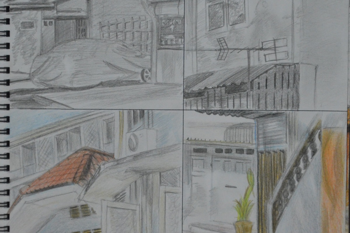
10 cm Squares Tonal and Detail Drawings with 3B and Colour Pencils
The brief for this exercise also instructed me to make a 10 cm drawing of a detailed part of the building and then another 10 cm tonal drawing depicting how the light falls across the building. I found it difficult to draw detail without drawing the shadows on the building and so I did two 3B pencil drawings and 2 coloured pencil drawings showing both. The drawings turned out rather like a comic strip.
Back of the Shops in 3B Pencil and Dry Watercolour Pencils
I have never liked the waxy feel of the Derwent colour pencils and so the next sketch was done 3B and dry water colour pencils. I really thought that this would be the sketch that I would use for the next exercise but when I finished it I wasn’t that satisfied that I could do that good a job with a limited palette and so did another drawing of the school this time in 3B and colour pencil.
Section of School in 3B and Dry Watercolour Pencils
I loved working on this which was a lot easier to draw than the very awkward shapes in the last drawing, which is why the final sketch looks a lot stronger and so i thought it was an ideal piece to reproduce in a limited palette for the next exercise.