Assignment 3 – A View from a Window or Door

Submitted Piece for Assignment 3
Final Drawing in Dry Watercolour Pencil

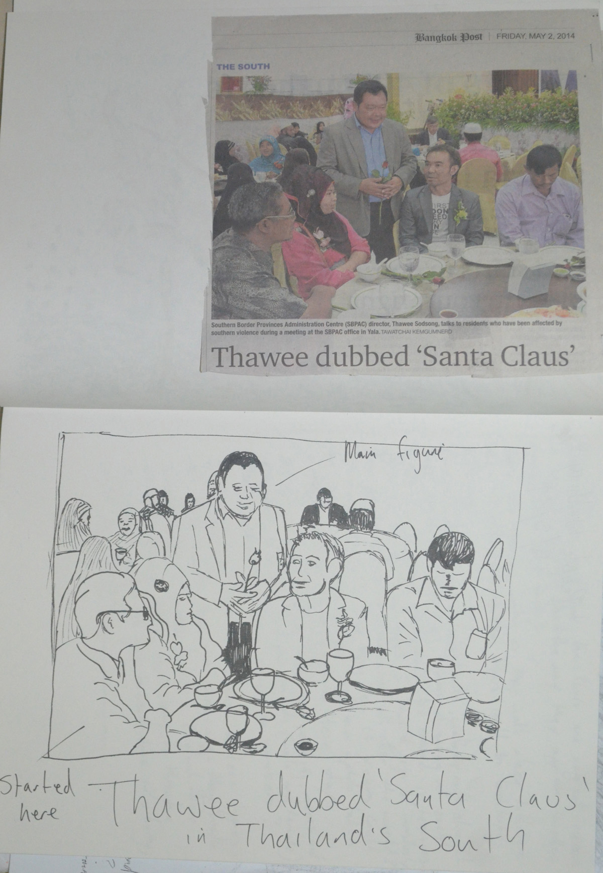
The task for this assignment was ‘to select a view from a window or from an open door. Try to find a view that includes some natural objects: trees, shrubs, pot plants, fields or garden plants’ also to ‘try and find a view that will demonstrate your understanding of aerial or linear perspective – in other words a view that has some depth to it.’

The brief also says to ‘look for a view that offers an opportunity to draw straight-lined objects as well as items drawn from nature, buildings, gates, fences and so on. It then says that ‘this may all seem like a lot to look for, but most views from windows and doors will offer you a bit of all these things’…

I have spent the best of two months trying to find a window or a door with view with any of these things and came up almost empty handed. The view from the 26th floor of an apartment block in Bangkok only offers you one of the most complex city views you could ever imagine.

view from my apartment kitchen window - Photo taken from back wall of living room
view from my apartment kitchen window – Photo taken from back wall of living room

I took a camera with me everywhere trying to find a view that would accommodate the criteria for this assignment and almost came up empty handed and then right at the last week of the school term, the last week in February for me I dropped on 2 views (by accident).

View from a 3rd floor window at school

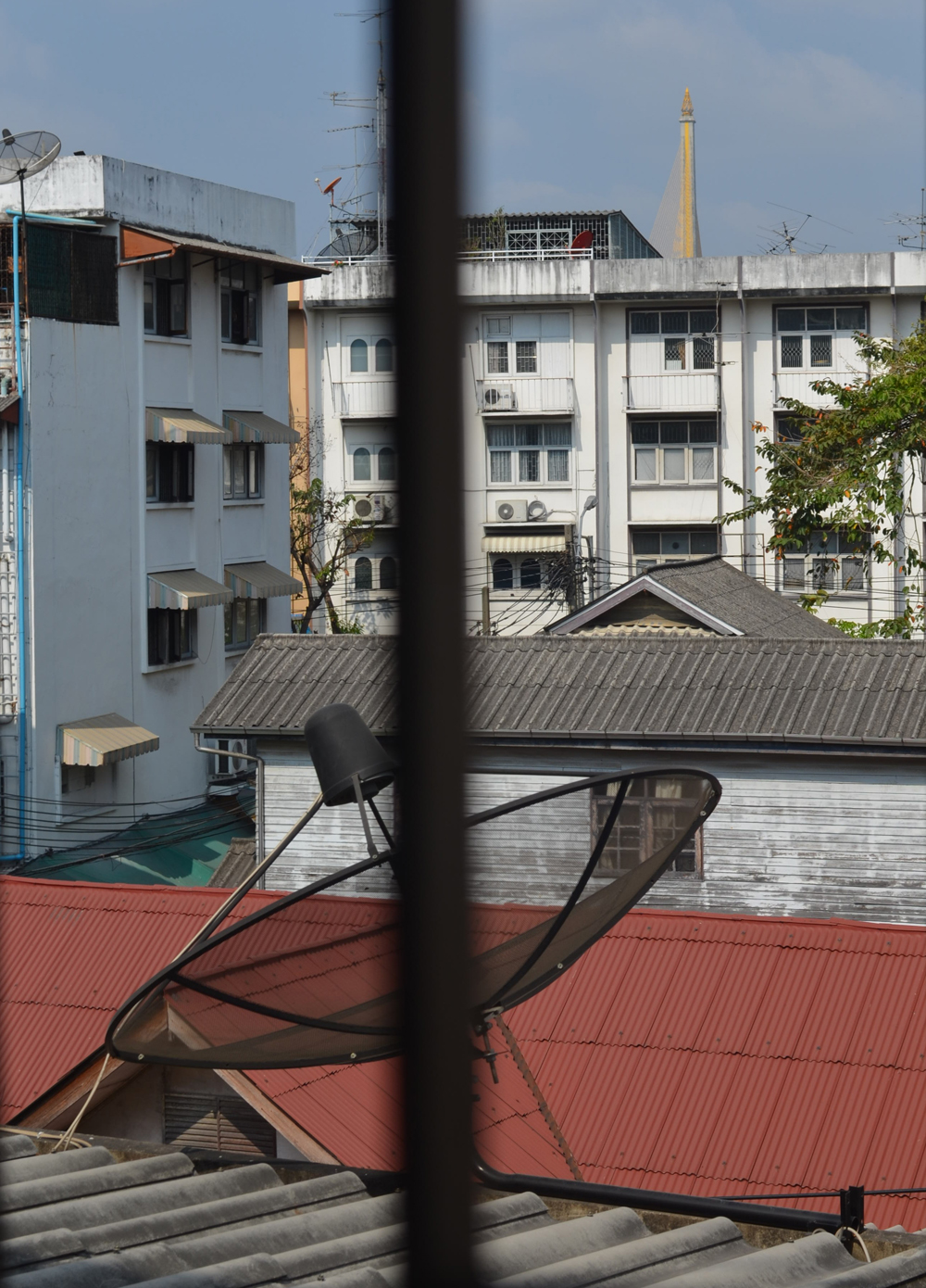
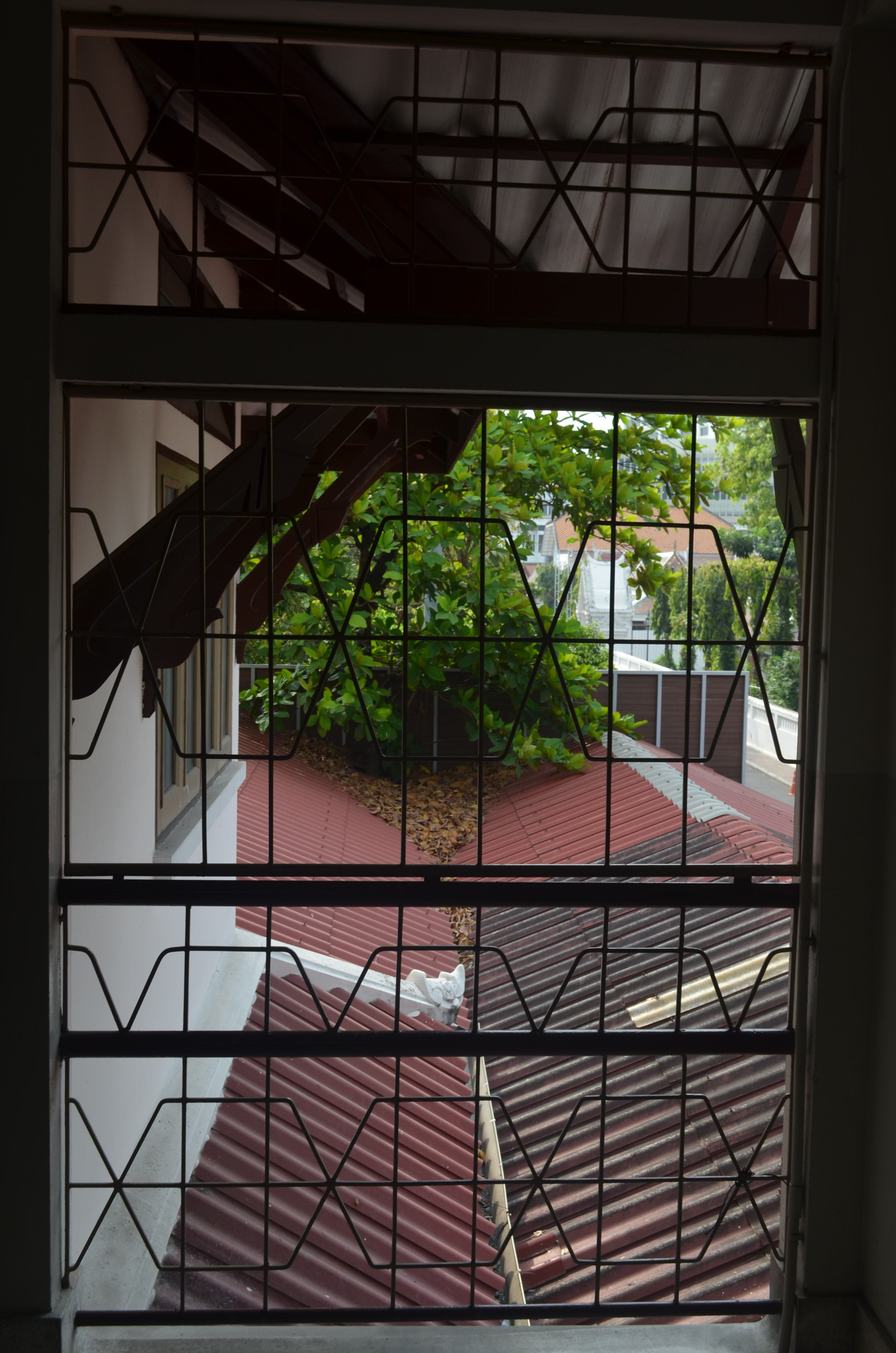
One was the view from the top floor of the school, which offered mostly concrete and not much of anything else, the other was a view from the school’s second floor window looking out of one of the windows of the school building that I had drawn in both ‘A Sketchbook of Townscape Drawings‘ and a ‘Limited Palette Study from Your Sketches‘.

View from second floor window facing temple

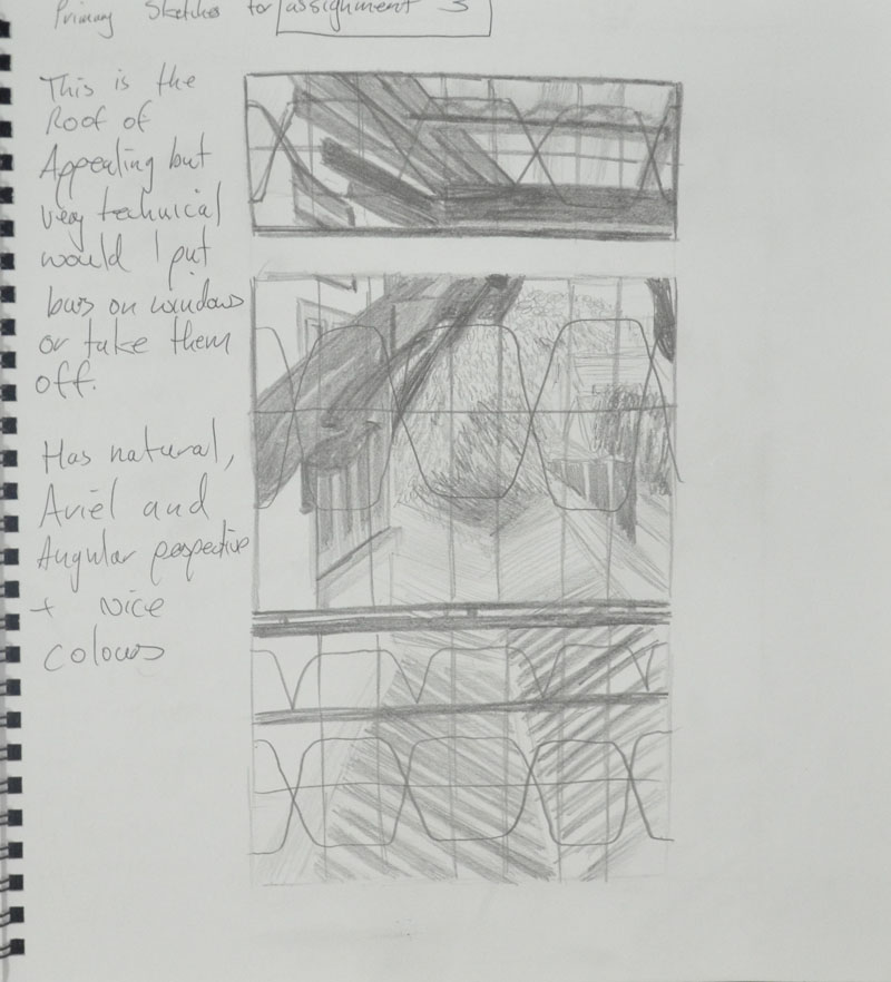
I decided to start by having a go at sketching all three, starting with the view from the second floor window, which even on the small preliminary (rough) sketch in my notebook proved very technical.

1st Sketch ifrom 2nd floor window in my notebook
1st Sketch from 2nd floor window in my notebook

The second was a half-hearted sketch of the view from my apartment window, working from the photograph I gave up after 5 minutes realizing that it wasn’t a drawing suited to the size of paper that they wanted us to do the final drawing on (A3). But maybe it would be something I would like to come back to later with the possibility that it could be painted in a style close to L.S. Lowry.

3rd Sketch an Attempt at Drawing the view from the 26th Floor Window
3rdd Sketch View from top floor classroom

The third sketch was from the window of the classroom on the top floor, which all though had most of everything, the tree in the view wasn’t very big at all and so after a second larger (partial) sketch on A3 I decided that I was to go with the view from the 2nd floor window.

3rd Sketch an Attempt at Drawing the view from the 26th Floor Window

View from the 2nd Floor Window

I started do do a study in line of what I could see from the window. This turned out to be a partially finished drawing but helped me to decide to crop the view to the middle window as it was very technical with the roof beams. It also helped me to decide on getting rid of the railings on the windows.

An attempt at Line Drawing

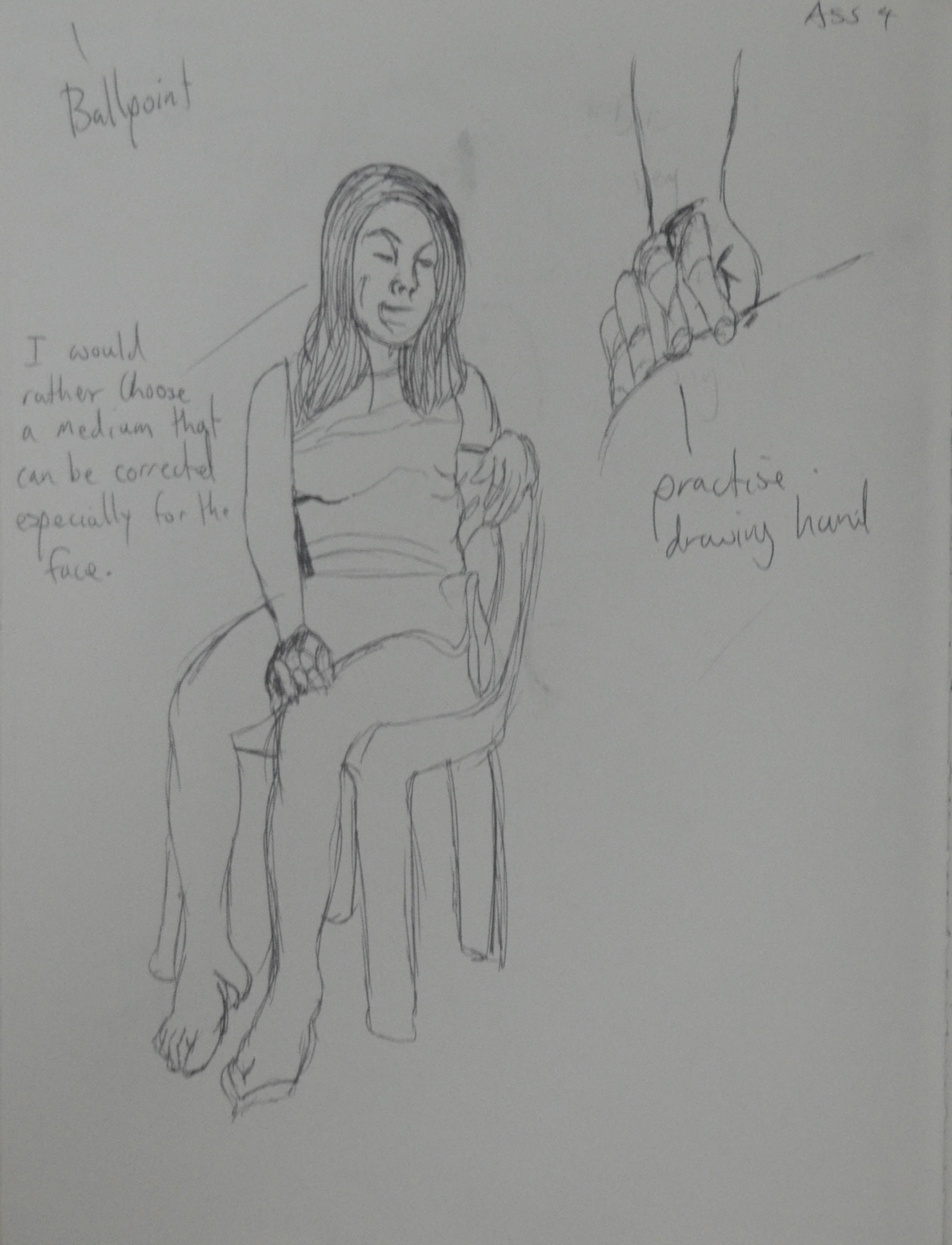
My next drawing was in A4 and was basically a quick sketch to see if I could meet the assessment criteria in my final drawing.

My Chosen View - CRopped down to the middle window
My Chosen View – Cropped down to the middle window

After the Study of several trees exercise I said that it give me an idea for the final drawing and that was to use oil pastels as I was impressed by the way they left white specs on the paper reminding me of a Seurat painting and if I had committed to the view from the classroom window I would have probably gone with that medium…after trying other mediums first of course. But, with the more intense view out of the 2nd floor window, on the small size paper I decided that it would have to be done in colour pencils.

Colour study in Marker Pen

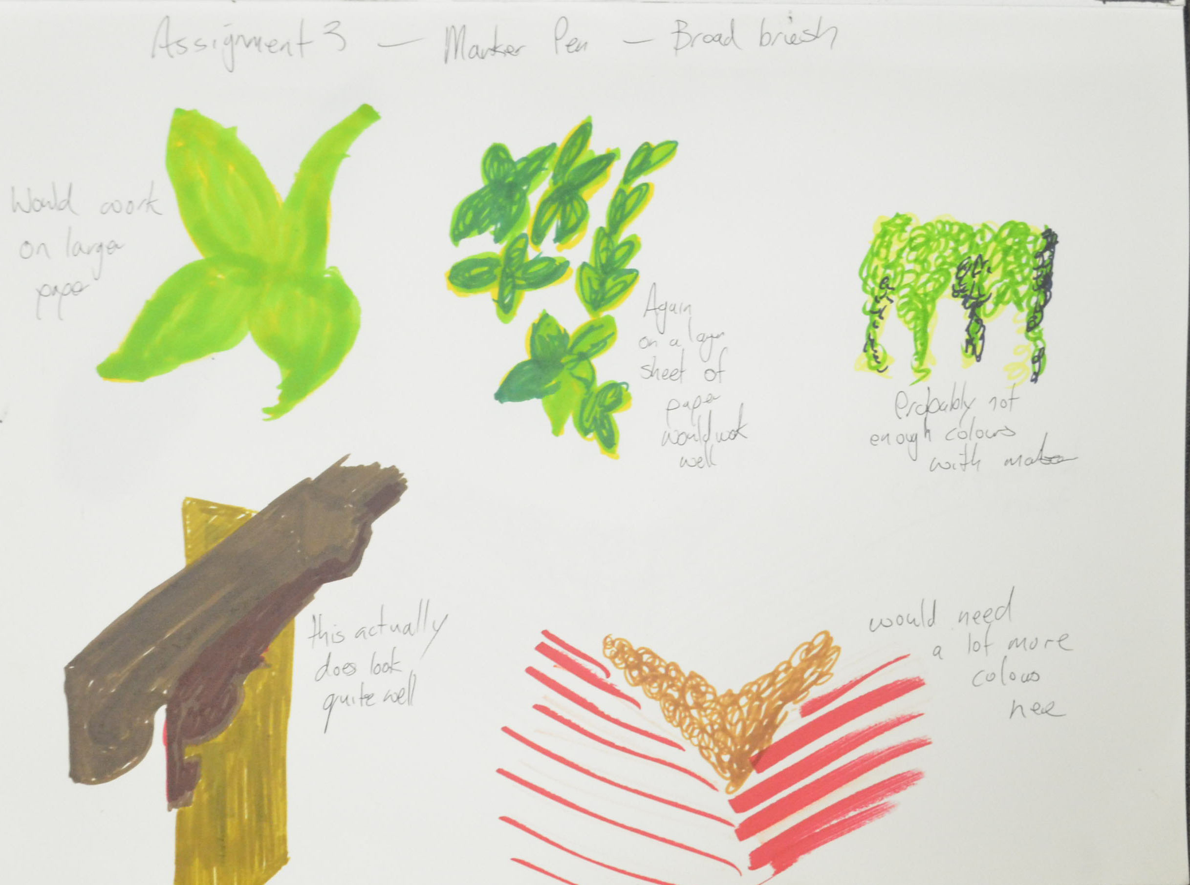
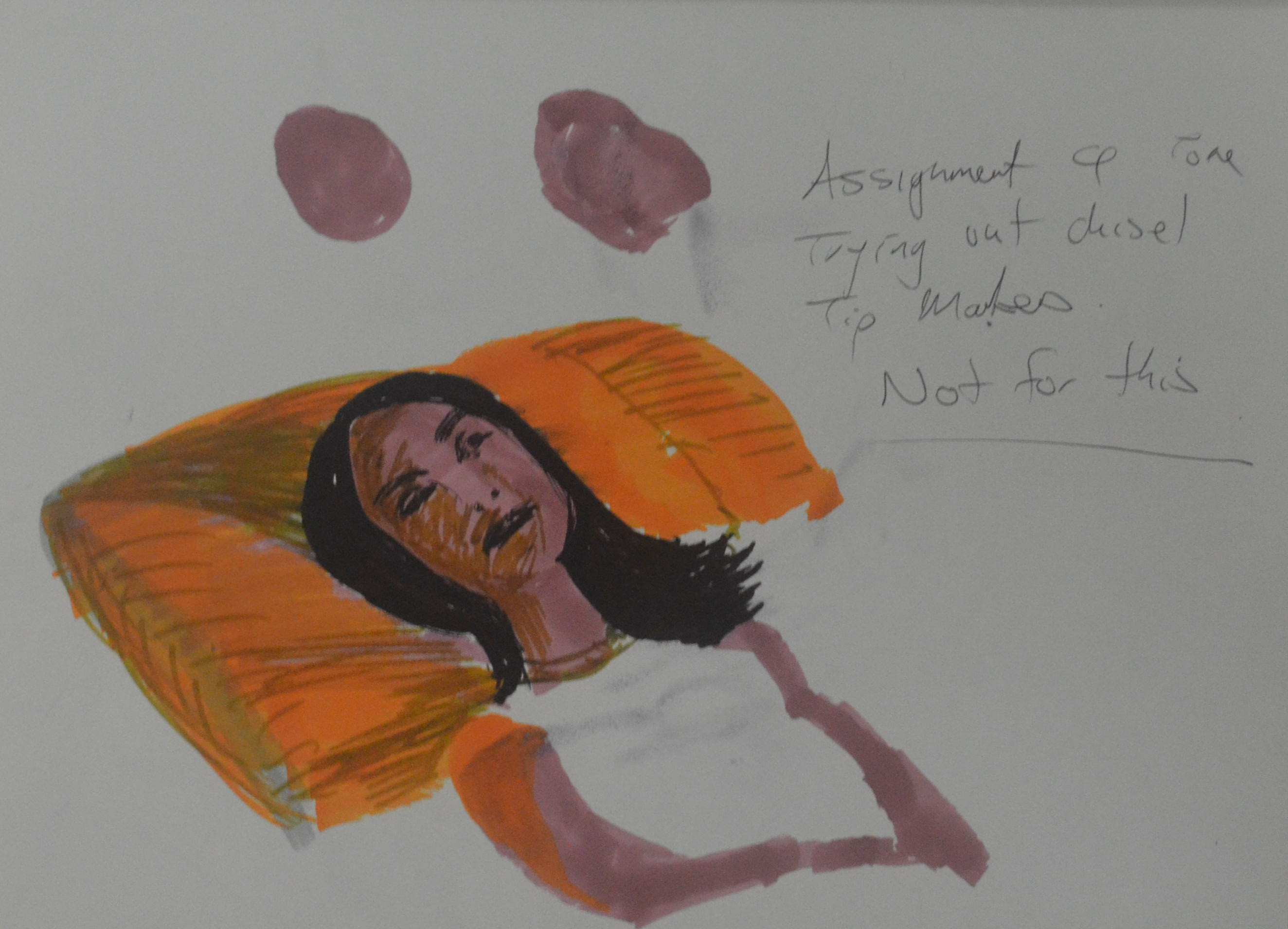
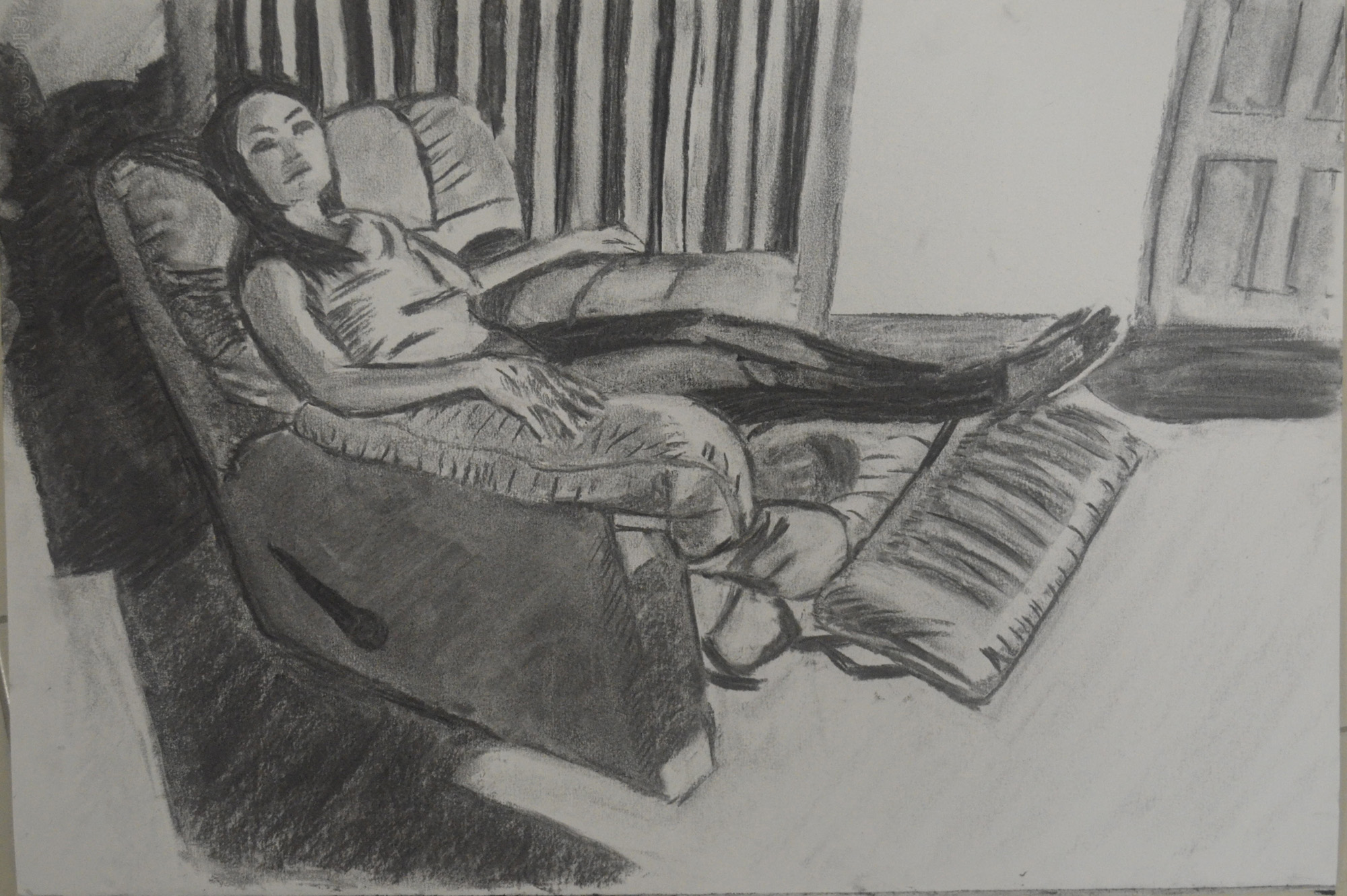
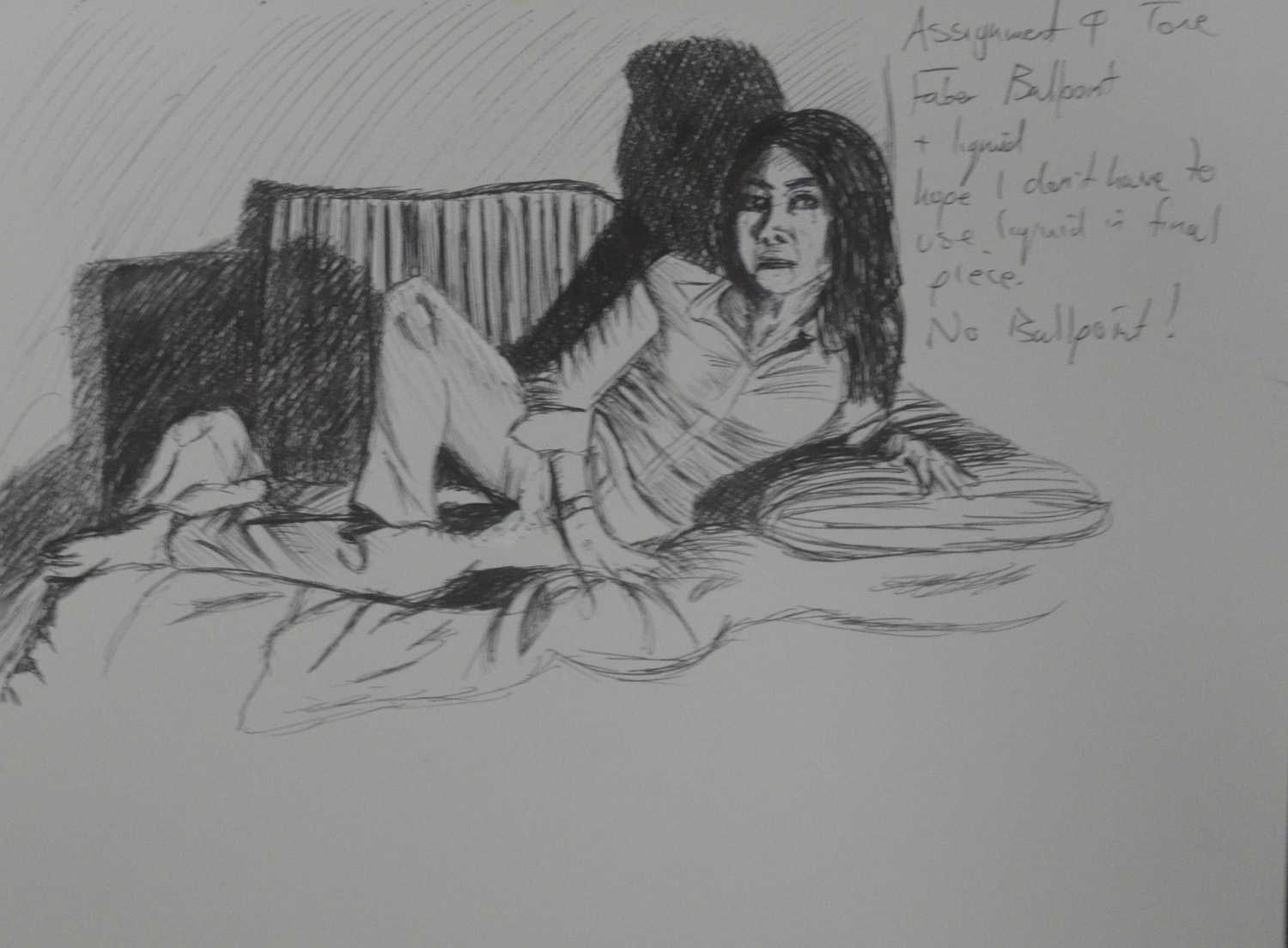
Still, even though I had already made my mind up the Assignment  had asked for broad brush stroke studies to decide on the colours I would use for the final drawing so I tried a couple of mediums that were very different to what I had decided on drawing for the final drawing.

Colour Study in Ecoline Liquid Watercolour

Both of the studies turned out to be quite pleasing and both mediums quite feasible. It was the first time I had used the liquid watercolour as a paint and not as an ink and even though the colours were great, my watercolour painting skills leave a lot to be desired.

I had been plodding on too slowly with this assignment and to be honest that’s because I was not happy with the subject and it was very stressful but eventually I had to start the final drawing and it had to be in dry watercolour pencil.

Final Drawing in Dry Watercolour Pencil

An English language student asked me the other day what I thought has been the hardest medium to draw with and when I replied colour pencil they weren’t surprised. The Derwent artist are very waxy so I prefer using the watercolour, dry, but stillI do have problems blending even though my I have come along way since the beginning of the course.

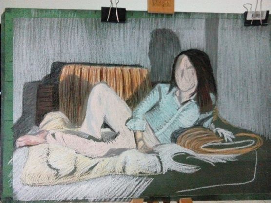
I started by drawing the shape of the window to act as a border then I drew in the window at the side and the roof beams as well as the horizontal line of the fence then I got stuck straight into the colour starting on the fancy Thai style roof beams (or props or whatever you want to call them).

I spent about an hour layering the colours to get each of them a different tone and looking quite accurate but then realized that it didn’t really matter how long I spent on those as they wouldn’t be the focal point of the drawing.

Next I worked on the window and the wall then the rafters and from there the tree that came up both sides of the fence, through the roof of the outdoor secondary cantine and on the other side. At first I was going to draw the tree with a form of squirkling in colour but when I did the broad brush colour studies I could see a reoccurring pattern of almost star like shapes and so I spent a lot of time trying to simplify the shapes and drawing them by layering yellow over green, from there I filled in the negative space in between to give the tree some thickness.

So far I wasn’t looking at all great but then I decided to use a form of squrkling in three colours on the dry fallen leaves with the occasional star shape trying to mirror the green leaves above, the result was quite nice and it made me feel a bit better about the assignment.

Once I hatched in the fence and the double roof of the canteen below everything started to come together but the problem now was that I didn’t leave myself enough space to draw in enough of the large orange roof behind and so a lot of the roof is hidden by leaves. I do still feel though that because of the direction of the roof beams and the perspective of the roof that the viewers eyes will still look where I want them to and that is to the temple and the road to the right.

I completed the drawing with one of the worse mistakes ever, I decided that I would draw the wall all the way around the window in oil pastel the result was a complete mess. My only hope is that I can crop and frame it when I come to send off my work for final assessment.

Assessment Criteria

Demonstration of Technical and Visual Skills

Although the final drawing is somewhat messy I do feel that I have definitely shown a demonstration of technical and visual skills in my final drawing especially where perspective is concerned and I feel that the drawing shows a clear understanding of both aerial and linear perspective. I also feel that the final drawing shows a substantial improvement on the way I have been drawing trees.

Quality of Outcome

Well to be very honest I am not satisfied with the quality of this final drawing that looks more like an exercise than an assignment. I really found this assignment stressful, it was very difficult to find a view that I was happy with and the problems we have been having here in Bangkok haven’t helped. But a poor craftsman always blames his tools.

I let myself down with the preliminary work on this assignment but this was due to being very busy working all hours to try and make up for loss of income lost through these protests. If I had more time for the preliminary work the quality of the final piece would have been much higher.

The work in the previous exercises in part 3 as been high quality let down by a low quality final piece.

Demonstration of Creativity

I believe I have demonstrated quite a lot of creativity through this part of the course I haven’t necessarily shown this in the final drawing. I would say the projects where this was more visible was Drawing Trees and Townscapes where I let go of trying to pay attention to detail and tried being more creative.

Context

The troubles here in Bangkok have been a great drag on this part of the course. I started out feeling really positive and in October when the protests started hit a brick wall. However I do feel like I have learnt a lot from this part of the course and I no longer feel that drawing landscape is a problem for me.

I have tackled every exercise to the best of my ability and even though I’m not happy with my final drawing I do feel that everything I have practiced through this part of the course is evident in the final piece.


Assignment 4 – Tone and Form

Tone and Form - Finished Piece Soft Pastel, Green Ingres
Final Drawing

For this part of the assignment I had to pose my model in a reclining position, such as lying back in an arm chair or with feet up extended on the sofa. That’s about all you can do really living in a one bedroom condominium with not much furniture you can lay down on, the choice was either bed, lay-z-boy or sofa, I went for the recliner.

We were instructed to dress the model in contrasting clothes,light top, dark pants etc. she wore the same white top as in the first part of this assignment but this time put on a pair of dark blue stretched pants.

Tone and Form - 1st Drawing a study in Marker Pens
Tone and Form – 1st Drawing a study in Marker Pens

My first quick sketch was in marker pens, using the same Chisel tipped marker pens that I used for both the using Markers and Dip Pens exercise and the Patrick Caulfield Research point. Even though they are nice and vibrant I decided against using them for this part of the assignment after just a quick study of her face and upper body.

Tone and Form - 2nd Drawing Conte Pencils on Ingres Paper
Tone and Form – 2nd Drawing Conte Pencils on Ingres Paper

I liked my self portrait in Conte Pencils on blue ingres paper so much  that I thought it would be a great medium to have a go with for this part of the assignment. But after a small 30 minute sketch with these on a A4 size sheet of the same blue ingres I decided they weren’t blending well enough for my liking. Also the pose that I chose for the drawing which was looking at her from the front and just slightly to the side didn’t show her form off as much as I should be doing in this part of the assignment.

Tone and Form - 3rd Drawing Compressed Charcoal A3
Tone and Form – 3rd Drawing Compressed Charcoal A3

The next drawing was in compressed charcoal on A3 paper this time I sat on a chair almost to the side of her with my light source (my bendy lamp) placed on the floor and facing her from an angle slightly to her left.

Although I was happier with both the medium and the angle, I wasn’t happy with not being able to hatch over small areas with a clumsy medium, she needed to be bigger or at a more ‘full on’ angle so I could see more of her.

Tone and Form - 4th Drawing Fine Marker Pens
Tone and Form – 4th Drawing Fine Marker Pens

The next study was in my A4 sketchbook with fine nib marker pens, although her face turned into some kind of cat woman the four colours that I chose worked well together although I did mess up on the arm of the chair but this was about describing tone and form and I still wasn’t satisfied that reclining poses in this chair was were allowing me to do that.

I gave up on it for a couple of days so I could think things through, my bed was against a plain white wall so I didn’t think the background would be interesting enough in there so I thought it might be worth drawing some poses on the sofa, However I had already used the sofa twice already in the three drawings exercise and essential elements  and I needed a pose that would fill more of the paper.

Two days later I was washing the covers of the sofa when my girlfriend came to visit again. As the sofa covers were in the wash I had a yellow quilt over the white cushion, my girlfriend was wearing a blue striped shirt with white collars and pink trousers and the three colours looked great together.

I placed the light sauce on the glass table in front of the sofa so I could create some nice shadows behind her and did a quick 20+ minute drawing in ballpoint pen. After a bit of tampering with Tipex I was satisfied that this was the perfect pose for this assignment.

Tone and Form - 5th Ball Point Pen
Tone and Form – 5th Ball Point PenT one and Form – 5th Ball Point Pen

For this drawing I wanted to use a medium that I had only experimented with before, soft pastel. I chose a dark green ingres paper but I didn’t think it would make a difference to how the picture looked as I thought I would be covering every bit of the paper with pastel, this changed as I started hatching realizing that the green of the paper still showed through the pastel strokes which changed the mood of the drawing to how actually imagined it.

Tone and Form Final Drawing Before Fixatives

I completed the whole drawing using hatching and soft pastel except for on the hands and face which I left to last and completed the details in pastel paper.

Tone and Form - Finished Piece Soft Pastel, Green Ingres
Tone and Form – Finished Piece Soft Pastel, Green Ingres

Things I am not happy with…

Well I completed this drawing at the end of the month and with hardly any money left I chose to use hair spray as my fixative. I would rather have just framed it behind glass as I thought it was very vibrant before I started spraying away. Nonetheless, it had to be fixed as I presume they have to be sent to England for formal assessment. For now it looks good, the hairspray has aged the  drawing and added some character but can it be preserved like it is.


Assignment 4 – Line and Shape

Line and Shape Finished Drawing

For the first part of this assignment, assignment 4 we were to produce a final piece using line and shape.  Instructed to take particular note of the proportions of the figure we were to describe details such as hands and facial features and find ways of describing the folds of the clothes with line rather than tone. As I have done in the other exercises for part 4 I asked my girlfriend to model for me and so I could get a good sense of form I asked her to wear shorts and a sleeveless white knitted top.

Line and Shape 1st Drawing Ballpoint

I started off by making sketches in line in my sketchbook. After the first sketch I realized that the face was going to be a problem, as I stated earlier I found it quite difficult to draw my girlfriend’s face and as this drawing was going to be in soft pencil, pen or some other permanent medium then I had to get it right the first time. The next drawing was of her face, not in line but in tone at first and from there I tried translating the key features of her face into a line drawing.

Line and Shape 2nd Drawing

I asked her to change pose for the second drawing. This pose was very elegant, it made her neck longer and her legs more womanly, at this stage I thought it would be a pose I would come back to for the finished line drawing.

Line and Shape 3rd Drawing - soft pencil
Line and Shape 3rd Drawing – soft pencil

During changing poses for the next drawing her son called her, I thought was a pose I could use and so I asked her to stay in that position, with phone to her ear for the next two drawings in both conte pencil and charcoal pencil.

Line and Shape 4th Drawing conte pencil

I decided that these two mediums (charcoal pencil and Conte pencil) were a bit too sloppy for my liking to be used in the final line drawing and so I decided on using either Drawing pen, ballpoint or soft pencil.

Line and Shape 5th Charcoal Pencil

The next sketch put me off using pencil, it would be too easy to start hatching and messing the final drawing up, drawing pen or ballpoint would be much cleaner.

Line and Shape 6th Drawing Soft Pencil

Going on the fact that ballpoint can look a bit too scratchy at times though and was probably ok for smaller drawings not at A2 size I journeyed over to Silapakorn University shop to buy a 0.3 and a 0.5 Rotring pen, both of which I would use for the final drawing.

Line and Shape Finished Drawing

The pose I chose for my final drawing was a fluke, she was trying to find the pose that I drew in the second preliminary sketch when this pose just jumped right out at me. It had everything, legs, arms, shoulders, elegant neck and goof hand positions.

Firstly I drew in the outline in an H2 pencil so I could erase it later, I was afraid that I would make too many mistakes drawing with pen first as I always seem to mess up [when the pressure’s on]. It turns out that this was a good decision, I had no problem drawing the legs, waist and hands but when I drew from her elbows up to her head everything was out of proportion and it made her look like she was leaning forward in the chair rather than sitting with her back against the back rest. I did take photos of the process to compare but sadly I deleted them by accident.

After I had corrected the proportions and completed her full outline, I quickly sketched in the door and shadows on the wall and floor, I really only had one shot at this great pose so tried to draw everything in to its proper place just in case she was getting uncomfortable or needed to go to the toilet.

The Face

From there I went over her whole figure in a 0.5 Rotring pen and then drew in her face in 0.3. With her face I kept it simple, initially in pencil I drew in a lot more details but when it came to going over her face in pen I just left in the key features. With her chin raised and slightly looking up I managed to capture the parts of her face in a way that created the best likeness, small nose almond shaped eyes and juicy top lip.

Hair

For the hair I used three pens, both Rotring pens and a fine marker to create a sense of depth.

Hands

In this pose the hands were at a great angle and very simple to draw, again, like the face I kept things nice and simple, drawing hands from the Bidgman’s Guide to Drawing from Life earlier in this part of the course was a great help. I used block shadow as well as some hatching on the hands to create a sense of three dimension.

Clothes

Thinking of drawing techniques to describe the creases and folds in the clothes was a hard one and so I settled for block shadow and short pen strokes for the knitted top and block shadow and squiggly lines for the shorts. The shorts, however turned out looking like silk Thai boxing shorts instead of cotton, 70s style boxer shorts.

Background

For me there could only be one type of background and it had to be detailed and either in charcoal or soft pencil. I went for 4B and 5B pencils. Charcoal may have been a better medium for adding depth to the drawing but to draw in the reflections and shadows on the floor that I had in mind it had to be done in pencil.

Things I am not (quite) happy with in this part of the assignment..

I probably could have done a lot more experimenting but with line and different backgrounds but a busy seven days a week schedule holds me back sometimes. Some of the exercises can be done on the go but this was something I wanted to do while the model was in front of me and not from a photo.

On the left arm (her right) I have taken the line too far over at the joint which has separated the forearm from the top of the arm, Because I am aware of it, it looks bad but I don’t know how others would see it.


Project: Self Portrait – Research Point

7 - Seventh Self Portrait in 4B

Which drawing materials produced the best results? Why?

I have produced good ad bad drawings with all tools apart from soft pastel but that was down to me being sloppy I think taking proper care with soft pastel would have also got me good results.

Drawing with pencil may have not got me the best results but it is certainly the most precise tool for the job and easily corrected which I think self portrait drawings at this stage (for me anyway) need a lot of correcting in order to get a likeness.

I loved drawing with watercolour pencil as the finished drawing really does stand out but unfortunately because the lines made with this drawing tool were so strong it made me look ten years older. I could have probably kept working on it to get more of a likeness but I didn’t want to ruin the drawing.

Until I made the last drawing the watercolour pencil was my favourite self portrait, even though the conte pencil drawing doesn’t look like me I am, it is very expressive and I am very satisfied with the results.

Does your self portrait look like you? Show it to a couple of friends or family members and note down their comments.

There is an element of me each in each one of the drawings in this project, some drawings look more like me than others. The younger students had the best comments which were mainly ‘mr Mark! Children see differently from adults the fact that all us white folk look the same also helps.

Friends and family mostly said the same thing, that they made me look older and didn’t do me justice, I do agree with them to a point, I’m only 40 and the drawings make me look at least 50 apart from the drawing below, which has the best likeness, even though the rough hatching does add a few years to me.

7 - Seventh Self Portrait in 4B
7 – Seventh Self Portrait in 4B

Did you find it easy to convert your sketches into a portrait?

My sketches weren’t converted into portraits, each portrait was a fresh drawing with my head in a different position but with each drawing I did I do think I improved a lot, the preliminary sketches  in the Drawing Your Face Exercise did get me used to ‘drawing my face’ and head and so it was a lot easier in this ‘A Self Portrait‘ exercise.

Were your preliminary drawings adequate?

I really do need a lot more practise but I do think that my preliminary drawings got me to a stage where I am quite confident to do a self portrait without worrying if it is going to look like me or not. They taught me how to he key features correct and why the shape of the head is so important for a true likeness.

Project Self Portrait : Exercise – a Self Portrait

8 - Eigth Self Portrait in Conte and Chinese White Pencil

I was looking forward to this exercise, the only other time I had done a self portrait was at the start of this course last year which was basically a 40 minute sketch to christen my sketch book. I did quite well with that and I thought I would do great after learning so much.

Self portrait in my 6 x 9 Sketchbook

I started by drawing with ballpoint in my sketchbook, the first sketch took 25 minutes and really didn’t resemble me at all. The shape of the head was good and I got the hairline just right, even the eyebrows were ok but everything else was well out. I was drawing looking into a mirror on my coffee table so it was difficult to keep the angles every time I lifted my head up from my sketchbook.

1 - First Self Portrait in Ballpoint - with hair
1 – First Self Portrait in Ballpoint – with hair

The second drawing was a bit better, I always seem to start on the left eyebrow and then draw in the shape of my head from the top of my ear to the crown of my head and then draw the rest of the top left-hand corner of my head. Then when I have something to work from I draw in my nose and then over onto the right eyebrow, shadow on the right eye and then mouth and chin, with the folds of skin from my cheeks framing my nose mouth and chin. Although this technique helps me work fast sometimes it doesn’t come together as it should do and I end up looking like someone else. I not only look older in the drawing below but from a distance I look like a posh toff with a monocle in my right .eye

2 - Second Self Portrait Ballpoint and Oil Pastel
2 – Second Self Portrait Ballpoint and Oil Pastel

Again the drawing below didn’t come together as I’d planned and I ended up looking like a completely different person with just my features all out of proportion, namely my chin and area above my upper lip/below my nose.

3 - Third Self Portrait in 4B
3 – Third Self Portrait in 4B

I showed the photos above around, my girlfriend said they don’t look like me while all my students said ‘Mr Mark’ straight away.

From there I had some light brown ingres paper left , about A4 size, so took a photo of me laid on the sofa and made a sketch in soft pastel, I should have taken aphoto of each stage of the drawing as it looked great before I messed up on the eyes and made myself look like an alien with larger-than-life eyes.

4 - Fourth Self Portrait in Soft Pastel
4 – Fourth Self Portrait in Soft Pastel
5 - Fifth Self Portrait in Watercolour Pencil
5 – Fifth Self Portrait in Watercolour Pencil

I decided it was time to draw a proper self portrait in a proper mirror, so I took my Derwent watercolour pencils and watercolour drawing pad into the bedroom and produced the drawing above in just under 2 and a half hours over 2 evenings. The drawing is spot on, it makes me look about ten years older as others have enjoyed pointing out but that’s the electric light in the bedroom. I have tried and tried to get a better photo of the drawing as it looks great but the photos I have took do not show the colour of the hatching to be as vibrant as it is in real life.


6 - Sixth Self Portrait Hard Pastel
6 – Sixth Self Portrait Hard Pastel

The drawing above was started as a hard pastel sketch to show how the left hand side of my face caught the light from a lamp directed at my face and how the most of the right hand side was left in shadow apart from part of my cheek, ear and below my eye lid and it was perfect until I messed up and went overboard on it and then ended up trying to draw my entire face in detail making this self portrait look like like a rubber horror mask from a joke shop at the seaside.

7 - Seventh Self Portrait in 4B
7 – Seventh Self Portrait in 4B

The drawing above was the second self portrait in 4B pencil, it took me an hour and a half and is a perfect likeness, one friend said that it is me in another 10 years, unfortunately I do look quite old with my specs on but it can’t be helped.

8 - Eigth Self Portrait in Conte and Chinese White Pencil
8 – Eigth Self Portrait in Conte and Chinese White Pencil

I produced the drawing above in my lunch hour at work. I left a drawing board at work for me to use when I have a bit of freeetime and I had an A4 size sheet of blue ingres paper in my sketchbook so I decided to see what I could posing in the front camera of my tablet. However when I opened my artist wrap up, all I had in there was conte pencils in black and sanguine and a Derwent Chinese White Pencil that had been sharpened to over the half way mark.

I’m long-sighted which is probably why I messed up on the other drawings with my glasses off but this one came together really well. I took it home to touch up and do do so I put t between the pages of my sketchbook, which is quite thick. When I get home the paper seemed to have been compressed inside the book and it was almost impossible to do anything with it, which is probably for the best as I am really happy with this finished piece which I feel looks great.

Project: The Moving Figure, Fleeting Moments – More Fleeting Moments

3 - Fleeting Moments - Students and Teachers Walking

After the army cleared away the protesters that have been camped out on the streets of Bangkok for the last few months the school finally opened and with me being around so much movement, I thought I would have another go at the fleeting moments exercise in the last project the Moving Figure. This time I tried to use as few lines as possible to suggest the person’s movement.

1 - Fleeting Moments - Students Being Naughty
1 – Fleeting Moments – Students Being Naughty
2 - Fleeting Moments - Students Testing
2 – Fleeting Moments – Students Testing
3 - Fleeting Moments - Students and Teachers Walking
3 – Fleeting Moments – Students and Teachers Walking


Research Point: Investigating Artist’s Self Portraits

Egon Schiele Self Portrait with Physalis 1912

Ok, for this research point I started by typing in artist’s self portraits on Google and put the artist’s into 2 groups.

Artists I’ve heard of:

  • Vincent van Gogh
  • Frida kahlo
  • Max Beckmann
  • Egon Schiele
  • Gustav Courbet
  • Pablo Picasso
  • Rembrandt

and…

Artists I haven’t head of:

  • Felix Nussbaum
  • Georges Dheedene
  • William Utermohlen
  • James Montgomery Flagg

The two groups included 4 very familiar paintings.

My tutor suggested that I looked at two books by John Berger, ‘Ways of Seeing’ and ‘Another Way of Telling’. I’ve almost finished with ‘Ways of Seeing and it’s opened my eyes quite a bit, so what I would like to do in this research point is to look at each painting and say what I see giving my own opinion of what’s going on in each painting without looking at the artist’s background.

Vincent van Gogh - Self Portrait
Vincent van Gogh – Self Portrait

It’s hard not to know anything about Vincent van Gogh so what I see in this painting is going to be tainted by my knowledge of the artist. The reason why I chose to look at the painting above is because of the colours and swirls that are obvious in his suit and background. It would be easy to say that he chose that coloured suit as a contrast to his red beard and that colour background just ‘happened’. What I see is a troubled man ‘having a go’ at creating something calm, hence the choice of colours for suit and background but then his emotions have got the better of him has he worked the oil into a frenzy, his serious expression on his face tells me that he’s getting lost in his own thoughts.

What I do notice in this painting by van Gogh is that it probably started from the eyes and then he built each part of the face and head up as he got to it rather than starting by drawing an outline of the overall shape of his head. The thickness of the paint brings his face and beard out from the background making it look almost 3D.

Frida Kahlo Self Portrait with a Monkey 1938

If I didn’t know anything about Frida Kahlo and saw this self portrait I’d have thought she had a pet monkey, but then has you start to look at more of her paintings you notice that the monkeys appear in more than one of her paintings and the rest are full of pain and suffering and so the monkey refers to her burden, her handicap the ‘monkey on her back’.

So apart from the pet monkey what else do I see in this painting, if it was me painting this I would have tried to minimize the uni-brow, still keeping it but making it less prominent. She hasn’t, along with the length of her neck she has emphasized it to show a sense of seriousness or to let the viewer know that she is fighting.

Max Beckmann Self Portrait

I know nothing of Max Beckmann just his name, and what I would say about this artist is, German, related to the pre-World War 2 expressionist movement. The bottle of champagne and the way he’s holding his cigar tells me that he’s gay and in the upper-class but then again from what I have seen of period movies the upper-class often acted camp to show they were having fun. Then again, is he having a poke at the upper-classes?

It seems like all his effort went into his face which is staring at someone or something or even listening intently to the person who he is enjoying the bottle of champagne with.

Egon Schiele Self Portrait with Physalis 1912

If I didn’t know who Egon Shiele was or read the book ‘Schiele’ by Reinhard Steiner this painting didn’t have a date on it I would have said late 1970s – mid 1980s as it makes me think about the post punk musical movements of that time. Rebellious, experimental, maybe the expressionist movement and New Wave music were driven by the same things, boredom and the need to break off and experiment. The look in Schiele’s face tells me ‘this is me, this is who I am, take it or leave it’.

Gustave Courbet The Desperate Man

I already did a research point including Gustave Courbet which brought me to this painting, as the model he is acting out a role, as the artist he is trying to capture as much emotion as he can into one pose and one facial expression, the ‘pulling your hair out look’.

Pablo Picasso Self Portrait 1906

The first word that came into my head here was ‘Negro’ and so I went to Google and typed in those words exactly ‘Pablo Picasso Negro’ and the first thing that came up was a Wiki link saying ‘Picasso’s African Period which lasted from 1906 (the date of this self portrait) to 1909. Picasso’s African Period was a period where he painted in the style of African sculptor…I learn something new every day.

Pablo Picasso Portrait 1900

In the portrait above Picasso looks like Crispin Glover in the movie Willard, an outcast. In the 1900s they were still wearing their hair brushed back and so he may have been showing his rebellious personality wearing his hair in this manner.

Rembrandt Self Portrait 1600s

I am going to have to be honest here and say I know nothing about Rembrandt apart from he was Dutch. Looking at the painting above and quite a few other of his self portraits, Rembrandt is pulling faces and from what I know through researching self portraits in this research point, he painted more self portraits that any other artist and so this is just another study of his face. If I didn’t know that I would say that he was either showing everyone how good his life was or how good he could paint!

And now for the artists I haven’t heard of..

Self Portrait in the Camp 1944 Felix Nussbaum

I think this portrait of German-Jewish Artist Felix Nussbaum speaks for itself, he’s not just painting himself but he’s painting the death that surrounds him. This is Auschwitz death camp where he was murdered a few months later. I don’t know how he got to paint this but I’m kind of glad he did, it’s a constant reminder of how evil men can be and how strong people can be in the face of death.

Last Self Portrait by Artist Georges Dheedene

The painting above is the last self portait by Belgian artist Georges Dheedene 1909-1973 (the latter being the year I was born. I look at it and the first thing that comes into my head is that it’s a portrait of a handsome old man with decent dress sense in the pipe and slippers years of his life.

William Utermohlen Self-Portrait (Green)

In the book ‘Ways of seeing’ by John Berger, there is a painting by Vincent van Gogh, and we are asked to think what we see when we look at it only to turn the page and get told that it is the last painting he painted before he killed himself.

As I was browsing the net for artist’s self portraits I came across the one above and van Gogh’s Wheatfield with Crows automatically came to mind, telling me that there was something going on in this painting, something not quite right with the artist, so I researched William Utermohlen only to find out that this was one of the last painting he produced before dying of Alzheimer’s.

This was his last…

William Utermohlen Last Self-Portrait
William Utermohlen Last Self-Portrait 2000

He died in 2007 but his wife said he actually died in 2000 when he realized he couldn’t draw anymore.

James Montgomery Flagg - Self Portrait as Uncle Sam
I Want You 1917 – James Montgomery Flagg – Self Portrait as Uncle Sam

I never realised this was a self -portrait but it is and was painted by James Mongomery Flagg in 1917. The fact that he has used himself as the model or himself as Uncle Sam tells me that he was a proud American ‘doing his part’, and earning  a decent buck for doing so.

Again this is another artist who has put himself in a role for the painting and has done so by making up for the self portrait with hat wig and beard rather than just using his imagination to age himself in the painting.

James Montgomery Flagg - Self Portrait 1956
James Montgomery Flagg – Self Portrait 1956

In both of the paintings above he has left the subject (himself) incomplete which is obvious in the first as he uses a white background so as to allow for US propaganda but in the second it is not so obvious as he merges the colour of his suit into the colour of the background, this makes him look almost ghostly or immortal… James Montgomery Flagg was an artist and at his peak was one of the highest paid illustrators in the USA, the painting above seems to be a self portrait documenting a lifetime of achievements for future generations.

Part 4 Drawing Figures: Project – Self Portrait – Exercise Drawing Your Face

12 - Face ears and kneck

For this exercise I started off with 5, five minute drawings of my face describing different angles of my face and head.

I made the first two 5 minute sketches looking into the forward camera of my tablet that was sitting on the table. This meant I was looking down at it (with my head slightly to the right) so all attempts at trying to give myself a chin failed as it disappeared into my neck (the disadvantage of having an overbite.

1st 5 minute Sketch of my Face

The second sketch was again made looking into the front camera this time with my head level looking forward, which meant the camera was looking up at me and up my nose, which actually came out looking like it wasn’t my nose at all. If I cover up the bottom half of the paper it does look like me but with the dodgy nose…no relation.

2nd 5 Minute Sketch
2nd 5 Minute Sketch

The third sketch was done looking into my bedroom wardrobe door, with the bedroom light on the right of me it cast some really dark shadows across my face. Even though others would probably say that it did not look like me and I actually wrote that it did not resemble me but every time I look at it I see more of myself in the drawing.

3rd 5 MInute Sketch in Shadow
3rd 5 MInute Sketch in Shadowim

Again the fourth drawing was drawn looking into the wardrobe door but this time with my face turned to more of an angle allowing for more light and less shadows. I decided to keep my glasses on again, just like in the first 5 minute sketch and just like in the first sketch my glasses made me look older.

4th 5 minute Sketch with Glasses on

For the last drawing I was facing the other way, the drawing looks more like a cartoon, which I think looks quite good . The eyes however should be looking at me and I just can’t think how I managed to the pupils so far over. There isn’t much resemblance at all, probably because the face is too long.

5th 5 Minute Sketch almost cartoonlike

After the 5 minute drawings I made 5 more quick sketches concentrating on the overall shape of my face which wasn’t an easy task. This time I bought a mirror from the twenty baht shop, and while I was buying the mirror and some toys for the kids my youngest daughter lost their tablet in the shop and they spent the next two hours crying until their mum came to pick them up.

6 - Overall Shape
6 – Overall Shape

Anyway, like I said this wasn’t an easy task, for one reason, as I said before I don’t have much of a chin and so the bottom half of my head is not as defined as the top. I decided that it looked like a cross between an hexagon and an heptagon and so did 5 sketches trying to perfect the shape.

7 - Overall Shape a bit better
7 – Overall Shape a bit better

The drawing above is probably the closest shape to my head but I didn’t realise it until I drew the chin in afterwards with a biro, after I had finished the exercise.

8 - Furthest from any likeness
8 – Furthest from any likeness
9 - Another Dodgy Shape
9 – Another Dodgy Shape
10 - Almost the Right Shape
10 – Almost the Right Shape.

At the time I thought that the drawing above was a better likeness and so I drew the shape across the page trying to get a sense of likeness. This probably did work as I realised it wasn’t the right shape and that it was too wide.

11 - Trying to get the right shape
11 – Trying to get the right shape
12 - Face ears and kneck
12 – Face ears and neck

Eventually I drew something closer to the shape of my head and then drew in the ears and chin and then the neck and continued to correct the shape of the neck until it was spot on.

Project The Moving Figure – Exercise : Fleeting Moments

7 - Follow up Drawing of Man and a Woman Pushing Stall

On the day I started this exercise I woke up to the first day of my second coupe d’etat while I’ve been in Thailand. Not bad going. The TV wasn’t exactly blank, there were 5 military logos on there with some old be proud of Thailand, very fascist sounding music on from a bygone era. The whole country was on curfew and I was wondering if it was safe to go out. If you ever want to know what it feels like to be on curfew at the start of a coupe d’etat, watch iRobot, because the ‘stay in your homes’ scene is quite close.

1st day of Tha Coupe d'etat
1st day of Tha Coupe d’etat

So anyway, while I was on lockdown, that first morning a memory came into my head that I thought I would try and get down on paper, It was the first day I met my girlfriend, September last yea, to be exact. I remember what we were both wearing, where we were and if she was the first up the escalators from the underground train or not. I just couldn’t quite pull it off in an abbreviated drawing, But it was worth a try.

1 - Drawing a Memory from Last Year
1 – Drawing a Memory from Last Year

That morning I was supposed to be teaching 3 students in a private class but everyone had cancelled, luckily for me I had made some very quick pencil sketches of the three students the day before noting their height and frame and how they were sitting and decided to go over them with a more detailed sketch from what I could remember, clothes, hairstyle etc. I haven’t taught them since so I haven’t been able to check if there was any likeness there.

2 - Sketch of 3 Students over outline
2 – Sketch of 3 Students over outline

All but one class had cancelled, which was my 4-6 pm, so I decided to take my spare computer down for repair in the early afternoon and just as I was having some breakfast preparing to get ready the army allowed the first TV broadcast of the day.

The scene on the TV was the yellow shirts who had been occupying the area near my school for the last 7 months, being cleared off by the army and their was a small, chubby, Chinese/Thai guy doing the reporting. The thing that made me want to draw him was that everything about him was that even though he was fat, which you would associate with being round, everything about him seemed to be square from his head to his microphone. After making a quick square sketch of him, I tried to draw him exactly how I remembered him but changed him a few times as his head wasn’t in proportion and I wasn’t sure if he was holding the mic with two hands or not.

3 - News Reporter 1st Day Thai Coupe
3 – News Reporter 1st Day Thai Coupe

That afternoon on my way to taking my computer to repaired I got my first glimpse of the army, stationed (or hiding from the sun) under the flyover at Pinklao intersection, two of them stood on top of the bridge with their backs to me and three of them stood by a Chinese knock off of a hummer. I made a quick drawing of what I remembered about the three stood by the hummer while the guy checked to see if my computer was worth repairing.

4 - Sketch of Soldiers under Pinklao Bridge
4 – Sketch of Soldiers under Pinklao Bridge

The sketch wasn’t up to much so I made a larger drawing with watercolour pencil in my sketch book the next evening. It was really messy, but by then so was my memory of the whole scene.

5 - Quick Watercolour Pencil Drawing from Sketch
5 – Quick Watercolour Pencil Drawing from Sketch

On my way back from my 4-6 pm private I decided to take a taxi, only to find that their was a traffic jam, after 20 minutes of sat in very slow traffic I got to find out what the hold up was, a man and a woman taking their market/food stall out for a jog.

6 - Quick Sketch - Man and a Woman Pushing Stall
6 – Quick Sketch – Man and a Woman Pushing Stall

I made a really quick sketch of them while I was still in the taxi and the following night I tried to replicate the scene with a better drawing.

7 - Follow up Drawing of Man and a Woman Pushing Stall
7 – Follow up Drawing of Man and a Woman Pushing Stall

Finally the last drawing was of two of two motorbike Taxi riders who I have known for the best part of 12 years, I made a very quick sketch of them while I was at the motorbike taxi rank and improved on it when I got home. Unlike the others I went over the top of the initial sketch so you can still see the rough sketch underneath.

8 - Motorbike Taxi Riders Waiting
8 – Motorbike Taxi Riders Waiting

Project the Moving Figure: Sitting and waiting – Part 1

7th Drawing - Burma Fire Brigade - Bangkok Post

For this exercise I was to take every opportunity to practise drawing people. Looking at magazines and TV to get the practise that I need. After sitting and studying people in my last research point ‘People Watching‘ I thought I would get out and try and sketch some real live moving people, how hard could it be?

My girlfriends son was in Bangkok for the school holidays so we decided to take him to the railway park that I had visited for ‘A Sketchbook Walk‘. After a few laps on the bicycles he was ready for some ice-cream and I was ready for some drawing, so while his mum fed him in a nearby restaurant I sat down on a mound focusing on a part of the path where bicycles weren’t allowed to be pedaled and tried to draw as many people as possible.

The easiest to draw were the ones doing absolutely nothing of course or standing around stretching. I really struggled with the ones walking around because…they were moving!

1st Drawing Suan Rod Fai Pencil

After ten minutes of being bitten by ants and getting cheesed off with people walking round the back of me to see what I was doing. I decided that it was best to go home and do some practising from the newspaper.

2nd Drawing Suan Rod Fai Pencil

The next day at work I went through a copy of the Bangkok post and cut out what I thought were the best photos I could find for practising drawing the moving figure.

3rd Drawing the Riot Act Bangkok Post 6B

The first newspaper article was from the international news section, about the riot police in China having drills, so in a 6B pencil I tried recreate the image depicting as much movement as possible,

4th Drawing Nairobi Bomb Blast - Bangkok Post
4th Drawing Nairobi Bomb Blast – Bangkok Post

The second scene was a bombing in Nairobi, three rescuers carrying a possible fatality away from the blast. I chose to draw this in oil pastel as fast as possible and I think I did quite well to depict movement in the very rough sketch.

5th Drawing Nutcracker in Bangkok

The next drawing was about the Nutcracker ballet in Bangkok I chose charcoal but I reckon with a more appropriate medium I could have done a lot better.

6th Drawing - Santa Claus of the South -Rotring
6th Drawing – Santa Claus of the South – Rotring Pen

The next drawing was from a news article about some politician being nicknamed Santa Claus in Thailand’s troubled south. I built up the scene from the guy in the bottom right hand corner and worked my way around the table, from there I drew in the main character, hence not in proportion and then went onto draw the background.

7th Drawing - Burma Fire Brigade - Bangkok Post
7th Drawing – Burma Fire Brigade – Bangkok Post

The next newspaper article was about the Burmese fire brigade dressed up as civilians for some demonstration or other. I worked very quickly in oil pastel again with this one and then went onto draw in the background.

Tesco Lotus Shopping Center

In Thailand, Tesco is known as Tesco Lotus, Lotus being the Thai partner and the supermarket is usually always in a shopping mall. On Sunday I work at the language centre on the 4th floor. Last week my first afternoon student cancelled so I decided to sit outside for two hours and draw the passers-by.

8th Drawing - Tesco Lotus 2 Hour Observation
8th Drawing – Tesco Lotus – 2 Hour Observation

It took me about twenty minutes to draw the shop fronts inside the mall across from the language centre then in colour pencil I began to sketch people as they walked past, a lot of the time having to remember how they were stood seconds before as I couldn’t draw them fast enough.

I tried drawing in both colour pencil and pen this worked well superimposing the shape of one of the Thai teachers over the top of the other people. But then I made the mistake of drawing two people in the very background in pen, as they should have looked more faded than the others so I went over them in a white pen to fade them out a bit.

The worse mistake I made here was trying to draw the ceiling in afterwards which was a network of suspended panels ,lights and pipes.