Tutor Feedback – Assignment 5

7 - Playing with Phone A3

Overall Comments

It is never easy to change tutor at assignment 5 but this is the situation that we find ourselves in. The task has fallen to me to give you feedback on what you have produced for assignment 5. You will have to bear with me as I have not seen anything of what you have done until this point.

Due to my tutor not being available until further notice because of family matters I was contacted and asked whether I would need a replacement tutor. So close to the end of my first course I thought it was important to find a replacement tutor. There was an extreme contrast between my previous tutor feedback’s which can be viewed below and this one.

Assignment 1, Assignment 2, Assignment 3, Assignment 4

Feedback on assignment 5

Demonstration of technical and Visual Skills, Quality of Outcome, Demonstration of Creativity

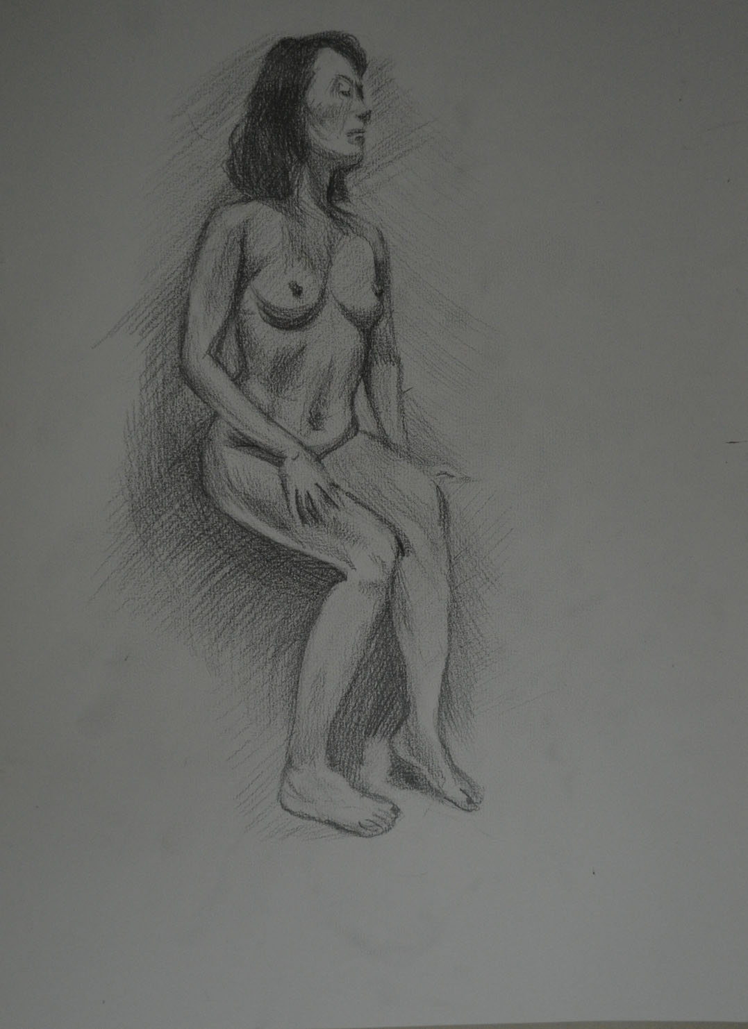
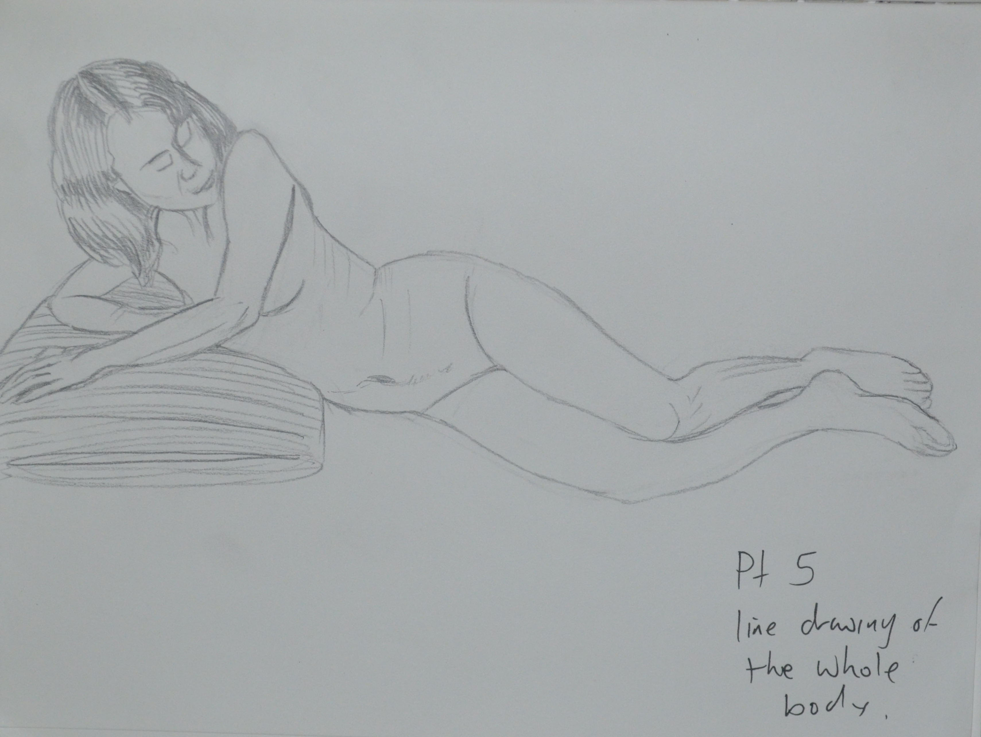
I see that you have chosen Option 4, the figure. Students can often find it difficult when working from the figure mainly due to preconceptions as to what a drawing should look like and particularly a work made from the figure.

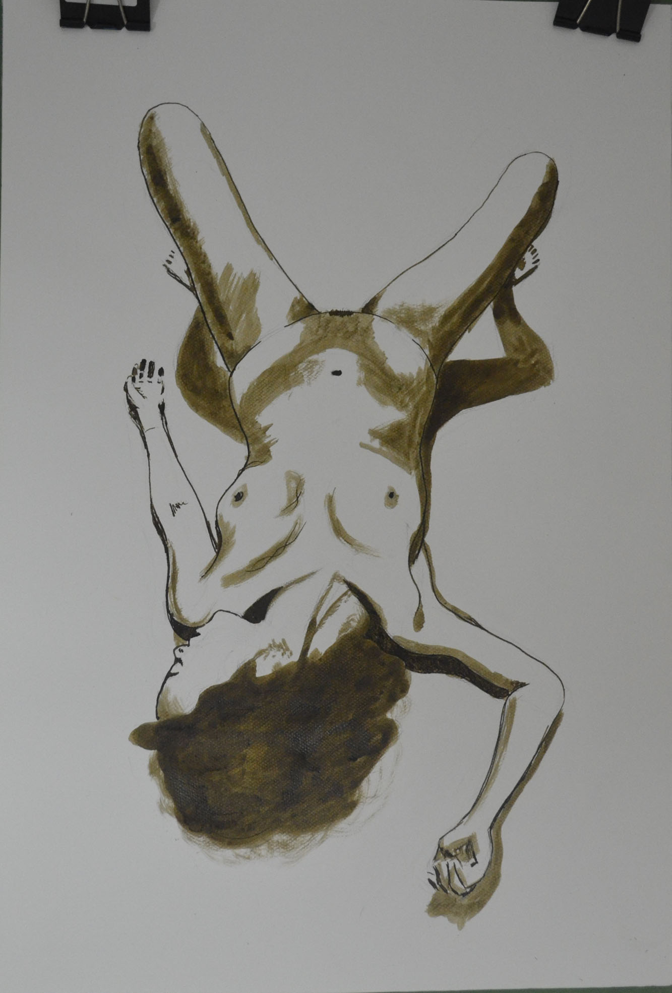
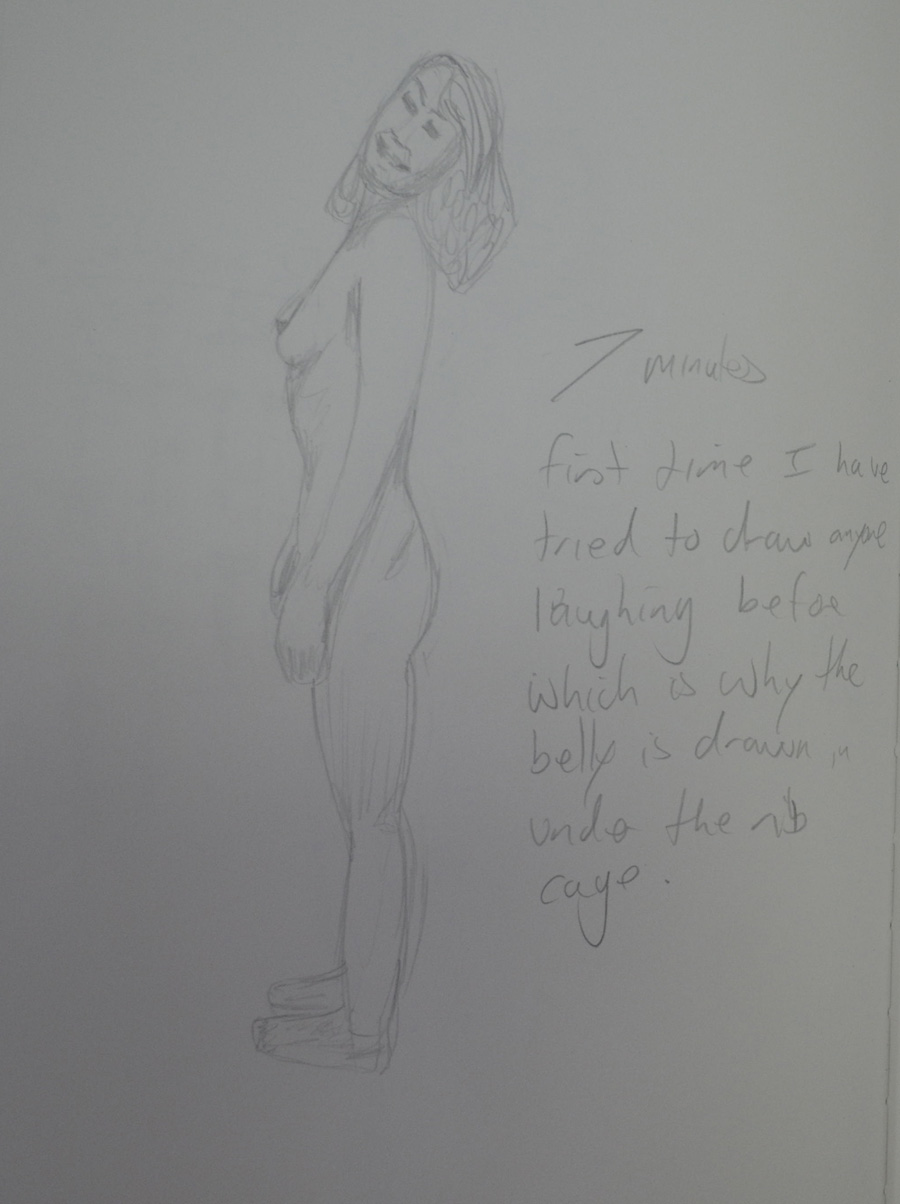
For the most part the quickly made drawings in the quick sketches work are weak; you have generalised far too much instead of drawing what you have seen. This has resulted in some poor understanding of proportion and  how bodies engage with the space around them. The interpretation of the hands and feet in this series of work needs thinking about. It is important to make changes as you draw correcting  and changing to get the whole operating cohesively. Writing on a drawing what is wrong with it or what needs to be done to it will not benefit you at this stage. Change the drawing!

Drawing 8 - Standing Up - 3B on A3
Quick Studies
Drawing 29 - Kneeling 3B Sketchbook
Quick Studies

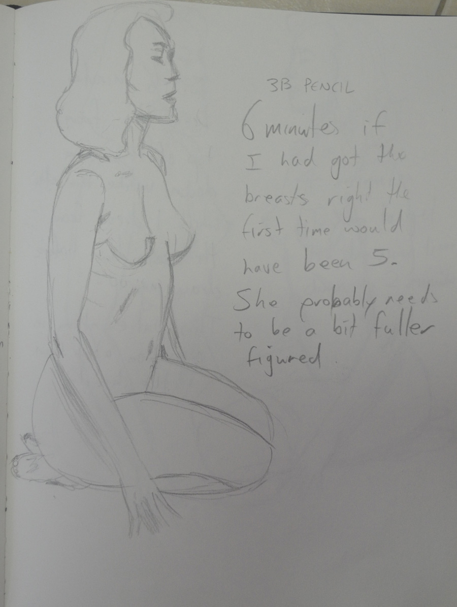
I agree that some of these quick studies were weak, out of proportion etc and said so in the learning log. Others were strong with a 100% resemblance and correct proportions. What needs to be realised here is that I am drawing figures of a ‘different race’, i.e. If I was drawing Japanese models, legs would be shorter. I made notes on drawings before making a fresh, I was drawing quick and so I thought this was a better approach than spending so long editing the drawing. These notes helped me to capture my thoughts at the time.

Varying  the speed that you draw can often open up new ways of seeing as can holding your drawing implements differently or using your ‘wrong’ hand. Quickly executed drawings can be good and bad. Drawings made more slowly likewise. It is the intent and nature of the outcome in reference to what your subject is and the quality of the drawing itself that matters.

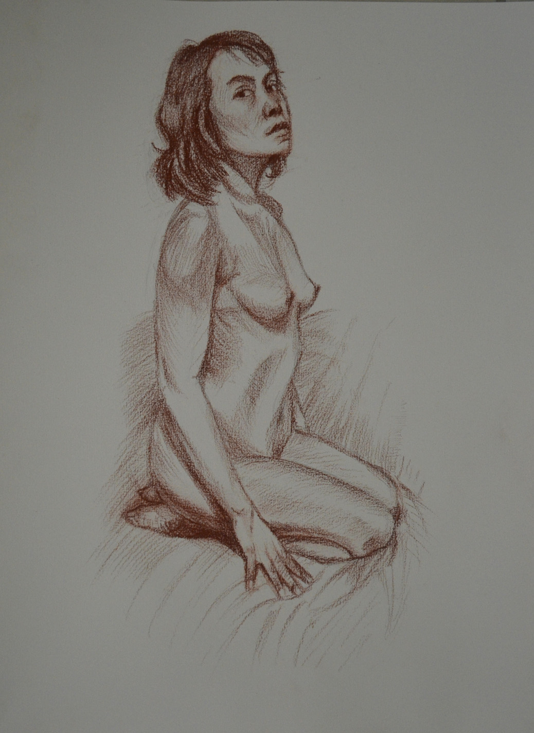
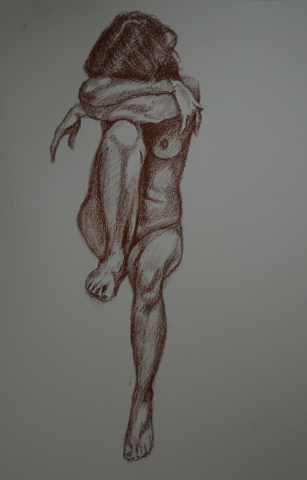
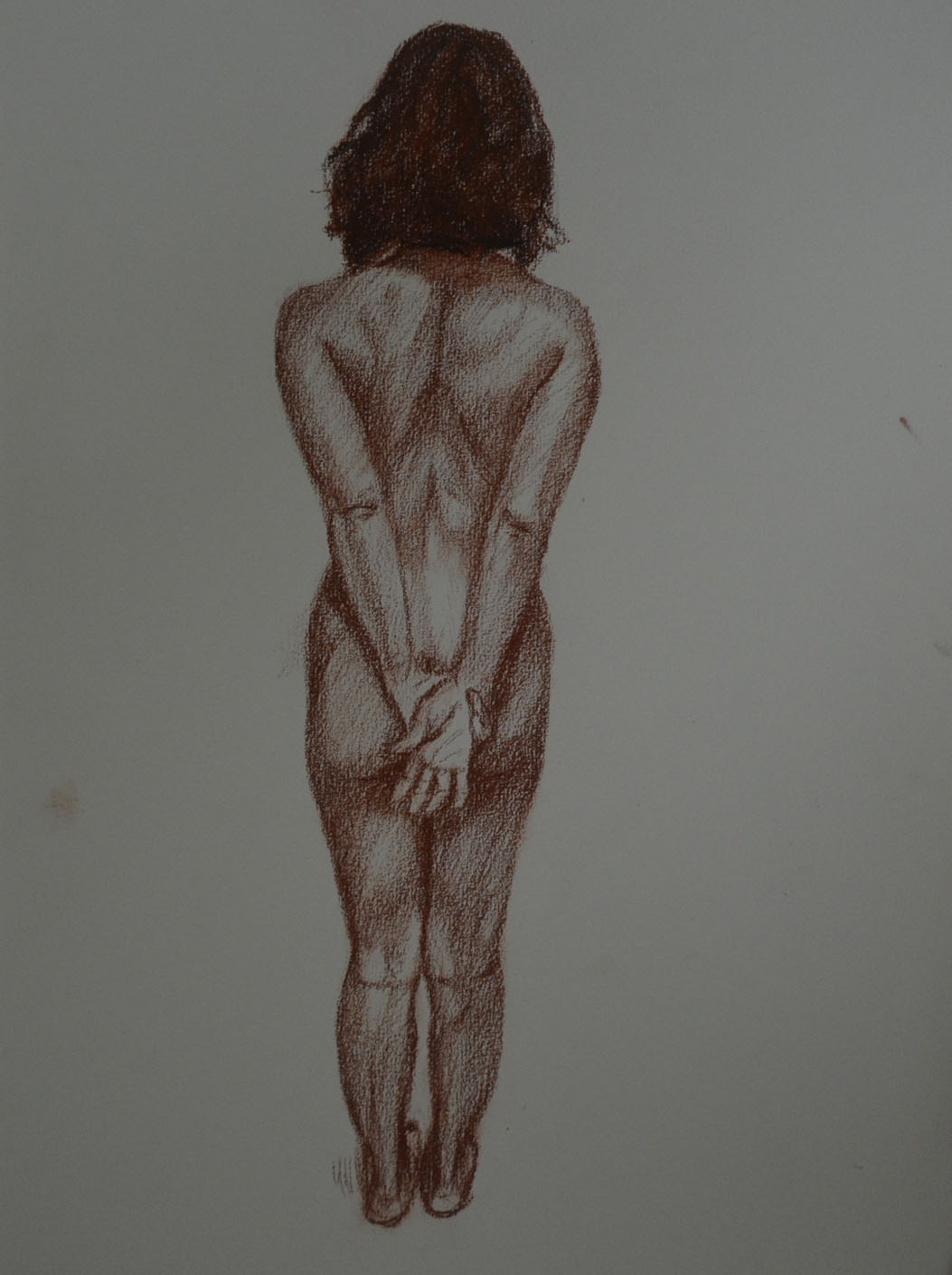
Now interestingly the batch of ‘more gesture’ drawings mostly made in pencil are really well seen and interpreted for the most part; working quickly has worked for you here! The works from the female model are full of life and movement; the proportions are very believable as is the weight distribution through the figure and the stances in general. Some of the male studies demonstrate some good understanding of foreshortening through some quite difficult poses.

For me here you have investigated as you have been drawing and it has allowed you to interpret the figure much more successfully through the use of the media itself. This approach has negated some of the repeated faults that your work can have i.e. too large heads and poorly articulated extremities. When an approach is working it is important to capitalise on it and build on both the methods and the look of the outcomes

My idea of a gesture drawing and a quick study are two different things. For me a quick study is a quick study in the style of my ‘would be’ finished piece, if he had looked at the previous assignment he would have seen the quick studies were closer to the way I finish a drawing. However, the ‘more gesture’ drawings were more satisfying and so maybe I am looking in the wrong place to find myself.

It is imperative that you look hard at all times at your subject; look draw, alter, draw again, change, look, you need to build up a dialogue between yourself, the subject and the particular medium that you are using. Different media require different approaches as do different subjects. It is good to build your drawings in this way.

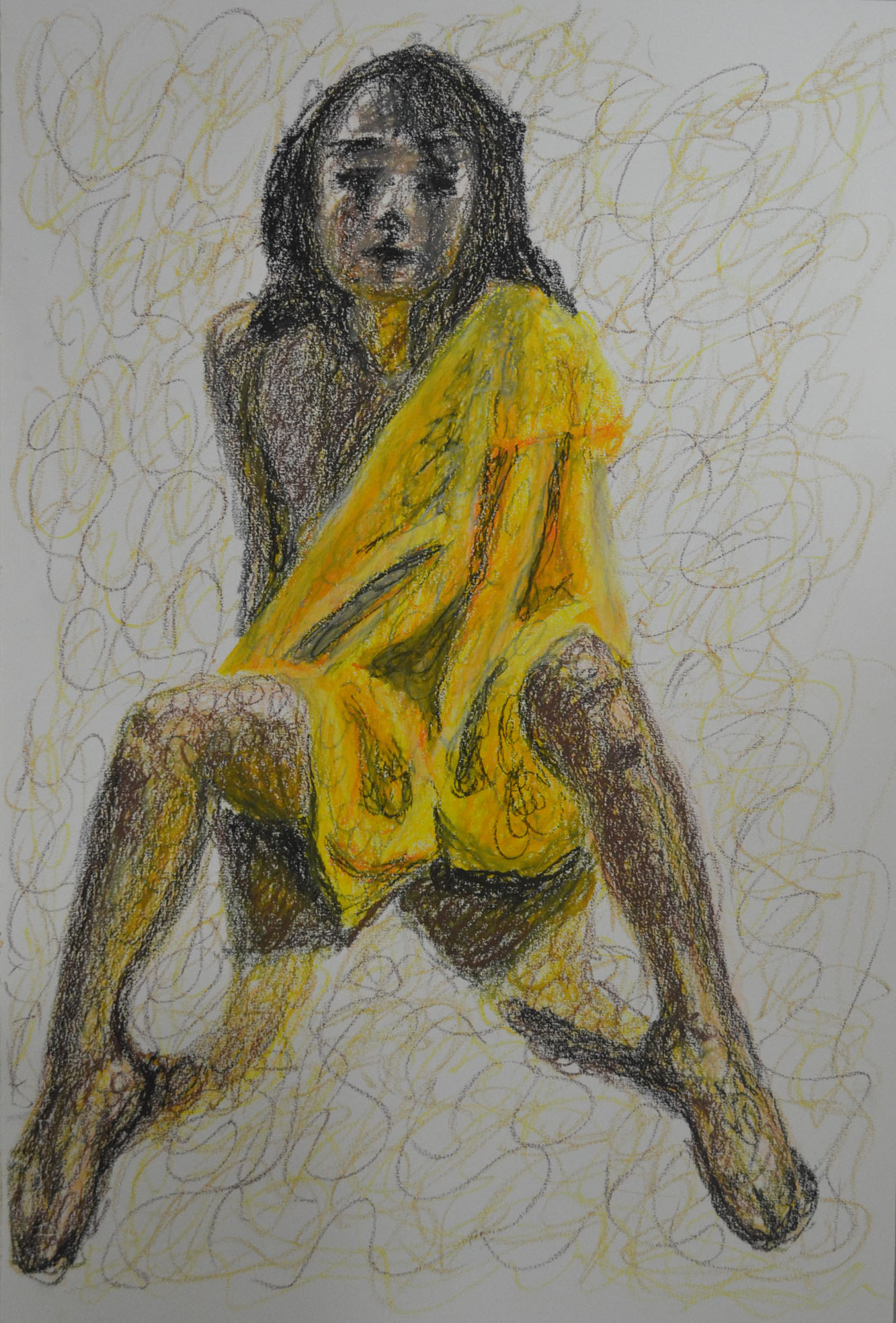
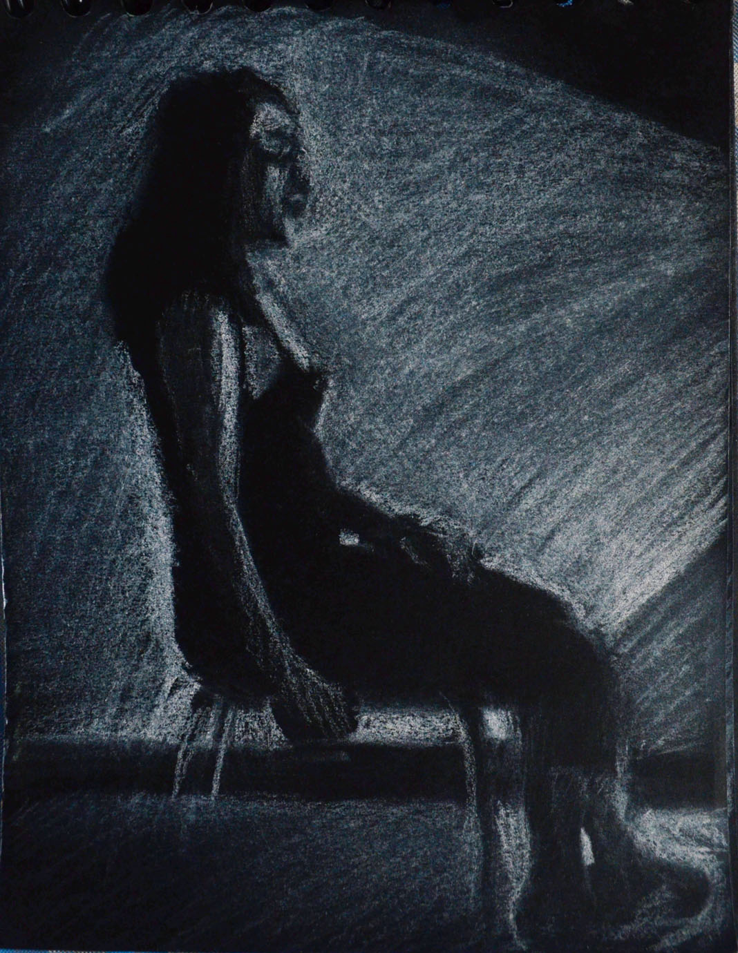
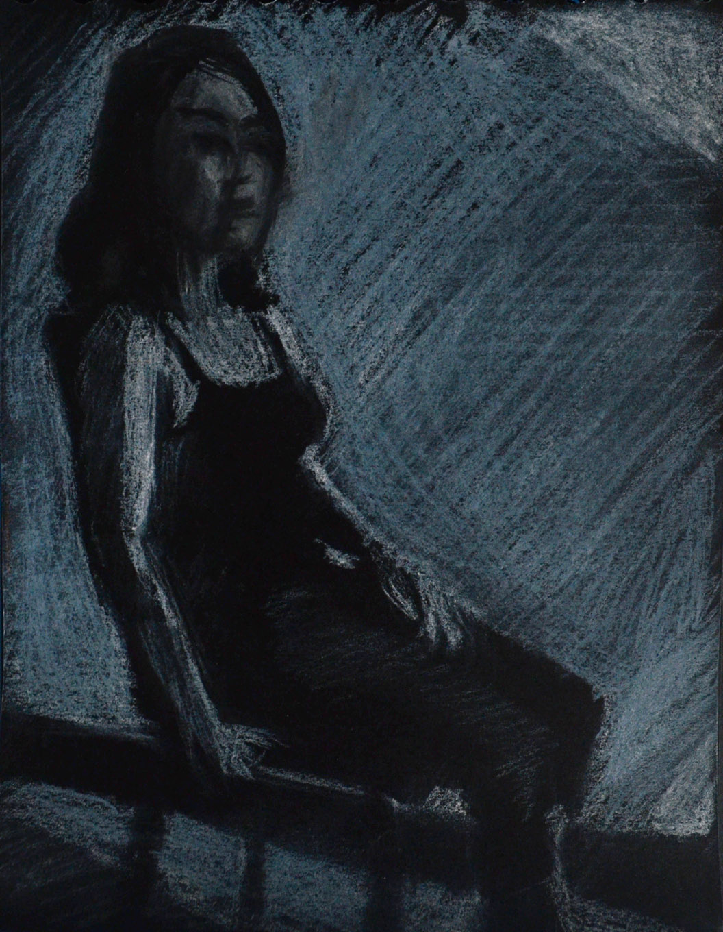
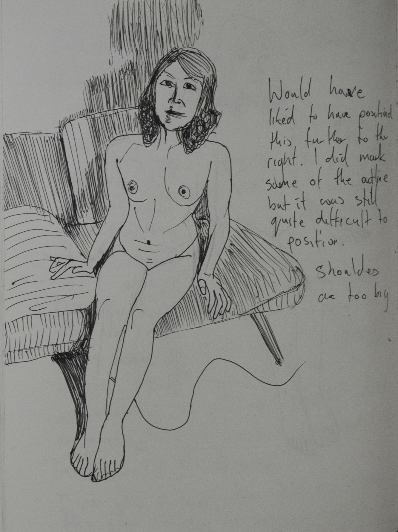
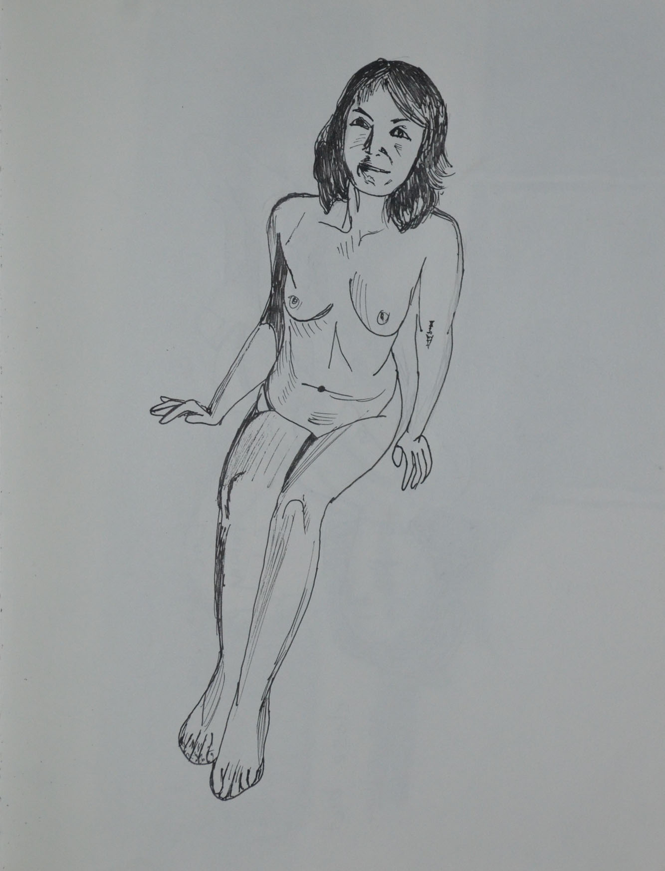
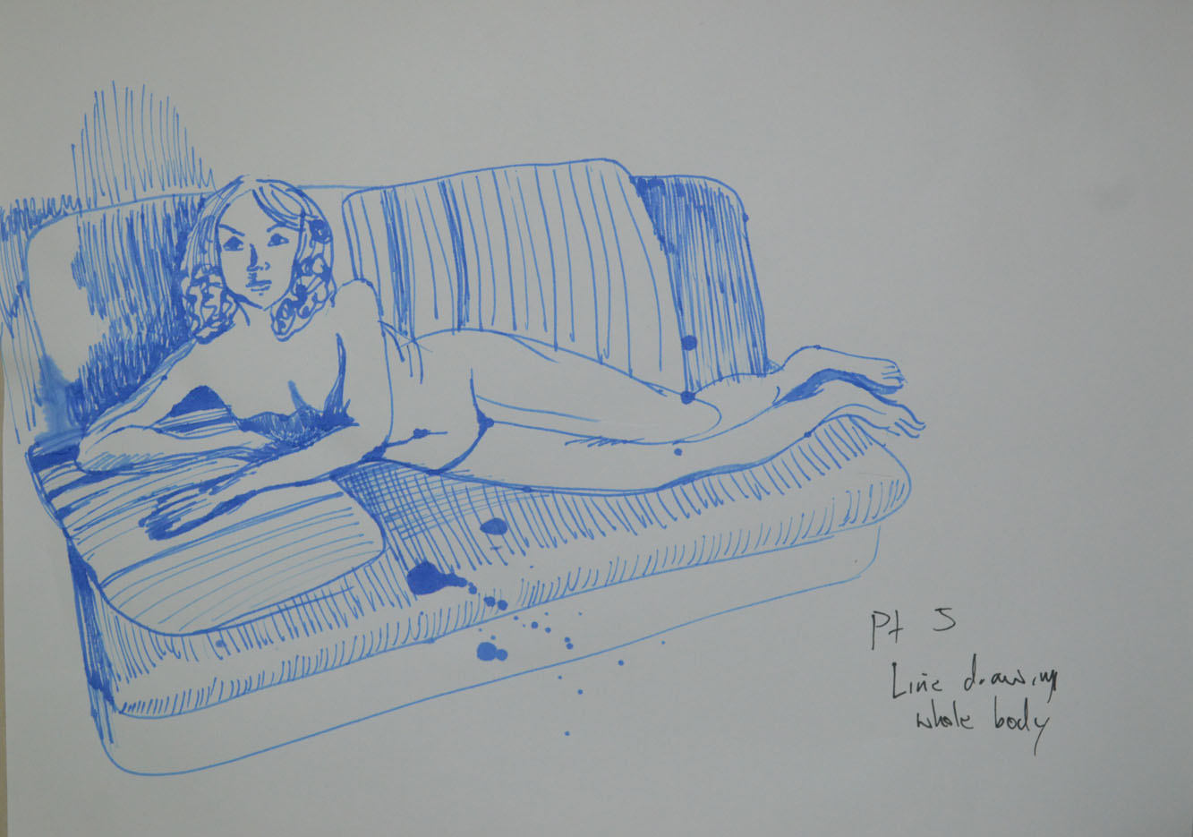
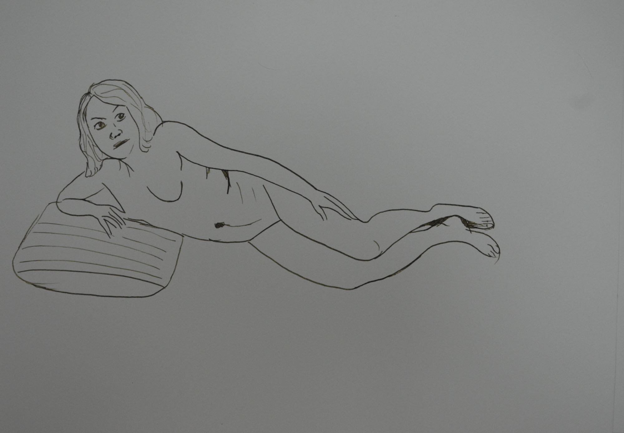
You included lots of work which in itself is fine, however, it is very important to us some objective discernment both as you are working and as you look at a completed body of work. Interestingly the drawing in line of the ‘woman playing with her phone’ is the most successful of this group of works. The proportions are fine and come together and form a believable figure in action. You have this marked as ‘out of proportion’, it isn’t! This tells me you are not seeing things clearly enough as you look; look at this drawing closely and try to recognise how you have articulated the figure in space; how well the head sits; how you have changed sizes of  parts of the body as they recede (foreshortening in other words). You have been looking here and not generalising. The shaded version of this pose is not as successful as the line version; it is stiff and lifeless by comparison. I will talk more about discernment later in the report.

6 - Playing with Phone - Out of Proportion
Playing with Phone – Out of Proportion
7 - Playing with Phone A3
Playing with Phone A3

I have to disagree here, this drawing was from a photo as I didn’t have time to do a life drawing in this pose. My girlfriend is only 5 foot and the second drawing is ‘spot on’. I like the first drawing in just line but it is as I said out of proportion.

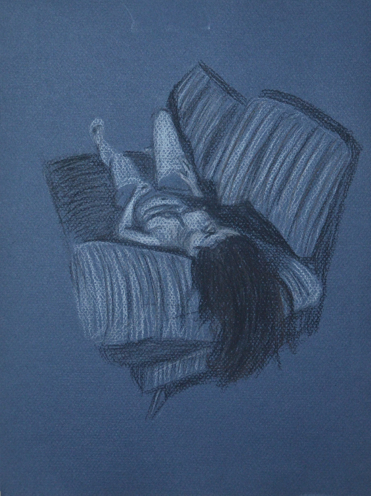
The tonal studies revert back to generalisation for the most part; you are forgetting to ‘look’ here and are trying far too hard to make a picture instead of investigating your subject. As a result proportions are out again; heads too big, feet and hands and legs too small. Some of the drawings are somewhat kitsch also which is a look you should avoid at this stage in your development.

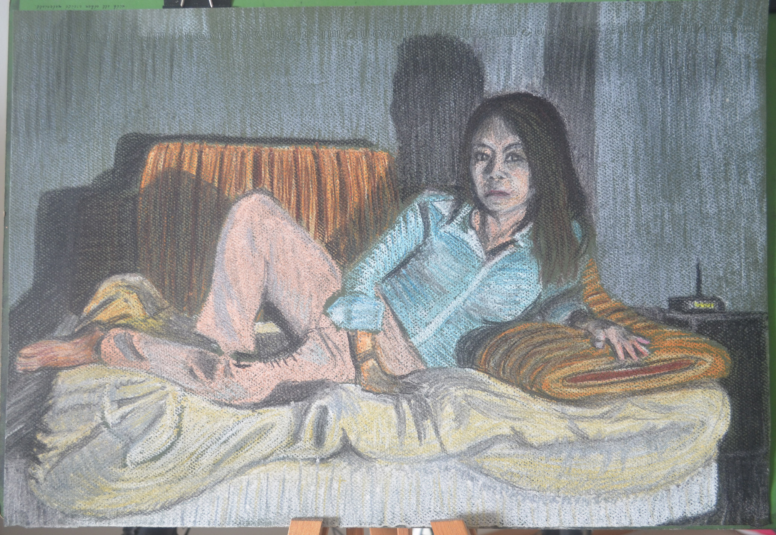
I submitted drawings here that others would have left out, mainly because the folders I have submitted digitally from my computer contains everything. Below is a photo of a very spontaneous easel drawing that was neither planned out or marked. It shouldn’t have been submitted but it was and as since been omitted from my learning log. However, there are positive drawings in this exercise, that were not generalised, were not drawn quick and were a result of looking. The tutor has nothing positive to say about any of these and that’s annoying. The ‘kitsch’ he talks of is a result of depicting tone using colour, the results were spontaneous not planned.


Tonal Study Nude in Monotone
Drawing that shouldn’t have been submitted
Large Tonal Drawing in Colour Pastel
A2 Tonal Drawing in Pastel Pencil on Ingres

I will be reproducing this in charcoal pencil.

Drawing with Angled Easel
Tonal Study Nude with White Pastel
Tonal Study with White Pastel
Tonal Portrait in Pastel
Angel in Tone

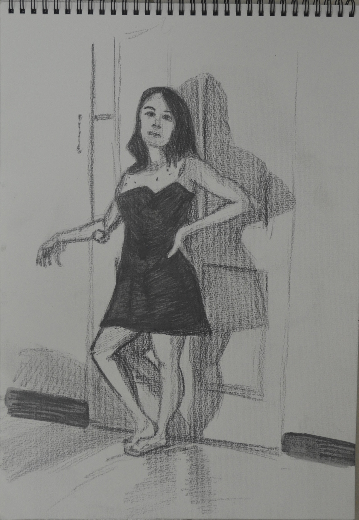
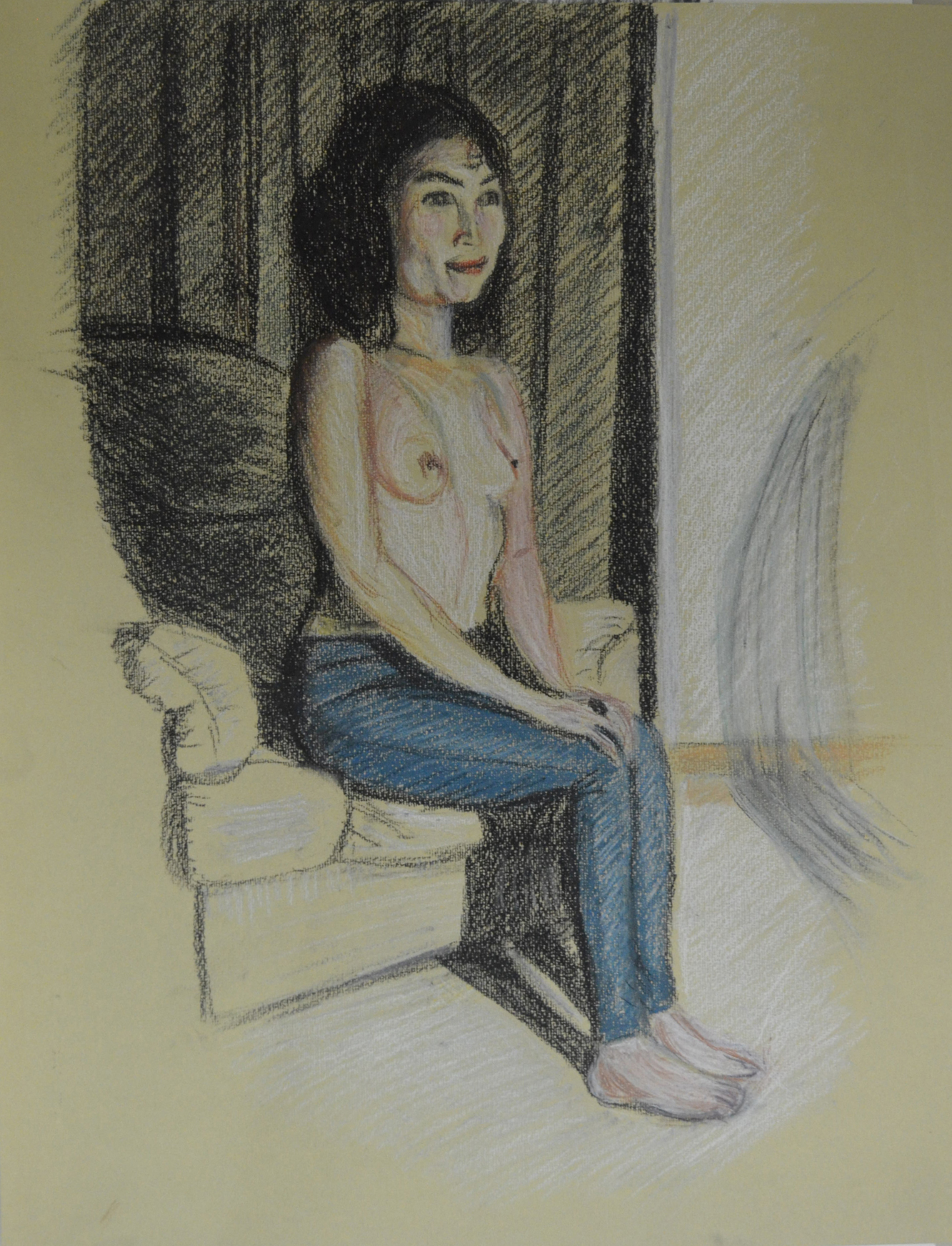
The work that you did for the assignment piece itself is actually much better. The understanding of proportion is better and the use of tone is quite successful also. The ‘looking at the door handle’ in water soluble pencil looks to be working better than some others as does the more expressive version in watercolour pencil which you have marked ‘Sad Attempt’. The expression that this study has could be pushed even further.

10 - Sad attempt in watercolour pencil
Sad attempt in watercolour pencil

The tutor and I obviously have different tastes, styles and understanding of what I was trying to do in this assignment, the above drawing was not it.

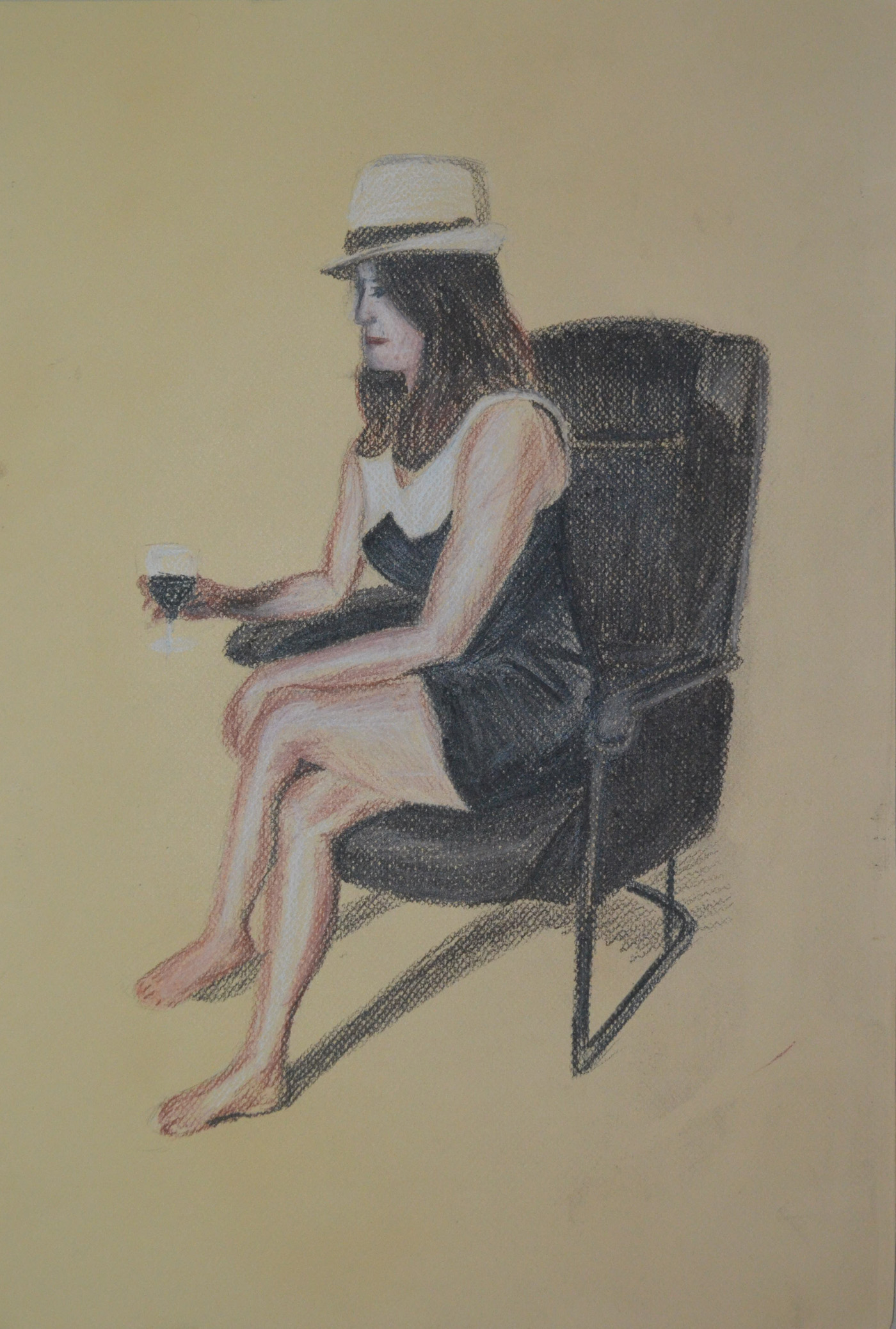
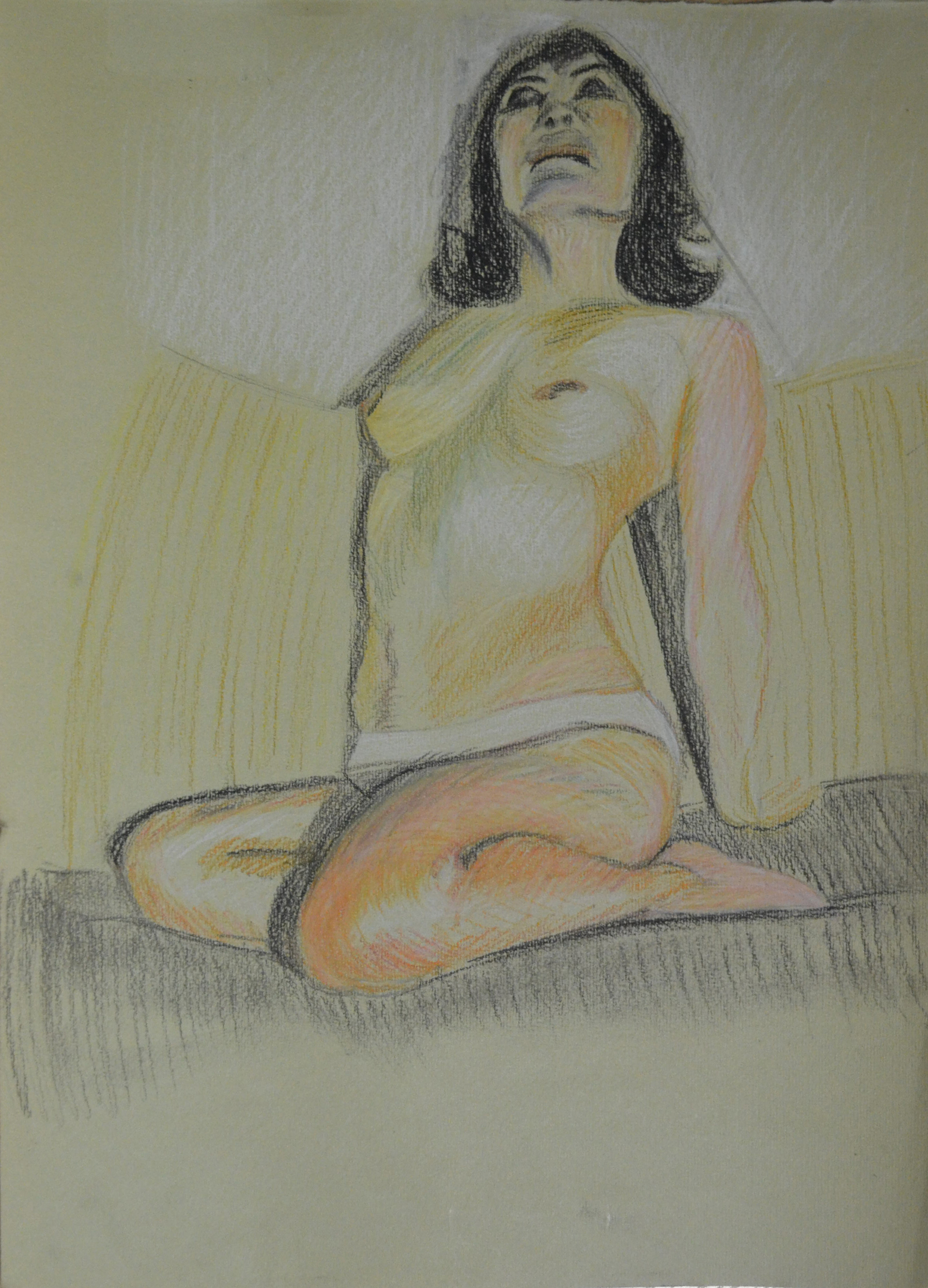
The larger drawing is a reasonable resolution on what you were trying to do. The sense of isolation within the figure is present and the pose supports the idea also. The relationship of the figure to the background maybe needs some more attention to get the areas of the drawing reacting together more.

Maybe the figure looking at the door handle would be sufficient as a concept to carry both the pose and idea. The pastel one maybe over done.

It is always good practice to work on more than one version of assignment pieces; this will give you much more scope to select when the time comes and it will also help you explore your ideas and methods more also. Remember this for the future.

I wasn’t trying to create a sense of isolation within the figure, I was trying to create a feeling of anxiety and fear, which I think the oil pastel, ‘over done’ drawing did well. The larger drawing in Gouache, watercolour and watercolour pencil was a second version of the assignment piece and if I preferred it to the oil pastel would have been submitted as such.

Sketchbooks

Demonstration of technical and Visual Skills, Demonstration of Creativity

I presume that you have been keeping sketchbooks through out the course. The more investigative the more useful they will be. Bear this in mind for the future.

Learning Logs or Blogs/Critical essays

Context

The blog is far too descriptive. You need much more critical comment on what you look at and indeed more of an in-depth comment on your practice and methods. Say more about why more often rather than how. More comparative statements about the quality of your work and how you think that you could improve it. It needs to be less descriptive and more of an analytical tool that you can use in your practice in a real sense.

This should have been pointed out to me at an earlier stage instead of getting pats on the back, is it too late to change?

Generally a learning log/Blog should contain objective and comparative comments on your own work and development. Comments on work of other artists relevant to what you are doing. Evidence of art you have seen, in the flesh in books or on the web – with images, annotated where necessary. The log should also contain the set theoretical studies from the course and your tutor reports.

Suggested reading/viewing

Context

Look at drawn figure work by Manet and Cezanne to see how they use their media fluidly and openly, Seurat’s drawings are good examples of inventive use of tone. Look at Degas for his use of pastel and inventive composition and Van Gogh for his use of mark making and line. Picasso and Matisse have both made exhaustive drawings in line  which would be beneficial to see as would some of Rodin’s work from the figure in line also.

Other

Discernment is going to be very important for you as you select for your assessment submission. You will have to do this as I can see that you have a lot of examples of work some of course more successful than others. You need to pick out the more successful work.

Some of the work throughout a all five assignments will not be quite as successful as others so you will need to select well. Look through all your reports to help you select. Spread all your work out in front of you and remove the less successful ones until you have a coherent group which satisfies the submission criteria. Put the best drawings in as the assignment pieces i.e. re designate them if you need to. Pick out your most successful pieces as support work also. You will find the submission criteria in your course book and check out the OCA website for tips on submission. You need the right balance; not to much but not too little either. Present your work in its best light.


Tutor Feedback – Assignment 4

3 - Lying Down - Conte Stick and Compressed Charcoal

Overall Comments

You’ve delivered another strong submission Mark. The determination and enthusiasm you have shown throughout the past four parts of the module has clearly been of great benefit to you as you approach the final part of this module. It is your unerring interest in the subject of drawing and your resolve to advance in the process that will successfully see you through to the end of this course. 

The first exercises looking at quick and long poses display good observational skills. Quick sketches of the figure are a wonderful way of loosening up before approaching longer, more studied pieces and allow the artist to look at the subject in a rapid way, to define what is integral as well as superfluous in the detail of the sketch in the given time and is important for honing the eye and hand. They are well-proportioned and show that you can handle – and understand – the process of measuring well. As these are your first experiments with drawing the figure from life I think you should feel very happy with the results. The more you do the more adept you will become with the process of looking and transposing what you see. Again the longer poses display good proportional observation as well as a good understanding of the portrayal of attitude.

I learnt a lot about measuring proportions from this exercise particularly how many heads distance it was from the crown of the head to the seat of the bum which was approximately 3.5.

The drawings you have produced for the essential shapes and elements exercises show good understanding of how to represent form and your decision to use charcoal was well founded both in the drawings of your girlfriend and in the series of your daughter. Proportion is well observed and rendered and elements such as foreshortening have been approached simply and successfully. You mentioned in the check and log for the proportion exercises that you feel a little frustrated with your abilities to represent a facial likeness in relation to the overall drawing – one step at a time Mark. With your focus and determination I am in no doubt that you will find that you’ll develop your own way to tackle the complexities of facial structure. Like the body it is all about proportion and form but with the face the detail is much more intricate. The ‘tightness’ you perceive when approaching the face is normal for this early stage of your practice. It is the pressure we put on ourselves to achieve a ‘true’ or life-like representation of the model’s features that often hinders progress and ‘puts us off’, especially when you are not only restricted by time but the desire to ‘get it right’ creates a kind of hurdle to what is normally free-flowing creative expression. For these exercises it is not necessary to produce fully formed portraits with intricate detail. Try to hint at the features by using simple tone to describe the shape of the face.

4 - Charcoal on A3 Paper
Charcoal on A3 Paper
1 - Charcoal on A4 Sketch Book
Charcoal on A4 Sketch Book

You have produced a vast array of work for the stance and energy exercises. It is good to see that you are pushing yourself with such enthusiasm Mark and the results show that you have a good eye for the depiction of weight and balance. The line you use in these sketches is particularly appropriate and successful: it is sure and confident and delineates the stance and energy of the poses without forsaking attention to detail such as proportion and anatomy.

I wasn’t as impressed with my energy drawings and so after I submitted my coursework I did some research on Gesture drawing as well as some reading, Force, Michael Mattesi and did a new set of drawings for this exercise, which I did submit to my tutor afterwards so maybe that is what he is taking about. 

drawing 4
New Run at Gesture Drawings

You have approached the structure exercises with great enthusiasm and openness with regards the use of different techniques and media. There are some very slight issues with proportion in some but I don’t think you should be overly concerned here – it’s like you’ve concentrated too closely on specific detail rather than considering how each anatomical element relates and works together by looking at the subject as a whole.

4 - Finished Anatomical Drawing Half and Half
Finished Anatomical Drawing Half and Half

I think my tutor was talking about the anatomical drawing above but I am not too sure. If so then I can say I wasn’t thinking about specific detail, I was thinking about how anatomical elements related to each other. At this stage we were a bit ‘shy’about nude drawings in detail but the choice of clothes for the model, my girlfriend, on this exercise was probably a bit poor and so it didn’t show off the structure as well and so I wasn’t able to.

1 - Sitting, Conte, Charcoal, Conte Pencil
1 – Sitting, Conte, Charcoal, Conte Pencil
2nd Pose 3 - Water Soluble Pencils Better Proportions
2nd Pose 3 – Water Soluble Pencils Better Proportions

In the conté and charcoal drawing of the seated figure, the upper part of her right arm appears too thin in relation to the overall proportion, and in the drawing using white gel ball the arm resting on the door knob appears a little elongated. The foreshortened reclining pose in conté and charcoal however is very nicely observed and delineated in terms of proportion, form and structure. The depiction of foreshortening can often cause great problems and confusion but not in your case. You’ve produced a very well executed drawing here Mark.

3 - Lying Down - Conte Stick and Compressed Charcoal
Lying Down – Conte Stick and Compressed Charcoal

I am hitting the same problems all the time, I am producing my best work on a small scale, I love this drawing and yet I am not sure whether it will get me where I want to be in the assessment when framed.

The drapery studies for the clothed figure exercises also show keen observational abilities. The manner in which you have portrayed the lightness and swathe of the fabric by utilising line following form and allowing the surface of the paper to describe highlights is very successful. The subtlety of tonal range in these drawings is also very well observed and this is particularly successful in the two drawings of the reclining figure using white pastel on black paper and the graphite version of the same pose (I must also say here that the face in this piece is beautifully rendered!). There is an undeniable believability in the way you have portrayed how the fabric drapes over the model’s body.

2 - White Pastel on Black paper
2 – White Pastel on Black paper
1 - 6B Pencil in A4 Sketchbook
1 – 6B Pencil in A4 Sketchbook

I shall be producing a finished piece for the exercise above from these sketches and the drapery studies.

You quick sketches for the sitting and waiting and fleeting moment exercises show good observational responses to what can be quite a difficult and pressurised way to work, especially for you in terms of the recent circumstances in Bangkok!

4 - Walking Women in Oil Pastel
Walking Women in Oil Pastel

It is evident that you thrive on these set tasks Mark. The definite evidence of development as you work through the self-portrait exercises is clear. The determined and studied visual research for shape and proportion you have employed for this exercise has surely helped with this. From the slightly tentative first sketches for the ‘Drawing your face’ exercise to the surer, more ‘finished’ pieces in different media, you have once again produced a focused collection of work. I thought the eighth portrait in conté and Chinese white pencil particularly successful with good attention to incident and reflected light. I thought the portrait from memory of Vladimir Putin worked well and was definitely recognisable as the Russian leader. 

Feedback on assignment Demonstration of technical and Visual Skills, Quality of Outcome, Demonstration of Creativity 

The assignment piece of your girlfriend reclining on the sofa in soft pastel was very well conceived, observed and executed. Once again you have handled the media successfully. The composition is well-balanced and the depiction and overall effect of light and shade makes for a very effective study – a nod to the reclining figure from the history of art, to Manet’s Olympia, Titian’s Venus of Urbino, Velázquez’s Rokeby Venus, Goya’s La maja desnuda, the list goes on? A very successful piece Mark!

Tone and Form - Finished Piece Soft Pastel, Green Ingres
Tone and Form – Finished Piece Soft Pastel, Green Ingres

This assignment was a breath of fresh air after the last one but there was a downside though that I hadn’t expected. The soft pastel colours were so bright until I used the fixative what I hadn’t anticipated was that the fixative would dampen it or blow the pastel dust away and allow so much of the green paper to show through making it murky, the upside of this of course is that it gives it a ancient/spooky look.

Tone and Form - Finished Piece Soft Pastel, Green Ingres
Final Drawing

Learning Logs or Blogs / Critical essays Context

As with your previous submissions you have delivered an honest, informative and thorough learning log for this part of the module. I enjoyed reading the piece on artists’ self-portraits and thought the manner in which it was written was fresh and personal – a welcome divergence from the usual heavily fact-based information we as tutors sometimes have to read! I am also very pleased to read that you are getting a lot out of Berger’s Ways of Seeing.

Sketchbooks 

What I find encouraging about the way you work Mark is that you are rarely put off by new processes; in fact you appear to thrive on the challenge. You confront new disciplines fearlessly and with an open mind to technique and media. The evidence is here in your sketchbooks – the amount of work and the confidence displayed by the inclusion of work you are rightfully happy with as well as pieces you have considered not so successful has been beneficial to the progression of your practice. Sometimes it is the recognition of ‘success’ and ‘failure’ that will drive us forward to constructively face. Your overriding interest in the subject of drawing will stand you in good stead for the final part of this module and your future art practice. I am pleased that you have chosen the option of figure drawing on which to concentrate.

Suggested viewing/reading Context 

I’m sure I don’t need to mention it but try as much as you can to immerse yourself in the work of other artists. I have always found it exciting when discovering the oeuvre of ‘new’ artists, the influence of their work potentially beneficial to my own. A couple of artists you may find interesting are Jenny Saville and Alison Watt.

See examples of their work below:

Jenny Saville Mother and Child (After the Leonardo Cartoon) Alison Watt charcoal on watercolour paper, 2009.
Jenny Saville
Mother and Child (After the Leonardo Cartoon) charcoal on watercolour paper, 2009.
Alison Watt Part of the Phantom series, oil on canvas, 2007.
Alison Watt
Part of the Phantom series, oil on canvas, 2007.

View the research point for Alison Watt

Tutor Feedback – Assignment 3

My finished Study of Several Trees

Overall Comments

You produce work of a high standard Mark and your submission for this third part of the module is no different. I can see a steady progression in your practice and evidence of it further gathering momentum with the introduction to new disciplines such as the natural landscape. Just as in prior submissions you have also delivered an extremely precise and well-considered learning log. I am greatly encouraged by the quality of your work Mark and look forward to seeing your next submission.

Feedback on assignment Demonstration of technical and Visual Skills, Quality of Outcome, Demonstration of Creativity

The preliminary studies and notation describe the developmental stages of the creative process heading towards your finished assignment piece very successfully. The consideration applied to the experimental trials for a suitable medium shows an admirable determination and engagement in the developmental process. The finished drawing for the assignment is well composed and displays a thorough and successful understanding of the portrayal of single-point perspective. I think, on the whole, the final drawing holds together well and is a convincing depiction of the landscape. It displays a strong composition, a good portrayal of depth and your handling of the medium has been effective. My one criticism would be in the rendering of the foliage in the middle ground. I feel you could have been a little bolder in the depiction of the light and shade created by the layers of leaves, thus validating the ’bulk’ of the foliage and accentuating the illusion of a receding background. The lightness of touch has made it appear a little flat with regards form (light and shade) and this slightly affects the overall depth of the piece. Watercolour pencil can be quite a difficult medium to achieve ‘heavier’ or solid depth of tone due to its hard quality, but as you have accomplished this in the rendering of the roof supports, I feel you could have pushed it a little further.

Submitted Piece for Assignment 3

I wasn’t particularly happy with my submission for this third assignment nor the task for this assignment as finding a view that was suitable was very difficult.

‘A View from a window or door – that offers an opportunity to draw straight-lined objects as well as items drawn from nature, buildings, gates, fences and so on. It then says that ‘this may all seem like a lot to look for, but most views from windows and doors will offer you a bit of all these things…’ 

This could have been my favourite assignment if I was in the countryside or back home in Yorkshire but not in the built up area where I live in Bangkok. There were views with some of the above but not all, the view from the school window was the best I could do but I wasn’t really keen on it. 

However, besides all this the tutor’s comments were very positive and he was right saying not being bold with the depiction of light and shade made by the trees has ‘made it a little flat’ and so with other drawings that need attention I shall try to give it some depth before assessment.

Learning Logs or Blogs / Critical essays Context

You have continued to produce a thorough investigative learning log Mark. You honestly identify situations that have hindered you and are equally open about your successes. Although you mention in your notes for this part of the module that you were not overly excited by the prospect of drawing landscape you have proven to me, and most importantly to yourself, that you do have the ability to overcome this doubt. I was pleased to read that you found looking at the work of other artists (Claude Lorrain and J. M. W. Turner specifically) helpful, by recognising the importance of defining fore-, middle and background, and that you have employed those findings to your advantage. I get the feeling that not only due to your obvious growing abilities it is your determination, enthusiasm and wholehearted interest in drawing that will define your progress to me as your tutor, but most importantly to you. That realisation is patently the greatest benefit to even further progress!

Sketchbooks

This part of the Drawing One module concentrated on working outdoors, or en plein air. Due to the unrest in Bangkok I’m sure the prospect of doing these exercises must have felt like particularly poor timing for you and been very difficult at the time! I must say however, even with these enormous obstacles, you have undertaken the exercises and the assignment very well indeed and have produced an extremely thorough and well-focused collection of work.

Your drawing is strong Mark. The enthusiasm and engagement you put into the exercises shines through in the work you have presented. The ‘Sketchbook walk’ and ‘360 degree’ studies are dynamic and show a methodical understanding of how to portray the illusion of depth in a two-dimensional image. I particularly liked your fourth and final sketch for the ‘Sketchbook walk’ series: it is confidently rendered, very well observed and displays a solid understanding of perspective and composition.

A Sketch book Walk Fourth and Final Sketch : Charcoal Pencil, EE and HB

I must admit the drawing above was one of my favourite drawings from this exercise and I am thinking about enlarging it for my assessment….but will it work?

It was also great to see you wholeheartedly taking on the challenge of new media for the ‘Drawing cloud formations’ exercise. You are lucky to be in a country where there is a defined difference between cloud and sky! The results were well considered in terms of their delineation – the most successful, and intriguing, for me were the night-time clouds on black paper. The drawing has something of the Odilon Redon about it. The developmental sequence for the ‘Plotting space through composition and structure’ exercise was transfixing and I think a very successful drawing.

3 - Plotting Space through Composition and Structure - Watercolour Pencil Mostly Dry
3 – Plotting Space through Composition and Structure – Watercolour Pencil Mostly Dry

The perspective exercises again have been undertaken with confidence and have displayed a good understanding of the representation of both parallel and angular perspective. The angular perspective drawing is particularly well-observed. This thorough understanding of the rules of perspective is confirmed by the beautiful series of townscapes you have included in your sketchbook. These are excellent studies Mark that show wonderfully realised depth through perspective and the subtle but effective use of tone. I especially liked the ‘Limited palette’ studies.

A Limited Palette Study in Conte, Pastel and China White

I am wondering whether or not to include this in the work for submission. It is probably a good choice as I have some great studies from the previous exercise.
Your studies for the ‘Drawing statues’ exercise raises my expectations to see your work for part 4 of the module. These again are very well-observed studies. The conté and pastel study of the Soonthorn Poo bust has been beautifully realised, the solidity of the representation skilfully rendered. This is also true of the studies for the ‘Drawing trees’ exercise, particularly the larger study of the individual tree and strong oil pastel study of several trees – I agree, it does appear like an admiring nod to Georges Seurat.


Soonthornpoo Conte and Pastel Pencil
My finished Study of Several Trees

Suggested viewing/reading Context

As it is obvious that you are continuing to make gallery visits and are clearly getting a lot from these sojourns there really isn’t much I can suggest you look into Mark. I am undoubtedly preaching to the converted but continue to gather references of other artists’ oeuvre and truly look into the way they work. Then look at your own work in a similar depth. You may be familiar with the writings of John Berger but if not check out the following two books:

Berger, John (2008) Ways of Seeing Penguin Classics ISBN: 9780141035796

Berger, John (2009) About Looking Bloomsbury Publishing PLC ISBN: 9780747599579

I couldn’t find About Looking without purchasing online but I was very lucky to find a copy of Ways of Seeing and exercised my new fresh view of seeing things in the research point Investigating Artists’ Self Portraits.

Pointers for the next assignment

As you know the next part of this module is all about the figure which I’m sure will suit you. Hold on to the enthusiasm and commitment you have shown and carry on looking and researching. It is evident that this way of working is very good for your practice. I look forward to seeing your submission for ‘Drawing figures’ Mark.

I understand your aim is to go for the Painting/ Creative Arts Degree and that you plan to submit your work for assessment at the end of this course. From the work you have shown in this assignment, and providing you commit yourself to the course, I suggest that you are likely to be successful in the assessment.

Assessment of Criteria Points

8 - WaterSoluble Pencil Sketch with Door Handle

Demonstration of technical and visual skills – materials, techniques, observational skills, visual awareness, design and compositional skills

I think I was disillusioned as to what materials i would use for this assignment, I chose water soluble media thinking that they were suited to my ideas but proved me to be wrong. My design and compositional skills shone through in this assignment but were suited to a totally different medium to what I had planned but in the end everything came together.

Quality of outcome – content, application of knowledge, presentation of work in a coherent manner, discernment, conceptualisation of thoughts, communication of ideas

The journey was very different from what I imagined but I arrived at the same destination, depicting in my final piece the mood or atmosphere that I was determined to achieve from the start. I am very happy with the quality of the final piece and  applied the knowledge that I had gained throughout the course to realize my thoughts of how it would turn out.

Demonstration of creativity – imagination, experimentation, invention, development of a personal voice

I demonstrated imagination, I experimented an I invented and as far as my personal voice is concerned something is happening but I’m not sure what as of yet.

Context – reflection, research, and critical thinking (i.e. learning blog)

My blog seems to go from strength to strength and my thirst for researching new artists is also getting stronger and with no library in the vicinity books are getting addictive and expensive. I am also spending more time to reflect on the work that I have done which shows in my blog entries.

Part 5, Option 4, Reflection

Large Tonal Drawing in Colour Pastel

I started off this part of the course with a fresh try at drawing with energy as my attempts at gesture drawing in Part 4 – Drawing Figures  where rather crap and so I read more of ‘Force’ by Michael D. Mattesi. So with a Chinese marker, larger sheets of drawing paper and my new found knowledge of applied force and road of rhythm, I set out to create more quick and dynamic figure drawings. Not only were these energetic drawings a vast improvement on any of my quick figure drawings in Part 4 but they were a great inspiration for the next few exercises.

Drawing 2
Drawing with Energy


I had been struggling in the Quick Poses exercise in the last module but the Quick Studies exercise in Part 5 was a breeze due to the fresh practice at energy drawings and also applying what I had learnt, unlike the hairy sketches in Part 4 the quick studies in this part were smoother and with a new found confidence I drew faster and faster sometimes getting the drawing time down to 3 minutes.

Drawing 30 - Kneeling 3B Pencil
Quick Studies

After researching how famous artists used line I took that new found confidence and applied it to the second part of this research where I had a go at using line in the style of famous artists. The results weren’t that great, I’m not sure if drawing in the style of Klimt or Schiele resembled the two artists’ work but I was pretty happy with drawing in the style of Hockney, Ingres and Giacometti, particularly the last two artists.

5 - Drawing in the Style of Ingres
5 – Drawing in the Style of Ingres
6 - Drawing in the Style of Giacometti
6 – Drawing in the Style of Giacometti

I’m not sure whether I did enough drawing with colour in the using colour exercise  but I do feel that I did ample experimenting with mixed media particularly the collage work which I was quite happy with, producing the drawing below was particularly satisfying but I may have to go over the hair in black.

3 - Collage with Black Felt Tip
3 – Collage with Black Felt Tip

This drawing in oil pastel below gave me some very interesting ideas for Assignment 5, which I will reflect on in the next post.

1 - Oil Pastel with Robe and Squiggles
1 – Oil Pastel with Robe and Squiggles

I was trying  not to get sucked into producing nudes for the rest of this module but that’s the direction I felt I was going in as I knew there was so much I could do with the nude figure and so many drawing tools I could use for them, I was especially happy with the drawing below in hard pastel that I produced for the Tonal Studies exercise which I will also send off for assessment. I love the way that I used contrasting colours to build up the tone and form of the sitter with very fluid hatching.

Large Tonal Drawing in Colour Pastel
7 – A2 Tonal Drawing in Pastel Pencil on Ingres

This module gave me enough ideas and time to reflect on the type of piece I wanted to produce for Assignment 5, I knew I wanted to produce a full figure drawing, I knew the sitter would not be totally nude as I wanted to draw folds in cloth again but what I hadn’t decided on was if it was going to be an expressive figure drawing or analytical study or what medium I would be using for the assignment.

Pt 5 – Figure Drawing – Tonal Studies

Tonal Portrait in Pastel

The first drawing I did for this exercise was a portrait of my daughter. I felt guilty that I have used my girlfriend as a muse for most of the figure drawing exercises in this course and so I decided to make it up for it with a tonal portrait  of my oldest daughter.

For this portrait in pastel I used mostly diagonal single hatching on a dark blue Ingres paper. I am really happy with the finished drawing but I seem to be having the same problem with positioning as I didn’t draw an outline first I just went straight into building up the picture with hatching starting at the cheek.

Tonal Portrait in Pastel
1 – Angel in Tone

Ideally I should have done the next drawing in pencil, maybe on a thick watercolour paper but I decided to go with charcoal on a large sheet of paper. The proportions are good but other than that the drawing is quite sloppy.

Tonal Drawing Nude Charcoal
2 – Tonal Study in Charcoal

I did the next drawing in pastel on a beige Ingres paper using the colour of the paper as a neutral tone for the chair and the upper body. The drawing looks slightly out of proportion and indeed it is, but only slightly I was drawing with the board on the easel, I spent most of the time drawing while holding the easel tilted towards me to try and avoid this.

Tonal Study Nude in Colour Pastel
3 – Tonal Study using colour

This is a photograph that I took with my phone of the drawing on the easel tilted back while I was working on it. You can see the difference in proportions.

Drawing with Angled Easel

The next drawing was also a quick one but this time from life in Conte Pencil and White Pastel on eggshell (I think).The outlines are probably too strong tho and it may have been better to build up the background and so I continued to draw until I had a drawing I was satisfied with.

Tonal Study Nude with White Pastel
5 – Tonal Study with Conte Pencil and White Pastel

This time I chose pastel pencil for my medium and beige Ingres paper and working from a photograph I drew with flowing hatching that followed the contours of the body building up the tones with about 8 different colours. The results were great but again the positioning was still not so great and so I decided to improve on this by starting a new drawing, something that I can send of for formal assessment.

Tonal Study in Pastel Pencil
6 – Tonal Study on A3

Working mostly from the last drawing until I got to the face that is I did my best to position the figure on the A3 paper so I could fill as much as the paper up as possible, it was definitely an improvement. The proportions of her breasts and bum in the last drawing were probably more realistic though as I went with the flow in this last drawing. The face is a lot better but I was warned by my girlfriend not to mess about with it and to leave it as it was and so I did.

Large Tonal Drawing in Colour Pastel
7 – A2 Tonal Drawing in Pastel Pencil on Ingres

A Fresh Try at Tonal Studies

Unhappy with most of the tonal drawings above and buy know getting slightly bored of using pastel on Ingres or charcoal I decided to have another go at the exercise and began researching other possible techniques and mediums.

Firstly I looked at lifting off charcoal rather than drawing with it and after completing the drawing below I decided that this technique was suitable to drawings of parts of the body rather than the whole figure.

Charcoal Study Lifting off

I then did a quick tonal study from a photograph in 6B pencil, this was great for hatching and I was able to build up the form really well but it I still wasn’t satisfied knowing that I could find abetter medium for these tonal studies.

Tonal Study in 6B Pencil

Researching the Old Masters

I remembered the studies in red chalk by the old Masters and so I decided to take a closer look at some of these drawings. I looked at drawings of several old masters including Bernardino Gatti, Raphael, Leonardo da Vinci and Michelangelo focusing on studies of the figure rather than portraits.

In several of the studies the artists seem to show light with white chalk and show shadow with darker chalk but it was quite clear to me that it was possible to depict light and shade by layering the one colour. However, because I already decided to do the next set of tonal studies on A3 drawing paper so I could draw on my lap I decided that red chalk wouldn’t be precise enough on A3 but a Sanuine Conte pencil would be an excellent substitute.


Bernardino Gatti Il Sojaro - Study of Horizontal Legs
Bernardino Gatti Il Sojaro – Study of Horizontal Legs
Leonardo da Vinci - Study of a hand
Leonardo da Vinci – Study of a hand
Leonardo da Vinci, A nude man from the front, c. 1504-1506, red chalk and pen and ink
Michelangelo Buonarroti - Seated Young Male Nude
Michelangelo Buonarroti – Seated Young Male Nude
Michelangelo - Study for an Ignudo, Red Chalk
Michelangelo – Study for an Ignudo, Red Chalk
Michelangelo - Nude study for the Battle of Cascina
Michelangelo – Nude study for the Battle of Cascina
Raphael - Red chalk study for the Villa Farnesina Three Graces
Raphael – Red chalk study for the Villa Farnesina Three Graces
Michelangelo - Studies for Haman
Michelangelo – Studies for Haman
Study for Adam Michelangelo

I decided to commit myself to one drawing an evening for five evenings spending at least an hour on each tonal study. The fully nude poses in my quick drawing studies helped me to get the proportions better than the semi naked poses above and so I went with very similar poses for the next group of drawings.

For the first of these drawings was probably the most difficult of the poses and took the longest time to draw. I used a black conte pencil for the darker tones, this was probably out of insecurity than anything else, so to was the drawing of the bed between the legs not believing that I had got the shape of the legs right.

First Tonal Study in Conte

The next drawing was better, this time I stuck to Sanguine and more precise hatching, the light source came from above and there was a lack of shadows but the pose worked well and until this point this was my best study so far.

Red Conte on White Paper

For the next pose was easier as I didn’t have to draw the details in the face. The proportions of the head look slightly out but this is due to the hair, the back of her head is actually flat like alot of Chinese and South east Asians. I liked not having to draw the full feet but getting the soles of her feet and toes right was still difficult.

2nd Pose Red Conte on White Paper

For some of the quick poses she was sat in the chair and I actually drew the chair, for the next drawing I left the chair out and glad I did. This study took almost as long as the first in this series to complete but drawing the shape was the easiest, most of the time was spent building up the layers of colour. This pose worked best for me and once I had drawn the outline I knew spending time on it would be rewarding, this became my favourite drawing to date, it actually reminds me of some of the red chalk drawings of the old masters.

3rd Pose in Red Conte

For the final drawing I chose a standing pose from the back with a V shape between the arms I drew something similar in the quick poses exercise and I knew that by choosing this pose I would get do depict muscle tone which is one of the most appealing features of the red chalk drawings by the old masters. The foreshortening of the feet made this a difficult pose though and I had to redraw the legs due to not getting the proportions right the first time.

Standing Pose in Red Conte

I really enjoyed working on the last five studies in Conte, this can’t be said for the first set of drawings in this exercise which I believe now were ruined due to rushing myself trying to get this 5th and final part of the course done quicker for  an earlier assessment.

It was really worthwhile to come back and have another go at this exercise with a clear mind, a better choice of drawing materials and a better choice of poses.

More Tonal Studies – George Seurat

Madame Seurat the Artists Mother

On advice from my tutor I looked at the works of George Seurat, I was familiar with his paintings but not his charcoal and Conte Crayon studies and so I browsed through Georges Seurat, 1859–1891 by Robert L. Herbert to take a closer look at some of his works and to give me some ideas on how I could approach this exercise differently.

Georges Seurat Le noeud noir
Devant le Balcon
Devant le Balcon


I was amazed at how he had managed to capture tone and wish I had come across these works earlier. I picked a handful of drawings out that really appealed to me, these were the darker drawings and the reason for me doing this was that I wanted to use a white conte stick on black pad drawing by candlelight, I have been doing some paintings by candlelight and I felt that I could gain some influence from Seurat’s works.

1st Tonal Drawing on Black Paper A6

Working in white conte stick the first drawing I did was very sloppy, however I did come back to this a bit later and add a bit of colour, it still wasn’t a tonal effect what I was hoping to achieve, the next two drawings were a lot better.

For the second drawing my girlfriend was i  a seated pose facing away from the candle, with her face in shadow it was easy to capture the silhouette of her face, The third drawing was not so easy as I sat her facing towards the candle and with the light shining on her face on these small sheets of paper it was very difficult to capture her correct facial profile.

2nd Tonal Drawing on Black Paper A6
3rd Tonal Drawing on Black Paper A6

The fourth study was much heavier and darker, this time mostly in orange, red and brown pastel. Facing towards me it was easier to capture her facial features, they are not perfect but I am happy with the overall effect of using these colours, that were very close to each other on the spectrum on the black paper. I feel that if any of these studied look like they have been influenced by Seurat’s drawings then this is it.

4th Tonal Drawing on Black Paper A6

Facing towards the candle, the 5th study was worked over and over again to get the proportions right, this compressed the layers of pastel which made the drawing looked aged and effect that I think looks really great but I didn’t manage to capture in the photo below.

5th Tonal Drawing on Black Paper A6

I took a break from colour for the sixth tonal study to have another go at drawing her facial features in conte, I hadn’t managed to depict them in earlier sketches and so I drew a closer to her at an angle to get them right.

6th Tonal Drawing on Black Paper A6

In the earlier studies with conte and pastel I had chosen to warm colours this was influenced by the orange-red tones of some of Seurat’s studies, for the final and probably most difficult drawing I chose cooler colours.

7th Tonal Drawing on Black Paper A6


Pt 5 Option 4 – Drawing Figures – Using Colour

1 - Oil Pastel with Robe and Squiggles

For this exercise I started off working with the model and from there I moved onto sketches. Last weekend was a big public holiday here in Thailand, mothers day, the Queens birthday which was actually on the 12th but the Thais have 4 days holiday.

I had previously tried to draw in the style of Alberto Giacometti; although I wasn’t too impressed with a lot of his work, which I had said in a previous post made me feel uncomfortable and a little anxious, I did like some of his work. and I rather enjoyed drawing in his style in the second part of the research point which I think reflects in the first piece for this exercise below. The ability to create a 3D form from squiggles is just too appealing to me and oil pastel felt like the perfect medium for this drawing. I am already starting to think about my final assignment and this was basically a practice piece for the upcoming assignment trying to produce an expressive (maybe), erotic nude, with some type of cloth covering part of the figure.

1 - Oil Pastel with Robe and Squiggles
1 – Oil Pastel with Robe and Squiggles

The second piece should have been bigger, also in oil pastel I tried to produce an expressive drawing with a different technique rather than a different medium. The technique I chose for this was a very contrasting technique to the squiggles above, horizontal hatching. The pose was also very different, this time the model wore no cloth at all and was laid down with her head towards me. The problem here though was trying to produce some shadow below her head to show that her hair is actually spread out across the floor, as looking at the finished piece below it looks like the head is floating.The other problem with this drawing is that the figure should fill the plane however when I was drawing the figure was happy with the outline and therefore I didn’t want to change it. So I filled the paper with furniture.


2 - Oil Pastel with Horizontal Hatching
2 – Oil Pastel with Horizontal Hatching

At this stage I had an idea for the next piece. Firstly I uploaded the  several photos of different drawings to Facebook so I could print them off at work later that evening and see which ones look best ripped or cut up as a collage.

I bought three packs of different coloured paper, orange, yellow and peach (I think) I then printed the picture out at 9 copies to a sheet to see which looked best. I decided on drawing 2 above and the photo below shows how it looked printed out.

Drawing Printed on Paper

The net day was my birthday and I spent the afternoon getting creative:

Collage Step 1
Collage Step 1
Collage Step 2
Collage Step 2
Collage Step 3
Collage Step 3
Collage Step 4
Collage Step 4
Collage Step 5
Collage Step 5
3 - Collage with Black Felt Tip
3rd Piece – The finished Collage with Black Felt Tip

The next challenge was to create a collage piece using the printed sheets of paper for the cloth draped over the model. I chose to do this drawing on watercolour paper and to draw the model in watercolour pen.

Firstly I drew the whole shape of the model with cloth draped over her in pencil and then with a black pen I drew around the shape of the cloth so I could see it through the paper enabling me to draw shapes in pencil to be cut out. Unfortunately the lines made by the black pen were too wide and so I had to make the shapes bigger to cover up the lines around the left arm which now looks withered.

From there I started to cut out and glue on small pieces of orange paper to depict the shadow in the folds of the cloth but I decided that I would probably mess up and and instead to finish these details in an orange watercolour pen with the darker shadows in green. After I finished with the cloth I finished of the shoulders, head, arms and knees, the vibrant lighter colour pens really made the darker colours stand out. I think because of the thin left arm the knees look two fat, this is my only regret here.

4 - Collage with Watercolour Pen on Watercolour Paper
4 – Collage with Watercolour Pen on Watercolour Paper

For the next piece I chose sepia ink with a dip pen and brush as my drawing tool of choice, I originally wanted to do a different coloured wash over the top but decided against it as I loved the plain and simple finished piece too much.

5 - Ink with Nib Pen and Brush on Watercolour paper
5 – Ink with Nib Pen and Brush on Watercolour paper

Pt 5 – Drawing Figures – Line Drawing of the Whole Figure

5 - Marker, Drawing Pen and Charcoal

For this exercise I started out in my sketchbook with a Rotring drawing pen and with my model in a seated position on the sofa I decided to start off with a continuous line drawing without taking my pen from the paper. The result was pretty good even though the face has no real resemblance.

1 - Continuous Line Drawing Pen
1 – Continuous Line Drawing Pen

The second drawing wasn’t a continuous drawing but it was quick and the results were almost the same. Like the first drawing it was quite small and off centre so I included the sofa to give it some balance. I have yet to choose a pose that I am happy with without including a background, maybe this could be a challenge for the 5th assignment.

2 - Rotring Drawing Pen with Sofa
2 – Rotring Drawing Pen with Sofa

The third drawing was of the same pose but this time more care and time was taken and because I messed up on the right arm and corrected it with shadow I tried to balance it out by adding some shading in other areas.

3 - Seated Position No Sofa
3 – Seated Position No Sofa

For the next pose the model was laid on her back, curled up grabbing her knees, I started out with a continuous line drawing to see how could I would be at drawing this pose on the first try. It had to be corrected as it was a very difficult pose to try and complete a drawing of without lifting my pen off the paper.

4 - On Back Holding Knees
4 – On Back Holding Knees

The next drawing was messy, it was all going well until I decided to go over some of the lines again and picked up the wrong pen so then I thought I would experiment by adding charcoal.

5 - Marker, Drawing Pen and Charcoal
5 – Marker, Drawing Pen and Charcoal

From there I went back to drawing with a 0.3 drawing pen, the drawing below may look like I have tried to draw in the style of David Hockney but this was drawn before the last research point ‘How Artists Use Line’ with no particular artist in mind. Everything was going well until I had a problem with foreshortening on the arm but because I liked how the legs stretched back and so I decided to do a larger drawing on A3 paper.

6 - Playing with Phone - Out of Proportion
6 – Playing with Phone – Out of Proportion

The second drawing was a bit more than a line drawing as I decided to add more detail to both the figure and the room. I probably should have took my time and got it bang on but it is a project that I can come back to at a later date.

7 - Playing with Phone A3
7 – Playing with Phone A3

For the next drawing I went back to a seated pose but this time my model crossed her hands over each other on her lap. Her head looks out of proportion but I believe it’s because I have drawn her eyes to high which has made her face look longer. With this drawing I started with the V between her arms and worked up, then worked my way down again. I use block shadow to describe the shape of her body.

8 - Sitting with Block Shadow
8 – Sitting with Block Shadow

The next drawing was done at work from an existing sketch in the Quick Poses exercise, total failure so I decided to do a couple more drawings on the same sheet just to mess it up completely.

9 - Line Drawing from Existing Sketch
9 – Line Drawing from Existing Sketch

The final drawing before going onto research how other artists use line was the ink on A3 drawing below. It was ink on drawing cartridge paper, totally forgetting what I had learnt about drawing with ink on watercolour paper for best outcome.

10 - Ink on A3
10 – Ink on A3

After the last research point I came back to see how researching how other artists use line would affect my line drawing. The next drawing started off as a line drawing but then I went further trying to produce a drawing in the style of Edgar Degas, something that I wasn’t very successful in doing in my last bit of research ‘using line in the style of famous artists ‘. I had since stocked up with some beige eggshell paper so after drawing the line in Conté I got carried away and added some tonal values in white pastel, unfortunately I zombified my girlfriends face but I was quite happy with the rest of the drawing.

11 - Conte and White pastel on Pastel Paper
11 – Conte and White pastel on Pastel Paper

From there I went back to basics and produced the following 2 lne drawings in my sketchbook with a 4B pencil, what is usually the easiest medium for me to use, after drawing with the pen was the most difficult but I think this was down to the fact that I was aware it could be corrected and because I wanted to fill the paper did so very often.

12- 4B Sketchbook Drawing
14 - 4B Pressed on
14 – 4B Pressed on

The next drawing was an attempt at drawing with ink again on A3 cartridge paper which kept blotching every time the nib stopped moving and then I realized why, I was drawing on the wrong type of paper so I switched to watercolour paper for the next two drawings.

15 - Ink on A3 - Blotchy
15 – Ink on A3 – Blotchy

The next two drawings were shoddy attempts, on both drawings I started with the arm on top and worked my way down then on to the legs, on both drawings I messed up when I got back up to her belly.

I really liked the feel of the nib pen on the watercolour paper and so I have set it in my sites to do a decent ink line drawing before the end of the course.

16 - Ink on A3 Watercolour paper
16 – Ink on A3 Watercolour paper
17 - Ink on Watercolour Paper Bad Attempt
17 – Ink on Watercolour Paper Bad Attempt

Where did I go wrong?

Well, I think I am still having problems with positioning the figure on the paper as to fill as much paper as possible. I also am still having problems with foreshortening and also,I think, choosing the best pose for the task at hand.

Option 4 – Drawing Figures, Exercise Quick Studies

Drawing 23 - Standing HB Sketchbook

This exercised proved I had improved considerably since the Quick Poses in the previous part of this course and it was all the projects in between that had got me here. After studying proportions, form and structure I approached this exercise with much more confidence and I think this showed in the drawings I produced below compared to previous quick drawings.

Drawing 1 - Laying Down - 3B on A3
Drawing 1 – Laying Down – 3B on A3

All though I produced better sketches than I expected, it wasn’t a problem free exercise. The first problem I came across was with drawing the clothed figure. I found that I got the proportions almost spot on straight way with the model naked but with clothes on I got distracted. I fall into the trap of drawing the clothes rather than drawing the outline of the model and then drawing the details of the clothes in afterwards, i.e. folds. And because of this the proportions on the first few quick clothed figure studies are slightly out.

Drawing 2 - Lying Down - 3B on A3
Drawing 2 – Lying Down – 3B on A3
Drawing 3 - Lying Down - 3B on A3
Drawing 3 – Lying Down – 3B on A3

I Started off by drawing different poses clothed on A3 sheets of paper in 3B pencil before moving on to drawing nude poses in my sketchbook. For each pose I tried different pencil hardness’s, all the while trying to complete each new sketch in shorter periods of time, even managing to get my time down to 2 minutes for poses where it wasn’t necessary to draw facial features.

Drawing 4 - Lying Down - 3B on A3
Drawing 4 – Lying Down – 3B on A3

I drew the model in many different poses and for the poses that I had difficulty on the first attempt, I made a second and sometimes even third attempt at drawing the same pose, taking into consideration all I had learnt in Part 4, Drawing figures with each attempt the drawings improved.

Drawing 5 - Lying Down - 3B on A3
Drawing 5 – Lying Down – 3B on A3
Drawing 6 - Lying Down - 3B on A3
Drawing 6 – Lying Down – 3B on A3
Drawing 7 - Lying Down - 3B on A3
Drawing 7 – Lying Down – 3B on A3

The poses that created the most problems for me were the poses that needed a lot of foreshortening on the legs such as Drawings 4, 17 and 18. Another problem, that I encountered was when the models head was tilted to one site, however, there was more likeness in these drawings, even with the shorter drawing periods, than I have managed to capture before. I even had some success in capturing different facial expressions, like laughing and smiling (Drawings 20 and 21).

Drawing 8 - Standing Up - 3B on A3
Drawing 8 – Standing Up – 3B on A3

I found that looking for shapes within the figure such as the square within the folded arms in the drawing above (Drawing 8) and the ‘V’ between the arms on drawing 13 helped me to get the proportions and right and so help me to position the figure on the paper.

Drawing 9 - Standing Up - HB on A3
Drawing 9 – Standing Up – HB on A3
Drawing 10 - Standing Up - HB on A3
Drawing 10 – Standing Up – HB on A3
Drawing 11 - Standing Up - HB on A3
Drawing 11 – Standing Up – HB on A3
Drawing 12 - Standing Up - HB on A3
Drawing 12 – Standing Up – HB on A3
Drawing 13 - Standing Up - HB on A3
Drawing 13 – Standing Up – HB on A3
Drawing 14 - Kneeling 2B Sketchbook
Drawing 14 – Kneeling 2B Sketchbook
Drawing 15 - Kneeling 2B Sketchbook
Drawing 15 – Kneeling 2B Sketchbook

Drawing 16 - Sitting Down 2B

Drawing 17 Kneeling HB
Drawing 18 Kneeling HB
Drawing 19 Laying Down 2B
Drawing 20 - Standing 2B
Drawing 20 – Standing 2B
Drawing 21 - Standing - HB
Drawing 21 – Standing – HB
Drawing 22 - Standing - HB
Drawing 22 – Standing – HB
Drawing 23 - Standing HB Sketchbook
Drawing 23 – Standing HB Sketchbook
Drawing 24 - Standing up - HB Pencil
Drawing 24 – Standing up – HB Pencil
Drawing 25 - Sitting Down - 3B Pencil
Drawing 25 – Sitting Down – 3B Pencil
Drawing 26 - Kneeling 3B Sketchbook
Drawing 26 – Kneeling 3B Sketchbook
Drawing 27 - Kneeling 3B sketchbook
Drawing 27 – Kneeling 3B sketchbook
Drawing 28 - Kneeling 3B Sketchbook
Drawing 28 – Kneeling 3B Sketchbook
Drawing 29 - Kneeling 3B Sketchbook
Drawing 29 – Kneeling 3B Sketchbook
Drawing 30 - Kneeling 3B Pencil
Drawing 30 – Kneeling 3B Pencil

Project The Moving Figure, Research Point, People Watching

1st Notes People Watching

It’s hard not to watch people in Thailand, I’ve been here 14 years and I can’t say there hasn’t been a day gone buy where I haven’t studied them, scrutinized them, complained about them. The speed they walk, how loud they talk, picking noses plus a multitude of other habits that makes the Thai race just what it is, unique!

Last Friday was one of the best opportunities I had to sit down and make notes about what I saw. In the school holidays, February to May, I work at the language centres, which are in shopping malls and in one of the malls, ‘the Central Plaza’ they usually have sales in a roundish area by the entrance on the basement floor right outside Macdonald’s, but on Friday the whole area was clear for the first time in months, so I grabbed myself a Mac-fish set and sat at a table right at the open entrance of the fast food restaurant so I could see people coming and going.

From where I was sat I could see people going up escalators, people going down them, people meeting their friends but mostly people dawdling about in slow-motion staring at their mobile phones, they were probably very active in their online social world but to the bystander, me, the scene that was coming together in the empty floor space reminded me of AMC’s Walking Dead.

I made quite a few notes about my findings, as you can see below however in my notes I stated that Thais have less types of walks than westerners.  To be truthful they probably have more. All the gaits that you’d find in the UK plus a good few of their own as I mentioned below, You just don’t see many people walking fast in Thailand.

1st Notes People Watching

Although it it could be fare to say that technology is making people walk slower all over the world as they spend more time looking at the screen while they’re walking down the street.

2nd Notes - People Watching
2nd Notes – People Watching\

I also mentioned in my notes that the locals actions and mannerisms make them seem more immature than those in the west but then again, how do I know, I’ve been in Thailand 14 years, I look on Facebook and see photos were the subjects can’t pose without making hand gestures, and I’m not sure whether it’s insecurity or immaturity brought on by technology. I know it makes me act younger.

2nd Notes - People Watching
2nd Notes – People Watching

One thing I do find here in Thailand is that there is a unique class of people who I have named the ‘drama queens’ a group of young woman who dress, act, walk and talk like the  characters on Thai soap operas, over-the-top-characters that have had a massive influence on teenagers and young women, not just in the way they act but in everything else.