Gallery Visit, The National Gallery – Thawan Duchanee

Thawan Duchanee -Power of Land Series

Either artists have become uninterested in exhibiting their work at the national gallery or I have picked poor times to visit, the last time I visited the gallery, there had been nothing in the temporary exhibitions luckily I used that time for drawing statues. I thought I was destined to spend my student days in the permanent exhibition of royal paintings by unknown artists until I discovered the Queens Gallery which I will talk about in the next gallery visit.

Anyway, a fortnight ago I ventured over to the National Gallery to see if there was anything on that would introduce me to some new Thai or western artists and I noticed that the permanent gallery had expended by one room displaying work my two contemporary artists. The paintings that really caught my eye work works by an artist named Thawan Duchanee, so I decided do some investigating into why his work had made it to the permanent exhibits with paintings of the royal family as neighbours.

Photo of Thawan Duchanee

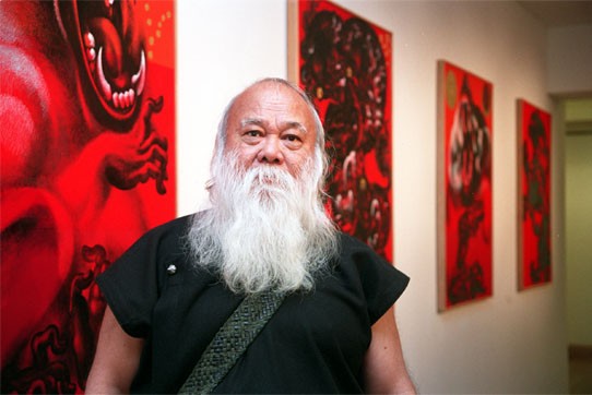
I discovered that the distinguished national artist Thawan Duchanee recently died on 3rd September this year, 2014 at the age of 74. He was born on 24th September, 1939, in Chiang Rai, Thawan and studied at the Poh Chang Art and Craft College in Bangkok. From there he then studied at the Faculty of Painting, Sculpture and Graphic Art at Silpakorn University, where he was mentored by the late professor Silpa Bhirasri. Thawan also earned a doctorate degree in metaphysics and aesthetics from the Royal Academy of Visual Arts, Amsterdam, Holland, under scholarship of the ministry of education. From 1964 to 1974 Thawan had a number of one man shows in France, the Netherlands and the U.S.A including Hawaii and various venues around Thailand, including Chiang Mai university and the British Council in Bangkok. In 1982 and 1983 he was commissioned to paint murals for the Bank of Thailand and the Shell Company respectively before embarking on a study tour of the Mount Everest region in search of yaks and Buddhist art in several Nepalese villages. Over the next thirty years he had numerous solo exhibitions around Asia, Europe and the U.S.A. as well as representing Thai Artists at many international events and art fairs including the “Art Beyond Borders” exhibition at the Museum of contemporary Art in Lisbon, Portugal. In 2001 Duchanee was declared the Thai National Artist and that same year saw the Grand Opening of the artist’s residence and gallery the Black House Museum of Art in Chiang Mai attended by 1,000 artists from 23 countries across the globe. Various media houses reported that Thawan Duchanee died of hepatitis although his 4 sons failed to reveal the cause of death. Interestingly enough I was reading ‘This is Modern Art’ by Matthew Collins in the book he talked about the myths of modern artists, maybe this is his.

Thawan Duchaneee - Farmer - 1976
Thawan Duchanee – Farmer – 1976
Thawan Duchanee - Suwanna same - 1976
Thawan Duchanee – Suwanna same – 1976
Thawan Duchanee - Unknown
Thawan Duchanee – Unknown
Thawan Duchanee - Two Boats - 1963
Thawan Duchanee – Two Boats – 1963

The four paintings above are in the national gallery next to the older section of paintings of the royal family. The last of the four paintings is the earliest of the lot and since I can’t find a more descriptive biography telling me the reasons for his change of subjects I will draw my own conclusions from the subject in the paintings and the timeline of events on his website (a little gift from John Berger’s Ways of Seeing). The painting of ‘Two Boats’ above is dated 1963 so it was painted during his time at Silpakorn university so it may have even been part of his coursework.  The subject of the ‘Two Boats’ and the first painting ‘Farmer’ are not that far apart though as both depict Thai rural life.

The connection between ‘Farmer’ and ‘Suwanna Some’ is also present, both are figurative paintings and both depict the human form as muscular male figures. The first painting however seems to be a study for a mural of sorts as it reminds me of a stained glass window, the thin strips of grey that depict movement and rigid shapes in the painting look like the lead strips in a church window.

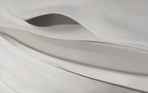
The paintings below were images i found from different sites on the internet mainly from his own site which seems to display work from his gallery and residence, the Black House Art Museum, Chiang Mai.

He developed his works in to a simple but unique style of painting that is strictly Asian but seems to take elements from art of different  parts of Asia most notably Chinese and Thai but there seems to be other Asian influences in there which is probably the result of study trip around the Mount Everest region of the Himalayas.

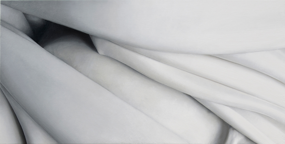
What I like about these more simpler works is that he manages to depict the beast’s anatomy and muscles with a few simple brush strokes and in some places even long continuous brush strokes that often resemble clouds adding to the mythical feel of the paintings.

Thawan Duchanee - Buffalo
Thawan Duchanee – Buffalo
Thawan Duchanee - Elephant
Thawan Duchanee – Elephant
Thawan Duchanee - Horse Real Name UnknownThawan Duchanee - Horse Real Name Unknown
Thawan Duchanee – Horse Real Name UnknownThawan Duchanee – Horse Real Name Unknown
Thawan Duchanee - Name Unknown
Thawan Duchanee – Name Unknown

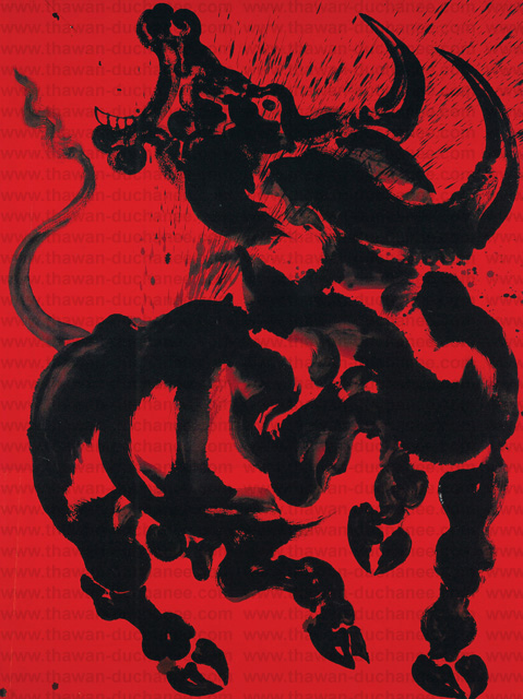
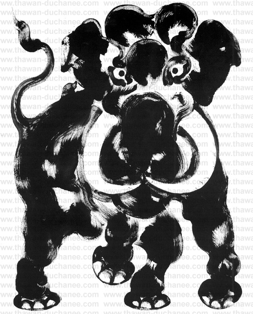
It is difficult to tell which painting tools he uses as he seems to change throughout his career some of the later pieces look as though parts of them could have been painted with an airbrush.

Thawan Duchanee - Power of Land Series
Thawan Duchanee – Power of Land Series
Thawan Duchanee -Power of Land Series
Thawan Duchanee Tiger and Monkey

Now and again I do find Thai artists that I get inspired by and Thawan Duchanee is one of them. I asked a few Thais what they new about him and what most of them seemed to say is that ‘He liked Black’, perhaps it will be a study visit to the Black House for me this winter. http://www.thawan-duchanee.com/ http://englishnews.thaipbs.or.th/ www.cakechooser.com

Research Point: Tutor Recommendation – Alison Watt

Alison Watt Part of the Phantom series, oil on canvas, 2007.

In my tutor feedback recommended that I look at 2 new artists the English artist Jenny Saville and Scottish artist Alison Watt. After a quick glance at some of their art work I decided to look at the paintings of Alison Watt first.

Alison Watt OBE is a Scottish painter, born in Greenock on 11 December 1965. She studied at Glasgow School of Art, graduating in 1988. Prior to graduating she won the John Player Portrait Award and as a result was commissioned to paint a portrait of the Queen Mother. Her first pieces to become famous were bluntly painted figurative canvases, more often than not female nudes, within light filled interiors.

In 1997 in an exhibition entitled simply ‘Fold’ she introduced fabric alongside these figures for the first time. In 2000 she was offered a solo exhibition at the Scottish national Gallery of Modern Art and was the youngest ever artist to be given this chance. This exhibition was called Shift and it consisted of 12 huge paintings that featured just fabric.

Alison Watt - Fold Exhibition
Alison Watt – Fold Exhibition

I’ve looked at many of her paintings and I wanted to say something like this ‘her early paintings seemed to be of the piece of fabric as a whole, the creases, the folds and the patterns that they make all on one canvas, painting cloth as a hyper-realist (if that makes sense) but it seems as though as she has developed, she has taken the same approach to painting fabric as Georgia O’Keeffe did with plants, flowers and other natural forms, moving towards painting more abstract with almost sexual qualities. In fact some of Alison Watts paintings echo the painting style of O’Keeffe.’

Alison Watt - Shift Collection of Scottish national
Alison Watt – Shift Collection of Scottish national
Alison Watt - Rosebud
Alison Watt – Rosebud
Alison watt - Riviere
Alison watt – Riviere
Alison Watt - Sabine
Alison Watt – Sabine
Alison Watt - Untitled II
Alison Watt – Untitled II
Alison Watt - Shoal 2013
Alison Watt – Shoal 2013
Alison Watt - Phantom
Alison Watt – Phantom

Looking at Alison Watts’ Paintings it seems like her earlier paintings of figure and fabric  helped her to see something in the folds, their beauty, energy, individuality and even sexual characteristics with each individual fold expressing something different.

Alison Watt - Echo
Alison Watt – Echo

The colour of the fabric in the paintings is something we take for granted in photos. We just see white because that’s what our eyes tell us it is, white fabric. If we look closer at Echo above for example, we can see blue, orange, pink and all the other colours that make up the light and shadows.

I had already thought about how I could draw a white door for example using lots of different colours and I think this maybe something I should try in my final assignment.


Pt5 – Research Point Part 2 – Using Line in the Style of Famous Artists

6 - Drawing in the Style of Giacometti

In this research point for this part of the course, Part 5, option 4 Drawing Figures we were asked to look at the different artists’ use of line which I did in my last post. However, I wanted to take it one step further and decided to try and ‘Draw in the style of’ some of those artists. Note I said ‘try’.

The first artist I tried to draw in the style of was Gustav Klimt, I thought drawing, not in the style of his bejeweled paintings but in the style of his erotic sketches would be easy, not at all, my lines just don’t flow that great and the drawing seems rather dull.

1 - Drawing in the Style of Klimt
1 – Drawing in the Style of Klimt

The second artist I decided to try and draw in the style of was Egon Schiele, I tried to imitate the jaggered lines of Schiele but I just didn’t get them quite right. it was hard to try and imitate Schiele when my model was a different build to the ones he drew. I’m not sure whether these first two drawings could pass for erotic art either.

2 - Drawing in the Style of Schiele
2 – Drawing in the Style of Schiele

I do feel that in the third drawing that I was successful in the task that I set out to do and that was to produce something in a similar style to David Hockney. Using myself as the model and drawing from the photograph it was much easier to try and get it right, having time to think about each line.

3 - Drawing in the Style of Hockney
3 – Drawing in the Style of Hockney

I don’t think that anyone could guess that I was trying to Draw in the style of Edgar Degas in the next drawing. I chose to draw with Conte pencil and white pastel over a pinkish wash in my sketchbook when I should have really been drawing on ingres paper which I had run out of. A clothed standing pose would have also been a better decision.

4 - Drawing in the Style of Degas
4 – Drawing in the Style of Degas

I think the 5th drawing, in the style of Jean-Auguste-Dominique Ingres was a decent attempt but again I would have been better with a different medium a sharp pencil on A3 or A2 drawing paper rather than 0.3 and 0.5 tip Rotring drawing pens in my sketchbook. However, I think I did quite well with the details and folds of the dress.

5 - Drawing in the Style of Ingres
5 – Drawing in the Style of Ingres

The first attempt (on the right in drawing 6) was probably my favourite drawing out of all these in this piece of research, producing something that was similar to the artist’s work and yet I believe, developing on it.The second attempt on the right however was not so great.

6 - Drawing in the Style of Giacometti
6 – Drawing in the Style of Giacometti

Pt 5 – Drawing Figures – Research Point – How Artists Use Line

Plague Episode

For this research point we were to look at the work of a range of artists, such as Ingres, David, Degas, Giacometti and Hockney and make notes about their use of line.

I have already started the line drawing exercise and so far I have produced drawings in ballpoint, drawing pen and even ink, a medium that I have been struggling with. For now the drawings I have produced for this exercise are ‘nice’ but nothing special and so I decided to hit this research point early to see how studying different artists’s use of line effects my line drawings from this point on.

Edgar Degas

I already researched Edgar Degas before starting on the last part of this course, Part 4, Drawing Figures and so I had already experienced Degas’s Use of line.

Most of Degas’s drawings were studies for finished paintings and most of these finished paintings such as his ballet dancers were able to depict energy and movement. His line drawings seemed to be experiments that helped him to achieve this.

Edgar Degas -Little Dancer

With Little dancer above it seems like the line acts as a frame to contain the minimal detail between them. If you take away those lines the figure would be difficult to make out and yet with the lines around the chalk and pastel, they help to contain enough detail to depict an ‘effortless gliding figure’ while the double lines in certain places help to capture movement.

Edgar Degas - Danseuse à la barre - Dancer at the Barre c.1880


With the dancer at the bar above he seems to have corrected his position while drawing the dancer in order to get a better prospective, however he hasn’t erased the lines from the corrected drawing, he chose to leave the lines rather than correct them which depicts the dancer’s former position and therefore ‘movement’.

Edouard Manet, Bust-Length Portrait, 1864-65

The bust length portrait of Edouard Manet above is something completely different, the flat line drawing of the suit helps to emphasize the more detailed head drawn with thicker lines, helping it to stand out.

Jean-Auguste-Dominique Ingres

Whenever I come across an artist that I am not familiar with I get excited and seeing the line drawings of Ingres was no different.

Unlike Degas who preferred chalk, graphite and pastel on wove, laid and eggshell paper etc. Ingres preferred a sharp graphite pencil on smooth white paper for his drawings.

Also unlike Degas his lines were smoother, cleaner and seemed to be more planned out. It’s hard to know which was drawn first, the figure or the faces, as like the Bust Length Portrait of Manet above the lines of the bodies in the drawing below seem to do the same job, to support the detailed faces.

Jean Auguste Dominique Ingres Portrait Drawing

Ingres not only uses heavier lines on the head to give a sense of three dimension but looking at the body of the figures he uses a darker heavier line on one side of the body and a thin crisp line on the other by doing this he manages to depict form and weight. This is something I had never even thought about.

The Alexandre Lethiere Family 1819

Gustav Klimt

Would it be wrong to look at Klimt’s erotic line drawings of seated women revealing themselves for this research point? In these drawings he captures his model in intimate and secret moments before ‘concealing them in his paintings beneath Sparkling Ornaments’ – Klimt, Gilles Neret.

Klimt’s erotic drawings are drawn with wobbly, unfinished lines that continue to double over the top of each other to create a sense of writhing in ecstasy.

Klimt Seated Semi-Nude Reclining
Klimt Woman Seated with Thighs Apart

Alberto Giacometti

Giacometti was a Swiss, sculptor, painter, print maker and draughtsman and probably one of the first artist’s who’s drawings make me feel as uncomfortable as the annoying buzz of an electric light on a horror movie.

I love surrealist paintings but I find surrealist sculptor makes me feel kind of tense and that’s what I feel when I look at Giacometti’s portraits of Sartre and Diego below where he has built up the 3D

form of the face with expressive, straight heavy lines, making sure he defines the shape of the eye sockets.

Alberto Giacometti, Jean-Paul Sartre, 1946
Alberto Giacometti, Portrait de Diego,1958

On the other hand I really like the ballpoint drawing below where he has used a continuous wire like line to build up the 3D form.

Alberto Giacometti, ballpoint on paper. Giacometti House, Paris

David Hockney

After browsing the works of Alberto Giacometto with their intense, awkward lines, researching the line drawings of David Hockney is a breath of fresh air. To me Hockney draws with what I would describe as relaxed baggy lines and creates a sense of three dimension by using space and perspective, leaving more space between the lines that form the shapes of the body parts that appear to be in the foreground, and in some cases, exaggerating shapes such as line drawing 2 and 5 below.

Line Drawing David Hockney 1
Line Drawing David Hockney 2
Line Drawing David Hockney 3
Line Drawing David Hockney 4
Line Drawing David Hockney 5

 Egon Schiele

Egon Schiele used rickety lines to describe skinny, almost anorexic women in sexy poses. It seems like he was describing not only the complexity of the human skeleton but also the frailty of these female figures and in doing so capturing what he found sexy or erotic about them.

Egon Schiele Reclining Nude
Egon Schiele Reclining Nude in Green Stockings
Egon Schiele Reclining Woman with Legs Apart 1914
Egon Schiele Standing Female Nude with Black Hair 1910

Jacques-Louis David

At the first look at the line drawings of Jacques-Louis David below it seems that the four drawings are in two different styles, while all all of them serve one purpose and that is as studies towards a finished piece.

Study for The Oath of Horatii

The study for The Oath of Horatii above and the Father of Horatii below use fine pencil lines to frame figures with little or no tone, but on the other hand the tone and form of folds on the figures are wearing are well detailed like he almost intended them to be manikins for the drapery which helps to describe the 3D form of the figures more than the lines around them.

Father of the Horatii
Death of Meleager
Death of Meleager

For the Death of Meleager above and the Plague Episode below it seems to be the opposite. He has drawn thick ink lines that act as a container for the ink wash shadows cast be the folds of the drapery and figures of the plague victims.

Plague Episode
Plague Episode

Project The Moving Figure, Research Point, People Watching

1st Notes People Watching

It’s hard not to watch people in Thailand, I’ve been here 14 years and I can’t say there hasn’t been a day gone buy where I haven’t studied them, scrutinized them, complained about them. The speed they walk, how loud they talk, picking noses plus a multitude of other habits that makes the Thai race just what it is, unique!

Last Friday was one of the best opportunities I had to sit down and make notes about what I saw. In the school holidays, February to May, I work at the language centres, which are in shopping malls and in one of the malls, ‘the Central Plaza’ they usually have sales in a roundish area by the entrance on the basement floor right outside Macdonald’s, but on Friday the whole area was clear for the first time in months, so I grabbed myself a Mac-fish set and sat at a table right at the open entrance of the fast food restaurant so I could see people coming and going.

From where I was sat I could see people going up escalators, people going down them, people meeting their friends but mostly people dawdling about in slow-motion staring at their mobile phones, they were probably very active in their online social world but to the bystander, me, the scene that was coming together in the empty floor space reminded me of AMC’s Walking Dead.

I made quite a few notes about my findings, as you can see below however in my notes I stated that Thais have less types of walks than westerners.  To be truthful they probably have more. All the gaits that you’d find in the UK plus a good few of their own as I mentioned below, You just don’t see many people walking fast in Thailand.

1st Notes People Watching

Although it it could be fare to say that technology is making people walk slower all over the world as they spend more time looking at the screen while they’re walking down the street.

2nd Notes - People Watching
2nd Notes – People Watching\

I also mentioned in my notes that the locals actions and mannerisms make them seem more immature than those in the west but then again, how do I know, I’ve been in Thailand 14 years, I look on Facebook and see photos were the subjects can’t pose without making hand gestures, and I’m not sure whether it’s insecurity or immaturity brought on by technology. I know it makes me act younger.

2nd Notes - People Watching
2nd Notes – People Watching

One thing I do find here in Thailand is that there is a unique class of people who I have named the ‘drama queens’ a group of young woman who dress, act, walk and talk like the  characters on Thai soap operas, over-the-top-characters that have had a massive influence on teenagers and young women, not just in the way they act but in everything else.

Project Structure : Research Point : Anatomy Drawing

4 - Finished Anatomical Drawing Half and Half

When I saw this research point coming up I already had ideas and when I finally got here everything started to fall into place. The human anatomy is such a massive subject and I knew that I wouldn’t be doing a full anatomical drawing as I didn’t want to get stuck in a hole researching for days, so I decided to focus on my favourite part of the human anatomy, the back.

While searching for ‘Anatomy Drawing’ on Google I came across a link on Artist’s Daily, 
Anatomy Drawing for Artists: An Art Lesson on Studying & Drawing Anatomy 
. The free e-book, written by Dan Gheno has got some nice images in and it doesn’t give you any shortcuts but I did get some ideas from it.

Firstly, like anatomy drawings by Michelangelo and Leonardo da Vinci, a lot of the works by artists in the free e-book are on coloured paper and so I decided that this drawing would be a drawing in Conté Crayon on coloured pastel paper similar to the paper that I had used in Assignment 2 – Observations in Nature. I had used Conté  pencils before but not the sticks that I had bought from Silpakorn University, over a year ago now, before I started this course.

I had to start somewhere and so the same night that I downloaded the free e-book I took my camera to my girlfriend’s apartment and after a short debate I decided that it would be my back that I would be drawing and so we did a session in the gym, followed by a dip in the pool to ‘get a pump on’ so that I could get some muscle definition showing in the photographs.

I had quite a few photographs taken in the gym and in the shower  at different angles…from the left-hand side, from the right-hand side, arms stretched out at the side, arms at the front, arched back etc. Eventually I found the right photograph for the drawing, a photograph that would help me see where the main muscles and bones were.

1 - Photo with Best Muscle Definition
1 – Photo with Best Muscle Definition

After choosing a good photograph for this research point I made a quick pencil sketch in my A4 sketchbook and then did a search for some anatomical drawings of muscles and bones. After discovering 2 great books ‘Grant’s Atlas of Anatomy‘ and ‘Bridgman’s Complete Guide To Drawing From Life‘ downloading them both in PDF format and having a quick browse through, I went back on line and looked for Anatomical Drawings of back muscles.

2 - Pencil on A4 Sketch Book Preliminary Drawing
2 – Pencil on A4 Sketch Book Preliminary Drawing

I found a good image in a similar pose to mine depicting the major back Muscles – www.physioadvisor.com.au and then remembered a quote that I read in the free e-book by by Dan Gheno earlier ‘ A helpful exercise is to first draw the figure in simple, flat silhouette form. Then, try to superimpose your understanding of the bones within’. However, instead of trying to superimpose my understanding of the bones within I decided that I would try and superimpose my understanding of the major back muscles.

Back Muscles - http://www.physioadvisor.com.au/
Back Muscles – http://www.physioadvisor.com.au/

On a thick tracing paper I used black and sanguine Conte pencils as well as my Derwent Chinese white pencil to quickly sketch in the major muscles over the preliminary drawing below. The end drawing wasn’t perfect but it was a start. From here I enlarged my drawing onto the coloured pastel paper.

3 - Muscles, Conte Pencil on Tracing paper
3 – Muscles, Conte Pencil on Tracing paper

The drawing on tracing paper looked more like a space suit from the ‘Riddick’ movies than anything else so before I committed myself to the final drawing, which actually at this point, I didn’t know would be an ‘in the flesh’ or muscle drawing, I had to do a bit more research.

Fortunately for me the back seems to be the anatomy artist’s favourite subject, as the back plays a significant part in human society and is the largest part of the human body and so finding good anatomical drawings of the back muscles in full display is not difficult, particularly the first layer of posterior torso muscles which is all I really wanted at this stage.

I found a great website www.medical-artist.com that had some great illustrations on so between the site and Grant’s Atlas of Anatomy I was able to check whether or not my earlier drawing and superimposed muscle drawing were correct.

It was time to start on the bigger drawing so I enlarged the smaller drawing onto an A2 sheet by drawing a grid and then drew my outline. I started on the left hand side with white and brown conte sticks, drawing the creases of the flesh by taking the colour off with a putty rubber to depict muscle tone.

4 - Finished Anatomical Drawing Half and Half
4 – Finished Anatomical Drawing Half and Half

As I crossed over onto the left hand side it was easier to see how I would be able to work in the muscle lines in order to make it look like a dissection drawing. This time the muscle drawing was more anatomically correct but it took more colours than what I expected, working with brown and white Conte sticks plus Sanguine and Black Conte pencils.

When I finished the drawing, I thought maybe I should label the muscles by numbering the muscles and then writing the name of the muscles in a key, top left to show some understanding of the muscles drawn. However, so as not to ruin it, I decided to keep it as it is.


Research Point: Different Artists’ Depictions of Landscape

Church Heart of the Andes

For the first research point in this part of the course, ‘Drawing Outdoors’ We were asked to look at different artists depictions of landscapes, for example Albrecht Dürer, Claude Lorrain and L.S. Lowry.

Albrecht Dürer

Albrecht Dürer 1471-1528 gave us some of the earliest and finest works of the ‘Northern Renaissance’ with some wonderful landscape paintings, however, with the next exercise ‘a sketchbook walk’ coming up, I decided to look for some of Dürer’s more sketchy works.

The first painting I came across was a painting called Quarry, I searched on Google to try to find more information on this painting but to no avail, all I found was other paintings in colour of the same name. Looking at the painting at a first glance I thought it was a drawing in pencil but then realized it was a watercolour but it does look like he may have used other media such as pencil to finish the piece. The mark making techniques he has used in the painting are very simple and yet he has managed to create a good sense of three dimension with thin strong lines for the turfs of grass and weeds in the foreground to the wide, smudged brush strokes for the trees in the background and everything else in between. I particularly like the mark making techniques he has used for the leafs of the trees as he has depicted what we see has very complex objects with a series of simple shapes.

Quarry - Albrecht Durer
Quarry – Albrecht Durer

Another painting that I really liked was ‘Forest Glade with a Walled Fountain by which Two Men are Sitting’. I haven’t found the details of this drawing but it looks more like a drawing in pen and ink than a drawing. At first I couldn’t determine whether the artist had no time to finish the painting or if he had deliberately left it unfinished but then I realized that he was trying to show the light shining in through the trees on the left hand side of the picture and the dark forest in the background.

Forest Glade with a Walled Fountain by Which Two Men are Sitting 1505
Forest Glade with a Walled Fountain by Which Two Men are Sitting 1505 Albrecht Durer

Again, like the first painting he has used many different mark making techniques using hatching and cross hatching for the fountain, as well as the two men and various hatching techniques to show the density of the forest behind. I can also see that he has used the same simple marks for the leaves on the trees as the first painting which works really well.

L.S. Lowry (1 November 1887 – 23 February 1976)

Laurence Stephen Lowry, was born in Stretford, Lancashire in 1887 and as a northerner as always been a favourite  of mine.

Lowry is famous for his paintings depicting life in various industrial districts in the Northwest of England in a very distinctive style of painting.

Because of his use of stylised figures and the lack of weather effects in many of his landscapes he is sometimes characterised as a naïve “Sunday painter”, although this is not the position of the galleries that have organised retrospectives of his works. – Wikipedia.

L.S. Lowry Industrial Landscape 1955

The oil painting, Industrial Landscape 1955, below is a great example of Lowry’s industrial landscape paintings. What I like about Lowry’s paintings especially this one is that the building, bridges, houses etc. are made up of very simple shapes, mostly rectangles and squares and yet he still manages to create feeling in his paintings with the help of factory smoke and dismal skies plus the background that fades to almost nothing helps not only to create a sense of distance but of smog and pollution being caused by the factory chimneys. Although the perspective is not perfect he creates a sense distance by painting the landscape lighter and lighter as he moves into the background eventually fading to a blue-grey; as well as painting objects like trees, bushes, chimneys and spires with simpler and smaller shapes so that they appear far-off.

L.S. Lowry An Industrial Landscape 1958

I tried to find a larger image of the following painting but to no avail. Also titled An Industrial Landscape the painting was bought for 300 GBP in 1959 and sold for 600,000 GBP in 2007. Again you can see how he paints the buildings in lighter and lighter shades in the background to give the impression they are disappearing into an industrial smog.

Finding a Substitute for Claude Lorrain

I noticed that I would be researching Claude Lorrain again later on in this module and so I set out to find a substitute. I first searched for Claude Lorrain on Google which took me to the Baroque period from there I clicked on a link to Landscapes which took me to page of wonderful landscapes on Wikipedia with Landscape Paintings of artists from all different periods.

The first painting that jumped out at me was a painting by Caspar David Friedrich, titled Wanderer above the Sea of Fog, 1818, which is a classic image from German Romanticism. I recently watched a series of documentaries about German art on the BBC and this painting was used in the credits. My kind of painting really, simple and yet the landscape he has painted catches the imagination wondering what is below the peaks, and below the cloud line. Again as in paintings by the other artists in this research point the trees on the mountain ridges are made up of very simple squiggles and other shapes but its not something you notice straight away. I love the way he has used what I think are long twisted brush strokes with a darker colour over the lighter colour in the background to create the effect of mist rolling down the ills to the center of the picture.

Caspar David Friedrich: The wanderer above the Sea of Fog
Caspar David Friedrich: The wanderer above the Sea of Fog 1818

The next image that caught my attention was a painting by Frederic Edwin Church titled The Heart of the Andes, 1859. Unlike the previous painting this is by no means simple, I couldn’t even begin to think about where this guy started or what techniques he used, say, for the trees, but the mountains in the background are pure inspiration. They seem to be layers and layers of colour painted over the blue sky background making their way to ground level with the white snowcapped mountains in the background taking your mind on a journey around the mountains in front to get to them.

Church Heart of the Andes
Frederic Edwin Church Heart of the Andes

Research Point: Dog Anatomy and George Stubbs

George Stubbs an engraving from The Anatomy of the Horse

In this research point we were asked firstly to look at the skeletal structure of the cat, dog or horse and then secondly t research the anatomical drawings of George Stubbs.

The Skeletal Structure of a Dog

For the first part of the research point I decided to take a look at the skeletal structure of a dog, I’ve never been that interested in domestic cats, big cats on the other hand are a different story.

Firstly I found a great little video on YouTube showing the skeleton of a dog while trotting, getting familiar with the animal in motion I think is important when depicting movement in drawings.

Dogs have the same skeletal structure all though the length and shape of the bones changes from breed to breed with difference in height, width and length a Dachshund for example would have short leg bones compared to say a Great Dane and an English Mastiff would have a broad rib where as a Greyhound would have a deep rib cage. The biggest noticeable difference being the size and shape of the skull.

Skeletal Structure of the Domestic Dog

The canine skeleton is into two sections which are the Appendicular skeleton which includes the front and back legs and hips and the  Axial skeleton which includes the  includes the head, spine, tail and chest area.

Skeletal Sttructure of a Daschund
Skeletal Sttructure of a Dachschund

When looking at the dogs skeleton for the first time it’s amazing to see how much leg there is above the knee and even in the Dachshund skeleton the legs are suprisingly long.

Great Dane and Chihuahua Skeletons
Skeletal Structure of a Greyhound

The Anatomical Drawings of George Stubbs

Mares and Foals in a River Landscape 1763-68
‘Mares and Foals in a River Landscape’, 1763-68 (oil on canvas)

I can’t lie, I had never heard of George Stubbs before taking this course and to be honest paintings of horses in front of beautiful scenery have never really interested me, for some reason they remind me of sitting in gloomy houses on rainy days. Over my 40 years I have probably seen prints of George Stubbs’s paintings many times in families and friends homes and the surrounding environments have never really made them stand out. Not that I wouldn’t pay them the respect they deserve if I saw the actual paintings in a gallery environment.

Whistlejacket, is a name that I have heard before, but I’m not sure from where, looking at the painting it does look quite familiar and this unlike say ‘Mares and Foals in a River Landscape’, is not only a very likeable painting but the detail he has captured in this work is quite stunning not only has he managed to capture the muscle tone in every part of the horses body but he has depicted perfectly the texture of the horses hair in its body, main and tale. I love the way he has captured the defined muscle in the back legs to depict how the back legs are taking the weight of the rest of the horse as it rears up. It is a very beautiful piece and reminds me of the Study of a Horse by Leonardo da Vinci that I posted in my previous research point.

George Stubbs an engraving from The Anatomy of the Horse

I absolutely love his anatomical drawings they’re quite dark and are more up my street than his finished pieces. Looking at the Dorsal View off the Muscle Structure of a Progressively Dissected Horse, Study No.7 from The Anatomy of the Horse, 1766 you can see how this study of the muscles in the hind legs of the horse has informed him of how the muscles should look in different positions, and how even after the completion of Whistlejacket, a painting that he was commissioned to paint by the 2nd Marquess of Rockingham of her champion racehorse 4 years earlier he was still persistent to take his realistic paintings of horses to the point of perfection.

Stubbs was born in Liverpool in 1724. His father was a currier and as a child he would help his father in his job stretching and burnishing leather for the local tannery. He moved to a remote farmhouse in Lincolnshire in 1756 with his lifelong partner, there he began work on ‘the Anatomy of the Horse’ a book of engravings illustrating the many layers of the horse’s anatomy from its skin to its skeletal structure.

He had a ready supply of cadavers (horse corpses) from a nearby tannery which he strung up from the roof on hooks in different poses as required. He thoroughly recorded his dissections with drawings and notes at every level as he peeled the creatures through their skin, muscle and all the way down to the skeleton. The book took him 18 months to complete and was finally published in 1766.

George Stubbs Skeleton of a Horse

In ‘The Skeleton of a Horse’ 1766 (engraving) he has captured the stance of the horse so well that it seems to be a live like an x-ray or CGI skeleton and you can definitely see how this has helped him capture the spirit of the horses in his finished paintings.

Bibliography:

http://www.artyfactory.com/art_appreciation/animals_in_art/george_stubbs.htm

http://www.wikipedia.org/

http://www.youtube.com/watch?v=fyot9IlVw1c

Research Point – Ben Nicholson

Ben Nicholson Mousehole 1947

Born in to an artistic family in Denham, Buckinghamshire in 1894 Ben Nicholson was the son of artists William Nicholson and Mabel Pryde.  In 1896 the Nicholson family moved to London where Ben was educated at the Tyttenhangar Lodge Prepatory School in Seaford before becoming a boarder at the Gresham’s School for boys in Holt, Norfolk. Ben Nicholson began his training as an artist in London at the Slade School of art, where he studied from 1910 – 1911, then from 1912 to 1914 he travelled between France, Spain and Italy.

In 1920 Nicholson married is first wife, painter Winifred Roberts to whom he had three children, two sons, Jake and Andrew and a daughter Kate, who also became a painter. From 1923 Ben and Winifred split their time between England and Switzerland spending their winters in the southern Swiss town of Lugano and the rest of the year was divided between Cumberland, where they made their home for that decade and London While In London following an exhibition with his wife Winifred he was invited to join the 7 & 5 Society, he was made chairman of the society in 1926.

Nicholson’s early paintings were still-lifes influenced by the works of his father but then after his first solo show at the Twenty-one gallery he began experimenting with abstract painting influenced by Synthetic Cubism which he implied in all his works thereafter. His works throughout the 1920s were of deceptively simple table top still-life’s and landscapes painted in Switzerland, Cumberland and Cornwall, making his first visit there in 1928.

While visiting France in 1932 and 1933, Nicholson became familiar with the works of artists such as Hans Arp, Joan Miro, Piet Mondrian and Alexander Calder who had settled in Paris in the 1920s. Nicholson was successful in fusing the European trends into a new style that would become identified as his own.

He made these visits to Paris with Barbara Hepworth; Winifred and Ben were divorced in 1938 a break up that was brought on by his growing relationship with Wakefield born sculptor. Hepworth had kids to Nicholson in 1934, three triplets and after his divorce in 1938 she would become his second wife.

Together they moved to Cornwall in 1939 and in 1943 he joined the St. Ives society of artists. Following the Second World War Nicholson lost faith in the ‘utopian promise of geometric abstraction’ and resumed painting landscapes adding colour to his abstract reliefs to emphasize the fundamental unity between nature and abstraction. Hepworth and Nicholson were divorced in 1951.

Throughout the 1950s he achieved international recognition as an artist through a series of awards which included the first Guggenheim International Painting Prize in 1956 and the International Prize for Painting at the São Paulo Biennale in 1957. From 1954 – 1961 retrospective exhibitions of his work were held throughout Europe including shows at the Venice Biennale and Tate Gallery and in several cities in the USA in the 60’s and 70’s.

Nicholson married his third wife, German photographer Felicitas Vogler in 1957 and the two moved to Ticino in Switzerland in 1958 where he again began to concentrate on painted reliefs. In 1968 Queen Elizabeth awarded him the O.M. (Order of Merit) and in 1971 after the end of his third marriage he moved back to England where he died in London in 1982 at the age of 87.

Researching this Artist

I used many different websites researching this artist as the information I found was confusing and contradictory, with information differing from site to site and so I chose to gather information from the websites of establishments that I found out at shown his work, The British Council, Tate Gallery and the Guggenheim comparing the details with the biography www.oxfordartonline.com.

I have never heard of Ben Nicholson before although his second wife Barbara Hepworth is very familiar to coming from Wakefield I have seen her works in West Bretton (Yorkshire Sculpture Park). Since I have been living in Thailand they have opened the Hepworth Center in her name in my home town so it was interesting to read about their relationships, both personal and professional.

Although I have never heard of the artist by name before, I did recognise a few his works, including 1934 (Still Life – Birdie),  1933 (Study of a Head) and 1932 (Head and Mug in a Greek Landscape).

Ben Nicholson Mousehole 1947

Why does he simplify still life forms and negative space and superimpose them on a Cornish Landscape?

I think the answer to this lies in the above text where it says Nicholson ‘resumed painting landscapes and added colour to his abstract reliefs to show the fundamental unity between nature and abstraction’.  Which maybe reflected in what he said in a letter from Nicholson to Patrick Heron (9 February 1954) ‘All the “still lifes” are in fact land-sea-sky scapes to me.’

Bibliography:

http://www.tate.org.uk/art/artists/ben-nicholson-om-1702

http://www.artrepublic.com/biographies/85-ben-nicholson.html

http://en.wikipedia.org/wiki/Ben_Nicholson

http://www.thefreelibrary.com

http://www.oxfordartonline.com/

http://visualarts.britishcouncil.org/

Research Point B – 2 Contrasting Artists, Gustave Courbet

Gustave Courbet auto retrato

For this research point I was to find two artists who work in contrasting ways: from tight, rigorous work to a more sketchy style. For the artist who worked in a sketchy style I had already researched Egon Scheile in Part A so now it was time to find an artist who did more tight, rigorous work.

I was all ready to research a modern artist for this part of this research point and discovered Grant Wood while looking at Egon Schiele’s work, but then on a last minute search I found another artist that was just as new to me.

While searching for images  I came across a picture that I had seen many times and for some obvious reason I thought was a picture of Johnny Depp in one of his movie rolls. I was surprised to find out that it was a self-portrait called ‘A Desperate Man’ by an artist called Gustave Courbet, the father of realism and even more interesting the artist that first coined the phrase.

http://en.wikipedia.org/wiki/File:Gustave_Courbet_auto-retrato.jpg

Born in Ornans, France to a wealthy family, Gustave Courbet went to Paris in 1841 with the intention of studying law but soon decided that he would study painting and did so by copying the paintings of the French, Flemish and Spanish masters in the Louvre.

His style was shaped near the start of his career when he chose direct his paintings to observed reality, among his early paintings were self portraits portraying himself in various roles he also painted seascapes, still-lifes and figurative compositions.

Courbet’s figurative work was somewhat controversial because he addressed social issues in his paintings portraying subjects that were considered vulgar at the time such as rural hierarchy, peasants and the poor working conditions of the underprivileged.

Courbet’s style became known as realism however instead of using perfect line and form in his paintings he dealt with realism with spontaneous brush strokes and a rough handling of paint achieving a sense of direct observation by the artist while depicting the inconsistency in nature.

Although Gustave Courbet and Egon Schiele are artists of two different movements living at two different times their lives are very similar in that they seem to demonstrate freedom of expression in their art by painting subjects that were pornographic or controversial at that time. The poses by Courbet’s nudes such as La Femme Aux Bas Blancs, (Woman with White Stockings), 1861 and The Origin of the World (L’Origine du monde) (1866) remind me very much of Schiele’s paintings; as though Schiele could have been influenced by the artist. Both artist’s also served time in prison.

I’m not particularly turned on by the works of the old masters and so there are a lot of Gustave’s paintings that I don’t find appealing, but there are two or three that I think are brilliant simply because I can imagine how sensational they were at that time being so ‘real’ when photography was still in it’s infancy.

http://en.wikipedia.org/wiki/File:Origin-of-the-World.jpg – The Origin of the World (L’Origine du monde) (1866)

Gustave Courbet auto retrato
Self-portrait (The Desperate Man), c. 1843–1845 (Private collection)
Gustave Courbet Autoportrait
The man with a pipe Self-portrait, 1848-49

Bibliography:

http://www.ibiblio.org

http://en.wikipedia.org/