Pt 5 – Figure Drawing – Tonal Studies

Tonal Portrait in Pastel

The first drawing I did for this exercise was a portrait of my daughter. I felt guilty that I have used my girlfriend as a muse for most of the figure drawing exercises in this course and so I decided to make it up for it with a tonal portrait  of my oldest daughter.

For this portrait in pastel I used mostly diagonal single hatching on a dark blue Ingres paper. I am really happy with the finished drawing but I seem to be having the same problem with positioning as I didn’t draw an outline first I just went straight into building up the picture with hatching starting at the cheek.

Tonal Portrait in Pastel
1 – Angel in Tone

Ideally I should have done the next drawing in pencil, maybe on a thick watercolour paper but I decided to go with charcoal on a large sheet of paper. The proportions are good but other than that the drawing is quite sloppy.

Tonal Drawing Nude Charcoal
2 – Tonal Study in Charcoal

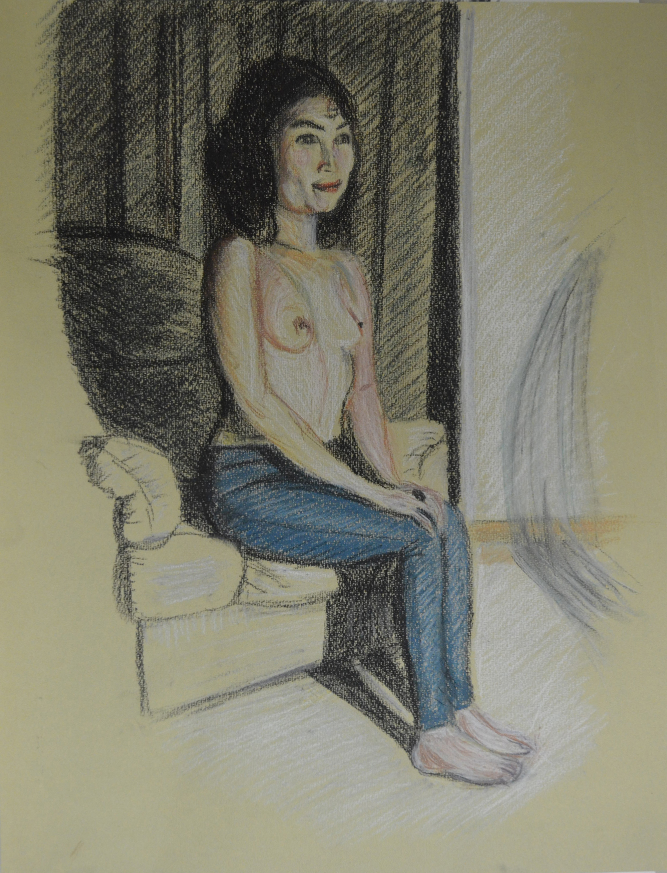
I did the next drawing in pastel on a beige Ingres paper using the colour of the paper as a neutral tone for the chair and the upper body. The drawing looks slightly out of proportion and indeed it is, but only slightly I was drawing with the board on the easel, I spent most of the time drawing while holding the easel tilted towards me to try and avoid this.

Tonal Study Nude in Colour Pastel
3 – Tonal Study using colour

This is a photograph that I took with my phone of the drawing on the easel tilted back while I was working on it. You can see the difference in proportions.

Drawing with Angled Easel

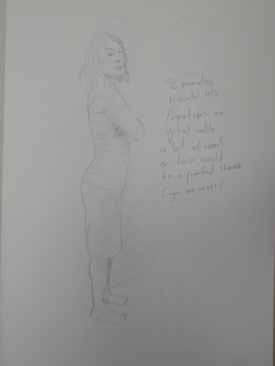
The next drawing was also a quick one but this time from life in Conte Pencil and White Pastel on eggshell (I think).The outlines are probably too strong tho and it may have been better to build up the background and so I continued to draw until I had a drawing I was satisfied with.

Tonal Study Nude with White Pastel
5 – Tonal Study with Conte Pencil and White Pastel

This time I chose pastel pencil for my medium and beige Ingres paper and working from a photograph I drew with flowing hatching that followed the contours of the body building up the tones with about 8 different colours. The results were great but again the positioning was still not so great and so I decided to improve on this by starting a new drawing, something that I can send of for formal assessment.

Tonal Study in Pastel Pencil
6 – Tonal Study on A3

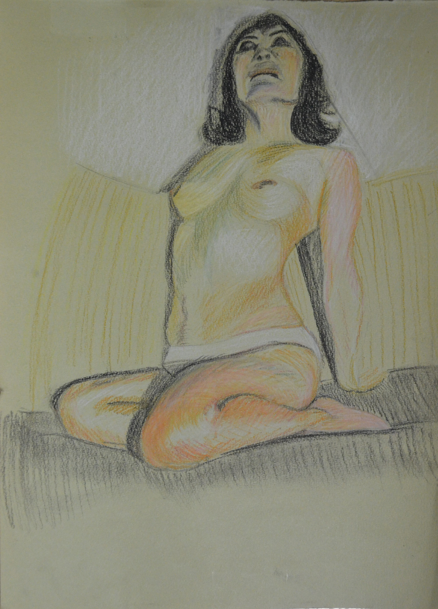
Working mostly from the last drawing until I got to the face that is I did my best to position the figure on the A3 paper so I could fill as much as the paper up as possible, it was definitely an improvement. The proportions of her breasts and bum in the last drawing were probably more realistic though as I went with the flow in this last drawing. The face is a lot better but I was warned by my girlfriend not to mess about with it and to leave it as it was and so I did.

Large Tonal Drawing in Colour Pastel
7 – A2 Tonal Drawing in Pastel Pencil on Ingres

A Fresh Try at Tonal Studies

Unhappy with most of the tonal drawings above and buy know getting slightly bored of using pastel on Ingres or charcoal I decided to have another go at the exercise and began researching other possible techniques and mediums.

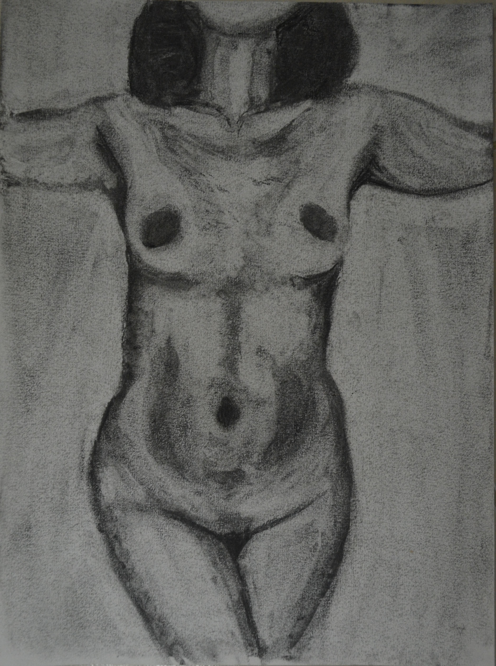
Firstly I looked at lifting off charcoal rather than drawing with it and after completing the drawing below I decided that this technique was suitable to drawings of parts of the body rather than the whole figure.

Charcoal Study Lifting off

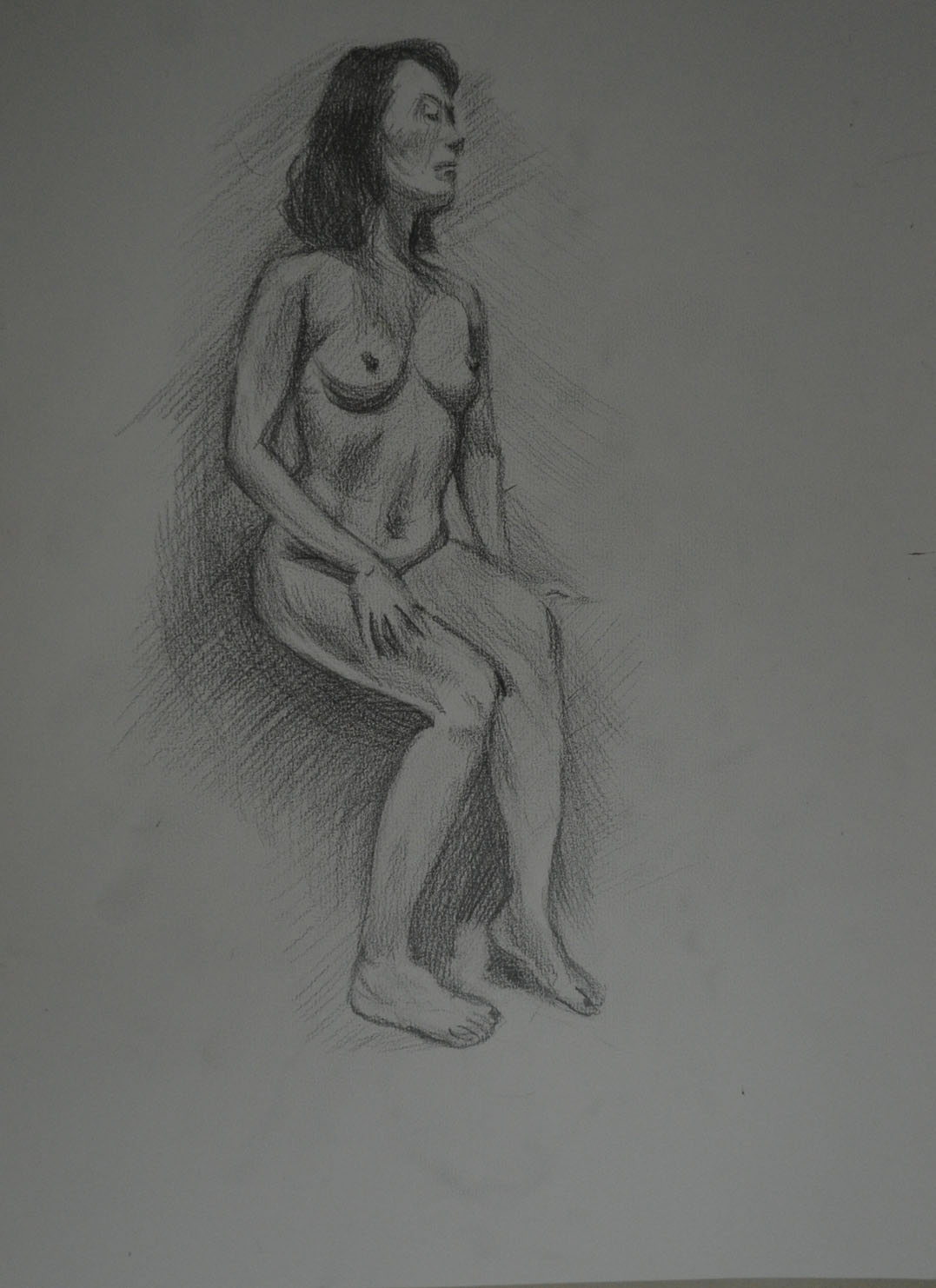
I then did a quick tonal study from a photograph in 6B pencil, this was great for hatching and I was able to build up the form really well but it I still wasn’t satisfied knowing that I could find abetter medium for these tonal studies.

Tonal Study in 6B Pencil

Researching the Old Masters

I remembered the studies in red chalk by the old Masters and so I decided to take a closer look at some of these drawings. I looked at drawings of several old masters including Bernardino Gatti, Raphael, Leonardo da Vinci and Michelangelo focusing on studies of the figure rather than portraits.

In several of the studies the artists seem to show light with white chalk and show shadow with darker chalk but it was quite clear to me that it was possible to depict light and shade by layering the one colour. However, because I already decided to do the next set of tonal studies on A3 drawing paper so I could draw on my lap I decided that red chalk wouldn’t be precise enough on A3 but a Sanuine Conte pencil would be an excellent substitute.


Bernardino Gatti Il Sojaro - Study of Horizontal Legs
Bernardino Gatti Il Sojaro – Study of Horizontal Legs
Leonardo da Vinci - Study of a hand
Leonardo da Vinci – Study of a hand
Leonardo da Vinci, A nude man from the front, c. 1504-1506, red chalk and pen and ink
Michelangelo Buonarroti - Seated Young Male Nude
Michelangelo Buonarroti – Seated Young Male Nude
Michelangelo - Study for an Ignudo, Red Chalk
Michelangelo – Study for an Ignudo, Red Chalk
Michelangelo - Nude study for the Battle of Cascina
Michelangelo – Nude study for the Battle of Cascina
Raphael - Red chalk study for the Villa Farnesina Three Graces
Raphael – Red chalk study for the Villa Farnesina Three Graces
Michelangelo - Studies for Haman
Michelangelo – Studies for Haman
Study for Adam Michelangelo

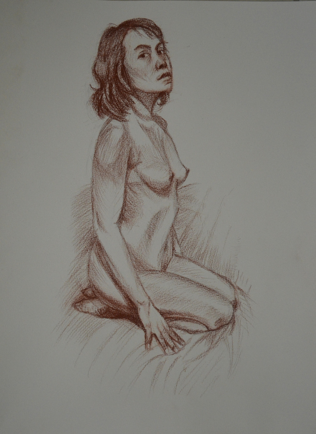
I decided to commit myself to one drawing an evening for five evenings spending at least an hour on each tonal study. The fully nude poses in my quick drawing studies helped me to get the proportions better than the semi naked poses above and so I went with very similar poses for the next group of drawings.

For the first of these drawings was probably the most difficult of the poses and took the longest time to draw. I used a black conte pencil for the darker tones, this was probably out of insecurity than anything else, so to was the drawing of the bed between the legs not believing that I had got the shape of the legs right.

First Tonal Study in Conte

The next drawing was better, this time I stuck to Sanguine and more precise hatching, the light source came from above and there was a lack of shadows but the pose worked well and until this point this was my best study so far.

Red Conte on White Paper

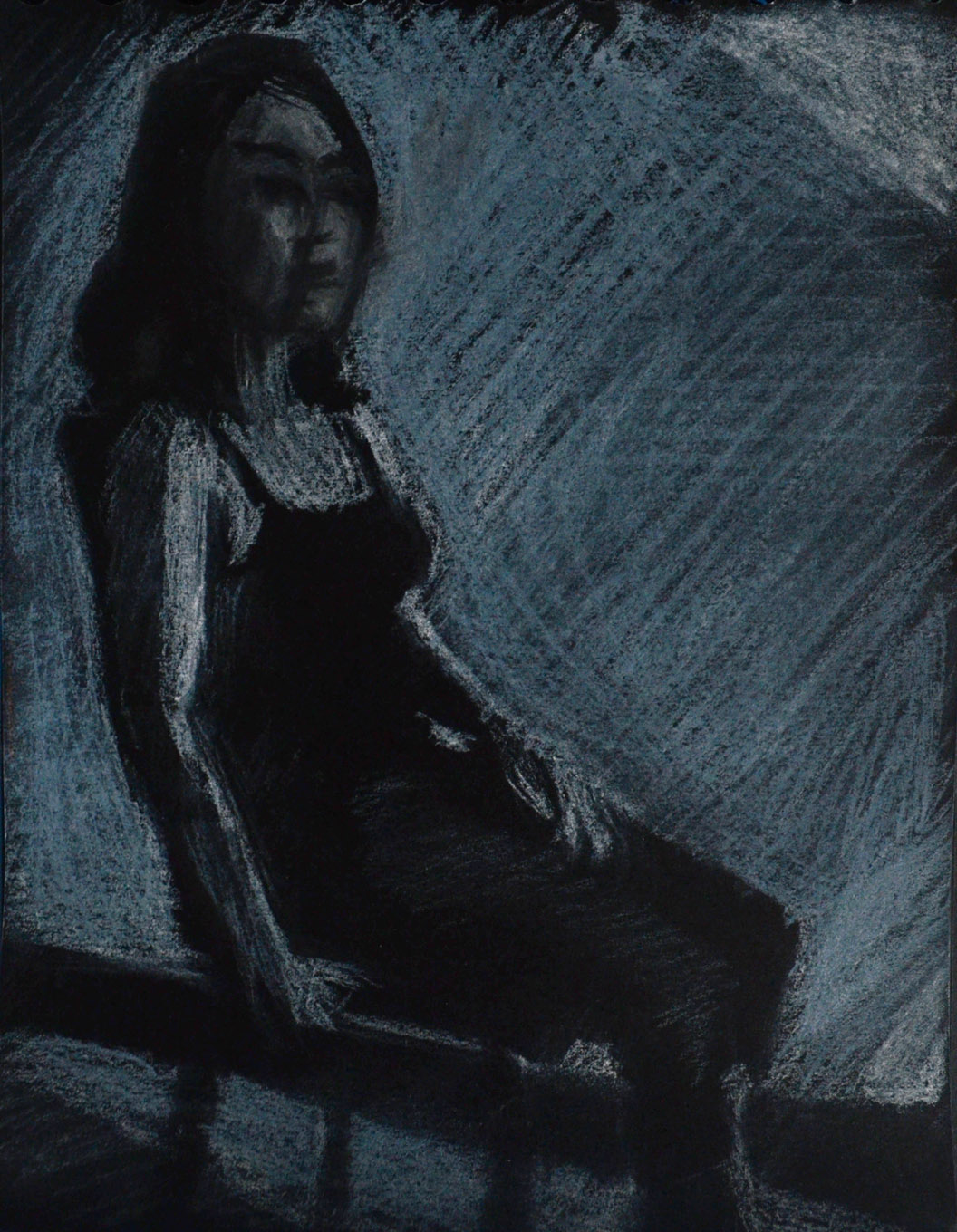
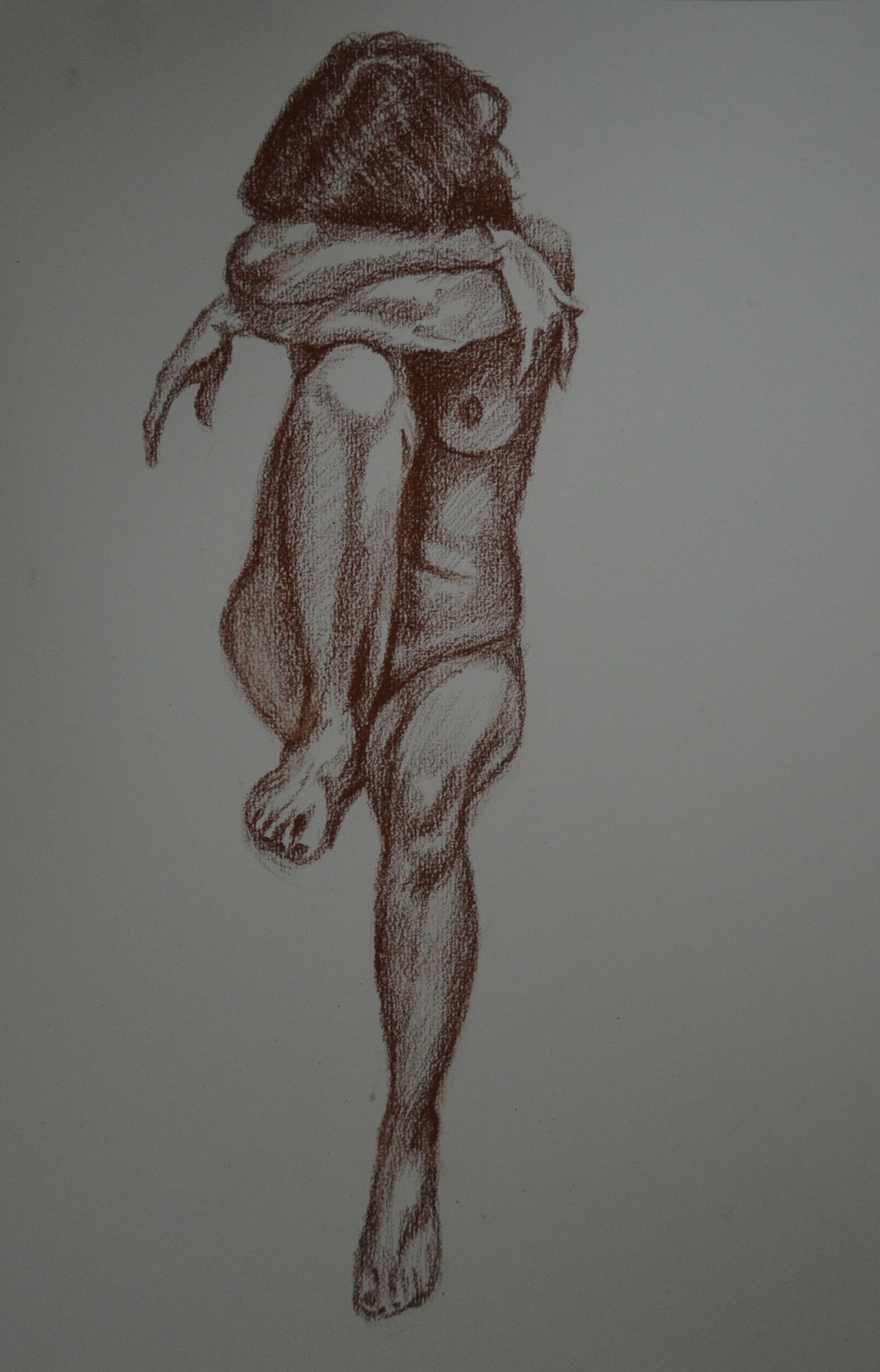
For the next pose was easier as I didn’t have to draw the details in the face. The proportions of the head look slightly out but this is due to the hair, the back of her head is actually flat like alot of Chinese and South east Asians. I liked not having to draw the full feet but getting the soles of her feet and toes right was still difficult.

2nd Pose Red Conte on White Paper

For some of the quick poses she was sat in the chair and I actually drew the chair, for the next drawing I left the chair out and glad I did. This study took almost as long as the first in this series to complete but drawing the shape was the easiest, most of the time was spent building up the layers of colour. This pose worked best for me and once I had drawn the outline I knew spending time on it would be rewarding, this became my favourite drawing to date, it actually reminds me of some of the red chalk drawings of the old masters.

3rd Pose in Red Conte

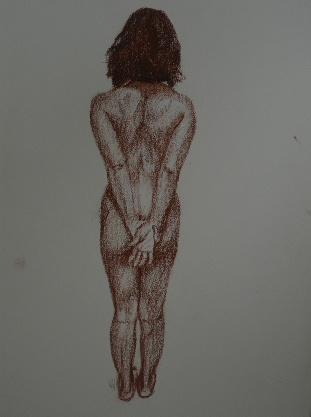
For the final drawing I chose a standing pose from the back with a V shape between the arms I drew something similar in the quick poses exercise and I knew that by choosing this pose I would get do depict muscle tone which is one of the most appealing features of the red chalk drawings by the old masters. The foreshortening of the feet made this a difficult pose though and I had to redraw the legs due to not getting the proportions right the first time.

Standing Pose in Red Conte

I really enjoyed working on the last five studies in Conte, this can’t be said for the first set of drawings in this exercise which I believe now were ruined due to rushing myself trying to get this 5th and final part of the course done quicker for  an earlier assessment.

It was really worthwhile to come back and have another go at this exercise with a clear mind, a better choice of drawing materials and a better choice of poses.

More Tonal Studies – George Seurat

Madame Seurat the Artists Mother

On advice from my tutor I looked at the works of George Seurat, I was familiar with his paintings but not his charcoal and Conte Crayon studies and so I browsed through Georges Seurat, 1859–1891 by Robert L. Herbert to take a closer look at some of his works and to give me some ideas on how I could approach this exercise differently.

Georges Seurat Le noeud noir
Devant le Balcon
Devant le Balcon


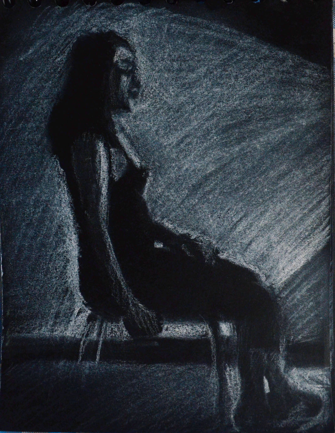
I was amazed at how he had managed to capture tone and wish I had come across these works earlier. I picked a handful of drawings out that really appealed to me, these were the darker drawings and the reason for me doing this was that I wanted to use a white conte stick on black pad drawing by candlelight, I have been doing some paintings by candlelight and I felt that I could gain some influence from Seurat’s works.

1st Tonal Drawing on Black Paper A6

Working in white conte stick the first drawing I did was very sloppy, however I did come back to this a bit later and add a bit of colour, it still wasn’t a tonal effect what I was hoping to achieve, the next two drawings were a lot better.

For the second drawing my girlfriend was i  a seated pose facing away from the candle, with her face in shadow it was easy to capture the silhouette of her face, The third drawing was not so easy as I sat her facing towards the candle and with the light shining on her face on these small sheets of paper it was very difficult to capture her correct facial profile.

2nd Tonal Drawing on Black Paper A6
3rd Tonal Drawing on Black Paper A6

The fourth study was much heavier and darker, this time mostly in orange, red and brown pastel. Facing towards me it was easier to capture her facial features, they are not perfect but I am happy with the overall effect of using these colours, that were very close to each other on the spectrum on the black paper. I feel that if any of these studied look like they have been influenced by Seurat’s drawings then this is it.

4th Tonal Drawing on Black Paper A6

Facing towards the candle, the 5th study was worked over and over again to get the proportions right, this compressed the layers of pastel which made the drawing looked aged and effect that I think looks really great but I didn’t manage to capture in the photo below.

5th Tonal Drawing on Black Paper A6

I took a break from colour for the sixth tonal study to have another go at drawing her facial features in conte, I hadn’t managed to depict them in earlier sketches and so I drew a closer to her at an angle to get them right.

6th Tonal Drawing on Black Paper A6

In the earlier studies with conte and pastel I had chosen to warm colours this was influenced by the orange-red tones of some of Seurat’s studies, for the final and probably most difficult drawing I chose cooler colours.

7th Tonal Drawing on Black Paper A6


Research Point: Tutor Recommendation – Alison Watt

Alison Watt Part of the Phantom series, oil on canvas, 2007.

In my tutor feedback recommended that I look at 2 new artists the English artist Jenny Saville and Scottish artist Alison Watt. After a quick glance at some of their art work I decided to look at the paintings of Alison Watt first.

Alison Watt OBE is a Scottish painter, born in Greenock on 11 December 1965. She studied at Glasgow School of Art, graduating in 1988. Prior to graduating she won the John Player Portrait Award and as a result was commissioned to paint a portrait of the Queen Mother. Her first pieces to become famous were bluntly painted figurative canvases, more often than not female nudes, within light filled interiors.

In 1997 in an exhibition entitled simply ‘Fold’ she introduced fabric alongside these figures for the first time. In 2000 she was offered a solo exhibition at the Scottish national Gallery of Modern Art and was the youngest ever artist to be given this chance. This exhibition was called Shift and it consisted of 12 huge paintings that featured just fabric.

Alison Watt - Fold Exhibition
Alison Watt – Fold Exhibition

I’ve looked at many of her paintings and I wanted to say something like this ‘her early paintings seemed to be of the piece of fabric as a whole, the creases, the folds and the patterns that they make all on one canvas, painting cloth as a hyper-realist (if that makes sense) but it seems as though as she has developed, she has taken the same approach to painting fabric as Georgia O’Keeffe did with plants, flowers and other natural forms, moving towards painting more abstract with almost sexual qualities. In fact some of Alison Watts paintings echo the painting style of O’Keeffe.’

Alison Watt - Shift Collection of Scottish national
Alison Watt – Shift Collection of Scottish national
Alison Watt - Rosebud
Alison Watt – Rosebud
Alison watt - Riviere
Alison watt – Riviere
Alison Watt - Sabine
Alison Watt – Sabine
Alison Watt - Untitled II
Alison Watt – Untitled II
Alison Watt - Shoal 2013
Alison Watt – Shoal 2013
Alison Watt - Phantom
Alison Watt – Phantom

Looking at Alison Watts’ Paintings it seems like her earlier paintings of figure and fabric  helped her to see something in the folds, their beauty, energy, individuality and even sexual characteristics with each individual fold expressing something different.

Alison Watt - Echo
Alison Watt – Echo

The colour of the fabric in the paintings is something we take for granted in photos. We just see white because that’s what our eyes tell us it is, white fabric. If we look closer at Echo above for example, we can see blue, orange, pink and all the other colours that make up the light and shadows.

I had already thought about how I could draw a white door for example using lots of different colours and I think this maybe something I should try in my final assignment.


Option 4 – Drawing Figures, Exercise Quick Studies

Drawing 23 - Standing HB Sketchbook

This exercised proved I had improved considerably since the Quick Poses in the previous part of this course and it was all the projects in between that had got me here. After studying proportions, form and structure I approached this exercise with much more confidence and I think this showed in the drawings I produced below compared to previous quick drawings.

Drawing 1 - Laying Down - 3B on A3
Drawing 1 – Laying Down – 3B on A3

All though I produced better sketches than I expected, it wasn’t a problem free exercise. The first problem I came across was with drawing the clothed figure. I found that I got the proportions almost spot on straight way with the model naked but with clothes on I got distracted. I fall into the trap of drawing the clothes rather than drawing the outline of the model and then drawing the details of the clothes in afterwards, i.e. folds. And because of this the proportions on the first few quick clothed figure studies are slightly out.

Drawing 2 - Lying Down - 3B on A3
Drawing 2 – Lying Down – 3B on A3
Drawing 3 - Lying Down - 3B on A3
Drawing 3 – Lying Down – 3B on A3

I Started off by drawing different poses clothed on A3 sheets of paper in 3B pencil before moving on to drawing nude poses in my sketchbook. For each pose I tried different pencil hardness’s, all the while trying to complete each new sketch in shorter periods of time, even managing to get my time down to 2 minutes for poses where it wasn’t necessary to draw facial features.

Drawing 4 - Lying Down - 3B on A3
Drawing 4 – Lying Down – 3B on A3

I drew the model in many different poses and for the poses that I had difficulty on the first attempt, I made a second and sometimes even third attempt at drawing the same pose, taking into consideration all I had learnt in Part 4, Drawing figures with each attempt the drawings improved.

Drawing 5 - Lying Down - 3B on A3
Drawing 5 – Lying Down – 3B on A3
Drawing 6 - Lying Down - 3B on A3
Drawing 6 – Lying Down – 3B on A3
Drawing 7 - Lying Down - 3B on A3
Drawing 7 – Lying Down – 3B on A3

The poses that created the most problems for me were the poses that needed a lot of foreshortening on the legs such as Drawings 4, 17 and 18. Another problem, that I encountered was when the models head was tilted to one site, however, there was more likeness in these drawings, even with the shorter drawing periods, than I have managed to capture before. I even had some success in capturing different facial expressions, like laughing and smiling (Drawings 20 and 21).

Drawing 8 - Standing Up - 3B on A3
Drawing 8 – Standing Up – 3B on A3

I found that looking for shapes within the figure such as the square within the folded arms in the drawing above (Drawing 8) and the ‘V’ between the arms on drawing 13 helped me to get the proportions and right and so help me to position the figure on the paper.

Drawing 9 - Standing Up - HB on A3
Drawing 9 – Standing Up – HB on A3
Drawing 10 - Standing Up - HB on A3
Drawing 10 – Standing Up – HB on A3
Drawing 11 - Standing Up - HB on A3
Drawing 11 – Standing Up – HB on A3
Drawing 12 - Standing Up - HB on A3
Drawing 12 – Standing Up – HB on A3
Drawing 13 - Standing Up - HB on A3
Drawing 13 – Standing Up – HB on A3
Drawing 14 - Kneeling 2B Sketchbook
Drawing 14 – Kneeling 2B Sketchbook
Drawing 15 - Kneeling 2B Sketchbook
Drawing 15 – Kneeling 2B Sketchbook

Drawing 16 - Sitting Down 2B

Drawing 17 Kneeling HB
Drawing 18 Kneeling HB
Drawing 19 Laying Down 2B
Drawing 20 - Standing 2B
Drawing 20 – Standing 2B
Drawing 21 - Standing - HB
Drawing 21 – Standing – HB
Drawing 22 - Standing - HB
Drawing 22 – Standing – HB
Drawing 23 - Standing HB Sketchbook
Drawing 23 – Standing HB Sketchbook
Drawing 24 - Standing up - HB Pencil
Drawing 24 – Standing up – HB Pencil
Drawing 25 - Sitting Down - 3B Pencil
Drawing 25 – Sitting Down – 3B Pencil
Drawing 26 - Kneeling 3B Sketchbook
Drawing 26 – Kneeling 3B Sketchbook
Drawing 27 - Kneeling 3B sketchbook
Drawing 27 – Kneeling 3B sketchbook
Drawing 28 - Kneeling 3B Sketchbook
Drawing 28 – Kneeling 3B Sketchbook
Drawing 29 - Kneeling 3B Sketchbook
Drawing 29 – Kneeling 3B Sketchbook
Drawing 30 - Kneeling 3B Pencil
Drawing 30 – Kneeling 3B Pencil

Part 5, Option 4 – Drawing Figures and Reasons for my Choice

I am still waiting for tutor feedback from Assignment 4  but I’m not expecting anything special. I feel there were a couple of exercises that I could have done a lot better on and therefore choosing Option 4, Drawing Figures will keep me focused on drawing figures and therefore allow me to get a bit more practice on those areas that I think I failed on the first time, particularly ‘Gesture Drawing’. Even after a couple of attempts at this, my gesture drawing needed a lot to be desired

My first attempt at Quick Poses was also a bit shabby and I think I can do a lot better especially for the ten minute poses. The first exercise of Part 5, Option 4 is also Quick poses and I am looking forward to tackling them again.

The first thing I did after completing Assignment 4 was to go to Asia Books and pick up Klimt by Gilles Néret, I have some ideas for assignment 5 and I am looking for some inspiration, which I think Klimt will give me.