
For this research point we were to look at the work of a range of artists, such as Ingres, David, Degas, Giacometti and Hockney and make notes about their use of line.
I have already started the line drawing exercise and so far I have produced drawings in ballpoint, drawing pen and even ink, a medium that I have been struggling with. For now the drawings I have produced for this exercise are ‘nice’ but nothing special and so I decided to hit this research point early to see how studying different artists’s use of line effects my line drawings from this point on.
Edgar Degas
I already researched Edgar Degas before starting on the last part of this course, Part 4, Drawing Figures and so I had already experienced Degas’s Use of line.
Most of Degas’s drawings were studies for finished paintings and most of these finished paintings such as his ballet dancers were able to depict energy and movement. His line drawings seemed to be experiments that helped him to achieve this.
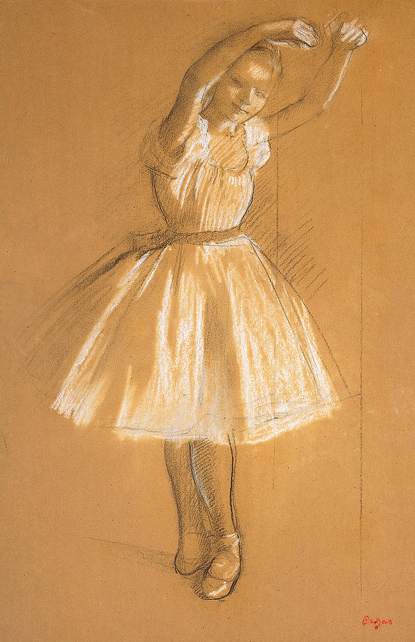
With Little dancer above it seems like the line acts as a frame to contain the minimal detail between them. If you take away those lines the figure would be difficult to make out and yet with the lines around the chalk and pastel, they help to contain enough detail to depict an ‘effortless gliding figure’ while the double lines in certain places help to capture movement.

With the dancer at the bar above he seems to have corrected his position while drawing the dancer in order to get a better prospective, however he hasn’t erased the lines from the corrected drawing, he chose to leave the lines rather than correct them which depicts the dancer’s former position and therefore ‘movement’.

The bust length portrait of Edouard Manet above is something completely different, the flat line drawing of the suit helps to emphasize the more detailed head drawn with thicker lines, helping it to stand out.
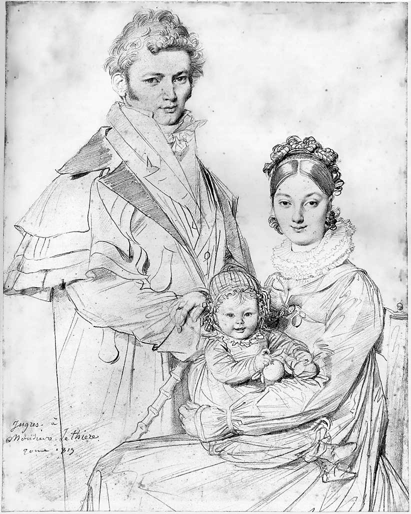
Jean-Auguste-Dominique Ingres
Whenever I come across an artist that I am not familiar with I get excited and seeing the line drawings of Ingres was no different.
Unlike Degas who preferred chalk, graphite and pastel on wove, laid and eggshell paper etc. Ingres preferred a sharp graphite pencil on smooth white paper for his drawings.
Also unlike Degas his lines were smoother, cleaner and seemed to be more planned out. It’s hard to know which was drawn first, the figure or the faces, as like the Bust Length Portrait of Manet above the lines of the bodies in the drawing below seem to do the same job, to support the detailed faces.

Ingres not only uses heavier lines on the head to give a sense of three dimension but looking at the body of the figures he uses a darker heavier line on one side of the body and a thin crisp line on the other by doing this he manages to depict form and weight. This is something I had never even thought about.
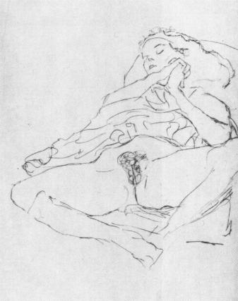
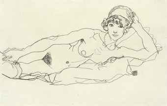
Gustav Klimt
Would it be wrong to look at Klimt’s erotic line drawings of seated women revealing themselves for this research point? In these drawings he captures his model in intimate and secret moments before ‘concealing them in his paintings beneath Sparkling Ornaments’ – Klimt, Gilles Neret.
Klimt’s erotic drawings are drawn with wobbly, unfinished lines that continue to double over the top of each other to create a sense of writhing in ecstasy.

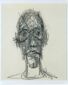
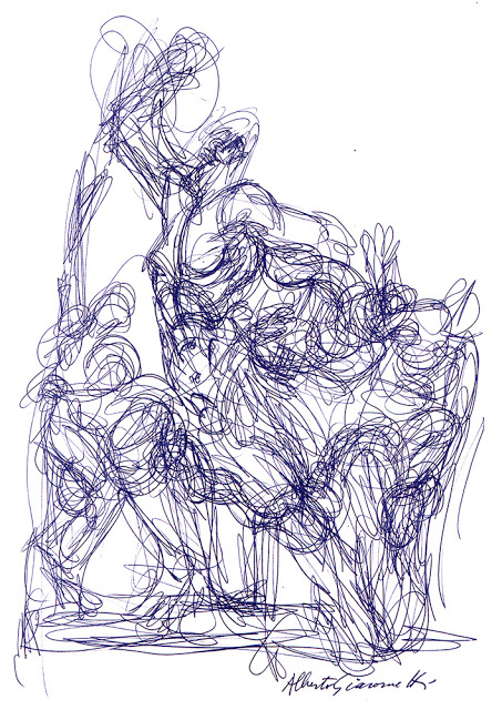
Alberto Giacometti
Giacometti was a Swiss, sculptor, painter, print maker and draughtsman and probably one of the first artist’s who’s drawings make me feel as uncomfortable as the annoying buzz of an electric light on a horror movie.
I love surrealist paintings but I find surrealist sculptor makes me feel kind of tense and that’s what I feel when I look at Giacometti’s portraits of Sartre and Diego below where he has built up the 3D
form of the face with expressive, straight heavy lines, making sure he defines the shape of the eye sockets.

On the other hand I really like the ballpoint drawing below where he has used a continuous wire like line to build up the 3D form.
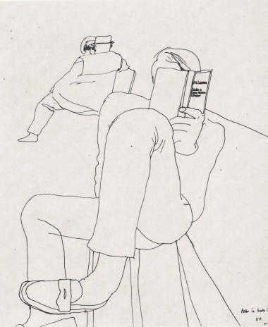
David Hockney
After browsing the works of Alberto Giacometto with their intense, awkward lines, researching the line drawings of David Hockney is a breath of fresh air. To me Hockney draws with what I would describe as relaxed baggy lines and creates a sense of three dimension by using space and perspective, leaving more space between the lines that form the shapes of the body parts that appear to be in the foreground, and in some cases, exaggerating shapes such as line drawing 2 and 5 below.


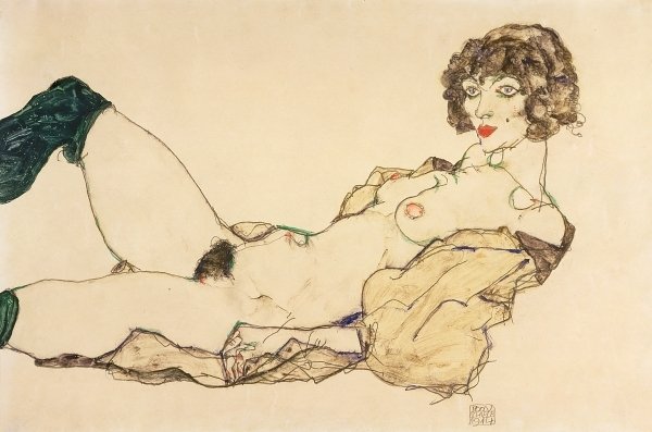
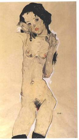
Egon Schiele
Egon Schiele used rickety lines to describe skinny, almost anorexic women in sexy poses. It seems like he was describing not only the complexity of the human skeleton but also the frailty of these female figures and in doing so capturing what he found sexy or erotic about them.

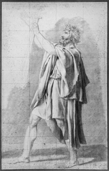
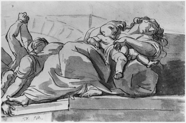
Jacques-Louis David
At the first look at the line drawings of Jacques-Louis David below it seems that the four drawings are in two different styles, while all all of them serve one purpose and that is as studies towards a finished piece.

The study for The Oath of Horatii above and the Father of Horatii below use fine pencil lines to frame figures with little or no tone, but on the other hand the tone and form of folds on the figures are wearing are well detailed like he almost intended them to be manikins for the drapery which helps to describe the 3D form of the figures more than the lines around them.

For the Death of Meleager above and the Plague Episode below it seems to be the opposite. He has drawn thick ink lines that act as a container for the ink wash shadows cast be the folds of the drapery and figures of the plague victims.

3 thoughts on “Pt 5 – Drawing Figures – Research Point – How Artists Use Line”