How did you manage to create a sense of the fleeting moment rather than a pose?
I’m not sure I was successful with this or not, I tried to create a sense of the fleeting moment by drawing as quick as possible, or at least I started off that way, then got carried away. I would have been more successful doing rougher more abstract sketches like in the Sitting and Waiting exercise. Like that exercise oil pastel may have also been a better medium for this exercise.
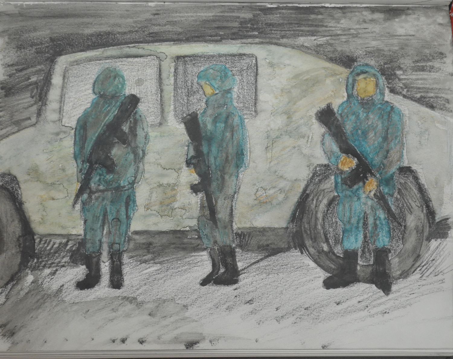
For me, I think the best drawing for the Fleeting Moment exercise was the watercolour pencil sketch of the soldiers as it was very smudged which helped me to create a blurred image.
Quick Watercolour Pencil Drawing from Sketch
How successful were your attempts to retain an image and draw later?
I didn’t give myself much chance to do this as I made quick sketches just after, to help me record the image. I have a very good long term memory but my short term memory is none existent so this was necessary.
Where you able to keep to a few descriptive lines to suggest the persons movement?
I made a sketch and a drawing for each image. In the sketch, yes but I weren’t satisfied with them and followed up with a drawing. I refrained from using oil pastel in this exercise as I have used it a lot in this project but looking back at the drawings I have done through this would have been the best medium for this exercise.
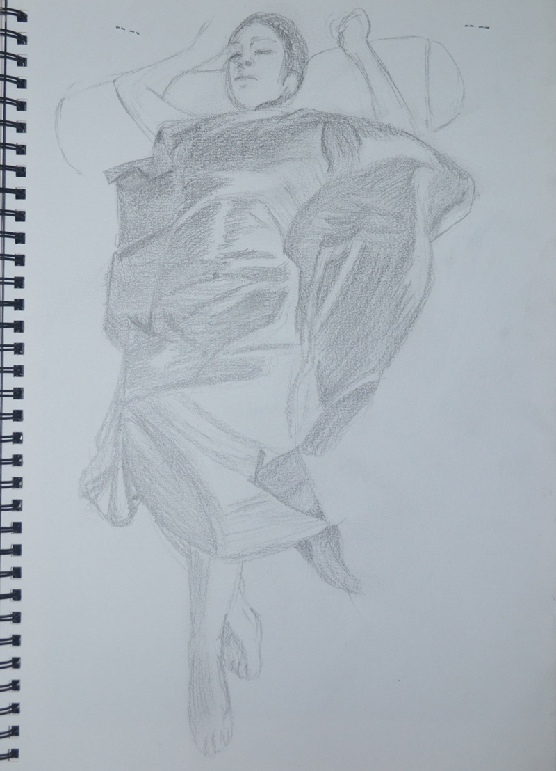
Did you find it easy to approach the figure as a whole or were you distracted by details of the sitters dress?
The way I chose the poses and the type of cloth that I draped my model in made it easy for me to approach the figure as a whole. The folds and shadows helped me to accentuate the models shape in both poses.
3 – Colour Pastel on Pastel Paper
How did you create volume in the folds of fabric?
I would have to say hatching and curved hatching, as well as use of light and shade, I did my best to depict the certain types of folds as researched from George Bridgman and described in the ‘Fabric with Line and Form‘ exercise.
Does the finished drawing give a sense of the figure beneath the fabric?
Yes, every limb and every curve including the gap between the rib cage and the convex shape of the pelvis.
How would you tackle a drawing like this again?
I would have to say, slower and in a lot more detail, iI liked the outcome of the three drawings but I feel spending a lot more time on them can improve quality of outcome. I would also love to have a go on larger sheets of paper in charcoal.
How well have you managed to capture the pose? what could be improved.
I think I did really well with capturing the pose throughout the project. However I do think that I could have done better to capture the feeling of the pose. Maybe experimenting with different mediums on different types of paper especially in the ‘Stance’ exercise. could have helped me do this. Since working on these two exercises I discovered ‘Bridgman’s Complete Guide to Drawing from Life’ by George W. Bridgman, which I will be reading and hopefully it will help me get more ‘drama’ into the pose.
Do you think the figures balance, if not where did you go wrong?
All but one of my figures balance and that is the first drawing of the model in tree pose, where I centered the entire model. I then redrew the model looking for areas where the model was balancing.
How did you go about conveying a sense of energy?
I explored a few different ways of conveying a sense of energy, I started by sketching really quickly with a 6B pencil and Conte pencil, focusing on poses that would help me capture the model in ‘action’. In went back to these and added swoosh lines as I wasn’t quite happy with them.
From there I went onto drawing the model in ballpoint pen going over and over the figure with more and more lines,
I experimented drawing moving body parts by hatching from side to side over where the body part should be in a rough blurred shape.
I roughly sketched the figure in a lighter felt tip pen and then went over in a black felt tip pen hoping to convey a sense of energy in that the model would look like she was in motion.
Last but not least I drew very quickly with a ballpoint pen in action poses.
Were you able to maintain a focus on proportion at the same time as creating a sense of weight and three dimensional form?
In the first exercise essential shapes I believe I managed this quite well apart from the first sketch, which was more of a trial, working with charcoal on A3 paper for figure drawing for the first time. In the second exercise essential elements there was a couple of times I messed up with proportions and coincidentally they were both when I was looking down at my daughter in a standing position, these are the second and 6th drawing . In the second drawing I made the head too small and then when I corrected it, it went off the paper.
Which Drawing gives the best sense of the pose and Why?
This is a difficult question to answer. To make a start on narrowing it down I would go for poses in the essential elements exercise as my daughter was uncomfortable posing for me and I think I have managed to depict this in these poses. Then I would probably say I think I would probably have to say the third drawing. She has the same arched back as me and I have managed to capture this in the drawing.
Was there any movement or gesture away from the model’s central axis? if so did you manage to identify this and put it in your drawing?
In the third and fifth drawing of the essential shapes exercise my girlfriend’s backside was cocked to one side maybe because she was a little uncomfortable at the length of time she had been sat there and I have definitely managed to capture this in the drawings but this, was done without noticing and it had been pointed out by her afterwards. But then, in the essential elements exercise, drawing 3, I haven’t done a great job of identifying this and I think it is down to the shadow on the legs.
Have you managed to make a complete statement within this time? What were your main problems?
Within 2 minutes? No, there is definitely a lot more time needed at this stage, however, with more practise drawing the human figure, two minutes could be enough to make a statement of a sort, more so with ten minutes. With one hour in ‘The Longer Pose‘ I do feel I managed to make a complete statement but the drawings did suffer with consistency.
Problems…
1. I have this knack of drawing the bodies really well with flowing lines but then when I get to the head and face I tend to tighten up and give the subject Action Man/Thunderbirds’ like features. I don’t know how other people see the drawings but that’s what I see.
How well have you captured the characteristics of the pose?
In the 2 minute life-drawing sketches In the ‘Quick Poses‘ exercise I would say about 50/50 I can see the original pose in what I captured on paper but then I would say that others probably wouldn’t get it. But then in ‘The Longer Pose’ exercise I would say ever I have managed to capture, in the pose, what draw me to it in the first place.
Do the proportions look right? If now how will you try to improve this?
In the quick poses the sketches do seem to be out of proportion in 2 or 3 but I think this was down to excitement more than anything else, it was the first time I had done any life-drawing and I was also worried that the model (my girlfriend) would be uncomfortable so I rushed my strokes. All the sitting poses however were in proportion and measured the same from the head to the seat of the backside.
I actually thought I had drawn 3 different tree types but looking at the drawings again and my photos I think I have only drawn two, three if you count the strangler fig as a species iof tree. I thought that the trees in the study of a several trees exercise were a different species from the Banyan tree in the Larger Study of an Individual tree but looking at them now I think the tree in the latter is the same tree in the later stages of being strangled to death by the fig.
What techniques did you use to distinguish each type?
I’d say smoothing and hatching the first ‘Alien’ tree in the sketching individual tree exercise was very smooth like it was naked without bark. So smooth that you could see the stretch marks in the tree so for this tree I used very fine hatching, smoothing with my finger and erasing with the putty rubber. For the individual Banyan tree I used more hatching and did less smoothing but with the study of several trees it was all very rough hatching with oil pastels.
What did you do to convey the mass of folioge?
The banyan trees were pretty much borrowing most of their folioge but where their was some I used squiggling and the sketches of an individual tree I came to realise that the leaves were in groups of three and so I squiggled in a kind of upside down Adidas trifoil shape not that it is noticeable in the drawings. To convey depth I then shaded in under the squiggles with more pressure on the pencil.
How did you handle light on the trees? Was it successful?
For the first sketches the light was above the folioge and so I showed light and shadow on the tree by way of hatching and yes I think I was successful. For the larger study of an individual tree the sun was behind the tree and so the whole of the tree was very dark but I depicted the light shining through the branches on the right by drawing the trees fainter than on the left. I don’t know how others will see it but it worked for me. I was going to use the putty rubber to show rays of light shining through but I sprayed it too soon.
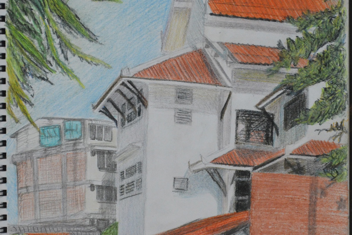
Larger Study of an Individual Tree
In the last exercise I used colour, it was early evening, and I think I managed to show this quite well in my drawing.
Did you manage to select and simplify? How did you do this, and what could you do better?
I did this differently in all three exercises. In the first exercise it was a case of not drawing to the top of the tree and only drawing what I felt was important, the roots, the trunk and the squiggled leaf shapes that framed the branches and trunk.
In the second exercise, I wasn’t too sure where branches and leaves were coming from and would have probably had to draw another 5 plants and bushes to get to the source, so I decided draw only what was within the branches of the Banyan tree.
With the third drawing, a study of several trees I simplified by zooming in, I could probably do better next time by drawing more of the branches of the trees. However, I am still pretty pleased with the close up of the trees in the finished drawing.
How did you use a limited colour palette to create a sense of depth?
Firstly I chose three colours that I knew would go well together, chocolate brown pastel pencil, Black and Sanguine Conté pencils and a Derwent Chinese white drawing pencil. I used the three colours together to create a sense of depth when drawing the trees then on the buildings, shadows etc. I used the pencils at different pressures to create light and dark tones. The Chinese white helped to relieve the colour if I put too much pressure on on the first attempt. Hatching and cross hatching also helped me to take the colours even deeper.
Did your preliminary sketches give you enough information for your final pieces of work?
Undoubtedly yes, they also helped me to eliminate details that I did not need and simplify more difficult parts of the buildings and scenes for the final pieces.
Would you approach this task differently another time?
Yes, most definitely scale is one thing I am very aware of and I believe that all buildings in the drawings are to scale.
Have you captured the colour and atmosphere in your drawings? How did you do this?
In the pencil sketches I think I captured the atmosphere quite well with use of shadow. As I said in the ‘A sketchbook of townscape drawings exercise’ it was a fresh morning and with the shadows cast from the trees around the temple it reminded of me of a road near my home in Wakefield, for me the sketches still arouse these emotions. However, the limited palette study does not seem to depict the brightness and freshness of the day and I’m left wondering what I could have done differently.
What problems did you find in executing perspective drawings?
I thought I would fly through this project as I’ve always been quite good with perspective, having studied design and communication at school but I struggled with the Angular Perspective exercise and did quite a lot of line correction, mostly due to the irregular shape of the temple roof and getting that wrong threw everything out.
Another problem I had was lining the wall up at the side and to the front of the temple which was like drawing another level at the same perspective.
My biggest problem is trying to get everything perfect rather than trying to keep the right perspective while simplifying the drawings.
Make notes on the merits of using, or not using, rulers to guide you.
I think that using a ruler for me would have to be the final solution for a smaller drawing but maybe a necessity for larger drawings.
For smaller drawings taking your pencil from A to B without wobbling all over the place isn’t that difficult and once you have the basic shape of the subject it can be developed with some correction and modeled to almost perfection.
I feel that using rulers on the other hand for anything other than technical or larger drawings, for me especially, may lead to overworking the drawing and even more correction trying to find the right angles, right lengths etc.
I would say that the main challenges for me were unique to the subjects that I chose. For one ‘s very hard to capture movement with ravens as they don’t stand still for long. Unlike a dog or cat the only time you can catch a bird sleeping is at night in a tree basically, so I had to capture movement with sketches as well as photos. Texture was also a challenge, birds feathers are very complex and have a different texture in different parts of the body.
Which media did you enjoy using most and which did you feel were best for the subject matter and why?
Grabbing the Chance Finished Drawing
As always I enjoyed using the ball point pen the most, for the sketches of the ravens in Grabbing the Chance. With the ball point pen and the colour of the raven’s I could almost do a continuous drawing of the birds. Coloured pencils were great for the finished drawing in grabbing the chance, they captured the details well and were great for layering all the different colours but they weren’t dark enough to capture the deep colours of the bird. hard pastels may have been better for the job.
Where can you go to draw more animals?
The only real place in Bangkok to draw animals unless you have a pet or live in a street where the stray dogs run freely is the zoo. I went to the zoo with the intention to draw different animals but came across the ravens while there.
How will your experiments with negative space help your observational drawing in the future?
Before I even started this course I was very aware of negative space but this course as made my awareness of it a lot more acute. I no longer just look at the negative space in and around the subject but the negative space between objects, Negative space plays a big part in all subjects whether it be a plant, landscape or the space between facial features in a portrait and being more aware of this will help to improve my observational skills with all.
What techniques did you use to ensure you drew your plants in proportion?
Negative space played a big part in this for me throughout this project I started at with one part of the subject and then worked my way around using the negative space between flowers and leaves piecing it together like a jigsaw. I then altered the shapes of the flowers and leaves where necessary.
How did you achieve an effect of three dimensional space in your drawings?
Firstly the way I arranged the flowers was a big help with the biggest at the front and the smallest at the back with the biggest flowers at the front acted as a focal point. The earlier exercise Still LIfe Group in Tone was also a big and drawing the overlapping plants and their cast shadows also helped me to create an effect three dimensional space.