Pt 5, Option 4, Drawing Figures – More experimenting

Third Try and a lot Better

I have spent the last three weeks getting ready for assessment, preparing my portfolio, piecing everything together and  taking a fresh look at my work coursework as well as having another try at any exercises that weren’t up to scratch; this was one of them.

The last part of the course was drawing and experimenting, I’d done plenty of drawing but not much experimenting, so I had another look through Vitamin D: New Perspectives in Drawing for some ideas. Having a fresh look at the book after following the course was very refreshing, but rather than being influenced by any works in particular I was inspired by how the artists had let themselves go and freed themselves from any chains that had previously bound them. This is what I needed to do.

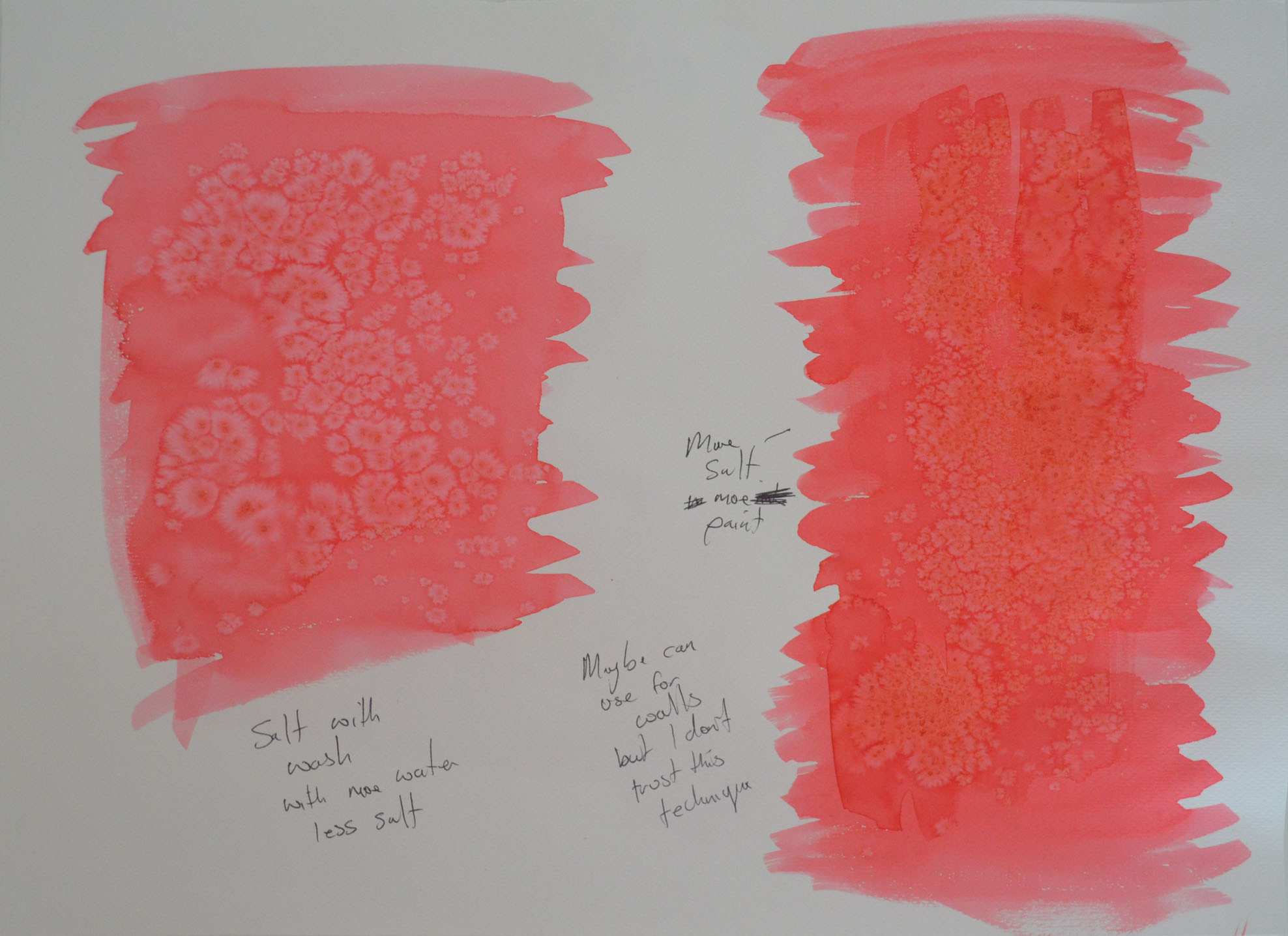
I had just finished having another go at the Quick Studies exercise and was due to do some more experimenting with colour. However, there were a few pages that I couldn’t use due to the black fine marker blotching on the reverse side of the pages, this gave me an idea.

I took out some of the coloured chisel pointed markers that I had purchased earlier in the course and coloured in the back side of one of the quick sketches, first in red then in green followed by a dark blue. Turning over the page I was very happy with the very random results apart from where I had coloured in with the dark blue but there were some light spaces so went over again with a yellow.

I was really happy with what I had created but I wasn’t going to stop there, just like I did in the Doodling exercise in the very first project in this course I freed my mind and let go.

1 Markers on the Back of a Quick Study
2 Quick Study with Marker Showing through
3 Two quick studies that I experimented with colour on
4 Another Quick Study in Marker
Oil Pastel Over Quick Study
5 Drawing over the back of the reverse side of two marker pen quick studies

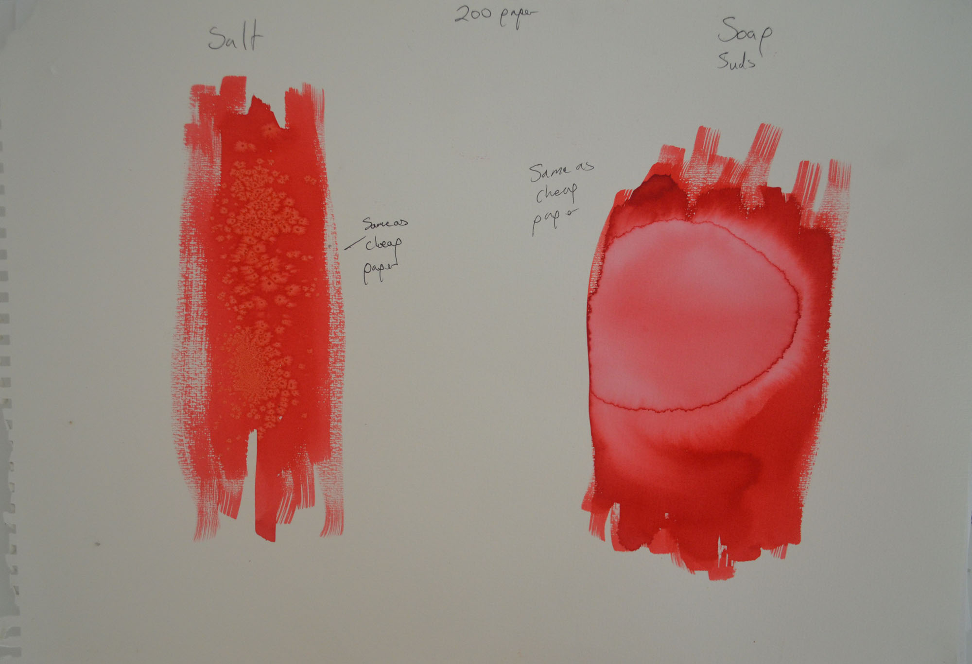
The first few experiments in this fresh try at using colour were basically drawing on the reverse side of, or over the top of existing marker pen studies with either marker or oil pastel but the studies weren’t that great and so I started the next 4 drawings from scratch.

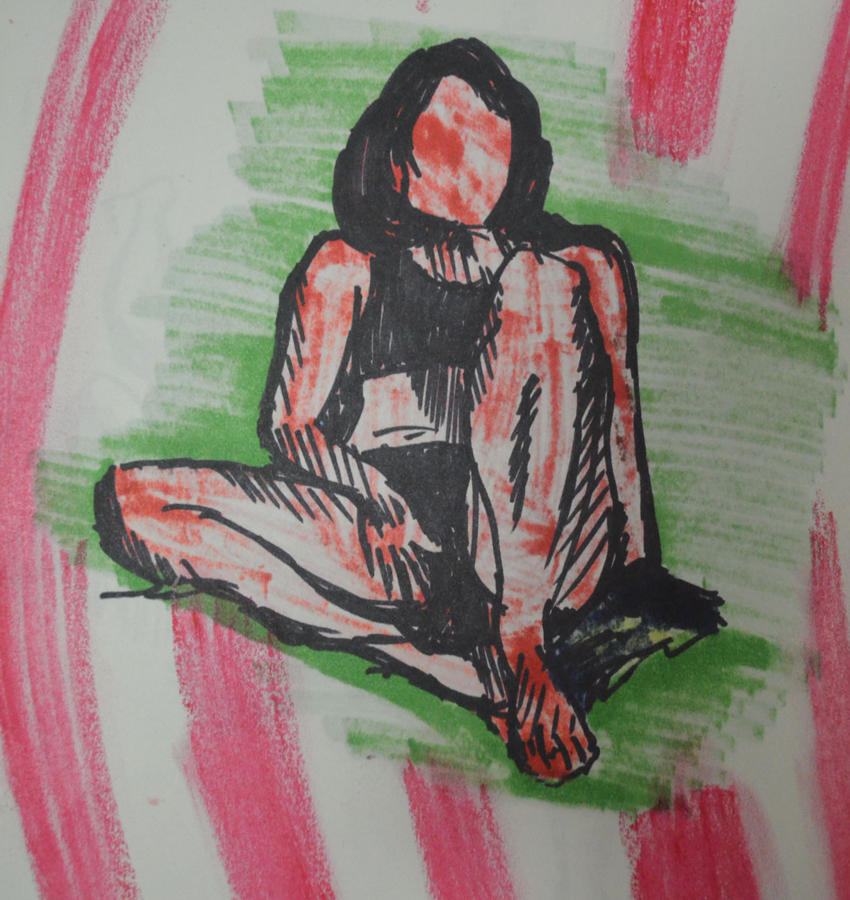
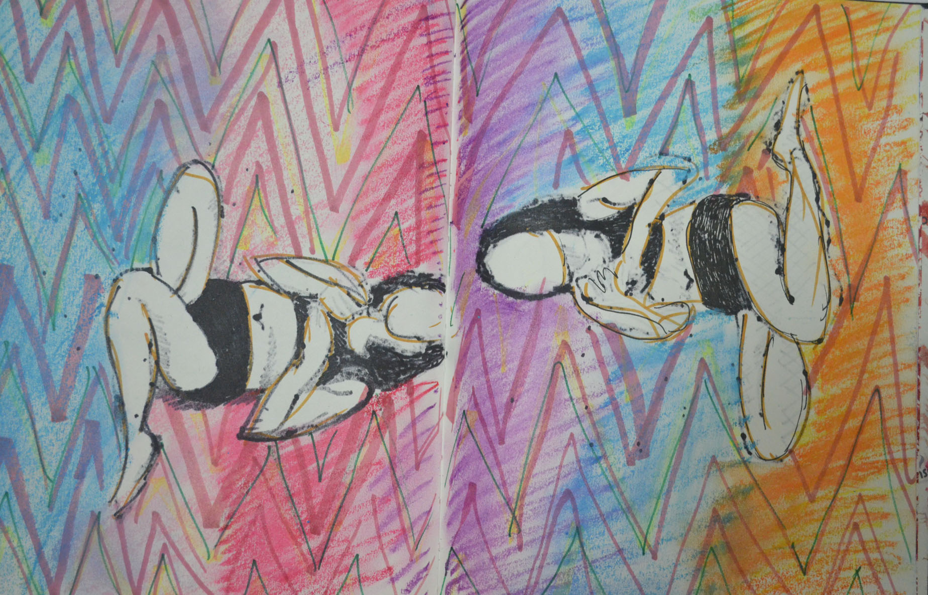
I began the next drawing by laying down random marker lines and then filling in the white gaps with pink, from there I drew a fresh pose from a series of photos that I took on the beach. Then I drew a similar pose on a plain page and then drew within the shape of the body with darker colours.

Both of these drawings worked out great, the first drawing looks like the the model is absorbing sunlight, while the second, even though it was a very similar pose with similar colours, albeit a tan instead of yellow looked very different indeed. This time the subject looked like a tanned figure and to add to it I drew a breath cloud. Thinking about it now they could actually look like before and after figures, tanning and burnt.

5 Quick fine marker over chisel coloured marker
6 Chisel Marker Pen inside fine black marker sketch

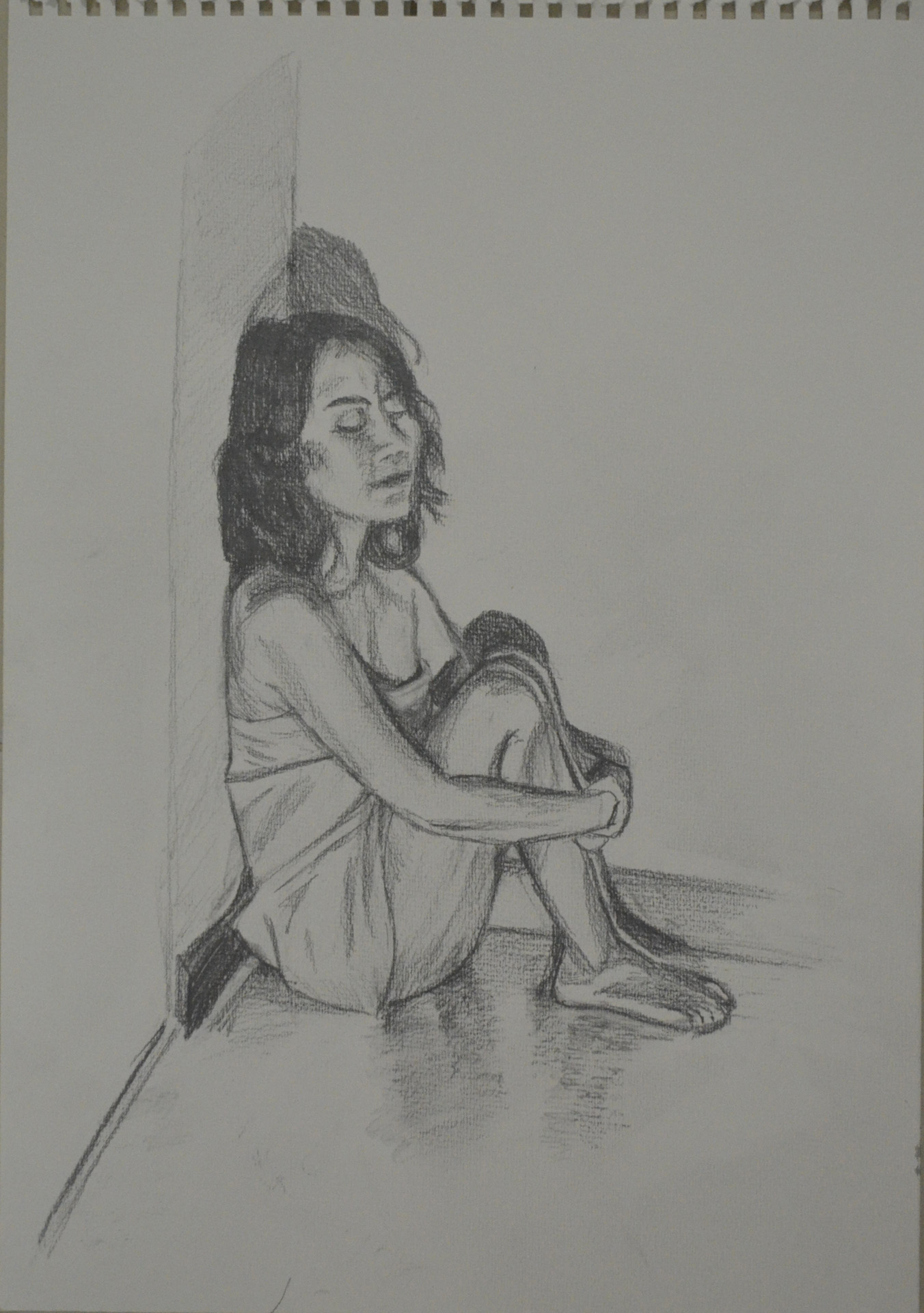
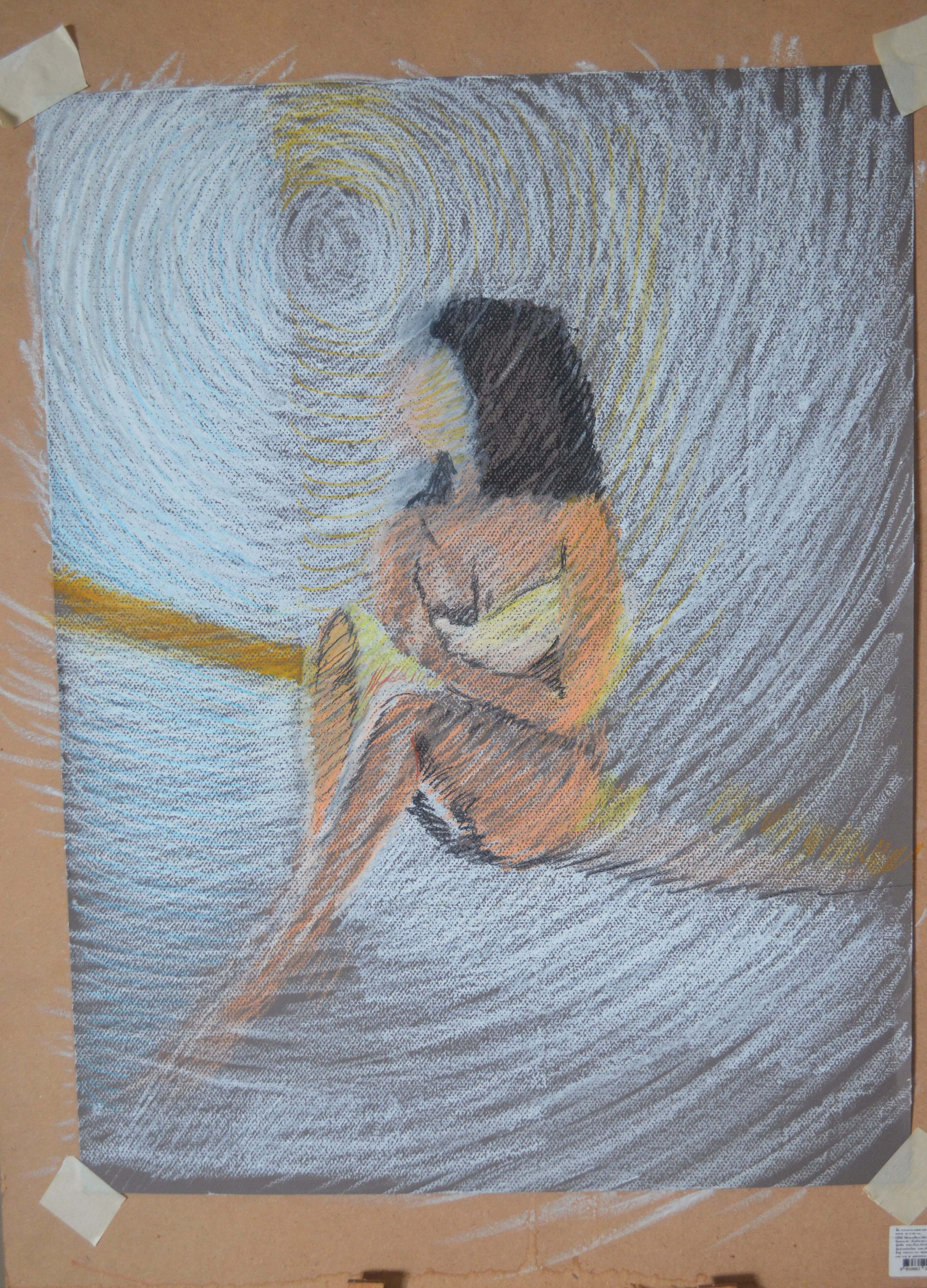
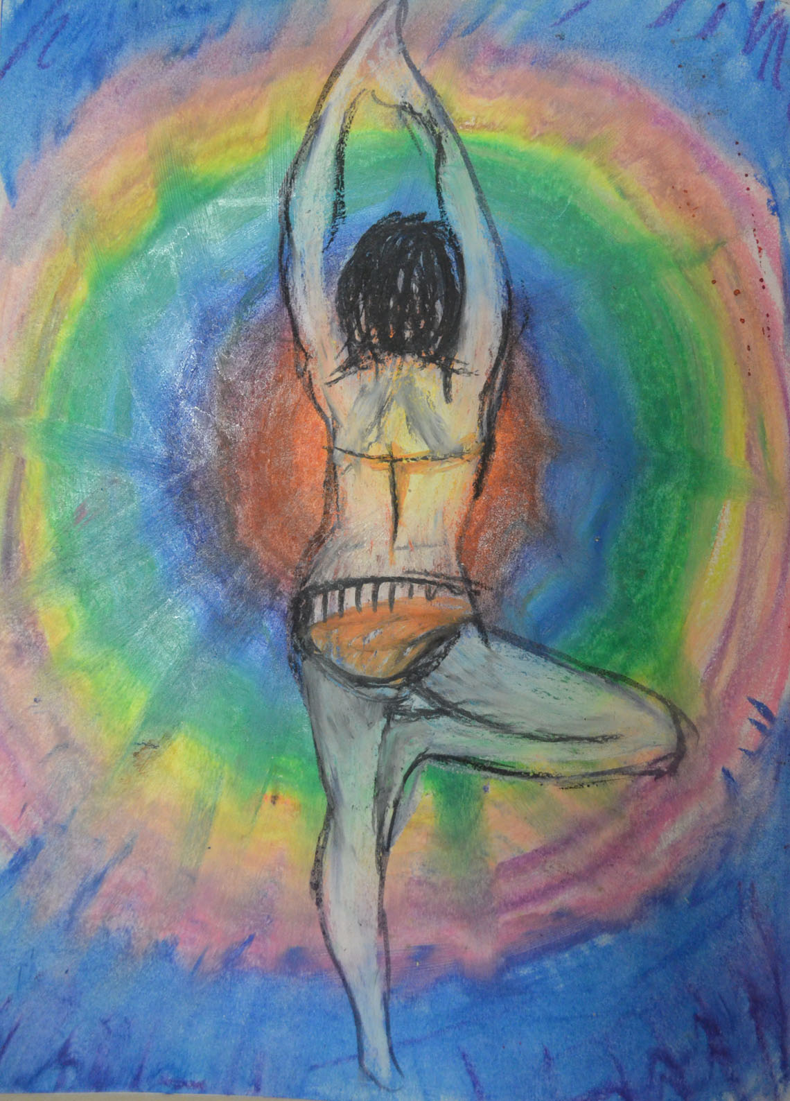
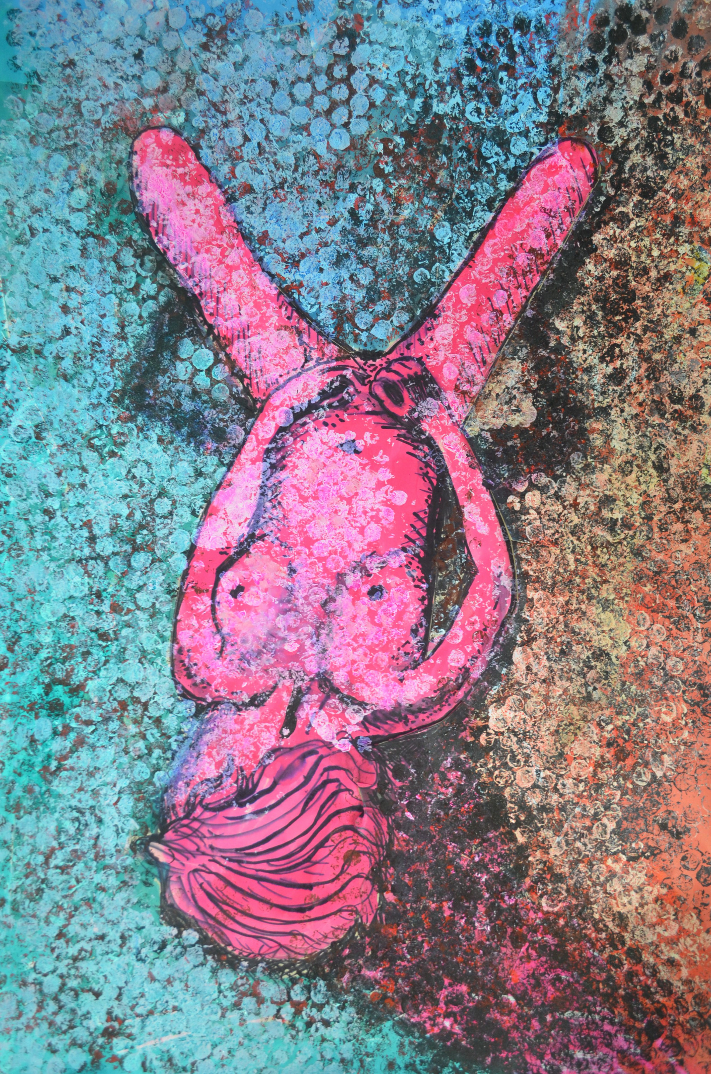
I started the next drawing by drawing in circles with the oil pastels and then blending them with my finger. I knew I would draw a figure over the top but i wasn’t sure which pose or how i would finish the experiment. I don’t know why I chose the pose below but it worked out well. To complete the drawing I first sprayed the bottom layer with hairspray then I drew the figure in a fine black marker before filling the figure in white oil pastel and then drawing in the details. I love the way her back glows due to the yellow in the centre of the bottom layer.

7 Oil Pastel and Marker Drawing Over Oil Pastel

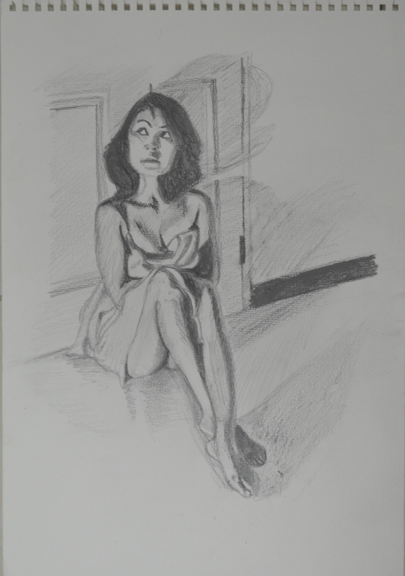
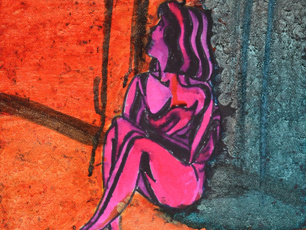
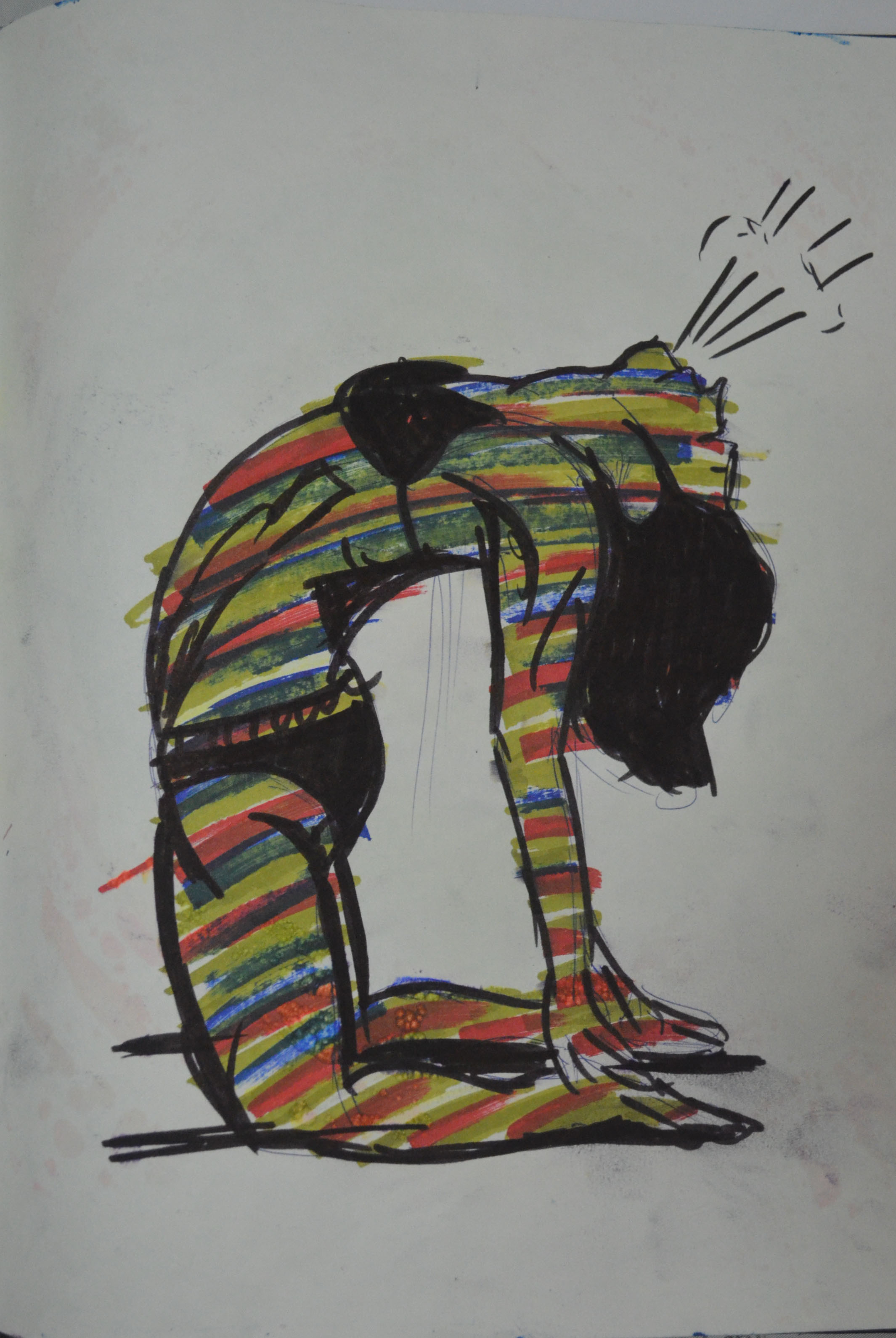
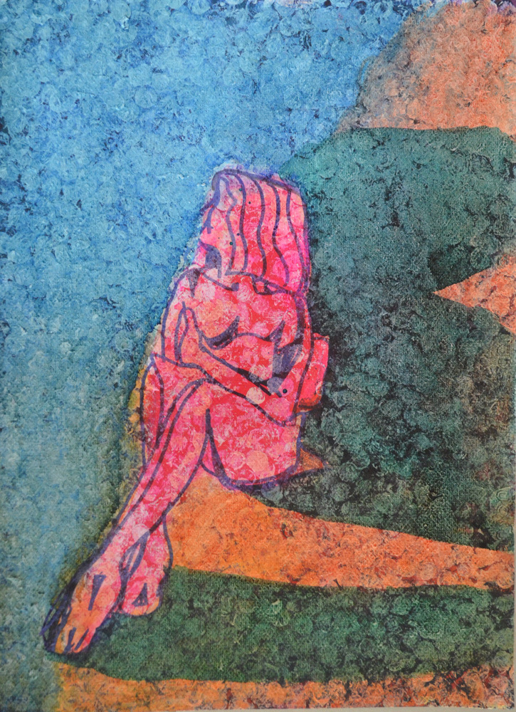
In the last experiment I drew the figure with the same fine marker then applied red liquid watercolour around the figure then brown inside but because I had freshly drawn the outline the black of the marker smudged into the red and brown making the figure impossible to determine so I went over the body in white oil pastel then the outline again in black. The end result looks (to me) like a rotting corpse on either blood splatters or rose petals.

8 Oil Pastel and Marker Pen Over Bubblewrap Applied Watercolour

More Experimenting

I realised that I could never do enough experimenting with colour and I came back for another play, only this time I worked on an existing piece, which turned out to be a bad idea but it seemed to be the start of something that I can could come back to develop in the future and I did.

Earlier Collage
Earlier Collage

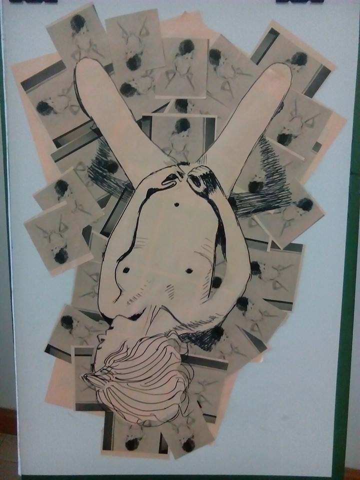
The collage that I made earlier seemed a bit bare and I thought that I could maybe do something else with it. The last experiment that I did in my exercise book gave me an idea. The red liquid watercolour over black and Iooked like blood or rose petals and I wondered if I could work on that idea over the top of the collage.

The problem was I had no red liquid water colour left and so decided to work with acrylic paint, although not a drawing medium it was worth a try to see what it would come out like. I first applied black acrylic with bubble wrap wrapped round a spray can lid that I could use like a stamp, then over the top of that I applied a layer of burnt sienna, followed by a layer of brilliant red, hopefully this would give me a shadow under the red. It turned out looking nothing like what I wanted it to and so I just kept on playing.

Finished Picture
Finished Picture

The paint I already applied was just too dark and ugly and so I went over it white acrylic paint and once that had dried or near enough dry I applied ink and liquid watercolour over the top. From bottom right I worked in a clockwise direction first applying green, then blue, red, orange and yellow and let them all drip into each other, finally i went over the figure in pink. The finished picture didn’t look that great but it had potential so I took a photo before it fell apart and unfortunately, got binned. I really lied the way the ink over the acrylic applied with bubble wrap looked like a very colourful snake skin and so I would come back to this.

Ink and Liquid Watercolour Applied with a Cork

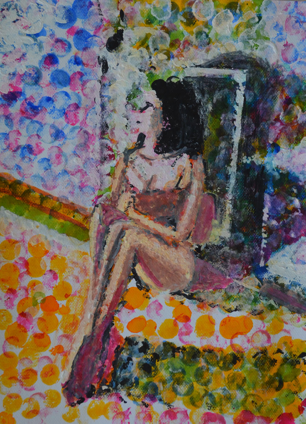
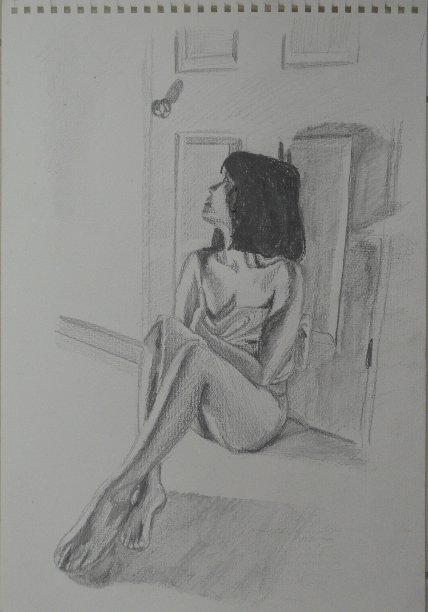
For the next picture I applied ink and liquid watercolour with a wine bottle cork, this was on an A3 sheet of paper so it looked better than I could possible imagine, I used white gouache over certain parts add light to the figure and the door.

Second Try with ink on Acrylic Paint

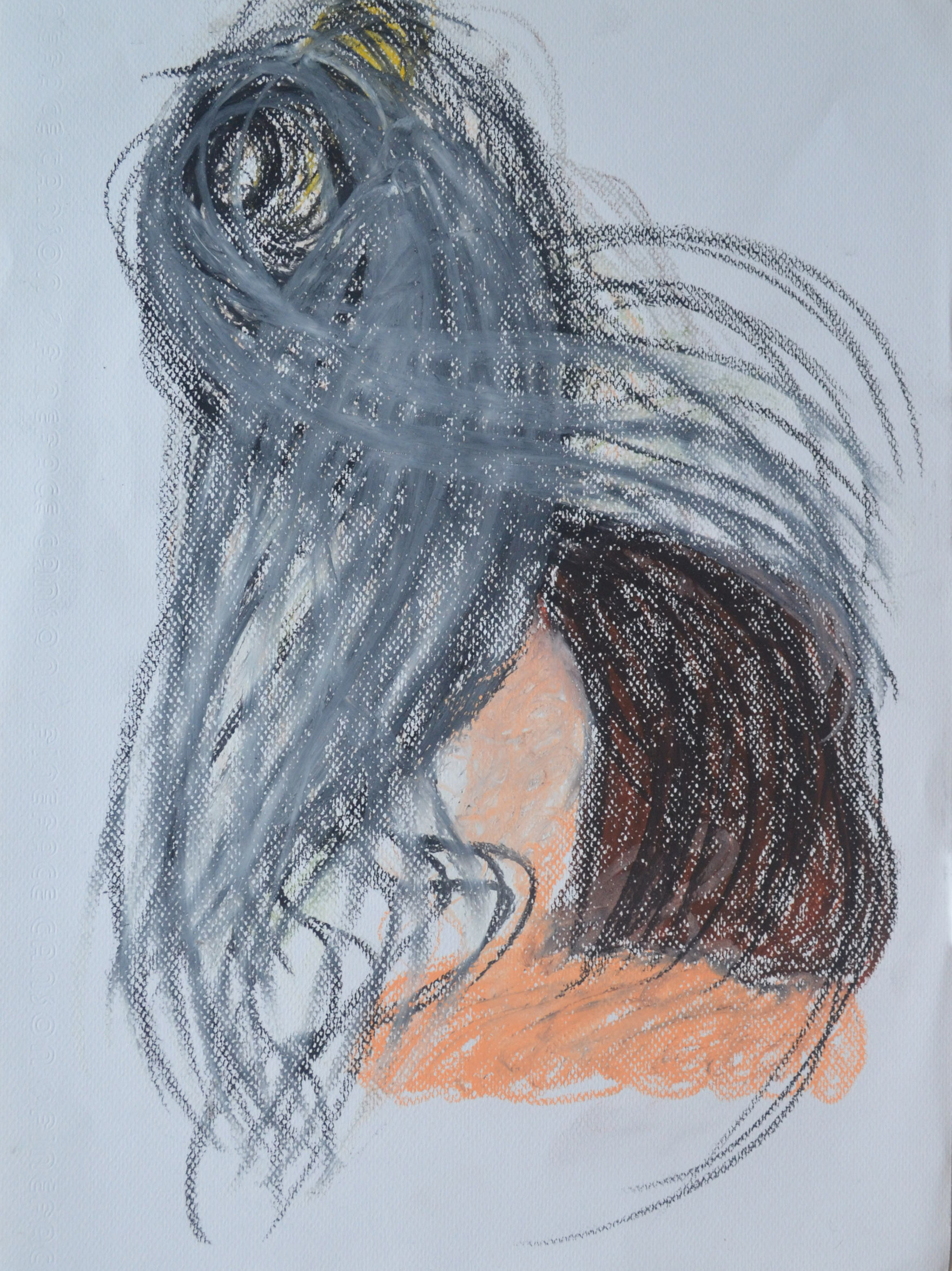
I decided to have another go at the acrylic>bubble wrap> ink technique as I wasn’t happy that  I had to throw away the drawing and so I did a little bit more experimenting before trying to have a go at a finished piece. This time the colour order didn’t suit the pose as the lighter colours should have been on the left of the figure. I also made the mistake of applying white acrylic to the figure then going over it with pink ink and marker, these didn’t take well over the acrylic and so I decided to have one last try.

Third Try and a lot Better

On the third try I drew the figure with marker and then went over it in pink ink before applying the acrylic this looked patchy as the marker bled into the ink but it still didn’t look that bad. From there I went threw the process of applying the acrylic but this time I added too much white so when it came to painting with the ink over the top it didn’t have the same effect.

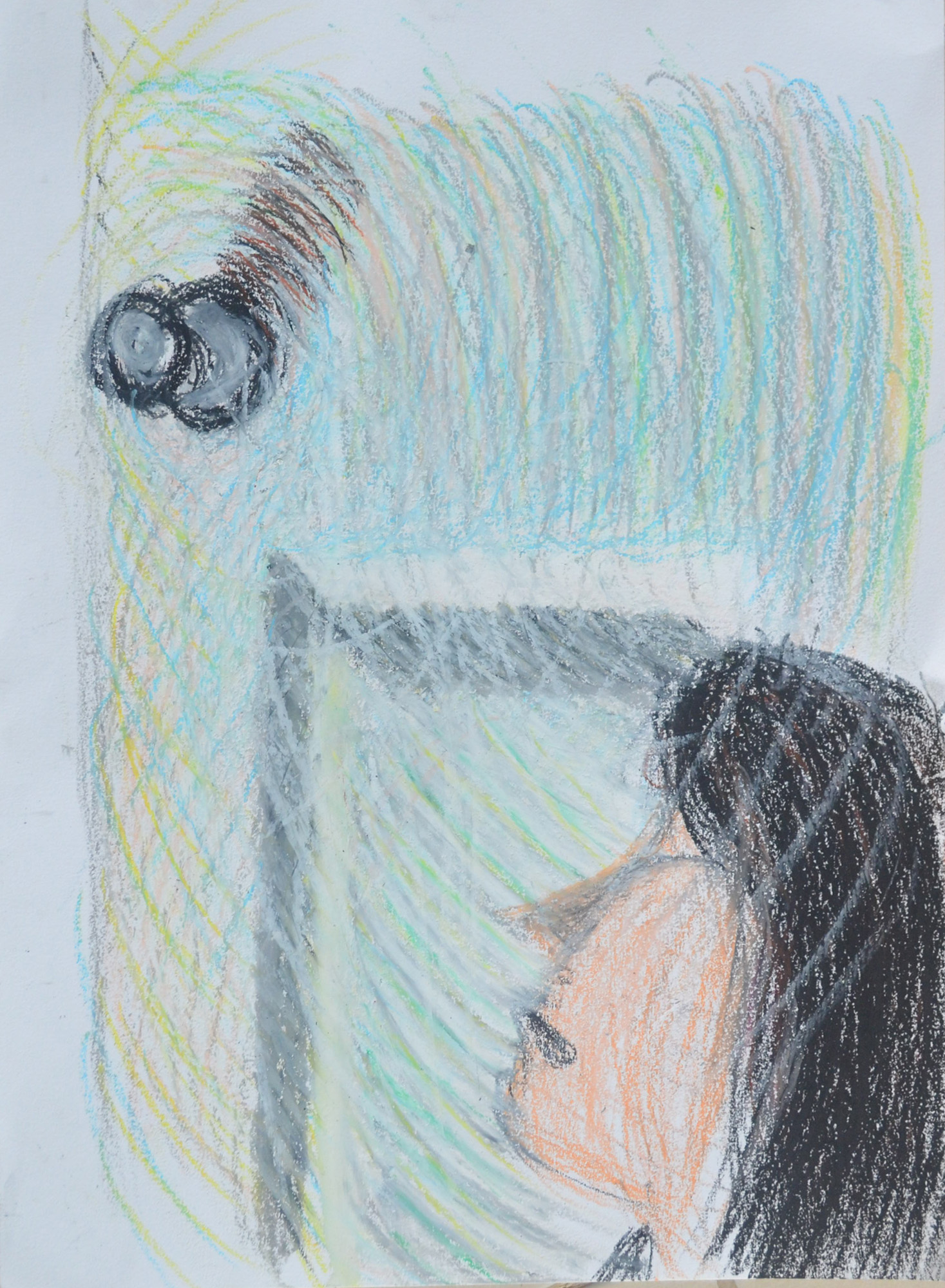
When it came to applying the cooler ink colours. I applied a dark turquoise instead of blued which I rubbed off with a paper towel before applying the blue then let the colours bleed into each other. This time the blue dripped over the orange instead of bleeding into each other and so I tried to drip draw the door as well.

Conclusion

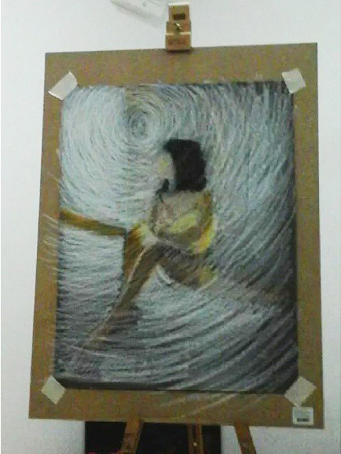
Every drawing in this final experiment turned out completely different the first looking like snake skin while the last a stain glass window and even though I haven’t managed to complete a final drawing using this new technique I feel it is something that can be developed further.

Assignment 5, Option 4, Drawing Figures

18 - Assignment 5 Final Piece

Over the last two months I kept looking at the brief for this final assignment and I was wondering how I could demonstrate a significant amount of new skills I had learnt not just i this last part, part 5 but throughout the course.

My strongest idea was a full figure semi nude sitter in the shadows of a lamp lit apartment I did for a brief moment think about a self portrait stood in the kitchen with the sky and clouds behind me, but in the rainy season that wasn’t a good idea.

I was definitely including the background and I wanted to use the background to create a unique mood, to try and influence the drawing as much as possible. I imagined my subject sitting against a wall with long shadows depicting how small and insignificant she was to her surroundings, like Gerald Scarfe’s illustrations of the main character in Pink Floyd’s The Wall.

As this module was all about experimenting, what was I going to experiment with? What techniques was I going to use? And would I use experimental techniques in my final drawing?

I decided that I would try to experiment more with water soluble media, pencils, watercolour pencils, watercolour paint, and gouache and see where that took me, I bought the book ‘Drawing and Painting with Water Soluble Media by Fiona Peart’ just to give me some ideas.

Fiona Peart Drawing and Painting with Water Soluble Media

I had plenty of low quality watercolour paper to mess around on and but not so many different types of water soluble media but I thought I’d have a go at some of the techniques in the book to see if I could use any in my final piece.

1 - Salt on Watered down Ecoline Wash
1 – Salt on Watered down Ecoline Wash

The first technique I tried was dropping salt granules on to a watercolour wash, see above. I had several bottles of Ecoline liquid watercolour so I dropped some in a jar and watered it down. I haven’t done much messing about or drawing with watercolour (probably haven’t been brave enough) so I still have a lot to learn about how much water to use in a wash etc. So I did a wash (the one on the right) in 30+ degrees heat and it seemed to start drying as soon as my brush left the paper, then i started to try and drop single granules of salt onto the wash. They didn’t do much and so I rubbed my hands and let the lot fall over the top of the wash. The result was a discoloured blotch effect that looked like fungus.

I decided to water the wash down some more and start again. this time I sed less salt and as you can see above the results are a bit better. However I wasn’t sure how I would use this technique in the finished piece.

2 - Dried Soap Suds on Watered Down Ecoline Wash
2 – Dried Soap Suds on Watered Down Ecoline Wash

The second technique  I used was soap suds. On the left I used a small amount of soap suds scooped up and placed on a watercolour wash, this time with more water added. The results were very different to what she had in the book where she had used them to depict pebbles on a beach, the patterns that mine made (after 2 hour of drying) resembled a cloudy sky.

3 - Soap and Suds on Ecoline Liquid Watercolour
3 – Soap and Suds on Ecoline Liquid Watercolour

I wasn’t sure whether it was the paper I had been using or whether my washes were too thin that made my experiments look nothing like anything in the book so I had another try with a thicker wash on a higher quality 200 g/m2 watercolour paper, the results were almost the same.

My girlfriend came round that evening so I decided to stop with the experimenting for the night to do a series of sketches of sketches in water soluble pencil to see which worked best.

4 - Soluble Pencil on 200 gm2 Paper
4 – Soluble Pencil on 200 gm2 Paper

My first sketch was a very sorry effort indeed, I did exactly what I’ve been trying to stop myself doing in this last section, misuse the paper. I wanted to use the background but the figure still had to be a good size on the paper.

5 - Another Try at First Pose Water Soluble Pencil
5 – Another Try at First Pose Water Soluble Pencil

The second sketch was better but was still not that great and by now I decided that her clothes would be replaced with the orange cloth. The third sketch was a lot better and probably one of the best so far over the last two modules and the face was almost spot on which was an added bonus. However, I really wanted the background to play a bigger role in the finished piece.

6 - Semi Nude with Monks Robe Cloth
6 – Semi Nude with Monks Robe Cloth

The next one was even better but I stopped at drawing the door, even though I knew this one would work it was a different mood to what i wanted to depict in the final piece. To me the pose in the drawing below was warm, welcoming, even romantic like she was waiting for her lover to come home, I wanted a totally different mood altogether for the final drawing.

7 - Semi Nude with Bent Knee
7 – Semi Nude with Bent Knee

By now I was working towards the pose that I had my mind set on and the next pose below was pretty close but still it looked like she was waiting for someone rather than hiding from someone which is what I really wanted to show in the ideal pose. Because this was a 100% perfect in looks, proportion, the long shadows and everything else I nearly went with this but I decided to squeeze just 1 more sketch out.

8 - WaterSoluble Pencil Sketch with Door Handle
8 – WaterSoluble Pencil Sketch with Door Handle

In this last sketch I decided I had got the pose that I wanted, it still looked like she was waiting for someone to come through the door rather than hiding behind it but I decided to go with it in the hope that the medium and technique that I chose to complete the assignment piece would help me to depict the mood that I wanted.

9 - WaterSoluble Pencil Looking at Door Handle
9 – WaterSoluble Pencil Looking at Door Handle

To give my girlfriend a break I decided to do some colour drawings working from the sketch above, the first one was a total abomination. Until now, apart from the Fish on a Plate exercise I had used my watercolour pencils dry, as a substitute to my Derwent colour pencils which I wasn’t keen on the waxy feel of, the awful attempt at being artistic below was a very tired try at sketching with wet watercolour pencils. I decided that was it for one day.

10 - Sad attempt in watercolour pencil
10 – Sad attempt in watercolour pencil

At this stage I wanted to have ago at painting this in watercolour but basically I wasn’t ready for drawing in a painting medium and so I had another go at watercolour pencil to get myself ready for a more permanent medium, this was drawn from the water soluble sketch.

11 - Watercolour Pencil Drawing from Sketch
11 – Watercolour Pencil Drawing from Sketch

That afternoon I went and bought some Louvre watercolour paints, a jar of white Gouache and some brushes. I still really didn’t have a clue what I was doing with the paints which were in tubes and so I decided to take minimum risks and draw the figure in watercolour pencil  and use the watercolour paint for the floor and walls.

After completing the figure with watercolour pencil and wet brush I painted the shadows on the floor with watercolour paint using a brush and then dragged the paint off with the paper with a tissue, I’m not sure if there’s a special name for that technique. I painted the rest of the floor and the walls with a brush but I needed to show the light reflecting off both and so when the watercolour paint was dry I stippled the gouache paint over the top with the same brush. From there I finished the door off hatching with watercolour pencils then going over them with a wet brush.

I wasn’t worried that I hadn’t used any of the experimental techniques that I played around with earlier as this was an experiment just on its own but I wasn’t satisfied with how this turned out, it was stagnant there was no mood to it and I decided to change to a different type of painting medium.

12 - Watercolour Pencil, Watercolour Paint and Gouache
12 – Watercolour Pencil, Watercolour Paint and Gouache

I wanted to make a bigger connection between the door handle and the figure and i wanted to do it with a visible energy field and swirling hatching came to mind and the perfect medium for this would be oil pastel. And so I went from water soluble mediums to oil pastel.

I knew I would need a lot of white oil pastel as I planned to draw it on an A2 size paper and so this was my first experiment at trying to get the lines that I needed without using the valuable white. I really don’t know what I was doing here and it started to look more like a kids drawing from an horror movie.

13 - Oil pastel - Too dark - Trying not to Use White
13 – Oil pastel – Too dark – Trying not to Use White

The second experiment was with much lighter colours using more of the white and trying as many different techniques together to see which one worked. From this it was obvious that the only one that was going to work and join everything together was circular hatching, or at least that’s what I call it, like a vortex drawing, spiraling out from the door handle connecting everything, or spiraling in.

14 - Trying a Few Different Techniques
14 – Trying a Few Different Techniques Together

I bought some dark grey Ingres paper and taped it to my largest drawing board with masking tape at the corners. I was still drawing from previous sketches including the latest watercolour/watercolour pencil drawing.

Two hours in and  something was beginning to form but it was more like the blurred image in a dream than anything else. I started with black for the hair plus pinks and various oranges for the skin, cloth and skirting board then white circular swirls for the walls and floor, with the white lines further apart for the darker shaded areas to let the grey show through. I wasn’t hatching in the same circular motion for everything but I kept going over the top with white to give the impression of doing so and only two hours in I was already on my second stick of white oil pastel.

15 - Drawing after First Two Hour
15 – Drawing after First Two Hour

The next day and a few hours in and the picture was looking a bit too light as I added more and more colours to the vortex including pinks, yellows, greens and blues, I liked where it was taking me as long as i could darken it eventually. The figure looked unnatural and out of proportion and also two far away from the door but I wasn’t worried, I knew eventually she would be right where I wanted her. The most worrying thing at this point was that the door handle was too low and had to be lifted up and that was the starting pint of my vortex so everything had to be reworked.

16 - Fnal Piece Second Stage
16 – Final Piece Second Stage

After about a good few hours it was proving to be a very long process but  knew the end results would be worth it. by now I had got everything marked out and re-positioned the door knob and I was starting to draw in the shadows which would tell me if the figure was too far to the right or not on the paper…It was. What was niggling me at this stage though was if I should draw the face or leave it blur as at this stage it reminded me a bit of Francis Bancon’s work, still blurred between the point where the face was and where I had moved it to.

17 -After about ten hours
17 -After a good few hours

It took me a few hours longer to finish the drawing and as you can see between the drawing above and the drawing below a lot more work went into this piece, moving her even more so she was in a more natural position against the door but that’s not where all the work went. No longer is there any grey from the paper showing through the oil pastel, the darker parts are darker layers of oil pastel on top of the lighter ones and the shadows took at least two hours to correct.

I would say in all this piece took me the best part of twenty hours to complete. No sure if it was all drawing though, there was a lot of thinking during the process, as with any lengthy process like this I tend to get lost in my thoughts as I step back and look at the drawing from different angles.

18 - Assignment 5 Final Piece
18 – Assignment 5 Final Piece

I chose to do something completely different with her face, so far I’ve only managed to get my girlfriend’s face right with a pencil or water soluble pencil, I wasn’t taking any chances and used the face to help me create the vortex effect, instead of just circular hatching, all the way to the door handle.

Things I’m Happy with

I like the way it turned out.

Things I’m not happy with

It didn’t turn out the way I expected it to.