In this exercise I gathered together a a range of objects with different surfaces, some I bought and some I already had. The objects that I used were a takraw (Siamese football), shaggy teddy bear, a towel, mop mitten and Scotch-Brite brillow sponge as well as a woven basket, PVC chair, wire wool, toilet roll and leather Lay-Z-Boy (not the whole thing) plus a couple of other different surfaces.
Experimenting with Texture 1
In my sketchbook I made a series of approximately 5 cm squares and used both pens and pencils to depict the textures in the squares. To depict the surfaces I used several different techniques such as hatching (takraw ball), irregular hatching squiggles and stippling (Scotch-Brite sponge) and very short hatching (towel) as well as some very irregular marks for my leather look PVC chair and the creases in the arms of my Lay-Z-Boy armchair. I also tried stippling with felt tips for a toilet roll tube but I could not get it to look anything like.
Experimenting with Texture 2
One surface that created something of a challenge was the shaggy teddy bear fur and so I chose this as well as the woven basket for the exercise ‘A Drawing with Textures’.
My old sketch book got full quite quickly so I needed to buy a new sketch book to finish the first part of my drawing 1 course. I wish I new more about what paper to choose gsm/tooth etc, there were a few expensive sketchbooks in the art shop, so I expect the quality was probably top notch but they were sealed and there wasn’t that much information on the wrapping. In the end I settled for a cheaper A4 sketch book with a lot of tooth, it said smooth on the front but doesn’t feel smooth to me.However the reason why I chose this sketchbook in particular was of the photo of Corrado Feroci on the front cover.
Silpakorn Bhirasri on the cover of my new Sketch Book
Here’s a short biography of his life:
Corrado Feroci was born in Florence Italy in 1892 and was a sculptor who worked mainly in Thailand after being invited to the kingdom in 1923 to teach western sculptor at the Fine Arts Department of the Ministry of Palace Affairs. Corrado later founded the Silpakorn University (the University of Fine Arts) in 1943.
After Italy surrendered to the allies in 1944, he changed his name to to Silpa Bhirasiri and became a Thai national to avoid being arrested by the occupying Imperial Japanese Army. While in Thailand he married his second wife, one of his Thai students.
The Rama I Statue at Memorial Bridge
If you have ever been to Thailand and travelled around the Bangkok streets you will see several of Silpa Bhirasiri’s works including the Democracy Monumenty, the Victory Monument and the Statue of King Rama I at the Memorial Bridge at Saphan Phut.
Democracy Monument by Silpa Bhirasri Bangkok
His photograph on the front helped me choose the notebook, I’d previously bought colour pencils and watercolor pencils by the Thai brand Masterart which weren’t so great, but I had not so long ago read about Silpha Bhirasiri and knew he was the founder of Silpakorn University so knowing that the university had endorsed the brand for this product I had faith in what I was purchasing.
To be honest my sketchbook hasn’t been that organised so far but I made a promise to myself on purchasing this new book to get things in order for my first assignment.
Do you think it is easier to suggest three dimensions on man-made or natural objects?
This project has taught me that it is easier to suggest three dimensions on man-made objects rather than natural objects. Man-made objects are usually made up of geometrical shapes such as cylinders, cones or cubes and so the lines of man-made objects are easier to draw and suggest their 3D form using most mediums. The irregular shapes of natural objects means that their three dimensional features are much more subtle with lines that are more difficult to depict and draw.
How did you create a sense of solidity in your composition?
In the exercise ‘Still Life Sketches of Made Objects’ I created a sense of solidity by using various hatching techniques and swapping between pencils of different hardness mainly B, HB and 2B, shadows and tone also played a big part in making the objects look solid.
Image 1: Exercise – Still Life of Made Objects
In the exercise ‘Composition of Natural Objects‘ working with watercolor pencil I used hatching and layers of darker colour to show solidity.
Image 2: Exercise – Composition of Natural Objects
Do you think changing the arrangement of your composition makes a difference to the way you create a sense of form?
Changing the arrangement of the objects changed the way each objects interacted with each other, shadows and light reflected off one object to another and other objects in the composition (such as the plate in image 2) can play a major role in creating a sense of form.
How did you decide how to position yourself in relation to the objects?
For the second exercise I decided to position myself slightly above looking down at the objects so I could see the full form of the the objects and shadows interacting with each other in the middle of the composition, I thought this would help me to create a sense of form in my drawing. A bruised rib from a an accident the day before helped me to reinforce this decision.
The brief for this was to make a drawing in a similar style to Patrick Caulfield White Ware screen prints, it wasn’t that easy. I decided that I wasn’t going to keep looking at his images so after I finished my part 1 of this research point, researching him, I thought I could remember enough about his prints and paintings to work in a similar style.
I decided to work on an A2 sheet from my larger sketchbook which is too big to work with felt tips and I wanted to show as little pen or brush strokes as possible so I went out and bought some Kurecolor graphic design markers, which were very expensive but well worth the money.
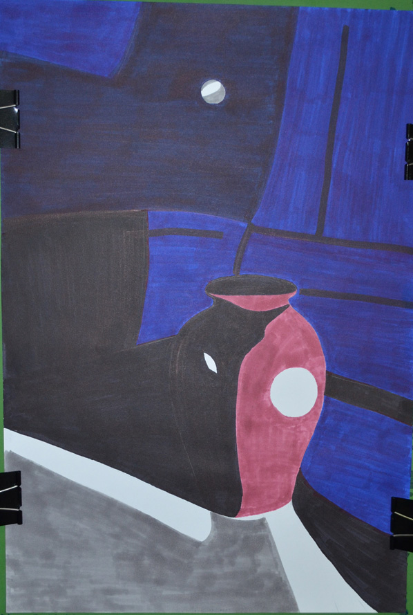
I used the vase that I used in an an earlier exercise ‘Study of Light Reflected from one Object to Another’ and placed it in the chair that I would usually sit in to do my work. I wanted to shine a more acute light on my subject so instead of using the bendy light that I used before I used a torch that I got free from the local western supermarket. I knew that the batteries in the torch wouldn’t last that long so I turned all the lights off found the right angle for the torch to shine at and took a photo, then I worked completely from the photo.
Photo with Torch, vase and Chair
I started by drawing the shadow on the vase, then instead of using white I used colour for the other half, I purchased the markers day before but I swapped vases so the colour did not match but I wasn’t worried about that, I just wanted to know if I could draw something in the similar style as Patrick Caulfield, I highlighted the light reflected from the vase vase by leaving those areas blank.
Drawing after first Two Colours
I used grey for the light that spread from the torch beam as I had I didn’t want the drawing to be completely dark and I had seen Patrick Caulfield also use grey in his paintings, this paid off.
Finished drawing
I cut down on the detail in my drawing and over exaggerated the detail that was left, after adding colour to the vase shadows and foreground I stopped looking at the photo and worked completely from memory hence the various differences like the position of the door handle and seams in the chair positioning where I thought they would look best rather than where they should be.
I was really happy with the finished drawing and even though it doesn’t resemble any 1 particular Caulfield style of painting you can tell he is the inspiration behind it.
In this exercise I was instructed to ‘Use charcoal, a putty rubber and pick two objects with shiny reflective surfaces. Decide on the size of the composition, use A1 or A2 paper so that you can do bold strokes. Try to fill the paper with your objects showing the reflected light and shade of one object falling on another and try to leave very little background space.’
Photo of Chosen Objects, Sieve and Ladle
I went out and purchased a few objects specifically for this exercise, after putting them together in pairs to see how they reflected off each other I settled for what I think is some kind of sieve and a ladle. I chose A2 for the composition because my drawing board wasn’t big so an A1 size drawing board will be my next purchase. The brief said to leave very little background but I wanted to show some of the handle of the ladle and the shadow that it cast but to be honest I could have shown a lot less and made the objects bigger.
Drawing Pattern of Shadow
I sketched an outline with an H3 pencil then as instructed I drew the basic pattern of shadow first with sweeps of charcoal. I did try hatching but the charcoal seemed to leave too darker marks on the paper even trying the charcoal at different angles, this may have been down to the smoothness of the Carson paper that I used.
I tried to stay away from smudging the charcoal as it said nothing about it in the brief but when I did resort to smudging my finger took too much off so I used a stump that I forgot I had. It was great for smudging the charcoal without taking too much off as well as drawing solid outlines. I think if I had used A1 sized paper I could have probably had a better chance of completing the drawing using hatching.
Finished Drawing, Shadows and Reflective Light and Shade
I did start off with the darker tones on the ladle but just on the inner shadows to make sure I was drawing the correct shape (hopefully in time I’ll get more confident with charcoal) and then once everything was fine I switched to the mid tones and then built up to the darker tones.
For the lightest tones and the light reflected from the bendy lamp I used a putty rubber to erase the charcoal. I bought a couple of Conte knead-able erasers which were much better quality than the ones I bought when starting off the course which stuck to everything in the Bangkok heat and left debris on the paper.
I enjoyed the exercise and proud of the result but I am still lacking the confidence with charcoal. I seem to still have a lot more to know about the different types of charcoal, if time allowed I would have liked to have done this again on an A1 sheet of paper to see if I can do the whole exercise without smudging.