Using Markers or Dip Pens

Chosen Composition in Marker Pens

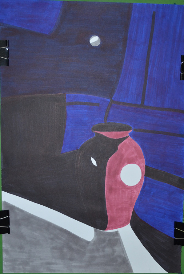
For me this was a stressful exercise that took me over two weeks to complete. I initially wanted to focus more on dip pens and ink for this exercise but it was a mediu I would continue to have problems with.

I started with markers as I already had a good choice of Kurecolor Markers, with a composition that consisted of vine tomatoes, bananas and an apple however I failed miserably looking down at the apple at that angle plus I didn’t have the right colour for the apple.

Using Markers First Composition

My second composition consisted of a red pepper, bananas a rose apple and plum tomato set on a back drop of two different coloured materials used to make monks robes; but then when I drew the composition in markers on the watercolour paper there was too much red in the picture and the colours weren’t brilliant enough for me.

Using Markers or Dip Pens - 2nd Composition
Using Markers or Dip Pens – 2nd Composition


Composition in Marker Pens

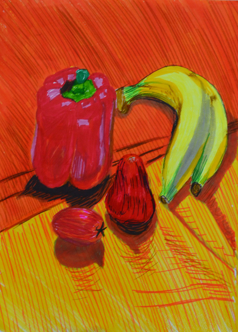
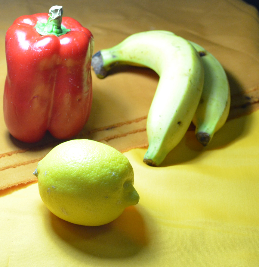
I setteled for a simple composition made up of the bananas, red pepper and lemon that I managed to find in an international supermarket as the Thai lemons are very small and green kind of like a lemon/lime hybrid.


Using Markers or Dip Pens - Final Composition
Using Markers or Dip Pens – Final Composition

Firstly I drew them in marker pens which wasn’t too difficult but getting the colours right before putting pen to paper was almost impossible as the markers reacted differently on the watercolour paper especially when layering at this stage I wasn’t really looking at the shadows and light formations of the surface of the pepper and just added a bit of depth with a dark blue which didn’t work well enough for me.

Chosen Composition in Marker Pens

I finally got round to using dip pens and at this stage I felt like packing in. Firstly I started with liquid water colour which did not stay well on the pen nibs I made several attempts which all got binned before going out to look for higher quality watercolour paper that wouldn’t get saturated as easy and some proper drawing inks.

1st Attempt at Dip Pens
1st Attempt with Ink and Dip Pens

My first attempt with dip pens, ink was a disheartening mess and I was trying to work out what I was doing wrong, inks were running into each other and the paper was still getting saturated. Realising that I wasn’t giving the inks on each object enough time to dry before adding different colours I decided to have another go.

2nd Attempt at Dip Pens
2nd Attempt with Ink and Dip Pens

My second attempt with ink and dip pens was an improvement but I decided that I would use markers on the final piece as I could capture the reflected light and shadows on the pepper a lot better with different coloured marker pens and so started work on my A4 piece,

Final Drawing on A4
Final Drawing on A4

I did use a bit of ink on the final piece with a lemon yellow was over the lemon and a dark wash for the shadows which was a bad decision and a couple of ink splashes finished it off. The final piece is not brilliant but I do feel it is an improvement to the earlier drawings and I think I did really well to capture the patterns on the peppers surface.

Research Point – Patrick Caulfield (Part 2)

drawing in the style of in the chair that I would patrick caulfield

The brief for this was to make a drawing in a similar style to Patrick Caulfield White Ware screen prints, it wasn’t that easy. I decided that I wasn’t going to keep looking at his images so after I finished my part 1 of this research point, researching him, I thought I could remember enough about his prints and paintings to work in a similar style.

I decided to work on an A2 sheet from my larger sketchbook which is too big to work with felt tips and I wanted to show as little pen or brush strokes as possible so I went out and bought some Kurecolor graphic design markers, which were very expensive but well worth the money.

I used the vase that I used in an an earlier exercise ‘Study of Light Reflected from one Object to Another’ and placed it in the chair that I would usually sit in to do my work. I wanted to shine a more acute light on my subject so instead of using the bendy light that I used before I used a torch that I got free from the local western supermarket. I knew that the batteries in the torch wouldn’t last that long so I turned all the lights off found the right angle for the torch to shine at and took a photo, then I worked completely from the photo.

drawing in the style of in the chair that I would patrick caulfield
Photo with Torch, vase and Chair

I started by drawing the shadow on the vase, then instead of using white I used colour for the other half, I purchased the markers day before but I swapped vases so the colour did not match but I wasn’t worried about that, I just wanted to know if I could draw something in the similar style as Patrick Caulfield, I highlighted the light reflected from the vase vase by leaving those areas blank.

drawing in the style of in the chair that I would patrick caulfield
Drawing after first Two Colours

I used grey for the light that spread from the torch beam as I had I didn’t want the drawing to be completely dark and I had seen Patrick Caulfield also use grey in his paintings, this paid off.

drawing in the style of in the chair that I would patrick caulfield
Finished drawing

I cut down on the detail in my drawing and over exaggerated the detail that was left, after adding colour to the vase shadows and foreground I stopped looking at the photo and worked completely from memory hence the various differences like the position of the door handle  and seams in the chair positioning where I thought they would look best rather than where they should be.

I was really happy with the finished drawing and even though it doesn’t resemble any 1 particular Caulfield style of painting you can tell he is the inspiration behind it.