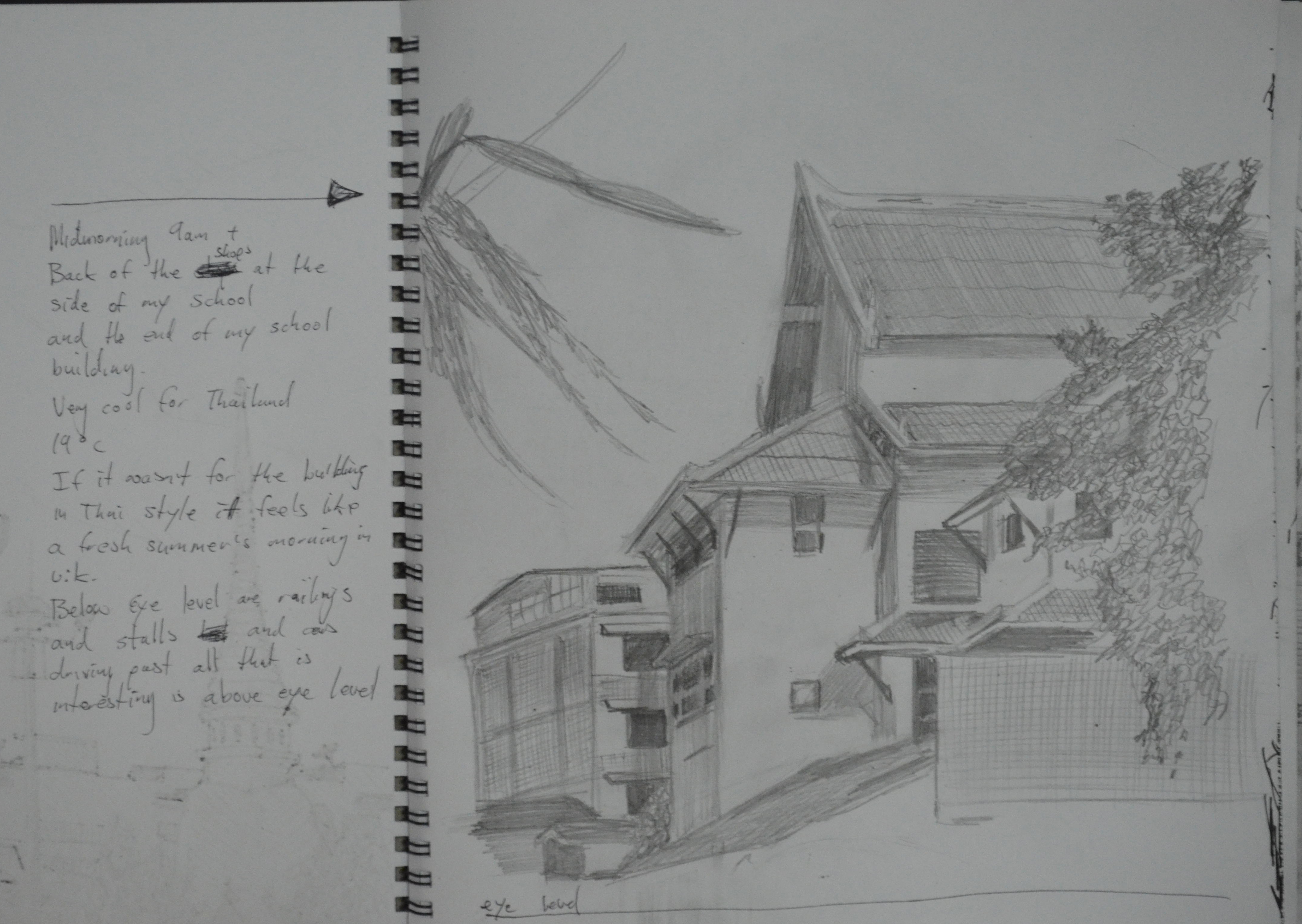
For this exercise I headed out to Suan Rot Fai Park again, railway park, where I did most of my work for Landscape Drawing. There was a eucalyptus tree there that really interested me due to it’s amazing rainbow colours. However, on the way there the traffic was so bad due to yellow shirt roadblocks in that area that we jumped out of the tuk tuk and decided to walk the rest of the way which was about a kilometre. To get to Suan Rot Fai we had to walk through another park, Chatuchak park which is just past the famous JJ weekend market and that was when the magic happened.
There were hundreds of people in the park and most of those were yellow shirt protesters who were using Chatuchak park as a campsite and using the public toilets there as temporary showers. Anyway to get to Suan Rot Fai I had to walk around the whole inside of the park and in doing so I came across a section of the park called, trees in literature (translated from Thai), which was basically a collection of trees from fairy tale movies.
Sketching an Individual Tree 1st Drawing
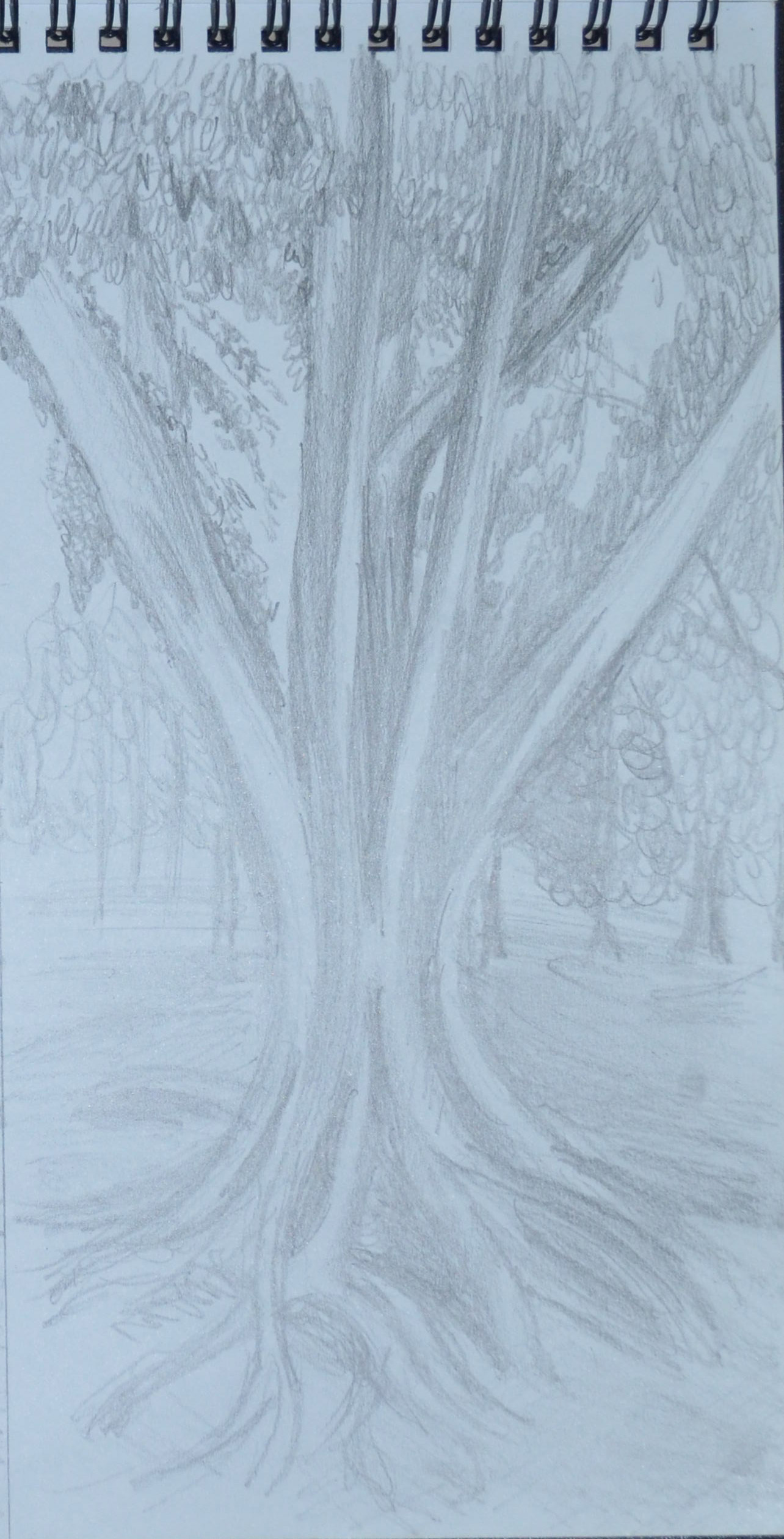
The first tree that took my eye looked like two alien hands coming together and I just had to put pencil to paper. I split my sketchbook page in half and did two preliminary drawings at that size one of the trunk and one of the roots.
Sketching an Individual Tree 2nd Drawing roots
Both drawings were in 6B but with the paper being almost toothless looked just the same as 3B or 4B, I thought it was the Mars Lumograph pencils that left less lead on the paper until the next exercise.
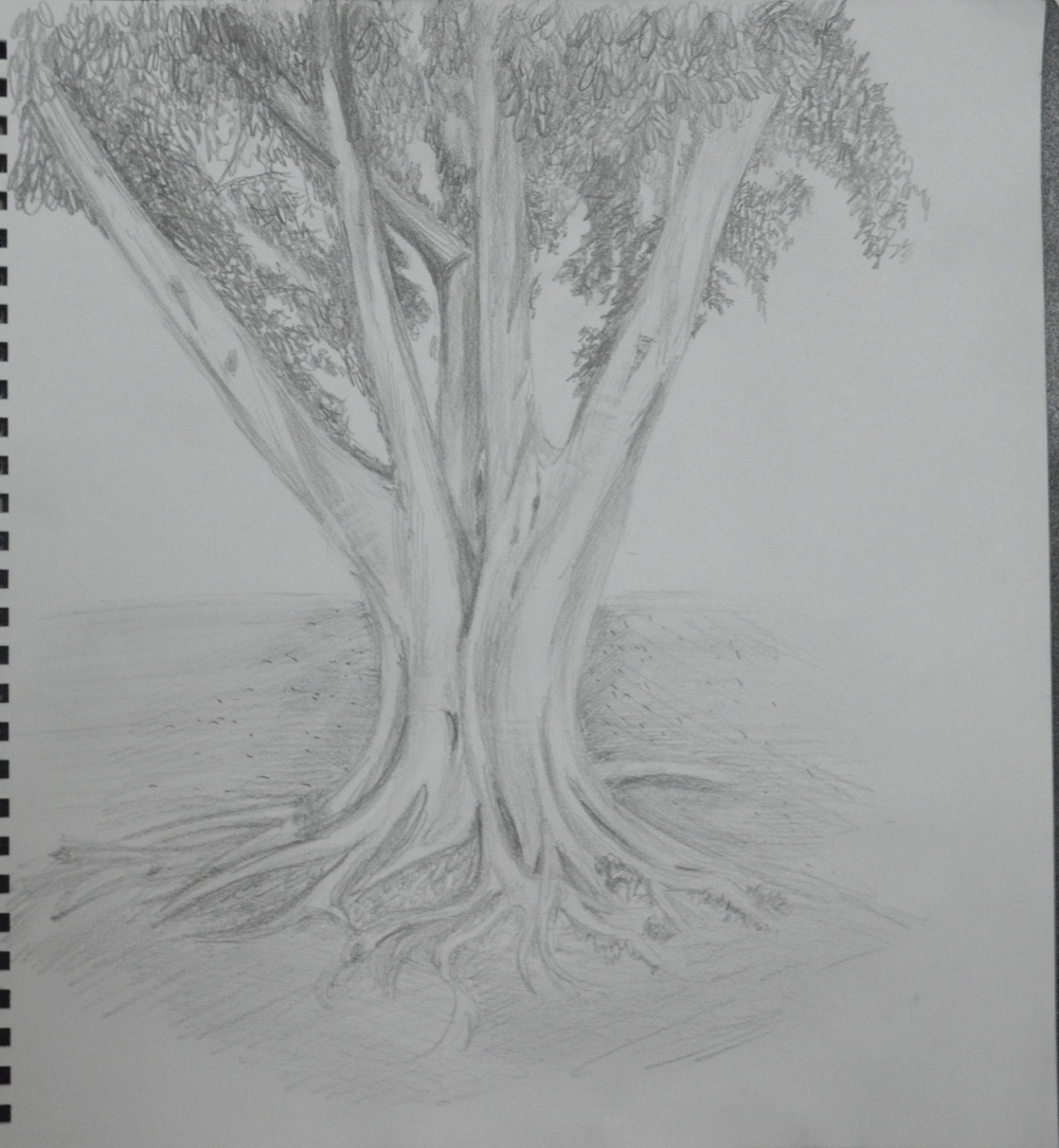
Sketching an Individual Tree 3rd Drawing
The next drawing was on a full page of the whole tree, or most of the tree including roots, bark and foliage and like the brief said I built up on the two previous preliminary sketches and the tree was really starting to come alive, reminding me of a bio art tattoo especially the roots and where the twin trunks meet. I didn’t think I could improve on it but my next drawing proved me wrong.
Sketching an Individual Tree 4th Drawing
There were details the tree was missing, things that we see all the time in tree but never give a thought to, stretch marks! I only started to notice them on the last drawing so I managed to depict these stretch mark lines pointing a putty rubber and dragging it across the widest part of the trunk and branches.
I have been drawing trees throughout this module or at least leaves and branches of them and there has been so much green that I haven’t enjoyed drawing them at all until now and I was really looking forward to the next having already chosen my next subject.
It has been a bit hard to get around Bangkok the last few weeks and the ‘mob’ protesters have shut off the main road entrances into the city. You can still get around, they aren’t preventing pedestrians but there has been numerous grenade attacks and shootings over the last few weeks; so unfortunately I had to stick to the national art gallery and in and around school.
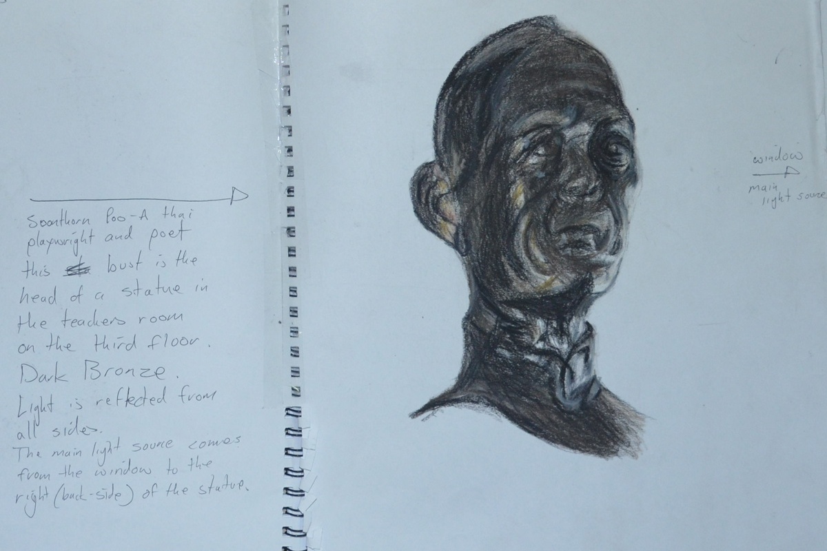
My first drawing was in Conté and hard pastel. I liked using them in the last exercise a limited palette study from your sketches and i thought that the three colours that I used in that exercise would be great for Bronze. In the teacher’s room on the third floor of the school, there was a reproduction bronze statue of the Thai playwright and poet Soonthornpoo (so highly regarded in Thailand that he has his own day).
Soonthornpoo Conte and Pastel Pencil
Surprisingly the three colours worked very differently together in this exercise as the subject was very dark and I had to bring in a yellow and orange pastel pencil.
My next drawings were done at the national art gallery, I was due a visit and I also planned to get some drawings of statues done while I was there. The protesters had been camped out round the corner from the gallery for the last three months which probably put everyone off exhibiting anything at the gallery so there was only one artist exhibiting. There were some nice statues in the permanent exhibition though.
The next subject was a statue of a naked young girl that caught my eye because of the smoothness and colour of the statue but after about 5 attempts in pastel pencil, that ended up in the bin, I gave up trying in colour and did two successful drawings in 4B pencil. Well not quite that successful as it was quite difficult to get the body and facial proportions right of a girl at that age, Drawing the kids heads at school has helped.
Statue of a Young Girl in 4B pencil
The next drawing in pastel and Conté of a women’s head in the gallery was the last drawing I did in the gallery, this particular statue caught my eye because of the strong contrast in colours of the light and shadow caused by being placed in the corner of the not-so-well lit statue exhibition. Disappointingly the finished drawing does not look like the statue, although it does look female, it does look Asian and the colours are spot on, the original statue’s face looked more primate-looking with the face stretching forwards and big cheeks.
Bust of a Thai Woman National Art Gallery
I was back at school on the Monday and so I had time to draw a statue depicting one of the 7 faces of Buddha (I think that’s how many there are). Phra Mahanchanok and the other 6 faces are depicted in different scenes around Wat (temple) Makut near the school and are statues molded from a cement time mixture around a metal frame. This was a disappointing effort as the drawing just looks flat.
Phra Mahanchanok Outside Temple in 4B
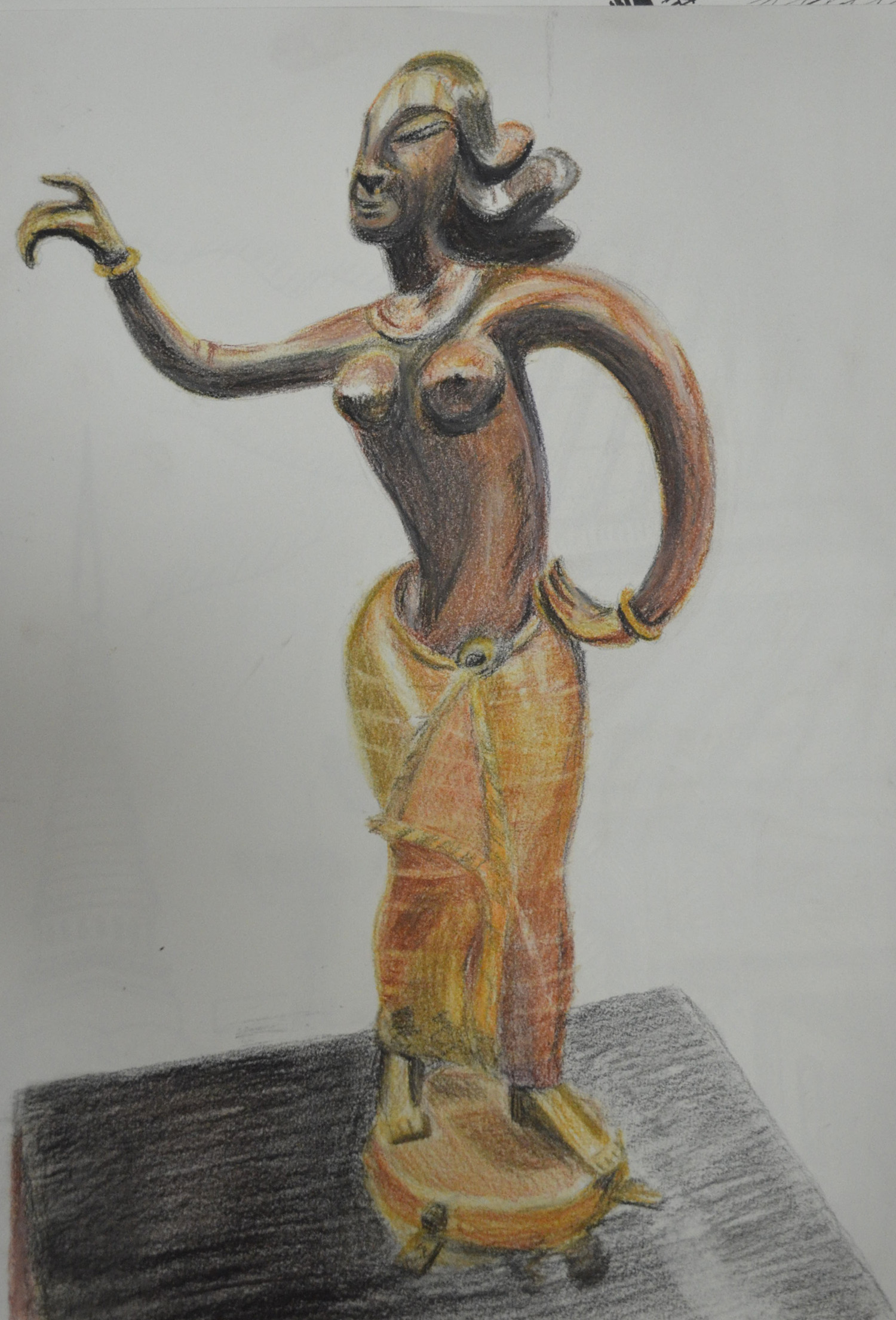
The last statue was of a southern Thai style female figure in bronze, from a photo that I took in the art gallery, I loved bronze appeared to be different colours in different parts of the statue due to the contrast in curves and textures, I thought it was the perfect subject for a larger drawing and so I completed her in pastel pencil and Conté on an A3 sheet of paper.
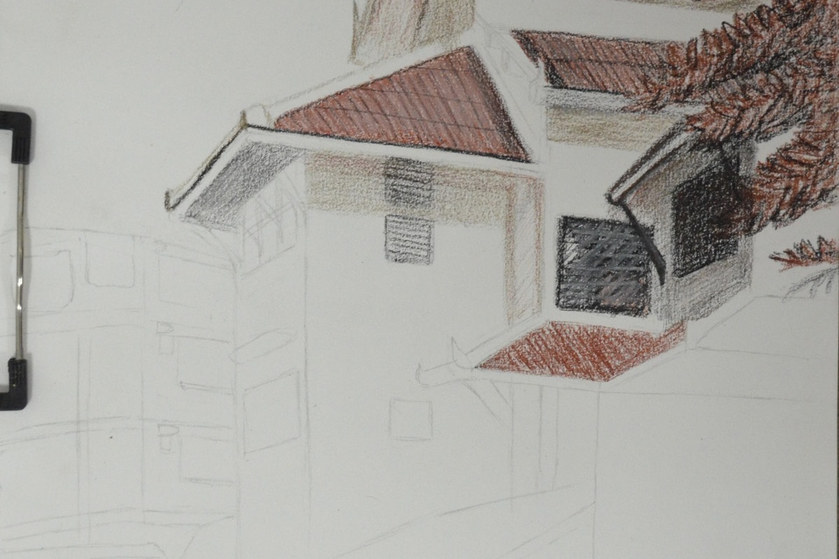
For this exercise I was to make a limited palette study from the sketches in my previous exercise ‘a Sketchbook of Townscape Drawings‘ in 2-3 colours. I used a chocolate pastel pencil, sanguine and black Conté pencils and a Derwent Chinese White drawing pencil.
I had already done a pencil sketch of my school in the last exercise as well as a drawing of the same school in colour pencil and knowing that it would work for this exercise I decided to develop those sketches into a larger drawing with a limited palette.
Sketch of School in H pencil w notesSection of School in 3B and Dry Watercolour Pencils
I followed the instructions of this exercise, drawing in the strongest verticals first, which were the corners of the main school building. From there I drew in the diagonals which were the many roofs of the school building and most of everything else.
Adding Colour
Drawing in the detail was quite easy simply because I got the verticals and diagonal lines right the first time but if not then drawing in the windows, roof beams etc. could have been a disaster.
A Limited Palette Study in Conte, Pastel and Chinese White
The colours that I chose for this exercise went very well together and so the roll of each colour i.e. light, dark and mid-tone swapped over in different parts of the picture with the most prominent colours being the Sanguine and the Black Conté simply because they helped me depict how bright and fresh the day was.
The chocolate colour pastel pencil was mainly used for shadow along with the black Conté at minimum pressure. The Chinese white was grade for toning down the Conté and also adding 3D properties to the tiled roofs.
I have to be honest and say I love the finished study which does remind me of some drawing from an history lesson at school.
‘The aim of this exercise was to establish a foreground, middle ground and background in your drawing. If you can compose and structure your drawing to include these divisions you are then beginning to establish a sense of space in the structure of your drawing. This way of organising space is characteristic of the French classical painters Nicholas Poussin and Claude Lorrain, who in turn influenced the British landscape artist, Joseph Mallord William Turner.’
Now I had already had a glimpsed at some of Claude Lorrain’s paintings but one painting that really inspired me for this exercise was Frederic Edwin Church Heart of the Andes that I looked at in an earlier research point Different Artists’ Depictions of Landscape.
With the red shirts and yellow shirts kicking off here in Bangkok my school has been closed for 3 or 4 days every week for the last week, with them calling a truce just for today, the king’s birthday. Anyway with time off work we made the decision to go away to Sarabruri for a couple of days and so I decided to take my pencils, an A3 drawing pad and drawing board.
The view from our room balcony at Saraburi
The lodge where we stayed was overlooking some beautiful – what I would call – mountain shaped hills but when we arrived on the first day it was already knocking on so I set my alarm and got up at 6 am.
The mountains looked great with the mist glowing above and in front of them and I knew they wouldn’t look like that forever so I took a few snaps with the camera first and took a great shot, the one above, which was framed with a tree. Using my view finder I began to draw knowing that I could work from the photos later. I had decided to work entirely in Derwent watercolour pencil for the following reasons:
Less waxy than Derwent Artists’ Pencils
Easy to erase
Easy to blend
If I needed to I could use them wet
I decided to work from the background down to the foreground as I wanted to get the mountains and the sky just right, However I spent so long working on the mountains that the mist was clearing and I had to keep resorting back to looking at the photo on my Galaxy Tab.
1 – Mountains and Sky Backgrund
The second step was the middle ground, the mist had all but lifted by now but using the photo on the tablet as reference I blocked in the middle ground areas with a a blend of grey, violet and blue and then drawing in the trees in thew distance with a 2 shades of green and grey to depict the trees appearing out of the mist.
2 – Middle Ground Complete
Up until now everything was going well but I was about three hours in and so that I didn’t ignore the girlfriend I decided to finish off the foreground, frame the picture with a tree then finish the rest of the drawing off back home in Bangkok and too be honest I was a bit overwhelmed by how many trees I had to draw so needed a break anyway.
3 – Plotting Space through Composition and Structure – Watercolour Pencil Mostly Dry
When it came to drawing the big trees in the foreground I started by drawing the outlines of the trees in a lighter coloured pencil, then using irregular hatching for the branches from dark to light colours.
4 – Plotting Space through Composition and Structure – Sky finished
I noticed there is a project coming up called Drawing Trees, for me it would have been better to have done that first before this project as I have been drawing nothing but trees since A Sketchbook Walk and it has been a struggle. and this exercise was no different.
5 – Photo of drawing with no reflection
Due to me not using watercolour paper I refrained from drawing wet until I needed to and that was on the largest tree and three at the side that I framed the drawing with.
To be honest not much of this drawing turned out the way I wanted it to, background great, middle-ground great but then the foreground just changed everything and made the drawing look like some kind of dodgy cartoon. However I am not going to start again as I believe I have achieved the goal of this exercise which was to establish a foreground, middle ground and background in my drawing.
For the first research point in this part of the course, ‘Drawing Outdoors’ We were asked to look at different artists depictions of landscapes, for example Albrecht Dürer, Claude Lorrain and L.S. Lowry.
Albrecht Dürer
Albrecht Dürer 1471-1528 gave us some of the earliest and finest works of the ‘Northern Renaissance’ with some wonderful landscape paintings, however, with the next exercise ‘a sketchbook walk’ coming up, I decided to look for some of Dürer’s more sketchy works.
The first painting I came across was a painting called Quarry, I searched on Google to try to find more information on this painting but to no avail, all I found was other paintings in colour of the same name. Looking at the painting at a first glance I thought it was a drawing in pencil but then realized it was a watercolour but it does look like he may have used other media such as pencil to finish the piece. The mark making techniques he has used in the painting are very simple and yet he has managed to create a good sense of three dimension with thin strong lines for the turfs of grass and weeds in the foreground to the wide, smudged brush strokes for the trees in the background and everything else in between. I particularly like the mark making techniques he has used for the leafs of the trees as he has depicted what we see has very complex objects with a series of simple shapes.
Quarry – Albrecht Durer
Another painting that I really liked was ‘Forest Glade with a Walled Fountain by which Two Men are Sitting’. I haven’t found the details of this drawing but it looks more like a drawing in pen and ink than a drawing. At first I couldn’t determine whether the artist had no time to finish the painting or if he had deliberately left it unfinished but then I realized that he was trying to show the light shining in through the trees on the left hand side of the picture and the dark forest in the background.
Forest Glade with a Walled Fountain by Which Two Men are Sitting 1505 Albrecht Durer
Again, like the first painting he has used many different mark making techniques using hatching and cross hatching for the fountain, as well as the two men and various hatching techniques to show the density of the forest behind. I can also see that he has used the same simple marks for the leaves on the trees as the first painting which works really well.
L.S. Lowry (1 November 1887 – 23 February 1976)
Laurence Stephen Lowry, was born in Stretford, Lancashire in 1887 and as a northerner as always been a favourite of mine.
Lowry is famous for his paintings depicting life in various industrial districts in the Northwest of England in a very distinctive style of painting.
Because of his use of stylised figures and the lack of weather effects in many of his landscapes he is sometimes characterised as a naïve “Sunday painter”, although this is not the position of the galleries that have organised retrospectives of his works. – Wikipedia.
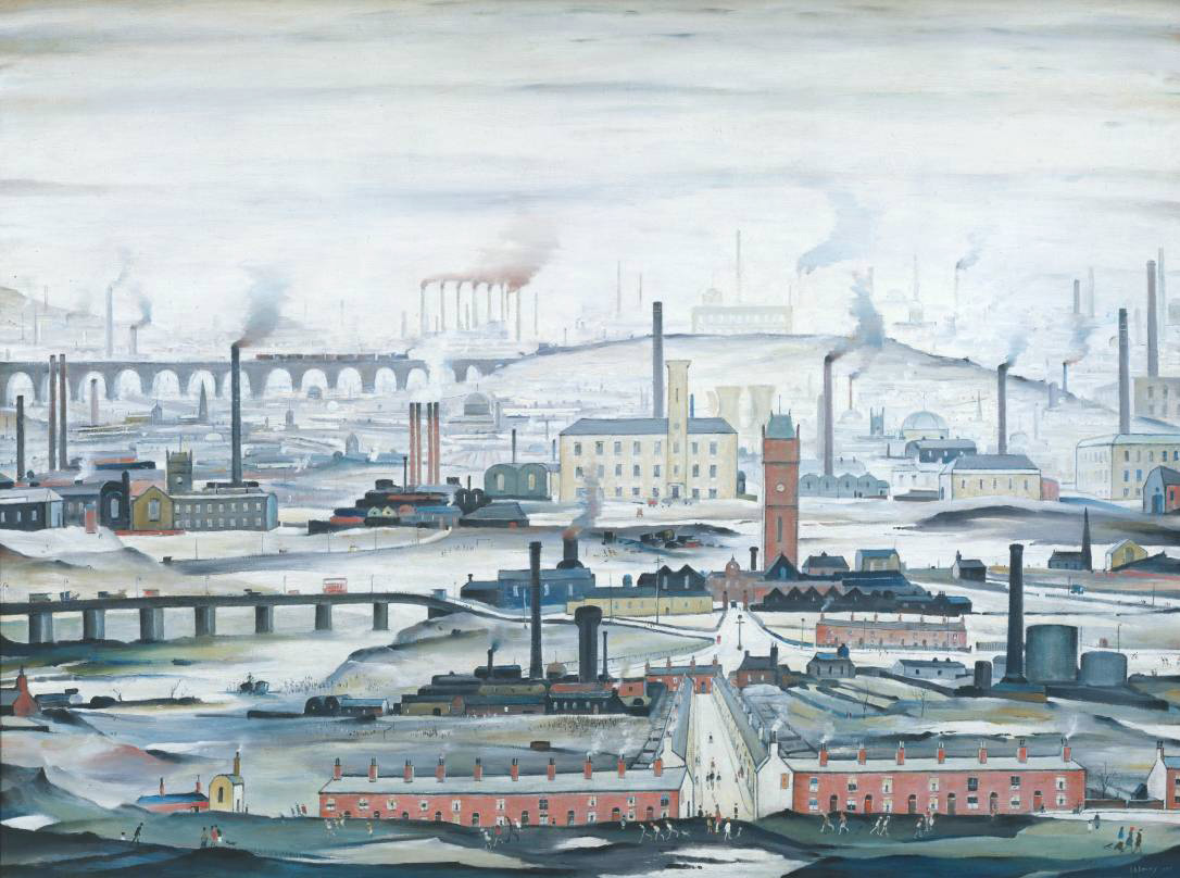
L.S. Lowry Industrial Landscape 1955
The oil painting, Industrial Landscape 1955, below is a great example of Lowry’s industrial landscape paintings. What I like about Lowry’s paintings especially this one is that the building, bridges, houses etc. are made up of very simple shapes, mostly rectangles and squares and yet he still manages to create feeling in his paintings with the help of factory smoke and dismal skies plus the background that fades to almost nothing helps not only to create a sense of distance but of smog and pollution being caused by the factory chimneys. Although the perspective is not perfect he creates a sense distance by painting the landscape lighter and lighter as he moves into the background eventually fading to a blue-grey; as well as painting objects like trees, bushes, chimneys and spires with simpler and smaller shapes so that they appear far-off.
L.S. Lowry An Industrial Landscape 1958
I tried to find a larger image of the following painting but to no avail. Also titled An Industrial Landscape the painting was bought for 300 GBP in 1959 and sold for 600,000 GBP in 2007. Again you can see how he paints the buildings in lighter and lighter shades in the background to give the impression they are disappearing into an industrial smog.
Finding a Substitute for Claude Lorrain
I noticed that I would be researching Claude Lorrain again later on in this module and so I set out to find a substitute. I first searched for Claude Lorrain on Google which took me to the Baroque period from there I clicked on a link to Landscapes which took me to page of wonderful landscapes on Wikipedia with Landscape Paintings of artists from all different periods.
The first painting that jumped out at me was a painting by Caspar David Friedrich, titled Wanderer above the Sea of Fog, 1818, which is a classic image from German Romanticism. I recently watched a series of documentaries about German art on the BBC and this painting was used in the credits. My kind of painting really, simple and yet the landscape he has painted catches the imagination wondering what is below the peaks, and below the cloud line. Again as in paintings by the other artists in this research point the trees on the mountain ridges are made up of very simple squiggles and other shapes but its not something you notice straight away. I love the way he has used what I think are long twisted brush strokes with a darker colour over the lighter colour in the background to create the effect of mist rolling down the ills to the center of the picture.
Caspar David Friedrich: The wanderer above the Sea of Fog 1818
The next image that caught my attention was a painting by Frederic Edwin Church titled The Heart of the Andes, 1859. Unlike the previous painting this is by no means simple, I couldn’t even begin to think about where this guy started or what techniques he used, say, for the trees, but the mountains in the background are pure inspiration. They seem to be layers and layers of colour painted over the blue sky background making their way to ground level with the white snowcapped mountains in the background taking your mind on a journey around the mountains in front to get to them.
I would say that the main challenges for me were unique to the subjects that I chose. For one ‘s very hard to capture movement with ravens as they don’t stand still for long. Unlike a dog or cat the only time you can catch a bird sleeping is at night in a tree basically, so I had to capture movement with sketches as well as photos. Texture was also a challenge, birds feathers are very complex and have a different texture in different parts of the body.
Which media did you enjoy using most and which did you feel were best for the subject matter and why?
Grabbing the Chance Finished Drawing
As always I enjoyed using the ball point pen the most, for the sketches of the ravens in Grabbing the Chance. With the ball point pen and the colour of the raven’s I could almost do a continuous drawing of the birds. Coloured pencils were great for the finished drawing in grabbing the chance, they captured the details well and were great for layering all the different colours but they weren’t dark enough to capture the deep colours of the bird. hard pastels may have been better for the job.
Where can you go to draw more animals?
The only real place in Bangkok to draw animals unless you have a pet or live in a street where the stray dogs run freely is the zoo. I went to the zoo with the intention to draw different animals but came across the ravens while there.
Research point: Look at how Renaissance masters such as Leonardo and Dürer depicted animals
During the Renaissance period (14th-17th centuries) Europe became the academic heart of the world with Renaissance scholars absorbing the knowledge acquired from other older cultures such as vanishing the Islamic world. Like many other areas of study during this period, both biology and natural science became progressively more specialized and began to take on their own identity.
The Renaissance began a cultural revolution that seemed to be driven by art and science at this time was no different, in fact it was the artists and sculptors of the Renaissance period seeking perfect realism in their work that brought anatomy and biology to the forefront of all scientific areas.
Renaissance artists were the first to dissect plants and animals for a better understanding of the living world. From this artists were able to create more energetic and realistic works of art and make the connection between the structures of animals and humans; Leonardo da Vinci was undoubtedly one of the first scholars to do just this.
Leonardo da Vinci (1452-1519)
These days described as the first animal rights activist Leonardo da Vinci would often go to the markets and buy caged animals to set them free. In several of his works Da Vinci combined art with science. This combination of art and science is especially clear in his depiction of animals.
To render the animals in his works with scientific precision Leonardo not only studied the anatomy of the animals but also their physiology. But too really depict them with scientific precision he performed dissection on a number of animals as well as studying their movement in their natural habitat.
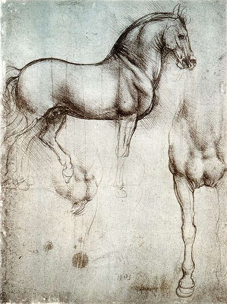
Cavillo di Leonardo – 1490 c
Nowhere is it more obvious as in his ‘Cavillo di Leonardo ’ (Leonardo’s Horse 1490 c) right. Not only has he managed perfectly reproduce the animals stance and bowed head but the wonderful muscle tone and folds around the neck.
Leonardo da Vinci “Study of horses”, red chalk on paper, 1504-6
In ‘Study of horses’ red chalk on paper 1504-6 which I think is actually a ‘ A Study for the Battle of Anghiari’ he focuses on the horse’s hind legs especially on how the defined muscles and tendons giving an impression the horse’s legs are buckling under weight. To me this is a prime example of how his scientific studies helped him to achieve this standard of realism.
Albrechct Durer (1471-1528)
Born in 15th century Nuremberg, Germany into the Northern Renaissance period, Albrecht Dürer was the son of a goldsmith who taught his son to draw, hence Albrecht’s appreciation of fine detail. Dürer is undoubtedly one of the greatest oil painters of the Northern Renaisssance but is also famous for his superb watercolours as well as woodcut prints and engravings.
Until the superb quality of George Stubbs’s work elevated animals in art in the 18th century animals were not thought of to be ideal subjects and the drawing of animals was considered to be merely a demonstration of an artist’s technical skill. However almost two centuries before Stubbs, Dürer began to view animals with the attention they deserved and demonstrating this with an array of watercolours and woodcut prints that over time have become increasingly popular and widely reproduced.
Albrecht Dürer Wing of a Blue Roller 1512
Albrecht Dürer was a familiar name to me and I was especially familiar with his painting ‘Wing of a Blue Roller 1512′ an image I have come across time and time again, and it’s a always been a goal of mine to create something similar being inspired by this wonderful piece.
The painting Is a perfect example of his exceptional drawing skill, ‘he uses watercolor to delicately blend the soft graduating color of the plumage and overpaints linear detail with gouache (an opaque watercolor) to pick out the jagged edges of the feathers.’ [3] He has managed to capture the contrasting textures of the feathers and down of the wing perfectly with so much realism that you can almost feel it.
Albrecht Dürer Rhinoceros 1515 pen and ink drawing
Dürer created this pen and ink drawing of the Indian rhinoceros based on notes and a sketch by an unknown artist from Lisbon who had obviously been a traveler and seen the animal with his own eyes. However Dürer had never seen this animal for himself and recreated the drawing enhancing the anatomy of the animal by adding an extra horn to the Rhino’s back. The rhinoceros had not been seen in Europe since Roman times and Dürer’s image of the animal was generally accepted as being anatomically correct until the 18th century. Again, even though he had never seen the animal for himself, he has almost managed to recreate the exact texture of the animal.
How will your experiments with negative space help your observational drawing in the future?
Before I even started this course I was very aware of negative space but this course as made my awareness of it a lot more acute. I no longer just look at the negative space in and around the subject but the negative space between objects, Negative space plays a big part in all subjects whether it be a plant, landscape or the space between facial features in a portrait and being more aware of this will help to improve my observational skills with all.
What techniques did you use to ensure you drew your plants in proportion?
Negative space played a big part in this for me throughout this project I started at with one part of the subject and then worked my way around using the negative space between flowers and leaves piecing it together like a jigsaw. I then altered the shapes of the flowers and leaves where necessary.
How did you achieve an effect of three dimensional space in your drawings?
Firstly the way I arranged the flowers was a big help with the biggest at the front and the smallest at the back with the biggest flowers at the front acted as a focal point. The earlier exercise Still LIfe Group in Tone was also a big and drawing the overlapping plants and their cast shadows also helped me to create an effect three dimensional space.
What are the difficulties in separating cast shadow from reflected Light and shade?
The difficulty in separating cast shadow from reflected light and shade is that there is very little tone difference between them and makes it hard to determine which is which. However the fact that they fall in opposite directions does help to determine which is which.
The reflected shadow and light follows the contours of the objects how have you shown this in your drawing?
To show how how reflected light follows the contours of the objects I used fluid strokes and hatching techniques as well as following the contours with a putty rubber.
Did you do enough preliminary work before starting on your final pieces?
Yes definitely, the preliminary work not only helped me decide on the best composition for the final piece but helped me to decide which mediums I should use. In both parts of this assignment it changed my mind about what mediums I would use and also the layout of the composition for the final piece. I probably could have done more with regards to colour blending and make more notes on which colours to use for the Natural Objects.
Do your large drawings give an accurate interpretation of the still life groups? If not, what went wrong?
The large drawing for Made Objects I believe was a very accurate interpretation of the still life group even after playing down certain details such as the amount of bars on the electric fan cage. However I I’m not too happy with the interpretation of the still life group in the large drawing for the Natural forms. There are certain shapes on the edge of the drawing that I know are not the same as the actual objects this was due to moving the objects about trying to find the composition that I chose to develop, then having to work from the drawings I had already done and photos that I had taken.
Did you make a good selection of objects or did you try to include too much?
I believe I made a good selection of objects for both parts of this assignment with a minimum amount of objects in mind as I set out on each project.
Do your drawings fit well on the paper, or could they be improved by working on a larger sheet of paper?
The drawings do fit well on the paper but I do feel that both compositions may have been improved on a larger A1 sheet of paper because of the objects that I chose for the Made Objects and for the medium that I chose for the Natural Forms.
Did you have problems with drawing, or find hatching too difficult?
I don’t feel that I have any problems with drawing, any problems that do have are probably from the lack of experience with certain mediums. In the Natural forms part of the assignment I thought I did quite well in developing my hatching skills with hard pastel.