In my tutor feedback recommended that I look at 2 new artists the English artist Jenny Saville and Scottish artist Alison Watt. After a quick glance at some of their art work I decided to look at the paintings of Alison Watt first.
Alison Watt OBE is a Scottish painter, born in Greenock on 11 December 1965. She studied at Glasgow School of Art, graduating in 1988. Prior to graduating she won the John Player Portrait Award and as a result was commissioned to paint a portrait of the Queen Mother. Her first pieces to become famous were bluntly painted figurative canvases, more often than not female nudes, within light filled interiors.
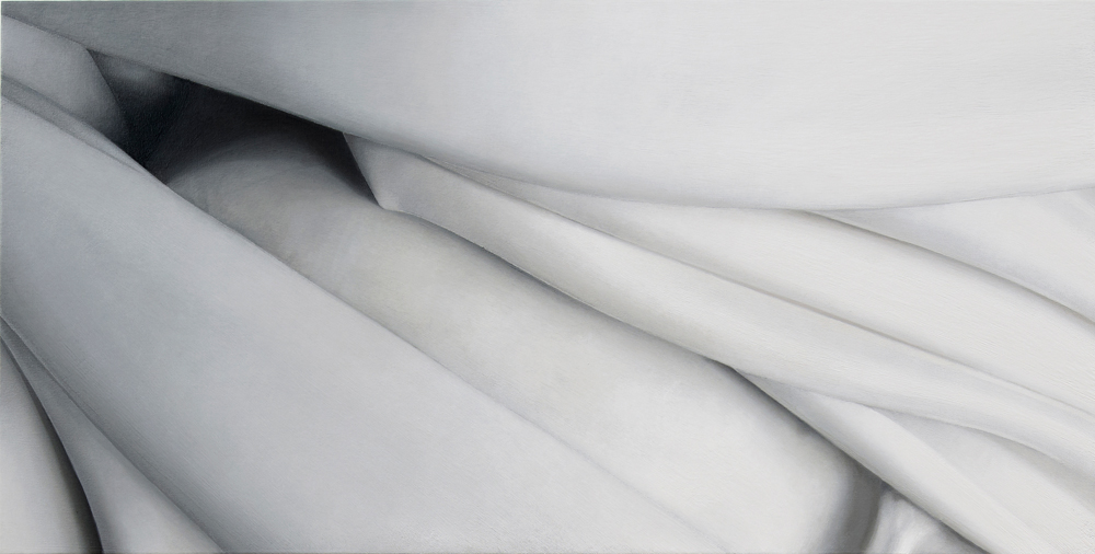
In 1997 in an exhibition entitled simply ‘Fold’ she introduced fabric alongside these figures for the first time. In 2000 she was offered a solo exhibition at the Scottish national Gallery of Modern Art and was the youngest ever artist to be given this chance. This exhibition was called Shift and it consisted of 12 huge paintings that featured just fabric.
Alison Watt – Fold Exhibition
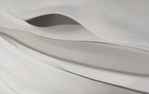
I’ve looked at many of her paintings and I wanted to say something like this ‘her early paintings seemed to be of the piece of fabric as a whole, the creases, the folds and the patterns that they make all on one canvas, painting cloth as a hyper-realist (if that makes sense) but it seems as though as she has developed, she has taken the same approach to painting fabric as Georgia O’Keeffe did with plants, flowers and other natural forms, moving towards painting more abstract with almost sexual qualities. In fact some of Alison Watts paintings echo the painting style of O’Keeffe.’
Looking at Alison Watts’ Paintings it seems like her earlier paintings of figure and fabric helped her to see something in the folds, their beauty, energy, individuality and even sexual characteristics with each individual fold expressing something different.
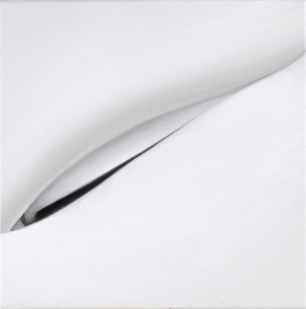
Alison Watt – Echo
The colour of the fabric in the paintings is something we take for granted in photos. We just see white because that’s what our eyes tell us it is, white fabric. If we look closer at Echo above for example, we can see blue, orange, pink and all the other colours that make up the light and shadows.
I had already thought about how I could draw a white door for example using lots of different colours and I think this maybe something I should try in my final assignment.
For this exercise I started off working with the model and from there I moved onto sketches. Last weekend was a big public holiday here in Thailand, mothers day, the Queens birthday which was actually on the 12th but the Thais have 4 days holiday.
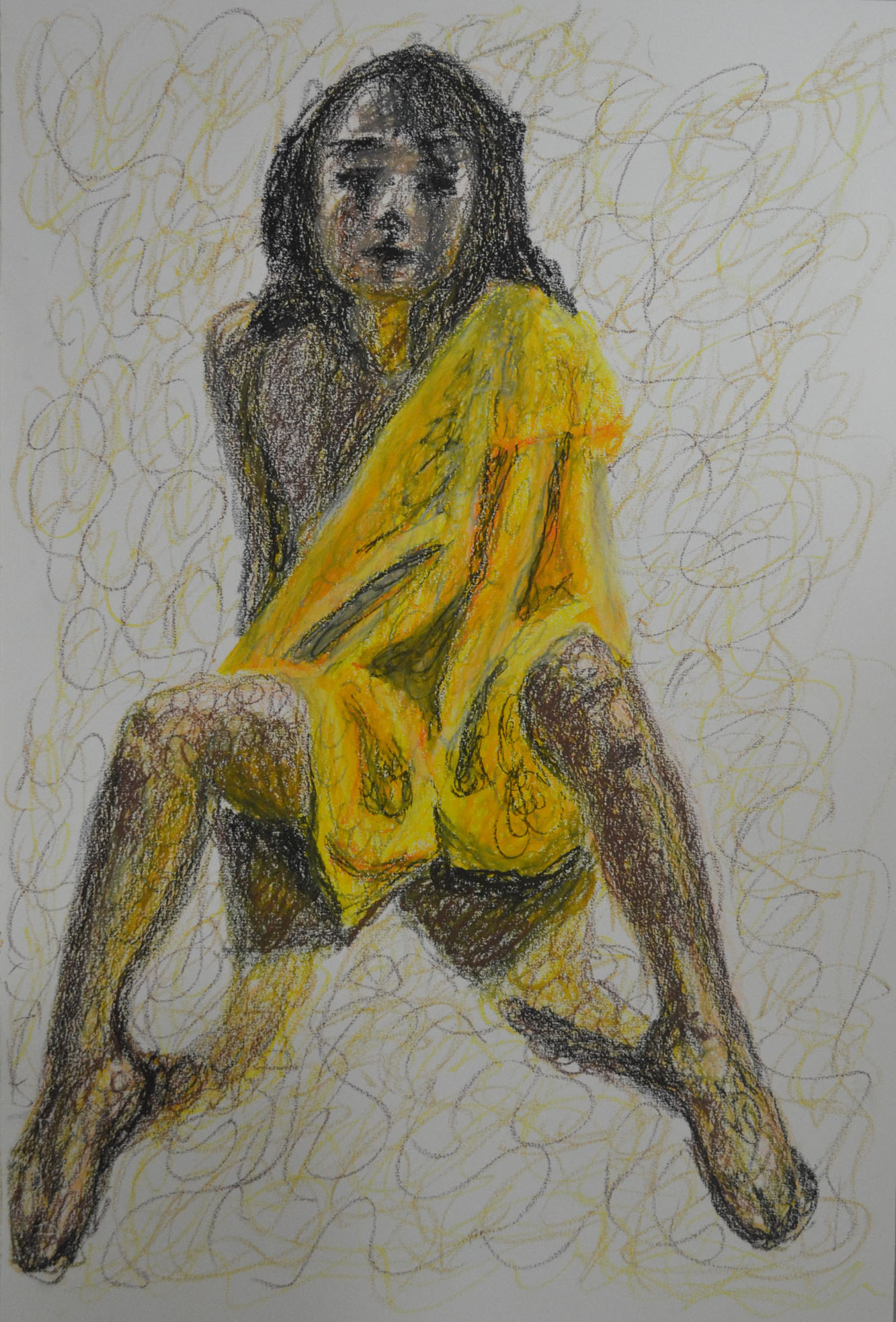
I had previously tried to draw in the style of Alberto Giacometti; although I wasn’t too impressed with a lot of his work, which I had said in a previous post made me feel uncomfortable and a little anxious, I did like some of his work. and I rather enjoyed drawing in his style in the second part of the research point which I think reflects in the first piece for this exercise below. The ability to create a 3D form from squiggles is just too appealing to me and oil pastel felt like the perfect medium for this drawing. I am already starting to think about my final assignment and this was basically a practice piece for the upcoming assignment trying to produce an expressive (maybe), erotic nude, with some type of cloth covering part of the figure.
1 – Oil Pastel with Robe and Squiggles
The second piece should have been bigger, also in oil pastel I tried to produce an expressive drawing with a different technique rather than a different medium. The technique I chose for this was a very contrasting technique to the squiggles above, horizontal hatching. The pose was also very different, this time the model wore no cloth at all and was laid down with her head towards me. The problem here though was trying to produce some shadow below her head to show that her hair is actually spread out across the floor, as looking at the finished piece below it looks like the head is floating.The other problem with this drawing is that the figure should fill the plane however when I was drawing the figure was happy with the outline and therefore I didn’t want to change it. So I filled the paper with furniture.
2 – Oil Pastel with Horizontal Hatching
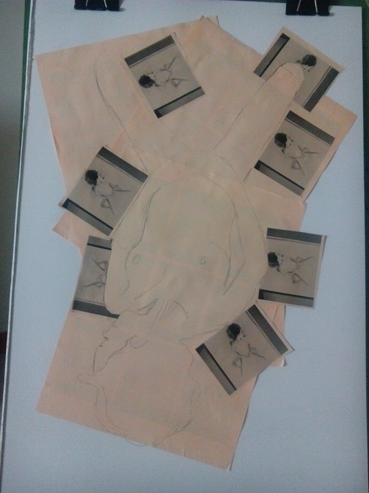
At this stage I had an idea for the next piece. Firstly I uploaded the several photos of different drawings to Facebook so I could print them off at work later that evening and see which ones look best ripped or cut up as a collage.
I bought three packs of different coloured paper, orange, yellow and peach (I think) I then printed the picture out at 9 copies to a sheet to see which looked best. I decided on drawing 2 above and the photo below shows how it looked printed out.
Drawing Printed on Paper
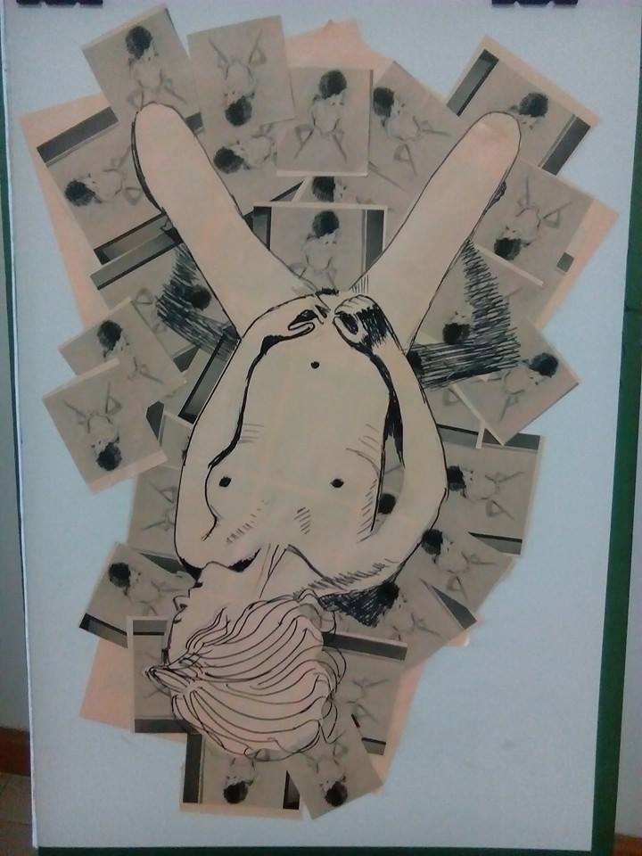
The net day was my birthday and I spent the afternoon getting creative:
Collage Step 1Collage Step 2Collage Step 3Collage Step 4Collage Step 53rd Piece – The finished Collage with Black Felt Tip
The next challenge was to create a collage piece using the printed sheets of paper for the cloth draped over the model. I chose to do this drawing on watercolour paper and to draw the model in watercolour pen.
Firstly I drew the whole shape of the model with cloth draped over her in pencil and then with a black pen I drew around the shape of the cloth so I could see it through the paper enabling me to draw shapes in pencil to be cut out. Unfortunately the lines made by the black pen were too wide and so I had to make the shapes bigger to cover up the lines around the left arm which now looks withered.
From there I started to cut out and glue on small pieces of orange paper to depict the shadow in the folds of the cloth but I decided that I would probably mess up and and instead to finish these details in an orange watercolour pen with the darker shadows in green. After I finished with the cloth I finished of the shoulders, head, arms and knees, the vibrant lighter colour pens really made the darker colours stand out. I think because of the thin left arm the knees look two fat, this is my only regret here.
4 – Collage with Watercolour Pen on Watercolour Paper
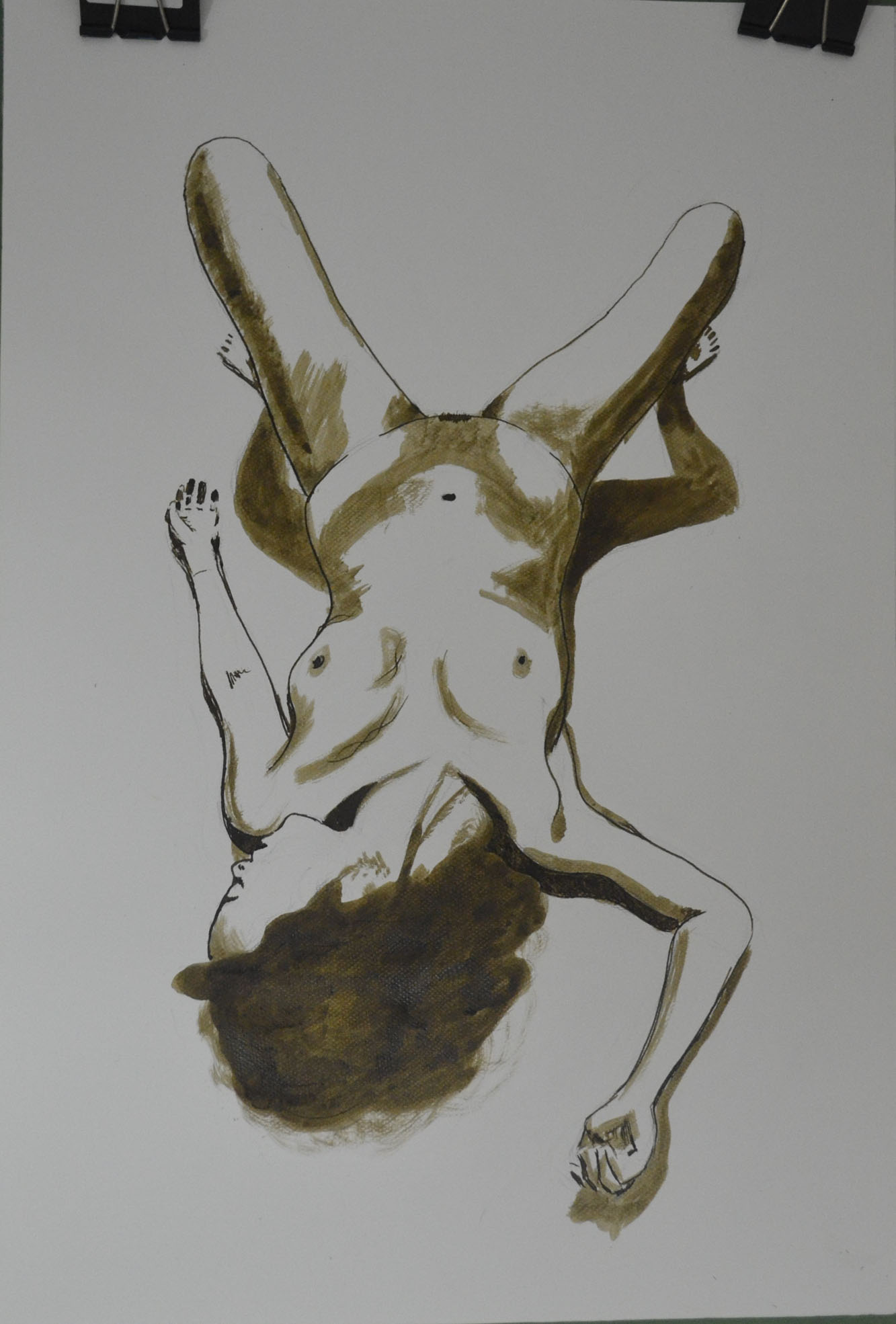
For the next piece I chose sepia ink with a dip pen and brush as my drawing tool of choice, I originally wanted to do a different coloured wash over the top but decided against it as I loved the plain and simple finished piece too much.
5 – Ink with Nib Pen and Brush on Watercolour paper
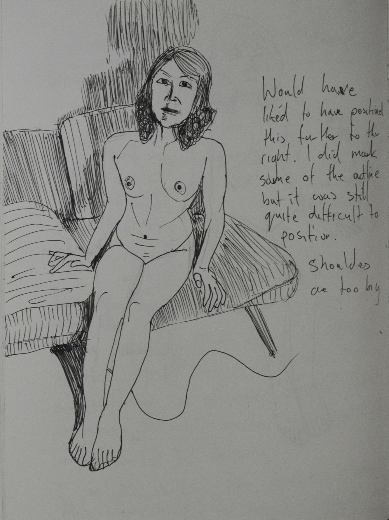
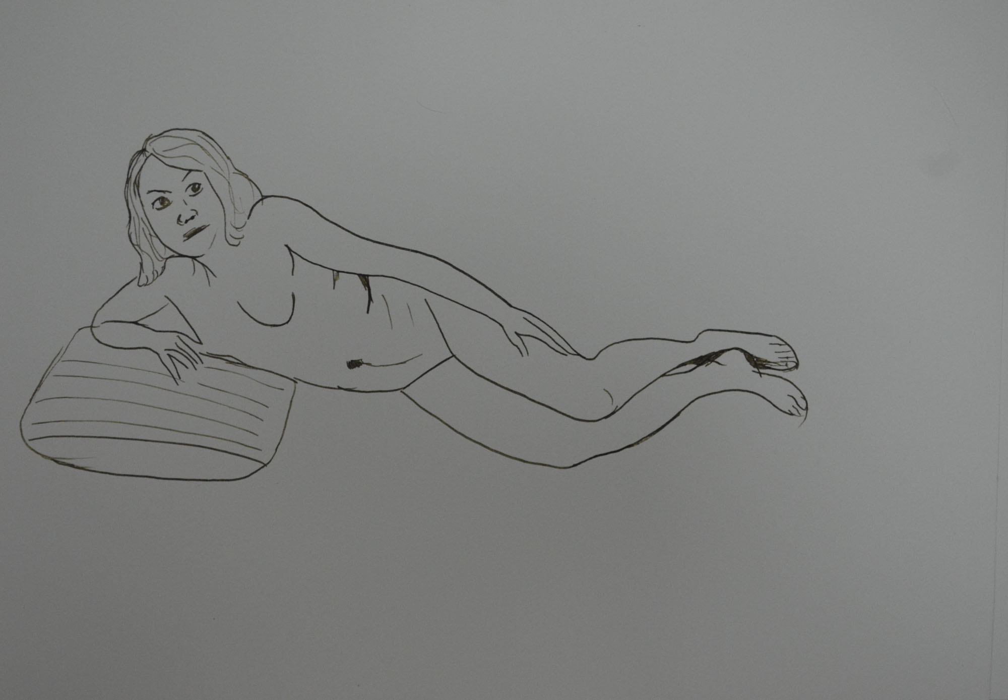
For this exercise I started out in my sketchbook with a Rotring drawing pen and with my model in a seated position on the sofa I decided to start off with a continuous line drawing without taking my pen from the paper. The result was pretty good even though the face has no real resemblance.
1 – Continuous Line Drawing Pen
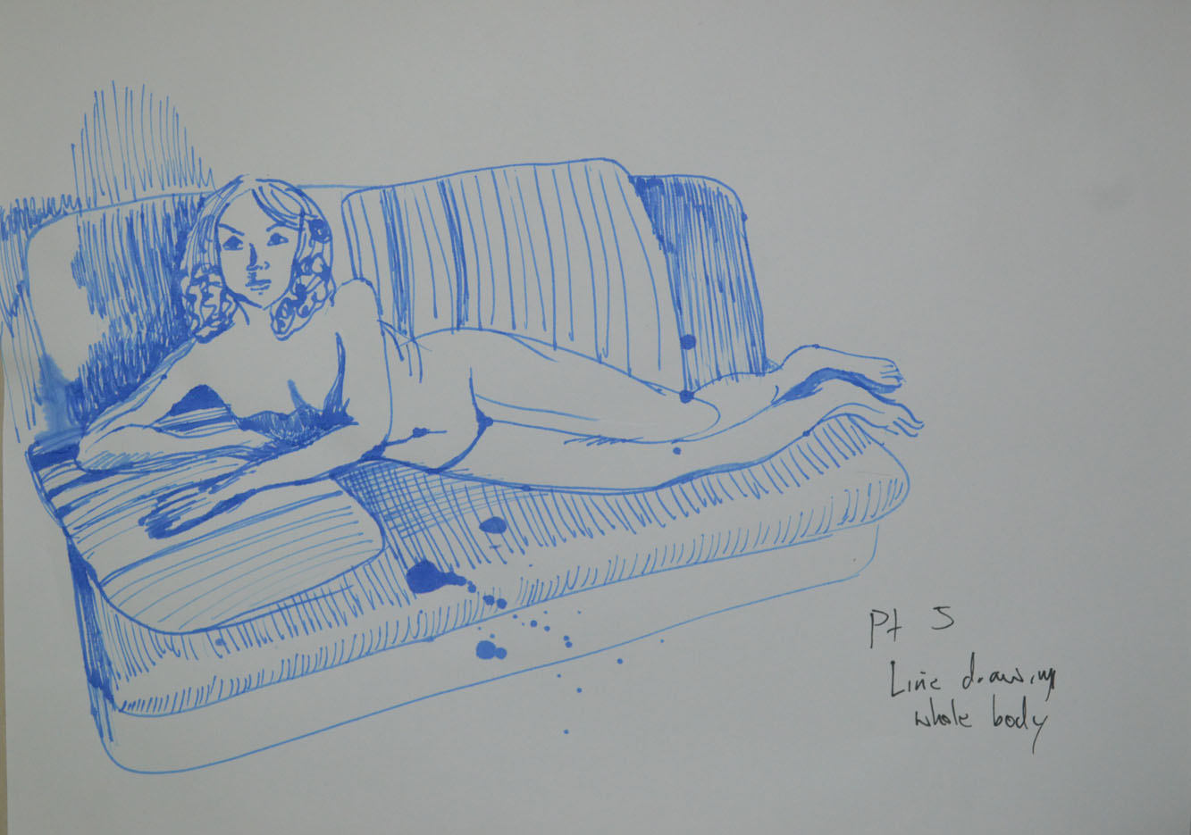
The second drawing wasn’t a continuous drawing but it was quick and the results were almost the same. Like the first drawing it was quite small and off centre so I included the sofa to give it some balance. I have yet to choose a pose that I am happy with without including a background, maybe this could be a challenge for the 5th assignment.
2 – Rotring Drawing Pen with Sofa
The third drawing was of the same pose but this time more care and time was taken and because I messed up on the right arm and corrected it with shadow I tried to balance it out by adding some shading in other areas.
3 – Seated Position No Sofa
For the next pose the model was laid on her back, curled up grabbing her knees, I started out with a continuous line drawing to see how could I would be at drawing this pose on the first try. It had to be corrected as it was a very difficult pose to try and complete a drawing of without lifting my pen off the paper.
4 – On Back Holding Knees
The next drawing was messy, it was all going well until I decided to go over some of the lines again and picked up the wrong pen so then I thought I would experiment by adding charcoal.
5 – Marker, Drawing Pen and Charcoal
From there I went back to drawing with a 0.3 drawing pen, the drawing below may look like I have tried to draw in the style of David Hockney but this was drawn before the last research point ‘How Artists Use Line’ with no particular artist in mind. Everything was going well until I had a problem with foreshortening on the arm but because I liked how the legs stretched back and so I decided to do a larger drawing on A3 paper.
6 – Playing with Phone – Out of Proportion
The second drawing was a bit more than a line drawing as I decided to add more detail to both the figure and the room. I probably should have took my time and got it bang on but it is a project that I can come back to at a later date.
7 – Playing with Phone A3
For the next drawing I went back to a seated pose but this time my model crossed her hands over each other on her lap. Her head looks out of proportion but I believe it’s because I have drawn her eyes to high which has made her face look longer. With this drawing I started with the V between her arms and worked up, then worked my way down again. I use block shadow to describe the shape of her body.
8 – Sitting with Block Shadow
The next drawing was done at work from an existing sketch in the Quick Poses exercise, total failure so I decided to do a couple more drawings on the same sheet just to mess it up completely.
9 – Line Drawing from Existing Sketch
The final drawing before going onto research how other artists use line was the ink on A3 drawing below. It was ink on drawing cartridge paper, totally forgetting what I had learnt about drawing with ink on watercolour paper for best outcome.
10 – Ink on A3
After the last research point I came back to see how researching how other artists use line would affect my line drawing. The next drawing started off as a line drawing but then I went further trying to produce a drawing in the style of Edgar Degas, something that I wasn’t very successful in doing in my last bit of research ‘using line in the style of famous artists ‘. I had since stocked up with some beige eggshell paper so after drawing the line in Conté I got carried away and added some tonal values in white pastel, unfortunately I zombified my girlfriends face but I was quite happy with the rest of the drawing.
11 – Conte and White pastel on Pastel Paper
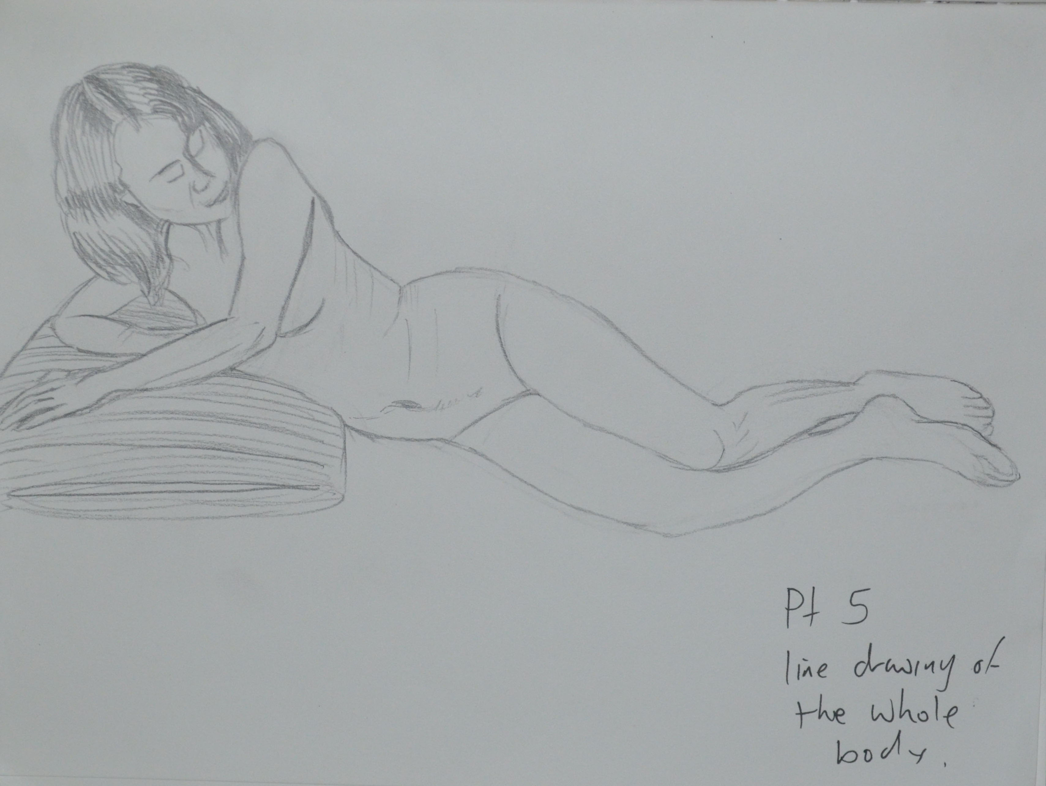
From there I went back to basics and produced the following 2 lne drawings in my sketchbook with a 4B pencil, what is usually the easiest medium for me to use, after drawing with the pen was the most difficult but I think this was down to the fact that I was aware it could be corrected and because I wanted to fill the paper did so very often.
12- 4B Sketchbook Drawing14 – 4B Pressed on
The next drawing was an attempt at drawing with ink again on A3 cartridge paper which kept blotching every time the nib stopped moving and then I realized why, I was drawing on the wrong type of paper so I switched to watercolour paper for the next two drawings.
15 – Ink on A3 – Blotchy
The next two drawings were shoddy attempts, on both drawings I started with the arm on top and worked my way down then on to the legs, on both drawings I messed up when I got back up to her belly.
I really liked the feel of the nib pen on the watercolour paper and so I have set it in my sites to do a decent ink line drawing before the end of the course.
16 – Ink on A3 Watercolour paper17 – Ink on Watercolour Paper Bad Attempt
Where did I go wrong?
Well, I think I am still having problems with positioning the figure on the paper as to fill as much paper as possible. I also am still having problems with foreshortening and also,I think, choosing the best pose for the task at hand.
In this research point for this part of the course, Part 5, option 4 Drawing Figures we were asked to look at the different artists’ use of line which I did in my last post. However, I wanted to take it one step further and decided to try and ‘Draw in the style of’ some of those artists. Note I said ‘try’.
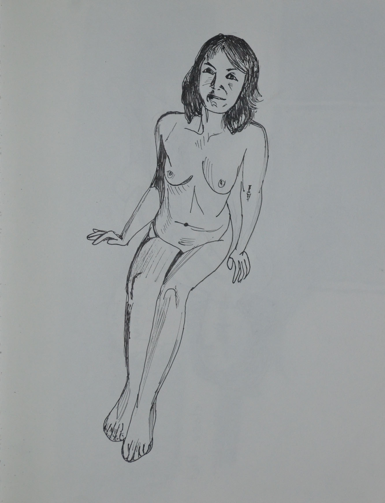
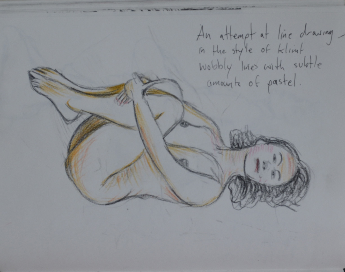
The first artist I tried to draw in the style of was Gustav Klimt, I thought drawing, not in the style of his bejeweled paintings but in the style of his erotic sketches would be easy, not at all, my lines just don’t flow that great and the drawing seems rather dull.
1 – Drawing in the Style of Klimt
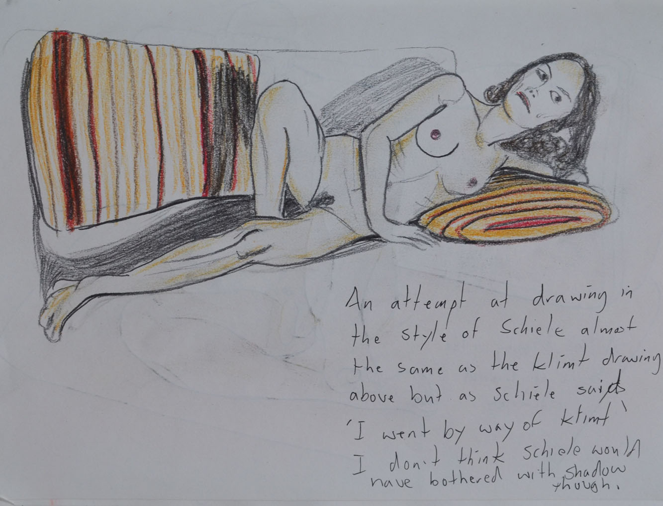
The second artist I decided to try and draw in the style of was Egon Schiele, I tried to imitate the jaggered lines of Schiele but I just didn’t get them quite right. it was hard to try and imitate Schiele when my model was a different build to the ones he drew. I’m not sure whether these first two drawings could pass for erotic art either.
2 – Drawing in the Style of Schiele
I do feel that in the third drawing that I was successful in the task that I set out to do and that was to produce something in a similar style to David Hockney. Using myself as the model and drawing from the photograph it was much easier to try and get it right, having time to think about each line.
3 – Drawing in the Style of Hockney
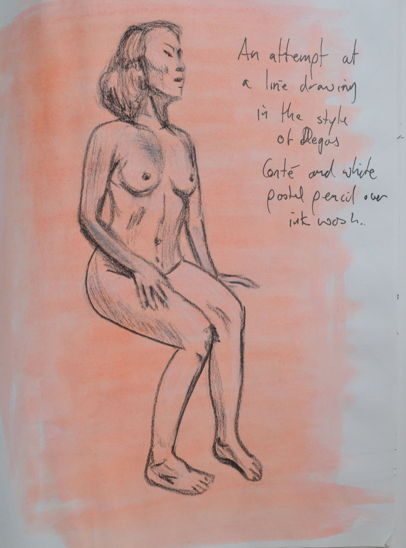
I don’t think that anyone could guess that I was trying to Draw in the style of Edgar Degas in the next drawing. I chose to draw with Conte pencil and white pastel over a pinkish wash in my sketchbook when I should have really been drawing on ingres paper which I had run out of. A clothed standing pose would have also been a better decision.
4 – Drawing in the Style of Degas
I think the 5th drawing, in the style of Jean-Auguste-Dominique Ingres was a decent attempt but again I would have been better with a different medium a sharp pencil on A3 or A2 drawing paper rather than 0.3 and 0.5 tip Rotring drawing pens in my sketchbook. However, I think I did quite well with the details and folds of the dress.
5 – Drawing in the Style of Ingres
The first attempt (on the right in drawing 6) was probably my favourite drawing out of all these in this piece of research, producing something that was similar to the artist’s work and yet I believe, developing on it.The second attempt on the right however was not so great.