Observing Light and Shadow Formations on a Surface

The brief for this exercise was to place two objects together and position a lamp so they are lit from one side, or natural light if its a bright day. Originally I wanted to get out on the balcony during the daytime but housework took me right through to early evening, so I settled for a bendy lamp in the living room and I’m glad I did because it threw more definite light on the objects that I chose, which were a Johnson’s Baby Powder bottle and a ceramic cup.

2 Drawings Light from Alternative Sides

I started with a simple sketch that I knew I could alter as I shaded back through the drawing. I begun with the mid tones but was very tempted to start on the darker tones first. The objects were placed on a glass table, however I put some paper down on the table top to cut down on where the reflected light was came from.

Light from Left Hand Side

I was very happy with the first drawing, the sketch itself took me about 10-15 minutes and the areas of dark and light were very clear so I didn’t think it would take me long to complete the shading, which in the end took me well over an hour. To complete the drawing off I shaded in the background as the edges on both of the objects were quite light and I wouldn’t have been able to show that on a lighter background.

Light from Right Hand Side

For the second drawing I pointed the lamp on the opposite side, which gave me different shadows and light and dark tones in different areas so between the two drawings I think I managed to get quite a lot of practise.

I really enjoyed this exercise but would have probably preferred to do it in colour as the cup looks more chrome than ceramic done in pencil.

My First Self Portrait (From a Photograph)

It was lunch time at school yesterday and as usual I sat on the top floor looking for something to draw. I decided on a self portrait, I’d never drawn a picture of my own face before and wondered how long I could get a drawing looking anything like me, so I took a photo with my mobile phone and started sketching away.

Self portrait in my 6 x 9 Sketchbook

I started on my right eye, left in the photograph working down to the tip of my nose then with my nose complete moved onto my left eye. Within 40 minutes I had my drawing looking something similar with the eyes and nose almost perfect. However the mouth was a little to high and so it put my face out of shape a little making it more round than long.

Photo on my Mobile Phone

For a first attempt I’m quite satisfied and even though my face was slightly out of shape I know I can only improve.

Basic Shapes and Fundamental Form – Check and Log

Are the objects in your drawings the correct size and shape in relation to each other? 

In most of the drawings in these three exercises, especially Boxes and Books, the objects were the correct size and shape in relation to each other apart from when I started to use pen for the Jugs and Jars, but with a bit of practise I managed to get them in proportion, a better quality pen helped.

Do the shapes between the objects look correct? 

Yes, one thing I don’t seem to have a problem with at this stage is the space between the objects, it helps to get them right the first time and then make sure you are looking from the same angle as you continue to draw.

Do the objects in your drawing look solid? 

Yes the drawings in the Supermarket shop exercise all look solid, however the objects in the watercolour pencil drawings do not look as sturdy as the others, but with more practise I will get better at drawing with these.

Have you managed to create the feeling of depth? 

I would say that in all three exercises I managed to create a good feeling of depth but more so in the charcoal sketch and the colour pencil drawing of the Supermarket Shop exercise

Making Marks – Check and Log

How did holding your pen or pencil in a different way affect your drawing? 

By holding near the bottom of the pen or pencil you allow yourself more control when making marks giving you more precise lines and the control to add more pressure if and when needed. Holding a pen from the top or ‘dangling from the top’ creates less controlled, lighter marks but and can allow you to fill larger areas at a much quicker pace. By holding the pen with finger pushing down on the tip you create broad heavy strokes that are both dark and smooth.

Which drawing tools suited the different mark-making techniques you used? 

For shading the best tools in my opinion are soft pencils, solid graphite pencils, graphite sticka and charcoal. Pencils, fine drawing pens, ball points and also coloured pencils are great for cross-hatching; felt tips may also be good with a bit of practise and knowledge of which is the best paper to use with these. However felt tips are great for stippling as the ink soaks into the paper quickly to leave a strong dot, drawing pens are also great for stippling.

Did you find that any marks or tools you used matched particular emotions or feelings? Did one convey calm and another frenzy for example? 

This is difficult to answer, one can convey calm with tools such as soft graphite pencils, graphite sticks, drawing pens and charcoal by making regular marks, smooth lines and strokes with soft edges but then the same tool can conveyed frenzy when used in a different way on the large sheets of paper. I found that the nib (dip) pens were quite scratch and so probably created a more negative mood.

How did the introduction of colour (soft pastels, Conte crayons) affect your mark making?

Introducing colour especially soft pastels, Conte crayons, wax crayons and hard pastels was distracting because it made me realize I really need the practise and so spent more time trying to get things right than being creative. However once I had used them for the first time it left me wanting to use them more.

Which of these experiments you found most interesting and rewarding? 

Definitely the Line and Other Marks exercise, it introduced me to colour for the first time plus tools that I had never used before as well as finding out how different mediums react to one other.

Basic Shapes and Fundamental Forms 3 – Supermarket Shop

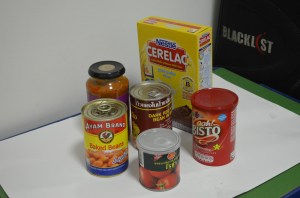
I originally wanted to do this exercise as quickly and as simply as possible, but then turned into something that I needed, a practise for using different medium.

DSC_0359

I did a practise drawing in charcoal pencil rather than graphite, I probably should have sketched it out in pencil first to see if it fit on the paper as I lost the top of the box of baby food but it felt good to do something completely in charcoal.

1st rawing with charcoal and Pencil

I wanted to produce the finish drawing in watercolour pencil, but I needed to get work up some confidence as I had never used watercolour pencils before so did an initial drawing in ordinary colour pencils, and I’m glad I did as it taught me a few crucial lessons.

1. I would never buy any drawing tools made in Thailand again, the leads kept breaking.

2. Next time I produce a colour pencil drawing to use paper with less tooth, rough paper is hard for blending.

3. Place objects at the best angles so I don’t have to spend hours producing every bit of detail.

4. Read the exercises in the course materials properly. Most of these objects were cylinders with only 1 box and no packets.

2nd Drawing Colour Pencil

After completing the colour pencil drawing which wasn’t great as I left a lot of text out off the objects plus the tin in the the middle was too light (the rough paper making it hard to blend) I went to do a bit of shopping. This time I purchased Faber Castell watercolour pencils not trusting the Masterart ones I had in the drawer and some A3 watercolour paper.

DSC_0384

I changed a few objects, I had to use the gravy for Sunday dinner so swapped that for parsley sauce, swapped the tin for a big bag of Nesvita cereal drinks, took the plastic lid off the Rosa tin and swapped the baked beans for a bag of Tipco something or other that the school director gave me for Christmas.

3rd drawing watercolour pencil on watercolour paper

I’ve never used watercolour pencils or watercolour paper before so instead of spending hours trying to learn how to use them through trial and error I jumped onto YouTube to have a look at a couple of videos.

However once I started the exercise I learnt some more valuable lessons:

1. This probably want the best medium for this exercise with all the writing on the boxes.

2. I probably should have used a heavier paper, the 190 I was using begun to warp like mad.

3. The video was not enough I should have practised before doing this exercise.

Even though I did not rush through this exercise (it took a good few hours split up over a couple of days) the final drawing in my eyes looks a complete mess due to the very reflective purple box in the middle that made me lose my rag. However I am happy that I allowed myself the chance to start using watercolour pencils and to be honest for the first drawing ever with this medium, I don’t think I did too bad even though it does looks better without my glasses and my eyes squinted.

Overall the shapes were fine, the shapes between the objects were pretty much perfect and there is depth there so in that respect I was successful.