Until I started this course the only drawing I had done in the last 20 years was with a pen or pencil in a notebook before putting my ideas down on canvas with a very crude painting method. Over the last twenty months I have not only learnt different drawing techniques but I have learnt to use many different mediums as well as develop skills and confidence as an artist.
I submitted Assignment 5 today and I have the next three months to prepare my coursework to send to the U.K. for formal assessment but I don’t think this blog will end here. I have enjoyed working with the different drawing mediums and there are certain mediums I still need to practise with, there also certain exercises that I feel I weren’t that successful and so I plan to have another go at those exercises while I am working my way through the next course Painting 1 : The Practice of Painting and so I expect to be posting more work very soon.
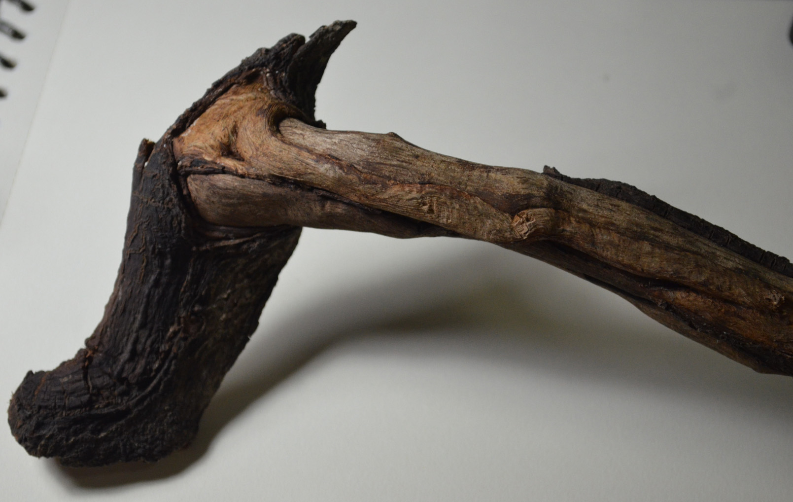
In this exercise I was to practise building up dark medium and light tones principally using pencils and hatching and cross-hatching techniques. I was to select a single object such as a shell or piece of driftwood and get a varied effect by combining soft and medium grade pencils as well as altering the direction of the strokes I make. The brief also informed me that this exercise would be time consuming and indeed it was. I used a smooth sheet of A3 Canson paper and 2B, 3B, 4B, 5B pencils to complete this exercise as well as a putty rubber for the highlights which I used quite often to lighten strokes that were too dark as I made my way through my chosen subject. Living in Bangkok has it’s downfalls especially when taking a drawing course but I’m very lucky to have a small park with some very exotic trees in front of the primary school that I teach at. I found a small branch that had fallen or been broken off one of the trees a few weeks ago that reminded me of the hammers in Pink Floyd the Wall with patches of bark still on it and some really nice contours, so I decided to use it for this exercise.
My subject for this drawing exercise, a tree branch
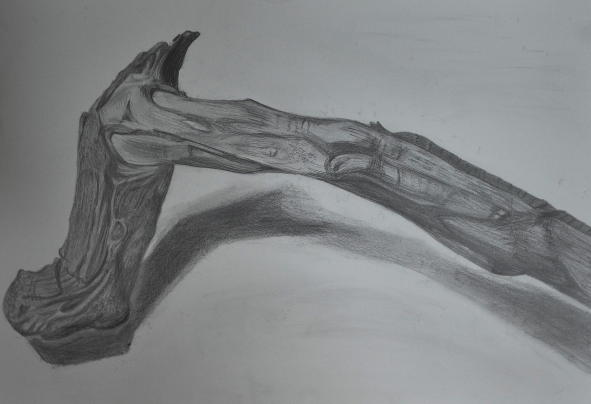
I started on the end that I knew would be the most difficult to try and reproduce with pencils, the tree bark, going over it first hatching with a 2B pencil then, 3B, 4B and 5B to get the darker tones. I know the brief said use hatching and cross-hatching on this exercise but I threw everything I had at it, including stippling, squirkling and dashes and I think I depicted the surface of the bark quite well. Unfortunately my photographic skills aren’t that great and the photo of the finished drawing is not as great as the drawing itself.
Getting Tine and Depth in Detail 1
The area that I thought would be the most difficult was actually the easiest, to depict tone on the areas of stripped branch with soft bare wood was the most difficult, but one thing it did teach me was to be more fluid with my drawing and for the first time ever I loosened up.
Getting Tine and Depth in Detail 2
I know there are flaws in the finished drawing, the shape is wrong in certain places and the shadow isn’t brilliant but there are parts of this drawing that I am really proud of namely the bark area which reminds me of a ‘bio’ tattoo for some reason. In fact I think the finished piece reminds me of an anatomy drawing and while I was working on it I kept thinking of the Marco Evaristti drawings of parts of suicide victims that I saw during my first visit to the national gallery. Overall I think I did quite well in this exercise, my tutor told me I should be more fluid and I think I managed it while working on this exercise. However, one thing I do have a problem with is drawing the very dark tones on a textured surface such as this which is something I will have to work on.
Odilon Redon (April 20, 1840 – July 6, 1916), started drawing as a young boy, and was awarded a prize for drawing at school at the age of 10. At 15 years of age, at his father’s insistence, he took up formal architectural studies, but failed to pass his entrance exams at Paris ‘Ecole des Beaux-Arts (School of Fine Arts). On return to Bordeaux he took up sculpture, and also etching and lithography under the instruction of Rodolphe Bresdin.
Threw his early career he continued to work almost exclusively in black and white, in lithographs and charcoal drawings right into his 50s. These drawings became known as his Blacks ‘Les Noirs’. He developed an extremely unique repertoire of weird subjects such as strange creatures, insects and plants with human heads on; these subjects were often influenced by the writings of Edgar Allen Poe.
In 1975 he studied trees and the Underwood at Barbizon in North-Central France, the same year saw his Blacks reached the ‘Most distressed period’ with him often depicting the topic of prisoners in his works, appearing behind the bars of windows or isolated in a nightmare or hallucination. Has he said about his Noirs “They were executed in hours of sadness and pain”.
From the 1890s due to illness and a religious crisis which transformed into a happier person he began to use pastels and oils, expressing himself with use of vibrant colour, creating works that depicted mythical scenes and flower paintings. Odilon abandoned his Noirs completely after 1900.
He always remained a fairly private person but the end of his life he became a rather distinguished figure with various awards and recognitions and was also regarded by the surrealists to be one of the forefathers of the surrealist movement (I was almost certain that it was going to say this in at least one of the online biographies as I began to look at his works.)
I had never heard of this artist until I was asked to research him but I’m glad I got the chance to do so. It was good to get a chance to see all his paintings side by side and to see how his works changed over the years, rollercoastering in and out of an often dominating dark mood until his change in mediums in the 1890s. I found a lot of his images disturbing and quite a lot of the hybrid characters made me feel uncomfortable like ‘The Egg’. However I was inspired by some of his darker works like ‘The Convict’; since my childhood I have often tried to put something similar down on paper but never got around to it.
The Egg, Odilon Redon 1885
I find a lot of his works interesting and could probably gain inspiration and ideas from them. Although I would find it hard to bare my emotions like he did, for all to see I quite often like to depict some of my innermost feelings and beliefs into my work and will continue to do so.
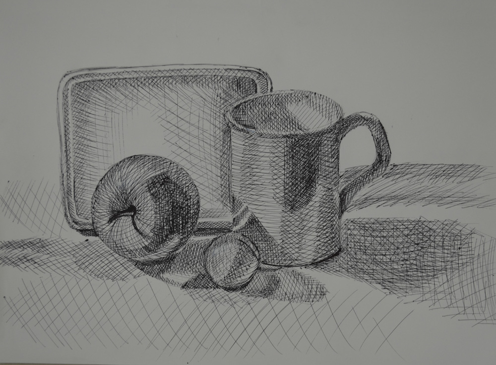
The brief of the first part of this exercise was to draw four 5 cm squares in my sketchbook using 4 different drawing tools such as a pencil, drawing pen, nib pen and black ink and a ballpoint pen. Try to make 4 distinctive grades of hatching with each square without paying too much attention to detail, suggesting that we have close our eyes as this will help eliminate most of the detail.
I totally read this wrong, drawing the squares in pencil and then hatching within the square using the 4 drawing tools that it gave as examples as above. I tried different types of hatching to do this including, cross hatching at an angle as well as using horizontal and vertical lines to give a much denser tone. The nip pen was probably the most difficult for me and couldn’t quite graduate the tones.
Tone Using Hatching
The second part of the exercise was to arrange 4 objects such as an apple, orange, ball, cup or other kitchen utensils, draw the objects then use a hatching technique to technique to add tonal shadow patterns to these objects. The 4 objects I initially chose were a mug, a small bowl an apple and a pong pong ball and chose to have a go at cross hatching with a Faber Castelle Ballpoint pen.
1st Drawing Using Ballpoint
I failed miserably in my first attempt, I even forgot I was hatching with a pen at one stage and went to smooth the pen and smudged the ink across the paper having to fill in the background to cover it up. However it did give me some well needed practise.and confidence towards the end to have another go with the ballpoint pen.
2nd Choice of Objects2nd Drawing Using Ballpoint
My second attempt was much better, this time I swapped the bowl for a tupperware container turned on its side and I could clearly make out what each of the objects were in my finished drawing, well…apart from the ping pong ball that is.
3rd Drawing Using 2B Pencil
For my third attempt I went back to a 2B graphite pencil, the tool I feel most comfortable with and successfully cross hatched the whole drawing without smoothing any lines with my finger and this time even the ping pong ball was clear enough to make out in my finished drawing,. I think deciding to start off the exercise with a ballpoint pen was a very wise idea and may have even helped to improve my cross hatching technique.
The brief for this exercise was to place two objects together and position a lamp so they are lit from one side, or natural light if its a bright day. Originally I wanted to get out on the balcony during the daytime but housework took me right through to early evening, so I settled for a bendy lamp in the living room and I’m glad I did because it threw more definite light on the objects that I chose, which were a Johnson’s Baby Powder bottle and a ceramic cup.
2 Drawings Light from Alternative Sides
I started with a simple sketch that I knew I could alter as I shaded back through the drawing. I begun with the mid tones but was very tempted to start on the darker tones first. The objects were placed on a glass table, however I put some paper down on the table top to cut down on where the reflected light was came from.
Light from Left Hand Side
I was very happy with the first drawing, the sketch itself took me about 10-15 minutes and the areas of dark and light were very clear so I didn’t think it would take me long to complete the shading, which in the end took me well over an hour. To complete the drawing off I shaded in the background as the edges on both of the objects were quite light and I wouldn’t have been able to show that on a lighter background.
Light from Right Hand Side
For the second drawing I pointed the lamp on the opposite side, which gave me different shadows and light and dark tones in different areas so between the two drawings I think I managed to get quite a lot of practise.
I really enjoyed this exercise but would have probably preferred to do it in colour as the cup looks more chrome than ceramic done in pencil.
It was lunch time at school yesterday and as usual I sat on the top floor looking for something to draw. I decided on a self portrait, I’d never drawn a picture of my own face before and wondered how long I could get a drawing looking anything like me, so I took a photo with my mobile phone and started sketching away.
Self portrait in my 6 x 9 Sketchbook
I started on my right eye, left in the photograph working down to the tip of my nose then with my nose complete moved onto my left eye. Within 40 minutes I had my drawing looking something similar with the eyes and nose almost perfect. However the mouth was a little to high and so it put my face out of shape a little making it more round than long.
Photo on my Mobile Phone
For a first attempt I’m quite satisfied and even though my face was slightly out of shape I know I can only improve.
Are the objects in your drawings the correct size and shape in relation to each other?
In most of the drawings in these three exercises, especially Boxes and Books, the objects were the correct size and shape in relation to each other apart from when I started to use pen for the Jugs and Jars, but with a bit of practise I managed to get them in proportion, a better quality pen helped.
Do the shapes between the objects look correct?
Yes, one thing I don’t seem to have a problem with at this stage is the space between the objects, it helps to get them right the first time and then make sure you are looking from the same angle as you continue to draw.
Do the objects in your drawing look solid?
Yes the drawings in the Supermarket shop exercise all look solid, however the objects in the watercolour pencil drawings do not look as sturdy as the others, but with more practise I will get better at drawing with these.
Have you managed to create the feeling of depth?
I would say that in all three exercises I managed to create a good feeling of depth but more so in the charcoal sketch and the colour pencil drawing of the Supermarket Shop exercise
How did holding your pen or pencil in a different way affect your drawing?
By holding near the bottom of the pen or pencil you allow yourself more control when making marks giving you more precise lines and the control to add more pressure if and when needed. Holding a pen from the top or ‘dangling from the top’ creates less controlled, lighter marks but and can allow you to fill larger areas at a much quicker pace. By holding the pen with finger pushing down on the tip you create broad heavy strokes that are both dark and smooth.
Which drawing tools suited the different mark-making techniques you used?
For shading the best tools in my opinion are soft pencils, solid graphite pencils, graphite sticka and charcoal. Pencils, fine drawing pens, ball points and also coloured pencils are great for cross-hatching; felt tips may also be good with a bit of practise and knowledge of which is the best paper to use with these. However felt tips are great for stippling as the ink soaks into the paper quickly to leave a strong dot, drawing pens are also great for stippling.
Did you find that any marks or tools you used matched particular emotions or feelings? Did one convey calm and another frenzy for example?
This is difficult to answer, one can convey calm with tools such as soft graphite pencils, graphite sticks, drawing pens and charcoal by making regular marks, smooth lines and strokes with soft edges but then the same tool can conveyed frenzy when used in a different way on the large sheets of paper. I found that the nib (dip) pens were quite scratch and so probably created a more negative mood.
How did the introduction of colour (soft pastels, Conte crayons) affect your mark making?
Introducing colour especially soft pastels, Conte crayons, wax crayons and hard pastels was distracting because it made me realize I really need the practise and so spent more time trying to get things right than being creative. However once I had used them for the first time it left me wanting to use them more.
Which of these experiments you found most interesting and rewarding?
Definitely the Line and Other Marks exercise, it introduced me to colour for the first time plus tools that I had never used before as well as finding out how different mediums react to one other.
I originally wanted to do this exercise as quickly and as simply as possible, but then turned into something that I needed, a practise for using different medium.
I did a practise drawing in charcoal pencil rather than graphite, I probably should have sketched it out in pencil first to see if it fit on the paper as I lost the top of the box of baby food but it felt good to do something completely in charcoal.
1st rawing with charcoal and Pencil
I wanted to produce the finish drawing in watercolour pencil, but I needed to get work up some confidence as I had never used watercolour pencils before so did an initial drawing in ordinary colour pencils, and I’m glad I did as it taught me a few crucial lessons.
1. I would never buy any drawing tools made in Thailand again, the leads kept breaking.
2. Next time I produce a colour pencil drawing to use paper with less tooth, rough paper is hard for blending.
3. Place objects at the best angles so I don’t have to spend hours producing every bit of detail.
4. Read the exercises in the course materials properly. Most of these objects were cylinders with only 1 box and no packets.
2nd Drawing Colour Pencil
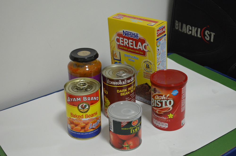
After completing the colour pencil drawing which wasn’t great as I left a lot of text out off the objects plus the tin in the the middle was too light (the rough paper making it hard to blend) I went to do a bit of shopping. This time I purchased Faber Castell watercolour pencils not trusting the Masterart ones I had in the drawer and some A3 watercolour paper.
I changed a few objects, I had to use the gravy for Sunday dinner so swapped that for parsley sauce, swapped the tin for a big bag of Nesvita cereal drinks, took the plastic lid off the Rosa tin and swapped the baked beans for a bag of Tipco something or other that the school director gave me for Christmas.
3rd drawing watercolour pencil on watercolour paper
I’ve never used watercolour pencils or watercolour paper before so instead of spending hours trying to learn how to use them through trial and error I jumped onto YouTube to have a look at a couple of videos.
However once I started the exercise I learnt some more valuable lessons:
1. This probably want the best medium for this exercise with all the writing on the boxes.
2. I probably should have used a heavier paper, the 190 I was using begun to warp like mad.
3. The video was not enough I should have practised before doing this exercise.
Even though I did not rush through this exercise (it took a good few hours split up over a couple of days) the final drawing in my eyes looks a complete mess due to the very reflective purple box in the middle that made me lose my rag. However I am happy that I allowed myself the chance to start using watercolour pencils and to be honest for the first drawing ever with this medium, I don’t think I did too bad even though it does looks better without my glasses and my eyes squinted.
Overall the shapes were fine, the shapes between the objects were pretty much perfect and there is depth there so in that respect I was successful.