Using Hatching to Create Tone

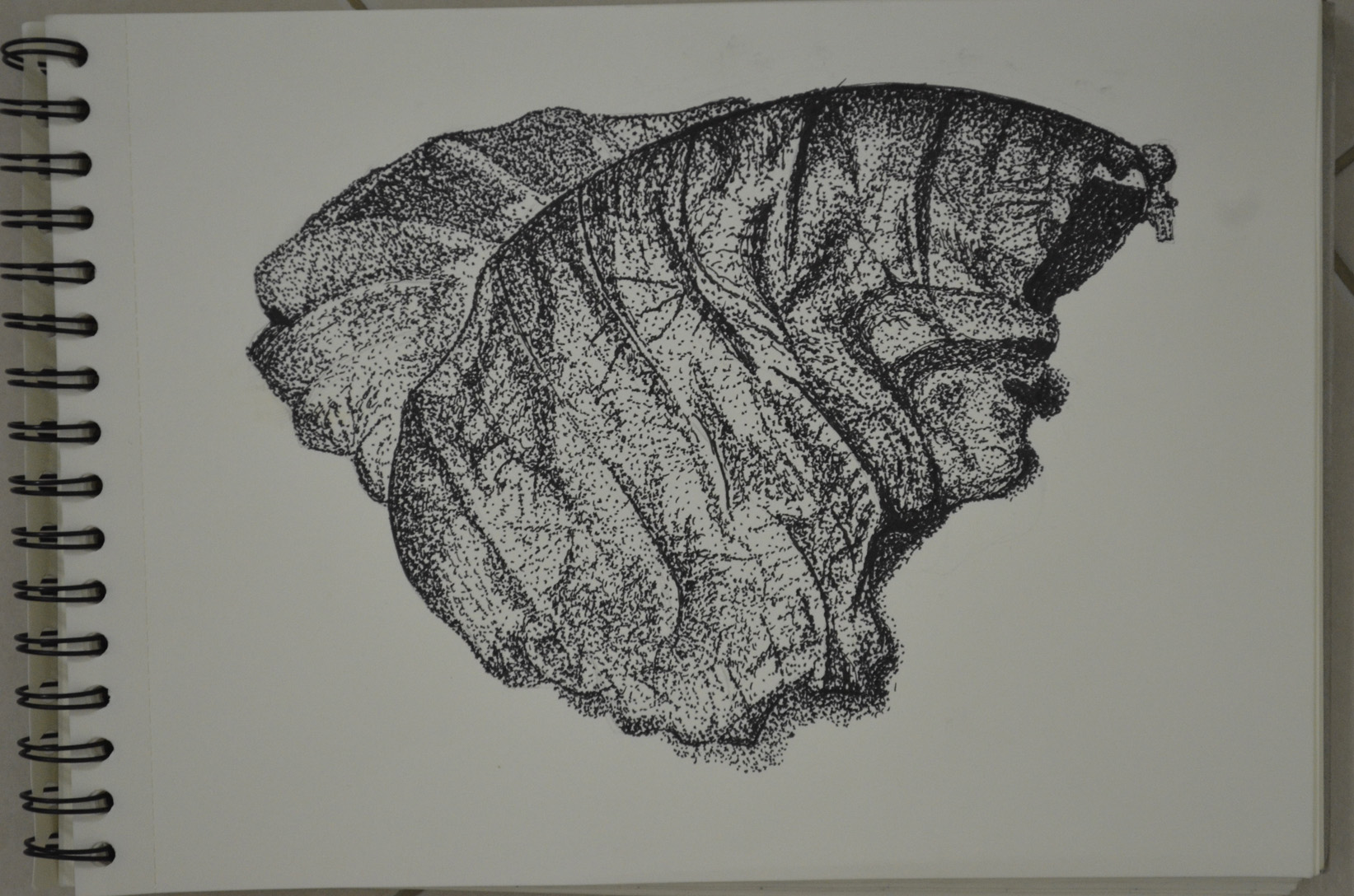
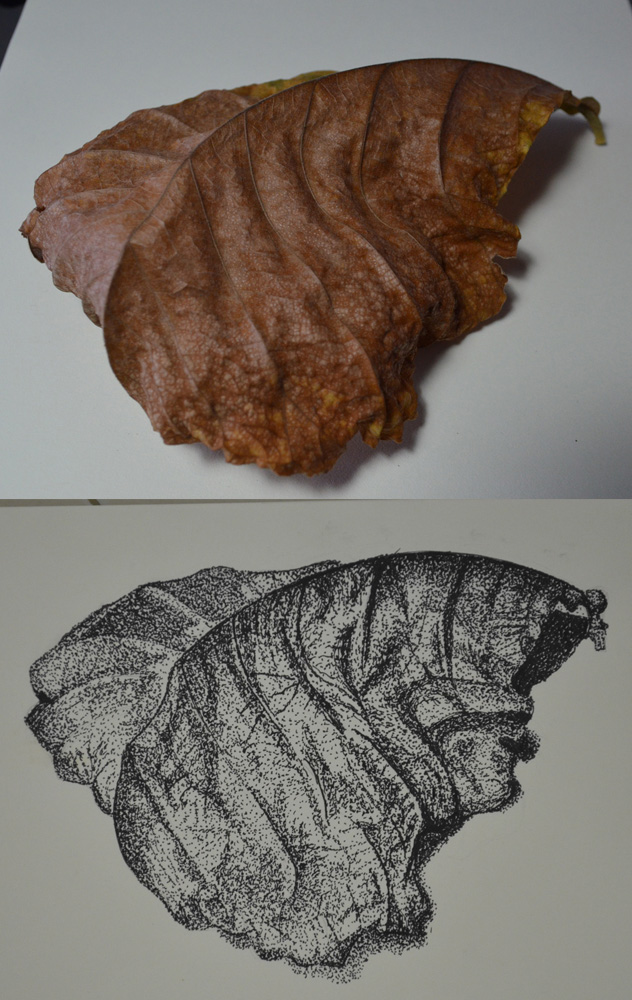
For this exercise firstly I was to select some pieces of fruit and vegetables and draw each of them individually in my sketchbook in a medium of my choice paying attention to the shapes or planes that make up the objects outline.

I decided to use colour pencils for this exercise as I needed more practise and have yet to get used to blending. I initially chose an onion, a cucumber and some strange Asian mushrooms for my composition but all that was to change.

Then I was to write my thoughts and ideas next to the sketches including some notes about tonal values and ideas about the arrangement of a composition and use a view finder to crop some of the shapes in different positions.

Using Hatching to Create Tone - Initial choice of objects
Using Hatching to Create Tone – Initial choice of objects

As a view finder I used my camera sometimes looking at a photo of the composition you notice things that you wouldn’t notice with the naked eye. It took me at least two hours to decide on the composition and what fruits and vegetables to change and the angle from which I would draw from, trying my hardest to stay away from similar layouts to the compositions I had used in earlier drawings.

Using Hatching to Create Tone - Orange, apple and dragon fruit
Using Hatching to Create Tone – Orange, apple and dragon fruit

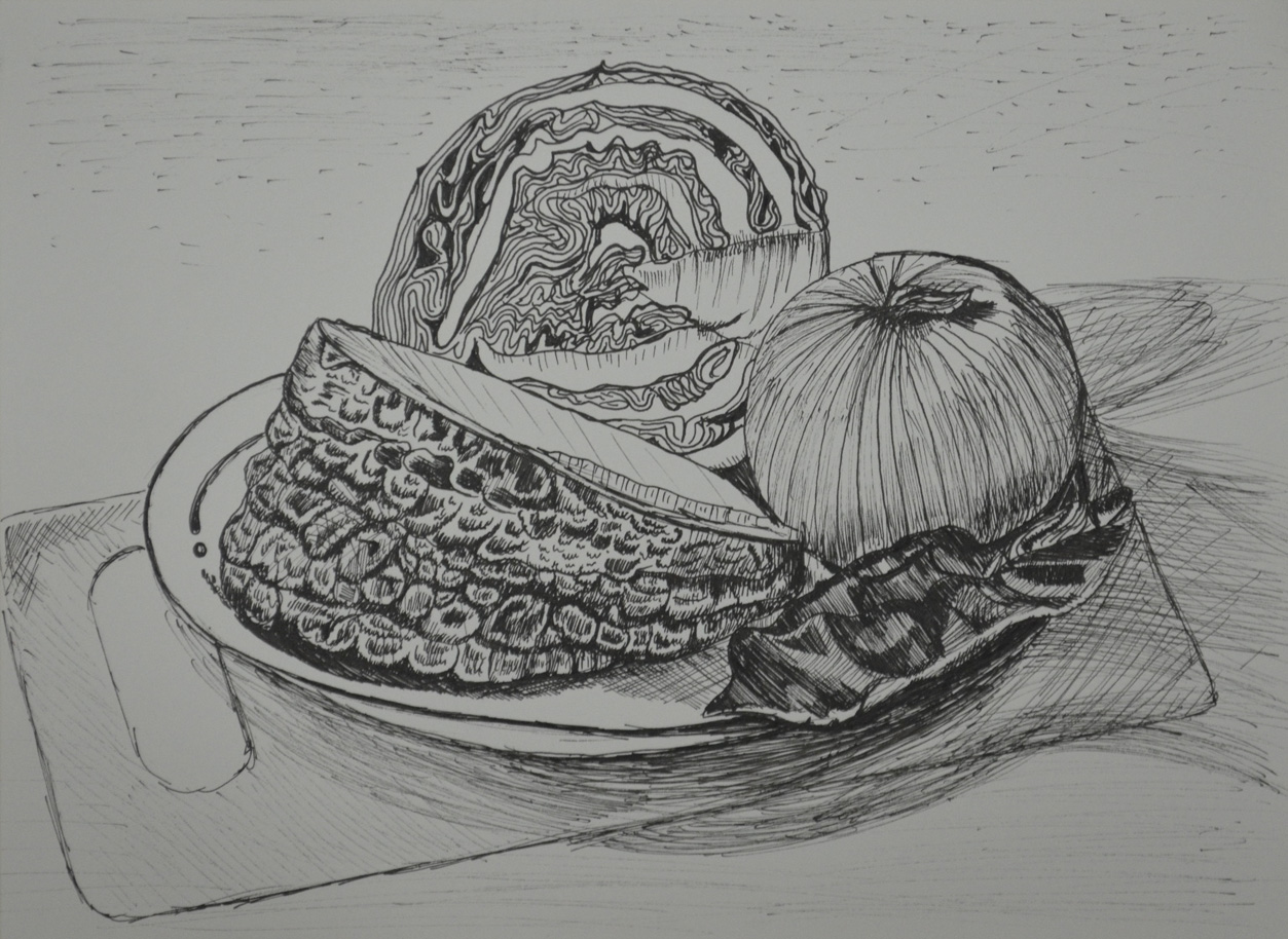
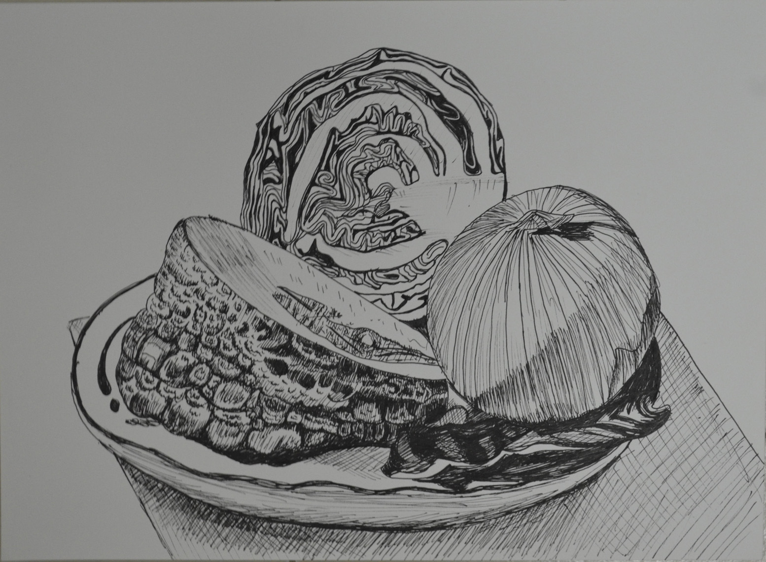
I swapped the Asian mushrooms/toadstools for an orange and an apple as I could use them in different positions and together with the onion the three spherical objects looked great with the cucumber. They also picked up the reflected light from the pink cloth that I decided to use as a backdrop very well.

Using Hatching to Create Tone - Composition

On an A3 sheet of paper I lightly sketched the outline of the objects with a 2H pencil and began to hatch working on the cucumber first but not finishing and then moving to the other objects to see how the cucumber looked against them this helped me decide on tone and colour of the cucumber being the more awkward of the 4 objects.

Using Hatching to Create Tone - Finished Drawing
Using Hatching to Create Tone – Finished Drawing

After working on the other 3 objects I came back to the cucumber which I had to reshape a little bit with an eraser. I’m quite happy with the finished drawing I think the composition fills up the picture plane quite nicely, and I think I did quite a good job with the hatching which I think is more fluid than anything I have done before. Probably the most difficult part of the drawing is the props I used the slightly transparent cloth and the straw basket.

The only think I am not satisfied with really is my photo skills and will try and get a better photo to send in for assessment.

Detailed Observation – Check and Log

Exercise - Stipples and Dots, Finished Drawing

Which drawing media did you find most effective to use, for which effects?

For me I love pencils I’ve been developing my pencil skills more and more on this course and I have got to the stage where I am doing less and less smudging and more and more hatching using my pencil at different angles with different holding techniques. I really think I did well depicting the tone of the wood and especially the bark in the ‘Getting Tone and Depth in Detail‘ exercise. However I was very happy with my stippling with the Rotring drawing pen on the ‘Stipples and Dots’ exercise, not only being able to depict the tone of the leaf but also it’s texture.

What sort of Marks work well to create tone and texture?

I used a variety of hatching to depict the texture of the tree branch with sporadic hatching to depict the bark and fluid lines and hatching to show the stripped wood all these marks worked really well. I thought I had chosen the wrong type of subject for the stipples and dots exercise but I think I showed the texture of the object really well with dots and patterns of stipples to show creases in the dying leaf.

Did you enjoy capturing details or are you more at home creating big broad brush sketches?

I must admit that capturing details with stipples and dots was a bit tedious but I am delighted with the finished drawing and I really enjoyed working on the tree branch in the first exercise so I can probably say that I am more at home capturing details.

Look at the composition of the drawings you have done in this project. Make some sketches and notes about how you could improve your composition.

The composition and the angles of the subjects that I chose were thought about long and hard before embarking on these exercises, I feel I chose the best compositions that I could to not only capture the full beauty of the objects but to fill the paper.

Still Life Group in Tone

Still life group in tone

After the last exercise ‘Still Life Group Using Line‘ this exercise sounded like it was going to be a breath of fresh air and indeed it was…

Still Life Group in Tone

I started with a bit of a study to firstly get the right composition for this exercise and then to try out different colours so I could find three colours that would give me three different tones for this drawing. I feel like I cheated on this exercise as I chose objects that could be drawn easily enough with just three colours, a yellowy green banana, an apple and two green bananas but I just started a high fruit diet the week before and I used objects that were at hand.

Like it instructed me in the brief I screwed up my eyes to take a look at the dark colours only and lightly sketched them in and then chose a different colour to sketch in the mid tones, then another for the light tone. On completion of the initial sketch I decided that my darkest colour was too light and so changed it for my final drawing.

Still life group in tone

I changed the composition of my final drawing slightly so I could depict the full form of the apple and I’m glad I did. The final drawing took me less than two hours going at a really steady pace and I am really satisfied with the completed drawing and my choice of colours, It would have been nice to apply a fourth colour though and also maybe a variation in orange and reds.

The one thing I am not happy with is the amount of blank space I left on the paper but I tried to make up for this by shading with my darkest colour.

Still Life Group Using Line

Still Life Group Using Line 2

In the brief for this exercise I was to set up a still life group out of objects at my disposal, either objects that naturally connect together or deliberately contrast. For this I did a supermarket shop and purchased onions, a big chunk of knobbly Asian pumpkin and a red cabbage thinking about three objects that gradually went from rough to smooth.

I had to think about the following questions: ‘How will I treat the objects?’, ‘How will their connections be clear?’, ‘How will I capture the differences between the objects?’, ‘How do the objects relate to their background? and ‘How will I reference the colour in the group in this drawing?.

Then with these questions in mind I had to select a medium such as pen and ink, marker pens or fine black pen and A3 paper and begin to draw; which is exactly what I did. I wanted to use pen and ink for this drawing as I have kept delaying it but when i saw I would be using them in the next project I decided to use a Rotring 0.3 drawing pen.

My objects had already been in the fridge a couple of days so they wouldn’t last long once I took them out and my SD card for my camera kept locking due to me removing it too often so I had to work fast as I couldn’t get a photo to work from in case I didn’t finish before evening came.

 Still Life Group Using Line 1st Drawing
Still Life Group Using Line 1st Drawing

There was no drawing this out in pencil first for me, I wanted to do start as I meant to go on and and put my Rotring drawing pen to paper. I started on the outline of the three objects together rather than drawing them individually then when the outline was complete I finished the shape of each object individually.

From there I started on the lines of the onion which were fairly simple and while I worked my way around the onion with a variation of light and dark lines (applying different pressures) I thought about how I was going to approach the different objects. Working from right to left I tackled the red cabbage next and it was extremely difficult; trying to view the patterns as a whole and then working on the lines individually was enough to drive me crazy.

The pumpkin was the next obstacle and because this was a still life group using line I had to exaggerate the texture of the pumpkin at certain parts where there was no real pattern at all. It looks like I have tried my hardest to depict tone here but actually I wasn’t thinking about tone at all. I was just trying to complete the surface of the pumpkin with as many different line as possible, squiggly lines, short strokes, anything that came to mind.

The cabbage leaf on the right of the drawing was probably the most difficult object in this drawing and was very difficult to draw without hatching to depict it’s smoothness which I wasn’t very successful in doing so.

Then when I finished the composition I ruined the whole picture by doing some stupid speckle background and so I decided to have another go.

Still Life Group Using Line 2

This time I tried a slightly different angle and the finished drawing was cleaner but there are a lot more things that I am unhappy with. For one I don’t know how the cutting board got so out of shape the cabbage leaf didn’t turn out that great and the pumpkin surface was a little too exaggerated but certain parts of the pumpkin surface turned out a lot better.

Research Point B – 2 Contrasting Artists, Gustave Courbet

Gustave Courbet auto retrato

For this research point I was to find two artists who work in contrasting ways: from tight, rigorous work to a more sketchy style. For the artist who worked in a sketchy style I had already researched Egon Scheile in Part A so now it was time to find an artist who did more tight, rigorous work.

I was all ready to research a modern artist for this part of this research point and discovered Grant Wood while looking at Egon Schiele’s work, but then on a last minute search I found another artist that was just as new to me.

While searching for images  I came across a picture that I had seen many times and for some obvious reason I thought was a picture of Johnny Depp in one of his movie rolls. I was surprised to find out that it was a self-portrait called ‘A Desperate Man’ by an artist called Gustave Courbet, the father of realism and even more interesting the artist that first coined the phrase.

http://en.wikipedia.org/wiki/File:Gustave_Courbet_auto-retrato.jpg

Born in Ornans, France to a wealthy family, Gustave Courbet went to Paris in 1841 with the intention of studying law but soon decided that he would study painting and did so by copying the paintings of the French, Flemish and Spanish masters in the Louvre.

His style was shaped near the start of his career when he chose direct his paintings to observed reality, among his early paintings were self portraits portraying himself in various roles he also painted seascapes, still-lifes and figurative compositions.

Courbet’s figurative work was somewhat controversial because he addressed social issues in his paintings portraying subjects that were considered vulgar at the time such as rural hierarchy, peasants and the poor working conditions of the underprivileged.

Courbet’s style became known as realism however instead of using perfect line and form in his paintings he dealt with realism with spontaneous brush strokes and a rough handling of paint achieving a sense of direct observation by the artist while depicting the inconsistency in nature.

Although Gustave Courbet and Egon Schiele are artists of two different movements living at two different times their lives are very similar in that they seem to demonstrate freedom of expression in their art by painting subjects that were pornographic or controversial at that time. The poses by Courbet’s nudes such as La Femme Aux Bas Blancs, (Woman with White Stockings), 1861 and The Origin of the World (L’Origine du monde) (1866) remind me very much of Schiele’s paintings; as though Schiele could have been influenced by the artist. Both artist’s also served time in prison.

I’m not particularly turned on by the works of the old masters and so there are a lot of Gustave’s paintings that I don’t find appealing, but there are two or three that I think are brilliant simply because I can imagine how sensational they were at that time being so ‘real’ when photography was still in it’s infancy.

http://en.wikipedia.org/wiki/File:Origin-of-the-World.jpg – The Origin of the World (L’Origine du monde) (1866)

Gustave Courbet auto retrato
Self-portrait (The Desperate Man), c. 1843–1845 (Private collection)
Gustave Courbet Autoportrait
The man with a pipe Self-portrait, 1848-49

Bibliography:

http://www.ibiblio.org

http://en.wikipedia.org/

Exercise – Stipples and Dots

Exercise: Stipples and Dots Finished

For this exercise I was to pick another interesting object and use A4 cartridge paper and a ballpoint or drawing pen. Then use a stippling effect, dots and and a variety of marks to create a drawing of depth and interest.

Exercise - Stipples and Dots, Finished Drawing
Exercise – Stipples and Dots, Finished Drawing

After my research on Eliot Hodgkin I took a walk through the very small park area opposite my school and took some photos of leaves with my mobile phone so I might use them later. When this exercise came up I went back into the park to grab some dying leaves to take home.

Exercise - Stipples and Dots, Leaf Subject
Exercise – Stipples and Dots, Leaf Subject

One particular leaf caught my eye as it had some great lines and at the time was half green half brown, so took many photos during the change from green and brown to completely brown and also tried the leaf at different angles, for my drawing I picked out the one above.

I can’t say that I love stippling as it is a very slow process and this exercise took me about three hours over two days to complete and since my first assignment was handed in quite slow I’m trying to keep up momentum.

I used a Rotring 0.3 drawing pen and began as I did with other exercises, drawing the light tones by spacing out the dots  and then going back over for the darker tones with more dots. I used a variety of mark making techniques which included stippling, dots, really short hatching and lines and for the creased patterns of the dying leaf I drew the dots in tracks close together and then went back over with more dots.

Exercise: Stipples and Dots Finished