Pt 5 – Drawing Figures – Line Drawing of the Whole Figure

5 - Marker, Drawing Pen and Charcoal

For this exercise I started out in my sketchbook with a Rotring drawing pen and with my model in a seated position on the sofa I decided to start off with a continuous line drawing without taking my pen from the paper. The result was pretty good even though the face has no real resemblance.

1 - Continuous Line Drawing Pen
1 – Continuous Line Drawing Pen

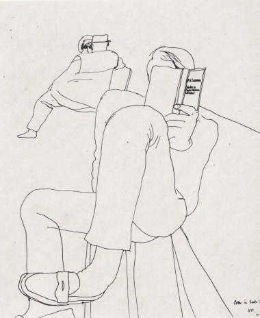
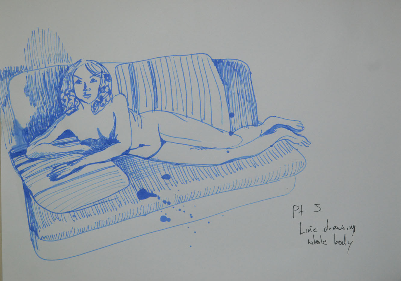
The second drawing wasn’t a continuous drawing but it was quick and the results were almost the same. Like the first drawing it was quite small and off centre so I included the sofa to give it some balance. I have yet to choose a pose that I am happy with without including a background, maybe this could be a challenge for the 5th assignment.

2 - Rotring Drawing Pen with Sofa
2 – Rotring Drawing Pen with Sofa

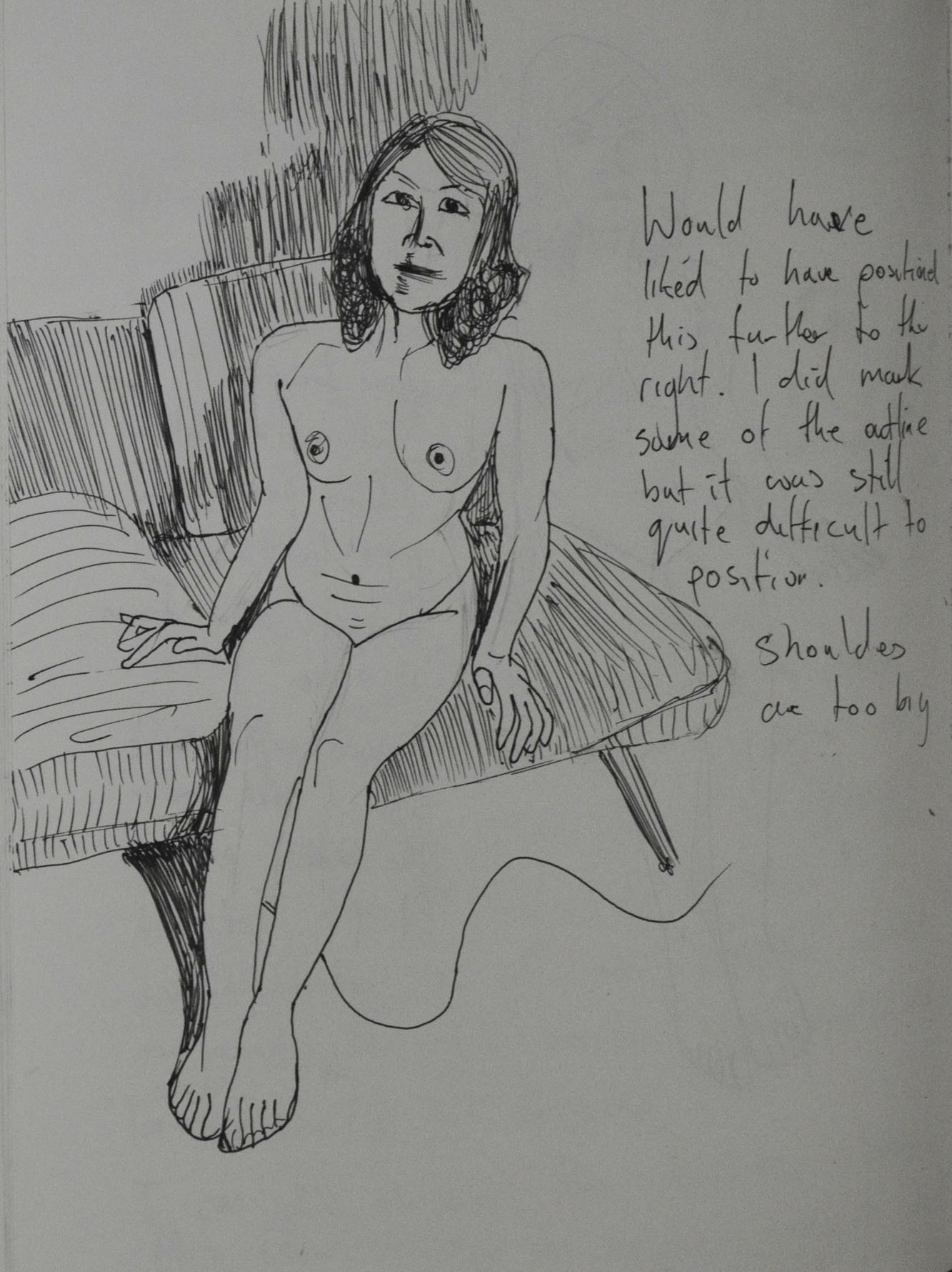
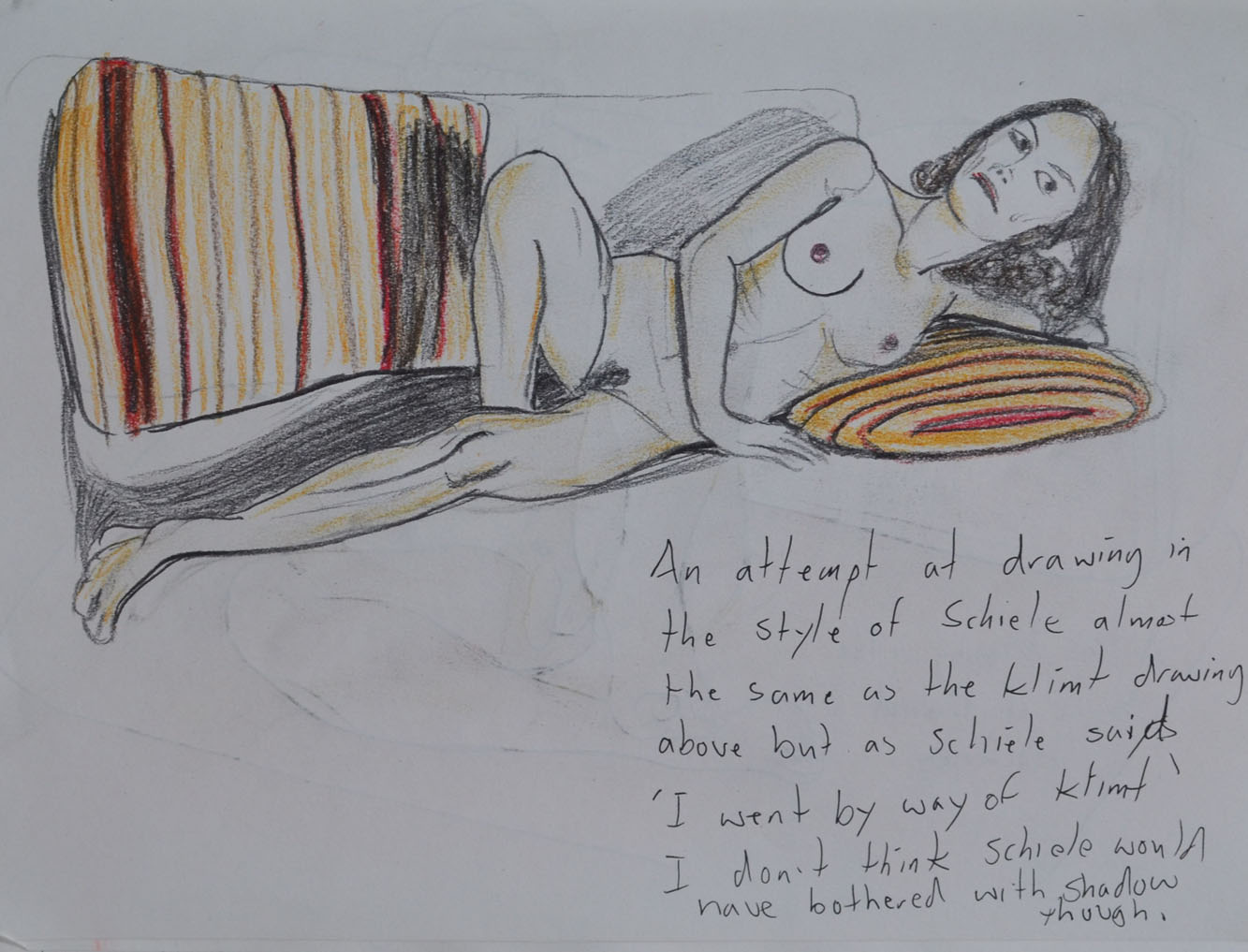
The third drawing was of the same pose but this time more care and time was taken and because I messed up on the right arm and corrected it with shadow I tried to balance it out by adding some shading in other areas.

3 - Seated Position No Sofa
3 – Seated Position No Sofa

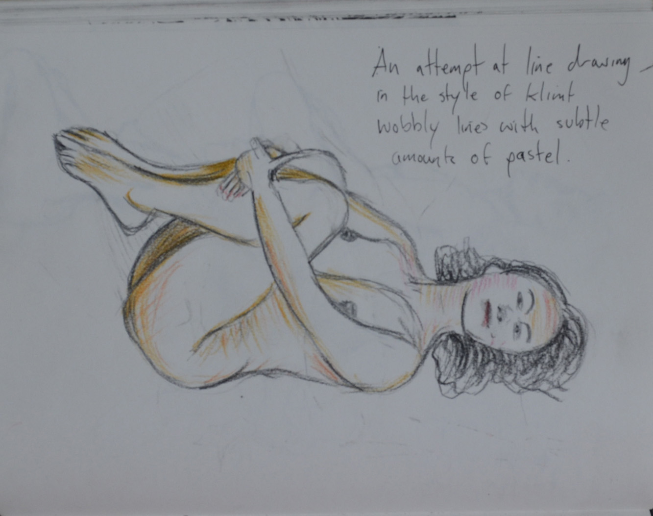
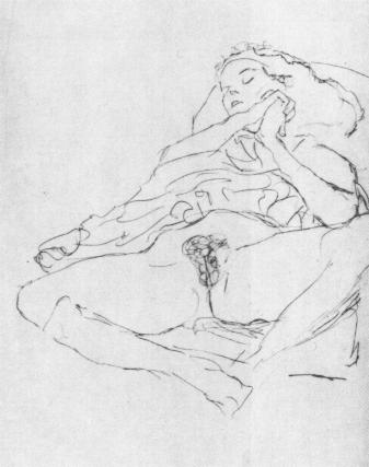
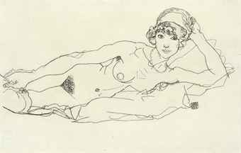
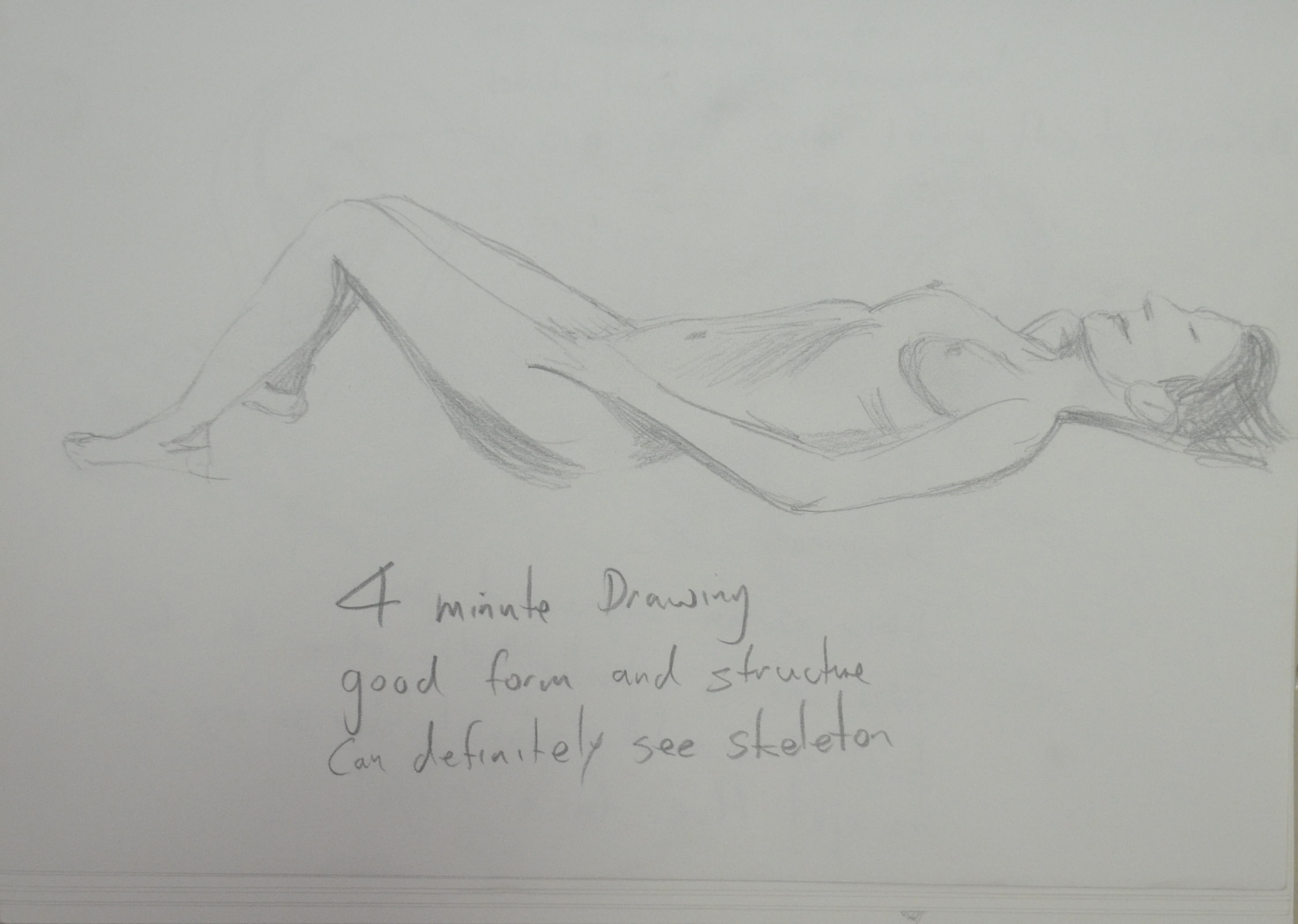
For the next pose the model was laid on her back, curled up grabbing her knees, I started out with a continuous line drawing to see how could I would be at drawing this pose on the first try. It had to be corrected as it was a very difficult pose to try and complete a drawing of without lifting my pen off the paper.

4 - On Back Holding Knees
4 – On Back Holding Knees

The next drawing was messy, it was all going well until I decided to go over some of the lines again and picked up the wrong pen so then I thought I would experiment by adding charcoal.

5 - Marker, Drawing Pen and Charcoal
5 – Marker, Drawing Pen and Charcoal

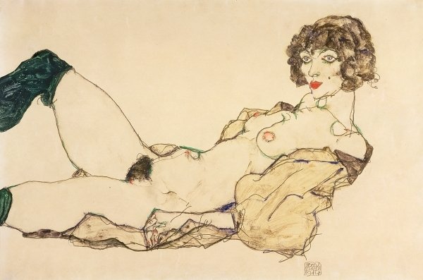
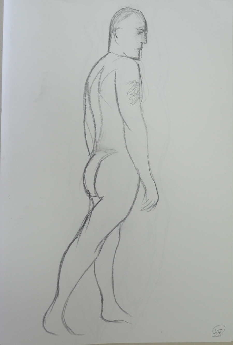
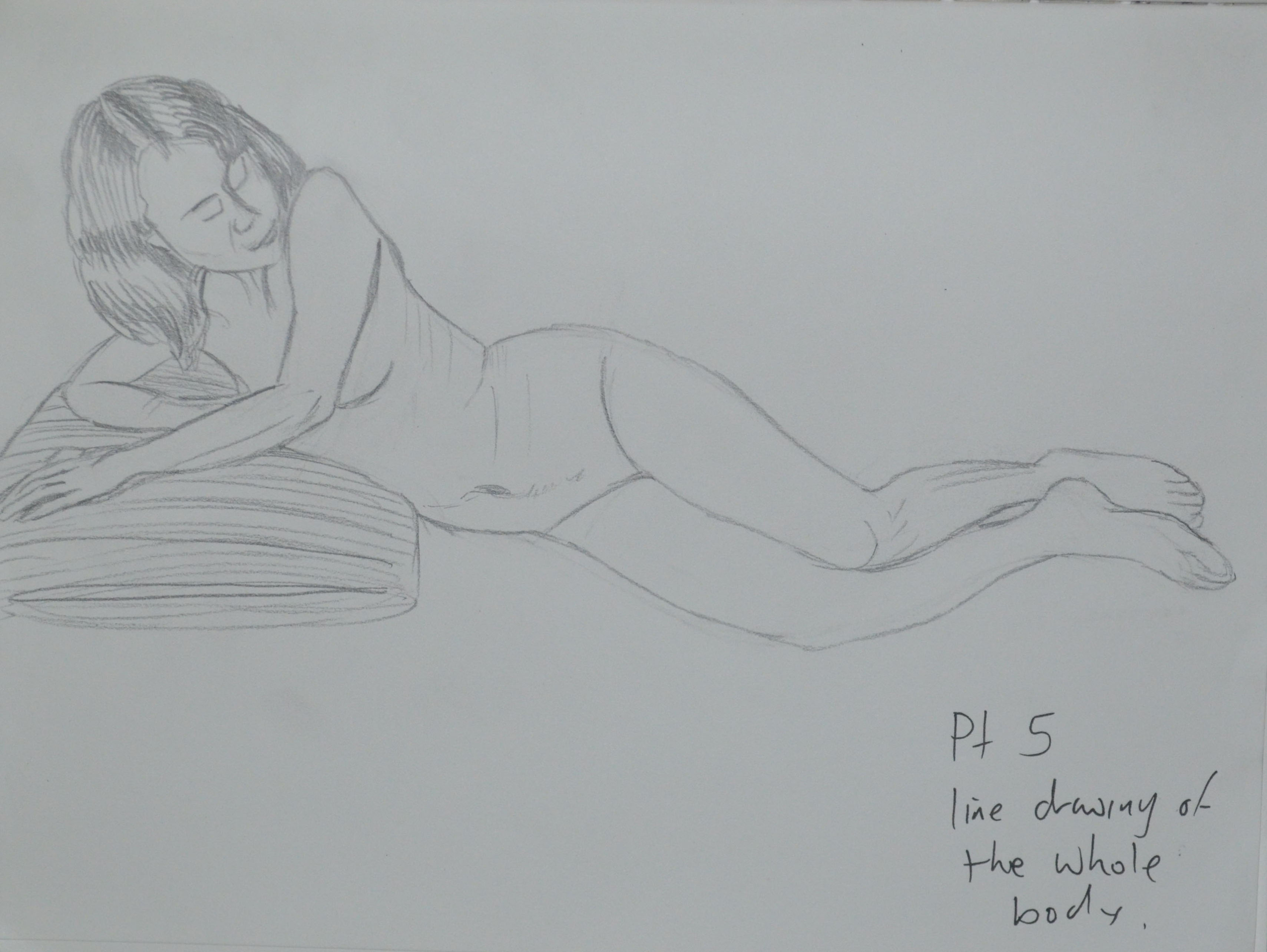
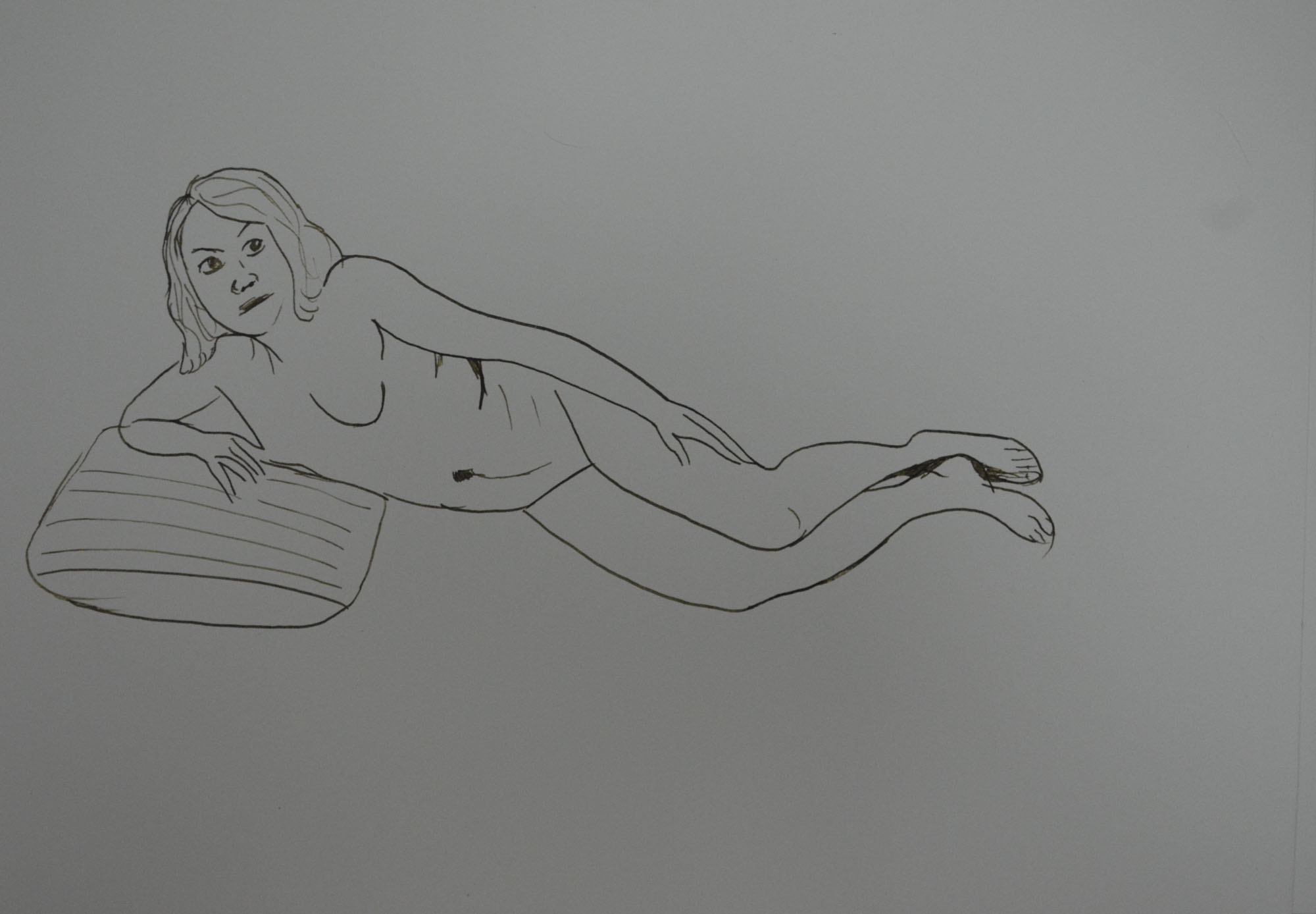
From there I went back to drawing with a 0.3 drawing pen, the drawing below may look like I have tried to draw in the style of David Hockney but this was drawn before the last research point ‘How Artists Use Line’ with no particular artist in mind. Everything was going well until I had a problem with foreshortening on the arm but because I liked how the legs stretched back and so I decided to do a larger drawing on A3 paper.

6 - Playing with Phone - Out of Proportion
6 – Playing with Phone – Out of Proportion

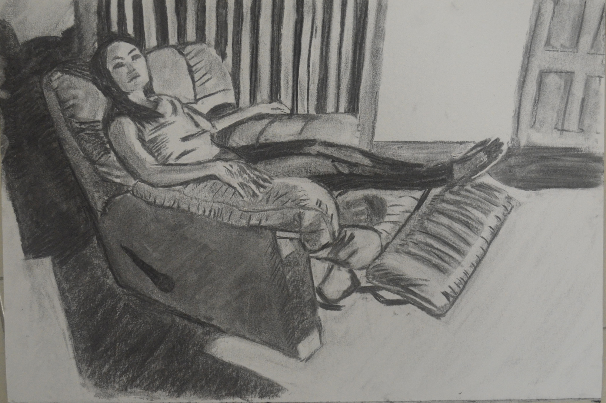
The second drawing was a bit more than a line drawing as I decided to add more detail to both the figure and the room. I probably should have took my time and got it bang on but it is a project that I can come back to at a later date.

7 - Playing with Phone A3
7 – Playing with Phone A3

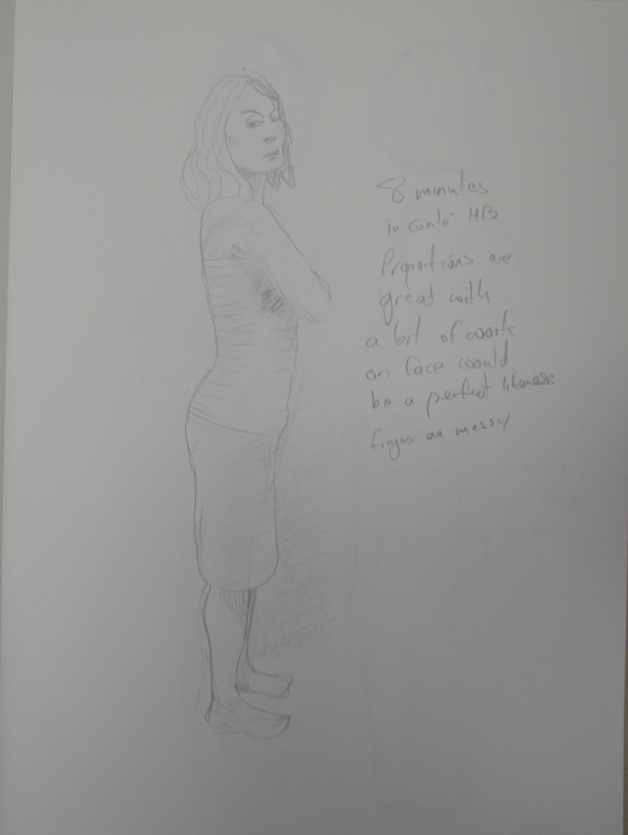
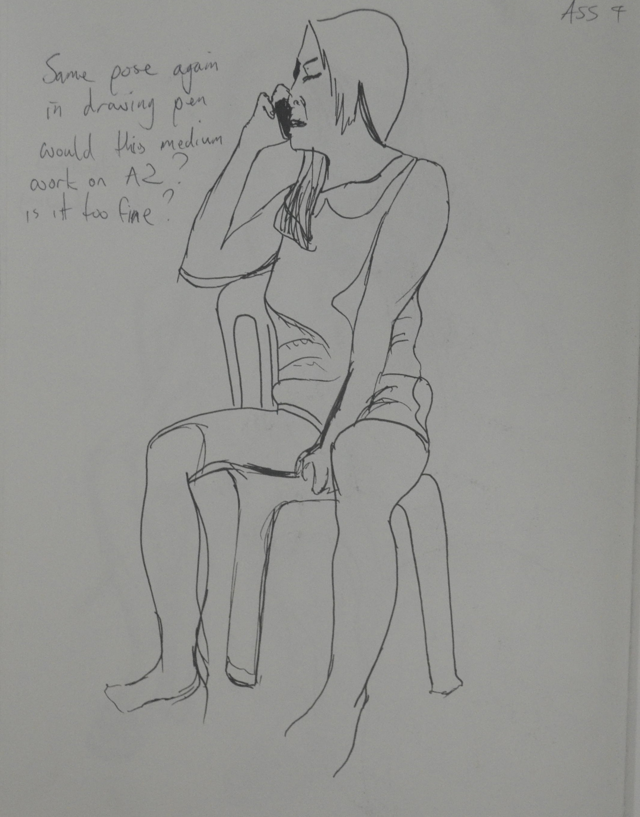
For the next drawing I went back to a seated pose but this time my model crossed her hands over each other on her lap. Her head looks out of proportion but I believe it’s because I have drawn her eyes to high which has made her face look longer. With this drawing I started with the V between her arms and worked up, then worked my way down again. I use block shadow to describe the shape of her body.

8 - Sitting with Block Shadow
8 – Sitting with Block Shadow

The next drawing was done at work from an existing sketch in the Quick Poses exercise, total failure so I decided to do a couple more drawings on the same sheet just to mess it up completely.

9 - Line Drawing from Existing Sketch
9 – Line Drawing from Existing Sketch

The final drawing before going onto research how other artists use line was the ink on A3 drawing below. It was ink on drawing cartridge paper, totally forgetting what I had learnt about drawing with ink on watercolour paper for best outcome.

10 - Ink on A3
10 – Ink on A3

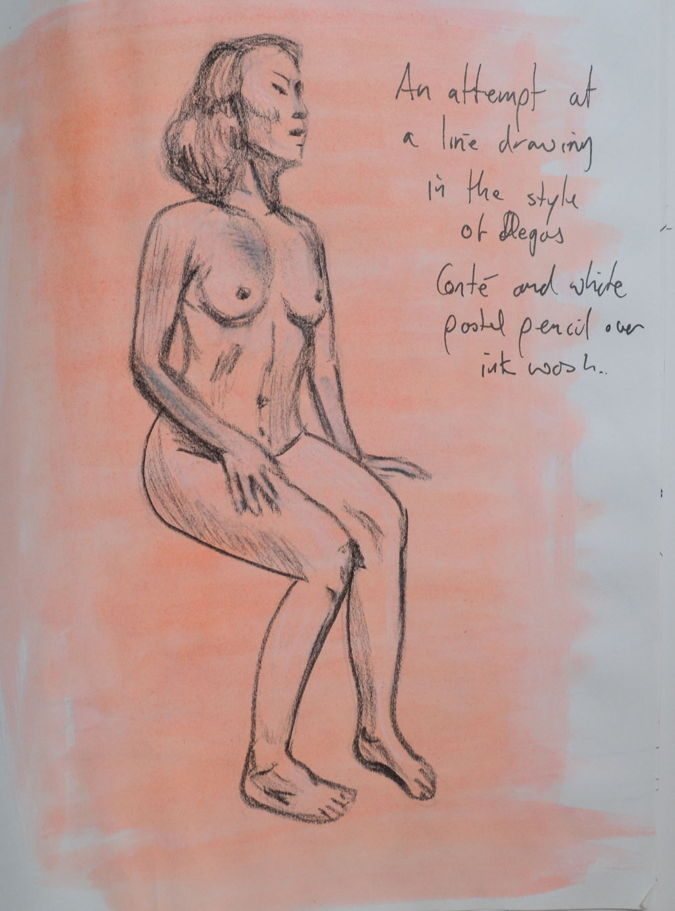
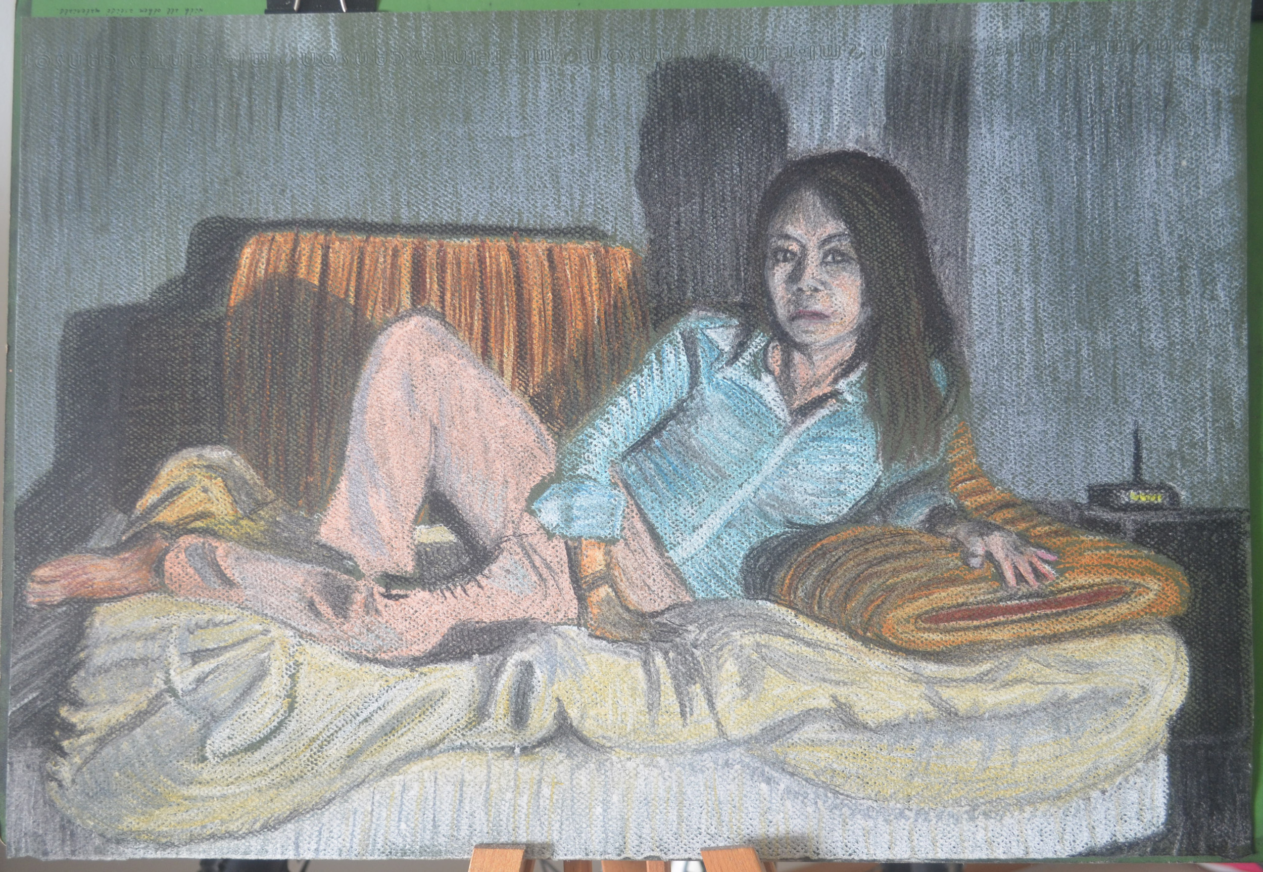
After the last research point I came back to see how researching how other artists use line would affect my line drawing. The next drawing started off as a line drawing but then I went further trying to produce a drawing in the style of Edgar Degas, something that I wasn’t very successful in doing in my last bit of research ‘using line in the style of famous artists ‘. I had since stocked up with some beige eggshell paper so after drawing the line in Conté I got carried away and added some tonal values in white pastel, unfortunately I zombified my girlfriends face but I was quite happy with the rest of the drawing.

11 - Conte and White pastel on Pastel Paper
11 – Conte and White pastel on Pastel Paper

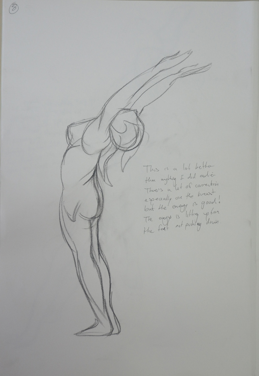
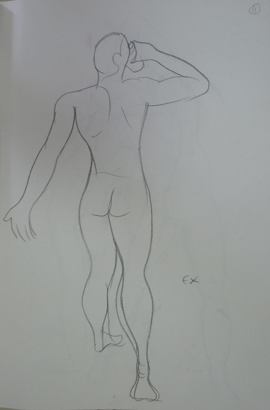
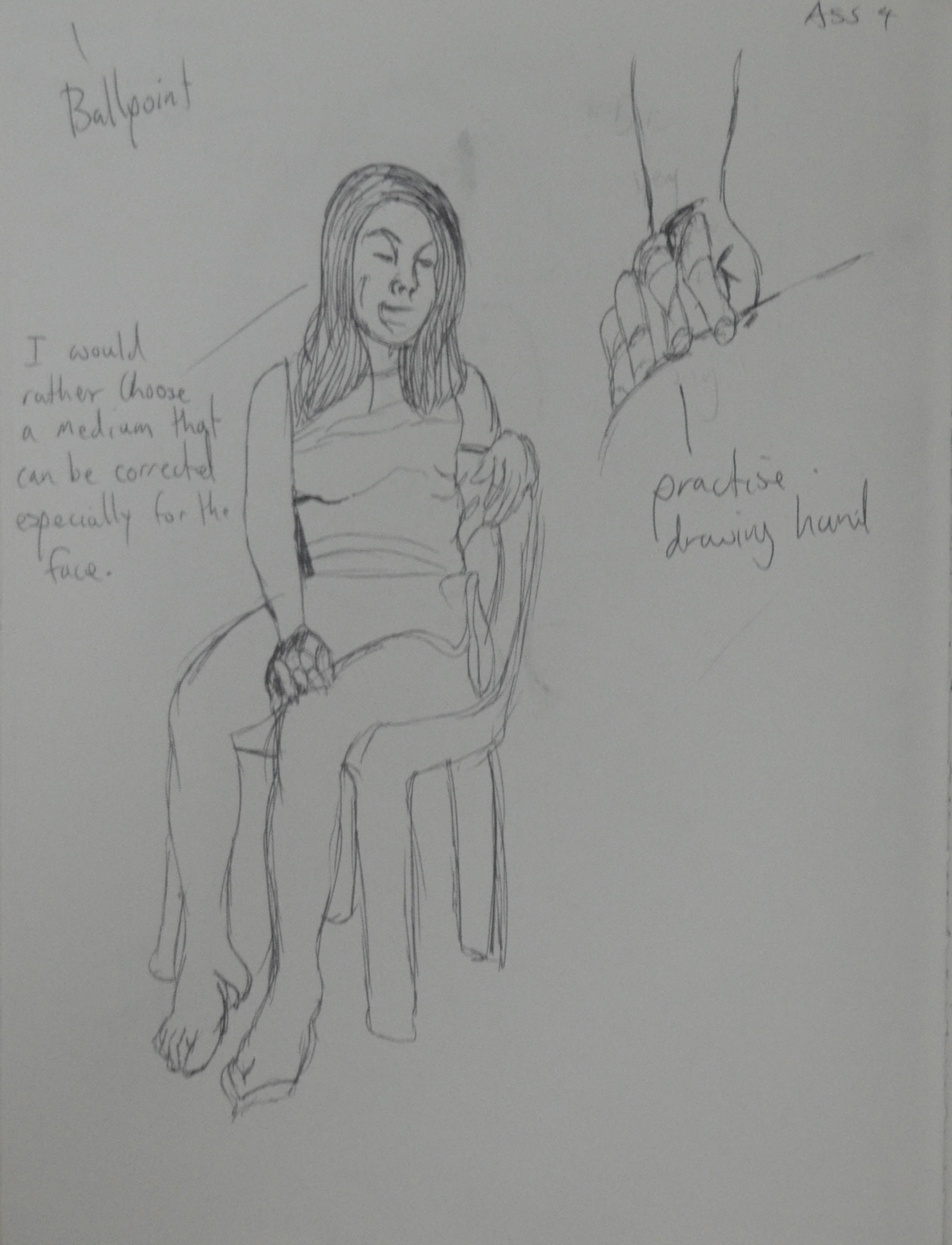
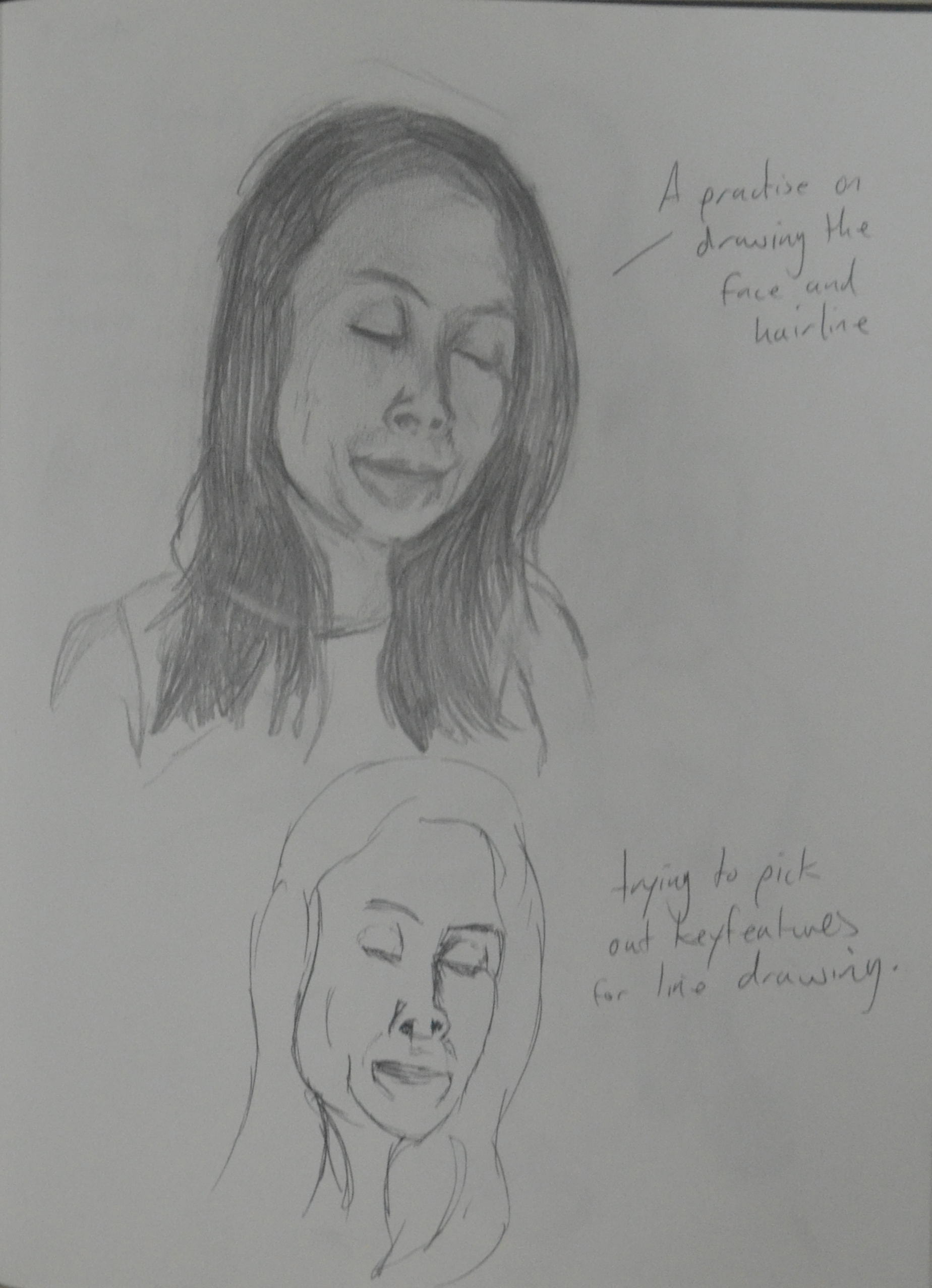
From there I went back to basics and produced the following 2 lne drawings in my sketchbook with a 4B pencil, what is usually the easiest medium for me to use, after drawing with the pen was the most difficult but I think this was down to the fact that I was aware it could be corrected and because I wanted to fill the paper did so very often.

12- 4B Sketchbook Drawing
14 - 4B Pressed on
14 – 4B Pressed on

The next drawing was an attempt at drawing with ink again on A3 cartridge paper which kept blotching every time the nib stopped moving and then I realized why, I was drawing on the wrong type of paper so I switched to watercolour paper for the next two drawings.

15 - Ink on A3 - Blotchy
15 – Ink on A3 – Blotchy

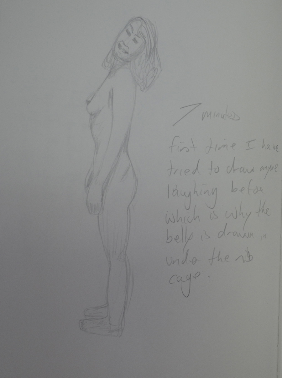
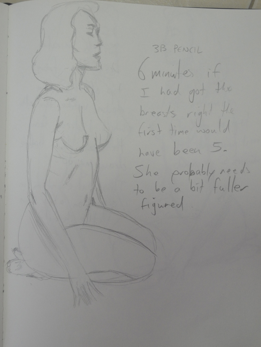
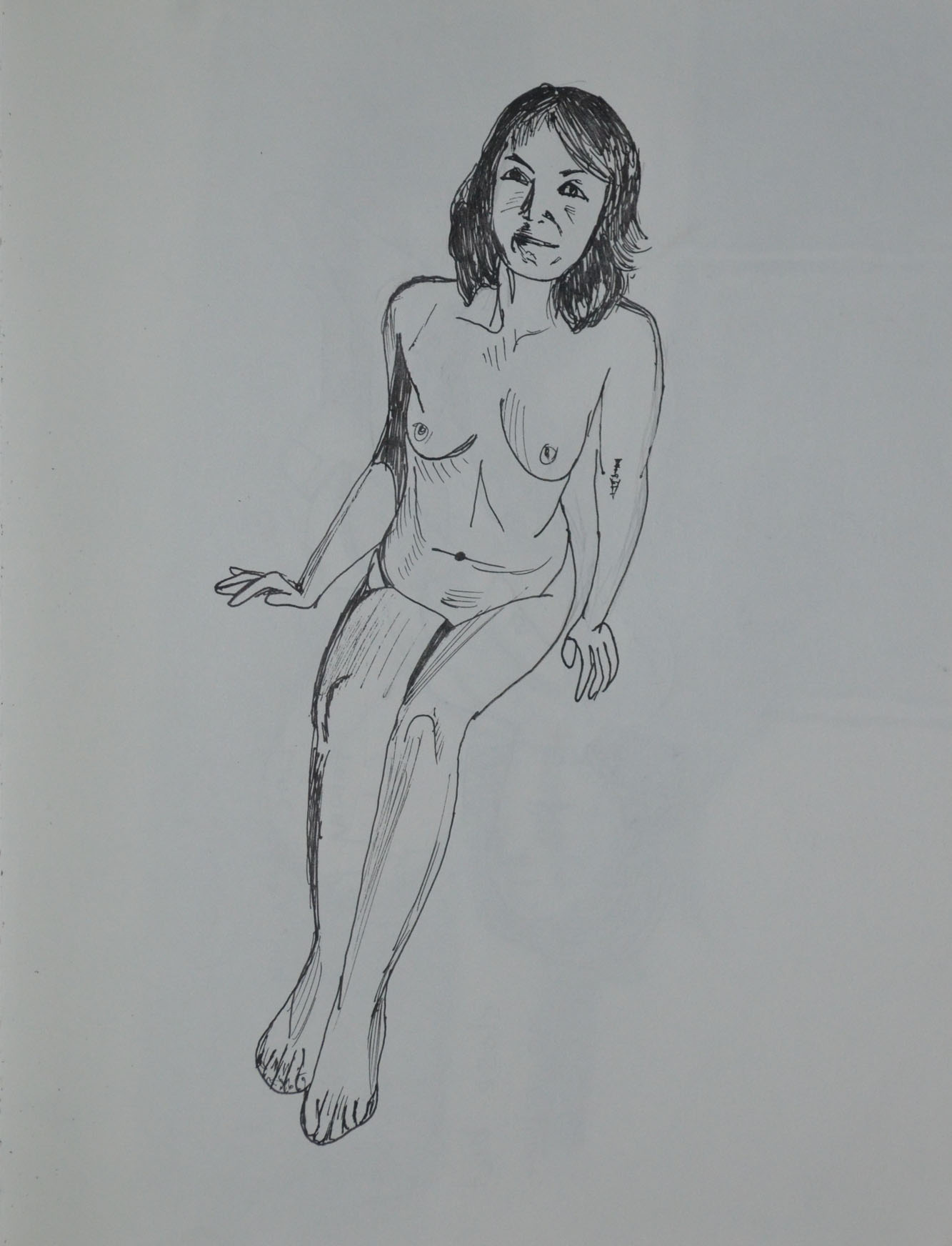
The next two drawings were shoddy attempts, on both drawings I started with the arm on top and worked my way down then on to the legs, on both drawings I messed up when I got back up to her belly.

I really liked the feel of the nib pen on the watercolour paper and so I have set it in my sites to do a decent ink line drawing before the end of the course.

16 - Ink on A3 Watercolour paper
16 – Ink on A3 Watercolour paper
17 - Ink on Watercolour Paper Bad Attempt
17 – Ink on Watercolour Paper Bad Attempt

Where did I go wrong?

Well, I think I am still having problems with positioning the figure on the paper as to fill as much paper as possible. I also am still having problems with foreshortening and also,I think, choosing the best pose for the task at hand.

Pt5 – Research Point Part 2 – Using Line in the Style of Famous Artists

6 - Drawing in the Style of Giacometti

In this research point for this part of the course, Part 5, option 4 Drawing Figures we were asked to look at the different artists’ use of line which I did in my last post. However, I wanted to take it one step further and decided to try and ‘Draw in the style of’ some of those artists. Note I said ‘try’.

The first artist I tried to draw in the style of was Gustav Klimt, I thought drawing, not in the style of his bejeweled paintings but in the style of his erotic sketches would be easy, not at all, my lines just don’t flow that great and the drawing seems rather dull.

1 - Drawing in the Style of Klimt
1 – Drawing in the Style of Klimt

The second artist I decided to try and draw in the style of was Egon Schiele, I tried to imitate the jaggered lines of Schiele but I just didn’t get them quite right. it was hard to try and imitate Schiele when my model was a different build to the ones he drew. I’m not sure whether these first two drawings could pass for erotic art either.

2 - Drawing in the Style of Schiele
2 – Drawing in the Style of Schiele

I do feel that in the third drawing that I was successful in the task that I set out to do and that was to produce something in a similar style to David Hockney. Using myself as the model and drawing from the photograph it was much easier to try and get it right, having time to think about each line.

3 - Drawing in the Style of Hockney
3 – Drawing in the Style of Hockney

I don’t think that anyone could guess that I was trying to Draw in the style of Edgar Degas in the next drawing. I chose to draw with Conte pencil and white pastel over a pinkish wash in my sketchbook when I should have really been drawing on ingres paper which I had run out of. A clothed standing pose would have also been a better decision.

4 - Drawing in the Style of Degas
4 – Drawing in the Style of Degas

I think the 5th drawing, in the style of Jean-Auguste-Dominique Ingres was a decent attempt but again I would have been better with a different medium a sharp pencil on A3 or A2 drawing paper rather than 0.3 and 0.5 tip Rotring drawing pens in my sketchbook. However, I think I did quite well with the details and folds of the dress.

5 - Drawing in the Style of Ingres
5 – Drawing in the Style of Ingres

The first attempt (on the right in drawing 6) was probably my favourite drawing out of all these in this piece of research, producing something that was similar to the artist’s work and yet I believe, developing on it.The second attempt on the right however was not so great.

6 - Drawing in the Style of Giacometti
6 – Drawing in the Style of Giacometti

Pt 5 – Drawing Figures – Research Point – How Artists Use Line

Plague Episode

For this research point we were to look at the work of a range of artists, such as Ingres, David, Degas, Giacometti and Hockney and make notes about their use of line.

I have already started the line drawing exercise and so far I have produced drawings in ballpoint, drawing pen and even ink, a medium that I have been struggling with. For now the drawings I have produced for this exercise are ‘nice’ but nothing special and so I decided to hit this research point early to see how studying different artists’s use of line effects my line drawings from this point on.

Edgar Degas

I already researched Edgar Degas before starting on the last part of this course, Part 4, Drawing Figures and so I had already experienced Degas’s Use of line.

Most of Degas’s drawings were studies for finished paintings and most of these finished paintings such as his ballet dancers were able to depict energy and movement. His line drawings seemed to be experiments that helped him to achieve this.

Edgar Degas -Little Dancer

With Little dancer above it seems like the line acts as a frame to contain the minimal detail between them. If you take away those lines the figure would be difficult to make out and yet with the lines around the chalk and pastel, they help to contain enough detail to depict an ‘effortless gliding figure’ while the double lines in certain places help to capture movement.

Edgar Degas - Danseuse à la barre - Dancer at the Barre c.1880


With the dancer at the bar above he seems to have corrected his position while drawing the dancer in order to get a better prospective, however he hasn’t erased the lines from the corrected drawing, he chose to leave the lines rather than correct them which depicts the dancer’s former position and therefore ‘movement’.

Edouard Manet, Bust-Length Portrait, 1864-65

The bust length portrait of Edouard Manet above is something completely different, the flat line drawing of the suit helps to emphasize the more detailed head drawn with thicker lines, helping it to stand out.

Jean-Auguste-Dominique Ingres

Whenever I come across an artist that I am not familiar with I get excited and seeing the line drawings of Ingres was no different.

Unlike Degas who preferred chalk, graphite and pastel on wove, laid and eggshell paper etc. Ingres preferred a sharp graphite pencil on smooth white paper for his drawings.

Also unlike Degas his lines were smoother, cleaner and seemed to be more planned out. It’s hard to know which was drawn first, the figure or the faces, as like the Bust Length Portrait of Manet above the lines of the bodies in the drawing below seem to do the same job, to support the detailed faces.

Jean Auguste Dominique Ingres Portrait Drawing

Ingres not only uses heavier lines on the head to give a sense of three dimension but looking at the body of the figures he uses a darker heavier line on one side of the body and a thin crisp line on the other by doing this he manages to depict form and weight. This is something I had never even thought about.

The Alexandre Lethiere Family 1819

Gustav Klimt

Would it be wrong to look at Klimt’s erotic line drawings of seated women revealing themselves for this research point? In these drawings he captures his model in intimate and secret moments before ‘concealing them in his paintings beneath Sparkling Ornaments’ – Klimt, Gilles Neret.

Klimt’s erotic drawings are drawn with wobbly, unfinished lines that continue to double over the top of each other to create a sense of writhing in ecstasy.

Klimt Seated Semi-Nude Reclining
Klimt Woman Seated with Thighs Apart

Alberto Giacometti

Giacometti was a Swiss, sculptor, painter, print maker and draughtsman and probably one of the first artist’s who’s drawings make me feel as uncomfortable as the annoying buzz of an electric light on a horror movie.

I love surrealist paintings but I find surrealist sculptor makes me feel kind of tense and that’s what I feel when I look at Giacometti’s portraits of Sartre and Diego below where he has built up the 3D

form of the face with expressive, straight heavy lines, making sure he defines the shape of the eye sockets.

Alberto Giacometti, Jean-Paul Sartre, 1946
Alberto Giacometti, Portrait de Diego,1958

On the other hand I really like the ballpoint drawing below where he has used a continuous wire like line to build up the 3D form.

Alberto Giacometti, ballpoint on paper. Giacometti House, Paris

David Hockney

After browsing the works of Alberto Giacometto with their intense, awkward lines, researching the line drawings of David Hockney is a breath of fresh air. To me Hockney draws with what I would describe as relaxed baggy lines and creates a sense of three dimension by using space and perspective, leaving more space between the lines that form the shapes of the body parts that appear to be in the foreground, and in some cases, exaggerating shapes such as line drawing 2 and 5 below.

Line Drawing David Hockney 1
Line Drawing David Hockney 2
Line Drawing David Hockney 3
Line Drawing David Hockney 4
Line Drawing David Hockney 5

 Egon Schiele

Egon Schiele used rickety lines to describe skinny, almost anorexic women in sexy poses. It seems like he was describing not only the complexity of the human skeleton but also the frailty of these female figures and in doing so capturing what he found sexy or erotic about them.

Egon Schiele Reclining Nude
Egon Schiele Reclining Nude in Green Stockings
Egon Schiele Reclining Woman with Legs Apart 1914
Egon Schiele Standing Female Nude with Black Hair 1910

Jacques-Louis David

At the first look at the line drawings of Jacques-Louis David below it seems that the four drawings are in two different styles, while all all of them serve one purpose and that is as studies towards a finished piece.

Study for The Oath of Horatii

The study for The Oath of Horatii above and the Father of Horatii below use fine pencil lines to frame figures with little or no tone, but on the other hand the tone and form of folds on the figures are wearing are well detailed like he almost intended them to be manikins for the drapery which helps to describe the 3D form of the figures more than the lines around them.

Father of the Horatii
Death of Meleager
Death of Meleager

For the Death of Meleager above and the Plague Episode below it seems to be the opposite. He has drawn thick ink lines that act as a container for the ink wash shadows cast be the folds of the drapery and figures of the plague victims.

Plague Episode
Plague Episode

Option 4 – Drawing Figures, Exercise Quick Studies

Drawing 23 - Standing HB Sketchbook

This exercised proved I had improved considerably since the Quick Poses in the previous part of this course and it was all the projects in between that had got me here. After studying proportions, form and structure I approached this exercise with much more confidence and I think this showed in the drawings I produced below compared to previous quick drawings.

Drawing 1 - Laying Down - 3B on A3
Drawing 1 – Laying Down – 3B on A3

All though I produced better sketches than I expected, it wasn’t a problem free exercise. The first problem I came across was with drawing the clothed figure. I found that I got the proportions almost spot on straight way with the model naked but with clothes on I got distracted. I fall into the trap of drawing the clothes rather than drawing the outline of the model and then drawing the details of the clothes in afterwards, i.e. folds. And because of this the proportions on the first few quick clothed figure studies are slightly out.

Drawing 2 - Lying Down - 3B on A3
Drawing 2 – Lying Down – 3B on A3
Drawing 3 - Lying Down - 3B on A3
Drawing 3 – Lying Down – 3B on A3

I Started off by drawing different poses clothed on A3 sheets of paper in 3B pencil before moving on to drawing nude poses in my sketchbook. For each pose I tried different pencil hardness’s, all the while trying to complete each new sketch in shorter periods of time, even managing to get my time down to 2 minutes for poses where it wasn’t necessary to draw facial features.

Drawing 4 - Lying Down - 3B on A3
Drawing 4 – Lying Down – 3B on A3

I drew the model in many different poses and for the poses that I had difficulty on the first attempt, I made a second and sometimes even third attempt at drawing the same pose, taking into consideration all I had learnt in Part 4, Drawing figures with each attempt the drawings improved.

Drawing 5 - Lying Down - 3B on A3
Drawing 5 – Lying Down – 3B on A3
Drawing 6 - Lying Down - 3B on A3
Drawing 6 – Lying Down – 3B on A3
Drawing 7 - Lying Down - 3B on A3
Drawing 7 – Lying Down – 3B on A3

The poses that created the most problems for me were the poses that needed a lot of foreshortening on the legs such as Drawings 4, 17 and 18. Another problem, that I encountered was when the models head was tilted to one site, however, there was more likeness in these drawings, even with the shorter drawing periods, than I have managed to capture before. I even had some success in capturing different facial expressions, like laughing and smiling (Drawings 20 and 21).

Drawing 8 - Standing Up - 3B on A3
Drawing 8 – Standing Up – 3B on A3

I found that looking for shapes within the figure such as the square within the folded arms in the drawing above (Drawing 8) and the ‘V’ between the arms on drawing 13 helped me to get the proportions and right and so help me to position the figure on the paper.

Drawing 9 - Standing Up - HB on A3
Drawing 9 – Standing Up – HB on A3
Drawing 10 - Standing Up - HB on A3
Drawing 10 – Standing Up – HB on A3
Drawing 11 - Standing Up - HB on A3
Drawing 11 – Standing Up – HB on A3
Drawing 12 - Standing Up - HB on A3
Drawing 12 – Standing Up – HB on A3
Drawing 13 - Standing Up - HB on A3
Drawing 13 – Standing Up – HB on A3
Drawing 14 - Kneeling 2B Sketchbook
Drawing 14 – Kneeling 2B Sketchbook
Drawing 15 - Kneeling 2B Sketchbook
Drawing 15 – Kneeling 2B Sketchbook

Drawing 16 - Sitting Down 2B

Drawing 17 Kneeling HB
Drawing 18 Kneeling HB
Drawing 19 Laying Down 2B
Drawing 20 - Standing 2B
Drawing 20 – Standing 2B
Drawing 21 - Standing - HB
Drawing 21 – Standing – HB
Drawing 22 - Standing - HB
Drawing 22 – Standing – HB
Drawing 23 - Standing HB Sketchbook
Drawing 23 – Standing HB Sketchbook
Drawing 24 - Standing up - HB Pencil
Drawing 24 – Standing up – HB Pencil
Drawing 25 - Sitting Down - 3B Pencil
Drawing 25 – Sitting Down – 3B Pencil
Drawing 26 - Kneeling 3B Sketchbook
Drawing 26 – Kneeling 3B Sketchbook
Drawing 27 - Kneeling 3B sketchbook
Drawing 27 – Kneeling 3B sketchbook
Drawing 28 - Kneeling 3B Sketchbook
Drawing 28 – Kneeling 3B Sketchbook
Drawing 29 - Kneeling 3B Sketchbook
Drawing 29 – Kneeling 3B Sketchbook
Drawing 30 - Kneeling 3B Pencil
Drawing 30 – Kneeling 3B Pencil

A Fresh try at Drawing with Energy

Drawing 3

I really think I could have done a lot better in the Gesture project in the last part of this course, my Energy drawings left a lot to be desired and so I decided that I wanted to start this part of the course with a fresh try at drawing with energy.

Drawing 1
Drawing 1

I previously only browsed  through ‘Force’ by Michael D Mattesi, this time I read it and utilized it. One of the first issues that he talks about in his book was the types of lines and I had been using the infamous hairy line in my drawings and it was time to do something about it.

Drawing 2
Drawing 2

Using photos I had taken earlier I was determined to draw with smoother, confident lines putting what I had learnt from the book into practice, concentrating on directional and applied force and the road of rhythm. The results were far better than my previous attempts at gesture drawing and rarely did the hairy line raise it’s ugly head.

Drawing 3
Drawing 3
drawing 4
drawing 4
drawing 5
drawing 5
Drawing 6
Drawing 6
Drawing 7
Drawing 7
Drawing 8
Drawing 8
Drawing 9
Drawing 9
Drawing 10
Drawing 10
Drawing 11
Drawing 11
Drawing 12
Drawing 12
Drawing 13
Drawing 13
Drawing 14
Drawing 14
Drawing 15
Drawing 15
Drawing 16
Drawing 16
Drawing 17
Drawing 17
Drawing 18
Drawing 18
Drawing 19
Drawing 19
Drawing 20
Drawing 20
Drawing 21
Drawing 21

Part 5, Option 4 – Drawing Figures and Reasons for my Choice

I am still waiting for tutor feedback from Assignment 4  but I’m not expecting anything special. I feel there were a couple of exercises that I could have done a lot better on and therefore choosing Option 4, Drawing Figures will keep me focused on drawing figures and therefore allow me to get a bit more practice on those areas that I think I failed on the first time, particularly ‘Gesture Drawing’. Even after a couple of attempts at this, my gesture drawing needed a lot to be desired

My first attempt at Quick Poses was also a bit shabby and I think I can do a lot better especially for the ten minute poses. The first exercise of Part 5, Option 4 is also Quick poses and I am looking forward to tackling them again.

The first thing I did after completing Assignment 4 was to go to Asia Books and pick up Klimt by Gilles Néret, I have some ideas for assignment 5 and I am looking for some inspiration, which I think Klimt will give me.

Assignment 4 – Assessment of Criteria Points

Tone and Form - 4th Drawing Fine Marker Pens

Demonstration of technical and visual skills – materials, techniques, observational skills, visual awareness, design and compositional skills

As with earlier assignment my observational skills are continuing to develop as I think shows in this assignment, assignment 4. As with other assignments, I have continued to try out different mediums, ensuring that I have used the right materials for the job and demonstrated techniques and observational skills that I have developed since the beginning of this course.

Quality of outcome – content, application of knowledge, presentation of work in a coherent manner, discernment, conceptualisation of thoughts, communication of ideas

I personally think that I have produced two good quality pieces for this assignment, (although I may have ruined one with cheap fixatives). I have applied the knowledge that I have acquired during this course to every step that brought me to the two final drawings and communicated my ideas in a way that others would understand.

Demonstration of creativity – imagination, experimentation, invention, development of a personal voice

In both the Tone and Form and Line and Shape parts of assignment 4 I have demonstrated imagination, experimentation and invention as of yet though I am not sure whether I have developed a personal voice

Context – reflection, research, and critical thinking (i.e. learning blog)

Unfortunately I haven’t had time to visit an art gallery during this part of the course but I have spent more time on my research points. My learning blog has continued to improve and I believe I am thinking more critically and being more descriptive in my entries.


Assignment 4 – Tone and Form

Tone and Form - Finished Piece Soft Pastel, Green Ingres
Final Drawing

For this part of the assignment I had to pose my model in a reclining position, such as lying back in an arm chair or with feet up extended on the sofa. That’s about all you can do really living in a one bedroom condominium with not much furniture you can lay down on, the choice was either bed, lay-z-boy or sofa, I went for the recliner.

We were instructed to dress the model in contrasting clothes,light top, dark pants etc. she wore the same white top as in the first part of this assignment but this time put on a pair of dark blue stretched pants.

Tone and Form - 1st Drawing a study in Marker Pens
Tone and Form – 1st Drawing a study in Marker Pens

My first quick sketch was in marker pens, using the same Chisel tipped marker pens that I used for both the using Markers and Dip Pens exercise and the Patrick Caulfield Research point. Even though they are nice and vibrant I decided against using them for this part of the assignment after just a quick study of her face and upper body.

Tone and Form - 2nd Drawing Conte Pencils on Ingres Paper
Tone and Form – 2nd Drawing Conte Pencils on Ingres Paper

I liked my self portrait in Conte Pencils on blue ingres paper so much  that I thought it would be a great medium to have a go with for this part of the assignment. But after a small 30 minute sketch with these on a A4 size sheet of the same blue ingres I decided they weren’t blending well enough for my liking. Also the pose that I chose for the drawing which was looking at her from the front and just slightly to the side didn’t show her form off as much as I should be doing in this part of the assignment.

Tone and Form - 3rd Drawing Compressed Charcoal A3
Tone and Form – 3rd Drawing Compressed Charcoal A3

The next drawing was in compressed charcoal on A3 paper this time I sat on a chair almost to the side of her with my light source (my bendy lamp) placed on the floor and facing her from an angle slightly to her left.

Although I was happier with both the medium and the angle, I wasn’t happy with not being able to hatch over small areas with a clumsy medium, she needed to be bigger or at a more ‘full on’ angle so I could see more of her.

Tone and Form - 4th Drawing Fine Marker Pens
Tone and Form – 4th Drawing Fine Marker Pens

The next study was in my A4 sketchbook with fine nib marker pens, although her face turned into some kind of cat woman the four colours that I chose worked well together although I did mess up on the arm of the chair but this was about describing tone and form and I still wasn’t satisfied that reclining poses in this chair was were allowing me to do that.

I gave up on it for a couple of days so I could think things through, my bed was against a plain white wall so I didn’t think the background would be interesting enough in there so I thought it might be worth drawing some poses on the sofa, However I had already used the sofa twice already in the three drawings exercise and essential elements  and I needed a pose that would fill more of the paper.

Two days later I was washing the covers of the sofa when my girlfriend came to visit again. As the sofa covers were in the wash I had a yellow quilt over the white cushion, my girlfriend was wearing a blue striped shirt with white collars and pink trousers and the three colours looked great together.

I placed the light sauce on the glass table in front of the sofa so I could create some nice shadows behind her and did a quick 20+ minute drawing in ballpoint pen. After a bit of tampering with Tipex I was satisfied that this was the perfect pose for this assignment.

Tone and Form - 5th Ball Point Pen
Tone and Form – 5th Ball Point PenT one and Form – 5th Ball Point Pen

For this drawing I wanted to use a medium that I had only experimented with before, soft pastel. I chose a dark green ingres paper but I didn’t think it would make a difference to how the picture looked as I thought I would be covering every bit of the paper with pastel, this changed as I started hatching realizing that the green of the paper still showed through the pastel strokes which changed the mood of the drawing to how actually imagined it.

Tone and Form Final Drawing Before Fixatives

I completed the whole drawing using hatching and soft pastel except for on the hands and face which I left to last and completed the details in pastel paper.

Tone and Form - Finished Piece Soft Pastel, Green Ingres
Tone and Form – Finished Piece Soft Pastel, Green Ingres

Things I am not happy with…

Well I completed this drawing at the end of the month and with hardly any money left I chose to use hair spray as my fixative. I would rather have just framed it behind glass as I thought it was very vibrant before I started spraying away. Nonetheless, it had to be fixed as I presume they have to be sent to England for formal assessment. For now it looks good, the hairspray has aged the  drawing and added some character but can it be preserved like it is.


Assignment 4 – Line and Shape

Line and Shape Finished Drawing

For the first part of this assignment, assignment 4 we were to produce a final piece using line and shape.  Instructed to take particular note of the proportions of the figure we were to describe details such as hands and facial features and find ways of describing the folds of the clothes with line rather than tone. As I have done in the other exercises for part 4 I asked my girlfriend to model for me and so I could get a good sense of form I asked her to wear shorts and a sleeveless white knitted top.

Line and Shape 1st Drawing Ballpoint

I started off by making sketches in line in my sketchbook. After the first sketch I realized that the face was going to be a problem, as I stated earlier I found it quite difficult to draw my girlfriend’s face and as this drawing was going to be in soft pencil, pen or some other permanent medium then I had to get it right the first time. The next drawing was of her face, not in line but in tone at first and from there I tried translating the key features of her face into a line drawing.

Line and Shape 2nd Drawing

I asked her to change pose for the second drawing. This pose was very elegant, it made her neck longer and her legs more womanly, at this stage I thought it would be a pose I would come back to for the finished line drawing.

Line and Shape 3rd Drawing - soft pencil
Line and Shape 3rd Drawing – soft pencil

During changing poses for the next drawing her son called her, I thought was a pose I could use and so I asked her to stay in that position, with phone to her ear for the next two drawings in both conte pencil and charcoal pencil.

Line and Shape 4th Drawing conte pencil

I decided that these two mediums (charcoal pencil and Conte pencil) were a bit too sloppy for my liking to be used in the final line drawing and so I decided on using either Drawing pen, ballpoint or soft pencil.

Line and Shape 5th Charcoal Pencil

The next sketch put me off using pencil, it would be too easy to start hatching and messing the final drawing up, drawing pen or ballpoint would be much cleaner.

Line and Shape 6th Drawing Soft Pencil

Going on the fact that ballpoint can look a bit too scratchy at times though and was probably ok for smaller drawings not at A2 size I journeyed over to Silapakorn University shop to buy a 0.3 and a 0.5 Rotring pen, both of which I would use for the final drawing.

Line and Shape Finished Drawing

The pose I chose for my final drawing was a fluke, she was trying to find the pose that I drew in the second preliminary sketch when this pose just jumped right out at me. It had everything, legs, arms, shoulders, elegant neck and goof hand positions.

Firstly I drew in the outline in an H2 pencil so I could erase it later, I was afraid that I would make too many mistakes drawing with pen first as I always seem to mess up [when the pressure’s on]. It turns out that this was a good decision, I had no problem drawing the legs, waist and hands but when I drew from her elbows up to her head everything was out of proportion and it made her look like she was leaning forward in the chair rather than sitting with her back against the back rest. I did take photos of the process to compare but sadly I deleted them by accident.

After I had corrected the proportions and completed her full outline, I quickly sketched in the door and shadows on the wall and floor, I really only had one shot at this great pose so tried to draw everything in to its proper place just in case she was getting uncomfortable or needed to go to the toilet.

The Face

From there I went over her whole figure in a 0.5 Rotring pen and then drew in her face in 0.3. With her face I kept it simple, initially in pencil I drew in a lot more details but when it came to going over her face in pen I just left in the key features. With her chin raised and slightly looking up I managed to capture the parts of her face in a way that created the best likeness, small nose almond shaped eyes and juicy top lip.

Hair

For the hair I used three pens, both Rotring pens and a fine marker to create a sense of depth.

Hands

In this pose the hands were at a great angle and very simple to draw, again, like the face I kept things nice and simple, drawing hands from the Bidgman’s Guide to Drawing from Life earlier in this part of the course was a great help. I used block shadow as well as some hatching on the hands to create a sense of three dimension.

Clothes

Thinking of drawing techniques to describe the creases and folds in the clothes was a hard one and so I settled for block shadow and short pen strokes for the knitted top and block shadow and squiggly lines for the shorts. The shorts, however turned out looking like silk Thai boxing shorts instead of cotton, 70s style boxer shorts.

Background

For me there could only be one type of background and it had to be detailed and either in charcoal or soft pencil. I went for 4B and 5B pencils. Charcoal may have been a better medium for adding depth to the drawing but to draw in the reflections and shadows on the floor that I had in mind it had to be done in pencil.

Things I am not (quite) happy with in this part of the assignment..

I probably could have done a lot more experimenting but with line and different backgrounds but a busy seven days a week schedule holds me back sometimes. Some of the exercises can be done on the go but this was something I wanted to do while the model was in front of me and not from a photo.

On the left arm (her right) I have taken the line too far over at the joint which has separated the forearm from the top of the arm, Because I am aware of it, it looks bad but I don’t know how others would see it.


Project: Self Portrait – Research Point

7 - Seventh Self Portrait in 4B

Which drawing materials produced the best results? Why?

I have produced good ad bad drawings with all tools apart from soft pastel but that was down to me being sloppy I think taking proper care with soft pastel would have also got me good results.

Drawing with pencil may have not got me the best results but it is certainly the most precise tool for the job and easily corrected which I think self portrait drawings at this stage (for me anyway) need a lot of correcting in order to get a likeness.

I loved drawing with watercolour pencil as the finished drawing really does stand out but unfortunately because the lines made with this drawing tool were so strong it made me look ten years older. I could have probably kept working on it to get more of a likeness but I didn’t want to ruin the drawing.

Until I made the last drawing the watercolour pencil was my favourite self portrait, even though the conte pencil drawing doesn’t look like me I am, it is very expressive and I am very satisfied with the results.

Does your self portrait look like you? Show it to a couple of friends or family members and note down their comments.

There is an element of me each in each one of the drawings in this project, some drawings look more like me than others. The younger students had the best comments which were mainly ‘mr Mark! Children see differently from adults the fact that all us white folk look the same also helps.

Friends and family mostly said the same thing, that they made me look older and didn’t do me justice, I do agree with them to a point, I’m only 40 and the drawings make me look at least 50 apart from the drawing below, which has the best likeness, even though the rough hatching does add a few years to me.

7 - Seventh Self Portrait in 4B
7 – Seventh Self Portrait in 4B

Did you find it easy to convert your sketches into a portrait?

My sketches weren’t converted into portraits, each portrait was a fresh drawing with my head in a different position but with each drawing I did I do think I improved a lot, the preliminary sketches  in the Drawing Your Face Exercise did get me used to ‘drawing my face’ and head and so it was a lot easier in this ‘A Self Portrait‘ exercise.

Were your preliminary drawings adequate?

I really do need a lot more practise but I do think that my preliminary drawings got me to a stage where I am quite confident to do a self portrait without worrying if it is going to look like me or not. They taught me how to he key features correct and why the shape of the head is so important for a true likeness.