For this exercise I decided to use the temple next to my school, that my school gets its name from ‘Wat Makut’, Wat meaning temple. Temple’ grounds usually contain several buildings including monks quarters…dorms or whatever you would like to call them, the cremation furnace, schools for teaching student monks and a host of other buildings. After a walk around the temple I decided to draw what I think is a school room as it had a blackboard outside.
The best thing about Thai buildings is that they are mostly right angles and so it’s quite easy to get the angles and perspective correct when drawing however the downfall is that Thai temples are really quite technical structures and there was a lot more right angles than I was hoping for.
I started out by drawing the roof and the windows and although I knew this was supposed to be an exercise using only line it did help to block in the windows and doors with solid shapes especially on the irregular shaped roof I also drew the wall at the side in the same way buy blocking in the square shapes in the wall and then erasing the solid shapes and going over the outlines again with just line.
Angular Perspective – Line Drawing
Although the drawing may look like I have used a ruler it was done completely freehand and it was by no means easy erasing and correcting every line in the drawing at least three times, and now and again erasing large sections of the drawing to start again. Getting things ‘just right’ seems to be my biggest weakness, it would have been a lot easier to do a tonal drawing of the building and I’m looking forward to doing so at some stage.
I marked on the drawing where I think the eye level is but I was sat on a chair outside the main temple building to draw it and I couldn’t really walk over and maintain the same level to check if I was correct. I thought I would have been able to do this at home but unfortunately the drawing fit too well on the paper and I couldn’t even check the vanishing points properly as the rings holding the paper wouldn’t let the ruler sit flat in order to draw the lines through to the other sheet of paper.
However from continuing the lines to where I think the eye level is it seems that the front of the building maybe slightly out which I can live with as I think I did quite well on this exercise. The drawing too me nearly three hours over two days and although the temperature here in Bangkok had dropped considerably over the last week the sun was still scorching hot.
I’m not sure whether I did the second part of this exercise correctly but with the very positive results of the second part of this exercise I chose not to change it and to leave it how it was.
Firstly the brief of this exercise was to draw an interior view through a door a doorway inside a building I chose to draw to draw the view in my apartment from the bedroom into the living room. I placed a rug in front of the doorway as instructed but thinking about it now I think I got the ‘wrong front’ with the rug in front of the doorway facing the other way.
I drew in line as well as tone, the main reason for this being that I found it quite difficult drawing straight lines without a ruler and using tone helped me to get the space right between the lines. I didn’t do much erasing and correcting lines as I was quite happy with the first attempt apart from the rug which seemed a bit wide. I realised afterwards that the reason why the rug seemed wide is because I made the door-frame wider than what it actually is and the negative space took the rug wider. This also meant that everything on the right and left of the door-frame was further apart but I didn’t think erasing and restarting was that much of an emergency so carried on.
Parallel Perspective – An Interior View
I live in a small 1 bedroom apartment in Bangkok with all the doors in irregular positions so the only real view I could draw was from the Bedroom into the Living room with the patio door into the kitchen on the right hand side, I didn’t think it would give me as many lines as it did but with the air-conditioning the open door and the patio door it gave me a great perspective.
Parallel Perspective an Interior View with Superimposed lines
When it came to the second part of this exercise the brief kind of confused me so the way I did things next probably conflicted with the brief in the coursework. I had a pack of gel-ball point pens in different colours. I used one colour to draw in the eye-level and then different colours for the groups of lines that met at different vanishing points.
I was very surprised by how accurate the angle of my lines were in the drawing I was also very surprised to to see which lines in the drawing met at the various vanishing points across the eye level line.
‘The aim of this exercise was to establish a foreground, middle ground and background in your drawing. If you can compose and structure your drawing to include these divisions you are then beginning to establish a sense of space in the structure of your drawing. This way of organising space is characteristic of the French classical painters Nicholas Poussin and Claude Lorrain, who in turn influenced the British landscape artist, Joseph Mallord William Turner.’
Now I had already had a glimpsed at some of Claude Lorrain’s paintings but one painting that really inspired me for this exercise was Frederic Edwin Church Heart of the Andes that I looked at in an earlier research point Different Artists’ Depictions of Landscape.
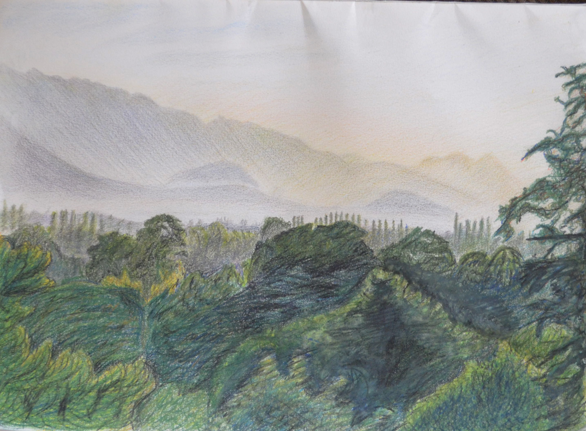
With the red shirts and yellow shirts kicking off here in Bangkok my school has been closed for 3 or 4 days every week for the last week, with them calling a truce just for today, the king’s birthday. Anyway with time off work we made the decision to go away to Sarabruri for a couple of days and so I decided to take my pencils, an A3 drawing pad and drawing board.
The view from our room balcony at Saraburi
The lodge where we stayed was overlooking some beautiful – what I would call – mountain shaped hills but when we arrived on the first day it was already knocking on so I set my alarm and got up at 6 am.
The mountains looked great with the mist glowing above and in front of them and I knew they wouldn’t look like that forever so I took a few snaps with the camera first and took a great shot, the one above, which was framed with a tree. Using my view finder I began to draw knowing that I could work from the photos later. I had decided to work entirely in Derwent watercolour pencil for the following reasons:
Less waxy than Derwent Artists’ Pencils
Easy to erase
Easy to blend
If I needed to I could use them wet
I decided to work from the background down to the foreground as I wanted to get the mountains and the sky just right, However I spent so long working on the mountains that the mist was clearing and I had to keep resorting back to looking at the photo on my Galaxy Tab.
1 – Mountains and Sky Backgrund
The second step was the middle ground, the mist had all but lifted by now but using the photo on the tablet as reference I blocked in the middle ground areas with a a blend of grey, violet and blue and then drawing in the trees in thew distance with a 2 shades of green and grey to depict the trees appearing out of the mist.
2 – Middle Ground Complete
Up until now everything was going well but I was about three hours in and so that I didn’t ignore the girlfriend I decided to finish off the foreground, frame the picture with a tree then finish the rest of the drawing off back home in Bangkok and too be honest I was a bit overwhelmed by how many trees I had to draw so needed a break anyway.
3 – Plotting Space through Composition and Structure – Watercolour Pencil Mostly Dry
When it came to drawing the big trees in the foreground I started by drawing the outlines of the trees in a lighter coloured pencil, then using irregular hatching for the branches from dark to light colours.
4 – Plotting Space through Composition and Structure – Sky finished
I noticed there is a project coming up called Drawing Trees, for me it would have been better to have done that first before this project as I have been drawing nothing but trees since A Sketchbook Walk and it has been a struggle. and this exercise was no different.
5 – Photo of drawing with no reflection
Due to me not using watercolour paper I refrained from drawing wet until I needed to and that was on the largest tree and three at the side that I framed the drawing with.
To be honest not much of this drawing turned out the way I wanted it to, background great, middle-ground great but then the foreground just changed everything and made the drawing look like some kind of dodgy cartoon. However I am not going to start again as I believe I have achieved the goal of this exercise which was to establish a foreground, middle ground and background in my drawing.
For this exercise I had to draw comprehensive tonal studies of cloud formations in charcoal, oil pastel and conte with the aid of a putty rubber.
It’s in the transition from rainy season to dry season here in Thailand but most of the rain happens in the afternoon and as I drew most of the following around mid day most of the clouds seemed to be developing into rain clouds.
I probably went about this exercise the wrong way, instead of drawing sketches in my sketchbook as it seemed a lot of other students have done I used separate sheets of paper and tried filling them up with not just the clouds but the blue skies behind the clouds to try and capture how the rays of light bouncing of the clouds effected the skies around them, and what a task.
1 – Cloud Formation in Oil Pastel
My first drawing was started in the morning from the car park at the Tesco Lotus shopping mall where I teach. I’m still really new to oil pastel so I started the drawing by drawing in the blue skies giving me the silhouette of the cloud then drawing in the dark parts of the cloud after. I could see it was going to take me a long time but luckily there was no strong winds, which is usually the norm here in Thailand during the rainy season, as the clouds just seem to form slowly through the course of the day, so I took a photo and finished the drawing at home.
The hardest part was depicting the sun shining behind the top of the clouds, I think I managed to do this by making the shadow of the cloud a lot darker in that area, so the white would look brighter.
I wasn’t going to be able to any more drawings until the next day so that night I decided to do something different. It was about 9 o’clock in the evening and I could see the moon shining through the sun so I took a photo of it from my window, When taking a photo of the night skies the camera seems to capture a lot more than what the eyes can see, I live on the 26th floor and I’ve often noticed that when taking photos of Bangkok at night clouds appear on photos that I didn’t think were there.
2 – Clouds at Night in Hard Pastel on Black Paper
I originally thought that I could do the drawing just in conte but I only had three colours a dark brick, black and white but then as I started to draw more and more colours began to appear so I highlighted the moon and the clouds in yellow and orange hard pastel, a move that would change the course of the exercise.
A Photo of the Moon at Night
The next drawings was done from my apartment window it was about half past two in the afternoon and the clouds were really starting to form now. One particular cloud caught my eye and because of the lack of wind I managed to get two drawings of it one using hard pastel for the blue skies.
3 – Cloud Formation in Charcoal
To be honest I don’t think I captured the full body of the cloud very well in charcoal and it could have looked a lot fluffier than what it did. The next drawing in hard pastel was a lot better.
4 – Cloud Formation in Hard Pastel and Charcoal
The next three drawings were done in my sketchbook in soft pastel. a medium that I wasn’t instructed to use in the brief but I really wanted to have ago in another medium as I wasn’t very keen on oil-pastel and because of the soft cloud formations and blue skies outside my window I thought it was very suitable, plus I haven’t done much work in soft pastel so far so it gave me a chance to use it.
6 – Sketchbook Drawng in Soft Pastel5 – Sketchbook Drawing in Soft Pastel
The final drawing was done in the early evening and it looks like wain was on the way but it was a really nice evening the problem was lack of selection of colours in the soft pastel set that I bought so this is something I have to correct.
7 – Sketchbook Drawing in Soft Paste (Evening)
I haven’t done as many studies I would have liked to in this exercise but with the amount of work I have had on lately I’ve slipped right behind and I want to get moving with the final exercise in this module but I’ll hopefully be doing more cloud studies throughout this part of the course and adding them later.
For this research point I was to look at artists who worked in Series such as Monet, Pissarro or Cézanne and make notes in my learning log about the challenges they faced and how they tackled them.
Camille Pissarro
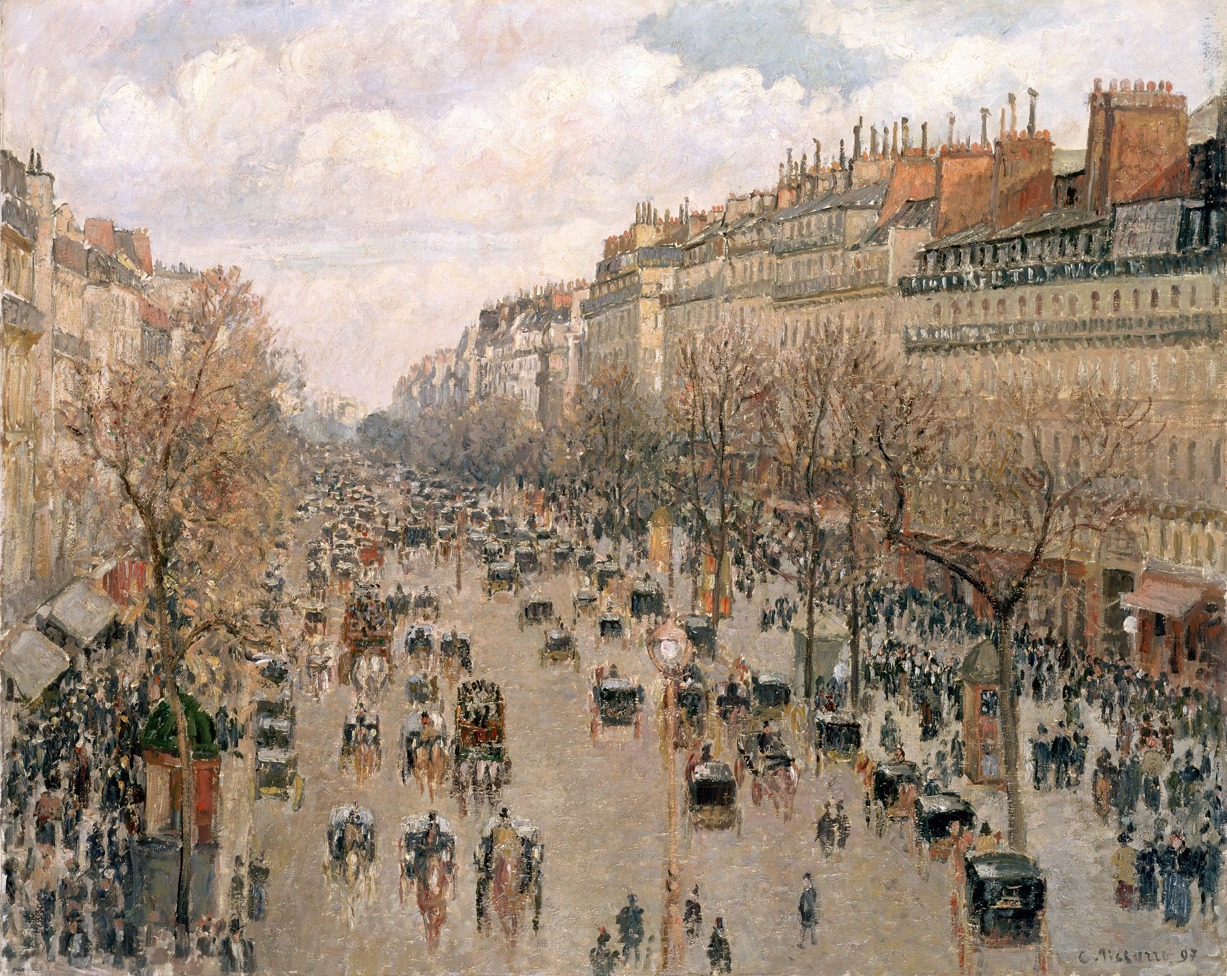
I thought I would look at Camille Pissarro first as I remembered his various paintings of The Boulevard Montmartre through different seasons and different times of day.
The Boulevard Montmartre 1897
I suspect that the first painting in this series would have been the Boulevard Montre 1897 above which from the shadows on the chimneys on the right looks like the scene is set in late afternoon or early evening.
Looking at the Boulevard Montre in Spring below I think it’s obvious that Pissarro’s biggest challenge was depicting the weather and he has tackled this by using a totally different colour pallet barring the chimneys on the right. Another challenge that I’m guessing he would have been thinking about while he was painting this would be duplicating the buildings so they seem to appear the same as in the original painting, however with different shadows and light shining from different directions he could add shadows where necessary to correct the shape of the buildings.
The Boulevard Montmartre Spring 1897
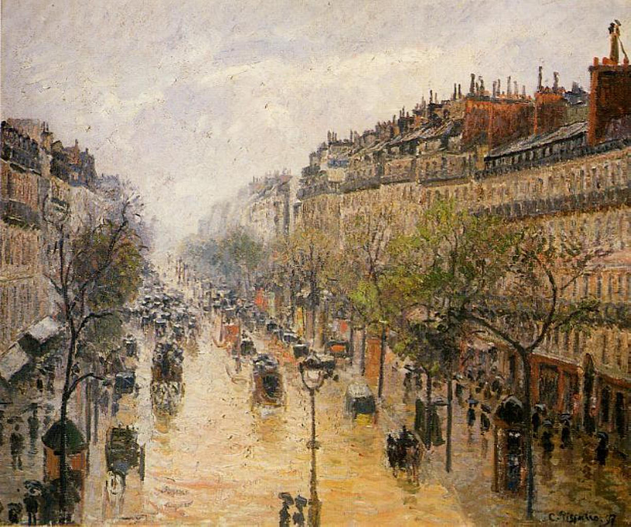
With Boulevard Montre in Spring Rain Below the biggest challenge for him would have been to make it look like the floor was wet, to give the effect of water it looks like he may have used a pallet knife as well as using colours that he has used in the sky so that it looks like it is reflective. With this painting it seems he has taken shelter lower to street level maybe with the balcony he was painting in earlier paintings above him to shield him from the rain but I’m wondering how long it took him to paint this and where his starting point was. If he has started from the flooded road he may have been painting in his original spot finishing at the rooftops and so the buildings look higher.
The Boulevard Montmartre Spring Rain
The Boulevard Montre at Night below seems to have been painted on a wet rainy night and it looks like he has used a palette knife for the entire painting in order to get that effect.
Boulevard Montmartre at Night
In The Boulevard Montre in Cloudy Weather below he has used a similar technique completing the painting with thicker brushstrokes and palette knife (I think) to create a blurry effect. I have also noticed that on clouded days some of the colours you see are a lot deeper probably due to lack of light being reflected off the buildings he seems to show this by using deep colours in certain places such as the rooftop on the right.
The Boulevard Montmartre Cloudy Weather
Claude Monet
Really spent quite a while trying to continue what I had been doing in earlier research points and that is finding new artists to look at, unfortunately my keyword searches let me down this time so I went with the recommendations from the brief and looked at Claude Monet’s Series of paintings ‘Haystacks’. This series of 25 paintings were painted in the fields near his home in Giverny, France, he begun painting them at harvest time (end of summer) 1890 and continued painting through to the Spring of 1891.
Grainstacks in the Sunlight, Morning Effect, 1890
The challenge that Monet faced, like Pissarro was to depict the different times of day as well as the different seasons, while still maintaining the texture of the haystacks and portraying the landscape in the background, he tackled this with a clever use of colour, different size brushstrokes and palette knife.
Haystacks, (Midday), 1890-91Wheatstacks, Snow Effect, Morning, 1891Haystacks on a Foggy Morning, 1891Grainstack. (Sunset.), 1890-91
For this exercise I was to choose an expansive landscape where I had an open view in all directions, then using my viewfinder to find a focal point and to frame my view I was to complete a fifteen-minute drawing.
From there I was to turn my stool on the same spot to face West, South and East, each time repeating the process of finding a focal point and completing another fifteen-minute drawing.
With not much choice of expansive Landscapes in Bangkok I knew I would be going back to the park where I did the sketches for the last exercise ‘A Sketchbook Walk‘ but I wasn’t sure when I would get the chance to go back. Then with a stroke of luck the Thai government tried bringing an ‘Amnesty Bill’ in so exiled former president Thaksin Shinawatra could come back Thailand without being strung up, so the protesters hit the streets again and I got three days off.
Well to start with I didn’t have a stool and I would have looked a bit silly getting in the taxi with a buffet but it hadn’t rained for 2 days so I decided I would sit on the floor, so armed with my artist’s wrap, my A4 sketchbook, my small viewfinder and my small drawing board I headed to Suan Rot Fai again. I’d already decided where I was going to sit and I started drawing what I thought was North and what happened next was a series of accidents.
It was pretty clouded and I was pretty positive the direction I was looking was south and there was no need to look at the GPS on my phone so I pulled out my charcoal pencil from my artist’s wrap and started drawing, two trees in I realised I had forgot my cutter and a pencil sharpener was just not going to do the job so I finished the drawing in compressed charcoal hence the two bushes in front of the trees in the background came out looking more like coal slacks than bushes.
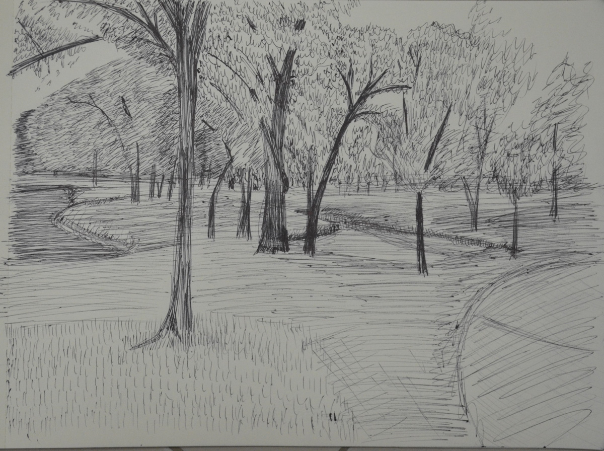
Exercise 360 Degree Studies: South
This first drawing did take me spot on 15 minutes and although I am not happy with the finished drawing as it looks more like Autumn in England than Rainy season in Thailand I thought I did quite well drawing the landscape with this medium for the first time.
Exercise 360 Degree Studies: East
As I turned 90 degrees anti-clockwise to draw what I thought was West I realised that the Sun had come out from the clouds behind me and it was nearly three in the afternoon so I was actually facing East, I’m usually great at guessing where North is…however I decided to carry on. East was very tricky it was the first time I had drawn water and I was facing a lake so I chose not to carry on in Charcoal but to switch to a 4B pencil, a decision I now regret.
Focusing on the tree directly in front of me, that looked like it was bending towards the water to get a drink, I began to draw. The whole process from beginning to end was a rush trying to finish in the 15 minute time frame and I was very lucky that it came out looking anything near the view I was drawing, I was going to leave the buildings in the background out but then decided to add them at the end. I wasn’t looking at the time but I reckon the drawing took me about ten minutes over the 15 minute time frame, the problem…too many trees!
Exercise 360 Degree Studies: North
As I turned North to face more trees, I decided to switch mediums again and this time began to draw in my trusty ball point pen, even though the sun was shining by now and I think I depicted this quite well in the sketch, it probably does look more like an Autumn Scene. It took no time at all to sketch everything out but then another 15 minutes to get the trees looking anything like trees. I feel now that a fine marker would have been a better choice of Medium.
Exercise 360 Degree Studies: West
The fourth and final drawing, which I thought would be the easiest was left incomplete dead on 15 minutes and after going over it about three times in charcoal, the medium that I thought was the safest for this type of landscape given the 15 minute time frame.
I am not impressed with my performance on this exercise, However I do feel that I have learnt something very important from it and that is choosing the right medium for the right job…the job being a 15 minute sketch in this type of environment.
What I did like about this exercise though were the notable changes in the landscape just by shifting my view a little, I could have got many great and very different drawings just by sitting in the same spot. I took advantage of this by finding the focal points that I thought would be best to start from given the 15 minute time frames.
The Brief for this exercise was to ‘Go for a walk in your local park, around your garden or somewhere you normally walk. Find a view that you like or are familiar with and use your viewfinder to help you focus on a point of interest. This could be a trees, a gate or a road.’
I had been working irregular hours over the last month as schools were on holiday and I had been working in the language center and with pretty earlier sunsets in Thailand I spent most of the day time I had left doing cloud drawings for the third exercise in this project. Finally I dropped on lucky with two days off which it turned out I needed for this exercise alone.
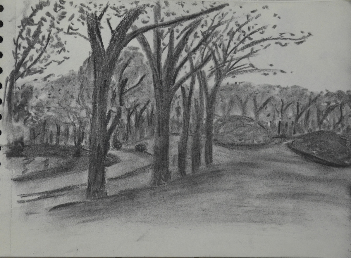
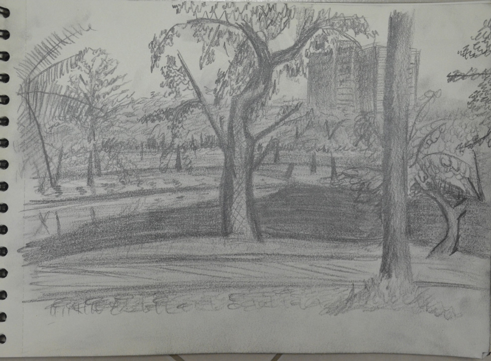
The only suitable place for this exercise and probably most of the others in this module is a place called ‘Suan Rot Fai’ (Suan=Park, Rot Fai = Train) which is basically a large park on the outskirts of Bangkok with lots of trees, lakes, grass, sculptures and a rotting train. So I set out armed with my artists wrap, filled with different pencils and charcoal and my viewfinder that I made in the first part of this course to see what I could draw. After a long walk around the park getting familiar with the sites, sculptures, trees and other landmarks, I decided that it was more like Disneyland than a park with scaled down replicas of famous Thai landmarks and a kind of theme park with traffic lights and statues of strange looking Asian Cartoon figures. Being spoil- for-choice on what to draw I made the decision to get some sketches of more natural looking subjects.
The first subject that caught my eye was some kind of park keepers shed, which was a bad choice for me really because when it comes to drawing any kind of structure like this I like the perspective to be perfect and although I followed the brief and didn’t erase any mistakes I might have made, I drew very slowly and the shed itself took me at least 30 minutes. It was in a great location and the trees above cast some lovely shadows which I think I did well to catch and I think I managed to do a great job depicting the light reflecting off the glass shutters at the side. When it came to drawing the trees I think I also did quite well but I could have chosen a better technique on drawing the leaves on the trees although the focal point of the picture, the shed, takes your mind off the rubbishy bits.
A Sketchbook Walk First Sketch : HB Pencil
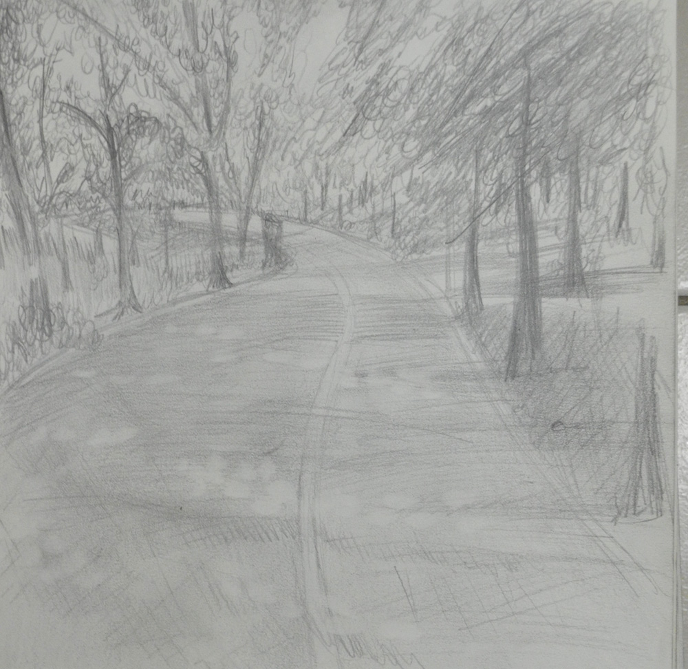
Bangkok is very flat and the first time I rode around this park on a mountain bike this year I realised that this was probably the only place in Bangkok that had sloping paths so I took the opportunity to make the second sketch of a path swooping round a bend it was about 4:30 in the afternoon by now and in Thailand time that’s nearly twilight so I had to work a lot faster now and I realised that this was probably going to be my last sketch of the day, not just because I didn’t think I’d have enough time to do another before it got dark but also because the park was filling up with people jogging and on bikes as the Thais don’t like to get sun tans and so they come out as the sun is going down.
A Sketchbook Walk Second Sketch : HB Pencil
This time I started by drawing the snaking outline of the cycle path and the trees on the left hand side of the road. There was a hell of a lot of trees here for my liking and it was difficult to see where the trees in the background came up to behind the trees in front but to be honest I think I did quite well drawing them and the light that shone down the short grass behind them. I also think I did quite well drawing the trees at the back on the right hand side of the road but totally messed up drawing thee trees closest on the right. However like the first drawing with the road acting as the point of focus it kind of takes your mind off how badly drawn they are.
The light shining on the road through the branches and leaves above was a challenge so I decided to go about this by hatching across the road to show the shadows coming off the trees, smudging the pencil lines with my finger and then erasing the areas of light with a putty rubber then where needed hatching again over the top for more shadow.
Day 2
To do the last two sketches I came out again the next day which was unfortunately a public holiday so I was limited for where I could sketch in peace as the park was full, so much for not wanting to get a sun tan.
My third subject was something that I thought would be a lot easier to draw and found extremely difficult, logs against a tree. I sketched in the tree first to give myself a starting point with the logs and taking advantage of the negative space started work on the chopped down chunks of tree. However the hardest thing was making the logs look like logs as the texture was quite difficult to replicate in a quick sketch the tree behind however was a different kettle-of-fish I spent more time on that and I think I managed to pull off the texture quite well.
A Sketchbook Walk Third Sketch : HB Pencil
Behind the tree was a miniature junction painted on the floor-fail! I did love drawing the shape of the big trees in the background though, I can’t wait to start drawing trees later on in this module, there are some great eucalyptus trees in the park. The grass was also a task as it was very patchy and the grass in Thailand is very different from the grass in the U.K., more like a weed than grass. Overall I am not very happy with this drawing but it was the quickest so far I just have to improve before I start drawing the 360 degree studies in 15 minutes per drawing!
With the park being pretty full I found myself in places where the Thais wouldn’t go or at least wouldn’t be distracting me walking around in the background so I found myself looking at this clearing and with the sun beating down and everything in the foreground looking very dark it was the perfect opportunity to pull out my charcoal pencil. I had been using an HB pencil for the first three pencils and just wanted to use something different so I began with a charcoal pencil to draw in the tree, which when I finished reminded me of a Klimt painting for some reason then I drew in shadows with an EE, taking the shadows up to the road, drawing in the road with HB and then taking the shadows over the road.
A Sketchbook Walk Fourth and Final Sketch : Charcoal Pencil, EE and HB
Unlike the previous picture the grass here was real grass and perfectly cut so instead of having to draw individual blades i simply shaded then smudged. This time for the branches of the tree itself I left the squiggles alone and used and drew the leaves with marks similar to those used by Albrecht Durer in my previous post Research Point: Different Artists’ Depictions of Landscapes and then resorted to the squiggles for the trees in the background to give the effect that they are in the distance. Their is a small like at the back on the left I found this quite difficult to draw you can tell there is something there but you can’t quite make out what it is.
For the first research point in this part of the course, ‘Drawing Outdoors’ We were asked to look at different artists depictions of landscapes, for example Albrecht Dürer, Claude Lorrain and L.S. Lowry.
Albrecht Dürer
Albrecht Dürer 1471-1528 gave us some of the earliest and finest works of the ‘Northern Renaissance’ with some wonderful landscape paintings, however, with the next exercise ‘a sketchbook walk’ coming up, I decided to look for some of Dürer’s more sketchy works.
The first painting I came across was a painting called Quarry, I searched on Google to try to find more information on this painting but to no avail, all I found was other paintings in colour of the same name. Looking at the painting at a first glance I thought it was a drawing in pencil but then realized it was a watercolour but it does look like he may have used other media such as pencil to finish the piece. The mark making techniques he has used in the painting are very simple and yet he has managed to create a good sense of three dimension with thin strong lines for the turfs of grass and weeds in the foreground to the wide, smudged brush strokes for the trees in the background and everything else in between. I particularly like the mark making techniques he has used for the leafs of the trees as he has depicted what we see has very complex objects with a series of simple shapes.
Quarry – Albrecht Durer
Another painting that I really liked was ‘Forest Glade with a Walled Fountain by which Two Men are Sitting’. I haven’t found the details of this drawing but it looks more like a drawing in pen and ink than a drawing. At first I couldn’t determine whether the artist had no time to finish the painting or if he had deliberately left it unfinished but then I realized that he was trying to show the light shining in through the trees on the left hand side of the picture and the dark forest in the background.
Forest Glade with a Walled Fountain by Which Two Men are Sitting 1505 Albrecht Durer
Again, like the first painting he has used many different mark making techniques using hatching and cross hatching for the fountain, as well as the two men and various hatching techniques to show the density of the forest behind. I can also see that he has used the same simple marks for the leaves on the trees as the first painting which works really well.
L.S. Lowry (1 November 1887 – 23 February 1976)
Laurence Stephen Lowry, was born in Stretford, Lancashire in 1887 and as a northerner as always been a favourite of mine.
Lowry is famous for his paintings depicting life in various industrial districts in the Northwest of England in a very distinctive style of painting.
Because of his use of stylised figures and the lack of weather effects in many of his landscapes he is sometimes characterised as a naïve “Sunday painter”, although this is not the position of the galleries that have organised retrospectives of his works. – Wikipedia.
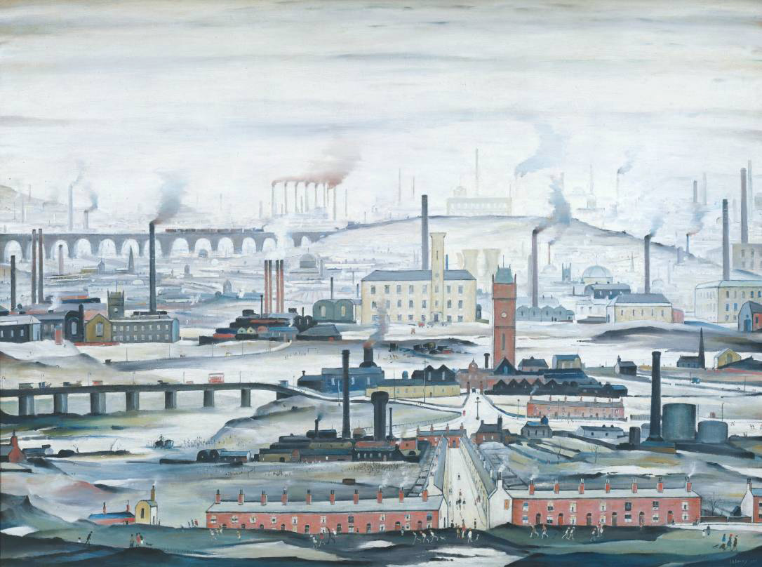
L.S. Lowry Industrial Landscape 1955
The oil painting, Industrial Landscape 1955, below is a great example of Lowry’s industrial landscape paintings. What I like about Lowry’s paintings especially this one is that the building, bridges, houses etc. are made up of very simple shapes, mostly rectangles and squares and yet he still manages to create feeling in his paintings with the help of factory smoke and dismal skies plus the background that fades to almost nothing helps not only to create a sense of distance but of smog and pollution being caused by the factory chimneys. Although the perspective is not perfect he creates a sense distance by painting the landscape lighter and lighter as he moves into the background eventually fading to a blue-grey; as well as painting objects like trees, bushes, chimneys and spires with simpler and smaller shapes so that they appear far-off.
L.S. Lowry An Industrial Landscape 1958
I tried to find a larger image of the following painting but to no avail. Also titled An Industrial Landscape the painting was bought for 300 GBP in 1959 and sold for 600,000 GBP in 2007. Again you can see how he paints the buildings in lighter and lighter shades in the background to give the impression they are disappearing into an industrial smog.
Finding a Substitute for Claude Lorrain
I noticed that I would be researching Claude Lorrain again later on in this module and so I set out to find a substitute. I first searched for Claude Lorrain on Google which took me to the Baroque period from there I clicked on a link to Landscapes which took me to page of wonderful landscapes on Wikipedia with Landscape Paintings of artists from all different periods.
The first painting that jumped out at me was a painting by Caspar David Friedrich, titled Wanderer above the Sea of Fog, 1818, which is a classic image from German Romanticism. I recently watched a series of documentaries about German art on the BBC and this painting was used in the credits. My kind of painting really, simple and yet the landscape he has painted catches the imagination wondering what is below the peaks, and below the cloud line. Again as in paintings by the other artists in this research point the trees on the mountain ridges are made up of very simple squiggles and other shapes but its not something you notice straight away. I love the way he has used what I think are long twisted brush strokes with a darker colour over the lighter colour in the background to create the effect of mist rolling down the ills to the center of the picture.
Caspar David Friedrich: The wanderer above the Sea of Fog 1818
The next image that caught my attention was a painting by Frederic Edwin Church titled The Heart of the Andes, 1859. Unlike the previous painting this is by no means simple, I couldn’t even begin to think about where this guy started or what techniques he used, say, for the trees, but the mountains in the background are pure inspiration. They seem to be layers and layers of colour painted over the blue sky background making their way to ground level with the white snowcapped mountains in the background taking your mind on a journey around the mountains in front to get to them.
This assignment is designed to pull together the fine observation and practice that you’ve done on this part of the course. You’re free to choose your own subject matter and drawing Media but there are a number of important issues to consider if you’re to produce an excellent piece of work. In your work for this assignment, you must demonstrate:
An understanding of the use of colour in drawing.
An understanding of the most appropriate choice of medium for the subject and skill using it.
The ability to set up an interesting composition
Variety in mark-making, depth, contrast, tone
Accuracy and a demonstrable understanding of tone.
Final Drawing in Pastel Pencil and Hard Pastel
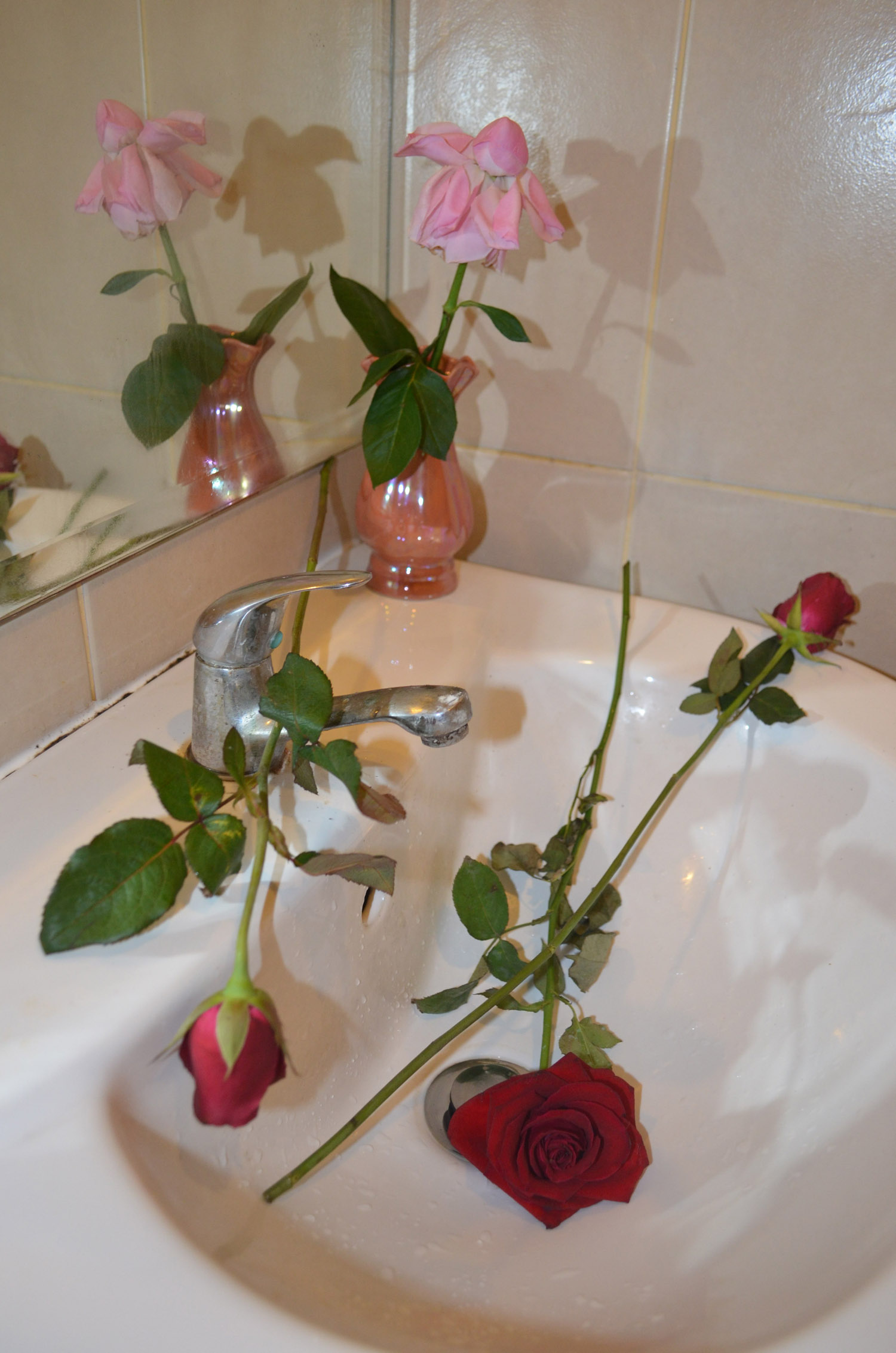
The last month was a month of heartache and arguments breaking up with the girlfriend of two years and although it did slow me down with my coursework and delay my assignment it was inspiring. The now ex-girlfriend left a dead rose at the side of the bed, one that she had saved from our first valentines day together, it did go straight in the bin on the day she left but it gave me a great idea.
For this assignment I planned to buy some roses to and throw them in the sink and draw them where they landed (using the sink was an idea I got from my research on Antonio López García, recommended by my tutor). I went to a small florist in the department store where I work, they had a disappointing selection of roses so I purchased two small red roses a pink rose and a larger red rose all of which had had their thorns removed, which was also quite disappointing.
When I finally got round to drawing the flowers the pink rose was on it’s way out and the petals were now pointing down and didn’t look much like a rose, the two small roses had opened up, but not too much and the large red rose was in full bloom; these changes gave me a nice variation of shapes to draw.
Chosen Composition
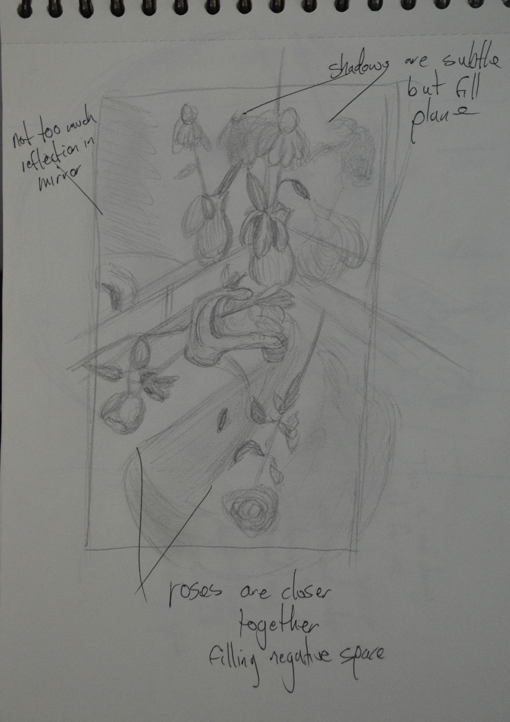
I started off by setting up the roses in different positions around the sink and using a view finder I decided that the stem of the pink rose was too big and so I snipped it to bring the flower closer to the vase. It took me a good twenty minutes to find some decent compositions to draw, throwing them in the sink and drawing them as they fell was just not going to work!
I made a few preliminary sketches in my notebook and decided that the paper had to be in a portrait position rather than landscape in order to concentrate on the natural objects in the drawing rather than the objects surrounding them.
Preliminary Sketches – First CompostionPreliminary Sketches – Second CompostionPreliminary Sketches – Third CompostionPreliminary Sketches – Chosen Compostion
After completing the preliminary sketches I chose the composition that I thought would work best and developed it for enlarging.
Colour Pencil Study
Up until this stage I was positive that I would be producing the final drawing for this assignment in coloured pencil and so I did a colour pencil sketch of the rose flowers and then a pencil and coloured pencil sketch of the tap and rose leaves in my sketchbook. Here, it was clear to me that they would be no good for this assignment and I would after look at other mediums.
I went out and purchased a pack of 24 Derwent Pastel pencils and 1 x A1 sheet of fawn coloured pastel paper and 1 x A1 sheet of cream coloured pastel paper. I did not know yet which kind of pastel I would be using for this assignment or whether or not it would be good to draw on dark paper and go lighter or lighter paper and go darker, I just knew that I would be using pastels and that coloured paper was best for the coloured tiles in the bathroom.
Colour Pencil Study
I decided that it was best to use the lighter paper and go darker and so I would use the darker paper for two more colour studies one in oil pastel and one in pastel pencil. I tore the A1 size paper into two halves and did two almost identical enlarged drawings and decxided to do the first drawing in oil pastel. There were parts of the drawing that would have been good in this medium but other parts I decided would just not work, I wasn’t prepared to mess up in my final drawing with a sloppy medium when the brief said I should be focusing on accuracy and so I refused to complete the full drawing wasting more time.
Study in Oil Pastel on A2 Pastel Paper
The second study in pastel pencil worked a lot of better and at some stages of the drawing I actually thought that I could submit it for more my final drawing and so I spent a few hours completing it. Towards the completion stage I realised that the flowers were too close to the edge of the paper and the perspective of the flower laid across the top of the open rose was way out but completing the drawing helped me to decide on the different techniques I would use on the different subjects in the drawing.
Study in Pastel Pencil on A2 Pastel Paper
By the time it came to work on my final drawing the flowers were long gone so I was working from a photo again. I decided that vthe composition still needed further development and so I put a photo of the original composition into Photoshop and used Photoshop’s guides to help me perfect the enlargement for my final piece on the cream sheet of A1 pastel paper. With pressure now on final piece I wasn’t prepared to mess up and so there is a lot of white showing through in certain parts of the drawing which I left for the sake of overworking and messing up.
I decided that in the final piece I would not only use pastel pencil but also hard pastel as I could cover bigger areas with the flat of the sticks of pastel. The only problem with this was that it was hard to layer the white over the darker colours and so I did mess up in certain parts of the shadows.
Assignment Criteria Again:
An understanding of the use of colour in drawing.
Above everything I think I did very well in demonstrating the use of colour in drawing. Before this part of the course I would have probably used several colours on each piece and kept ‘trying’ throughout the drawing. In this assignment I started off with the lightest colours layering the darker colours over the top and got the results that I wanted.
An understanding of the most appropriate choice of medium for the subject and skill using it.
Apart from regretting using hard pastel in places, I think I did well choosing the right medium for this drawing. With the subtle shadows and colours reflected off the sink and the deep reds in the flowers, Pastel pencil was the best choice.
The ability to set up an interesting composition.
Absolutely! And I am positive it shows in this assignment.
Variety in mark-making, depth, contrast, tone
There are aspects of this drawing where I could have done better in all three of these categories but overall I think I did very well to show what I have learnt in the first two parts of this course, mark-making, depth, contrast and tone.
Accuracy and a demonstrable understanding of tone.
I really try to focus on accuracy at all times, I do think that I have shown accuracy and a demonstrable understanding of tone in this assignment however being modest I still have to say that there is most definitely room for improvement.
What aspects of each drawing have been successful, and what did you have problems with?
Still Life Group Using Line
I drew this drawing from scratch without sketching in pencil first in this aspect I think I did really well. However I found it very difficult not to start hatching to depict tone and so I probably went overboard on the pumpkin but I feel that it was better to but too much effort in than two little.
I was also dissatisfied with the pumpkin because the actual surface wasn’t as rough or bumpy as what I made it out to be in my drawing. In both drawings.
Still Life Group in Tone
The only problem I had with this is I should have chose a composition that used up more of the paper. I also could have been more adventurous with the subjects that I chose. Apart from that I think I did really well with depicting tone and none of the objects look out of place.
Did you manage to get a sense of depth in your Drawings? What elements of the drawings and still life groupings helped create that sense?
This is one thing I did not have a problem with with the Still Life Group Using Line exercise I did this by placing the tallest objects at the back. With the Still Life Group in Tone I looked down at the group from an angle.
What difficulties were created by being restricted to line or tone?
Like I said earlier sometimes it was very difficult not to cross the fine-line between drawing with line and hatching.