I don’t get many days off in fact the only day I do get off is the only day I get to see my kids, Saturday but luckily for me my kids love drawing and looking at art so we went for a day out to the Thai National Art Gallery near the Khaosan Road area of Bangkok.
A Visit to the Gallery
It was my first visit to the National Art gallery, I didn’t even know where it was which was a bit embarrassing as I used to cycle past it everyday to the last school I used to work at. With it being my first visit to the National Art gallery I didn’t know what to expect, I actually thought it would be a bit disorganized.
A Painting by King Bhumipol, a self portait maybe?
The price for the ticket for the gallery was 250 baht for foreigners but only 30 baht if you speak Thai, the kids were free so it only cost us 30 baht to enter. On entering my first impression was that it was all a bit too royalist and I with photos of the Royal family from different generations, traditional Thai drawings, which I am quite fond of and even an abstract painting by the king (which I think is a self portrait).
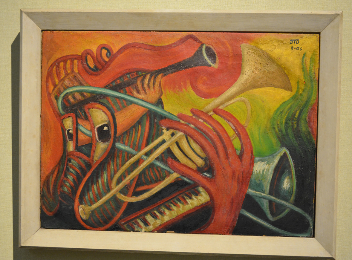
Muslim Girl unknown
As I made my way round into the temporary gallery section I decided that my money was well spent and was amazed at some of the work on display, so much so that I forgot to get the name of the artist who created this piece which I believe is of a Muslim girl, knowing what is going on in the south of Thailand.
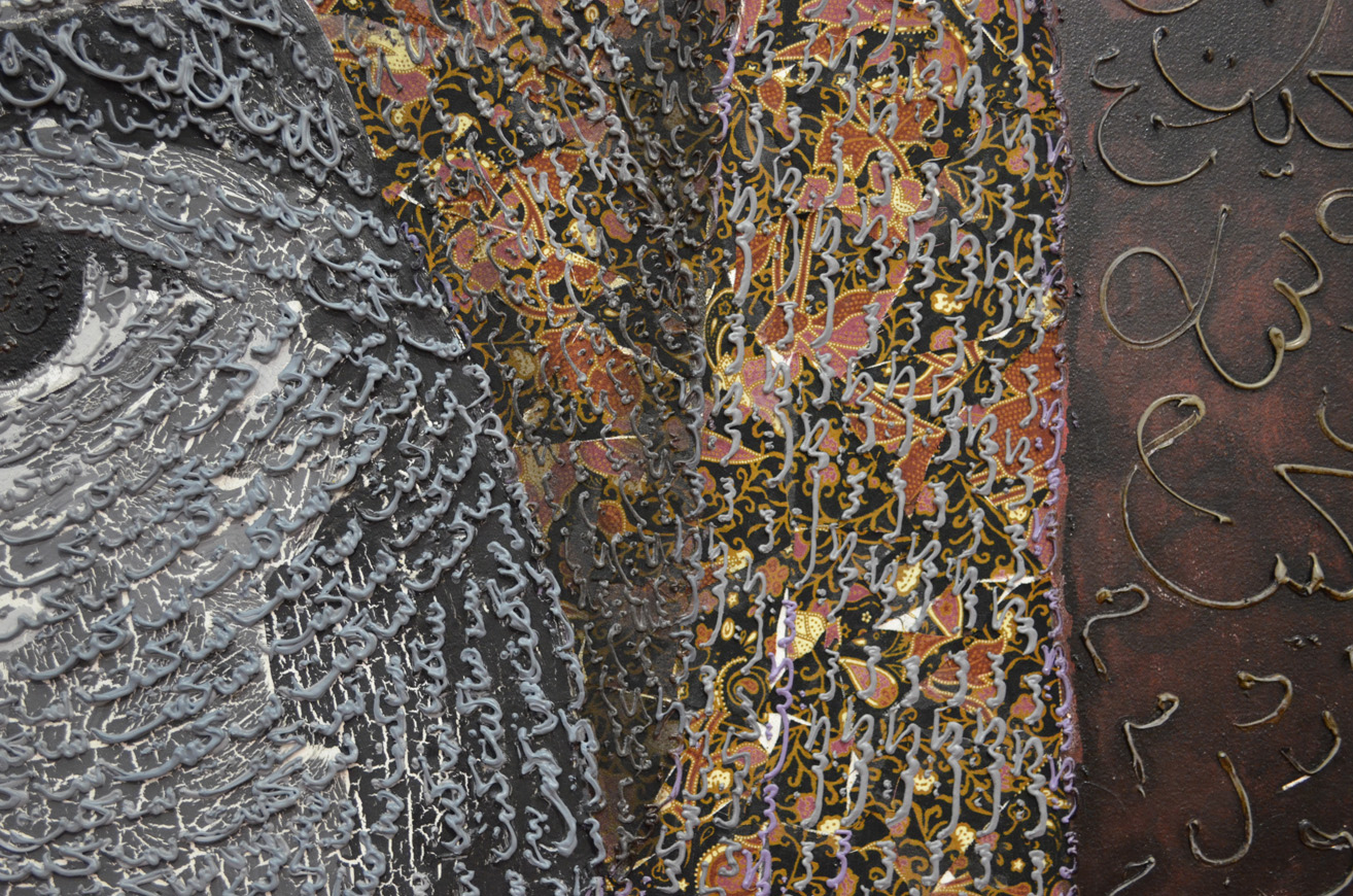
Close up of Muslim Girl by Thai Artist
At a first glance of the painting it looked to be made up of Thai alphabetical characters but I think most probably just squiggles influenced by both Thai and Islamic characters.
It wasn’t long before I came across the next exhibition, Crossing over by Chile born artist Marco Evaristti. Crossing over displays several drawings and paintings of dismembered suicide bombers and victims, although they were very beautifully drawn my kids were terrified so I only managed to stick around long enough to get some photos and managed to get the details on line from the Bangkok post.
It was a shame that I had to rush through crossing over I did go down for a second visit a few weeks later but the artists in the temporary gallery had changed.
Crossing Over by Marco Evaristti remainders of suicide bombersdrawing of suicide bomber and victimsCrossing Over by Marco Evaristti – skullsCrossing Over by Marco EvaristtiTerrorialista Dismembered TerroristCityscape 2013 part of the Crossing Over exhibition
My old sketch book got full quite quickly so I needed to buy a new sketch book to finish the first part of my drawing 1 course. I wish I new more about what paper to choose gsm/tooth etc, there were a few expensive sketchbooks in the art shop, so I expect the quality was probably top notch but they were sealed and there wasn’t that much information on the wrapping. In the end I settled for a cheaper A4 sketch book with a lot of tooth, it said smooth on the front but doesn’t feel smooth to me.However the reason why I chose this sketchbook in particular was of the photo of Corrado Feroci on the front cover.
Silpakorn Bhirasri on the cover of my new Sketch Book
Here’s a short biography of his life:
Corrado Feroci was born in Florence Italy in 1892 and was a sculptor who worked mainly in Thailand after being invited to the kingdom in 1923 to teach western sculptor at the Fine Arts Department of the Ministry of Palace Affairs. Corrado later founded the Silpakorn University (the University of Fine Arts) in 1943.
After Italy surrendered to the allies in 1944, he changed his name to to Silpa Bhirasiri and became a Thai national to avoid being arrested by the occupying Imperial Japanese Army. While in Thailand he married his second wife, one of his Thai students.
The Rama I Statue at Memorial Bridge
If you have ever been to Thailand and travelled around the Bangkok streets you will see several of Silpa Bhirasiri’s works including the Democracy Monumenty, the Victory Monument and the Statue of King Rama I at the Memorial Bridge at Saphan Phut.
Democracy Monument by Silpa Bhirasri Bangkok
His photograph on the front helped me choose the notebook, I’d previously bought colour pencils and watercolor pencils by the Thai brand Masterart which weren’t so great, but I had not so long ago read about Silpha Bhirasiri and knew he was the founder of Silpakorn University so knowing that the university had endorsed the brand for this product I had faith in what I was purchasing.
To be honest my sketchbook hasn’t been that organised so far but I made a promise to myself on purchasing this new book to get things in order for my first assignment.
Do you think it is easier to suggest three dimensions on man-made or natural objects?
This project has taught me that it is easier to suggest three dimensions on man-made objects rather than natural objects. Man-made objects are usually made up of geometrical shapes such as cylinders, cones or cubes and so the lines of man-made objects are easier to draw and suggest their 3D form using most mediums. The irregular shapes of natural objects means that their three dimensional features are much more subtle with lines that are more difficult to depict and draw.
How did you create a sense of solidity in your composition?
In the exercise ‘Still Life Sketches of Made Objects’ I created a sense of solidity by using various hatching techniques and swapping between pencils of different hardness mainly B, HB and 2B, shadows and tone also played a big part in making the objects look solid.
Image 1: Exercise – Still Life of Made Objects
In the exercise ‘Composition of Natural Objects‘ working with watercolor pencil I used hatching and layers of darker colour to show solidity.
Image 2: Exercise – Composition of Natural Objects
Do you think changing the arrangement of your composition makes a difference to the way you create a sense of form?
Changing the arrangement of the objects changed the way each objects interacted with each other, shadows and light reflected off one object to another and other objects in the composition (such as the plate in image 2) can play a major role in creating a sense of form.
How did you decide how to position yourself in relation to the objects?
For the second exercise I decided to position myself slightly above looking down at the objects so I could see the full form of the the objects and shadows interacting with each other in the middle of the composition, I thought this would help me to create a sense of form in my drawing. A bruised rib from a an accident the day before helped me to reinforce this decision.
The brief for this exercise was to ‘Make a selection of natural objects for my composition, such as fruit or vegetables on a plate, and explore the different viewpoints by moving all the objects around in different arrangements and assessing which set up I like best. In my sketchbook, make quick sketches of each different set-up before moving the objects about again.’
I found making quick sketches of the natural objects a lot easier than making thumbnail sketches of ‘made objects‘ in the previous exercise and started out with a good feeling that the exercise would go well. I chose vegetables for my composition which were a red yellow and green capsicum, a tomato and a carrot.
Thumbnail Sketches of Compositions of Natural Forms
I thought about the best place to position myself in relation to the objects and positioned myself slightly above. This was also more comfortable as I had bruised a rib after a fall during the Thai new year festivities (Songkran) a couple of days before, so I propped myself up with a couple of pillows, I couldn’t complain though as it did give me a good view of all the vegetables.
The brief for the second part of the exercise was to ‘Use the information collated in my sketchbook along with written notes from previous exercises to make an informed decision about the organisation of my still life drawing. This would help me to clear my mind and give a sense of order to my work.’
As always due to doing most of my work over different times of day and especially in the evening I worked with a bendy light as a light source, making sure it cast adequate light and shade onto the still life.
Mediums used – Watercolor pencil, 2B, 4B, 8B, EE graphite pencil, charcoal, Conté pencil
Paper – A3 Canson Watercolor pencil 190 gsm
Time taken – 10+ hours
I wanted to get more practice with watercolor pencils and so I initially chose to do this exercise completely in watercolor pencil and so the only size sheets I had were A3 which I bought for the ‘Supermarket Shop’ exercise. However the problem was the composition I chose meant that I had to use the paper length ways but I wanted to get the whole of the plate into the finished drawing with the shadow that it cast and so I knew in advance it would leave a lot of negative space on the paper. Placing another folded sheet of paper under the composition helped me fill up the negative space and I decided that I would also use the TV unit in the background as the background.
I made a very poor first attempt at the still life completely in watercolor pencil, it set me back a good few hours and did not put me in the best of moods but did teach me some valuable lessons.
I did not have enough practice with this medium to get it perfect.
Blending colours with this medium was more difficult than I thought.
You can’t erase watercolor pencil once it’s in paint form and if you try there’s a risk of ripping the paper!
I decided that my next attempt at this exercise would be a great chance to produce my first mix medium drawing and if I couldn’t perfect the colour, shadow and light of the vegetables I would do my best and then really make the composition stand out by the drawing everything else in graphite pencil.
On my first attempt at this exercise I started out sketching the dark parts of the vegetables in watercolor pencil first but on the second attempt I started with the lighter colours, although the second attempt was easier and looked better I have yet to perfect my technique.
When it to the lighter shadows in the drawing I took it very slow, using the pencil very lightly and holding it at the end and letting it almost dangle, only occasionally did I have to resort to blending with my finger. For the darker shadows on the plate I used 4B and 8B pencil.
All was going well until it came to the background objects, my 7B, 8B and 9B pencil kept snapping so after an email to Derwent to complain about the quality of pencils in their 24 graphite pack I continued with an EE pencil. I found the EE pencil no replacement for the 9B pencil and was hard to produce different tones so I finished the background off in Conté pencil and charcoal.
Still Life Composition of Natural Objects
I was a bit disheartened at times after starting off so well, especially having discovered that I drew the composition in my second try on the the wrong side of the paper thinking they were the same. Luckily enough it turned out to my advantage as it was easier to draw in graphite and the paper did not warp as much when wet plus the colours seemed to be a lot brighter when they bled.
I was also a bit upset that I had to use more than two mediums in this drawing and found it frustrating when things kept breaking. The end result of the watercolor pencils is not what I had in mind but I thought the contrast between the colour and the graphite pencil was excellent.
Composition of Natural Forms – close up
The good news is Derwent did get back to me and admitted there was a problem with the old batch of graphic pencils and are sending me replacement 7B, 8B and 9B pencils.
The aim of this exercise was to create a small still life composition from a small themed selection of made objects, of which I chose personal hygiene as my theme and the objects that I chose were, a tube of toothpaste, a toothbrush, a Bic Razor and a bottle of mouthwash.
Then with a pen, pencil, or ballpoint use a technique such as hatching. I used a 3H and a HB pencil (to show the darker shadows).
Then I had to draw two or three thumbnail sketches in my sketchbook of different arrangements from different view points, using my light source to help create strong lights and dark shadows on the surfaces of the objects. I had to include tonal values to indicate form in my sketches as well as shadows seeing as they can also play an important part of a still life composition.
Then I was to make notes on or around my sketches about the technique I used and why I had used it. And make notes on anything else I felt was important.
I did two initial drawings that I have to admit were not exactly thumbnail size, I think this was down to miscalculating proportions of the first objects I started on in each composition and then having to keep up proportions,
First attempt at this exercise
In the first drawing I started on the toothpaste tube as I always end up working clockwise, I think this is force of habit. However, because of this I misjudged how much paper I would need for the mouthwash so squashed the lid to fit the rest in; so when I came to the second drawing I worked from the mouthwash down.
On the first attempt I forgot what I was instructed to do in the exercise. Instead of writing down about the techniques I used I totally ripped the sketches apart fault by fault, only actually remembering what I was supposed to do after I took the photo to upload to my working log. I decided to do the exercise again and this time do it right.
In my second attempt I scaled the drawings down and was less worried about every detail. My hatching technique also seemed to improve a lot in my second attempt, using a variation of cross, vertical and horizontal hatching as well as swooping lines to follow the contours of certain objects.
Second Attempt at this exercise was much better
This exercise was probably the first time that I made no attempt of smudging in the pencil lines instead I practiced the pencil holding techniques I used earlier in this course, from the tip, from the end etc…
The hardest thing to draw in the composition were the toothbrush and razor and I felt like abandoning the objects and using something easier to draw but stuck at it and did a reasonably good attempt at getting proportions and details right all 4 times.
Odilon Redon (April 20, 1840 – July 6, 1916), started drawing as a young boy, and was awarded a prize for drawing at school at the age of 10. At 15 years of age, at his father’s insistence, he took up formal architectural studies, but failed to pass his entrance exams at Paris ‘Ecole des Beaux-Arts (School of Fine Arts). On return to Bordeaux he took up sculpture, and also etching and lithography under the instruction of Rodolphe Bresdin.
Threw his early career he continued to work almost exclusively in black and white, in lithographs and charcoal drawings right into his 50s. These drawings became known as his Blacks ‘Les Noirs’. He developed an extremely unique repertoire of weird subjects such as strange creatures, insects and plants with human heads on; these subjects were often influenced by the writings of Edgar Allen Poe.
In 1975 he studied trees and the Underwood at Barbizon in North-Central France, the same year saw his Blacks reached the ‘Most distressed period’ with him often depicting the topic of prisoners in his works, appearing behind the bars of windows or isolated in a nightmare or hallucination. Has he said about his Noirs “They were executed in hours of sadness and pain”.
From the 1890s due to illness and a religious crisis which transformed into a happier person he began to use pastels and oils, expressing himself with use of vibrant colour, creating works that depicted mythical scenes and flower paintings. Odilon abandoned his Noirs completely after 1900.
He always remained a fairly private person but the end of his life he became a rather distinguished figure with various awards and recognitions and was also regarded by the surrealists to be one of the forefathers of the surrealist movement (I was almost certain that it was going to say this in at least one of the online biographies as I began to look at his works.)
I had never heard of this artist until I was asked to research him but I’m glad I got the chance to do so. It was good to get a chance to see all his paintings side by side and to see how his works changed over the years, rollercoastering in and out of an often dominating dark mood until his change in mediums in the 1890s. I found a lot of his images disturbing and quite a lot of the hybrid characters made me feel uncomfortable like ‘The Egg’. However I was inspired by some of his darker works like ‘The Convict’; since my childhood I have often tried to put something similar down on paper but never got around to it.
The Egg, Odilon Redon 1885
I find a lot of his works interesting and could probably gain inspiration and ideas from them. Although I would find it hard to bare my emotions like he did, for all to see I quite often like to depict some of my innermost feelings and beliefs into my work and will continue to do so.
In this exercise I was instructed to ‘Use charcoal, a putty rubber and pick two objects with shiny reflective surfaces. Decide on the size of the composition, use A1 or A2 paper so that you can do bold strokes. Try to fill the paper with your objects showing the reflected light and shade of one object falling on another and try to leave very little background space.’
Photo of Chosen Objects, Sieve and Ladle
I went out and purchased a few objects specifically for this exercise, after putting them together in pairs to see how they reflected off each other I settled for what I think is some kind of sieve and a ladle. I chose A2 for the composition because my drawing board wasn’t big so an A1 size drawing board will be my next purchase. The brief said to leave very little background but I wanted to show some of the handle of the ladle and the shadow that it cast but to be honest I could have shown a lot less and made the objects bigger.
Drawing Pattern of Shadow
I sketched an outline with an H3 pencil then as instructed I drew the basic pattern of shadow first with sweeps of charcoal. I did try hatching but the charcoal seemed to leave too darker marks on the paper even trying the charcoal at different angles, this may have been down to the smoothness of the Carson paper that I used.
I tried to stay away from smudging the charcoal as it said nothing about it in the brief but when I did resort to smudging my finger took too much off so I used a stump that I forgot I had. It was great for smudging the charcoal without taking too much off as well as drawing solid outlines. I think if I had used A1 sized paper I could have probably had a better chance of completing the drawing using hatching.
Finished Drawing, Shadows and Reflective Light and Shade
I did start off with the darker tones on the ladle but just on the inner shadows to make sure I was drawing the correct shape (hopefully in time I’ll get more confident with charcoal) and then once everything was fine I switched to the mid tones and then built up to the darker tones.
For the lightest tones and the light reflected from the bendy lamp I used a putty rubber to erase the charcoal. I bought a couple of Conte knead-able erasers which were much better quality than the ones I bought when starting off the course which stuck to everything in the Bangkok heat and left debris on the paper.
I enjoyed the exercise and proud of the result but I am still lacking the confidence with charcoal. I seem to still have a lot more to know about the different types of charcoal, if time allowed I would have liked to have done this again on an A1 sheet of paper to see if I can do the whole exercise without smudging.
The brief of the first part of this exercise was to draw four 5 cm squares in my sketchbook using 4 different drawing tools such as a pencil, drawing pen, nib pen and black ink and a ballpoint pen. Try to make 4 distinctive grades of hatching with each square without paying too much attention to detail, suggesting that we have close our eyes as this will help eliminate most of the detail.
I totally read this wrong, drawing the squares in pencil and then hatching within the square using the 4 drawing tools that it gave as examples as above. I tried different types of hatching to do this including, cross hatching at an angle as well as using horizontal and vertical lines to give a much denser tone. The nip pen was probably the most difficult for me and couldn’t quite graduate the tones.
Tone Using Hatching
The second part of the exercise was to arrange 4 objects such as an apple, orange, ball, cup or other kitchen utensils, draw the objects then use a hatching technique to technique to add tonal shadow patterns to these objects. The 4 objects I initially chose were a mug, a small bowl an apple and a pong pong ball and chose to have a go at cross hatching with a Faber Castelle Ballpoint pen.
1st Drawing Using Ballpoint
I failed miserably in my first attempt, I even forgot I was hatching with a pen at one stage and went to smooth the pen and smudged the ink across the paper having to fill in the background to cover it up. However it did give me some well needed practise.and confidence towards the end to have another go with the ballpoint pen.
2nd Choice of Objects2nd Drawing Using Ballpoint
My second attempt was much better, this time I swapped the bowl for a tupperware container turned on its side and I could clearly make out what each of the objects were in my finished drawing, well…apart from the ping pong ball that is.
3rd Drawing Using 2B Pencil
For my third attempt I went back to a 2B graphite pencil, the tool I feel most comfortable with and successfully cross hatched the whole drawing without smoothing any lines with my finger and this time even the ping pong ball was clear enough to make out in my finished drawing,. I think deciding to start off the exercise with a ballpoint pen was a very wise idea and may have even helped to improve my cross hatching technique.
The brief for this exercise was to place two objects together and position a lamp so they are lit from one side, or natural light if its a bright day. Originally I wanted to get out on the balcony during the daytime but housework took me right through to early evening, so I settled for a bendy lamp in the living room and I’m glad I did because it threw more definite light on the objects that I chose, which were a Johnson’s Baby Powder bottle and a ceramic cup.
2 Drawings Light from Alternative Sides
I started with a simple sketch that I knew I could alter as I shaded back through the drawing. I begun with the mid tones but was very tempted to start on the darker tones first. The objects were placed on a glass table, however I put some paper down on the table top to cut down on where the reflected light was came from.
Light from Left Hand Side
I was very happy with the first drawing, the sketch itself took me about 10-15 minutes and the areas of dark and light were very clear so I didn’t think it would take me long to complete the shading, which in the end took me well over an hour. To complete the drawing off I shaded in the background as the edges on both of the objects were quite light and I wouldn’t have been able to show that on a lighter background.
Light from Right Hand Side
For the second drawing I pointed the lamp on the opposite side, which gave me different shadows and light and dark tones in different areas so between the two drawings I think I managed to get quite a lot of practise.
I really enjoyed this exercise but would have probably preferred to do it in colour as the cup looks more chrome than ceramic done in pencil.
It was lunch time at school yesterday and as usual I sat on the top floor looking for something to draw. I decided on a self portrait, I’d never drawn a picture of my own face before and wondered how long I could get a drawing looking anything like me, so I took a photo with my mobile phone and started sketching away.
Self portrait in my 6 x 9 Sketchbook
I started on my right eye, left in the photograph working down to the tip of my nose then with my nose complete moved onto my left eye. Within 40 minutes I had my drawing looking something similar with the eyes and nose almost perfect. However the mouth was a little to high and so it put my face out of shape a little making it more round than long.
Photo on my Mobile Phone
For a first attempt I’m quite satisfied and even though my face was slightly out of shape I know I can only improve.