I wasn’t completely happy with the gesture drawing exercise in the last project as I didn’t feel I was quick enough with the sketches and so I decided to have another go at the language center I teach at.
1 – Students Writing in Charcoal
The first two drawings were done in a private class and in a small class of four students. The drawing on the right is of my mature private student and on the left a young man of 15 both of which did not know I was drawing them.
2 – Students Standing
The two girls posed for me while I did a 30 second drawing, stance was fine, the proportions are OK but I feel I could have done a lot better and been a bit more confident.
The hands on the one on the right are more like feet as well, I think I am going to need a lot of practice drawing hands, both quickly and in detail.
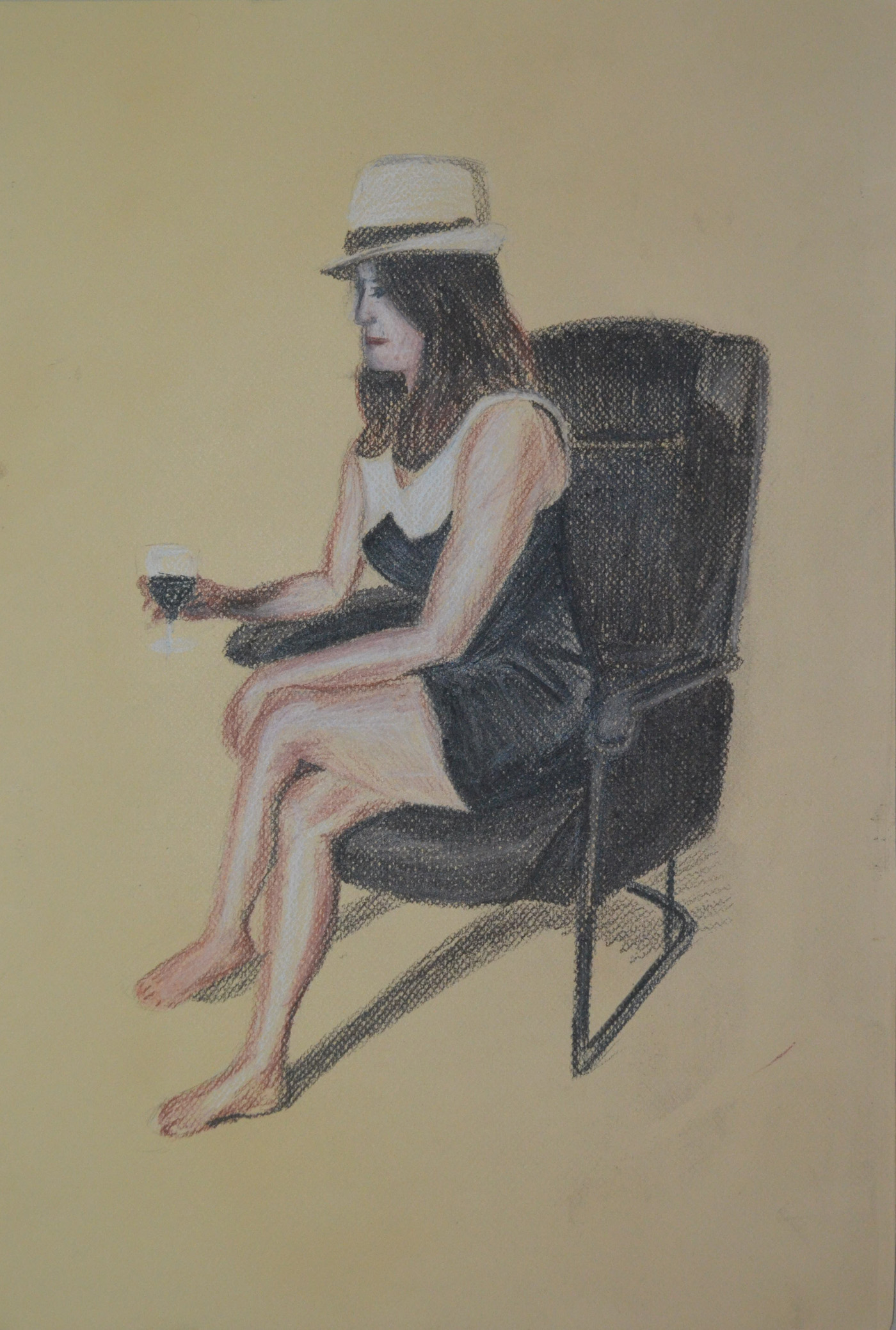
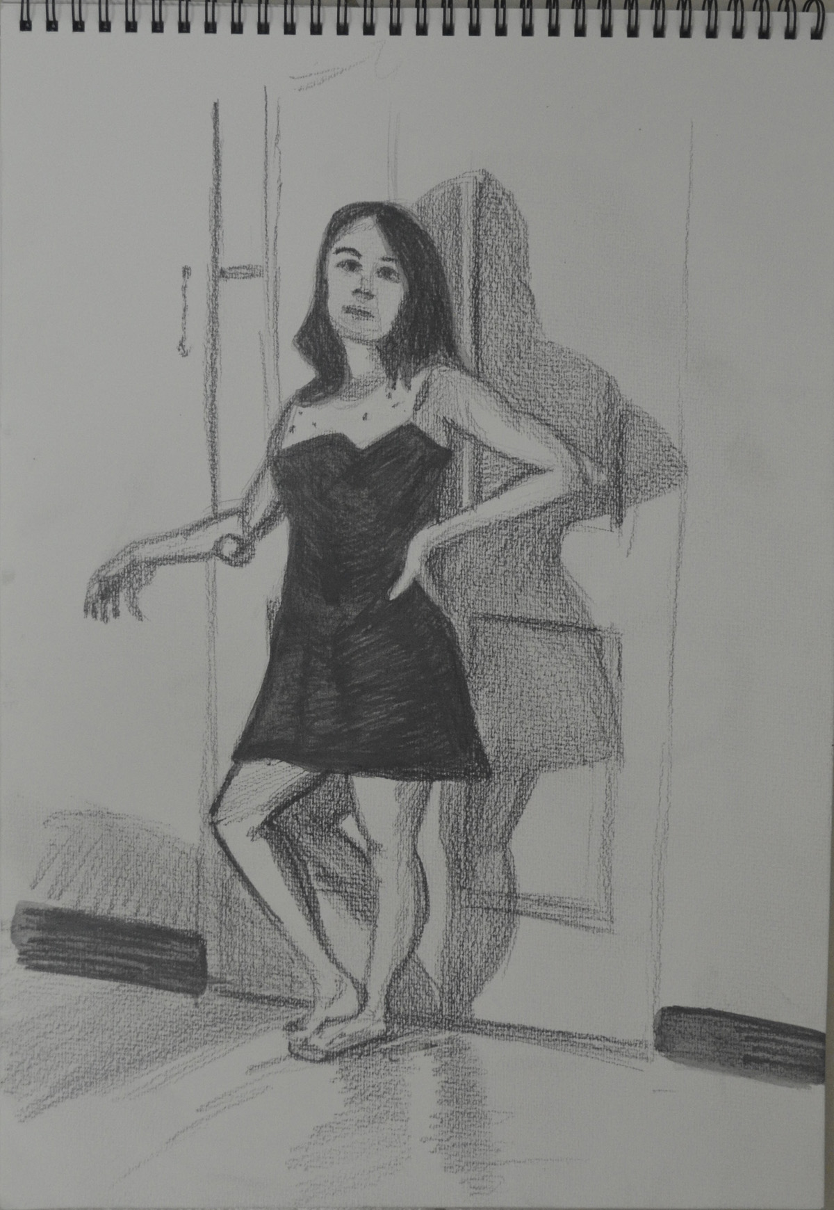
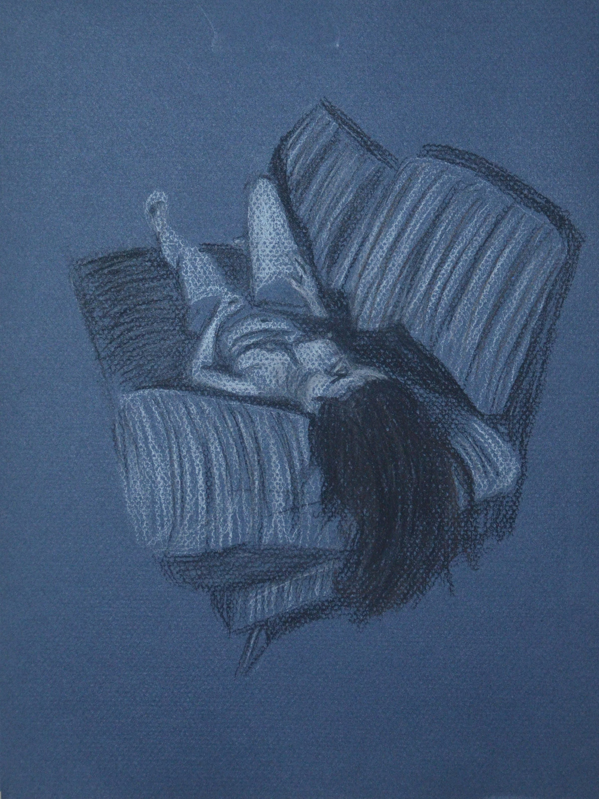
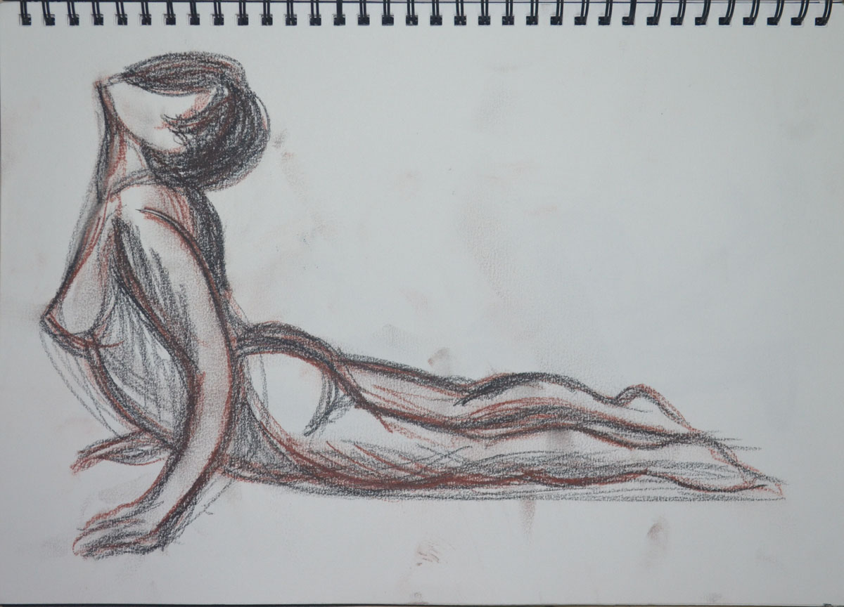
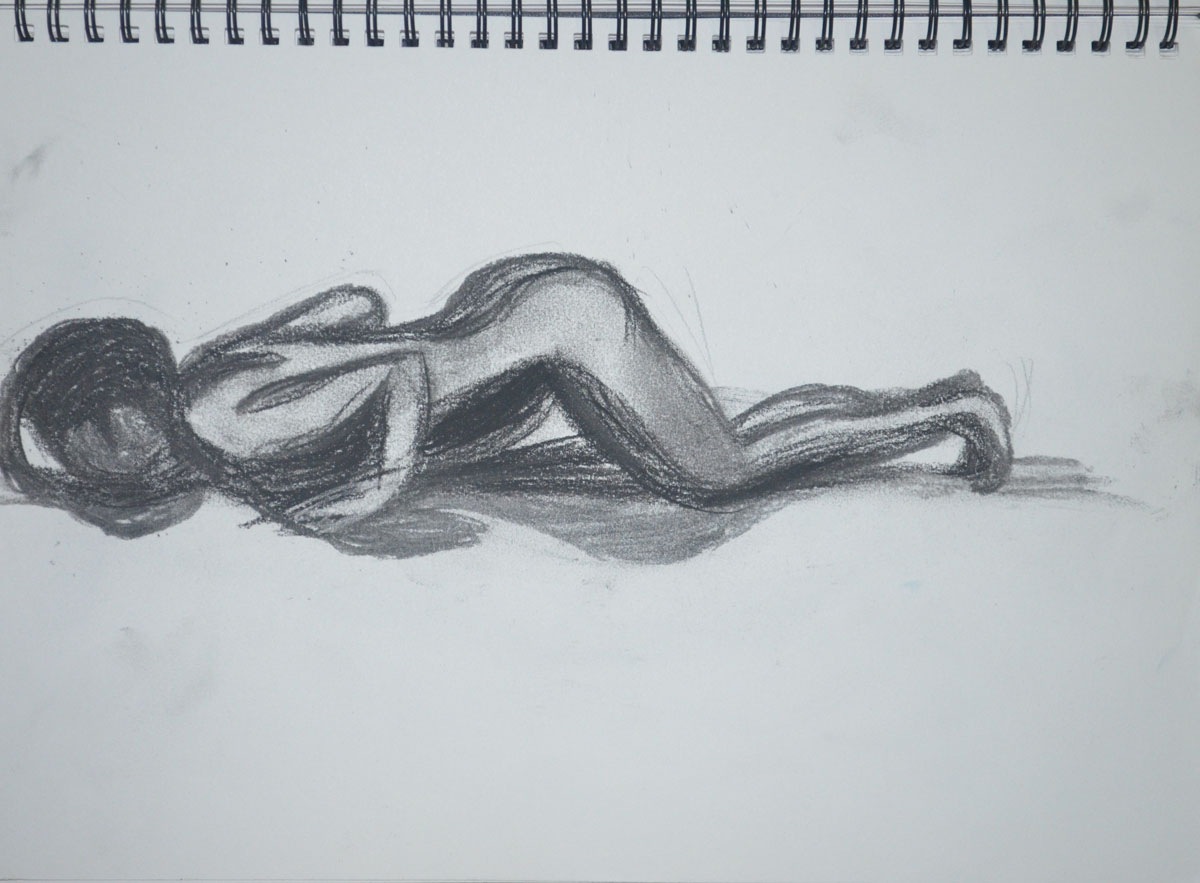
For this exercise I was to make three drawings, 1 seated, 1 Standing up and 1 laid down looking down the body at a slight angle from behind the head. I was to try and use a different medium for each drawing.
Again, my girlfriend volunteered to be my model for this exercise and for the first drawing, which I decided to do on the Canson pastel paper I had left over from my last research point, an anatomical drawing, she decided she needed some props, a glass of wine and her trilby.
1 – Sitting, Conte, Charcoal, Conte Pencil
I have had no success so far at drawing her profile and this drawing wasn’t any different. I really need to practise drawing profiles. The drawing is on A3 and the thing that consumed the most time was not drawing my girlfriend but the chair she was sat on. I moved around her before starting looking for the best position and even though drawing from the front may have been better for drawing her face, I think that the angle that I chose was the best or showing all the things we were asked to notice in the brief.
The next drawing was the standing pose and for this I really wish I had had some white charcoal, as my girlfriend in the lamp light against the door looked quite spooky.
2nd Pose 1 – Using Watersoluble Pencils for the first time
I made two attempts in a medium I hadn’t used since I bought them over a year ago, water-soluble pencils. I would have been happy with one but someone decided she looked ugly in the first drawing, the second however, looked a hell of a lot better in every way.
2nd Pose 2- Water Soluble Pencils Better Proportions
For me, the third drawing was the easiest drawing for just about everything. I know I was to try using different tools for each drawing, but I couldn’t think of any other drawing tool that would help me capture the mood as much as pastel on blue paper.
3 – Lying Down – Conte Stick and Compressed Charcoal
Just like the first drawing, I spent most of the 1 hour that it took me to draw in the sofa, I was very lucky to get the shadows across the belly, breasts and rib cage right, as they didn’t take much adjusting.
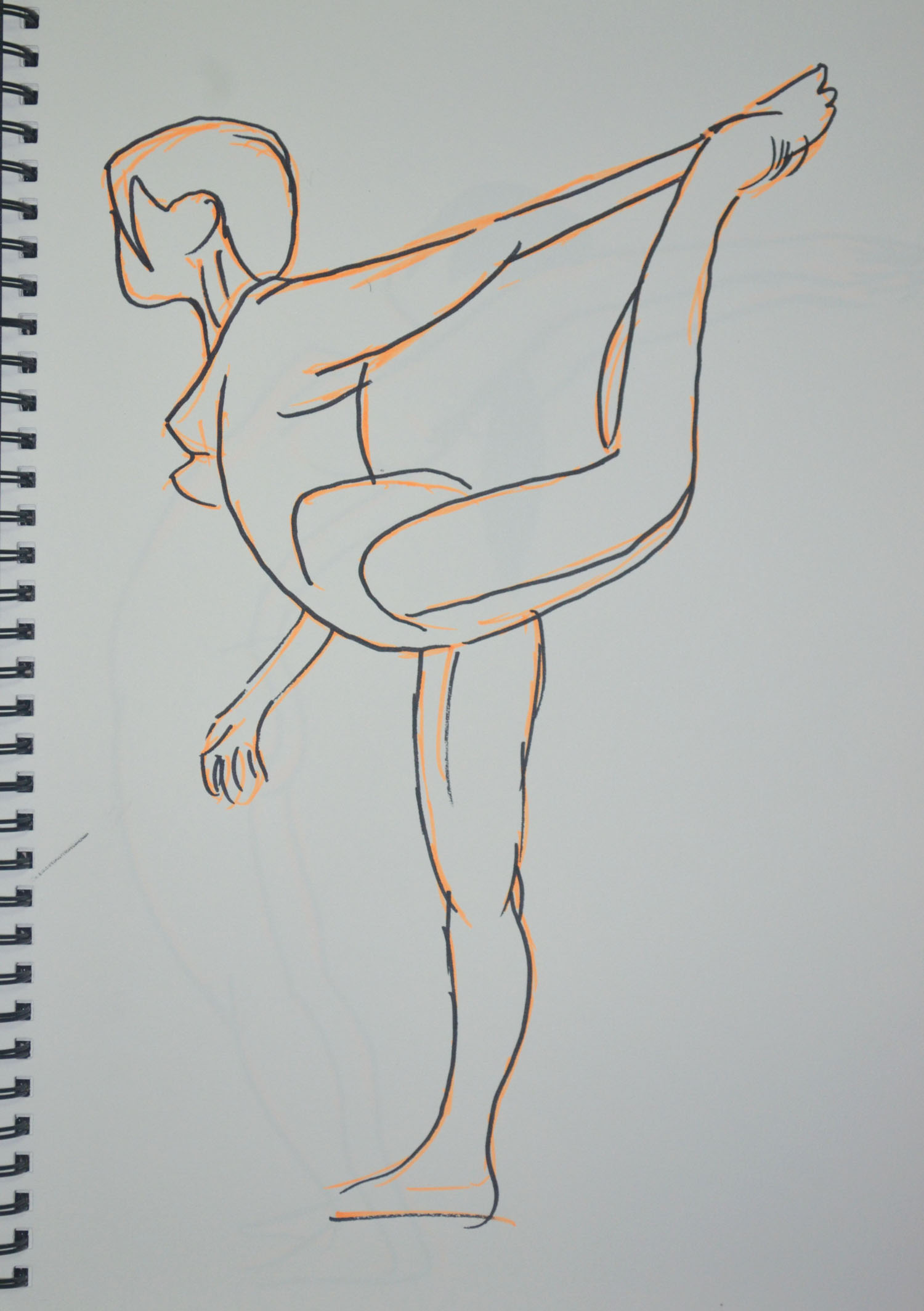
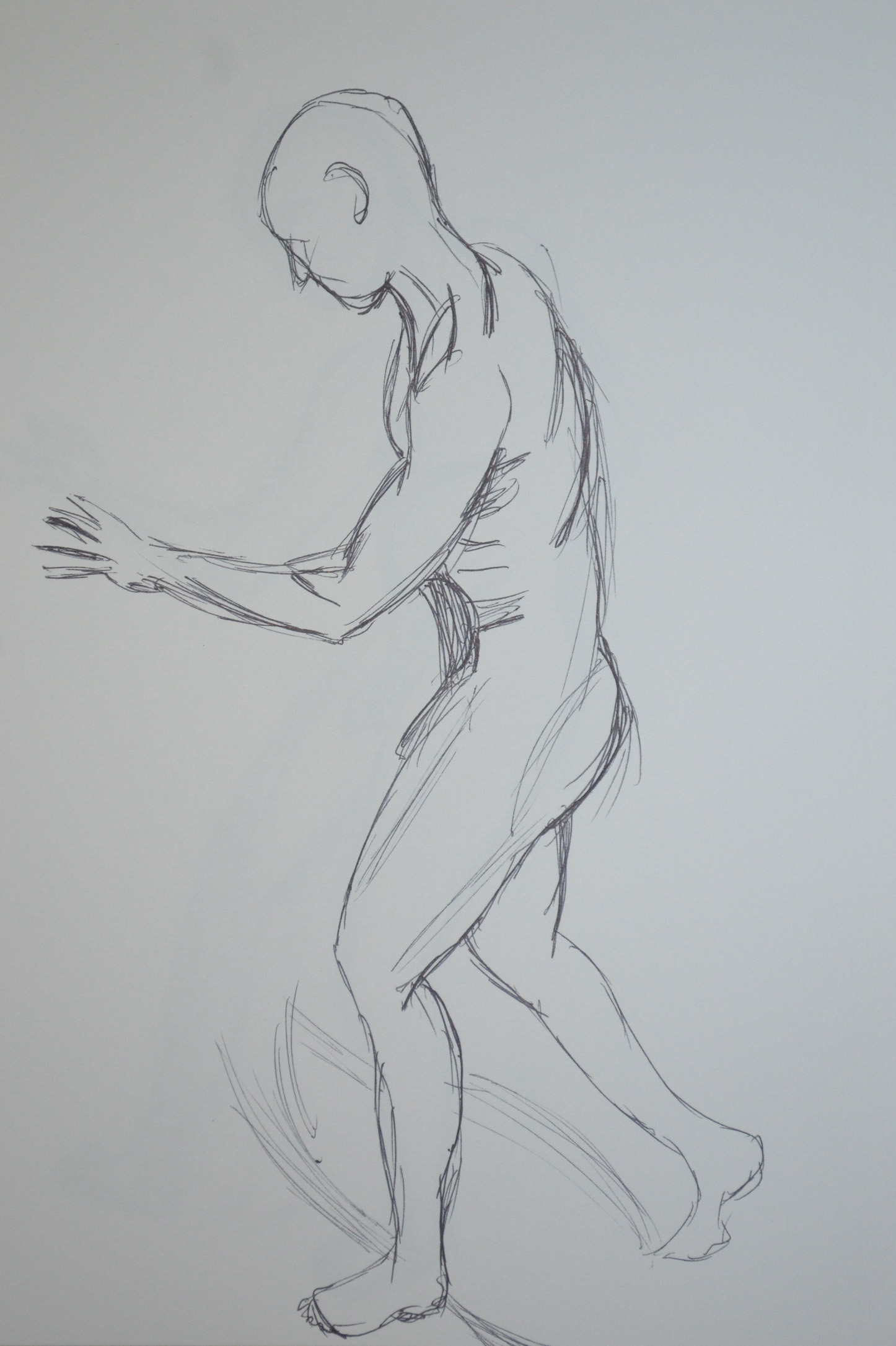
In the instructions for this exercise we were to ask the model to adopt a dynamic pose such as lifting an arm, twisting the hips, turning the head stretching the arms or walking. I had an idea of what I would be doing for this exercise from the start, so I asked my girlfriend to do the sun salutation for me and to hold certain poses that I thought may work well I stayed close with my A4 sketchpad.
Warrior 1 6B on A4
Warrior 1 was easy to draw with the 6B pencil on the textured paper and as can be seen in the enlarged photo . However, I can never seem to use long flowing lines but am really sketchy and use lots of broken lines when faced with the task of drawing quickly within a time frame. The drawing itself would probably would not have expressed energy that we’ll so i added more pencil lines to depict movement.
Warrior 2 in Conte on A4
This was the same for Warrior 2, which was drawn a lot faster and with more energy but I just think it needed a little something so spiced it up a bit.
Cobra Pose 1 Faber Castell Ballpoint on A4
The next pose was the Cobra Pose which after drawing the first one in Faber Castell Ballpoint I decided it was a pose that could be drawn with lots of energy and depict movement quite well if done right so with the girlfriend taking a short break after each one.
Cobra Pose 2 Faber Castell BallpointExploring Cobra Pose in ConteLarger Cobra Pose in Conte
There were a couple that were ok and a couple that were totally out of proportion. The thing about the Cobra Pose is that the legs look longer in the pose especially with mygirlfriend who has quite a short body, or high backside as can be seen in the upward salute below.
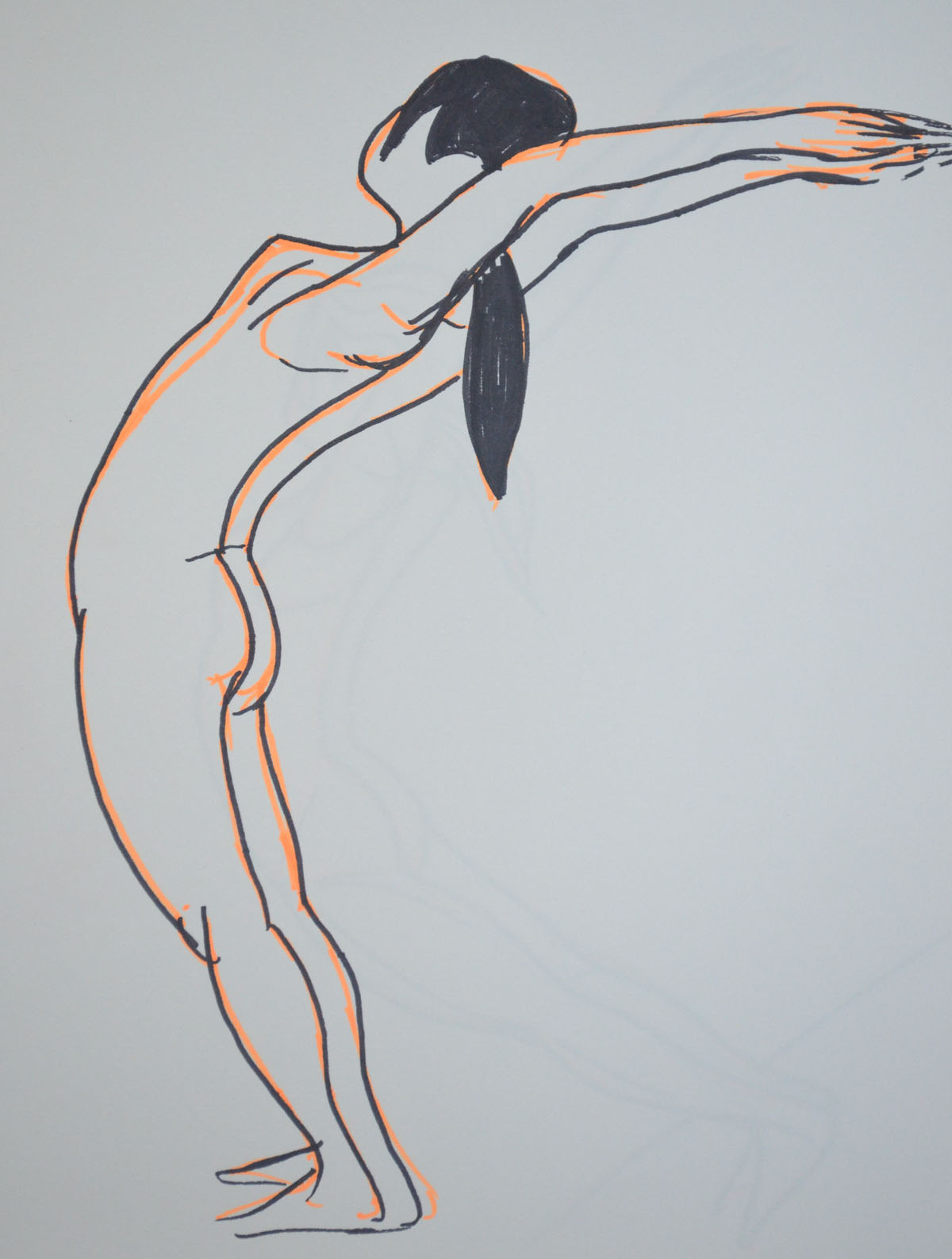
Upward salute 6B on A4
I did a quick sketch with my girlfriend in the ‘upward salute’ pose, starting from the waste I worked down to the feet. I should have done it the other way around and drawn the top first because by the time I got to drawing the top she had eased off the bent back position.
Upward salute Back Bent Further Back
The second drawing of the same pose was a lot easier for us both and this time I started with longer lines from the waist to the breast then from the breast to the wrist then worked my way down to the floor. Her hair flicked back gave me an idea and so i decided to add some trail lines to both drawings, successfully adding energy and movement to the drawings. For the next two drawings we chose the ‘Knees, chest and chin pose’ as I thought, like the Cobra Pose, drawing with energy I may be able to depict movement in the following sketches. This maybe true for the Conte sketch in two colours but not the drawing in charcoal.
Knees, chest and chin pose CharcoalKnees, chest and chin pose, Conte pencils
That was it for the first day but the next day I had some time to kill between lessons at the language centre, so I thought I would try something a bit different. With 6B pencil in my A4 sketch book and working from two photos I had taken from the bed with my tablet the night before I quickly sketched my girlfriend and then distorted the body parts that had been caught in action (moving) in the two photos.
Experimenting with Moving Limbs 1, 6B on A4
In the first photo from what I can remember she was on her way to the toilet lifting her left leg up and swishing her damp hair to one side after making a start on blow drying it. In the second photo she was cooking her log up, maybe scratching the back of the right leg with the top of her left foot.
Experimenting with Moving Limbs 2, 6B on A4
The next day I cycled back up to my girlfriend’s home sketchbook in bag but this time armed with my felt tip pens and my girlfriend went through a few more poses to see which would be best as drawings.
Felt Tip Pens Shiva dancing pose
Actually it doesn’t say felt tip pens on the box, it says wwatercolour Pens and the colours are far more vibrant than felt tip pens.
The Shiva Dancing Pose above is a very static pose but I thought by using the vibrant orange to sketch in the form first before I went over it in black it would give it some energy. I don’t think it does, my students think it does, nonetheless it does remind me of Degas’s ballerinas.
Felt Tip Pens standing salute pose
The last two drawings of my girlfriend were again of her in the ‘standing salute’ pose but drawn from a photo her back was bent so far back that I couldn’t ask her to stay like that for any length of time without her falling over especially with her hands together. The first drawing wasn’t in Proportion as her body ws too long and her arms were too short in order to fit her on the page.
The second drawing was drawn at an angle in order toner her in Proportion and git yer on the page.
Felt Tip Pens standing salute pose at an angle
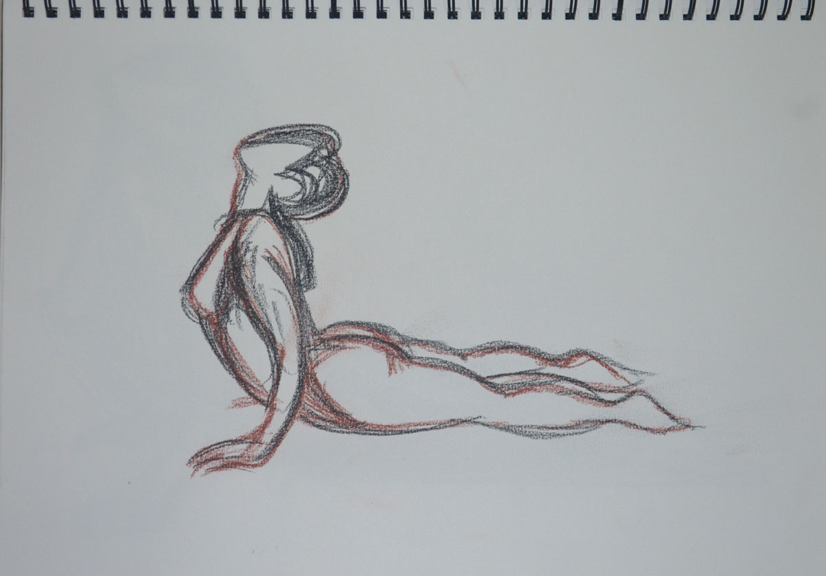
At the end of our second session I got the girlfriend to take some shots of me in various poses, the following sketches drawn in ballpoint pen was the result. A quick sketch, full of energy and reminding me somewhat of a Scheile painting.
Were you able to maintain a focus on proportion at the same time as creating a sense of weight and three dimensional form?
In the first exercise essential shapes I believe I managed this quite well apart from the first sketch, which was more of a trial, working with charcoal on A3 paper for figure drawing for the first time. In the second exercise essential elements there was a couple of times I messed up with proportions and coincidentally they were both when I was looking down at my daughter in a standing position, these are the second and 6th drawing . In the second drawing I made the head too small and then when I corrected it, it went off the paper.
Which Drawing gives the best sense of the pose and Why?
This is a difficult question to answer. To make a start on narrowing it down I would go for poses in the essential elements exercise as my daughter was uncomfortable posing for me and I think I have managed to depict this in these poses. Then I would probably say I think I would probably have to say the third drawing. She has the same arched back as me and I have managed to capture this in the drawing.
Was there any movement or gesture away from the model’s central axis? if so did you manage to identify this and put it in your drawing?
In the third and fifth drawing of the essential shapes exercise my girlfriend’s backside was cocked to one side maybe because she was a little uncomfortable at the length of time she had been sat there and I have definitely managed to capture this in the drawings but this, was done without noticing and it had been pointed out by her afterwards. But then, in the essential elements exercise, drawing 3, I haven’t done a great job of identifying this and I think it is down to the shadow on the legs.
Have you managed to make a complete statement within this time? What were your main problems?
Within 2 minutes? No, there is definitely a lot more time needed at this stage, however, with more practise drawing the human figure, two minutes could be enough to make a statement of a sort, more so with ten minutes. With one hour in ‘The Longer Pose‘ I do feel I managed to make a complete statement but the drawings did suffer with consistency.
Problems…
1. I have this knack of drawing the bodies really well with flowing lines but then when I get to the head and face I tend to tighten up and give the subject Action Man/Thunderbirds’ like features. I don’t know how other people see the drawings but that’s what I see.
How well have you captured the characteristics of the pose?
In the 2 minute life-drawing sketches In the ‘Quick Poses‘ exercise I would say about 50/50 I can see the original pose in what I captured on paper but then I would say that others probably wouldn’t get it. But then in ‘The Longer Pose’ exercise I would say ever I have managed to capture, in the pose, what draw me to it in the first place.
Do the proportions look right? If now how will you try to improve this?
In the quick poses the sketches do seem to be out of proportion in 2 or 3 but I think this was down to excitement more than anything else, it was the first time I had done any life-drawing and I was also worried that the model (my girlfriend) would be uncomfortable so I rushed my strokes. All the sitting poses however were in proportion and measured the same from the head to the seat of the backside.
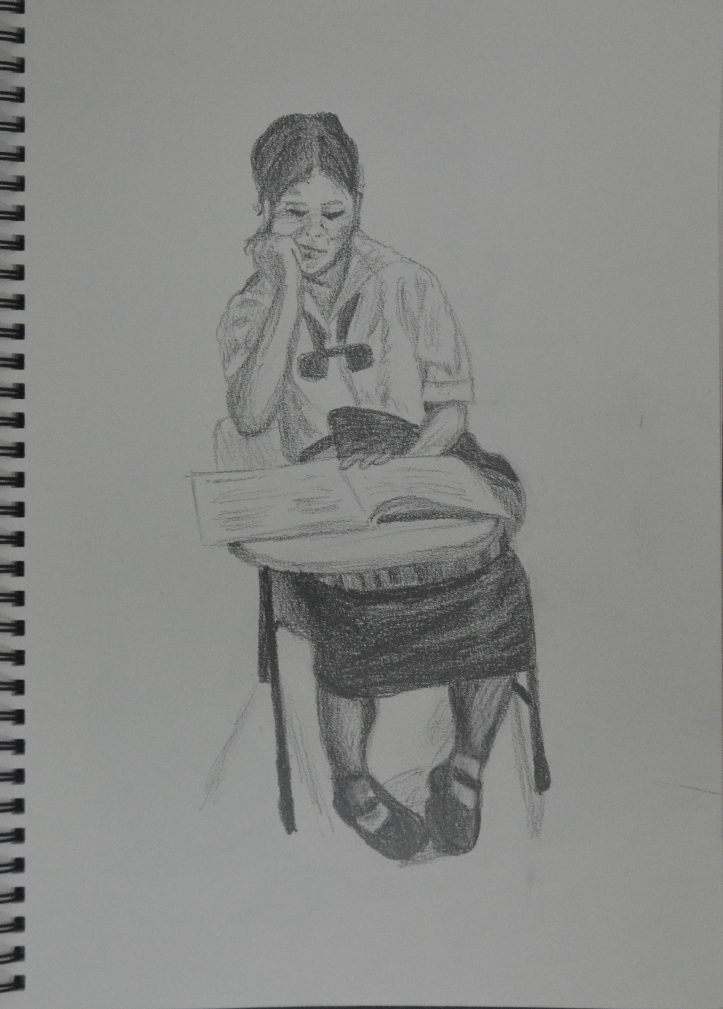
I was meaning to draw the girlfriend again with this exercise but I came across two great opportunities to do two longer pose drawings on the same day. Firstly I was teaching a class of two teenagers but on this day only one turned up.
The girl who turned up was dressed in her lower-high school uniform, which are quite quaint and remind me a bit of the Victorian school uniforms so I couldn’t resist drawing her. Being the best English speaker of the two we managed to keep chatting while I finished. The drawing took me only about 40 minutes or so and I used the end of my Mars Lumograph pencil in front of her head and checking the measurement against the rest of her body. As with my girlfriend in the quick poses exercise her head fit into her body about 4 times to the seat.
However, it wasn’t the ideal drawing for this exercise, as the clothes weren’t tight fitting and the desk and bag cover a large proportion of the girl’s body but drawing from her waist (or desk) up it gave me some good practice and my subject fit nicely on the A4 sheet.
35-40 Minutes in 6B on A4
My second great opportunity came with my friend being in the dog-house and taking refuge at mine until he found somewhere else to live although this time I worked mainly from a photo as he could never stay still for long.
1 Hour Drawing in 6B on A4
The drawing took me spot on an hour but a large portion of the time was spent getting his mouth right. I wish I had remembered what I had learnt from the OCA video below and asked him to keep his mouth shut. Nevertheless, I am quite happy with the finished drawing.
This time I drew from the waist out to the feet and then up to the head and again using my same method of measurement. Unlike the drawing of the schoolgirl above you can see more of his body shape and I could actually follow the contours of his body in the t-shirt and shorts. The hardest part of the drawing was his dodgy pointing finger and his open mouth which I had to resort to drawing with a 2B pencil as the 6B was just too big.
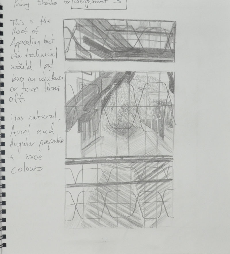
The task for this assignment was ‘to select a view from a window or from an open door. Try to find a view that includes some natural objects: trees, shrubs, pot plants, fields or garden plants’ also to ‘try and find a view that will demonstrate your understanding of aerial or linear perspective – in other words a view that has some depth to it.’
The brief also says to ‘look for a view that offers an opportunity to draw straight-lined objects as well as items drawn from nature, buildings, gates, fences and so on. It then says that ‘this may all seem like a lot to look for, but most views from windows and doors will offer you a bit of all these things’…
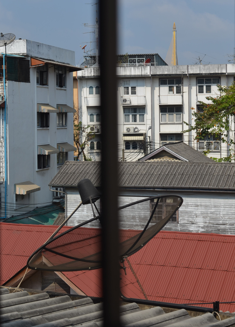
I have spent the best of two months trying to find a window or a door with view with any of these things and came up almost empty handed. The view from the 26th floor of an apartment block in Bangkok only offers you one of the most complex city views you could ever imagine.
view from my apartment kitchen window – Photo taken from back wall of living room
I took a camera with me everywhere trying to find a view that would accommodate the criteria for this assignment and almost came up empty handed and then right at the last week of the school term, the last week in February for me I dropped on 2 views (by accident).
View from a 3rd floor window at school
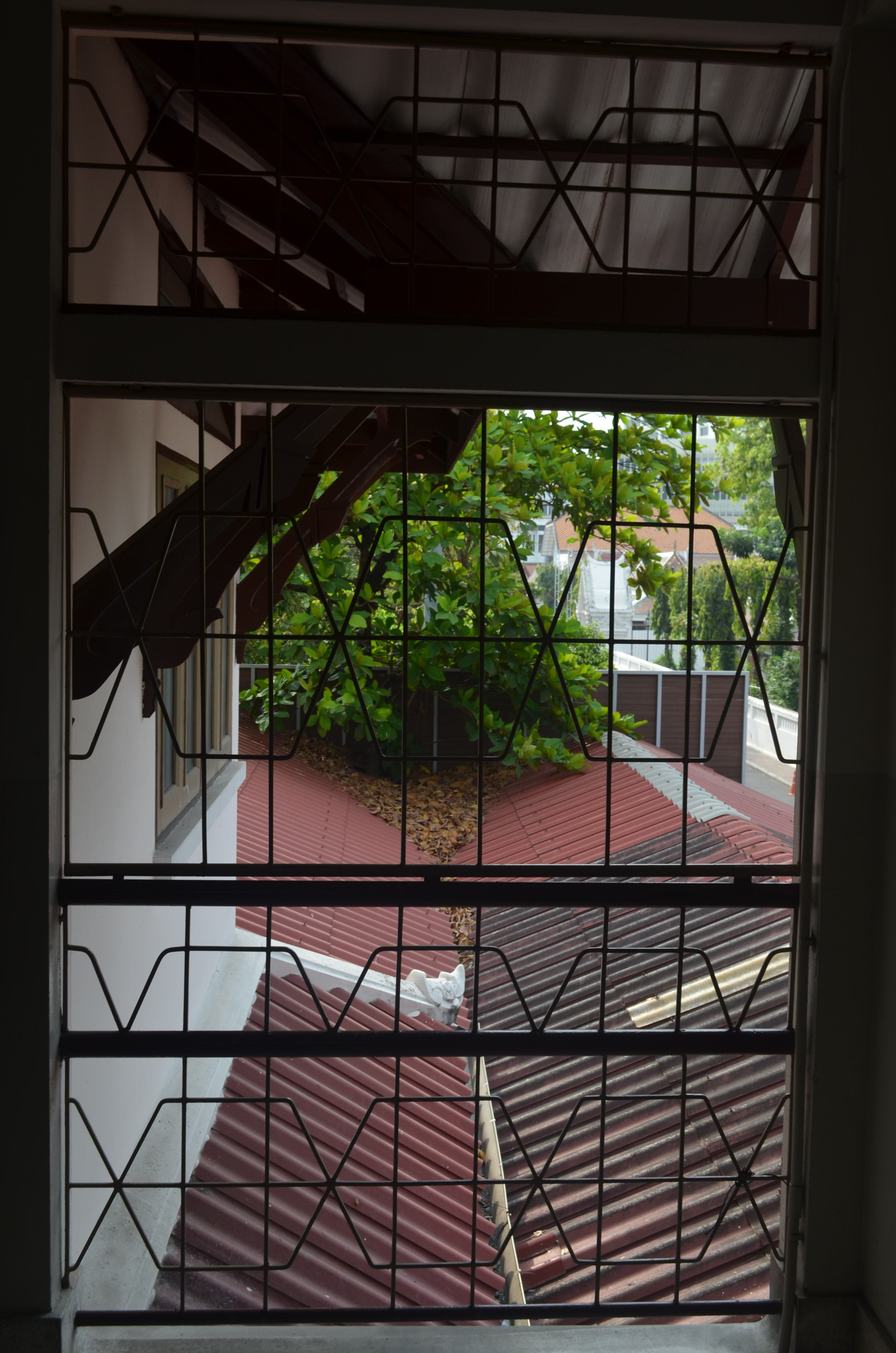
One was the view from the top floor of the school, which offered mostly concrete and not much of anything else, the other was a view from the school’s second floor window looking out of one of the windows of the school building that I had drawn in both ‘A Sketchbook of Townscape Drawings‘ and a ‘Limited Palette Study from Your Sketches‘.
View from second floor window facing temple
I decided to start by having a go at sketching all three, starting with the view from the second floor window, which even on the small preliminary (rough) sketch in my notebook proved very technical.
1st Sketch from 2nd floor window in my notebook
The second was a half-hearted sketch of the view from my apartment window, working from the photograph I gave up after 5 minutes realizing that it wasn’t a drawing suited to the size of paper that they wanted us to do the final drawing on (A3). But maybe it would be something I would like to come back to later with the possibility that it could be painted in a style close to L.S. Lowry.
3rd Sketch an Attempt at Drawing the view from the 26th Floor Window3rdd Sketch View from top floor classroom
The third sketch was from the window of the classroom on the top floor, which all though had most of everything, the tree in the view wasn’t very big at all and so after a second larger (partial) sketch on A3 I decided that I was to go with the view from the 2nd floor window.
3rd Sketch an Attempt at Drawing the view from the 26th Floor Window
View from the 2nd Floor Window
I started do do a study in line of what I could see from the window. This turned out to be a partially finished drawing but helped me to decide to crop the view to the middle window as it was very technical with the roof beams. It also helped me to decide on getting rid of the railings on the windows.
An attempt at Line Drawing
My next drawing was in A4 and was basically a quick sketch to see if I could meet the assessment criteria in my final drawing.
My Chosen View – Cropped down to the middle window
After the Study of several trees exercise I said that it give me an idea for the final drawing and that was to use oil pastels as I was impressed by the way they left white specs on the paper reminding me of a Seurat painting and if I had committed to the view from the classroom window I would have probably gone with that medium…after trying other mediums first of course. But, with the more intense view out of the 2nd floor window, on the small size paper I decided that it would have to be done in colour pencils.
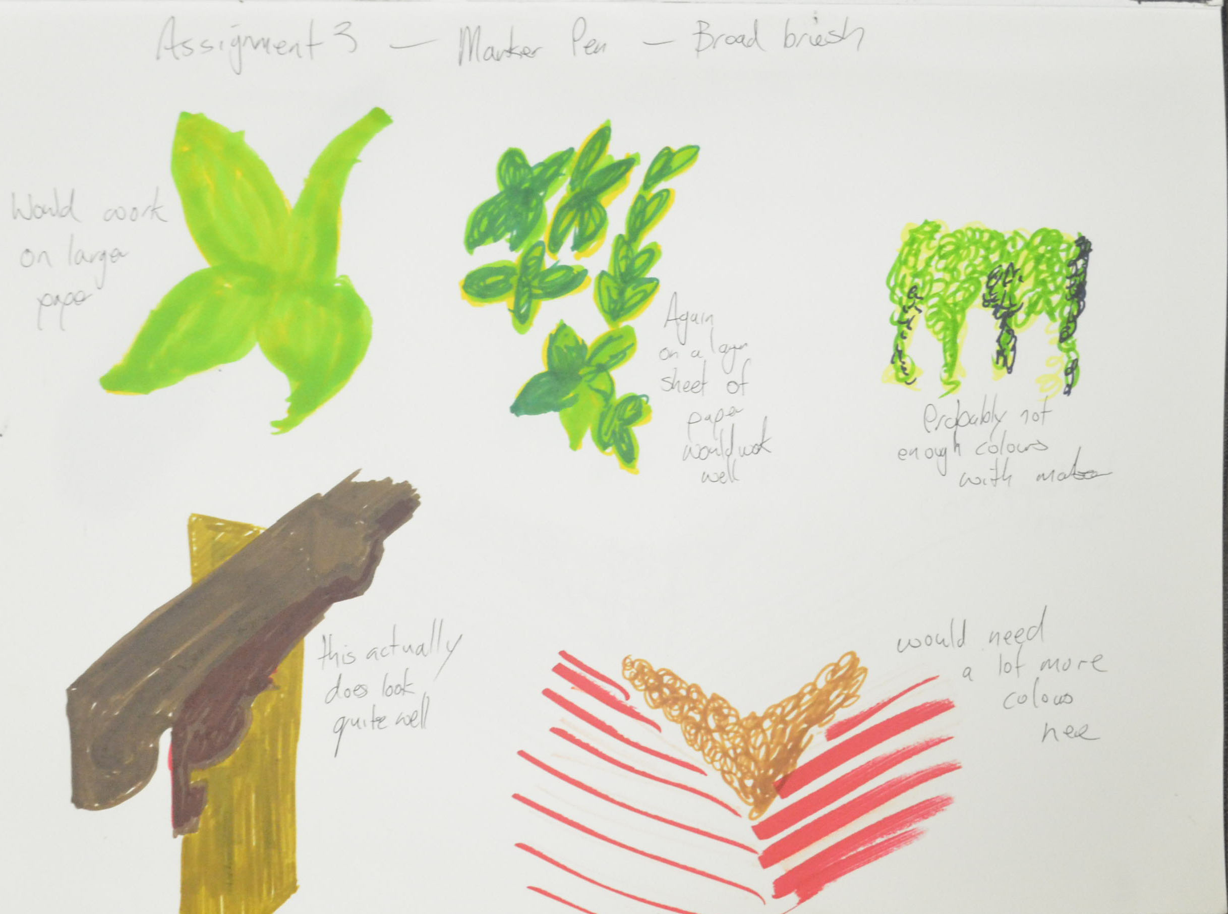
Colour study in Marker Pen
Still, even though I had already made my mind up the Assignment had asked for broad brush stroke studies to decide on the colours I would use for the final drawing so I tried a couple of mediums that were very different to what I had decided on drawing for the final drawing.
Colour Study in Ecoline Liquid Watercolour
Both of the studies turned out to be quite pleasing and both mediums quite feasible. It was the first time I had used the liquid watercolour as a paint and not as an ink and even though the colours were great, my watercolour painting skills leave a lot to be desired.
I had been plodding on too slowly with this assignment and to be honest that’s because I was not happy with the subject and it was very stressful but eventually I had to start the final drawing and it had to be in dry watercolour pencil.
Final Drawing in Dry Watercolour Pencil
An English language student asked me the other day what I thought has been the hardest medium to draw with and when I replied colour pencil they weren’t surprised. The Derwent artist are very waxy so I prefer using the watercolour, dry, but stillI do have problems blending even though my I have come along way since the beginning of the course.
I started by drawing the shape of the window to act as a border then I drew in the window at the side and the roof beams as well as the horizontal line of the fence then I got stuck straight into the colour starting on the fancy Thai style roof beams (or props or whatever you want to call them).
I spent about an hour layering the colours to get each of them a different tone and looking quite accurate but then realized that it didn’t really matter how long I spent on those as they wouldn’t be the focal point of the drawing.
Next I worked on the window and the wall then the rafters and from there the tree that came up both sides of the fence, through the roof of the outdoor secondary cantine and on the other side. At first I was going to draw the tree with a form of squirkling in colour but when I did the broad brush colour studies I could see a reoccurring pattern of almost star like shapes and so I spent a lot of time trying to simplify the shapes and drawing them by layering yellow over green, from there I filled in the negative space in between to give the tree some thickness.
So far I wasn’t looking at all great but then I decided to use a form of squrkling in three colours on the dry fallen leaves with the occasional star shape trying to mirror the green leaves above, the result was quite nice and it made me feel a bit better about the assignment.
Once I hatched in the fence and the double roof of the canteen below everything started to come together but the problem now was that I didn’t leave myself enough space to draw in enough of the large orange roof behind and so a lot of the roof is hidden by leaves. I do still feel though that because of the direction of the roof beams and the perspective of the roof that the viewers eyes will still look where I want them to and that is to the temple and the road to the right.
I completed the drawing with one of the worse mistakes ever, I decided that I would draw the wall all the way around the window in oil pastel the result was a complete mess. My only hope is that I can crop and frame it when I come to send off my work for final assessment.
Assessment Criteria
Demonstration of Technical and Visual Skills Although the final drawing is somewhat messy I do feel that I have definitely shown a demonstration of technical and visual skills in my final drawing especially where perspective is concerned and I feel that the drawing shows a clear understanding of both aerial and linear perspective. I also feel that the final drawing shows a substantial improvement on the way I have been drawing trees.
Quality of Outcome Well to be very honest I am not satisfied with the quality of this final drawing that looks more like an exercise than an assignment. I really found this assignment stressful, it was very difficult to find a view that I was happy with and the problems we have been having here in Bangkok haven’t helped. But a poor craftsman always blames his tools.
I let myself down with the preliminary work on this assignment but this was due to being very busy working all hours to try and make up for loss of income lost through these protests. If I had more time for the preliminary work the quality of the final piece would have been much higher.
The work in the previous exercises in part 3 as been high quality let down by a low quality final piece.
Demonstration of Creativity I believe I have demonstrated quite a lot of creativity through this part of the course I haven’t necessarily shown this in the final drawing. I would say the projects where this was more visible was Drawing Trees and Townscapes where I let go of trying to pay attention to detail and tried being more creative.
Context
The troubles here in Bangkok have been a great drag on this part of the course. I started out feeling really positive and in October when the protests started hit a brick wall. However I do feel like I have learnt a lot from this part of the course and I no longer feel that drawing landscape is a problem for me.
I have tackled every exercise to the best of my ability and even though I’m not happy with my final drawing I do feel that everything I have practiced through this part of the course is evident in the final piece.
In what way did you simplify and select in your study? Were you able to focus on simple shapes and patterns amid all the visual information available to you?
For me these two questions are intertwined I was able to simplify and select by putting everything into group shapes in the sketches and or blocks of colour in the larger study.
How did you create a sense of distance and form in your studies?
I created a sense of distance by using stronger shading or colour in the foreground with lighter shading or colour in the background to make the background look generally more misty. I also used softer pencils in the foreground or in sketches where I used pens I created a sense of distance by drawing simpler and smaller shapes between the more dominant ones to make them look like they are at the back.
How did you use light and shade? Was it successful?
A Sketch book Walk Fourth and Final Sketch : Charcoal Pencil, EE and HB
In the sketch above I made the tree solid black and put the shadows in the foreground to depict the sun shining behind the tree then drew the leaves of the tree in a lighter pencil to show light shining through the trees. The result was definitely a success.
What additional preliminary work would have been helpful towards the larger study?
Like I said in the exercises, for me and where I am, to do the drawing trees exercises before the final study would have been a great help.
Look at the work of Claude Lorrain and Turner. Write notes on how these artists divide their landscapes into foreground, middle ground and background.
Claude Lorrain
In the earlier research point I refrained from looking at the works of Claude Lorrain as I knew I would be looking at them again here. However looking at his paintings now, some of those artists may have possibly been influenced by Claud Lorrain himself.
I looked at quite a few of his paintings but for this research point I chose three to look at in detail.
Claude Lorrain Landscape with Merchants
The first painting that I chose out was ‘Landscape with Merchants’ a prime example of how Lorrain used different levels, like platforms, to divide his paintings into a foreground, middle ground and a background helping him to create a great sense of distance in his paintings with the foreground level being the clearest and the most colourful with each level on top fading to the background. In this painting he staggers each level to depict the river flowing in a snake like pattern around the hills into the distance.
Landscape with Aeneas at Delos
Again with the next painting ‘Landscape with Aeneas at Delos’ he has used the layers in the same way but this time arranged them into what I would say blocks on the left which remind me of stepping stones and doing this has managed to depict the coastline of a sea or massive lake with one final layer set to one side allowing him to show the sea meeting the sky in the horizon.
Landscape with Ascanius Shooting the Stag of Sylvia
Trees also play a big part in depicting distance in Lorrain’s drawings often using them to divide the foreground from the middle ground like in the ‘Landscape with Ascanius Shooting the Stag of Sylvia’ above’.
J M W Turner
I looked a few of Turner’s paintings, his later seascape paintings were a bit too stressful for me so I decided to take a closer look at his earlier work. The first painting I came across was ‘Composition of Tivoli’.
Turner – Composition of Tivoli
Realizing that it did have an uncanny resemblance to Lorrain’s paintings I decided to look at the web page from which the image came, which turned out to be an article on the Guardian’s website entitled ‘Turner Inspired – In the light of Claude‘.
Interestingly, the article goes on that Turner was even known as the British Claude and ‘In his immense and complex bequest, Turner left two landscapes to the nation to be hung next to a pair by Claude so that the affinities would be fully apparent to succeeding generations. You can see them in room 15 of the National Gallery to this day.’ says Laura Cumming who wrote the article.
‘What Turner took from Claude is all there at a glance: the aerial view, the graceful staging with great trees on either side and the landscape dissolving into the distance in untraceable gradations, the mastery of hazy golden sunrise and the luminous glow of dusk; Claude’s magical light.’
However, in ‘Mount Vesuvius in Eruption’ below he takes the magical light that he got from Lorrain to the next step and actually depicts the eruption of a volcano. In this painting Turner uses the same kind of levels as Lorrain but he wants the background and Vesuvius to dominate the painting and so drenches the foreground with light in the form of reflection off gentle waves.
I actually thought I had drawn 3 different tree types but looking at the drawings again and my photos I think I have only drawn two, three if you count the strangler fig as a species iof tree. I thought that the trees in the study of a several trees exercise were a different species from the Banyan tree in the Larger Study of an Individual tree but looking at them now I think the tree in the latter is the same tree in the later stages of being strangled to death by the fig.
What techniques did you use to distinguish each type?
I’d say smoothing and hatching the first ‘Alien’ tree in the sketching individual tree exercise was very smooth like it was naked without bark. So smooth that you could see the stretch marks in the tree so for this tree I used very fine hatching, smoothing with my finger and erasing with the putty rubber. For the individual Banyan tree I used more hatching and did less smoothing but with the study of several trees it was all very rough hatching with oil pastels.
What did you do to convey the mass of folioge?
The banyan trees were pretty much borrowing most of their folioge but where their was some I used squiggling and the sketches of an individual tree I came to realise that the leaves were in groups of three and so I squiggled in a kind of upside down Adidas trifoil shape not that it is noticeable in the drawings. To convey depth I then shaded in under the squiggles with more pressure on the pencil.
How did you handle light on the trees? Was it successful?
For the first sketches the light was above the folioge and so I showed light and shadow on the tree by way of hatching and yes I think I was successful. For the larger study of an individual tree the sun was behind the tree and so the whole of the tree was very dark but I depicted the light shining through the branches on the right by drawing the trees fainter than on the left. I don’t know how others will see it but it worked for me. I was going to use the putty rubber to show rays of light shining through but I sprayed it too soon.
Larger Study of an Individual Tree
In the last exercise I used colour, it was early evening, and I think I managed to show this quite well in my drawing.
Did you manage to select and simplify? How did you do this, and what could you do better?
I did this differently in all three exercises. In the first exercise it was a case of not drawing to the top of the tree and only drawing what I felt was important, the roots, the trunk and the squiggled leaf shapes that framed the branches and trunk.
In the second exercise, I wasn’t too sure where branches and leaves were coming from and would have probably had to draw another 5 plants and bushes to get to the source, so I decided draw only what was within the branches of the Banyan tree.
With the third drawing, a study of several trees I simplified by zooming in, I could probably do better next time by drawing more of the branches of the trees. However, I am still pretty pleased with the close up of the trees in the finished drawing.