How will your experiments with negative space help your observational drawing in the future?
Before I even started this course I was very aware of negative space but this course as made my awareness of it a lot more acute. I no longer just look at the negative space in and around the subject but the negative space between objects, Negative space plays a big part in all subjects whether it be a plant, landscape or the space between facial features in a portrait and being more aware of this will help to improve my observational skills with all.
What techniques did you use to ensure you drew your plants in proportion?
Negative space played a big part in this for me throughout this project I started at with one part of the subject and then worked my way around using the negative space between flowers and leaves piecing it together like a jigsaw. I then altered the shapes of the flowers and leaves where necessary.
How did you achieve an effect of three dimensional space in your drawings?
Firstly the way I arranged the flowers was a big help with the biggest at the front and the smallest at the back with the biggest flowers at the front acted as a focal point. The earlier exercise Still LIfe Group in Tone was also a big and drawing the overlapping plants and their cast shadows also helped me to create an effect three dimensional space.
In this exercise I used the same subjects as the Drawing Plants and Flowers in Coloured Pencil exercise and drew them in a variety of other coloured media, using Watercolour pencil, marker pens (fine and chisel nibs) and coloured pencil, watercolour pens, crayons and oil pastels.
Due to the choice of mediums and that I would be using them together I used watercolour paper for both of the drawings that I did in this exercise, knowing that the watercolour pencils and markers would react better with watercolour colour paper and hoping that the crayons and oil pastels would cling better to the rough texture of the papers surface.
Drawing with Crayons and Oil Pastels
I started the first drawing with the intention to use a lot more coloured media on this but it turned out to be a personal experiment to see the difference between oil pastels and wax crayons. With the wax crayons, I didn’t have much of a range of colours as I was using some I had bought from my kids a few months back but luckily enough there was enough colours for the subjects in my arrangement so I went through the arrangement flower by flower, leaf by leaf weighing up the advantages of each of the mediums. On the watercolour paper I found that the oil pastels clung to the paper a lot better than the wax crayons which left alot more white space than the pastels. I also found that the colours of the oil pastels were a lot more vivid. Layering over the top of the wax crayons with oil pastels was a lot easier than the other way round. It was also easier to get a better stroke with the oil pastels than with crayons as the tip of the crayons rounded off to easy. Nonetheless, both mediums, in my opinion, are better for the parts of the subject with less details such as the flowers rather than leaves; this would change with the size of the sheet of paper used.
Drawing with Markers, Water Coloured Pencils, Crayons and Water Coloured Pens
For my second drawing I used a wider variety of coloured media inluding marker pens (chisel and fine tips), coloured pencil, watercolour pencils as well as watercolour pens and wax crayons. Starting with the orchid flower like I did in the previous two pictures I worked my way around the arrangement. For the orchid I used markers mainly chisel tip and with no red available for the last layer I used coloured pencil which really worked well on top of the markers. I drew the other orchid flowers above in wax crayon an they looked somewhat drab against the bright colours of the markers.
The mixed mediums that impresssed me the most were the fine markers over the top of watercolour pencil for the red roses, the outcome of mixing these two mediums was a lot more impressive than coloured pencils in the last exercise.
The watercolour pens (watercolour felt-tip pens) which are actually quite bright when used by themselves were very dull over the top of damp watercolour pencil, however they did blend quite well, somewhat uncontrollable but I feel with a bigger sheet of paper and more practise they could be used quite well together or just the pens by themselves.
Watercolour pencils were suited to drawing the flowers but not so suited for the detail in the different leaves in the composition they were also a good base for using other mediums over the top.
I don’t really like wax crayons maybe because of the feel on the paper or that they seem to need a lot of hard work to get your drawing looking anything like you want it too but then this could be down to the type of paper used.
All in all I thought this exercise was a lot more time consuming than drawing in coloured pencil but that boiled down more to the thought process than anything else. I am not too happy with the results but it was great getting to know what the different mediums could do together.
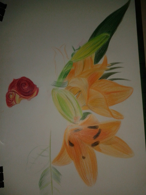
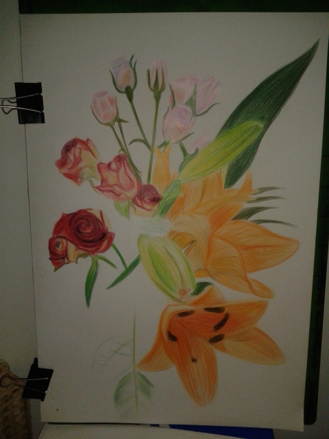
For this exercise I bought an assortment of flowers from the Tops supermarket while I was visiting my kids for a meal for my oldest daughters Birthday. The flowers I chose were orchids and some red and pink roses, I really was not thinking about shapes or colour when I purchased them but I am glad I made the choices that I did. On an A2 sheet of white paper I began to draw.
Roses and Orchids
Now the brief said to experiment with different methods of blending in my sketchbook first, however I thought I had had enough practise blending colour with colour pencils so far in this course so I put pencil straight to paper, for the flowers this was no problem but for the leaves I wish I had done as the brief said and practised a little more.
Drawing the Orchid
I began with a neutral colour for each subject starting with the orchid and working my way around the composition working on the most prominent flowers and leaves first keeping a careful eye on negative space.
Part way through the drawing I read the brief again to find out I had skipped over some valuable instructions:
Make the plant the focal point of your drawing but draw the background
Do not draw the plant in isolation
Draw in the context to give depth and substance to the drawing
The background I had chosen was a plane white wall with brown skirting boards and very pale floor tiles but I decided to carry on and I am glad I did. Using three different types of flowers with large leaves and petals on the orchid the composition and the vase I had placed them in made up the main subject and the background. Placing the largest flowers at the front and the smallest at the back helped me to create a nice three dimensional effect with the large orchid flower taking on the role as the focal point of the drawing.
I used different methods of blending for each of the flowers with layering used on all, the Still Life Group in Tone Exercise early on in this part of the course really helped using 3-4 colours on each flower but starting off with the lightest colour first and working my way to the darkest.
I used long strokes for the orchid to give it a stretching outwards feel and to me it almost seems like it as a life of its own.
Drawing in the Red Roses
For the red roses I coloured them in a spiral motion then layered the darkest colours over the top rubbing out the colour from time to time to let the lighter colours show through.
Flowers Complete
The pink roses were the most challenging of the lot with the colours and details being so delicate I decided to tackle them in a different way by hatching then squiggling over the top for the flowers where you can see the petals grouped together.
Aspects of the Drawing I am Satisfied with:
I am really happy with the 3 dimensional feel of the drawing and the way the different solutions I came up with to tackle each type of flower pad off. I am also very happy with way the drawing came together using the practise I had from the Negative Space in a Plant Exercise helped me to piece the drawing together like a jigsaw.
Plants and Flowers in Coloured Pencil
Aspects of the Drawing I am not happy with:
As always I wish I had read the brief again and again until I was clear on what I had to do but then this would have lead to a one or two plant composition which would have probably been a lot less challenging.
I wish I had practised blending colours in my sketch book if just for the leaves and stems, although not all the leaves and stems are clearly visible I can see that I definitely could have improved on the blending on those parts of the flowers.
The final drawing is very sketchy although this is a big difference from some of the final drawings in part 1 of this and I know I allowed the the sketchy artist I researched earlier to influence me in this exercise I would have preferred a more realistic finished drawing.
I don’t have any plants at all in my apartment and was quite worried about where I would get one from without having to travel to the outskirts of Bangkok to find a suitable pot plant for this exercise.
My Subject – Jasmine
Luckily it was mothers day here in Thailand (12th August – the Queen’s birthday) and while my girlfriend was shopping in Tesco she came across some Jasmine plants, Jasmine is the Queens flower and at only 49 baht (just over a pound) they were a bargain and I’d definitely picked the nest time of year to do this exerise.
I used my faithful ball point pen and an A3 sheet of paper, placed the plant in front of a large drawing that I am in the progress of doing for a friend in England and began to draw. Concentrating on the negative spaces, I started to draw the space within and around the pot plant beginning at the top and working my way down to the bottom.
Drawing Negative Space in a Plant 1st Attempt
My first attempt went really well until I got down to the bottom where the plant came out of the soil and I realised that the right of the plant would be well out, so to make the plant readable I drew in a few more negative spaces to even it up. I then began to finish it off by filling in the negative space in the drawing with some swirling psychedelic patterns.
Drawing Negative Space in a Plant 2nd Attempt
My second attempt was quicker and I think is also an improvement on the first, this time I crossed over a few lines along the way and when I had finished filled in the negative space with more conservative lines.
What have you learnt from drawing the details of fruit and vegetables?
All fruits and vegetables have different surfaces from smooth and shiny to rough, hairy and spiky so every object is a challenge not only this but its very difficult to get familiar with the shape of a certain fruit or vegetable as the surface differs from one to another taking into consideration ‘ripeness’.
What did you find most challenging about this part of the course?
Firstly, I really had problems using dip pens and creating tone with this medium it is something I really have to work hard at getting as much practise in as possible.
Secondly composition arrangement and that arranging a composition with fruit and vegetables takes more time than arranging other objects; not only for fear of repeating a similar composition you drew in a previous exercise but for fear of arranging a composition that will not allow you to capture the full details of the objects.
Born in to an artistic family in Denham, Buckinghamshire in 1894 Ben Nicholson was the son of artists William Nicholson and Mabel Pryde. In 1896 the Nicholson family moved to London where Ben was educated at the Tyttenhangar Lodge Prepatory School in Seaford before becoming a boarder at the Gresham’s School for boys in Holt, Norfolk. Ben Nicholson began his training as an artist in London at the Slade School of art, where he studied from 1910 – 1911, then from 1912 to 1914 he travelled between France, Spain and Italy.
In 1920 Nicholson married is first wife, painter Winifred Roberts to whom he had three children, two sons, Jake and Andrew and a daughter Kate, who also became a painter. From 1923 Ben and Winifred split their time between England and Switzerland spending their winters in the southern Swiss town of Lugano and the rest of the year was divided between Cumberland, where they made their home for that decade and London While In London following an exhibition with his wife Winifred he was invited to join the 7 & 5 Society, he was made chairman of the society in 1926.
Nicholson’s early paintings were still-lifes influenced by the works of his father but then after his first solo show at the Twenty-one gallery he began experimenting with abstract painting influenced by Synthetic Cubism which he implied in all his works thereafter. His works throughout the 1920s were of deceptively simple table top still-life’s and landscapes painted in Switzerland, Cumberland and Cornwall, making his first visit there in 1928.
While visiting France in 1932 and 1933, Nicholson became familiar with the works of artists such as Hans Arp, Joan Miro, Piet Mondrian and Alexander Calder who had settled in Paris in the 1920s. Nicholson was successful in fusing the European trends into a new style that would become identified as his own.
He made these visits to Paris with Barbara Hepworth; Winifred and Ben were divorced in 1938 a break up that was brought on by his growing relationship with Wakefield born sculptor. Hepworth had kids to Nicholson in 1934, three triplets and after his divorce in 1938 she would become his second wife.
Together they moved to Cornwall in 1939 and in 1943 he joined the St. Ives society of artists. Following the Second World War Nicholson lost faith in the ‘utopian promise of geometric abstraction’ and resumed painting landscapes adding colour to his abstract reliefs to emphasize the fundamental unity between nature and abstraction. Hepworth and Nicholson were divorced in 1951.
Throughout the 1950s he achieved international recognition as an artist through a series of awards which included the first Guggenheim International Painting Prize in 1956 and the International Prize for Painting at the São Paulo Biennale in 1957. From 1954 – 1961 retrospective exhibitions of his work were held throughout Europe including shows at the Venice Biennale and Tate Gallery and in several cities in the USA in the 60’s and 70’s.
Nicholson married his third wife, German photographer Felicitas Vogler in 1957 and the two moved to Ticino in Switzerland in 1958 where he again began to concentrate on painted reliefs. In 1968 Queen Elizabeth awarded him the O.M. (Order of Merit) and in 1971 after the end of his third marriage he moved back to England where he died in London in 1982 at the age of 87.
Researching this Artist
I used many different websites researching this artist as the information I found was confusing and contradictory, with information differing from site to site and so I chose to gather information from the websites of establishments that I found out at shown his work, The British Council, Tate Gallery and the Guggenheim comparing the details with the biography www.oxfordartonline.com.
I have never heard of Ben Nicholson before although his second wife Barbara Hepworth is very familiar to coming from Wakefield I have seen her works in West Bretton (Yorkshire Sculpture Park). Since I have been living in Thailand they have opened the Hepworth Center in her name in my home town so it was interesting to read about their relationships, both personal and professional.
Why does he simplify still life forms and negative space and superimpose them on a Cornish Landscape?
I think the answer to this lies in the above text where it says Nicholson ‘resumed painting landscapes and added colour to his abstract reliefs to show the fundamental unity between nature and abstraction’. Which maybe reflected in what he said in a letter from Nicholson to Patrick Heron (9 February 1954) ‘All the “still lifes” are in fact land-sea-sky scapes to me.’
For me this was a stressful exercise that took me over two weeks to complete. I initially wanted to focus more on dip pens and ink for this exercise but it was a mediu I would continue to have problems with.
I started with markers as I already had a good choice of Kurecolor Markers, with a composition that consisted of vine tomatoes, bananas and an apple however I failed miserably looking down at the apple at that angle plus I didn’t have the right colour for the apple.
Using Markers First Composition
My second composition consisted of a red pepper, bananas a rose apple and plum tomato set on a back drop of two different coloured materials used to make monks robes; but then when I drew the composition in markers on the watercolour paper there was too much red in the picture and the colours weren’t brilliant enough for me.
Using Markers or Dip Pens – 2nd Composition
Composition in Marker Pens
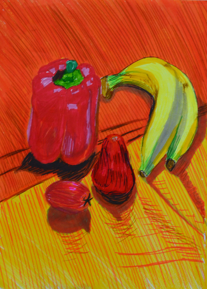
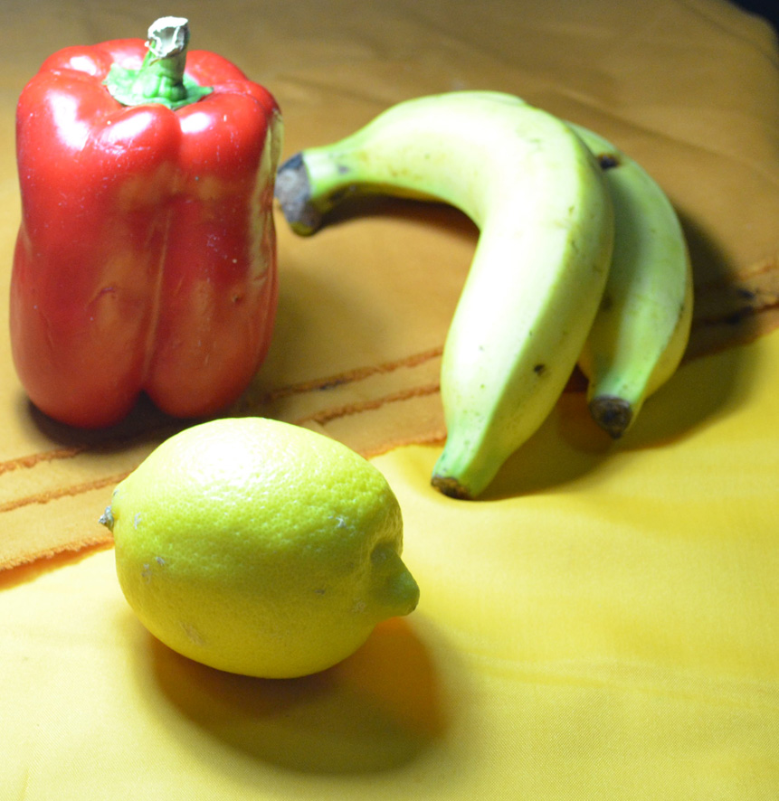
I setteled for a simple composition made up of the bananas, red pepper and lemon that I managed to find in an international supermarket as the Thai lemons are very small and green kind of like a lemon/lime hybrid.
Using Markers or Dip Pens – Final Composition
Firstly I drew them in marker pens which wasn’t too difficult but getting the colours right before putting pen to paper was almost impossible as the markers reacted differently on the watercolour paper especially when layering at this stage I wasn’t really looking at the shadows and light formations of the surface of the pepper and just added a bit of depth with a dark blue which didn’t work well enough for me.
Chosen Composition in Marker Pens
I finally got round to using dip pens and at this stage I felt like packing in. Firstly I started with liquid water colour which did not stay well on the pen nibs I made several attempts which all got binned before going out to look for higher quality watercolour paper that wouldn’t get saturated as easy and some proper drawing inks.
1st Attempt with Ink and Dip Pens
My first attempt with dip pens, ink was a disheartening mess and I was trying to work out what I was doing wrong, inks were running into each other and the paper was still getting saturated. Realising that I wasn’t giving the inks on each object enough time to dry before adding different colours I decided to have another go.
2nd Attempt with Ink and Dip Pens
My second attempt with ink and dip pens was an improvement but I decided that I would use markers on the final piece as I could capture the reflected light and shadows on the pepper a lot better with different coloured marker pens and so started work on my A4 piece,
Final Drawing on A4
I did use a bit of ink on the final piece with a lemon yellow was over the lemon and a dark wash for the shadows which was a bad decision and a couple of ink splashes finished it off. The final piece is not brilliant but I do feel it is an improvement to the earlier drawings and I think I did really well to capture the patterns on the peppers surface.
For this exercise I used approximately 13 different colours of oil pastel and a white textured sheet of A3 watercolour paper and I’m kicking myself now reading the brief where it says use coloured paper. However further down the page it does say leave gaps to let the white break through so it’s easy to see how I got confused.
I set up a colourful group of fruit which included a quarter of watermelon, a red apple and two ramhutan or ‘gno’ as they are known in Thai, concentrating on creating a group of contrasting colour and texture I set them on a stainless steel reflective plate which I bought with the intention to use in the earlier exercise ‘Shadows and Reflected Light and Shade‘, and placed the composition on a piece of folded cloth used to make Thai monks robes.
Drawing Using Oil Pastel – Chosen Composition
First of all I lightly sketched in the main shapes of the group doing my best to fill the paper including the main shapes of the cast shadows on the cloth underneath, I think this was my best attempt at filling the paper so far.
I then started to block in the darkest areas using a sketchy hatching technique, I’m trying to be more fluid in this part of the course and I think I’m doing well so far. From there I went on to sketch the light areas in a different colour, on the watermelon and apple at least.
Once the initial layers of colour were blocked in I worked back over them to strengthen the tone using related colours on each object to strengthen the tone.
Drawing Using Oil Pastel – Finished drawing
Approximate breakdown of colours used on objects
Watermelon:
On the flesh of the watermelon I used pink, red, a very dark red and a dark blue to create shadow as well as black and white for the seeds. For the skin I used a dark green a light yellow and a grey-blue colour.
Red Apple:
For the red apple I used ultramarine, red, orange and pink for the skin and green, yellow and orange for the core, these colours worked really well together.
Rambutan:
On the rambutan I worked from light to dark then back again and they were probably the hardest thing I’ve drawn so far. For these two objects I used all of the above colours but it took me a very long time to build up the layers and to get them looking anywhere near they did in real life. Although they are not perfect I really love the effect I have created while working on them. They are a very irregular shape and yet I have still managed to make them look round and spiky.
The Plate:
Same again on the plate, because it was so reflective I used a lot of the colours utilized for the fruit plus a light blue, grey and white.
This is the first time I have worked with oil pastels other than experimenting and I found that you have to know when enough is enough for danger of messing up your drawing.
I’m very impressed with the finished picture, but what is worrying me now is how I am going to preserve it, I have sprayed it a few times with an expensive fixative already but I used cheap pastels by Pentel and it doesn’t look like the fixative is not going to do any good…