For this exercise I was to pick another interesting object and use A4 cartridge paper and a ballpoint or drawing pen. Then use a stippling effect, dots and and a variety of marks to create a drawing of depth and interest.
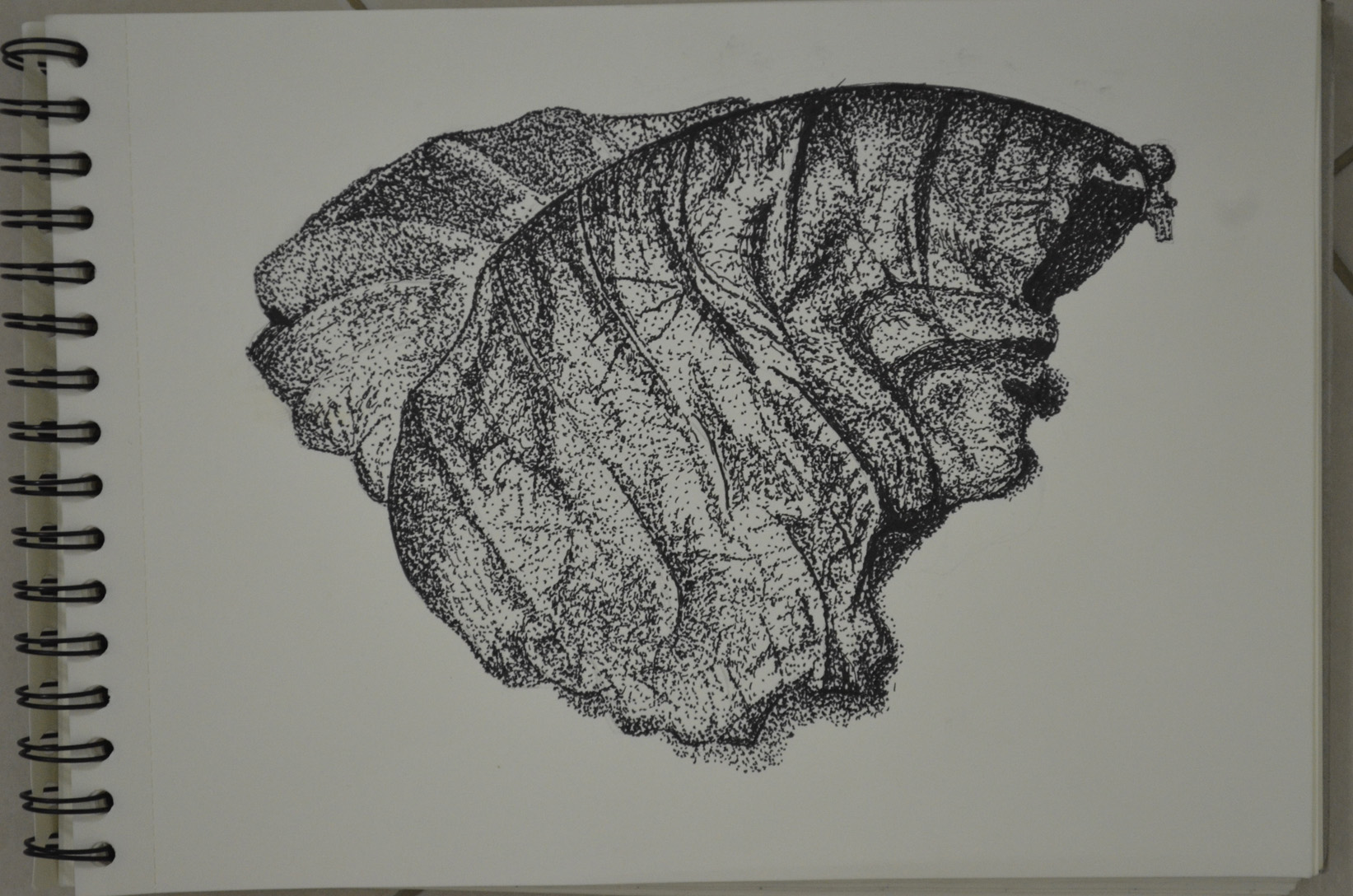
Exercise – Stipples and Dots, Finished Drawing
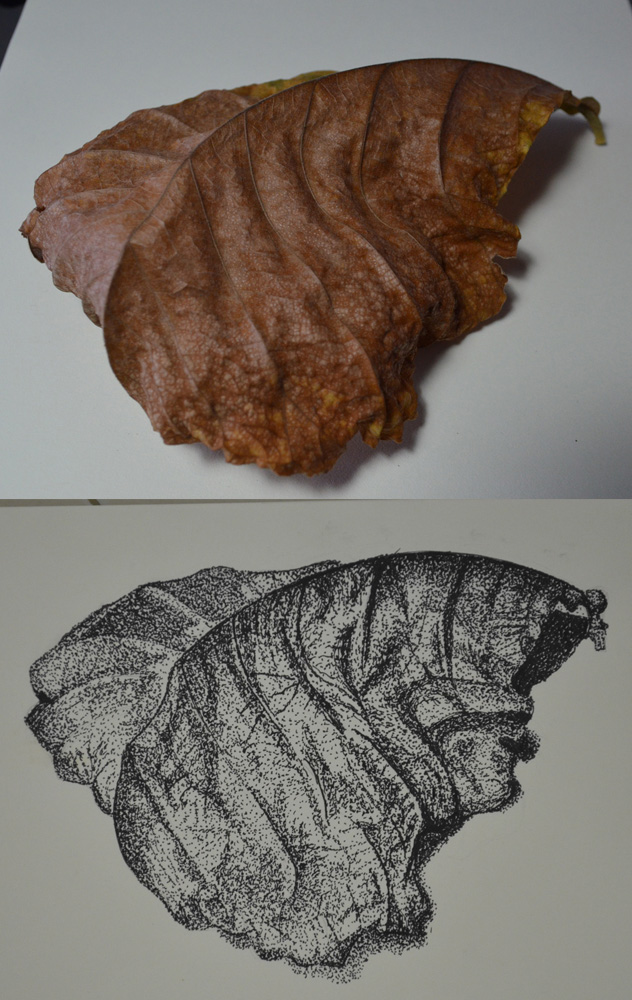
After my research on Eliot Hodgkin I took a walk through the very small park area opposite my school and took some photos of leaves with my mobile phone so I might use them later. When this exercise came up I went back into the park to grab some dying leaves to take home.
Exercise – Stipples and Dots, Leaf Subject
One particular leaf caught my eye as it had some great lines and at the time was half green half brown, so took many photos during the change from green and brown to completely brown and also tried the leaf at different angles, for my drawing I picked out the one above.
I can’t say that I love stippling as it is a very slow process and this exercise took me about three hours over two days to complete and since my first assignment was handed in quite slow I’m trying to keep up momentum.
I used a Rotring 0.3 drawing pen and began as I did with other exercises, drawing the light tones by spacing out the dots and then going back over for the darker tones with more dots. I used a variety of mark making techniques which included stippling, dots, really short hatching and lines and for the creased patterns of the dying leaf I drew thedots in tracks close together and then went back over with more dots.
For this exercise I was to select an object with interesting detail such as a sliced through red cabbage or a fir cone. Then on a sheet of A4 paper create a line drawing of the object that I set up, taking time and effort to really look at the patterning, thickness of line, texture and shape of the overall composition. The brief also said that I was to position the drawing well on the paper and fill the paper effectively with a continuous line drawing and no shading which is what I TRIED to do…
I made a few attempts at this with two different subjects, both of which were green peppers but in the Bangkok heat they go off pretty quick. With the first pepper every attempt was a continuous drawing with minimum detail, I used the thick nib of a double tipped felt pen and although the subject fit well on the paper, I didn’t give it a strong enough light source to pick up all the detail and too be honest the finished drawings at that line thickness all looked somewhat pathetic.
Exercise – Line Drawing Detail First Subject
I gave it a week with another exercise in between before I had another go at this exercise. Visually the drawings with the second subject look a lot better, I used the finer nib of the felt pen and this time after I completed what I could do continuously without taking my pen off the paper I decided to add the detail which were the ribs on the inside of the pepper that I could see from wisely using a light source this time.
Exercise – Line Drawing Detail Second Subject – Image A
I probably did go a bit overboard and it does look like I have had a go at shading the object but this is all down to the closeness off the lines on the inside of the pepper. However I am quite happy with the results.
Exercise – Line Drawing Detail Second Subject – Image B
The thing that I am not happy with however is the positioning on the paper and how much space I left to the sides and underneath it. When drawing an object such as a pepper with a very irregular shape I think it’s best if you know where to start, in Image A above I started at the core just above the seeds. With Image B I started at the tip of the stem Starting near the center of the image was better with this object but that would differ with something like a cabbage.
For this research point I was asked to find two artists who exemplify mastery of detailed drawing 1 from the 19th century or earlier and a modern artist. I already researched the 19th century artist Thomas Hartley Cromek in ‘Masters of Detailed Drawing 1, 19th Century, Thomas Hartley Cromek‘ and it was now time to find a Modern artist. Again I wanted to find an artist that I wasn’t familiar with so I started my search on Google looking for British artists of the 20th century. A list of names of British artists came up on Wkipedia so I went down the names looking at their work 1 artist at a time.
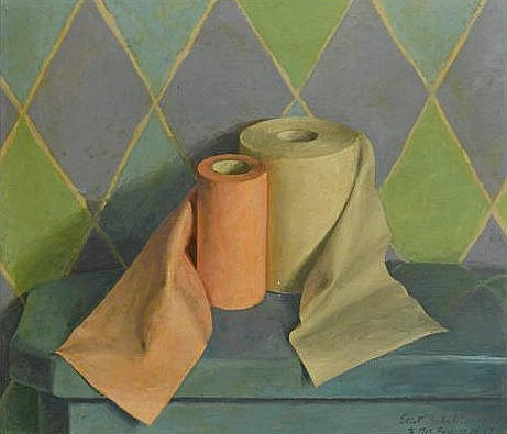
I came across the name Eliot Hodgkin, a name that I was very familiar with but I’m not sure from where so I took a look at his work to see if I recognised any of his paintings. I had never seen any of his paintings before but what I did see was truly inspiring and perfect for this part of the course. With the image below Large Leaf 2 particularly catching my eye as near my school there are some very similar large leafs that I would love to draw for this part of the course.
Eliot Hodgkin Large Leaf 2 Tempera on Card
Curwen Eliot Hodgkin was an English painter born into a Quaker family in Purley-on-Thames on 19 June 1905 and was the cousin of abstract painter Howard Hodgkin. Eliot Hodgkin was educated at Harrow School but his artistic life began at the Byam Shaw School of Art and then at the Royal Academy Schools where he studied under Francis Ernest Jackson.
Eliot Hodgkin Seven Brussel Sprouts
Hodgkin had already established himself as a still life and landscape painter by the mid-1930s and regularly exhibited at the Royal Academy. In 1937 Hodgkin started working in egg tempera a recipe that was given to him by his close friend and former teacher Maxwell Armfield.
Hodgkin stated that he wasn’t attracted to tempera as a medium as it was used by Italian primitives and their work did not do anything for him, he simply used tempera as it was the only medium that allowed him to express the unique character of the objects that fascinated him.
Hodgkin said that his conscious purpose was to ‘show the beauty in natural objects’- that people would usually think unattractive such as ‘Brussels sprouts, turnips, onions, pebbles and flints, bulbs, dead leaves, bleached vertebrae, an old boot cast up by the tide.’
When i did a search for his paintings and saw his work the first thing that went through my mind was how beautiful his paintings were and yet his compositions are so very simple. I have heard of tempera before but as far as I know I have never seen anything painted in it until now and I knew at firs glance that they were painted in a medium other than oil or acrylic.
He depicts the texture of his objects wonderfully and his paintings are so crisp and life-like but still he manages to express them in a way that makes u aware of the beauty of these objects for the first time with wonderful contours and a brilliant balance of light and dark tone, whether it be a dead leaf or a toilet roll.
Toilet Rolls Eliot Hodgin
Like Eliot Hodkin Says ‘ People sometimes tell me that they had never really ‘seen’ something before I painted it, and I should like to believe this… For myself, if I must put it into words, I try to look at quite simple things as though I were seeing them for the first time and as though no one had ever painted them before.’
For me I agree with others that to see these objects in his paintings is to ‘see’ them for the first time with detail and beauty that you would never notice before. Hodgkin really makes you notice every part of the object, every leaf, every crease and every pattern on the objects surface.
Frottage was invented by Max Ernst in 1925. Find out more about how Ernst and others used this technique.
Born in Brühl in Germany in 1891 to a middle-class family Max Ernst was a German painter sculptor and graphic artist as well as a poet. Max’was inspired to take up painting by his father who was an amateur painter and had an interest in painting and sketching and nature.
Max enrolled at the University of Bonn in 1909 where he studied Philosophy, art history and literature as well as psychology and psychiatry during this time he visited asylums and developed a fascination for the art of mentally ill patients. He became an artist in 1911 and was influenced by the works of Pablo Picasso, Vincent van Gogh and Paul Gauguin.
Max Ernst’s early life was interrupted in 1914 by World War I when he was drafted and served on the Western and Eastern Front. Max was devastated by the effects of war and in his biography he wrote: “On the first of August 1914 M[ax].E[rnst]. died. He was resurrected on the eleventh of November 1918.” – Wikipedia. While on the Western front he was assigned to chart maps for a short time which allowed him to continue painting. World War I was a sad time for the expressionist movement with many of the expressionist artists dying in the trenches.
I recently watched two documentaries about the German Expressionist Movement, BBC’s ‘Art of Germany – In the Shadow of Adolph Hitler’ and ‘Degenerate Art, The Nazis vs. Expressionism’ a 1993 documentary which were both very interesting.
At the end of the war in 1918 Max returned to cologne and started the Dada movement in 1921, he is known as the pioneer of the Dada movement and surrealism.
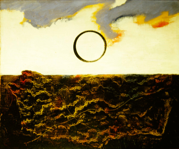
In 1925 he invented frottage and developed it as a graphic art technique. Ernst got the idea after observing a washed-out wooden floor in his hotel in France on one rainy afternoon, which inspired him to transfer the texture of the floor to a sheet of paper using graphite. He also created textures from rubbing over objects such as textiles, bark and leaves and ‘Through precise selection, combination, control of texture and some discreet additions, he was able to build up delicate, surprising images of fantasy landscapes, plants and creatures.’ – Oxford Art Online.
Max Ernst Marine 1926 (oil on canvas)
The English Surrealist Maddox Conroy, (27 December 1912 – 14 January 2005) who discovered surrealism in 1935 and spent the rest of his life exploring its potential through his paintings, collages and photographs was also inspired by Max Ernst and also experimented with frottage as seen here in his Bird in the Hand (Watercolour on Paper).
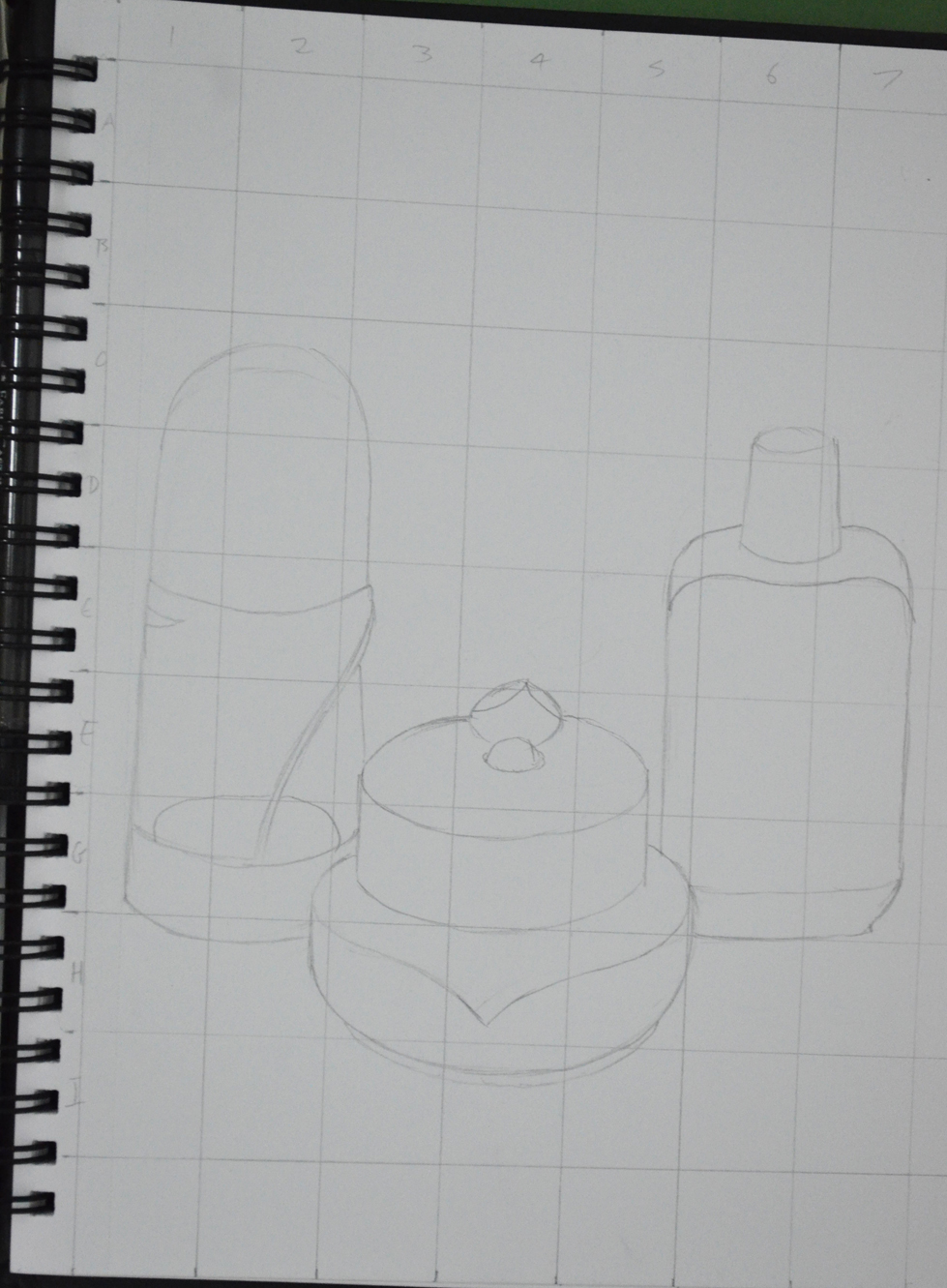
This exercise was aimed to give me further practice in enlarging original drawing with a slightly more complicated structure. For this exercise I chose a fancy jar of face cream (borrowed from my girlfriend), a roll on deodorant and a plastic Nasol bottle.
Enlarging a simple flat image – initial sketches
To get familiar with the objects I did a quick 3 minute drawing of each one before putting them together for the composition in my A5 sketchbook. This helped me to recognise problem areas on the objects such as the top of the Nasol bottle that would have looked a mess too wide or too narrow.
Enlarging a simple flat image – A5 sketchbook
As in the previous exercise ‘ Enlarging an Existing Image’ I drew the composition of three objects in my A5 sketchbook and drew a grid of 2 cm squares over the top of the composition with an HB pencil. Just as in the previous exercise I labeled the squares by writing numbers across the top and letters down the right hand side to stop any confusion to which squares I would be drawing in.
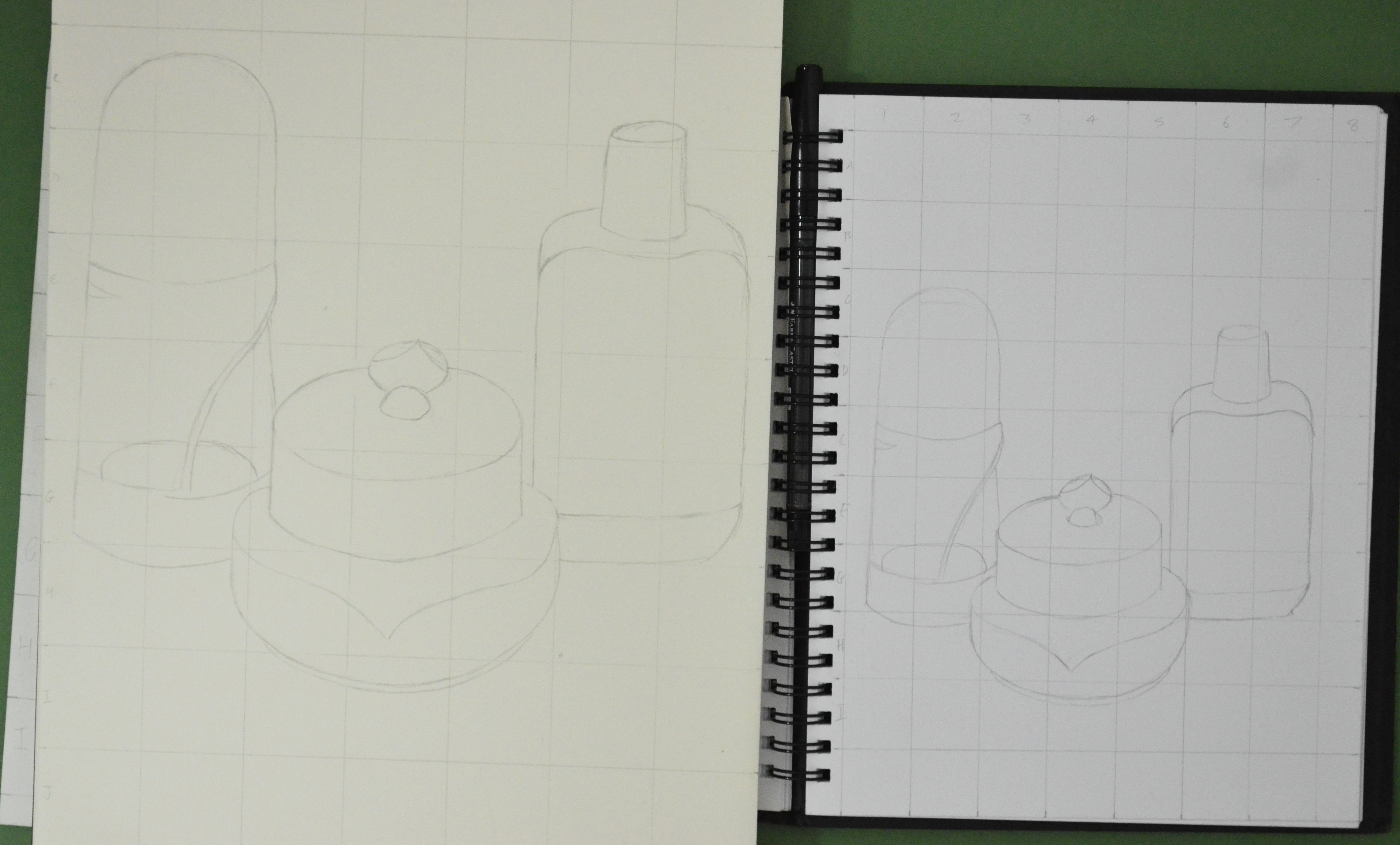
From there I drew a grid of 3 cm squares in my A4 sketchbook, again moving the composition up the page by taking away the A row in the grid then reproduced the drawing on a larger scale.
Enlarging a simple flat image – englarged sketch
Again, I really loved this exercise it was so simple and easy, I erased the odd line due to points of contact on the grid being slightly wrong, but the results of drawing these 3 objects were actually better than in the first object. I think this was down to viewing all three at once rather than trying to look for faults on the angles and curves of one single object.
The technique of Frottage was invented by Max Ernst in 1925 and involves placing paper over a rough surface such as grained wood and rubbing with a crayon or pencil. In this exercise I experimented with the technique of Frottage (which I always thought was just called rubbing) to see what kind of patterns and textures rubbing over certain surfaces gave me.
Up until this exercise I had done all of the coursework in my apartment and most of it at night, due to early evenings and work finishing times, this was a great opportunity to get outside and do something in the daylight.
Armed with charcoal and pencils I headed out to the swimming pool to experiment on tree bark, stone-chip floors and wooden sun chairs only to find that the paper in my new sketchbook was too thick or too rough and it wasn’t giving me any patterns/texture whatsoever.
It was another day before I finally got going on this exercise or should I say the next evening (fated to working at night) I took some pages out of my small sketch book, a white paper with less tooth and started with charcoal.
Experimenting with Frottage – Charcoal
I tried the technique on stone chip floor, my apartment door, floor and even the draining board and then again with different colour crayons before heading downstairs to the lobby,
Experimenting with Frottage – Crayon
Unfortunately the bark of the trees outside did not give me good results which was both surprising and disappointing and down to the bark being very smooth (difficult to find great trees in Thailand). I did get some nice rubbings off other surfaces though including the joint of a breeze block wall, which looking at it now resembles a crucifix in the sunshine but the best results using both charcoal and coloured crayon were got from the grain of the wooden door of my apartment with different panels giving me different patterns.
In this exercise I gathered together a a range of objects with different surfaces, some I bought and some I already had. The objects that I used were a takraw (Siamese football), shaggy teddy bear, a towel, mop mitten and Scotch-Brite brillow sponge as well as a woven basket, PVC chair, wire wool, toilet roll and leather Lay-Z-Boy (not the whole thing) plus a couple of other different surfaces.
Experimenting with Texture 1
In my sketchbook I made a series of approximately 5 cm squares and used both pens and pencils to depict the textures in the squares. To depict the surfaces I used several different techniques such as hatching (takraw ball), irregular hatching squiggles and stippling (Scotch-Brite sponge) and very short hatching (towel) as well as some very irregular marks for my leather look PVC chair and the creases in the arms of my Lay-Z-Boy armchair. I also tried stippling with felt tips for a toilet roll tube but I could not get it to look anything like.
Experimenting with Texture 2
One surface that created something of a challenge was the shaggy teddy bear fur and so I chose this as well as the woven basket for the exercise ‘A Drawing with Textures’.
This exercise of observing negative space and perspective involved following the silhouette of a group of objects that shared similar elements with a soft drawing tool such as soft pencil without taking it off the paper.
I drew in from the left using the furthest edge of the table as a starting point and followed the upper silhouette of the objects carefully assessing the silhouette and proportions of each object and changing the direction of the line as the silhouette of one object impacted off another.
Then I went back to my original starting point and followed the line until it reached the first object again then followed the bottom silhouette of the objects following the same steps as the top half. When the bottom half of the silhouette was complete I went back and drew in the details of the objects themselves.
Observing Negative Space and Perspective 1st Attempt
I used a 6B pencil for this exercise as I am still waiting for Derwent to send me replacements for my 7, 8 and 9B. I found the exercise quite difficult and frankly one that I should keep having ago at from time to time.
Observing Negative Space and Perspective 2nd Attempt
I made a few attempts without taking my pencil off the paper and I was actually very surprised when I drew the bottom silhouette and the objects looked something similar to what they did in my composition. There were a few errors in each of my attempts, vase to wide (starting to draw it too early and the bowl to narrow and the jar on the right hand side was quite wonky in each of my attempts, but the negative space between each object was the correct shape just not always the right size.
Observing Negative Space and Perspective Attempt 3 and 4
Like I said earlier it is an exercise that I think I will gain a lot from and should practice from time to time, I also like the way that I arranged the objects and would like to do a similar still life using a similar composition, this exercise maybe a great starting point for that still life.
The brief for this exercise was to ‘Make a selection of natural objects for my composition, such as fruit or vegetables on a plate, and explore the different viewpoints by moving all the objects around in different arrangements and assessing which set up I like best. In my sketchbook, make quick sketches of each different set-up before moving the objects about again.’
I found making quick sketches of the natural objects a lot easier than making thumbnail sketches of ‘made objects‘ in the previous exercise and started out with a good feeling that the exercise would go well. I chose vegetables for my composition which were a red yellow and green capsicum, a tomato and a carrot.
Thumbnail Sketches of Compositions of Natural Forms
I thought about the best place to position myself in relation to the objects and positioned myself slightly above. This was also more comfortable as I had bruised a rib after a fall during the Thai new year festivities (Songkran) a couple of days before, so I propped myself up with a couple of pillows, I couldn’t complain though as it did give me a good view of all the vegetables.
The brief for the second part of the exercise was to ‘Use the information collated in my sketchbook along with written notes from previous exercises to make an informed decision about the organisation of my still life drawing. This would help me to clear my mind and give a sense of order to my work.’
As always due to doing most of my work over different times of day and especially in the evening I worked with a bendy light as a light source, making sure it cast adequate light and shade onto the still life.
Mediums used – Watercolor pencil, 2B, 4B, 8B, EE graphite pencil, charcoal, Conté pencil
Paper – A3 Canson Watercolor pencil 190 gsm
Time taken – 10+ hours
I wanted to get more practice with watercolor pencils and so I initially chose to do this exercise completely in watercolor pencil and so the only size sheets I had were A3 which I bought for the ‘Supermarket Shop’ exercise. However the problem was the composition I chose meant that I had to use the paper length ways but I wanted to get the whole of the plate into the finished drawing with the shadow that it cast and so I knew in advance it would leave a lot of negative space on the paper. Placing another folded sheet of paper under the composition helped me fill up the negative space and I decided that I would also use the TV unit in the background as the background.
I made a very poor first attempt at the still life completely in watercolor pencil, it set me back a good few hours and did not put me in the best of moods but did teach me some valuable lessons.
I did not have enough practice with this medium to get it perfect.
Blending colours with this medium was more difficult than I thought.
You can’t erase watercolor pencil once it’s in paint form and if you try there’s a risk of ripping the paper!
I decided that my next attempt at this exercise would be a great chance to produce my first mix medium drawing and if I couldn’t perfect the colour, shadow and light of the vegetables I would do my best and then really make the composition stand out by the drawing everything else in graphite pencil.
On my first attempt at this exercise I started out sketching the dark parts of the vegetables in watercolor pencil first but on the second attempt I started with the lighter colours, although the second attempt was easier and looked better I have yet to perfect my technique.
When it to the lighter shadows in the drawing I took it very slow, using the pencil very lightly and holding it at the end and letting it almost dangle, only occasionally did I have to resort to blending with my finger. For the darker shadows on the plate I used 4B and 8B pencil.
All was going well until it came to the background objects, my 7B, 8B and 9B pencil kept snapping so after an email to Derwent to complain about the quality of pencils in their 24 graphite pack I continued with an EE pencil. I found the EE pencil no replacement for the 9B pencil and was hard to produce different tones so I finished the background off in Conté pencil and charcoal.
Still Life Composition of Natural Objects
I was a bit disheartened at times after starting off so well, especially having discovered that I drew the composition in my second try on the the wrong side of the paper thinking they were the same. Luckily enough it turned out to my advantage as it was easier to draw in graphite and the paper did not warp as much when wet plus the colours seemed to be a lot brighter when they bled.
I was also a bit upset that I had to use more than two mediums in this drawing and found it frustrating when things kept breaking. The end result of the watercolor pencils is not what I had in mind but I thought the contrast between the colour and the graphite pencil was excellent.
Composition of Natural Forms – close up
The good news is Derwent did get back to me and admitted there was a problem with the old batch of graphic pencils and are sending me replacement 7B, 8B and 9B pencils.