The technique of Frottage was invented by Max Ernst in 1925 and involves placing paper over a rough surface such as grained wood and rubbing with a crayon or pencil. In this exercise I experimented with the technique of Frottage (which I always thought was just called rubbing) to see what kind of patterns and textures rubbing over certain surfaces gave me.
Up until this exercise I had done all of the coursework in my apartment and most of it at night, due to early evenings and work finishing times, this was a great opportunity to get outside and do something in the daylight.
Armed with charcoal and pencils I headed out to the swimming pool to experiment on tree bark, stone-chip floors and wooden sun chairs only to find that the paper in my new sketchbook was too thick or too rough and it wasn’t giving me any patterns/texture whatsoever.
It was another day before I finally got going on this exercise or should I say the next evening (fated to working at night) I took some pages out of my small sketch book, a white paper with less tooth and started with charcoal.
Experimenting with Frottage – Charcoal
I tried the technique on stone chip floor, my apartment door, floor and even the draining board and then again with different colour crayons before heading downstairs to the lobby,
Experimenting with Frottage – Crayon
Unfortunately the bark of the trees outside did not give me good results which was both surprising and disappointing and down to the bark being very smooth (difficult to find great trees in Thailand). I did get some nice rubbings off other surfaces though including the joint of a breeze block wall, which looking at it now resembles a crucifix in the sunshine but the best results using both charcoal and coloured crayon were got from the grain of the wooden door of my apartment with different panels giving me different patterns.
In this exercise I gathered together a a range of objects with different surfaces, some I bought and some I already had. The objects that I used were a takraw (Siamese football), shaggy teddy bear, a towel, mop mitten and Scotch-Brite brillow sponge as well as a woven basket, PVC chair, wire wool, toilet roll and leather Lay-Z-Boy (not the whole thing) plus a couple of other different surfaces.
Experimenting with Texture 1
In my sketchbook I made a series of approximately 5 cm squares and used both pens and pencils to depict the textures in the squares. To depict the surfaces I used several different techniques such as hatching (takraw ball), irregular hatching squiggles and stippling (Scotch-Brite sponge) and very short hatching (towel) as well as some very irregular marks for my leather look PVC chair and the creases in the arms of my Lay-Z-Boy armchair. I also tried stippling with felt tips for a toilet roll tube but I could not get it to look anything like.
Experimenting with Texture 2
One surface that created something of a challenge was the shaggy teddy bear fur and so I chose this as well as the woven basket for the exercise ‘A Drawing with Textures’.
I don’t get many days off in fact the only day I do get off is the only day I get to see my kids, Saturday but luckily for me my kids love drawing and looking at art so we went for a day out to the Thai National Art Gallery near the Khaosan Road area of Bangkok.
A Visit to the Gallery
It was my first visit to the National Art gallery, I didn’t even know where it was which was a bit embarrassing as I used to cycle past it everyday to the last school I used to work at. With it being my first visit to the National Art gallery I didn’t know what to expect, I actually thought it would be a bit disorganized.
A Painting by King Bhumipol, a self portait maybe?
The price for the ticket for the gallery was 250 baht for foreigners but only 30 baht if you speak Thai, the kids were free so it only cost us 30 baht to enter. On entering my first impression was that it was all a bit too royalist and I with photos of the Royal family from different generations, traditional Thai drawings, which I am quite fond of and even an abstract painting by the king (which I think is a self portrait).
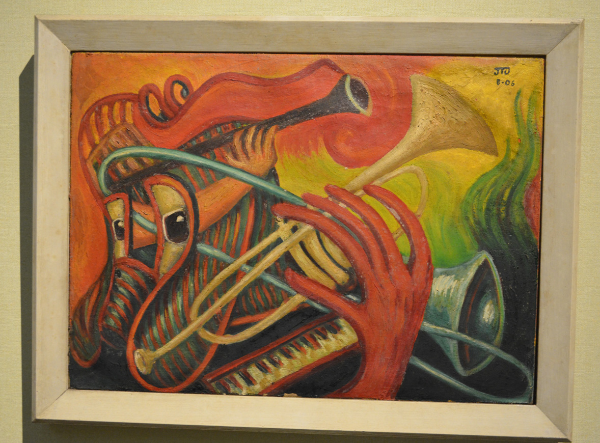
Muslim Girl unknown
As I made my way round into the temporary gallery section I decided that my money was well spent and was amazed at some of the work on display, so much so that I forgot to get the name of the artist who created this piece which I believe is of a Muslim girl, knowing what is going on in the south of Thailand.
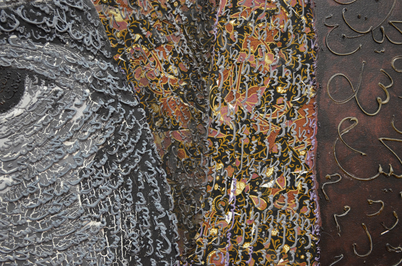
Close up of Muslim Girl by Thai Artist
At a first glance of the painting it looked to be made up of Thai alphabetical characters but I think most probably just squiggles influenced by both Thai and Islamic characters.
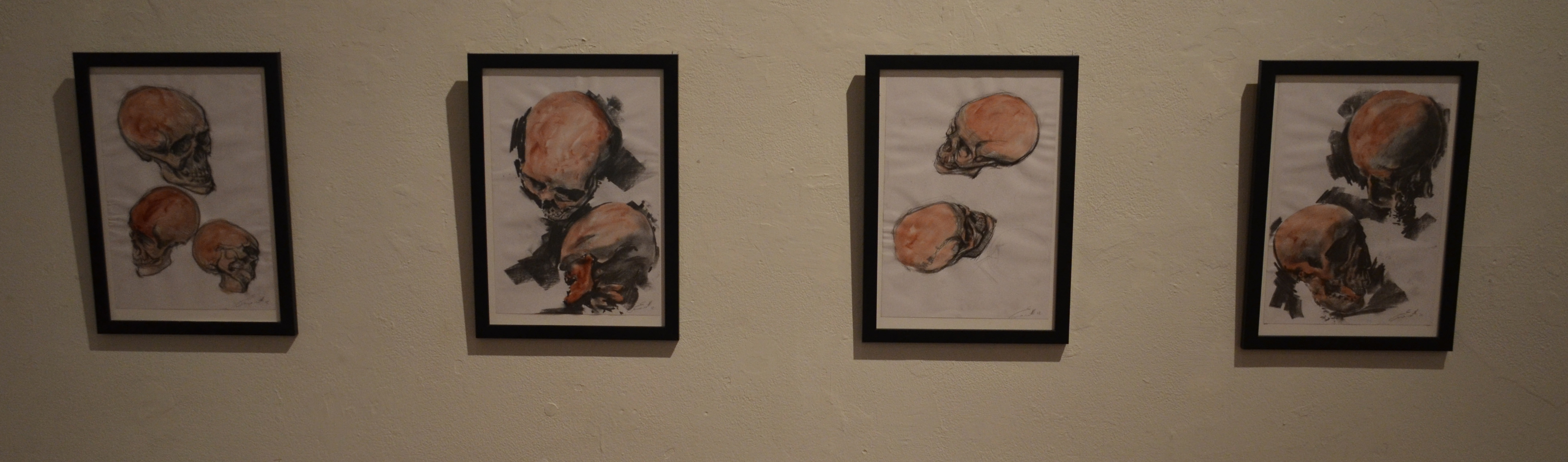
It wasn’t long before I came across the next exhibition, Crossing over by Chile born artist Marco Evaristti. Crossing over displays several drawings and paintings of dismembered suicide bombers and victims, although they were very beautifully drawn my kids were terrified so I only managed to stick around long enough to get some photos and managed to get the details on line from the Bangkok post.
It was a shame that I had to rush through crossing over I did go down for a second visit a few weeks later but the artists in the temporary gallery had changed.
Crossing Over by Marco Evaristti remainders of suicide bombersdrawing of suicide bomber and victimsCrossing Over by Marco Evaristti – skullsCrossing Over by Marco EvaristtiTerrorialista Dismembered TerroristCityscape 2013 part of the Crossing Over exhibition
My old sketch book got full quite quickly so I needed to buy a new sketch book to finish the first part of my drawing 1 course. I wish I new more about what paper to choose gsm/tooth etc, there were a few expensive sketchbooks in the art shop, so I expect the quality was probably top notch but they were sealed and there wasn’t that much information on the wrapping. In the end I settled for a cheaper A4 sketch book with a lot of tooth, it said smooth on the front but doesn’t feel smooth to me.However the reason why I chose this sketchbook in particular was of the photo of Corrado Feroci on the front cover.
Silpakorn Bhirasri on the cover of my new Sketch Book
Here’s a short biography of his life:
Corrado Feroci was born in Florence Italy in 1892 and was a sculptor who worked mainly in Thailand after being invited to the kingdom in 1923 to teach western sculptor at the Fine Arts Department of the Ministry of Palace Affairs. Corrado later founded the Silpakorn University (the University of Fine Arts) in 1943.
After Italy surrendered to the allies in 1944, he changed his name to to Silpa Bhirasiri and became a Thai national to avoid being arrested by the occupying Imperial Japanese Army. While in Thailand he married his second wife, one of his Thai students.
The Rama I Statue at Memorial Bridge
If you have ever been to Thailand and travelled around the Bangkok streets you will see several of Silpa Bhirasiri’s works including the Democracy Monumenty, the Victory Monument and the Statue of King Rama I at the Memorial Bridge at Saphan Phut.
Democracy Monument by Silpa Bhirasri Bangkok
His photograph on the front helped me choose the notebook, I’d previously bought colour pencils and watercolor pencils by the Thai brand Masterart which weren’t so great, but I had not so long ago read about Silpha Bhirasiri and knew he was the founder of Silpakorn University so knowing that the university had endorsed the brand for this product I had faith in what I was purchasing.
To be honest my sketchbook hasn’t been that organised so far but I made a promise to myself on purchasing this new book to get things in order for my first assignment.
This exercise of observing negative space and perspective involved following the silhouette of a group of objects that shared similar elements with a soft drawing tool such as soft pencil without taking it off the paper.
I drew in from the left using the furthest edge of the table as a starting point and followed the upper silhouette of the objects carefully assessing the silhouette and proportions of each object and changing the direction of the line as the silhouette of one object impacted off another.
Then I went back to my original starting point and followed the line until it reached the first object again then followed the bottom silhouette of the objects following the same steps as the top half. When the bottom half of the silhouette was complete I went back and drew in the details of the objects themselves.
Observing Negative Space and Perspective 1st Attempt
I used a 6B pencil for this exercise as I am still waiting for Derwent to send me replacements for my 7, 8 and 9B. I found the exercise quite difficult and frankly one that I should keep having ago at from time to time.
Observing Negative Space and Perspective 2nd Attempt
I made a few attempts without taking my pencil off the paper and I was actually very surprised when I drew the bottom silhouette and the objects looked something similar to what they did in my composition. There were a few errors in each of my attempts, vase to wide (starting to draw it too early and the bowl to narrow and the jar on the right hand side was quite wonky in each of my attempts, but the negative space between each object was the correct shape just not always the right size.
Observing Negative Space and Perspective Attempt 3 and 4
Like I said earlier it is an exercise that I think I will gain a lot from and should practice from time to time, I also like the way that I arranged the objects and would like to do a similar still life using a similar composition, this exercise maybe a great starting point for that still life.
Do you think it is easier to suggest three dimensions on man-made or natural objects?
This project has taught me that it is easier to suggest three dimensions on man-made objects rather than natural objects. Man-made objects are usually made up of geometrical shapes such as cylinders, cones or cubes and so the lines of man-made objects are easier to draw and suggest their 3D form using most mediums. The irregular shapes of natural objects means that their three dimensional features are much more subtle with lines that are more difficult to depict and draw.
How did you create a sense of solidity in your composition?
In the exercise ‘Still Life Sketches of Made Objects’ I created a sense of solidity by using various hatching techniques and swapping between pencils of different hardness mainly B, HB and 2B, shadows and tone also played a big part in making the objects look solid.
Image 1: Exercise – Still Life of Made Objects
In the exercise ‘Composition of Natural Objects‘ working with watercolor pencil I used hatching and layers of darker colour to show solidity.
Image 2: Exercise – Composition of Natural Objects
Do you think changing the arrangement of your composition makes a difference to the way you create a sense of form?
Changing the arrangement of the objects changed the way each objects interacted with each other, shadows and light reflected off one object to another and other objects in the composition (such as the plate in image 2) can play a major role in creating a sense of form.
How did you decide how to position yourself in relation to the objects?
For the second exercise I decided to position myself slightly above looking down at the objects so I could see the full form of the the objects and shadows interacting with each other in the middle of the composition, I thought this would help me to create a sense of form in my drawing. A bruised rib from a an accident the day before helped me to reinforce this decision.
The brief for this exercise was to ‘Make a selection of natural objects for my composition, such as fruit or vegetables on a plate, and explore the different viewpoints by moving all the objects around in different arrangements and assessing which set up I like best. In my sketchbook, make quick sketches of each different set-up before moving the objects about again.’
I found making quick sketches of the natural objects a lot easier than making thumbnail sketches of ‘made objects‘ in the previous exercise and started out with a good feeling that the exercise would go well. I chose vegetables for my composition which were a red yellow and green capsicum, a tomato and a carrot.
Thumbnail Sketches of Compositions of Natural Forms
I thought about the best place to position myself in relation to the objects and positioned myself slightly above. This was also more comfortable as I had bruised a rib after a fall during the Thai new year festivities (Songkran) a couple of days before, so I propped myself up with a couple of pillows, I couldn’t complain though as it did give me a good view of all the vegetables.
The brief for the second part of the exercise was to ‘Use the information collated in my sketchbook along with written notes from previous exercises to make an informed decision about the organisation of my still life drawing. This would help me to clear my mind and give a sense of order to my work.’
As always due to doing most of my work over different times of day and especially in the evening I worked with a bendy light as a light source, making sure it cast adequate light and shade onto the still life.
Mediums used – Watercolor pencil, 2B, 4B, 8B, EE graphite pencil, charcoal, Conté pencil
Paper – A3 Canson Watercolor pencil 190 gsm
Time taken – 10+ hours
I wanted to get more practice with watercolor pencils and so I initially chose to do this exercise completely in watercolor pencil and so the only size sheets I had were A3 which I bought for the ‘Supermarket Shop’ exercise. However the problem was the composition I chose meant that I had to use the paper length ways but I wanted to get the whole of the plate into the finished drawing with the shadow that it cast and so I knew in advance it would leave a lot of negative space on the paper. Placing another folded sheet of paper under the composition helped me fill up the negative space and I decided that I would also use the TV unit in the background as the background.
I made a very poor first attempt at the still life completely in watercolor pencil, it set me back a good few hours and did not put me in the best of moods but did teach me some valuable lessons.
I did not have enough practice with this medium to get it perfect.
Blending colours with this medium was more difficult than I thought.
You can’t erase watercolor pencil once it’s in paint form and if you try there’s a risk of ripping the paper!
I decided that my next attempt at this exercise would be a great chance to produce my first mix medium drawing and if I couldn’t perfect the colour, shadow and light of the vegetables I would do my best and then really make the composition stand out by the drawing everything else in graphite pencil.
On my first attempt at this exercise I started out sketching the dark parts of the vegetables in watercolor pencil first but on the second attempt I started with the lighter colours, although the second attempt was easier and looked better I have yet to perfect my technique.
When it to the lighter shadows in the drawing I took it very slow, using the pencil very lightly and holding it at the end and letting it almost dangle, only occasionally did I have to resort to blending with my finger. For the darker shadows on the plate I used 4B and 8B pencil.
All was going well until it came to the background objects, my 7B, 8B and 9B pencil kept snapping so after an email to Derwent to complain about the quality of pencils in their 24 graphite pack I continued with an EE pencil. I found the EE pencil no replacement for the 9B pencil and was hard to produce different tones so I finished the background off in Conté pencil and charcoal.
Still Life Composition of Natural Objects
I was a bit disheartened at times after starting off so well, especially having discovered that I drew the composition in my second try on the the wrong side of the paper thinking they were the same. Luckily enough it turned out to my advantage as it was easier to draw in graphite and the paper did not warp as much when wet plus the colours seemed to be a lot brighter when they bled.
I was also a bit upset that I had to use more than two mediums in this drawing and found it frustrating when things kept breaking. The end result of the watercolor pencils is not what I had in mind but I thought the contrast between the colour and the graphite pencil was excellent.
Composition of Natural Forms – close up
The good news is Derwent did get back to me and admitted there was a problem with the old batch of graphic pencils and are sending me replacement 7B, 8B and 9B pencils.
The aim of this exercise was to create a small still life composition from a small themed selection of made objects, of which I chose personal hygiene as my theme and the objects that I chose were, a tube of toothpaste, a toothbrush, a Bic Razor and a bottle of mouthwash.
Then with a pen, pencil, or ballpoint use a technique such as hatching. I used a 3H and a HB pencil (to show the darker shadows).
Then I had to draw two or three thumbnail sketches in my sketchbook of different arrangements from different view points, using my light source to help create strong lights and dark shadows on the surfaces of the objects. I had to include tonal values to indicate form in my sketches as well as shadows seeing as they can also play an important part of a still life composition.
Then I was to make notes on or around my sketches about the technique I used and why I had used it. And make notes on anything else I felt was important.
I did two initial drawings that I have to admit were not exactly thumbnail size, I think this was down to miscalculating proportions of the first objects I started on in each composition and then having to keep up proportions,
First attempt at this exercise
In the first drawing I started on the toothpaste tube as I always end up working clockwise, I think this is force of habit. However, because of this I misjudged how much paper I would need for the mouthwash so squashed the lid to fit the rest in; so when I came to the second drawing I worked from the mouthwash down.
On the first attempt I forgot what I was instructed to do in the exercise. Instead of writing down about the techniques I used I totally ripped the sketches apart fault by fault, only actually remembering what I was supposed to do after I took the photo to upload to my working log. I decided to do the exercise again and this time do it right.
In my second attempt I scaled the drawings down and was less worried about every detail. My hatching technique also seemed to improve a lot in my second attempt, using a variation of cross, vertical and horizontal hatching as well as swooping lines to follow the contours of certain objects.
Second Attempt at this exercise was much better
This exercise was probably the first time that I made no attempt of smudging in the pencil lines instead I practiced the pencil holding techniques I used earlier in this course, from the tip, from the end etc…
The hardest thing to draw in the composition were the toothbrush and razor and I felt like abandoning the objects and using something easier to draw but stuck at it and did a reasonably good attempt at getting proportions and details right all 4 times.
The brief for this was to make a drawing in a similar style to Patrick Caulfield White Ware screen prints, it wasn’t that easy. I decided that I wasn’t going to keep looking at his images so after I finished my part 1 of this research point, researching him, I thought I could remember enough about his prints and paintings to work in a similar style.
I decided to work on an A2 sheet from my larger sketchbook which is too big to work with felt tips and I wanted to show as little pen or brush strokes as possible so I went out and bought some Kurecolor graphic design markers, which were very expensive but well worth the money.
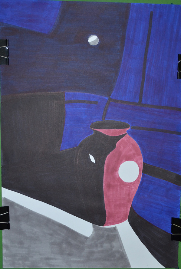
I used the vase that I used in an an earlier exercise ‘Study of Light Reflected from one Object to Another’ and placed it in the chair that I would usually sit in to do my work. I wanted to shine a more acute light on my subject so instead of using the bendy light that I used before I used a torch that I got free from the local western supermarket. I knew that the batteries in the torch wouldn’t last that long so I turned all the lights off found the right angle for the torch to shine at and took a photo, then I worked completely from the photo.
Photo with Torch, vase and Chair
I started by drawing the shadow on the vase, then instead of using white I used colour for the other half, I purchased the markers day before but I swapped vases so the colour did not match but I wasn’t worried about that, I just wanted to know if I could draw something in the similar style as Patrick Caulfield, I highlighted the light reflected from the vase vase by leaving those areas blank.
Drawing after first Two Colours
I used grey for the light that spread from the torch beam as I had I didn’t want the drawing to be completely dark and I had seen Patrick Caulfield also use grey in his paintings, this paid off.
Finished drawing
I cut down on the detail in my drawing and over exaggerated the detail that was left, after adding colour to the vase shadows and foreground I stopped looking at the photo and worked completely from memory hence the various differences like the position of the door handle and seams in the chair positioning where I thought they would look best rather than where they should be.
I was really happy with the finished drawing and even though it doesn’t resemble any 1 particular Caulfield style of painting you can tell he is the inspiration behind it.
Patrick Caulfield (29 Jan 1936 – 29 Sept 2005) was an English painter and printmaker who started his formal education as an artist at the Chelsea School of Art in 1956. He then studied from 1960-1963 at the Royal College of Art where he was one year below students who were credited with starting the UK pop art movement.
As a student he was influenced by abstract painters such as Mark Rothko and Jackson Pollock even though he only experimented in abstract painting for a short time. His bold, colourful prints and paintings are deemed to be Pop Art even though Caulfield himself was wary of being connected with any such movements. His association with the movement with ‘Pop Art’, mainly due to exhibiting alongside David Hockney, Allen Jones and R B Kitaj at the ‘New Generation’ exhibition in 1964.
Unlike the American Pop Artists his works depicted ordinary every day subjects such as a vase, buildings or interiors rather than images of popular culture such as celebrities or advertising products. It is the way he treats his subject that that gives his work a Pop Art feel, creating ambiguity by treating fine art subjects in an unrealistic and stylised manner.
When I first looked at Caulfield’s work it seems to me that the negative space plays just as much an important role in his paintings as positive space. In some of his images he uses negative space to sculpture the objects which in some cases are an abstract image but we get the sense that we are looking at the whole thing subject.
In the ‘White Ware’ screen prints he has managed to balance out the level of importance between negative space, reflected light and what we automatically presume is the main subjects such as a vase. With this he leaves the viewer trying to imagine what the light source maybe or what could be causing the shadows in his images. He also creates a good sense of distance between the foreground objects and what’s happening in the background by using very simple shapes to depict reflected light for example.
In some of these prints he has inserted a second object behind the main subject, this is made up of one or two shapes and difficult to work out what it is but is just as important as the main subject. I love some of his other paintings and in the future I would very much like to paint something in the style of ‘After Lunch 1975’ due to the simplicity of my Bangkok apartment and the technical city scape outside. For now I will concentrate on the task at hand and make a drawing in the style of his ‘White Ware’ screen prints for this research point.