How did you use a limited colour palette to create a sense of depth?
Firstly I chose three colours that I knew would go well together, chocolate brown pastel pencil, Black and Sanguine Conté pencils and a Derwent Chinese white drawing pencil. I used the three colours together to create a sense of depth when drawing the trees then on the buildings, shadows etc. I used the pencils at different pressures to create light and dark tones. The Chinese white helped to relieve the colour if I put too much pressure on on the first attempt. Hatching and cross hatching also helped me to take the colours even deeper.
Did your preliminary sketches give you enough information for your final pieces of work?
Undoubtedly yes, they also helped me to eliminate details that I did not need and simplify more difficult parts of the buildings and scenes for the final pieces.
Would you approach this task differently another time?
Yes, most definitely scale is one thing I am very aware of and I believe that all buildings in the drawings are to scale.
Have you captured the colour and atmosphere in your drawings? How did you do this?
In the pencil sketches I think I captured the atmosphere quite well with use of shadow. As I said in the ‘A sketchbook of townscape drawings exercise’ it was a fresh morning and with the shadows cast from the trees around the temple it reminded of me of a road near my home in Wakefield, for me the sketches still arouse these emotions. However, the limited palette study does not seem to depict the brightness and freshness of the day and I’m left wondering what I could have done differently.
It has been a bit hard to get around Bangkok the last few weeks and the ‘mob’ protesters have shut off the main road entrances into the city. You can still get around, they aren’t preventing pedestrians but there has been numerous grenade attacks and shootings over the last few weeks; so unfortunately I had to stick to the national art gallery and in and around school.
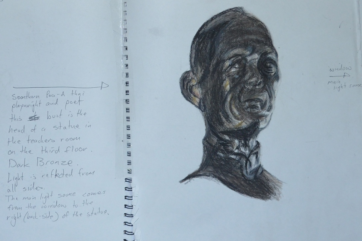
My first drawing was in Conté and hard pastel. I liked using them in the last exercise a limited palette study from your sketches and i thought that the three colours that I used in that exercise would be great for Bronze. In the teacher’s room on the third floor of the school, there was a reproduction bronze statue of the Thai playwright and poet Soonthornpoo (so highly regarded in Thailand that he has his own day).
Soonthornpoo Conte and Pastel Pencil
Surprisingly the three colours worked very differently together in this exercise as the subject was very dark and I had to bring in a yellow and orange pastel pencil.
My next drawings were done at the national art gallery, I was due a visit and I also planned to get some drawings of statues done while I was there. The protesters had been camped out round the corner from the gallery for the last three months which probably put everyone off exhibiting anything at the gallery so there was only one artist exhibiting. There were some nice statues in the permanent exhibition though.
The next subject was a statue of a naked young girl that caught my eye because of the smoothness and colour of the statue but after about 5 attempts in pastel pencil, that ended up in the bin, I gave up trying in colour and did two successful drawings in 4B pencil. Well not quite that successful as it was quite difficult to get the body and facial proportions right of a girl at that age, Drawing the kids heads at school has helped.
Statue of a Young Girl in 4B pencil
The next drawing in pastel and Conté of a women’s head in the gallery was the last drawing I did in the gallery, this particular statue caught my eye because of the strong contrast in colours of the light and shadow caused by being placed in the corner of the not-so-well lit statue exhibition. Disappointingly the finished drawing does not look like the statue, although it does look female, it does look Asian and the colours are spot on, the original statue’s face looked more primate-looking with the face stretching forwards and big cheeks.
Bust of a Thai Woman National Art Gallery
I was back at school on the Monday and so I had time to draw a statue depicting one of the 7 faces of Buddha (I think that’s how many there are). Phra Mahanchanok and the other 6 faces are depicted in different scenes around Wat (temple) Makut near the school and are statues molded from a cement time mixture around a metal frame. This was a disappointing effort as the drawing just looks flat.
Phra Mahanchanok Outside Temple in 4B
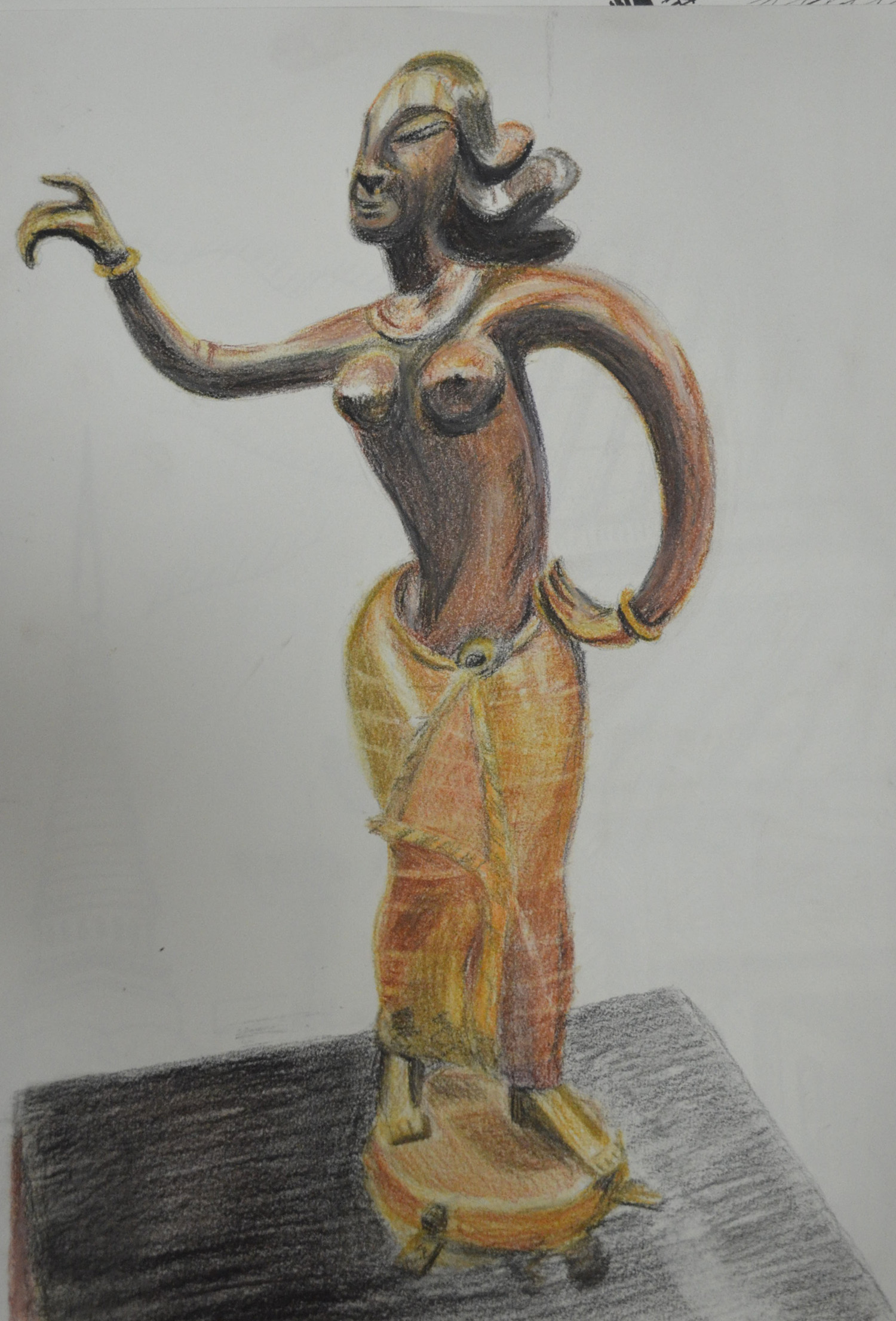
The last statue was of a southern Thai style female figure in bronze, from a photo that I took in the art gallery, I loved bronze appeared to be different colours in different parts of the statue due to the contrast in curves and textures, I thought it was the perfect subject for a larger drawing and so I completed her in pastel pencil and Conté on an A3 sheet of paper.
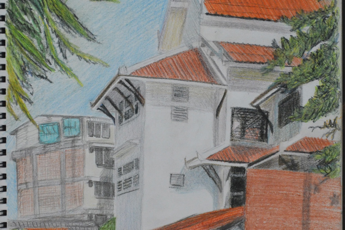
For this exercise I was to make a limited palette study from the sketches in my previous exercise ‘a Sketchbook of Townscape Drawings‘ in 2-3 colours. I used a chocolate pastel pencil, sanguine and black Conté pencils and a Derwent Chinese White drawing pencil.
I had already done a pencil sketch of my school in the last exercise as well as a drawing of the same school in colour pencil and knowing that it would work for this exercise I decided to develop those sketches into a larger drawing with a limited palette.
Sketch of School in H pencil w notesSection of School in 3B and Dry Watercolour Pencils
I followed the instructions of this exercise, drawing in the strongest verticals first, which were the corners of the main school building. From there I drew in the diagonals which were the many roofs of the school building and most of everything else.
Adding Colour
Drawing in the detail was quite easy simply because I got the verticals and diagonal lines right the first time but if not then drawing in the windows, roof beams etc. could have been a disaster.
A Limited Palette Study in Conte, Pastel and Chinese White
The colours that I chose for this exercise went very well together and so the roll of each colour i.e. light, dark and mid-tone swapped over in different parts of the picture with the most prominent colours being the Sanguine and the Black Conté simply because they helped me depict how bright and fresh the day was.
The chocolate colour pastel pencil was mainly used for shadow along with the black Conté at minimum pressure. The Chinese white was grade for toning down the Conté and also adding 3D properties to the tiled roofs.
I have to be honest and say I love the finished study which does remind me of some drawing from an history lesson at school.
With the threat of protests shutting the roads down around my school I had to move quickly with this exercise. I decided to use the square sketchbook that I had purchased from the school suppliers especially for the last exercise ‘Study of a Townscape Using Line‘ which I completed in drawing pen.
The sketchbook wouldn’t have been my first choice for pencil sketches as the paper is very smooth with no tooth at all but as part of the learning process I decided to go with it to see what results I would get putting drawing pencil to paper.
For this exercise the brief told us to, ‘carefully select a viewpoint that gives you somewhere to sit comfortably while you are sketching and making notes. Focus on one particular building, for example a corner site or a building facade, and notice how the other buildings support your main focus.
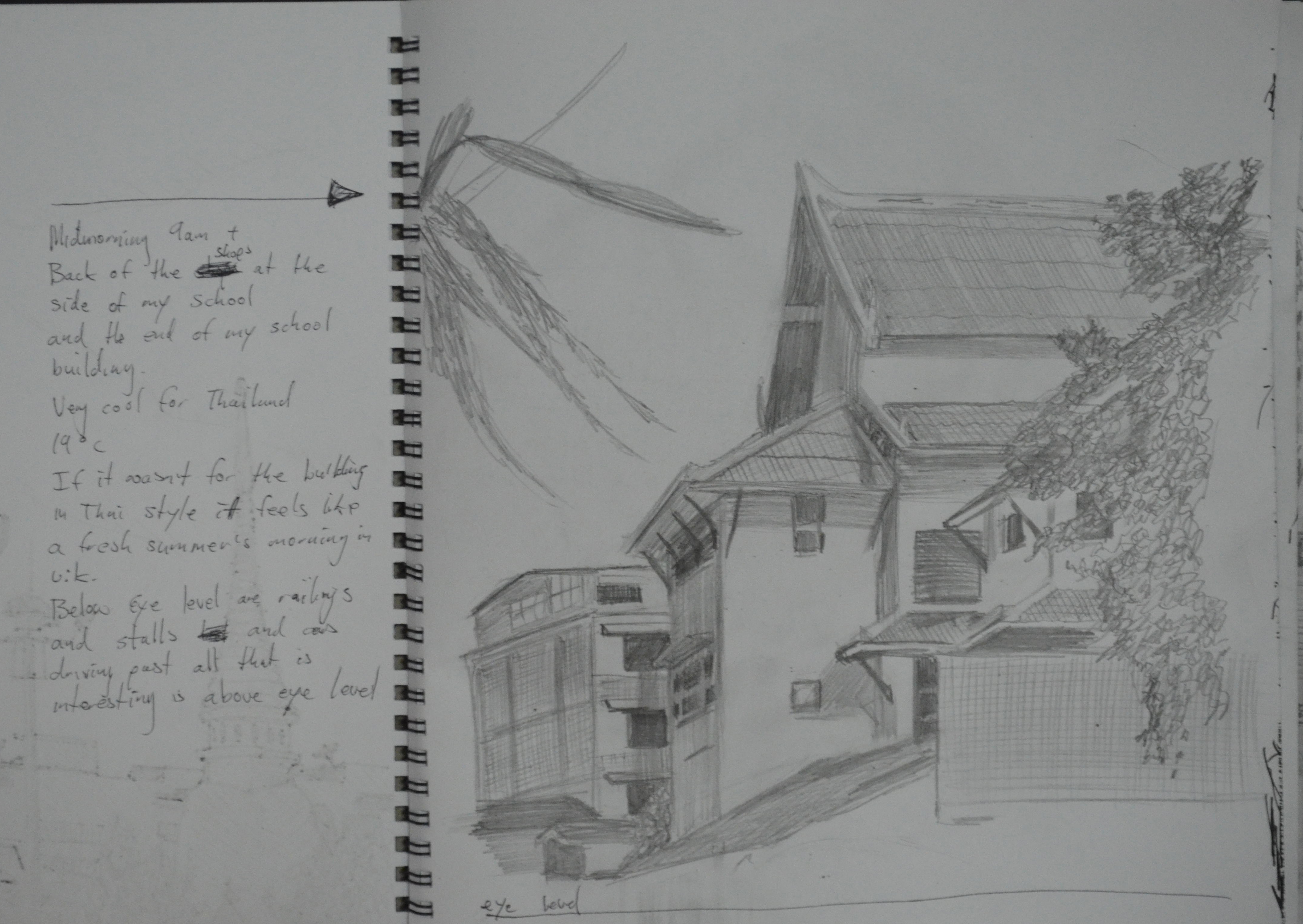
‘It was 9 a.m. and one of the coolest mornings we had experienced in Bangkok for a long time, probably the first morning of the cold season and at 18 degrees it was really quite cold for Bangkok. There were activities in the morning so I took my camera with me to school so I could take some photos of the buildings around the school at what is the best time of the day. From 9-11 the buildings and roads around the school are saturated with the shadows of the trees around the temple. On this fresh morning the area reminded me of a road close to my house in Wakefield, which made me quite home sick as I’ve only been back once in 14 years..
After taking some photos that I could use for reference later I took a chair out to settle down and make some sketches. My first sketch was of my school itself, which is a temple school and therefore built in the same style as a temple and with its external roof beams it looks similar to a building from the middle ages, when viewed at certain angles
1 – Sketch of School in H pencil w notes
I chose an angle that captured the best part of the school with its tiled roofs sloping in different directions, framed by trees at either side and an old apartment block to the back. I didn’t take the drawing all the way to the road as at this stage I thought I woulds be spending more time drawing around the corner.
Sketch of Temple Gates in H Pencil w Notes
There are plenty of opportunities to make sketches that capture the contrast between old and new within a stone throw of the school grounds. My next sketch was of the temple wall, including two of the temple’s gates and part of the Prathom (secondary) school opposite the primary school where I work.
Sketch of Ginnel in H Pencil w Notes
From there I made a sketch of the ginnel at the side of the school with the shop on the corner. I left out a lot of detail in this drawing while still trying to include the most important parts, which was a real lesson that helped with the next few sketches.
By now I was beginning to find my feet around the area and I had worked my way round to the back of a group of shops that really caught my attention when taking the photos unfortunately I didn’t have enough time to continue outside so the next few sketches were done at home.
Back of the Shops in H Pencil w Notes
It’s amazing how far I am into this course and yet I’m still having problems fitting the subject on the canvas but then again drawing the buildings here that have been built then added onto year after year, are made up of lots of irregular shapes and are definitely not that easy to draw.
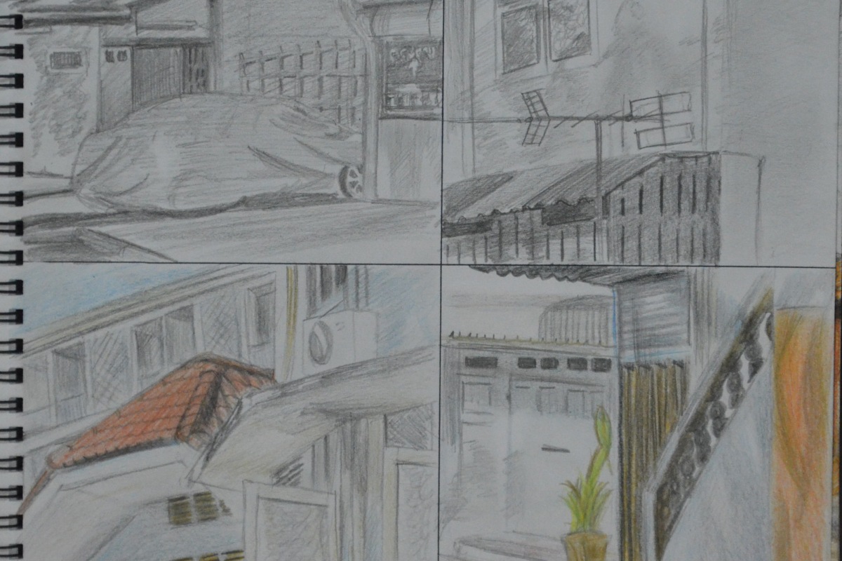
10 cm Squares Tonal and Detail Drawings with 3B and Colour Pencils
The brief for this exercise also instructed me to make a 10 cm drawing of a detailed part of the building and then another 10 cm tonal drawing depicting how the light falls across the building. I found it difficult to draw detail without drawing the shadows on the building and so I did two 3B pencil drawings and 2 coloured pencil drawings showing both. The drawings turned out rather like a comic strip.
Back of the Shops in 3B Pencil and Dry Watercolour Pencils
I have never liked the waxy feel of the Derwent colour pencils and so the next sketch was done 3B and dry water colour pencils. I really thought that this would be the sketch that I would use for the next exercise but when I finished it I wasn’t that satisfied that I could do that good a job with a limited palette and so did another drawing of the school this time in 3B and colour pencil.
Section of School in 3B and Dry Watercolour Pencils
I loved working on this which was a lot easier to draw than the very awkward shapes in the last drawing, which is why the final sketch looks a lot stronger and so i thought it was an ideal piece to reproduce in a limited palette for the next exercise.
What problems did you find in executing perspective drawings?
I thought I would fly through this project as I’ve always been quite good with perspective, having studied design and communication at school but I struggled with the Angular Perspective exercise and did quite a lot of line correction, mostly due to the irregular shape of the temple roof and getting that wrong threw everything out.
Another problem I had was lining the wall up at the side and to the front of the temple which was like drawing another level at the same perspective.
My biggest problem is trying to get everything perfect rather than trying to keep the right perspective while simplifying the drawings.
Make notes on the merits of using, or not using, rulers to guide you.
I think that using a ruler for me would have to be the final solution for a smaller drawing but maybe a necessity for larger drawings.
For smaller drawings taking your pencil from A to B without wobbling all over the place isn’t that difficult and once you have the basic shape of the subject it can be developed with some correction and modeled to almost perfection.
I feel that using rulers on the other hand for anything other than technical or larger drawings, for me especially, may lead to overworking the drawing and even more correction trying to find the right angles, right lengths etc.
When I first started this course I went upstairs to the third floor of my school for a bit of sketching practise and did a couple of drawings of the outside of the school building from the balcony. When this exercise came up it was a good excuse to get back up there as the school has a great view of the temple next door.
I actually completed this exercise well over a month ago but for the last couple of months I have been concentrating on drawing rather than my online log as Townscapes as been quite a long project for me with the irregular shapes of Thai architecture making this part of the course quite difficult but also very interesting.
So anyway it was the start of the cool season and clouds were getting less and less in the sky and the only chance I got to go out on the balcony was 1:30 pm and the sun was beating almost straight down.
Study of Townscape Using Line first Drawing
The first preliminary drawing took me a little over 25 minutes with a Rotring Tikky Graphic 0.3 and even though it was quite messy I felt that that could have been the final drawing for this study. And reminded me of a couple of the pen drawings in the Urban Sketching Handbook, particularly Singapore by Kampong Glam by Paul Heaston and Nanjing Fuzimiao by Frank Ching, the latter drawn in 30 minutes roughly about the same time as my drawing.
2 Study of Landscape Using Line 2nd Attempt
The second drawing took me from a flowing line drawing to something a bit more technical, with the first drawing everything flowed, I didn’t worry about the marks I was making and I wasn’t trying at all, with the second drawing I started to think about perspective the marks I was making the shapes I was drawing, negative space and everything went wrong. Instead of drawing objects I was familiar with I started to draw them like I was seeing them for the first time and everything went wrong. One of the biggest notable errors is the spire of the temple in the second drawing making it look like a Tibetan temple rather than a Thai temple.
Study of Landscape Using Line – Final Study
The final study was drawn from both of the preliminary drawings, using the temple from the first drawing and the school building from the second drawing every thing else was a mixture of both.
I never had any doubts about what I would use for the fore, middle and background but what lines and marks to use was always going to stress me out. This is the second time I have had to do line drawings in an exercise and the second time I have found it hard not to hatch and even though I know a degree of hatching was needed I know I went over the top with it.
For this exercise we were given a copy of the pencil drawing ‘Rome’ by Sir Muirhead Bone, a drawing that uses perspective to draw the viewers eye along the street to create a busy street drawing rather than an architectural drawing.
We were instructed to copy a simplified version of the drawing into our sketch books to check the accuracy of the drawing.
Well to do this I realized that on completion of my copied version of his drawing I wouldn’t be checking the accuracy of his drawing but actually the accuracy of my copied version so I did both. I always enjoy producing very rough sketches so I made use of this by producing a very rough reproduction of the original drawing.
Rome – Sir Muirhead Bone – My Version
I checked the accuracy of my drawing first and was unable to find any common vanishing points to obviously mine wasn’t that accurate at all.
Rome – Sir Muirhead Bone Pencil
On checking the original I discovered that it was very accurate with the baseline of the building, third floor window ledge and roof all sharing the same vanishing point which is probably the reason he is able to bring the viewers attention to the street.
For this exercise I decided to use the temple next to my school, that my school gets its name from ‘Wat Makut’, Wat meaning temple. Temple’ grounds usually contain several buildings including monks quarters…dorms or whatever you would like to call them, the cremation furnace, schools for teaching student monks and a host of other buildings. After a walk around the temple I decided to draw what I think is a school room as it had a blackboard outside.
The best thing about Thai buildings is that they are mostly right angles and so it’s quite easy to get the angles and perspective correct when drawing however the downfall is that Thai temples are really quite technical structures and there was a lot more right angles than I was hoping for.
I started out by drawing the roof and the windows and although I knew this was supposed to be an exercise using only line it did help to block in the windows and doors with solid shapes especially on the irregular shaped roof I also drew the wall at the side in the same way buy blocking in the square shapes in the wall and then erasing the solid shapes and going over the outlines again with just line.
Angular Perspective – Line Drawing
Although the drawing may look like I have used a ruler it was done completely freehand and it was by no means easy erasing and correcting every line in the drawing at least three times, and now and again erasing large sections of the drawing to start again. Getting things ‘just right’ seems to be my biggest weakness, it would have been a lot easier to do a tonal drawing of the building and I’m looking forward to doing so at some stage.
I marked on the drawing where I think the eye level is but I was sat on a chair outside the main temple building to draw it and I couldn’t really walk over and maintain the same level to check if I was correct. I thought I would have been able to do this at home but unfortunately the drawing fit too well on the paper and I couldn’t even check the vanishing points properly as the rings holding the paper wouldn’t let the ruler sit flat in order to draw the lines through to the other sheet of paper.
However from continuing the lines to where I think the eye level is it seems that the front of the building maybe slightly out which I can live with as I think I did quite well on this exercise. The drawing too me nearly three hours over two days and although the temperature here in Bangkok had dropped considerably over the last week the sun was still scorching hot.
I’m not sure whether I did the second part of this exercise correctly but with the very positive results of the second part of this exercise I chose not to change it and to leave it how it was.
Firstly the brief of this exercise was to draw an interior view through a door a doorway inside a building I chose to draw to draw the view in my apartment from the bedroom into the living room. I placed a rug in front of the doorway as instructed but thinking about it now I think I got the ‘wrong front’ with the rug in front of the doorway facing the other way.
I drew in line as well as tone, the main reason for this being that I found it quite difficult drawing straight lines without a ruler and using tone helped me to get the space right between the lines. I didn’t do much erasing and correcting lines as I was quite happy with the first attempt apart from the rug which seemed a bit wide. I realised afterwards that the reason why the rug seemed wide is because I made the door-frame wider than what it actually is and the negative space took the rug wider. This also meant that everything on the right and left of the door-frame was further apart but I didn’t think erasing and restarting was that much of an emergency so carried on.
Parallel Perspective – An Interior View
I live in a small 1 bedroom apartment in Bangkok with all the doors in irregular positions so the only real view I could draw was from the Bedroom into the Living room with the patio door into the kitchen on the right hand side, I didn’t think it would give me as many lines as it did but with the air-conditioning the open door and the patio door it gave me a great perspective.
Parallel Perspective an Interior View with Superimposed lines
When it came to the second part of this exercise the brief kind of confused me so the way I did things next probably conflicted with the brief in the coursework. I had a pack of gel-ball point pens in different colours. I used one colour to draw in the eye-level and then different colours for the groups of lines that met at different vanishing points.
I was very surprised by how accurate the angle of my lines were in the drawing I was also very surprised to to see which lines in the drawing met at the various vanishing points across the eye level line.
‘The aim of this exercise was to establish a foreground, middle ground and background in your drawing. If you can compose and structure your drawing to include these divisions you are then beginning to establish a sense of space in the structure of your drawing. This way of organising space is characteristic of the French classical painters Nicholas Poussin and Claude Lorrain, who in turn influenced the British landscape artist, Joseph Mallord William Turner.’
Now I had already had a glimpsed at some of Claude Lorrain’s paintings but one painting that really inspired me for this exercise was Frederic Edwin Church Heart of the Andes that I looked at in an earlier research point Different Artists’ Depictions of Landscape.
With the red shirts and yellow shirts kicking off here in Bangkok my school has been closed for 3 or 4 days every week for the last week, with them calling a truce just for today, the king’s birthday. Anyway with time off work we made the decision to go away to Sarabruri for a couple of days and so I decided to take my pencils, an A3 drawing pad and drawing board.
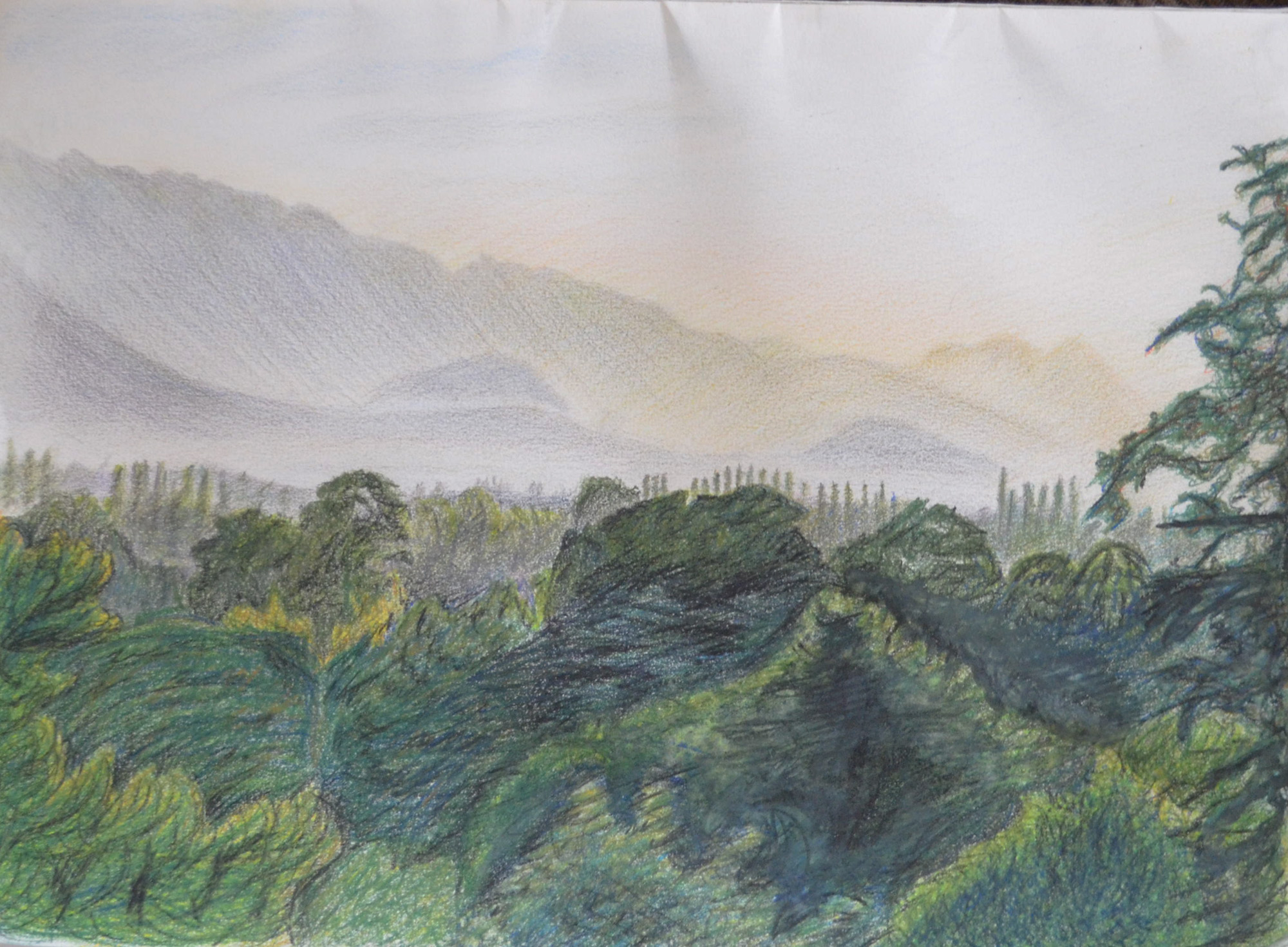
The view from our room balcony at Saraburi
The lodge where we stayed was overlooking some beautiful – what I would call – mountain shaped hills but when we arrived on the first day it was already knocking on so I set my alarm and got up at 6 am.
The mountains looked great with the mist glowing above and in front of them and I knew they wouldn’t look like that forever so I took a few snaps with the camera first and took a great shot, the one above, which was framed with a tree. Using my view finder I began to draw knowing that I could work from the photos later. I had decided to work entirely in Derwent watercolour pencil for the following reasons:
Less waxy than Derwent Artists’ Pencils
Easy to erase
Easy to blend
If I needed to I could use them wet
I decided to work from the background down to the foreground as I wanted to get the mountains and the sky just right, However I spent so long working on the mountains that the mist was clearing and I had to keep resorting back to looking at the photo on my Galaxy Tab.
1 – Mountains and Sky Backgrund
The second step was the middle ground, the mist had all but lifted by now but using the photo on the tablet as reference I blocked in the middle ground areas with a a blend of grey, violet and blue and then drawing in the trees in thew distance with a 2 shades of green and grey to depict the trees appearing out of the mist.
2 – Middle Ground Complete
Up until now everything was going well but I was about three hours in and so that I didn’t ignore the girlfriend I decided to finish off the foreground, frame the picture with a tree then finish the rest of the drawing off back home in Bangkok and too be honest I was a bit overwhelmed by how many trees I had to draw so needed a break anyway.
3 – Plotting Space through Composition and Structure – Watercolour Pencil Mostly Dry
When it came to drawing the big trees in the foreground I started by drawing the outlines of the trees in a lighter coloured pencil, then using irregular hatching for the branches from dark to light colours.
4 – Plotting Space through Composition and Structure – Sky finished
I noticed there is a project coming up called Drawing Trees, for me it would have been better to have done that first before this project as I have been drawing nothing but trees since A Sketchbook Walk and it has been a struggle. and this exercise was no different.
5 – Photo of drawing with no reflection
Due to me not using watercolour paper I refrained from drawing wet until I needed to and that was on the largest tree and three at the side that I framed the drawing with.
To be honest not much of this drawing turned out the way I wanted it to, background great, middle-ground great but then the foreground just changed everything and made the drawing look like some kind of dodgy cartoon. However I am not going to start again as I believe I have achieved the goal of this exercise which was to establish a foreground, middle ground and background in my drawing.