Masters of Detailed Drawing 1, 19th Century, Thomas Hartley Cromek

Study of Plants, Ariccia Watercolour, over traces of a pencil underdrawing.

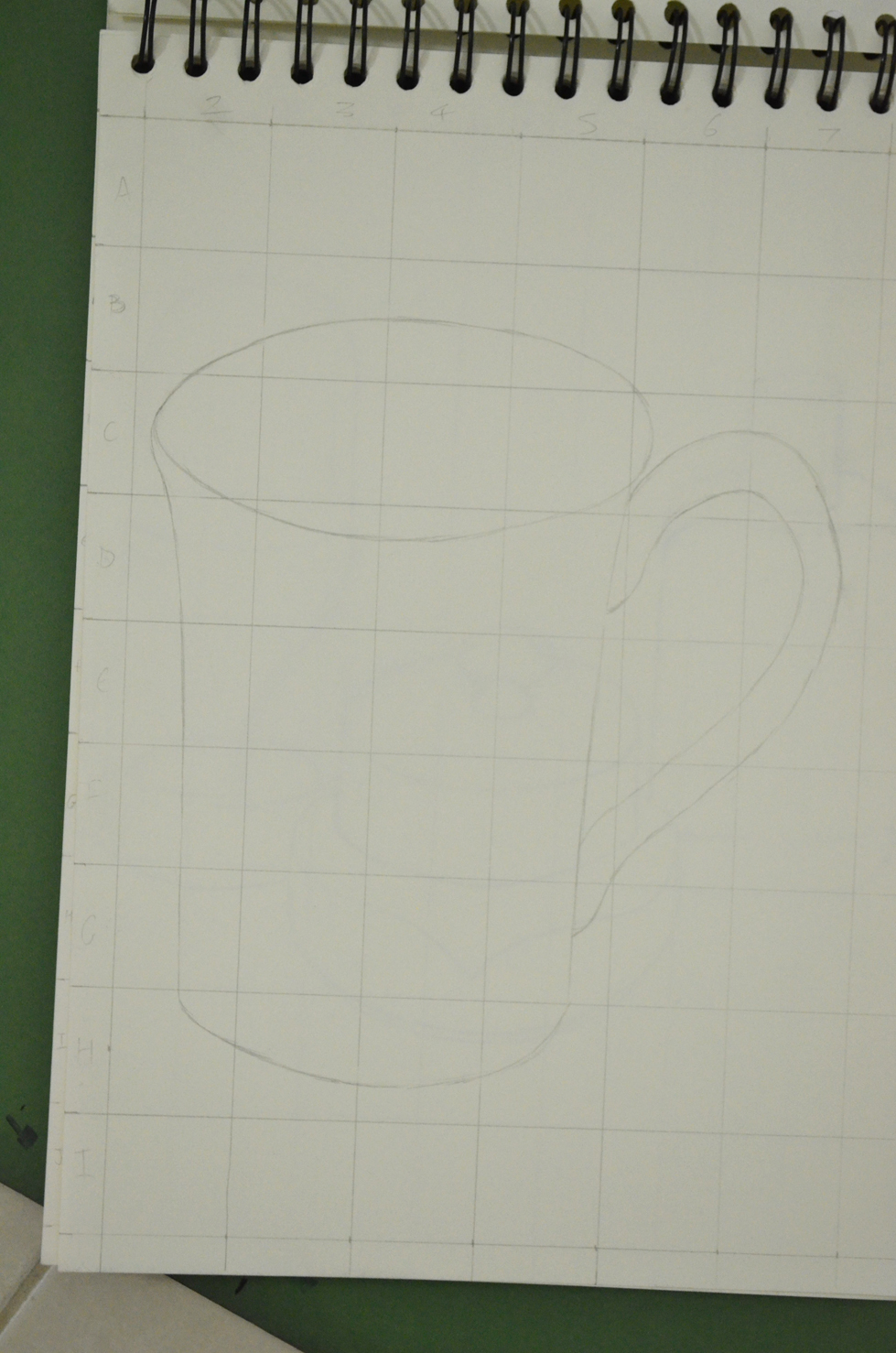
For this research point I was asked to find two artists who exemplify mastery of detailed drawing.

I used to have a reproduction painting site and am familiar with the works and lives of quite a few but since starting this course I’ve been introduced to new artists and new techniques so I thought I’d carry that on by typing in a few keywords on Google to see where they took me.

The first artist I found was a 19th century artist called Thomas Hartley Cromek and after seeing that his place of death was Wakefield, my home town, I made the decision to research this artist a little more.

Born in London in 1809 Thomas Hartley Cromek was the son of Robert Hartley Cromek the  engraver and art dealer who allegedly cheated William Blake out of potential profits. In his childhood he moved from school to school starting off his education at Enoch Harrison’s school in Wakefield and then onto the Moravian School in Fulneck. He then moved back to Wakefield to study at the grammar school there before returning to Harrison’s.

Thomas Hartley Cromek received his first art lessons from a Wakefield based portrait painter, James Hunter but then in 1826 he moved to Leeds study landscape painting under Joseph Rhodes, while studying in Leeds Thomas also taught himself anatomical drawing.

He travelled to Italy in 1830 to study the old masters and spent most of the next 20 years within the country mainly in Florence eventually reaching Rome where he attracted much attention for his ‘excellence in drawing and his careful colouring’ – Wikipedia. While in Rome he gave drawing lessons to several distinguished visitors including the British artist and poet, Edward Lear.

Between 1831 and 1849 Thomas Cromek spent most of his time drawing the major buildings in Rome as well as Greece but then was forced to leave Rome with the outbreak of the first Italian War of Independence.

There’s not much information about Thomas Hartley Cromek online about techniques, ideas, influences etc but I did find quite a few images.

Study of Plants, Ariccia Watercolour, over traces of a pencil underdrawing.
Study of Plants, Ariccia
Watercolour, over traces of a pencil underdrawing.

I found many of his works online but it was the drawing above that caught my eye and I thought it was quite relevant to this module. The drawing itself is only 7 1/4 x 8 1/8 in in size and yet his brilliant use of shadow amplifies the detail of the drawing. I enlarged this image on my computer to the size he would have worked at and was amazed how much detail he has got into such a small drawing with what I still regard to be a messy medium, for me that is anyway. He has managed to depict some very thin leaves and blades of grass and makes this picture seem a lot bigger than what it is.

THE TEMPLE OF ANTONINUS AND FAUSTINA, FORUM, ROME - WATERCOLOUR 18 1/4 X 13 INCHES
THE TEMPLE OF ANTONINUS AND FAUSTINA, FORUM, ROME – WATERCOLOUR 18 1/4 X 13 INCHES

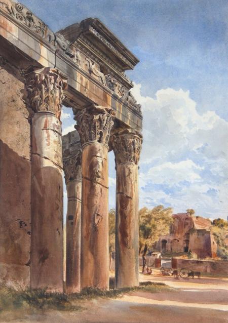
 Just like his drawing of plants and flowers his watercolour paintings of buildings such as the Temple of Antoninus above shows brilliant detail and colour as well as amazing shadows which really amplify the bulkiness of the stone structure.

Bibliography

Wikipedia

Stephen Ongpin Fine Art

A Street Art Page on Facebook Brought me Here

I was just browsing a street art page on Facebook when I came across a very normal photo of woman in her 40’s titled ’11 Portraits Of Life As A Post-Playboy Bunny’ and out of curiosity followed the link.

http://www.fastcodesign.com/1671411/11-portraits-of-life-as-a-post-playboy-bunny

It took me to a page with 11 photography portraits by Robyn Twomey who had attended a playboy reunion in Las Vegas. Interested to see how they looked in their later years and what kind of lifestyles they live now I flicked through the photographs. The following photograph jumped out at me.

1671411-inline-bunnies-114
One bunny, in her home, sits reluctant to be photographed between her son and dog. Robyn Twomley

At first glance I thought the boy behind her was a poster or painting set behind a curtain of a cartoon figure ready to shoot but then I read the caption underneath.

This is definitely a future project for me, to recreate what I thought I saw when I first looked at this photo.

Enlarging an Existing Image

Enlarging an existing image 1

For this exercise I drew a thumbnail drawing of my favourite coffee cup roughly 10 cm square in my small A5 sketchbook, which I’ve barely put to use so was good to fill a page or 2. Once I had finished the thumbnail drawing I drew a grid of 2 cm squares with an HB pencil over my thumbnail sketch.

Enlarging an existing image 1
Enlarging an existing image – A5 sketchbook

In my A4 sketchbook I drew 3 cm squares, deciding they were a perfect size for this object on this size paper, with a larger more detailed composition I would have probably needed smaller squares in both sketchbooks.

Enlarging an existing image - A4 Sketchbook
Enlarging an existing image – A4 Sketchbook

To make it easier for myself to identify which squares I would be drawing in I labelled the squares with letters down the left hand side and numbers across the top. However the drawing was quite low in my A5 sketchbook so in my A4 sketchbook I started at B instead of A lifting the drawing up 1 square.

Enlarging an existing image using grids
Enlarging an existing image – side by side

I loved this ‘Enlarging an Existing Image’ exercise, it was like piecing together a jigsaw puzzle but a hell of a lot easier and as the squares weren’t that big quite easy to judge where  a line curves or which point of the grid they would meet. Admittedly I did do a little bit of rubbing out with an eraser but not that much.

My New Sketch Book and Silpa Bhirasiri of Silpakorn University

New Sketch Book with Silpakorn Bhirasri on the front cover

My old sketch book got full quite quickly so I needed to buy a new sketch book to finish the first part of my drawing 1 course. I wish I new more about what paper to choose gsm/tooth etc, there were a few expensive sketchbooks in the art shop, so I expect the quality was probably top notch but they were sealed and there wasn’t that much information on the wrapping. In the end I settled for a cheaper A4 sketch book with a lot of tooth, it said smooth on the front but doesn’t feel smooth to me.However the reason why I chose this sketchbook in particular was of the photo of Corrado Feroci on the front cover.

New Sketch Book with Silpakorn Bhirasri on the front cover
Silpakorn Bhirasri on the cover of my new Sketch Book

Here’s a short biography of his life:

Corrado Feroci was born in Florence Italy in 1892 and was a sculptor who worked mainly in Thailand after being invited to the kingdom in 1923 to teach western sculptor at the Fine Arts Department of the Ministry of Palace Affairs. Corrado later founded the Silpakorn University (the University of Fine Arts) in 1943.

After Italy surrendered to the allies in 1944, he changed his name to to Silpa Bhirasiri and became a Thai national to avoid being arrested by the occupying Imperial Japanese Army. While in Thailand he married his second wife, one of his Thai students.

Rama I Statue at Memorial Bridge
The Rama I Statue at Memorial Bridge

If you have ever been to Thailand and travelled around the Bangkok streets you will see several of Silpa Bhirasiri’s works including the Democracy Monumenty, the Victory Monument and the Statue of King Rama I at the Memorial Bridge at Saphan Phut.

Democracy Monument by Silpa Bhirasri Bangkok

His photograph on the front helped me choose the notebook, I’d previously bought colour pencils and watercolor pencils by the Thai brand Masterart which weren’t so great,  but I had not so long ago read about Silpha Bhirasiri and knew he was the founder of Silpakorn University so knowing that the university had endorsed the brand for this product I had faith in what I was purchasing.

To be honest my sketchbook hasn’t been that organised so far but I made a promise to myself on purchasing this new book to get things in order for my first assignment.

Research Point – Patrick Caulfield (Part 2)

drawing in the style of in the chair that I would patrick caulfield

The brief for this was to make a drawing in a similar style to Patrick Caulfield White Ware screen prints, it wasn’t that easy. I decided that I wasn’t going to keep looking at his images so after I finished my part 1 of this research point, researching him, I thought I could remember enough about his prints and paintings to work in a similar style.

I decided to work on an A2 sheet from my larger sketchbook which is too big to work with felt tips and I wanted to show as little pen or brush strokes as possible so I went out and bought some Kurecolor graphic design markers, which were very expensive but well worth the money.

I used the vase that I used in an an earlier exercise ‘Study of Light Reflected from one Object to Another’ and placed it in the chair that I would usually sit in to do my work. I wanted to shine a more acute light on my subject so instead of using the bendy light that I used before I used a torch that I got free from the local western supermarket. I knew that the batteries in the torch wouldn’t last that long so I turned all the lights off found the right angle for the torch to shine at and took a photo, then I worked completely from the photo.

drawing in the style of in the chair that I would patrick caulfield
Photo with Torch, vase and Chair

I started by drawing the shadow on the vase, then instead of using white I used colour for the other half, I purchased the markers day before but I swapped vases so the colour did not match but I wasn’t worried about that, I just wanted to know if I could draw something in the similar style as Patrick Caulfield, I highlighted the light reflected from the vase vase by leaving those areas blank.

drawing in the style of in the chair that I would patrick caulfield
Drawing after first Two Colours

I used grey for the light that spread from the torch beam as I had I didn’t want the drawing to be completely dark and I had seen Patrick Caulfield also use grey in his paintings, this paid off.

drawing in the style of in the chair that I would patrick caulfield
Finished drawing

I cut down on the detail in my drawing and over exaggerated the detail that was left, after adding colour to the vase shadows and foreground I stopped looking at the photo and worked completely from memory hence the various differences like the position of the door handle  and seams in the chair positioning where I thought they would look best rather than where they should be.

I was really happy with the finished drawing and even though it doesn’t resemble any 1 particular Caulfield style of painting you can tell he is the inspiration behind it.

Making Marks – 5 Line and Other Marks

The object of this exercise was to draw lots of 5 cm squares in my sketchbook and fill them using pencils and pens practise several different marks in each square, thinking about intensity, texture, smoothness, pattern, length and repetition.

Now after reading the words ‘practise several different marks in each square’ there was a danger of either turning this exercise into another ‘Doodling’ exercise or making the squares look like swatches for a textile course. I wanted to avoid both so I looked a few different existing OCA Drawing 1 blogs to see how others had tackled this exercise.

The benefits of other students having their blogs online is that you can see how others have gone about completing each exercise, the drawbacks of this is that one can go look at someone’s blog and then feel a little bit restricted for risk of going too close to someone else’s work; but then it does force uniqueness or at least it did with me.

The materials I used for this exercise were, pencil, coloured pencil, bic, water soluble pencil, solid graphite pencil and graphite sticks as well as charcoal, Chinese ink, nip pens, marker, whiteboard marker, ArtLiner drawing pens and Chinese white pencil.

Line and Other Marks, Pencil, Bic and Colour Pencil
Pencil, Bic and Colour Pencil

I found that I used the HB pencil a lot until I came out of my comfort zone, it’s a tool that’s easy to rub out if I’m not happy with what I’ve done but then I realised at this stage I should allow for going overboard or getting sloppy as it is those little mishaps that will help me ‘learn’. I also found that I kept going back to shading and the hardest part of this exercise was trying not to repeat anything I had done in earlier exercises.

As I tried to move onto different media I kept realising that there were still other marks that I could do with pencil. Holding the pencil in different ways and at different angles gave me different effects, holding it in a writing position I created smooth, strong lines while holding it at the end gave me uncontrolled, sometimes smooth but then sometimes rough lines, depending on the direction I took.

Creating patterns through repetition was not only great for conveying a feeling of depth but was a good transition point to help me to move on to using other media, otherwise I could have been there all day (just a figure of speech, this actually took me three evenings).

DSC_0276
Pencil, Drawing Pen, Charcoal, Graphite, Nib Pens and Ink

With the size of the squares (just 5 cm) I spent a lot of time practising on large sheets of paper not having the confidence to go straight into my sketchbook with the softer mediums such as charcoal and the messier mediums like ink.

Nib Pens – This time I had a lot more confidence with nib pens knowing exactly how much ink to put on them and how to ‘put pen to paper’ and what direction is best with each nib to give me different lines. I used two different nibs, 1 Italic which was nice and smooth and 1 very fine nib which was very scratchy and didn’t feel that comfortable with but it was great for doing the Khmer style marks in the third photo.

Trying New Media

Too be honest I wasn’t that eager to move onto other mediums, but once I did, I really started to enjoy myself. I was limited to what I had, it might take me forever to find a descent quill in Bangkok, but a walk in the communal garden on the 5th floor got me a leaf and a stick.

The new media I used for this were watercolour pens, water soluble coloured pencils, water soluble graphite pencils, coffee, drawing ink, hard pastels, oil pastels as well as wax crayon, solid graphite sticks, UHU glue, liquid paper and a Derwent Chinese white pencil. I also used several different drawing tools including a scrunched up tissue, nib pens, a stick, a leaf, a toothbrush and a straight razor plus a couple of new techniques such as drip drawing and washing over several of the new mediums with water and a fine brush.

DSC_0273
Trying Other Media, Glue, Leaf, Stick and Straight Razor

It took me a good few squares to really get into this but my hunger for new mediums really started when I drew with the stick dipped in Chinese Ink, with just one stroke of the stick I made both thick strong lines and thin whipping lines which were both chaotic and rhythmic.

I had the idea of washing coffee over UHU glue while I was at  the gym for some strange reason but I’m glad I did. I could have created many different patterns by doing this and practised a few times on large sheets of paper but the easiest one given the size of the square was the swirl which created a wonderful blended effect.

123 uhu
Coffee washed over UHU glue with a fine brush

Even after practising on large sheets of paper when it came to repeating it in the squares on my sketchbook I still messed up. The solution to this was either cut the successful practise from my large sheets and glue it into the squares or to try and make something else of it. When I tried brushing sideways with the toothbrush dipped in drawing ink I got nothing but a large dark grey surface, determined to get something out of this I attacked the surface with a straight razor. The result of this was very raw but it is something I can use later.

DSC_0277
Pastels, Coffeee, Watercolour pen, Cotton Bud and Wax Crayon

I got some great results washing ink over wax crayon and in some ways it looked like the negative of a drip drawing which I also successfully pulled off in both ink and coffee.

I also really enjoyed the watercolour pens that I have been using as felt tips which gave me some great oil type patterns when drawn with on a wet surface, and drawing with liquid paper over mixed coloured felt tip lines produced very dramatic white lines.

Chinese White on Black Pad

This was a quick sketch to christen my new black pad.The raven is my favourite animal and I wanted to know how it would look drawn on black paper with a Derwent Chinese White colour pencil. I completed the sketch in about 40 minutes (with distractions) and I would have rather have drawn this without the moon  but without it it wasn’t recognisable as a and kind of bird. I have a feeling that this pad will be filled with crows by the time I’m finished.

blackpad1

Hell’s Bells – A Practise Using Coloured Pencils

I have been wanting to create this image for the last year after seeing a statue of Mary on the TV and thinking that it had a similar shape to bottle of whisky. Originally it was planned for acrylic on canvas but after using colour pencils on the last exercise ‘Mark Making Techniques’ I decided to get it down on paper in coloured pencils while it was still fresh in my mind.

However, due to what I think is probably the standard of pencils I am using I had to press very hard on the paper to get the shadow in some spots removing some of the surface. I think it maybe would have been a better idea to produce this sketch in watercolour pencils.

DSC_0231
Hell’s Bells – colour pencil on paper

I began by sketching it with pencil and then rubbing out the lines as I swapped them for a very light tan colour pencil and then started on the lighter tone. My only regret really is that I didn’t make the bottle longer, rather than cutting it shorter like I did, although it is still recognisable as a bells bottle the figure would have looked better with a longer bottle.

My weaknesses with colour pencils at this stage are completing the details such as the writing on the bottle, I made a total mess of the 8 at the bottom of the label but liquid paper came in very handy.

Overcoming my Fear of Colour Pencil Sketches

I’ve always stayed away from colour pencil sketches, I’ve always produced graphite pencil sketches and then put the best ideas on canvas but since starting this course I’ve realised that there’s more to art than just paint. After completing the ‘Mark Making Techniques‘ exercise I decided that I should spend more time using other mediums and so I decided to start by making a coloured sketch from a photo of a girl with red hair from one of my Facebook likes.

Everything was going great until I got to the lips when I gave the girl, who was supposed to have inviting full lips a pair of camel lips which ruined the whole sketch. Anyway I plodded on to finish the sketch which was in a bit of a state by now but I was determined to learn something from it, the first lesson I learnt was that I should have done this in my large sketch book, not my 6 x 9″ sketch book.

DSC_0218

Realising that messing up the lips on a portrait can ruin the whole thing and when you are working with media that is difficult or impossible to erase that can be drastic, I used this as an opportunity to not just practise drawing lips but to practise drawing using coloured pencil. I did a number of sketches starting off drawing the outlines in graphite pencil then colouring in until I got confident then I produced further sketches using 100% colour pencil using techniques such as hatching, cross hatching and point shading.

Sketch Book

As the kettle started to boil I thought I would test myself to see if I could start to draw the coffee cup on the table and then finish sketching it after it had been moved and then put back in the same place. But as I began I realised that I had never been successful in drawing the delicate rim of a coffee cup but this time I was armed with a new technique. I lightly sketched the outline of the cup, hatched around the outside and inside the cup then took out the edges of the object with an eraser.
DSC_0169Drawing wood has never been my forte but taking advantage of my position as a teacher in a Thai temple school I sat down to sketch the ideal wooden object to overcome this.

DSC_0170As my Thai students copied the oral test questions off the white board I found the perfect opportunity to practise drawing the head of a Thai child. The boy kept lifting his head up and down to browse the board which just added to the challenge however I will be finishing this off another time as certain features such as balloon lips and the uniquely shaped heads of Thai people are not something that I can finish off from memory. I would like to recreate this drawing again on large paper using colour.

DSC_0172