For this exercise I was to select an object with interesting detail such as a sliced through red cabbage or a fir cone. Then on a sheet of A4 paper create a line drawing of the object that I set up, taking time and effort to really look at the patterning, thickness of line, texture and shape of the overall composition. The brief also said that I was to position the drawing well on the paper and fill the paper effectively with a continuous line drawing and no shading which is what I TRIED to do…
I made a few attempts at this with two different subjects, both of which were green peppers but in the Bangkok heat they go off pretty quick. With the first pepper every attempt was a continuous drawing with minimum detail, I used the thick nib of a double tipped felt pen and although the subject fit well on the paper, I didn’t give it a strong enough light source to pick up all the detail and too be honest the finished drawings at that line thickness all looked somewhat pathetic.
Exercise – Line Drawing Detail First Subject
I gave it a week with another exercise in between before I had another go at this exercise. Visually the drawings with the second subject look a lot better, I used the finer nib of the felt pen and this time after I completed what I could do continuously without taking my pen off the paper I decided to add the detail which were the ribs on the inside of the pepper that I could see from wisely using a light source this time.
Exercise – Line Drawing Detail Second Subject – Image A
I probably did go a bit overboard and it does look like I have had a go at shading the object but this is all down to the closeness off the lines on the inside of the pepper. However I am quite happy with the results.
Exercise – Line Drawing Detail Second Subject – Image B
The thing that I am not happy with however is the positioning on the paper and how much space I left to the sides and underneath it. When drawing an object such as a pepper with a very irregular shape I think it’s best if you know where to start, in Image A above I started at the core just above the seeds. With Image B I started at the tip of the stem Starting near the center of the image was better with this object but that would differ with something like a cabbage.
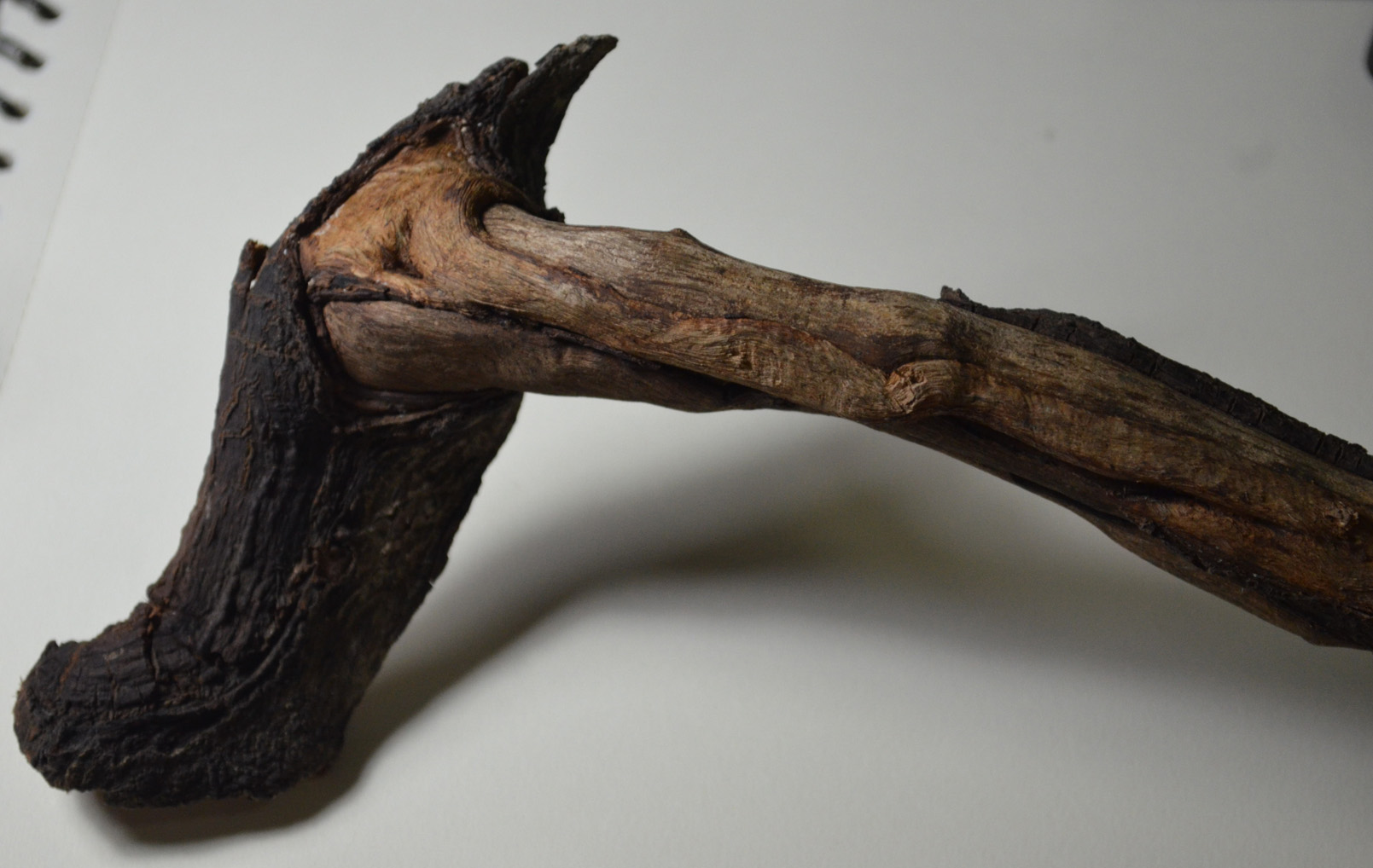
In this exercise I was to practise building up dark medium and light tones principally using pencils and hatching and cross-hatching techniques. I was to select a single object such as a shell or piece of driftwood and get a varied effect by combining soft and medium grade pencils as well as altering the direction of the strokes I make. The brief also informed me that this exercise would be time consuming and indeed it was. I used a smooth sheet of A3 Canson paper and 2B, 3B, 4B, 5B pencils to complete this exercise as well as a putty rubber for the highlights which I used quite often to lighten strokes that were too dark as I made my way through my chosen subject. Living in Bangkok has it’s downfalls especially when taking a drawing course but I’m very lucky to have a small park with some very exotic trees in front of the primary school that I teach at. I found a small branch that had fallen or been broken off one of the trees a few weeks ago that reminded me of the hammers in Pink Floyd the Wall with patches of bark still on it and some really nice contours, so I decided to use it for this exercise.
My subject for this drawing exercise, a tree branch
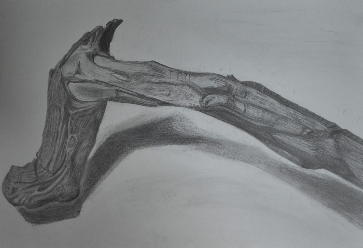
I started on the end that I knew would be the most difficult to try and reproduce with pencils, the tree bark, going over it first hatching with a 2B pencil then, 3B, 4B and 5B to get the darker tones. I know the brief said use hatching and cross-hatching on this exercise but I threw everything I had at it, including stippling, squirkling and dashes and I think I depicted the surface of the bark quite well. Unfortunately my photographic skills aren’t that great and the photo of the finished drawing is not as great as the drawing itself.
Getting Tine and Depth in Detail 1
The area that I thought would be the most difficult was actually the easiest, to depict tone on the areas of stripped branch with soft bare wood was the most difficult, but one thing it did teach me was to be more fluid with my drawing and for the first time ever I loosened up.
Getting Tine and Depth in Detail 2
I know there are flaws in the finished drawing, the shape is wrong in certain places and the shadow isn’t brilliant but there are parts of this drawing that I am really proud of namely the bark area which reminds me of a ‘bio’ tattoo for some reason. In fact I think the finished piece reminds me of an anatomy drawing and while I was working on it I kept thinking of the Marco Evaristti drawings of parts of suicide victims that I saw during my first visit to the national gallery. Overall I think I did quite well in this exercise, my tutor told me I should be more fluid and I think I managed it while working on this exercise. However, one thing I do have a problem with is drawing the very dark tones on a textured surface such as this which is something I will have to work on.
For this research point I was asked to find two artists who exemplify mastery of detailed drawing 1 from the 19th century or earlier and a modern artist. I already researched the 19th century artist Thomas Hartley Cromek in ‘Masters of Detailed Drawing 1, 19th Century, Thomas Hartley Cromek‘ and it was now time to find a Modern artist. Again I wanted to find an artist that I wasn’t familiar with so I started my search on Google looking for British artists of the 20th century. A list of names of British artists came up on Wkipedia so I went down the names looking at their work 1 artist at a time.
I came across the name Eliot Hodgkin, a name that I was very familiar with but I’m not sure from where so I took a look at his work to see if I recognised any of his paintings. I had never seen any of his paintings before but what I did see was truly inspiring and perfect for this part of the course. With the image below Large Leaf 2 particularly catching my eye as near my school there are some very similar large leafs that I would love to draw for this part of the course.
Eliot Hodgkin Large Leaf 2 Tempera on Card
Curwen Eliot Hodgkin was an English painter born into a Quaker family in Purley-on-Thames on 19 June 1905 and was the cousin of abstract painter Howard Hodgkin. Eliot Hodgkin was educated at Harrow School but his artistic life began at the Byam Shaw School of Art and then at the Royal Academy Schools where he studied under Francis Ernest Jackson.
Eliot Hodgkin Seven Brussel Sprouts
Hodgkin had already established himself as a still life and landscape painter by the mid-1930s and regularly exhibited at the Royal Academy. In 1937 Hodgkin started working in egg tempera a recipe that was given to him by his close friend and former teacher Maxwell Armfield.
Hodgkin stated that he wasn’t attracted to tempera as a medium as it was used by Italian primitives and their work did not do anything for him, he simply used tempera as it was the only medium that allowed him to express the unique character of the objects that fascinated him.
Hodgkin said that his conscious purpose was to ‘show the beauty in natural objects’- that people would usually think unattractive such as ‘Brussels sprouts, turnips, onions, pebbles and flints, bulbs, dead leaves, bleached vertebrae, an old boot cast up by the tide.’
When i did a search for his paintings and saw his work the first thing that went through my mind was how beautiful his paintings were and yet his compositions are so very simple. I have heard of tempera before but as far as I know I have never seen anything painted in it until now and I knew at firs glance that they were painted in a medium other than oil or acrylic.
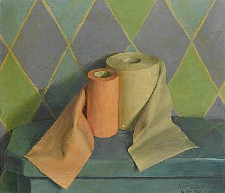
He depicts the texture of his objects wonderfully and his paintings are so crisp and life-like but still he manages to express them in a way that makes u aware of the beauty of these objects for the first time with wonderful contours and a brilliant balance of light and dark tone, whether it be a dead leaf or a toilet roll.
Toilet Rolls Eliot Hodgin
Like Eliot Hodkin Says ‘ People sometimes tell me that they had never really ‘seen’ something before I painted it, and I should like to believe this… For myself, if I must put it into words, I try to look at quite simple things as though I were seeing them for the first time and as though no one had ever painted them before.’
For me I agree with others that to see these objects in his paintings is to ‘see’ them for the first time with detail and beauty that you would never notice before. Hodgkin really makes you notice every part of the object, every leaf, every crease and every pattern on the objects surface.
For this research point I was asked to find two artists who exemplify mastery of detailed drawing.
I used to have a reproduction painting site and am familiar with the works and lives of quite a few but since starting this course I’ve been introduced to new artists and new techniques so I thought I’d carry that on by typing in a few keywords on Google to see where they took me.
The first artist I found was a 19th century artist called Thomas Hartley Cromek and after seeing that his place of death was Wakefield, my home town, I made the decision to research this artist a little more.
Born in London in 1809 Thomas Hartley Cromek was the son of Robert Hartley Cromek the engraver and art dealer who allegedly cheated William Blake out of potential profits. In his childhood he moved from school to school starting off his education at Enoch Harrison’s school in Wakefield and then onto the Moravian School in Fulneck. He then moved back to Wakefield to study at the grammar school there before returning to Harrison’s.
Thomas Hartley Cromek received his first art lessons from a Wakefield based portrait painter, James Hunter but then in 1826 he moved to Leeds study landscape painting under Joseph Rhodes, while studying in Leeds Thomas also taught himself anatomical drawing.
He travelled to Italy in 1830 to study the old masters and spent most of the next 20 years within the country mainly in Florence eventually reaching Rome where he attracted much attention for his ‘excellence in drawing and his careful colouring’ – Wikipedia. While in Rome he gave drawing lessons to several distinguished visitors including the British artist and poet, Edward Lear.
Between 1831 and 1849 Thomas Cromek spent most of his time drawing the major buildings in Rome as well as Greece but then was forced to leave Rome with the outbreak of the first Italian War of Independence.
There’s not much information about Thomas Hartley Cromek online about techniques, ideas, influences etc but I did find quite a few images.
Study of Plants, Ariccia Watercolour, over traces of a pencil underdrawing.
I found many of his works online but it was the drawing above that caught my eye and I thought it was quite relevant to this module. The drawing itself is only 7 1/4 x 8 1/8 in in size and yet his brilliant use of shadow amplifies the detail of the drawing. I enlarged this image on my computer to the size he would have worked at and was amazed how much detail he has got into such a small drawing with what I still regard to be a messy medium, for me that is anyway. He has managed to depict some very thin leaves and blades of grass and makes this picture seem a lot bigger than what it is.
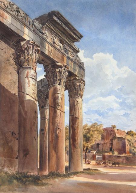
THE TEMPLE OF ANTONINUS AND FAUSTINA, FORUM, ROME – WATERCOLOUR 18 1/4 X 13 INCHES
Just like his drawing of plants and flowers his watercolour paintings of buildings such as the Temple of Antoninus above shows brilliant detail and colour as well as amazing shadows which really amplify the bulkiness of the stone structure.
Which of the media you have experimented with did you find the most expressive?
From experimenting with the different colour media in this exercise I would probably say at this stage that the oil pastel is the most expressive. Oil pastels seem to allow more sketchy fluid strokes and seems to work well with all the techniques that I have practised so far.
Which medium do you think lends itself to more detailed work?
From what I have seen so far I would say coloured pencils as well as ball point pen but then again I do not think I have worked with nib pens and ink enough at this stage to dismiss these as a medium for more detailed drawings
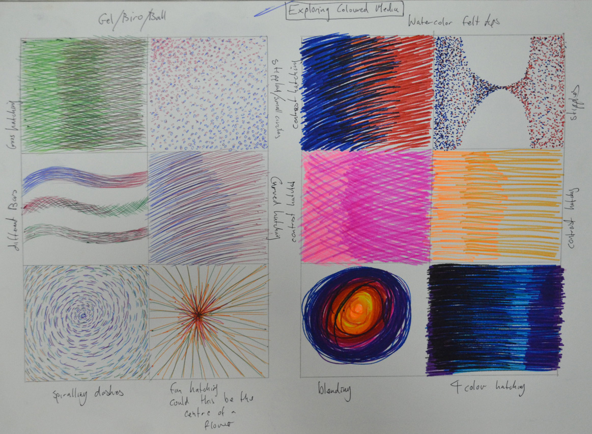
In this exercise I set out to explore the different coloured mediums I had available which included oil pastels, soft pastels, felt tips, markers, different coloured inks and dip pens as well as coloured pencils and a pack of coloured ball point pens. Just like I did in the Making Marks Project in Part 1 I decided to go at this project using a mixture of doodling and filling in squares with different techniques.
Coloured Pencils
I started out with coloured pencils I had recently bought some Derwent coloured pencils for the composition development of assignment 1 but have yet to discover their full potential. I began by putting together a rough colour wheel based on one that I found online to see how the colours would blend together, there are much more possible colour variations to be had from blending this medium but it gives me some idea and will help me in the future.
exploring coloured media – Coloured Pencil
In the squares i tried different hatching techniques such as cross hatching and horizontal hatching. some techniques work better with this medium but I think all can be utilized in a drawing and this gives me some idea of what each technique can be used for,
exploring coloured media – Oil Pastel
Oil Pastels
With the oil pastels I decided to do some experimenting by doodling just to get a better feel for this medium as I know I will be using them a lot later. I found that they were quite good forstippling and leave a lot more colour on the page when stippling than coloured pencils which weren’t great and found myself drawing circles with them. They were also really good for hatching but can also be smudged quite well, so all in all a very versatile medium.
exploring coloured media – Soft and Hard Pastel
Soft Pastels
At the start of the course I bought some soft pastels but haven’t really used them until now. I hadn’t noticed that they were a portrait set so I didn’t have much choice of colours, however I did enjoy working with them. They were very good for stippling and hatching and depicted tone very well, in one box I did some stippling and then smudged over the top and was rather pleased with the result.
Hard Pastels
I’ve used these a couple of times now in both the Study of Light Reflected from one Object to Another exercise in part 1 of this course as well as in my finished piece for the Natural Forms part of Assignment 1 but yet still have to discover their full potential. Hard pastels are great for hatching and smudging as well as layering. They are also quite expressive when using certain techniques and they blend very well.
exploring coloured media – Ball Point and Felt Tip
Ball Point Pens
I bought a cheap pack of Staedtler coloured ball points that were in a sale in a local art/book store and tried out different techniques, now I know from the work I have seen of other artists in ball point that they are a great medium to use, however techniques have to be improved, when hatching they seem to work better when you lift the pen off the paper towards the end. I get a feeling they are probably better for small pieces rather than large drawings.
Felt Tip Pens
The felt tip pens that I have here are not a normal felt tip but a watercolour pen, I didn’t know they existed, the colours are very vivid and seem to better when used for darker images. Stippling is great with this medium but when hatching they tend to clot on the paper towards the end of the stroke so like the ball points I found that they work better if you lift your pen off the paper towards the end of the stroke. These watercolour pens also blended quite well, I have yet to try out normal felt tip pens but shall be doing so quite soon.
exploring coloured media – Markers and Dip Pens/ Coloured Inks
Markers
I used markers for the Patrick Caulfield Research point but only used them in blocks of colour, I really enjoyed using them just as I did in this exercise. They were brilliant for stipling and hatching and depicted tone very well, I also filled a square with hatching using both the pointed nib and the chisel nip and found it to be very expresive. Again they tend to clot but not as much as the felt tip and I found that that they are probably better for darker drawings.
Nib Pens and Coloured Inks
This is a medium that I am still struggling with I have a good few Ecoline colours to play around with and have been experimenting with different papers but I think my nibs are letting me down, I shall be investing in some quality nibs very shortly. However, i did get some decent results this time. Starting off with a bit of doodling I got used to the feel of the pen on the smooth paper in my A5 drawing book then did some stippling and hatching. I get the feeling that it is best to let the inks dry before using other colours. I found that they were great for stippling on the smooth paper but then on water colour paper not great at all the same went for hatching. This is a medium that I want to see myself using more of as I love pen and ink drawings so it is going to be worthwhile exploring this medium more deeply.
My tutor suggested that I should look at the works of Antonio López García a Spanish painter and sculptor known for his realistic style. As usual I started my research by popping onto Wikipedia to see if I could find some valuable keywords that could take me elsewhere and seeing that he is still alive I looked on YouTube to see if I could find a documentary or interview and i found a small part of an interview here.
It’s not only good to hear the artists voice but it’s also good to check any contradictions.
Antonio López García was born into a farming family in Tomelloso 1936 and was probably expected to carry on the family tradition as a farmer until his uncle, Antonio Lopez Torres a local landscape painter took an interest in his drawing when he was 13 years old.
As he says in his interview “…at 12 and 13 he didn’t pay much notice of me, I did the kind of drawings that all children do and he didn’t pay much attention to me…at 13 he saw something that made him intervene. He told me not to copy illustrations, that this was not good and I should do things directly from nature”
Antonio moved to the Spanish capital in 1949 to study so that he could qualify for entrance to the Real Academia de Bellas Artes de San Fernando, which he did and won a number of prizes while studying at the school from 1950-1955. While attending the school he met his future wife and several friends who would later form a realistgroup together in Madrid. In 1955 he won a scholarship which enabled him to travel to Italy where he studied paintings from the Renaissance.
From the moment i saw the examples of his works that my tutor sent me I realised why my tutor suggested that I look at this artist. Facebook can be a bit of a demon sometimes and since I started this course I’ve been receiving regular posts from various hyperrealism pages which I think have had a big influence on my finished pieces. As a painter I seem to follow a more surrealistic path but this course has taken me in a very different direction. However the negative side of this like my tutor says is that I tighten up while working on the finished pieces.
Antonio López García was regarded by the critic Robert Hughes to be ‘the Greatest Realist alive’ with his style sometimes deemed hyperrealistic and yet his works are still very fluid, something that my drawings lack at this time.
López García has devoted himself to creating images of everyday subjects such as buildings, plants, his bathroom and even the red brick wall in his backyard but then he expresses them in such away that make them both beautiful and captivating.
As the artist explains, “the pictorial nucleus begins to grow and you work until the whole surface has an expressive intensity equivalent to what you have before you, converted into a pictorial reality.“-Wikipedia
At this time I can genuinely say that I can see this artist having an influence on my future work especially now i have discovered new mediums and I am beginning to develop my drawing skills. I have had very similar ideas from time to time but lack of skills and knowledge of mediums have prevented me from putting my ideas on canvas or paper. Two of his works that particularly stand out to me at this time are ‘Antonio López Torres’ House, 1972-75’ which my tutor sent to me in the sample of his works and ‘Sink and Mirror, 1967’.
Antonio López Torres’ House, 1972-75Sink and Mirror, 1967
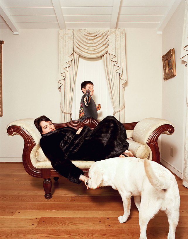
I was just browsing a street art page on Facebook when I came across a very normal photo of woman in her 40’s titled ’11 Portraits Of Life As A Post-Playboy Bunny’ and out of curiosity followed the link.
It took me to a page with 11 photography portraits by Robyn Twomey who had attended a playboy reunion in Las Vegas. Interested to see how they looked in their later years and what kind of lifestyles they live now I flicked through the photographs. The following photograph jumped out at me.
One bunny, in her home, sits reluctant to be photographed between her son and dog. Robyn Twomley
At first glance I thought the boy behind her was a poster or painting set behind a curtain of a cartoon figure ready to shoot but then I read the caption underneath.
This is definitely a future project for me, to recreate what I thought I saw when I first looked at this photo.
How successful were you in copying the lines from the smaller squares to the larger squares?
I thought I was very successful indeed however even though I enjoyed this project and was almost to perfect the enlarged image I can see where things can go wrong especially on curves over a line of the grid.
Are you satisfied with your larger replica of the image? What would you differently next time?
I am very satisfied with the however maybe I would divide the grid up in to smaller squares on the larger image which would make it a lot easier.
Frottage was invented by Max Ernst in 1925. Find out more about how Ernst and others used this technique.
Born in Brühl in Germany in 1891 to a middle-class family Max Ernst was a German painter sculptor and graphic artist as well as a poet. Max’was inspired to take up painting by his father who was an amateur painter and had an interest in painting and sketching and nature.
Max enrolled at the University of Bonn in 1909 where he studied Philosophy, art history and literature as well as psychology and psychiatry during this time he visited asylums and developed a fascination for the art of mentally ill patients. He became an artist in 1911 and was influenced by the works of Pablo Picasso, Vincent van Gogh and Paul Gauguin.
Max Ernst’s early life was interrupted in 1914 by World War I when he was drafted and served on the Western and Eastern Front. Max was devastated by the effects of war and in his biography he wrote: “On the first of August 1914 M[ax].E[rnst]. died. He was resurrected on the eleventh of November 1918.” – Wikipedia. While on the Western front he was assigned to chart maps for a short time which allowed him to continue painting. World War I was a sad time for the expressionist movement with many of the expressionist artists dying in the trenches.
I recently watched two documentaries about the German Expressionist Movement, BBC’s ‘Art of Germany – In the Shadow of Adolph Hitler’ and ‘Degenerate Art, The Nazis vs. Expressionism’ a 1993 documentary which were both very interesting.
At the end of the war in 1918 Max returned to cologne and started the Dada movement in 1921, he is known as the pioneer of the Dada movement and surrealism.
In 1925 he invented frottage and developed it as a graphic art technique. Ernst got the idea after observing a washed-out wooden floor in his hotel in France on one rainy afternoon, which inspired him to transfer the texture of the floor to a sheet of paper using graphite. He also created textures from rubbing over objects such as textiles, bark and leaves and ‘Through precise selection, combination, control of texture and some discreet additions, he was able to build up delicate, surprising images of fantasy landscapes, plants and creatures.’ – Oxford Art Online.
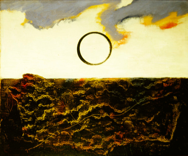
Max Ernst Marine 1926 (oil on canvas)
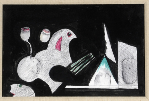
The English Surrealist Maddox Conroy, (27 December 1912 – 14 January 2005) who discovered surrealism in 1935 and spent the rest of his life exploring its potential through his paintings, collages and photographs was also inspired by Max Ernst and also experimented with frottage as seen here in his Bird in the Hand (Watercolour on Paper).