Tutor Feedback – Assignment 2

Final Drawing on A4

Overall Comments

You have maintained a very high standard in the work you have produced for part two of this module Mark. I can see that with every new process and experimentation an even greater and more concentrated progress will occur in your practice. If you maintain this focus you will notice that your output will go from strength to strength.

Feedback on assignment Demonstration of technical and Visual Skills, Quality of Outcome, Demonstration of Creativity

Assignment Two brings together the skills you have attained from experimentation with different coloured media, the manner and method in which you use them and focuses on their suitability to subject matter and the size and format of your finished piece. It also puts you in the position of getting used to confidently employing methods in the arrangement of interesting compositional constructions and refining your ability to render form with accuracy.

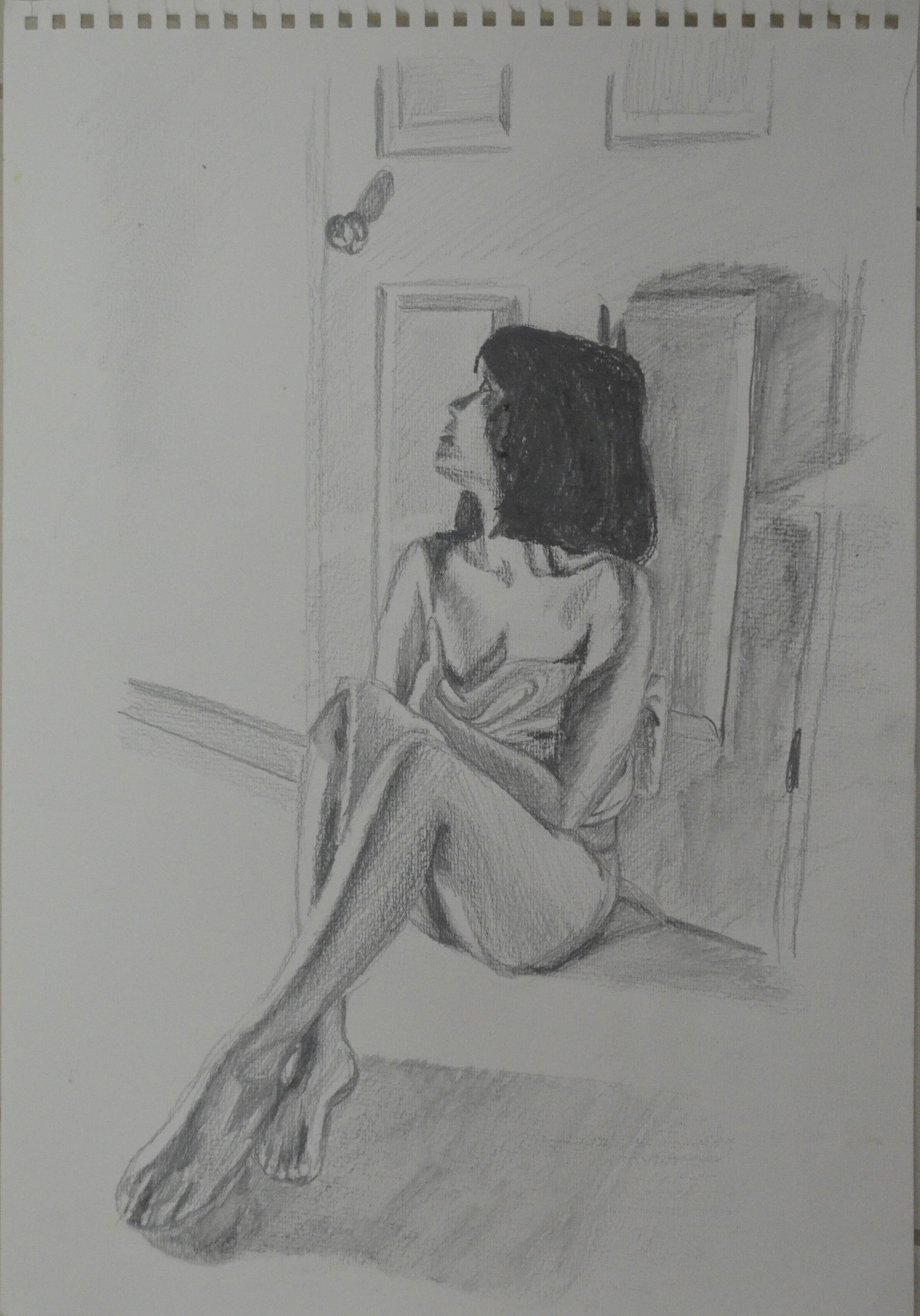
The subject you have chosen was undoubtedly an emotive one. Often these heartfelt themes can produce touching imagery and you have successfully done so with this piece. Firstly, I was greatly encouraged to see that you had diligently worked on multiple preliminary studies for the composition and had made detailed and clear annotation with regards ideas and working methodologies. The subtle colour palette utilised has a poignancy that works very well within its compositional arrangement. I was pleased to see that you had really thought about the narrative of the set up and had not fallen back on a conventional still-life arrangement. The placement of the still-life in a bathroom setting with its reflective surfaces of mirror, white ceramic tiles and porcelain basin was also a nice touch. This has strengthened the end result and added a tender feel to the piece, not to mention the inclusion of roses, which have an obvious relevancy. To be honest I feel your choice of working on white paper has worked for you – a coloured support would have made the drawing appear overworked and would have contradicted its intrinsic mood of sensitivity and restraint. It was good to read that you had used the influence of Antonio López García, an artist whose work I greatly admire. There is some very nice drawing here Mark. The delineation of form and reflective surfaces in details such as the tap and the apricot-coloured vase is very effective, as is your utilisation of the compositional device of the rule of thirds – a very well-considered piece.

Final Drawing in Pastel Pencil and Hard Pastel
Assignment 2 in Hard Pastel and Pastel Pencil

I have to admit I had never heard of the rule of thirds until now but now at least I can put an artistic phrase to it. 

Rule of Thirds
Rule of Thirds

Learning Logs or Blogs / Critical essays Context

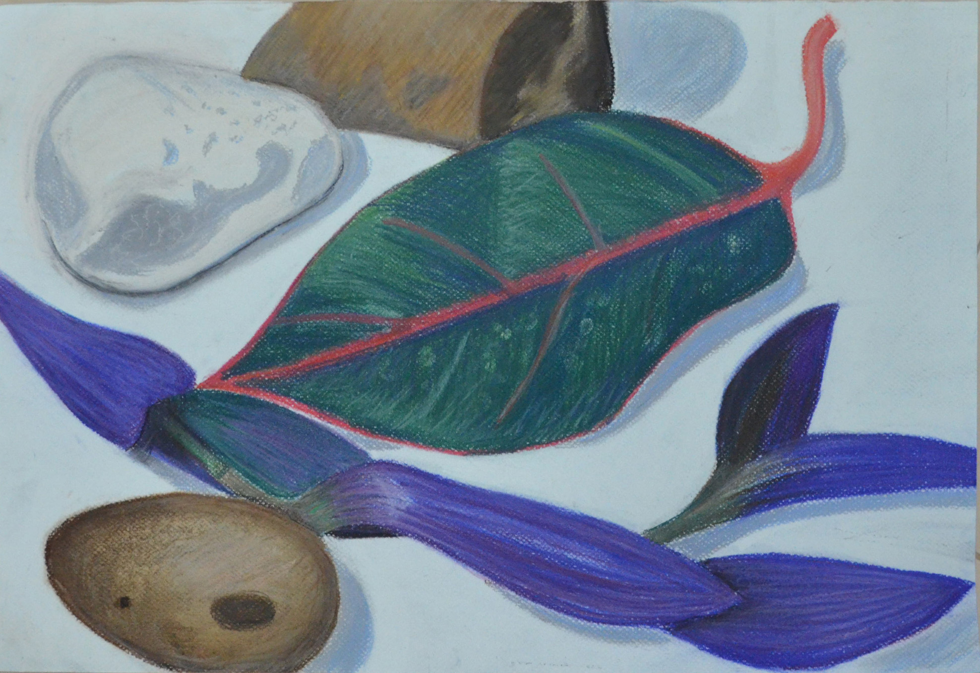
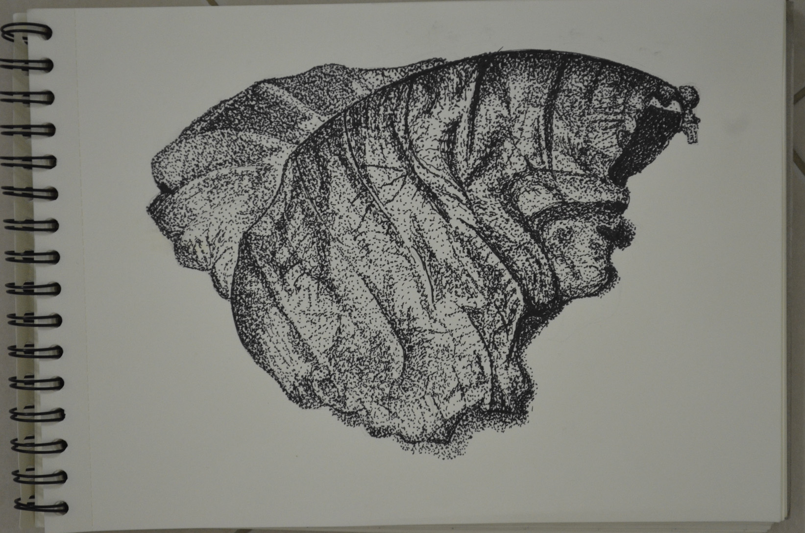
Just as in assignment one the learning log has been kept up-to-date meticulously and outlines your thoughts and discoveries scrupulously. It is a breath of fresh air to read your thorough investigation into the research points with regards your chosen artists. I read with great interest your piece about Eliot Hodgkin, an artist whose work I did not know – what a wonderful discovery. As you have suggested, his compositions and depictions of what some may call ‘mundane’ subjects, opens ones’ eyes to the beauty of simplicity. It also confirms that there is beauty in the everyday or commonplace. I can see the inspiration for your leaf drawing. I think you may find working with tempera interesting Mark. If you can’t find any, try gouache which has a similar finish and is more readily available and equally wonderful to work with.

I was hoping to try and put off tempera, gouache and any other paint mediums until the Practice of Painting Course but I made a promise to myself that I would try to get to use either one or the other by the end of this course.

Sketchbooks 

You have delivered an impressive amount of work for your sketchbooks Mark. Your adherence to the exercises within this part of the module is admirable and a high quality of work has been maintained throughout. What I find particularly encouraging is your willingness to experiment not only with a diversity of media but also the manner in which it is manipulated.  There are many good examples here and I will not mention them all: I especially liked your experiments with dip pens and markers – these display a demonstrability of eye and hand and what appears to be a natural sense for composition. I will also mention that, just as exemplified in your assignment piece, you have a knack for using colour in a way that is sympathetic to your subject, in this case, one that is fearlessly vibrant. The ‘Still-life group using line’ drawing and the study of the dying leaf in stipples and dots also show a considerable dexterity with ink as a medium.

I have to disagree with some of this, I really want to work with dip pens but I feel that I am lacking any reasonable amount of control with them and it is something I working hard to change. It was my effort with the marker pens and applying ink using a brush that made my dip pen work look good.

Chosen Composition in Marker Pens
Using Markers and Dip Pens

The leaf in stipples and dots however remains one of my favourite pieces and one that I am very proud of, It reflects the crispness of Elliot Hodgkin’s paintings as researched in the research point in this part.

Exercise - Stipples and Dots, Finished Drawing
Exercise – Stipples and Dots, Finished Drawing


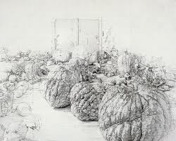
I am sure the benefits of living in an exotic country are numerous but one that stands out is the wonderful fruits to choose from when setting up a still-life – obviously the watermelon and apple in the ‘Drawing using oil pastel’ exercise are recognisable but the gno is wonderful, reminding me a little of a sea urchin. The piece you have produced for this exercise displays good balance both in terms of colour palette and composition. It is a strong and lively piece and you have successfully proven that you are willing to experiment with new, untried media. The form of each fruit and its overall perspective has been effectively rendered and considered and, generally speaking, possesses a believable compositional balance. The inclusion of the yellow cloth is a bold pronouncement but works perfectly well with the overall colour palette. The detail of the diagonal folds in the cloth in the foreground is also a nice touch as it balances the slightly left-handed arrangement.  If I were to be picky however, there are things worth looking at: there is a minor inaccuracy with regards the ellipse of the plate, most noticeable at the rear edge as it disappears behind the watermelon and apple and the shadow cast could have done with a slightly darker rendering; the delineation of the reflection of the apple on the plate needs closer observation – the dark hard line and the highlight next to it in the reflection has created the appearance of a dip in the surface of the plate. Having said all that I feel this piece shows a keen observational ability and an encouraging competence in handling new media.

Again this is another piece that I feel strongly about and would like to submit it for assessment. What I let myself down on here is that I did not make any sketches of other compositions so it may be wise to make more sketches and if necessary redo the  piece.

Drawing Using Oil Pastel - Finished drawing
Drawing Using Oil Pastel – Finished drawing

The only piece I felt didn’t quite have the strength of the aforementioned drawings is the study of roses and orchids in a vase, in both colour pencil and crayon and oil pastel. My problem with it is not necessarily the handling of the media, although both examples don’t display the same confidence or strong delineation of light and shade as the others, I feel that in comparison it is its less considered composition. The close cropping or the lack of ‘breathing space’ around the arrangement needs closer scrutinisation.

Plants and Flowers in Coloured Pencil

This is a piece that I am hoping I will have the time to redo. However, I already took what I didn’t like about this composition and used what I learnt from it for my second assignment so is it really necessary?

Suggested viewing/reading Context 

It is clear that you thrive on researching the work of other artists and enjoy the process that entails. My only suggestion would be to continue doing this as it obviously has a beneficial effect on your work. With each new discovery, a new direction will open up for you. Keep up the gallery visits too! 

Pointers for the next assignment

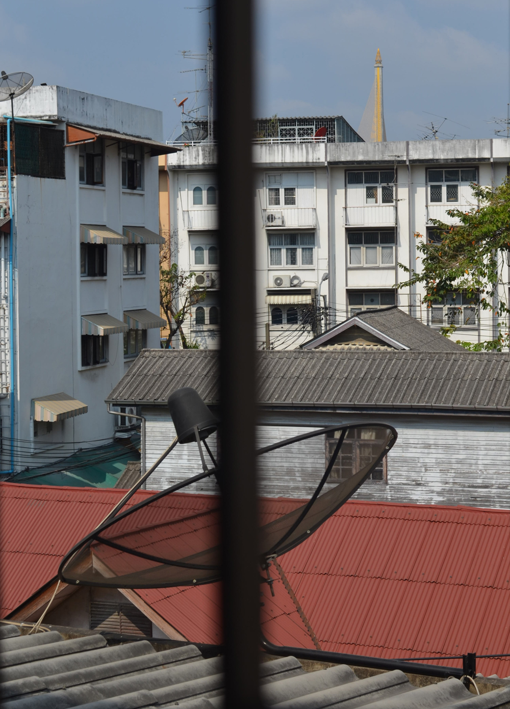
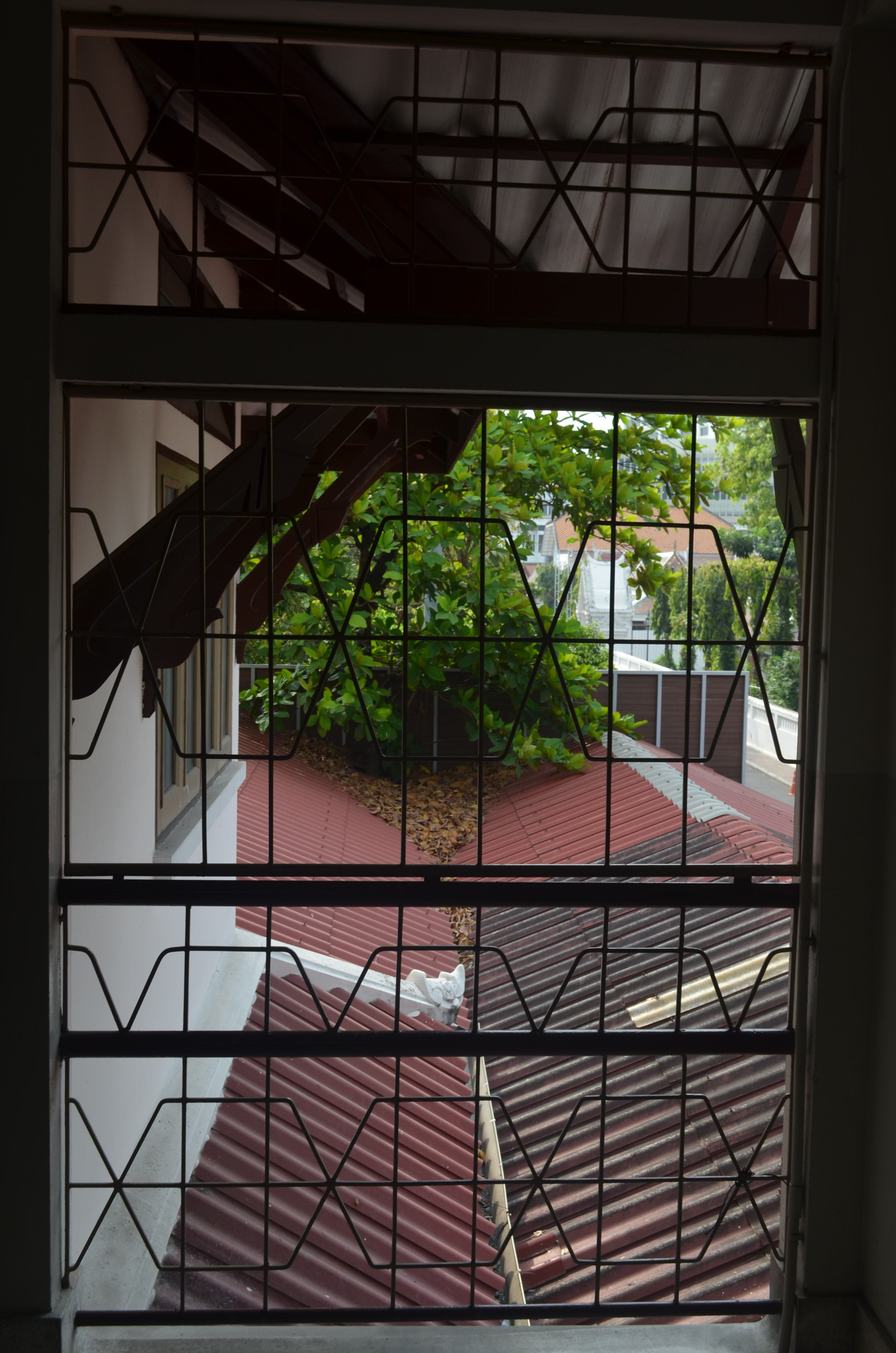
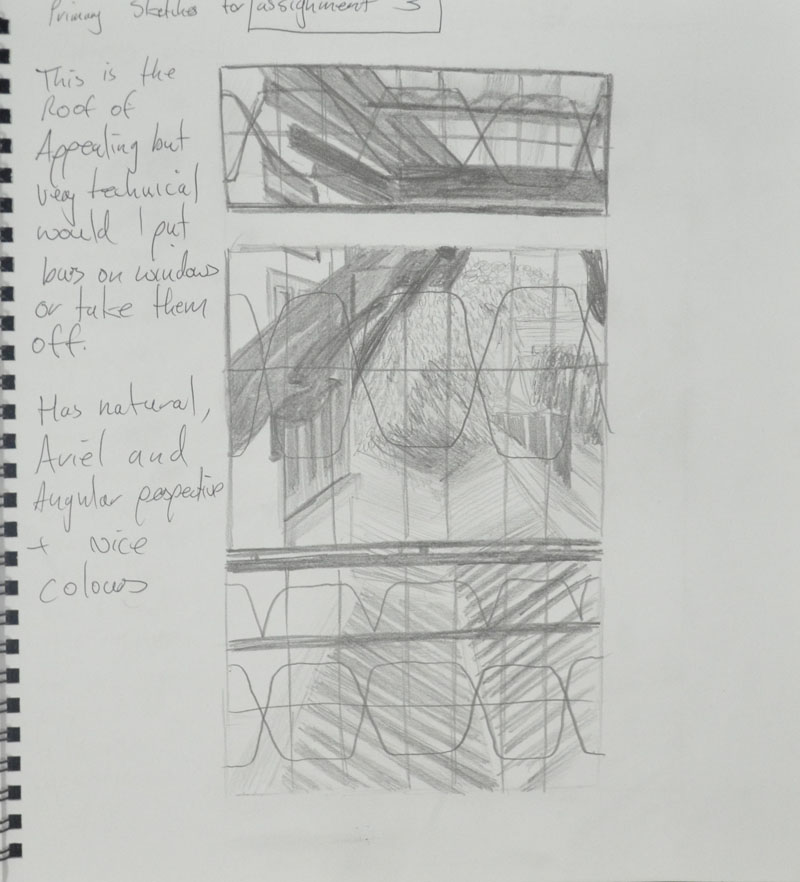
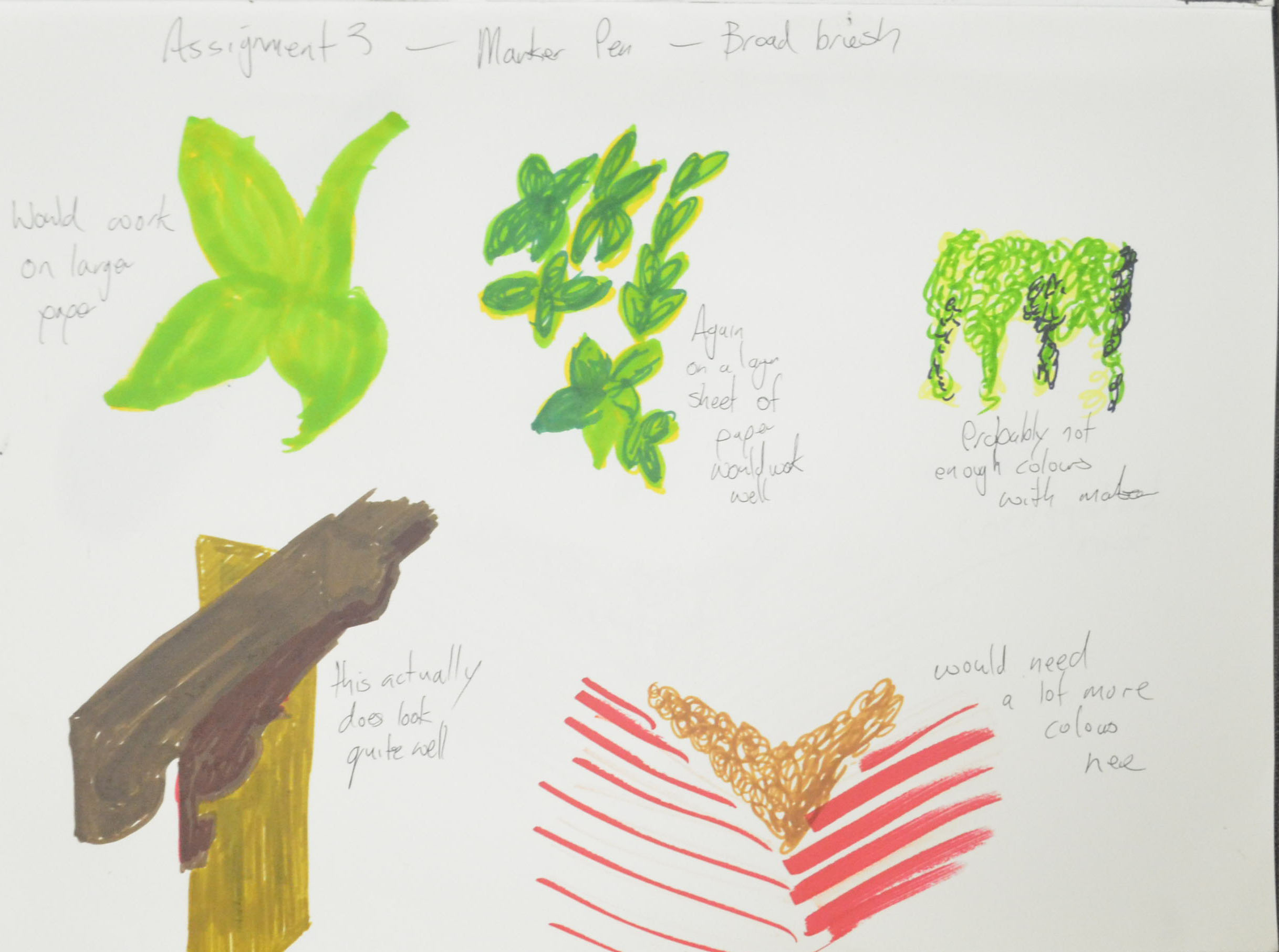
 The next part of this module is about the outdoors and I’ve noticed you have already made a good start on the work. Try, as much as you can, to work from life rather than from photos. Although you have a keen eye and a good visual understanding of space and form it is always good practice to work directly from three dimensions. This will add an even greater perspective to your work. 

I understand your aim is to go for the Painting/ Creative Arts Degree and that you plan to submit your work for assessment at the end of this course. From the work you have shown in this assignment, and providing you commit yourself to the course, I suggest that you are likely to be successful in the assessment.

Tutor Feedback – Assignment 1

Assignment 1 - Enlargement Grid

Overall Comments

You have made a particularly good start to the module Mark. You have displayed an encouraging talent for observational studies, showing a good and competent technique and a willingness to try new media. You do however tend to tighten up when producing the final finished pieces. As time goes on and your confidence builds I have no doubt that you will produce some very fine work.

‘Tighten up when producing final finished pieces’ This was so true, most of the techniques I had learnt in this first part of the course were all about fluidity, a relaxed hand, using the pencil in ways that would have probably made these two finished final pieces look very different. However, I did use a lot of these techniques in my final pieces, I just think that they are not visible enough.

Assignment 1 - Made Objects Finished Piece
Assignment 1 – Made Objects Finished Piece

Feedback on assignment Demonstration of technical and Visual Skills, Quality of Outcome, Demonstration of Creativity

The first assignment is treated as a diagnostic tool to allow the tutor to see where help may or may not be needed with regards your future drawing endeavours. The amount and quality of preliminary work you have included in your sketchbooks clearly outlines that you have a focussed and deliberate way of working. The drawings show a willingness to confront and question the suitability of materials to the subject matter you aim to portray and have been honestly contemplated, and this shows in your final pieces. The two finished studies are thoroughly researched and considered in terms of compositional structure, materials, colour palette and technical application.

Composition Development
Composition Development Study
Assignment 1 - Natural Forms - A Study in Colour Pencil
Assignment 1 – Natural Forms – A Study in Colour Pencil

The natural object study has a balanced compositional arrangement and successful harmonic colour palette however I feel it has been cropped a little too tightly. The composition as a whole would benefit from a larger area of negative space, especially at the upper framing, around the pebble or rock in the background. The addition of this negative space would accentuate a sense of perspective or feeling of receding. Looking back on your preliminary work in relation to this piece I found that the compositional development sketch in colour pencil worked a little better. It has vivacity and more space to breathe and this I feel is missing from the finished piece. The development sketch possesses a more gestural and immediate rendering whereas the finished piece appears more guarded, as if you were slightly hampered or aware that it needed to be ‘finished’. The pressure we put on ourselves to produce something that is finished and ‘special’ can often hold us back, impeding a more direct and fluid representation.

Yes, I totally agree here that the finished piece was a little too cropped, I had been following other students’ blogs and thefeedback they had received from their students, leaving too much background space etc. and I wanted to fill up the paper, however if I had positioned what I drew in the study better I would have accomplished this as well as not omitting important negative space.

Assignment 1 - Natural Forms - Finished Drawing a2
Assignment 1 – Natural Forms – Finished Drawing A2

As with the natural object study the preparatory research you have done for the man-made piece demonstrates a true motivation to understand your subject. You have thought long and hard about its conception and have displayed excellent indicators and developmental information, in the form of preliminary sketches and annotation, to describe the creative process. It was interesting to read your considerations for choosing the subject matter for this piece and also to read the reasoning for discarding your original compositional idea of the traditional Buddhist items. I would have quite liked to have seen a quick sketch of the latter, maybe even a combination of the two cultural elements – in visual terms it would have been a nice juxtaposition. Having said that, I feel your finished piece for the man-made study worked very well. It is evident that you are dexterous with graphite pencil and have delineated the objects with sensitivity, and portrayed their material properties observantly. The composition has a comfortable rhythm to it. I particularly liked the way you reconsidered the placement of the plastic spray bottle to improve the composition thus alleviating the possibility of it ‘kissing’ the cage of the fan. The drawing has good differentiation of tone and representation of volume. The manner in which you have rendered the transparency of the fan blades is particularly well observed. I must admit however having seen the colour photograph of the composition I feel the addition of the limited colour palette would have made for an interesting drawing, with reflected colour on the base of the iron, spray bottle, towel and base and blades of the fan. Try not to be held back by insecurity when using a new medium – you have the skill and adventurous spirit to overcome this Mark.

‘juxtaposition’ and ‘limited colour palette are two new art terms that I learnt from this. The reason for not going with the Buddhist items was that I wanted to work in pencil as a contrast to the hard pastel on the natural objects, I tried colour pencil on the Buddhist objects but the colour wasn’t strong enough. The fact is I should have used pastel on the made objects and colour pencil on the natural objects. I do have some preliminary sketches of the Buddhist items which I will include for assessment.

Learning Logs or Blogs / Critical essays Context

Your investigation into the research points in this first part of the drawing module has been delivered meticulously and with great enthusiasm. You have written your thoughts articulately and with obvious interest in the subjects and have offered reflective opinion on other artists’ work and how it relates to your own. This research and in turn practical discoveries into the artists’ work –artists you were not familiar with – will expand your critical thinking as well as enhance your drawing skills.

Sketchbooks

Your sketchbooks are full of some very promising work Mark. It is plain to see that you are committed not only to the course but to learning and the development of your art practice. You have shown an open-minded dedication to experimentation with different materials and media as well as a determined approach to new methodologies and conceptual constructs. This trait will stand you in good stead for future modules. Your drawing is thoughtful and investigative and shows a good ability and understanding of the fundamentals of composition and perspective.

These are inspiring words, I personally thought at this stage my keeping sketchbooks weren’t up to scratch, to read positive words words like this is definitely a push in the right direction.

The exercises have been considered honestly, with a clear view to getting the most out of the projects. I could see in your mark-making and doodling exercises a direct influence of two of the artists you researched: Max Ernst and Odilon Redon. I also felt encouraged by the inspiration you absorbed of both Patrick Caulfield and Van Gogh. The example of where you work in the style of Caulfield for instance shows good observational skills and an understanding of the artist’s oeuvre by taking that inspiration and producing a piece that represents his style but at the same time maintains your own creative integrity.

I have enjoyed researching new artists and have absorbed pieces of them, I know this to be true. I do feel though that the research points are in the wrong place in the coursework and so have to read ahead to the research is helpful in the right modules. 

The basic shapes and fundamental form exercises (books and boxes, jugs and jars and supermarket shop) have been tackled diligently and with determination. You have a keen sense of observation and focus but can sometimes lose the rhythm when being overly careful with your finished pieces – check the ellipses on the jars and cans in the supermarket shop drawings.  The still life of fruit and veg could do with a little more depth in the cast shadows. Try to be a little more expressive with colour; see how the reflected colour of the table plays on the green and red peppers and how the yellow of the third pepper is cast on the surface of the plate. You have observed and delineated this especially well in the reflected light exercise.

still life natural forms 2 still life natural forms 6

So true, the tightening up as mentioned earlier is probably the cause of this losing rhythm, that and my relief when a drawing goes the way I like and fear that I will mess up if I go further. One thing I do have to say here is that if I hadn’t shown the photo of the composition the colour of the table wouldn’t have been known. Because I made this into a mixed media drawing I felt that I could depict the reflected light while omitting the colour. I do agree with the shadows should have been a lot darker though and shall go over them as I feel this is a piece that could be submitted for assessment.

All exercises have been methodically researched and thought through and I have no doubt that if you maintain this determination and enthusiasm you will see a steady and confident progression in your work.

Suggested viewing/reading Context

It is good to hear that you have now discovered the joys of art galleries! It is imperative that you immerse yourself in current and historical examples of visual art. It will be interesting to see if inspiration develops from these excursions, especially any Thai influences. Already, with the introduction to new artists, you have broadened your own visual vocabulary. Gather as many references as you can. One practitioner I think you may find interesting is the Spanish artist Antonio López García. Below are a couple of examples of his work:


Pumpkins, 1994-95. Pencil on cardboard. Fundación ICO, Madrid, Spain.


Antonio López Torres’ House, 1972-75. Pencil on paper. Fundación Sorigué, Lérida, Spain.

Here is the research point for Antonio López Garcia .


Pointers for the next assignment

Continue to work just as you have been doing Mark but try not to get bogged down or tighten up when faced with the final piece. Maintain a loose and fluid hand. The next assignment gives you the opportunity to further experiment with different media but is also about observation in nature – be prepared to capture movement.

Assessment potential (after Assignment 1)

You may want to get credit for your hard work and achievements with the OCA by formally submitting your work for assessment at the end of the module. More and more people are taking the idea of lifelong learning seriously by submitting their work for assessment but it is entirely up to you. We are just as keen to support you whether you study for pleasure or to gain qualifications. Please consider whether you want to put your work forward for assessment and let me know your decision when you submit Assignment 2. I can then give you feedback on how well your work meets the assessment requirements.”

I am hoping to work through the B.A. (Hons) painting so I will be submitting my work for assessment.

The sting at the end of this courses tail – Tutor feedback

Quick Study with Marker Showing through

Looking at other students’ blogs which all had their tutor feedback on them I planned to put my own tutor feedback for my assignments on my blog too. However, I trailed behind other students throughout the course which meant when I submitted my assignments I had to wait my turn in the queue for my tutor to go over everything, and so when I finally got emailed my feedback I was chasing my tail again and didn’t have time to post the tutor feedback on my learning log.

Finally after my second or third assignment submission I asked my tutor if it was necessary to post my tutor feedback to my learning log, to which he replied it wasn’t necessary as he had submitted the reports to the OCA, after all the reports were for me and I had read them thoroughly.

Towards the end of this course I was informed that I was without a tutor due to some reason or other and that the OCA would find me a replacement tutor if I needed one and obviously anyone who is doing a degree needs a tutor, which they found for me, to give me feedback on my final assignment.

The feedback from this replacement tutor was very thorough and far more critical than the pats on the back that I had been receiving in my previous tutor’s reports. Not only was he critical of my assignment and work for the final part of the drawing course but he was also critical of this learning log and informed me that I should put my tutor feedback on my learning log and so the next few posts will be my tutor feedback for all assignments and my thoughts on  that feedback.


My Drawing Journey so Far

4 - Walking Women in Oil Pastel

Until I started this course the only drawing I had done in the last 20 years was with a pen or pencil in a notebook before putting my ideas down on canvas with a very crude painting method. Over the last twenty months I have not only learnt different drawing techniques but I have learnt to use many different mediums as well as develop skills and confidence as an artist.

I submitted Assignment 5 today and I have the next  three months to prepare my coursework to send to the U.K. for formal assessment but I don’t think this blog will end here. I have enjoyed working with the different drawing mediums and there are certain mediums I still need to practise with, there also certain exercises that I feel I weren’t that successful and so I plan to have another go at those exercises while I am working my way through the next course Painting 1 : The Practice of Painting and so I expect to be posting more work very soon.

Assignment 3 – A View from a Window or Door

Submitted Piece for Assignment 3
Final Drawing in Dry Watercolour Pencil

The task for this assignment was ‘to select a view from a window or from an open door. Try to find a view that includes some natural objects: trees, shrubs, pot plants, fields or garden plants’ also to ‘try and find a view that will demonstrate your understanding of aerial or linear perspective – in other words a view that has some depth to it.’

The brief also says to ‘look for a view that offers an opportunity to draw straight-lined objects as well as items drawn from nature, buildings, gates, fences and so on. It then says that ‘this may all seem like a lot to look for, but most views from windows and doors will offer you a bit of all these things’…

I have spent the best of two months trying to find a window or a door with view with any of these things and came up almost empty handed. The view from the 26th floor of an apartment block in Bangkok only offers you one of the most complex city views you could ever imagine.

view from my apartment kitchen window - Photo taken from back wall of living room
view from my apartment kitchen window – Photo taken from back wall of living room

I took a camera with me everywhere trying to find a view that would accommodate the criteria for this assignment and almost came up empty handed and then right at the last week of the school term, the last week in February for me I dropped on 2 views (by accident).

View from a 3rd floor window at school

One was the view from the top floor of the school, which offered mostly concrete and not much of anything else, the other was a view from the school’s second floor window looking out of one of the windows of the school building that I had drawn in both ‘A Sketchbook of Townscape Drawings‘ and a ‘Limited Palette Study from Your Sketches‘.

View from second floor window facing temple

I decided to start by having a go at sketching all three, starting with the view from the second floor window, which even on the small preliminary (rough) sketch in my notebook proved very technical.

1st Sketch ifrom 2nd floor window in my notebook
1st Sketch from 2nd floor window in my notebook

The second was a half-hearted sketch of the view from my apartment window, working from the photograph I gave up after 5 minutes realizing that it wasn’t a drawing suited to the size of paper that they wanted us to do the final drawing on (A3). But maybe it would be something I would like to come back to later with the possibility that it could be painted in a style close to L.S. Lowry.

3rd Sketch an Attempt at Drawing the view from the 26th Floor Window
3rdd Sketch View from top floor classroom

The third sketch was from the window of the classroom on the top floor, which all though had most of everything, the tree in the view wasn’t very big at all and so after a second larger (partial) sketch on A3 I decided that I was to go with the view from the 2nd floor window.

3rd Sketch an Attempt at Drawing the view from the 26th Floor Window

View from the 2nd Floor Window

I started do do a study in line of what I could see from the window. This turned out to be a partially finished drawing but helped me to decide to crop the view to the middle window as it was very technical with the roof beams. It also helped me to decide on getting rid of the railings on the windows.

An attempt at Line Drawing

My next drawing was in A4 and was basically a quick sketch to see if I could meet the assessment criteria in my final drawing.

My Chosen View - CRopped down to the middle window
My Chosen View – Cropped down to the middle window

After the Study of several trees exercise I said that it give me an idea for the final drawing and that was to use oil pastels as I was impressed by the way they left white specs on the paper reminding me of a Seurat painting and if I had committed to the view from the classroom window I would have probably gone with that medium…after trying other mediums first of course. But, with the more intense view out of the 2nd floor window, on the small size paper I decided that it would have to be done in colour pencils.

Colour study in Marker Pen

Still, even though I had already made my mind up the Assignment  had asked for broad brush stroke studies to decide on the colours I would use for the final drawing so I tried a couple of mediums that were very different to what I had decided on drawing for the final drawing.

Colour Study in Ecoline Liquid Watercolour

Both of the studies turned out to be quite pleasing and both mediums quite feasible. It was the first time I had used the liquid watercolour as a paint and not as an ink and even though the colours were great, my watercolour painting skills leave a lot to be desired.

I had been plodding on too slowly with this assignment and to be honest that’s because I was not happy with the subject and it was very stressful but eventually I had to start the final drawing and it had to be in dry watercolour pencil.

Final Drawing in Dry Watercolour Pencil

An English language student asked me the other day what I thought has been the hardest medium to draw with and when I replied colour pencil they weren’t surprised. The Derwent artist are very waxy so I prefer using the watercolour, dry, but stillI do have problems blending even though my I have come along way since the beginning of the course.

I started by drawing the shape of the window to act as a border then I drew in the window at the side and the roof beams as well as the horizontal line of the fence then I got stuck straight into the colour starting on the fancy Thai style roof beams (or props or whatever you want to call them).

I spent about an hour layering the colours to get each of them a different tone and looking quite accurate but then realized that it didn’t really matter how long I spent on those as they wouldn’t be the focal point of the drawing.

Next I worked on the window and the wall then the rafters and from there the tree that came up both sides of the fence, through the roof of the outdoor secondary cantine and on the other side. At first I was going to draw the tree with a form of squirkling in colour but when I did the broad brush colour studies I could see a reoccurring pattern of almost star like shapes and so I spent a lot of time trying to simplify the shapes and drawing them by layering yellow over green, from there I filled in the negative space in between to give the tree some thickness.

So far I wasn’t looking at all great but then I decided to use a form of squrkling in three colours on the dry fallen leaves with the occasional star shape trying to mirror the green leaves above, the result was quite nice and it made me feel a bit better about the assignment.

Once I hatched in the fence and the double roof of the canteen below everything started to come together but the problem now was that I didn’t leave myself enough space to draw in enough of the large orange roof behind and so a lot of the roof is hidden by leaves. I do still feel though that because of the direction of the roof beams and the perspective of the roof that the viewers eyes will still look where I want them to and that is to the temple and the road to the right.

I completed the drawing with one of the worse mistakes ever, I decided that I would draw the wall all the way around the window in oil pastel the result was a complete mess. My only hope is that I can crop and frame it when I come to send off my work for final assessment.

Assessment Criteria

Demonstration of Technical and Visual Skills

Although the final drawing is somewhat messy I do feel that I have definitely shown a demonstration of technical and visual skills in my final drawing especially where perspective is concerned and I feel that the drawing shows a clear understanding of both aerial and linear perspective. I also feel that the final drawing shows a substantial improvement on the way I have been drawing trees.

Quality of Outcome

Well to be very honest I am not satisfied with the quality of this final drawing that looks more like an exercise than an assignment. I really found this assignment stressful, it was very difficult to find a view that I was happy with and the problems we have been having here in Bangkok haven’t helped. But a poor craftsman always blames his tools.

I let myself down with the preliminary work on this assignment but this was due to being very busy working all hours to try and make up for loss of income lost through these protests. If I had more time for the preliminary work the quality of the final piece would have been much higher.

The work in the previous exercises in part 3 as been high quality let down by a low quality final piece.

Demonstration of Creativity

I believe I have demonstrated quite a lot of creativity through this part of the course I haven’t necessarily shown this in the final drawing. I would say the projects where this was more visible was Drawing Trees and Townscapes where I let go of trying to pay attention to detail and tried being more creative.

Context

The troubles here in Bangkok have been a great drag on this part of the course. I started out feeling really positive and in October when the protests started hit a brick wall. However I do feel like I have learnt a lot from this part of the course and I no longer feel that drawing landscape is a problem for me.

I have tackled every exercise to the best of my ability and even though I’m not happy with my final drawing I do feel that everything I have practiced through this part of the course is evident in the final piece.


Assessment of Criteria Points

8 - WaterSoluble Pencil Sketch with Door Handle

Demonstration of technical and visual skills – materials, techniques, observational skills, visual awareness, design and compositional skills

I think I was disillusioned as to what materials i would use for this assignment, I chose water soluble media thinking that they were suited to my ideas but proved me to be wrong. My design and compositional skills shone through in this assignment but were suited to a totally different medium to what I had planned but in the end everything came together.

Quality of outcome – content, application of knowledge, presentation of work in a coherent manner, discernment, conceptualisation of thoughts, communication of ideas

The journey was very different from what I imagined but I arrived at the same destination, depicting in my final piece the mood or atmosphere that I was determined to achieve from the start. I am very happy with the quality of the final piece and  applied the knowledge that I had gained throughout the course to realize my thoughts of how it would turn out.

Demonstration of creativity – imagination, experimentation, invention, development of a personal voice

I demonstrated imagination, I experimented an I invented and as far as my personal voice is concerned something is happening but I’m not sure what as of yet.

Context – reflection, research, and critical thinking (i.e. learning blog)

My blog seems to go from strength to strength and my thirst for researching new artists is also getting stronger and with no library in the vicinity books are getting addictive and expensive. I am also spending more time to reflect on the work that I have done which shows in my blog entries.

Assignment 5, Option 4, Drawing Figures

18 - Assignment 5 Final Piece

Over the last two months I kept looking at the brief for this final assignment and I was wondering how I could demonstrate a significant amount of new skills I had learnt not just i this last part, part 5 but throughout the course.

My strongest idea was a full figure semi nude sitter in the shadows of a lamp lit apartment I did for a brief moment think about a self portrait stood in the kitchen with the sky and clouds behind me, but in the rainy season that wasn’t a good idea.

I was definitely including the background and I wanted to use the background to create a unique mood, to try and influence the drawing as much as possible. I imagined my subject sitting against a wall with long shadows depicting how small and insignificant she was to her surroundings, like Gerald Scarfe’s illustrations of the main character in Pink Floyd’s The Wall.

As this module was all about experimenting, what was I going to experiment with? What techniques was I going to use? And would I use experimental techniques in my final drawing?

I decided that I would try to experiment more with water soluble media, pencils, watercolour pencils, watercolour paint, and gouache and see where that took me, I bought the book ‘Drawing and Painting with Water Soluble Media by Fiona Peart’ just to give me some ideas.

Fiona Peart Drawing and Painting with Water Soluble Media

I had plenty of low quality watercolour paper to mess around on and but not so many different types of water soluble media but I thought I’d have a go at some of the techniques in the book to see if I could use any in my final piece.

1 - Salt on Watered down Ecoline Wash
1 – Salt on Watered down Ecoline Wash

The first technique I tried was dropping salt granules on to a watercolour wash, see above. I had several bottles of Ecoline liquid watercolour so I dropped some in a jar and watered it down. I haven’t done much messing about or drawing with watercolour (probably haven’t been brave enough) so I still have a lot to learn about how much water to use in a wash etc. So I did a wash (the one on the right) in 30+ degrees heat and it seemed to start drying as soon as my brush left the paper, then i started to try and drop single granules of salt onto the wash. They didn’t do much and so I rubbed my hands and let the lot fall over the top of the wash. The result was a discoloured blotch effect that looked like fungus.

I decided to water the wash down some more and start again. this time I sed less salt and as you can see above the results are a bit better. However I wasn’t sure how I would use this technique in the finished piece.

2 - Dried Soap Suds on Watered Down Ecoline Wash
2 – Dried Soap Suds on Watered Down Ecoline Wash

The second technique  I used was soap suds. On the left I used a small amount of soap suds scooped up and placed on a watercolour wash, this time with more water added. The results were very different to what she had in the book where she had used them to depict pebbles on a beach, the patterns that mine made (after 2 hour of drying) resembled a cloudy sky.

3 - Soap and Suds on Ecoline Liquid Watercolour
3 – Soap and Suds on Ecoline Liquid Watercolour

I wasn’t sure whether it was the paper I had been using or whether my washes were too thin that made my experiments look nothing like anything in the book so I had another try with a thicker wash on a higher quality 200 g/m2 watercolour paper, the results were almost the same.

My girlfriend came round that evening so I decided to stop with the experimenting for the night to do a series of sketches of sketches in water soluble pencil to see which worked best.

4 - Soluble Pencil on 200 gm2 Paper
4 – Soluble Pencil on 200 gm2 Paper

My first sketch was a very sorry effort indeed, I did exactly what I’ve been trying to stop myself doing in this last section, misuse the paper. I wanted to use the background but the figure still had to be a good size on the paper.

5 - Another Try at First Pose Water Soluble Pencil
5 – Another Try at First Pose Water Soluble Pencil

The second sketch was better but was still not that great and by now I decided that her clothes would be replaced with the orange cloth. The third sketch was a lot better and probably one of the best so far over the last two modules and the face was almost spot on which was an added bonus. However, I really wanted the background to play a bigger role in the finished piece.

6 - Semi Nude with Monks Robe Cloth
6 – Semi Nude with Monks Robe Cloth

The next one was even better but I stopped at drawing the door, even though I knew this one would work it was a different mood to what i wanted to depict in the final piece. To me the pose in the drawing below was warm, welcoming, even romantic like she was waiting for her lover to come home, I wanted a totally different mood altogether for the final drawing.

7 - Semi Nude with Bent Knee
7 – Semi Nude with Bent Knee

By now I was working towards the pose that I had my mind set on and the next pose below was pretty close but still it looked like she was waiting for someone rather than hiding from someone which is what I really wanted to show in the ideal pose. Because this was a 100% perfect in looks, proportion, the long shadows and everything else I nearly went with this but I decided to squeeze just 1 more sketch out.

8 - WaterSoluble Pencil Sketch with Door Handle
8 – WaterSoluble Pencil Sketch with Door Handle

In this last sketch I decided I had got the pose that I wanted, it still looked like she was waiting for someone to come through the door rather than hiding behind it but I decided to go with it in the hope that the medium and technique that I chose to complete the assignment piece would help me to depict the mood that I wanted.

9 - WaterSoluble Pencil Looking at Door Handle
9 – WaterSoluble Pencil Looking at Door Handle

To give my girlfriend a break I decided to do some colour drawings working from the sketch above, the first one was a total abomination. Until now, apart from the Fish on a Plate exercise I had used my watercolour pencils dry, as a substitute to my Derwent colour pencils which I wasn’t keen on the waxy feel of, the awful attempt at being artistic below was a very tired try at sketching with wet watercolour pencils. I decided that was it for one day.

10 - Sad attempt in watercolour pencil
10 – Sad attempt in watercolour pencil

At this stage I wanted to have ago at painting this in watercolour but basically I wasn’t ready for drawing in a painting medium and so I had another go at watercolour pencil to get myself ready for a more permanent medium, this was drawn from the water soluble sketch.

11 - Watercolour Pencil Drawing from Sketch
11 – Watercolour Pencil Drawing from Sketch

That afternoon I went and bought some Louvre watercolour paints, a jar of white Gouache and some brushes. I still really didn’t have a clue what I was doing with the paints which were in tubes and so I decided to take minimum risks and draw the figure in watercolour pencil  and use the watercolour paint for the floor and walls.

After completing the figure with watercolour pencil and wet brush I painted the shadows on the floor with watercolour paint using a brush and then dragged the paint off with the paper with a tissue, I’m not sure if there’s a special name for that technique. I painted the rest of the floor and the walls with a brush but I needed to show the light reflecting off both and so when the watercolour paint was dry I stippled the gouache paint over the top with the same brush. From there I finished the door off hatching with watercolour pencils then going over them with a wet brush.

I wasn’t worried that I hadn’t used any of the experimental techniques that I played around with earlier as this was an experiment just on its own but I wasn’t satisfied with how this turned out, it was stagnant there was no mood to it and I decided to change to a different type of painting medium.

12 - Watercolour Pencil, Watercolour Paint and Gouache
12 – Watercolour Pencil, Watercolour Paint and Gouache

I wanted to make a bigger connection between the door handle and the figure and i wanted to do it with a visible energy field and swirling hatching came to mind and the perfect medium for this would be oil pastel. And so I went from water soluble mediums to oil pastel.

I knew I would need a lot of white oil pastel as I planned to draw it on an A2 size paper and so this was my first experiment at trying to get the lines that I needed without using the valuable white. I really don’t know what I was doing here and it started to look more like a kids drawing from an horror movie.

13 - Oil pastel - Too dark - Trying not to Use White
13 – Oil pastel – Too dark – Trying not to Use White

The second experiment was with much lighter colours using more of the white and trying as many different techniques together to see which one worked. From this it was obvious that the only one that was going to work and join everything together was circular hatching, or at least that’s what I call it, like a vortex drawing, spiraling out from the door handle connecting everything, or spiraling in.

14 - Trying a Few Different Techniques
14 – Trying a Few Different Techniques Together

I bought some dark grey Ingres paper and taped it to my largest drawing board with masking tape at the corners. I was still drawing from previous sketches including the latest watercolour/watercolour pencil drawing.

Two hours in and  something was beginning to form but it was more like the blurred image in a dream than anything else. I started with black for the hair plus pinks and various oranges for the skin, cloth and skirting board then white circular swirls for the walls and floor, with the white lines further apart for the darker shaded areas to let the grey show through. I wasn’t hatching in the same circular motion for everything but I kept going over the top with white to give the impression of doing so and only two hours in I was already on my second stick of white oil pastel.

15 - Drawing after First Two Hour
15 – Drawing after First Two Hour

The next day and a few hours in and the picture was looking a bit too light as I added more and more colours to the vortex including pinks, yellows, greens and blues, I liked where it was taking me as long as i could darken it eventually. The figure looked unnatural and out of proportion and also two far away from the door but I wasn’t worried, I knew eventually she would be right where I wanted her. The most worrying thing at this point was that the door handle was too low and had to be lifted up and that was the starting pint of my vortex so everything had to be reworked.

16 - Fnal Piece Second Stage
16 – Final Piece Second Stage

After about a good few hours it was proving to be a very long process but  knew the end results would be worth it. by now I had got everything marked out and re-positioned the door knob and I was starting to draw in the shadows which would tell me if the figure was too far to the right or not on the paper…It was. What was niggling me at this stage though was if I should draw the face or leave it blur as at this stage it reminded me a bit of Francis Bancon’s work, still blurred between the point where the face was and where I had moved it to.

17 -After about ten hours
17 -After a good few hours

It took me a few hours longer to finish the drawing and as you can see between the drawing above and the drawing below a lot more work went into this piece, moving her even more so she was in a more natural position against the door but that’s not where all the work went. No longer is there any grey from the paper showing through the oil pastel, the darker parts are darker layers of oil pastel on top of the lighter ones and the shadows took at least two hours to correct.

I would say in all this piece took me the best part of twenty hours to complete. No sure if it was all drawing though, there was a lot of thinking during the process, as with any lengthy process like this I tend to get lost in my thoughts as I step back and look at the drawing from different angles.

18 - Assignment 5 Final Piece
18 – Assignment 5 Final Piece

I chose to do something completely different with her face, so far I’ve only managed to get my girlfriend’s face right with a pencil or water soluble pencil, I wasn’t taking any chances and used the face to help me create the vortex effect, instead of just circular hatching, all the way to the door handle.

Things I’m Happy with

I like the way it turned out.

Things I’m not happy with

It didn’t turn out the way I expected it to.

Part 5, Option 4, Reflection

Large Tonal Drawing in Colour Pastel

I started off this part of the course with a fresh try at drawing with energy as my attempts at gesture drawing in Part 4 – Drawing Figures  where rather crap and so I read more of ‘Force’ by Michael D. Mattesi. So with a Chinese marker, larger sheets of drawing paper and my new found knowledge of applied force and road of rhythm, I set out to create more quick and dynamic figure drawings. Not only were these energetic drawings a vast improvement on any of my quick figure drawings in Part 4 but they were a great inspiration for the next few exercises.

Drawing 2
Drawing with Energy


I had been struggling in the Quick Poses exercise in the last module but the Quick Studies exercise in Part 5 was a breeze due to the fresh practice at energy drawings and also applying what I had learnt, unlike the hairy sketches in Part 4 the quick studies in this part were smoother and with a new found confidence I drew faster and faster sometimes getting the drawing time down to 3 minutes.

Drawing 30 - Kneeling 3B Pencil
Quick Studies

After researching how famous artists used line I took that new found confidence and applied it to the second part of this research where I had a go at using line in the style of famous artists. The results weren’t that great, I’m not sure if drawing in the style of Klimt or Schiele resembled the two artists’ work but I was pretty happy with drawing in the style of Hockney, Ingres and Giacometti, particularly the last two artists.

5 - Drawing in the Style of Ingres
5 – Drawing in the Style of Ingres
6 - Drawing in the Style of Giacometti
6 – Drawing in the Style of Giacometti

I’m not sure whether I did enough drawing with colour in the using colour exercise  but I do feel that I did ample experimenting with mixed media particularly the collage work which I was quite happy with, producing the drawing below was particularly satisfying but I may have to go over the hair in black.

3 - Collage with Black Felt Tip
3 – Collage with Black Felt Tip

This drawing in oil pastel below gave me some very interesting ideas for Assignment 5, which I will reflect on in the next post.

1 - Oil Pastel with Robe and Squiggles
1 – Oil Pastel with Robe and Squiggles

I was trying  not to get sucked into producing nudes for the rest of this module but that’s the direction I felt I was going in as I knew there was so much I could do with the nude figure and so many drawing tools I could use for them, I was especially happy with the drawing below in hard pastel that I produced for the Tonal Studies exercise which I will also send off for assessment. I love the way that I used contrasting colours to build up the tone and form of the sitter with very fluid hatching.

Large Tonal Drawing in Colour Pastel
7 – A2 Tonal Drawing in Pastel Pencil on Ingres

This module gave me enough ideas and time to reflect on the type of piece I wanted to produce for Assignment 5, I knew I wanted to produce a full figure drawing, I knew the sitter would not be totally nude as I wanted to draw folds in cloth again but what I hadn’t decided on was if it was going to be an expressive figure drawing or analytical study or what medium I would be using for the assignment.