Overall Comments
You’ve delivered another strong submission Mark. The determination and enthusiasm you have shown throughout the past four parts of the module has clearly been of great benefit to you as you approach the final part of this module. It is your unerring interest in the subject of drawing and your resolve to advance in the process that will successfully see you through to the end of this course.
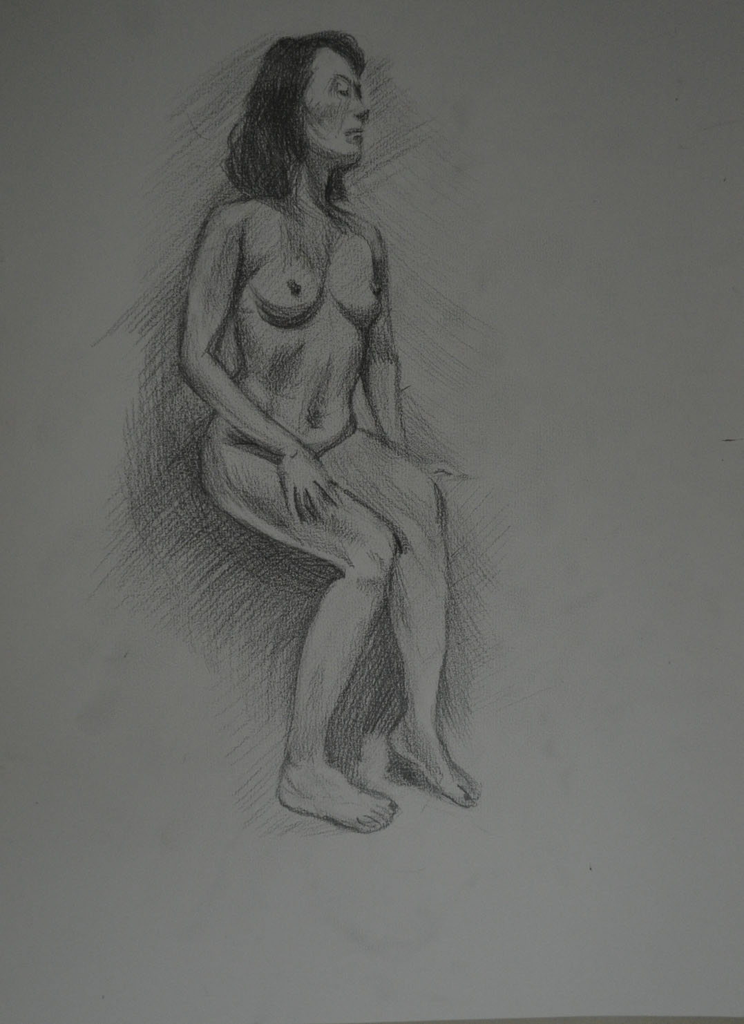
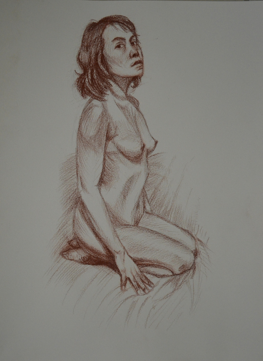
The first exercises looking at quick and long poses display good observational skills. Quick sketches of the figure are a wonderful way of loosening up before approaching longer, more studied pieces and allow the artist to look at the subject in a rapid way, to define what is integral as well as superfluous in the detail of the sketch in the given time and is important for honing the eye and hand. They are well-proportioned and show that you can handle – and understand – the process of measuring well. As these are your first experiments with drawing the figure from life I think you should feel very happy with the results. The more you do the more adept you will become with the process of looking and transposing what you see. Again the longer poses display good proportional observation as well as a good understanding of the portrayal of attitude.
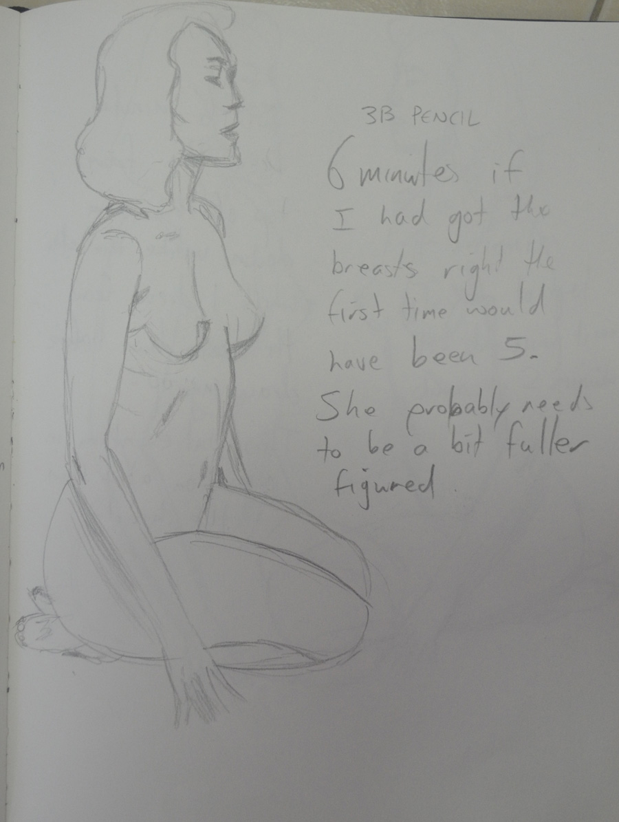
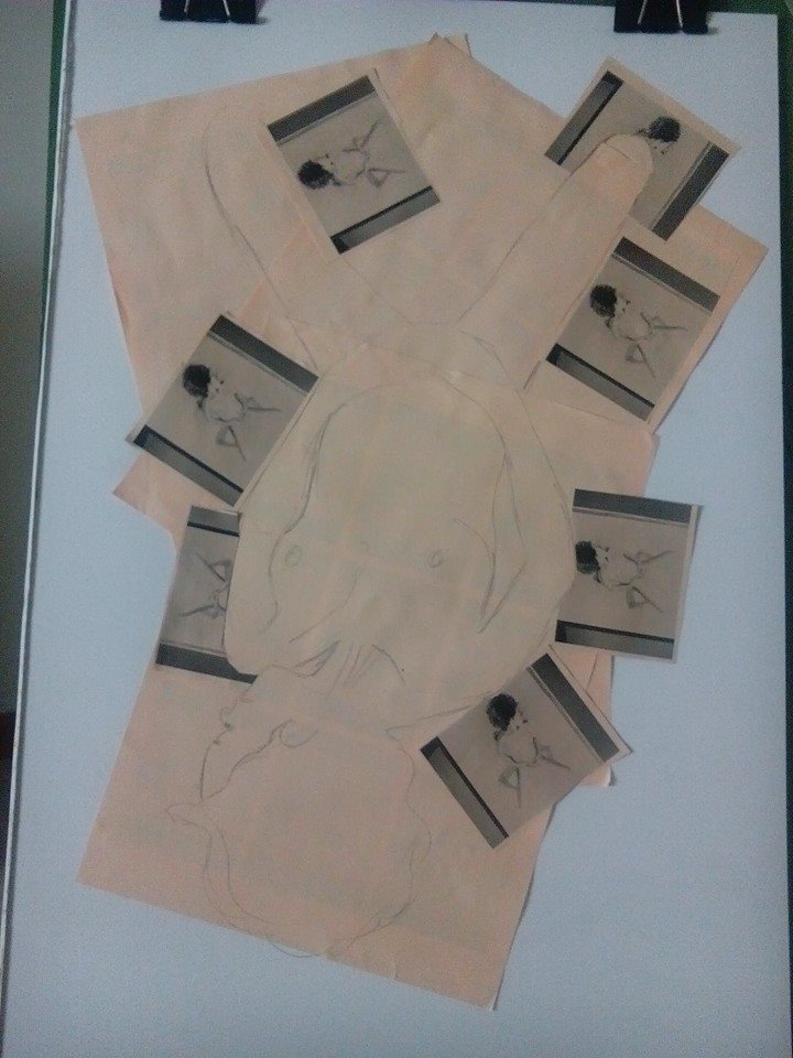
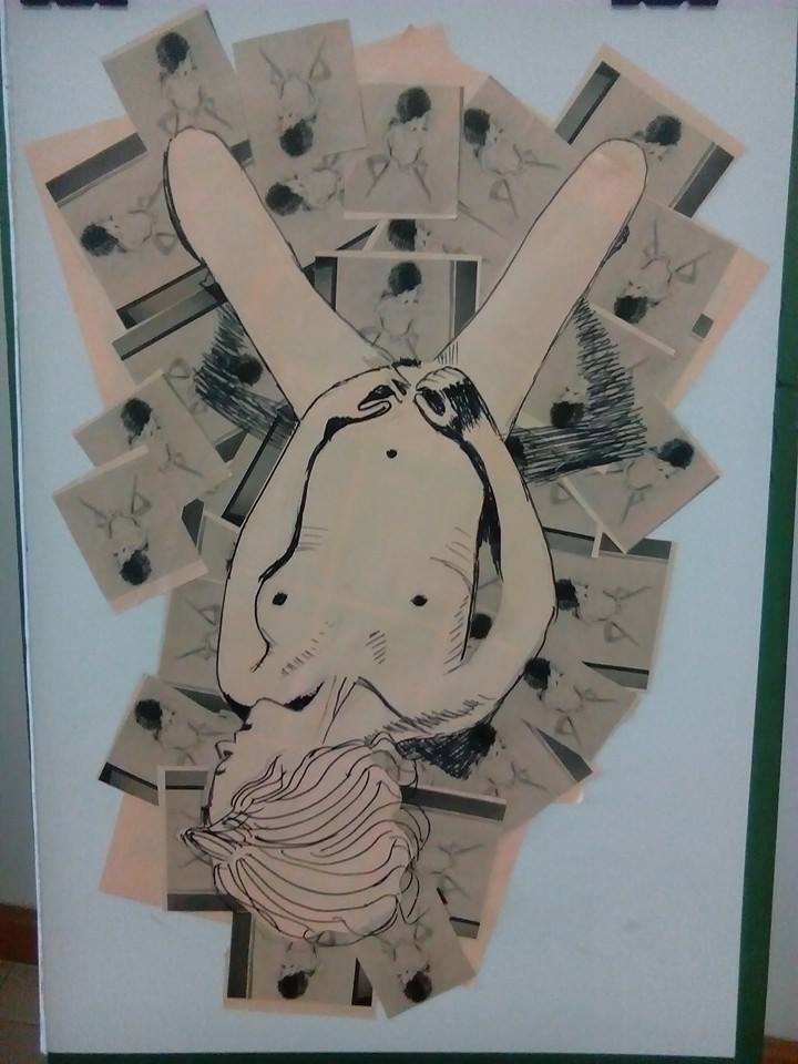
I learnt a lot about measuring proportions from this exercise particularly how many heads distance it was from the crown of the head to the seat of the bum which was approximately 3.5.
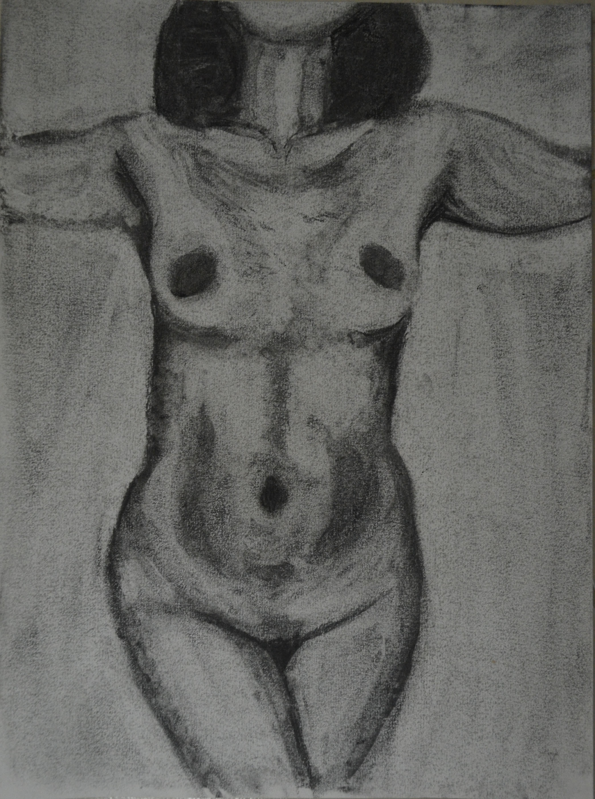
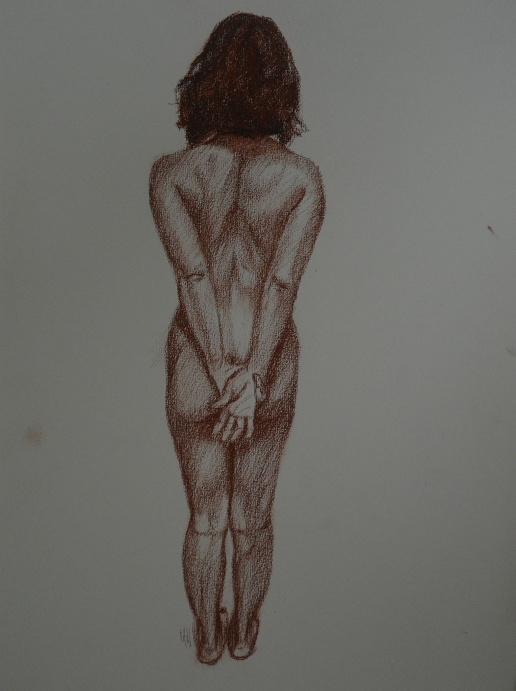
The drawings you have produced for the essential shapes and elements exercises show good understanding of how to represent form and your decision to use charcoal was well founded both in the drawings of your girlfriend and in the series of your daughter. Proportion is well observed and rendered and elements such as foreshortening have been approached simply and successfully. You mentioned in the check and log for the proportion exercises that you feel a little frustrated with your abilities to represent a facial likeness in relation to the overall drawing – one step at a time Mark. With your focus and determination I am in no doubt that you will find that you’ll develop your own way to tackle the complexities of facial structure. Like the body it is all about proportion and form but with the face the detail is much more intricate. The ‘tightness’ you perceive when approaching the face is normal for this early stage of your practice. It is the pressure we put on ourselves to achieve a ‘true’ or life-like representation of the model’s features that often hinders progress and ‘puts us off’, especially when you are not only restricted by time but the desire to ‘get it right’ creates a kind of hurdle to what is normally free-flowing creative expression. For these exercises it is not necessary to produce fully formed portraits with intricate detail. Try to hint at the features by using simple tone to describe the shape of the face.


You have produced a vast array of work for the stance and energy exercises. It is good to see that you are pushing yourself with such enthusiasm Mark and the results show that you have a good eye for the depiction of weight and balance. The line you use in these sketches is particularly appropriate and successful: it is sure and confident and delineates the stance and energy of the poses without forsaking attention to detail such as proportion and anatomy.
I wasn’t as impressed with my energy drawings and so after I submitted my coursework I did some research on Gesture drawing as well as some reading, Force, Michael Mattesi and did a new set of drawings for this exercise, which I did submit to my tutor afterwards so maybe that is what he is taking about.

You have approached the structure exercises with great enthusiasm and openness with regards the use of different techniques and media. There are some very slight issues with proportion in some but I don’t think you should be overly concerned here – it’s like you’ve concentrated too closely on specific detail rather than considering how each anatomical element relates and works together by looking at the subject as a whole.

I think my tutor was talking about the anatomical drawing above but I am not too sure. If so then I can say I wasn’t thinking about specific detail, I was thinking about how anatomical elements related to each other. At this stage we were a bit ‘shy’about nude drawings in detail but the choice of clothes for the model, my girlfriend, on this exercise was probably a bit poor and so it didn’t show off the structure as well and so I wasn’t able to.
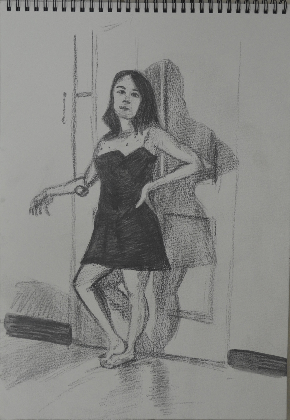
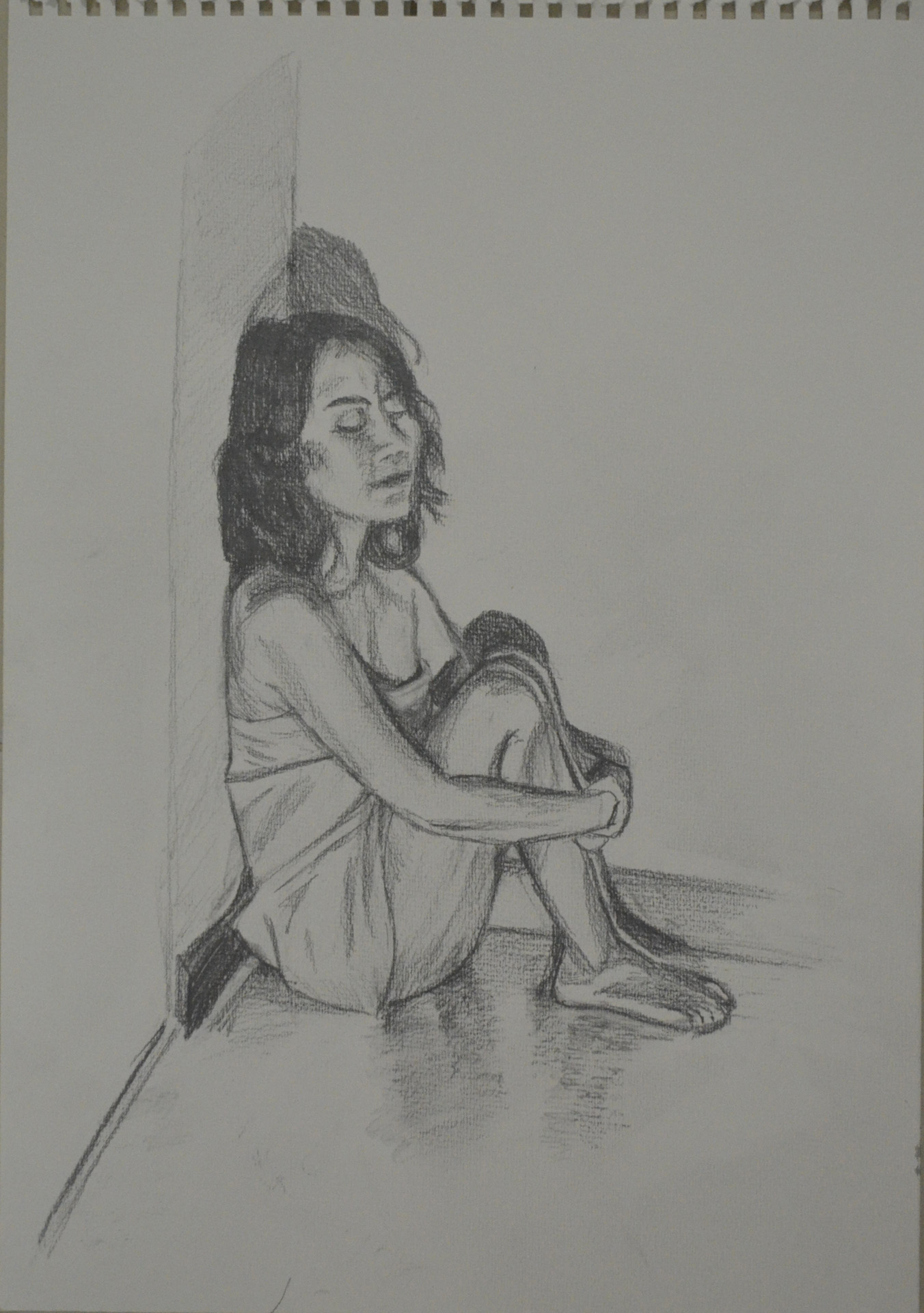
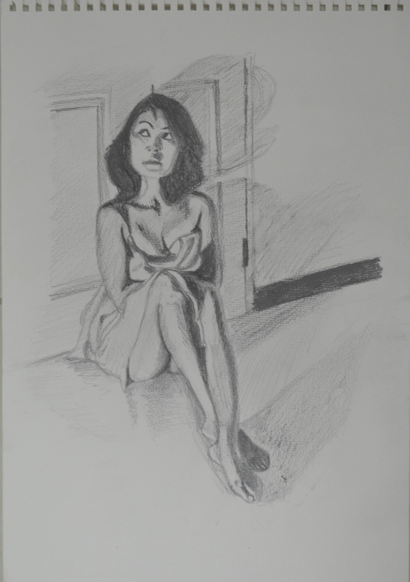
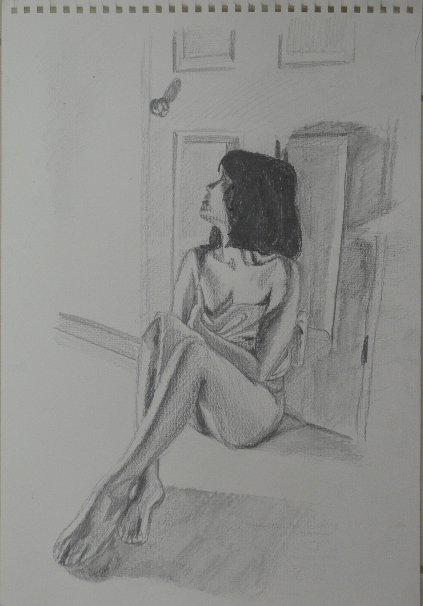
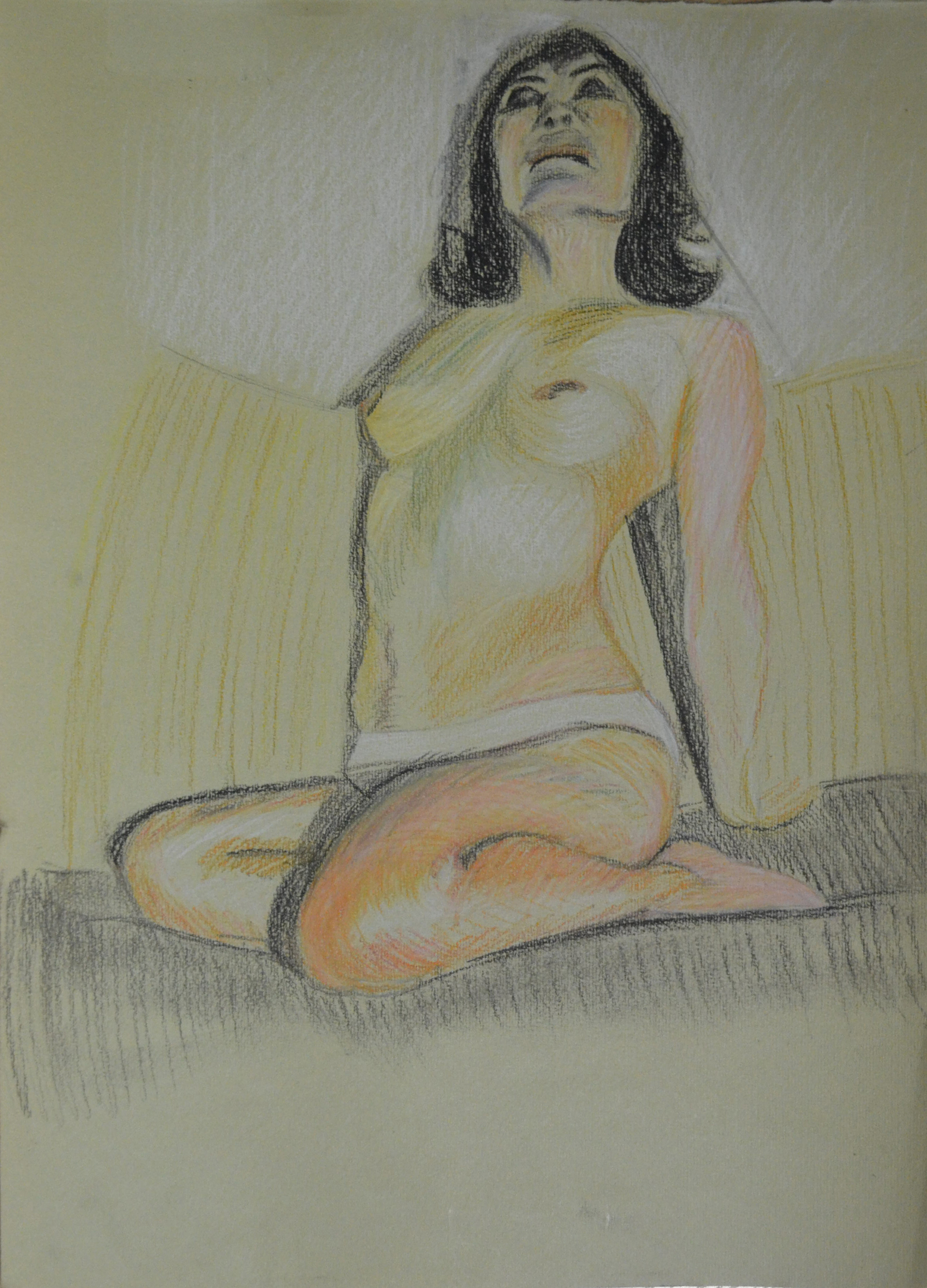
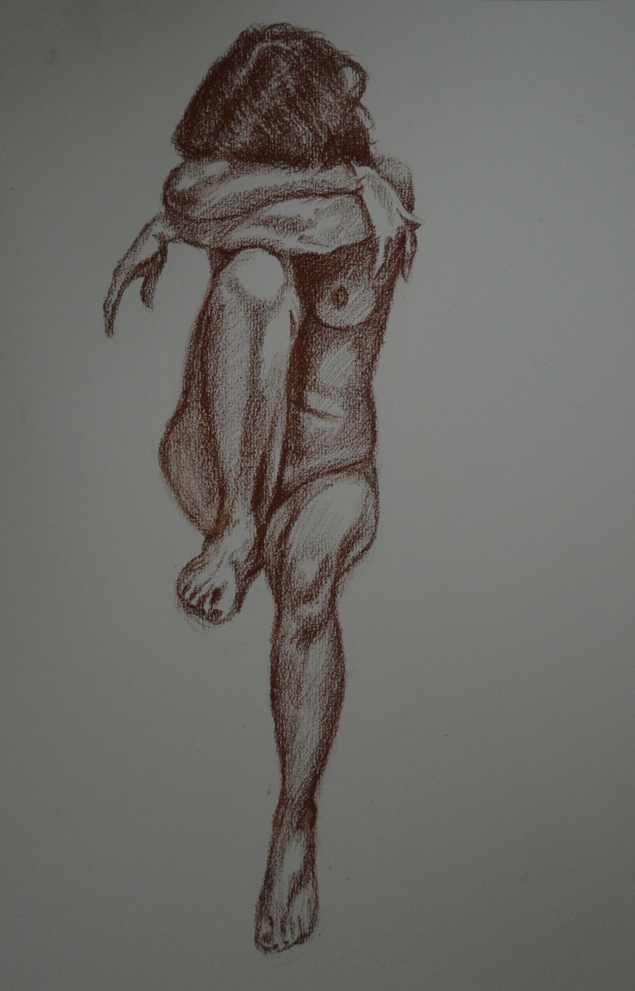
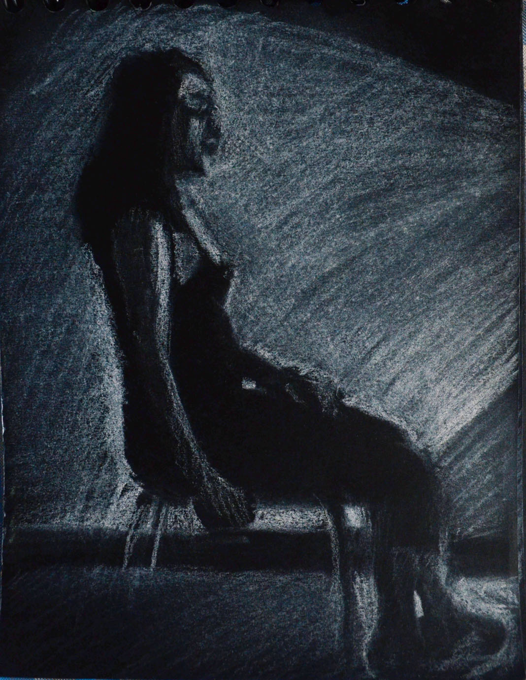
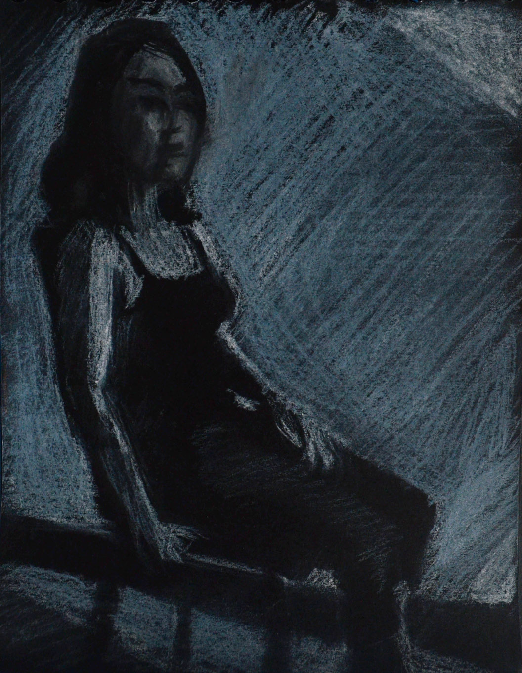
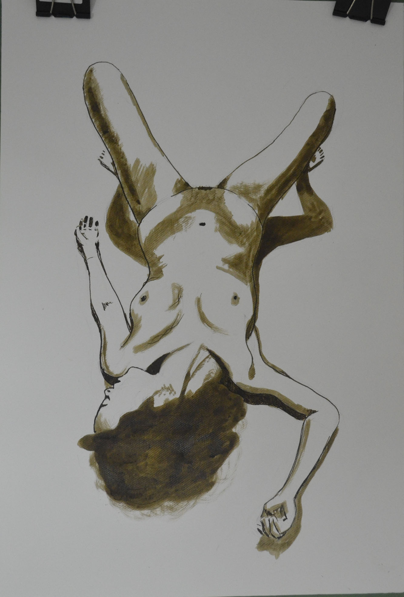
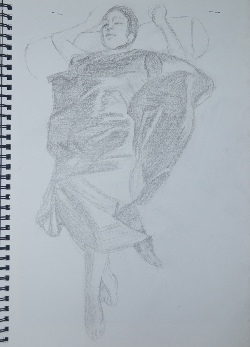
In the conté and charcoal drawing of the seated figure, the upper part of her right arm appears too thin in relation to the overall proportion, and in the drawing using white gel ball the arm resting on the door knob appears a little elongated. The foreshortened reclining pose in conté and charcoal however is very nicely observed and delineated in terms of proportion, form and structure. The depiction of foreshortening can often cause great problems and confusion but not in your case. You’ve produced a very well executed drawing here Mark.
I am hitting the same problems all the time, I am producing my best work on a small scale, I love this drawing and yet I am not sure whether it will get me where I want to be in the assessment when framed.
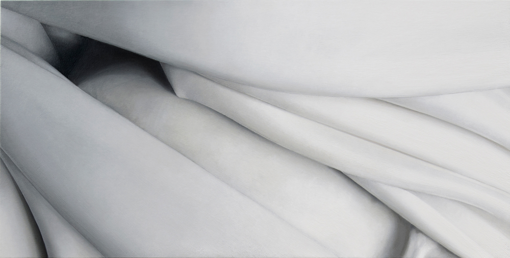
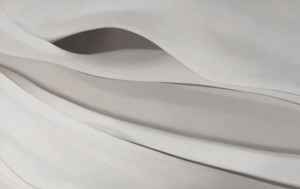
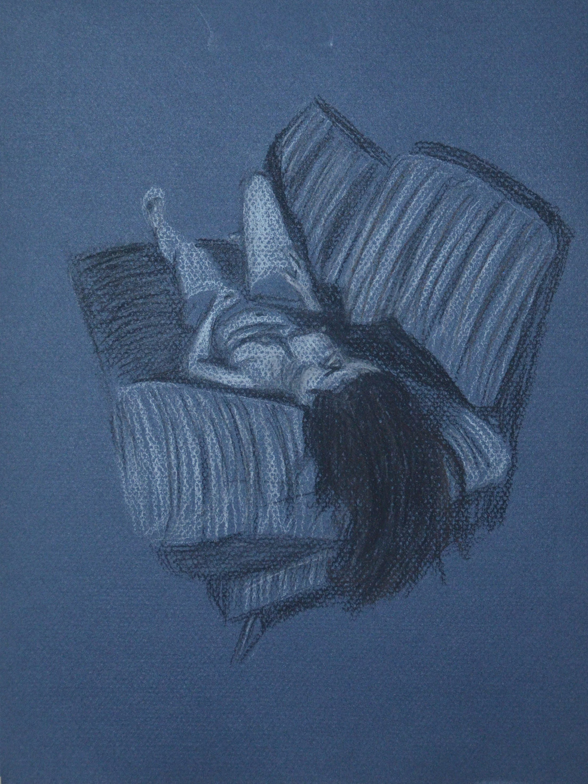
The drapery studies for the clothed figure exercises also show keen observational abilities. The manner in which you have portrayed the lightness and swathe of the fabric by utilising line following form and allowing the surface of the paper to describe highlights is very successful. The subtlety of tonal range in these drawings is also very well observed and this is particularly successful in the two drawings of the reclining figure using white pastel on black paper and the graphite version of the same pose (I must also say here that the face in this piece is beautifully rendered!). There is an undeniable believability in the way you have portrayed how the fabric drapes over the model’s body.

I shall be producing a finished piece for the exercise above from these sketches and the drapery studies.
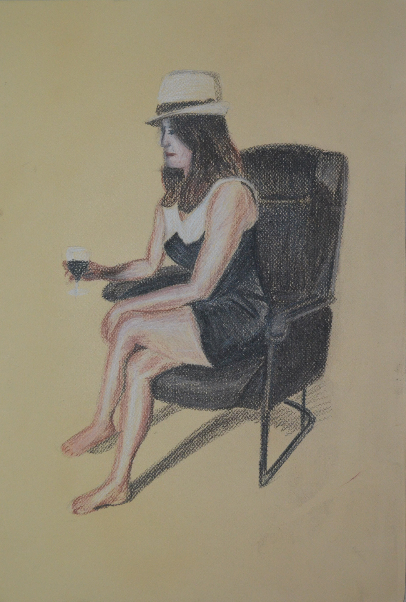
You quick sketches for the sitting and waiting and fleeting moment exercises show good observational responses to what can be quite a difficult and pressurised way to work, especially for you in terms of the recent circumstances in Bangkok!

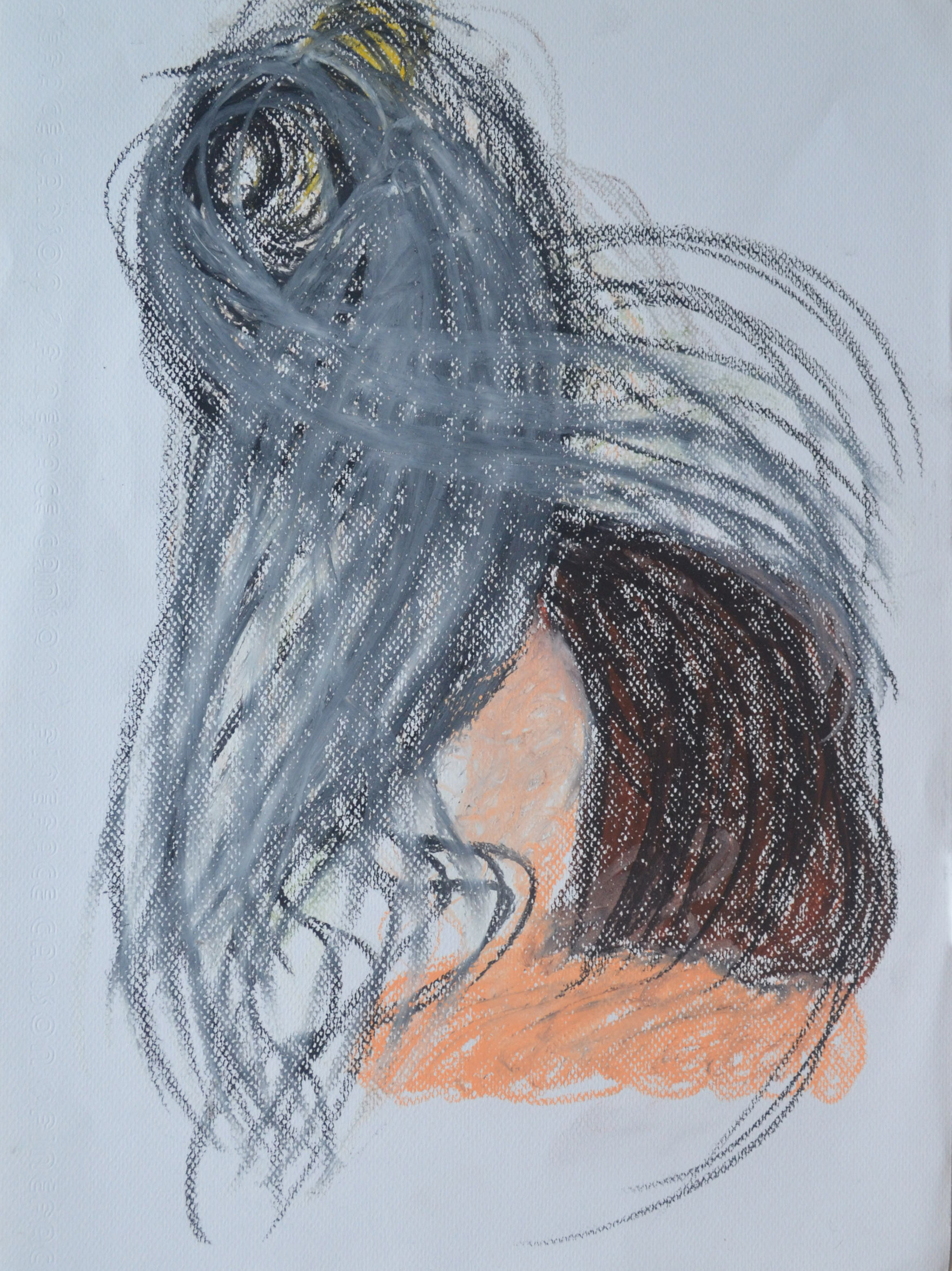
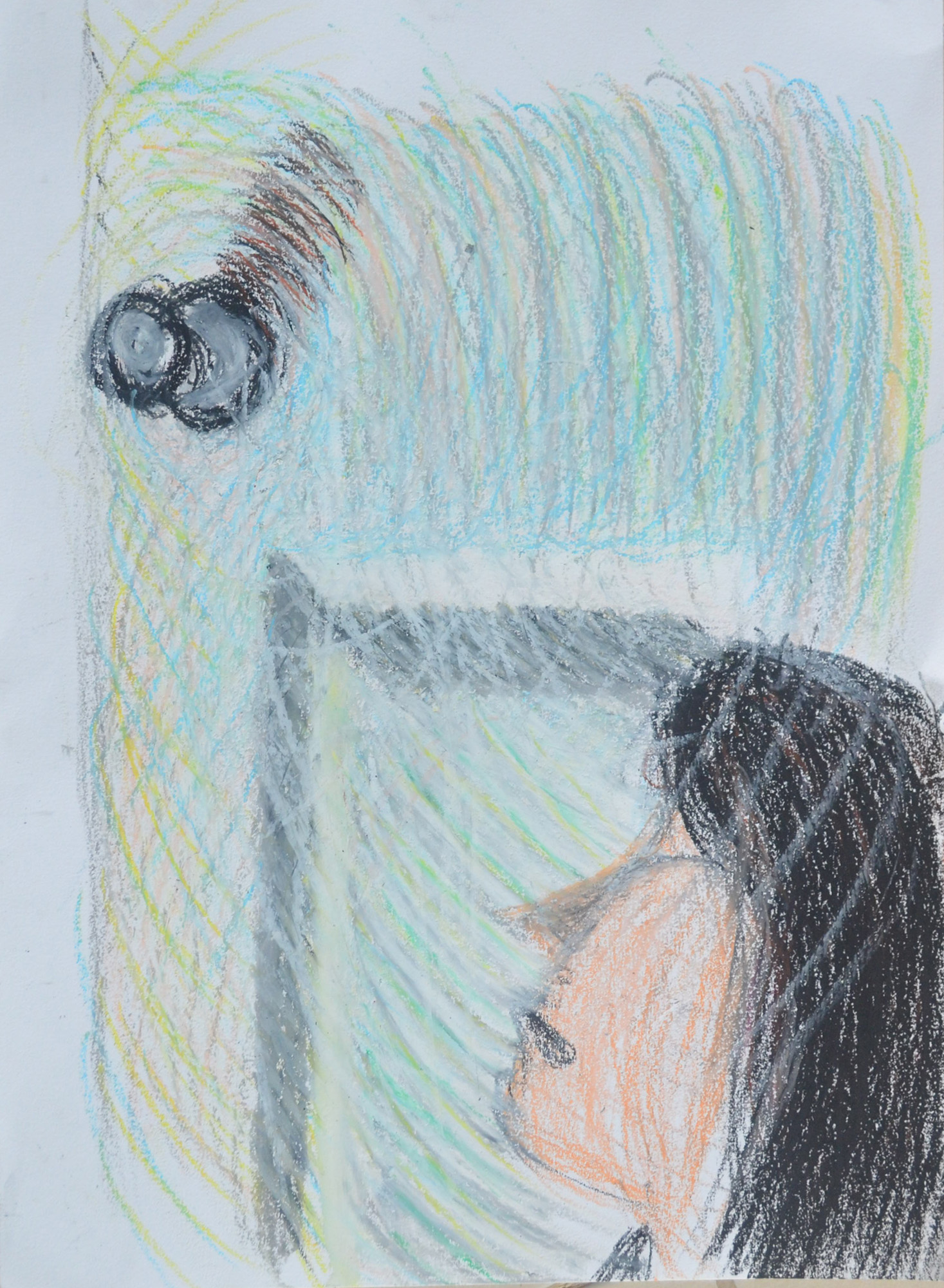
It is evident that you thrive on these set tasks Mark. The definite evidence of development as you work through the self-portrait exercises is clear. The determined and studied visual research for shape and proportion you have employed for this exercise has surely helped with this. From the slightly tentative first sketches for the ‘Drawing your face’ exercise to the surer, more ‘finished’ pieces in different media, you have once again produced a focused collection of work. I thought the eighth portrait in conté and Chinese white pencil particularly successful with good attention to incident and reflected light. I thought the portrait from memory of Vladimir Putin worked well and was definitely recognisable as the Russian leader.
Feedback on assignment Demonstration of technical and Visual Skills, Quality of Outcome, Demonstration of Creativity
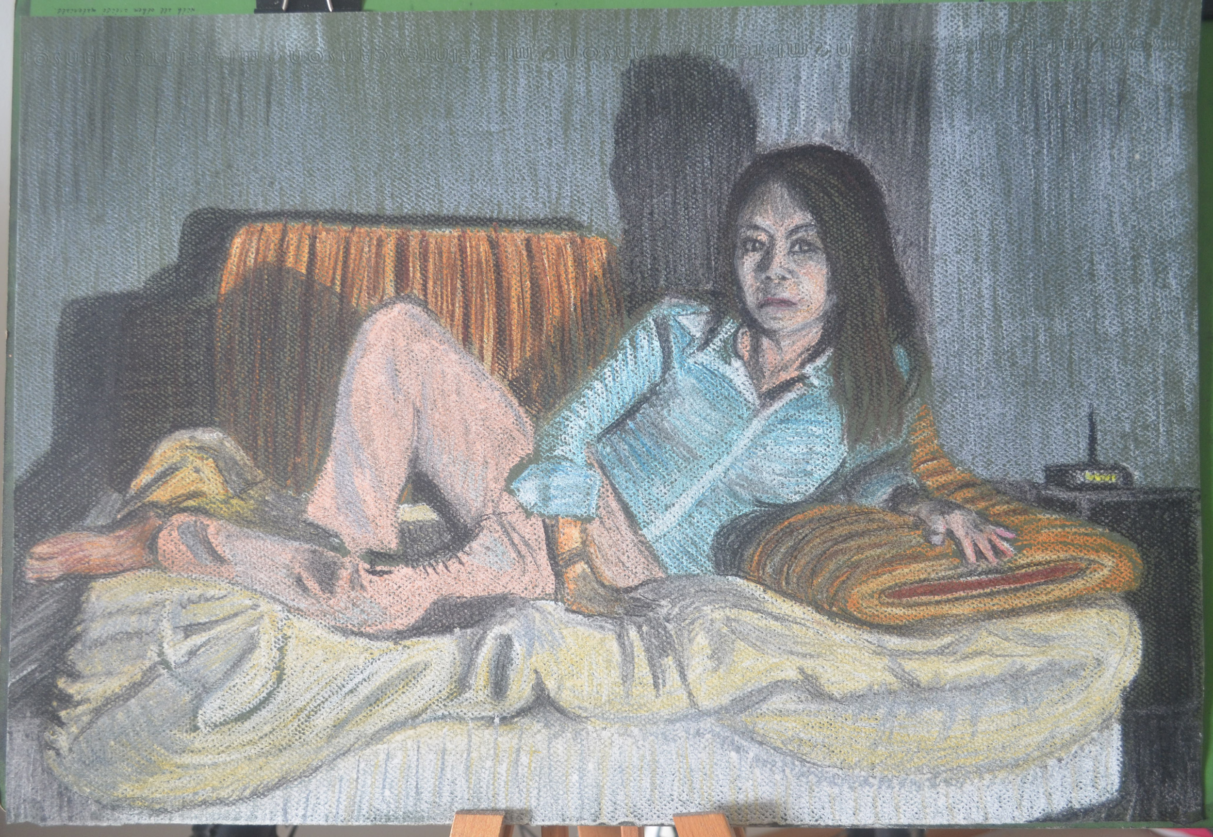
The assignment piece of your girlfriend reclining on the sofa in soft pastel was very well conceived, observed and executed. Once again you have handled the media successfully. The composition is well-balanced and the depiction and overall effect of light and shade makes for a very effective study – a nod to the reclining figure from the history of art, to Manet’s Olympia, Titian’s Venus of Urbino, Velázquez’s Rokeby Venus, Goya’s La maja desnuda, the list goes on? A very successful piece Mark!

This assignment was a breath of fresh air after the last one but there was a downside though that I hadn’t expected. The soft pastel colours were so bright until I used the fixative what I hadn’t anticipated was that the fixative would dampen it or blow the pastel dust away and allow so much of the green paper to show through making it murky, the upside of this of course is that it gives it a ancient/spooky look.
Learning Logs or Blogs / Critical essays Context
As with your previous submissions you have delivered an honest, informative and thorough learning log for this part of the module. I enjoyed reading the piece on artists’ self-portraits and thought the manner in which it was written was fresh and personal – a welcome divergence from the usual heavily fact-based information we as tutors sometimes have to read! I am also very pleased to read that you are getting a lot out of Berger’s Ways of Seeing.
Sketchbooks
What I find encouraging about the way you work Mark is that you are rarely put off by new processes; in fact you appear to thrive on the challenge. You confront new disciplines fearlessly and with an open mind to technique and media. The evidence is here in your sketchbooks – the amount of work and the confidence displayed by the inclusion of work you are rightfully happy with as well as pieces you have considered not so successful has been beneficial to the progression of your practice. Sometimes it is the recognition of ‘success’ and ‘failure’ that will drive us forward to constructively face. Your overriding interest in the subject of drawing will stand you in good stead for the final part of this module and your future art practice. I am pleased that you have chosen the option of figure drawing on which to concentrate.
Suggested viewing/reading Context
I’m sure I don’t need to mention it but try as much as you can to immerse yourself in the work of other artists. I have always found it exciting when discovering the oeuvre of ‘new’ artists, the influence of their work potentially beneficial to my own. A couple of artists you may find interesting are Jenny Saville and Alison Watt.
See examples of their work below:
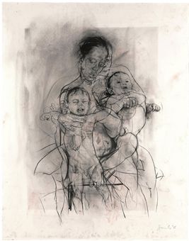
Mother and Child (After the Leonardo Cartoon) charcoal on watercolour paper, 2009.

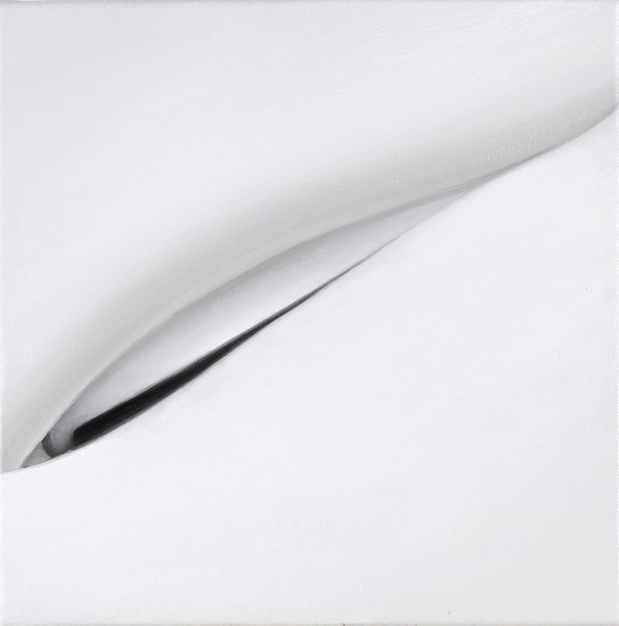
Part of the Phantom series, oil on canvas, 2007.
View the research point for Alison Watt