Did you find it easy to approach the figure as a whole or were you distracted by details of the sitters dress?
The way I chose the poses and the type of cloth that I draped my model in made it easy for me to approach the figure as a whole. The folds and shadows helped me to accentuate the models shape in both poses.
3 – Colour Pastel on Pastel Paper
How did you create volume in the folds of fabric?
I would have to say hatching and curved hatching, as well as use of light and shade, I did my best to depict the certain types of folds as researched from George Bridgman and described in the ‘Fabric with Line and Form‘ exercise.
Does the finished drawing give a sense of the figure beneath the fabric?
Yes, every limb and every curve including the gap between the rib cage and the convex shape of the pelvis.
How would you tackle a drawing like this again?
I would have to say, slower and in a lot more detail, iI liked the outcome of the three drawings but I feel spending a lot more time on them can improve quality of outcome. I would also love to have a go on larger sheets of paper in charcoal.
It’s hard not to watch people in Thailand, I’ve been here 14 years and I can’t say there hasn’t been a day gone buy where I haven’t studied them, scrutinized them, complained about them. The speed they walk, how loud they talk, picking noses plus a multitude of other habits that makes the Thai race just what it is, unique!
Last Friday was one of the best opportunities I had to sit down and make notes about what I saw. In the school holidays, February to May, I work at the language centres, which are in shopping malls and in one of the malls, ‘the Central Plaza’ they usually have sales in a roundish area by the entrance on the basement floor right outside Macdonald’s, but on Friday the whole area was clear for the first time in months, so I grabbed myself a Mac-fish set and sat at a table right at the open entrance of the fast food restaurant so I could see people coming and going.
From where I was sat I could see people going up escalators, people going down them, people meeting their friends but mostly people dawdling about in slow-motion staring at their mobile phones, they were probably very active in their online social world but to the bystander, me, the scene that was coming together in the empty floor space reminded me of AMC’s Walking Dead.
I made quite a few notes about my findings, as you can see below however in my notes I stated that Thais have less types of walks than westerners. To be truthful they probably have more. All the gaits that you’d find in the UK plus a good few of their own as I mentioned below, You just don’t see many people walking fast in Thailand.
1st Notes People Watching
Although it it could be fare to say that technology is making people walk slower all over the world as they spend more time looking at the screen while they’re walking down the street.
2nd Notes – People Watching\
I also mentioned in my notes that the locals actions and mannerisms make them seem more immature than those in the west but then again, how do I know, I’ve been in Thailand 14 years, I look on Facebook and see photos were the subjects can’t pose without making hand gestures, and I’m not sure whether it’s insecurity or immaturity brought on by technology. I know it makes me act younger.
2nd Notes – People Watching
One thing I do find here in Thailand is that there is a unique class of people who I have named the ‘drama queens’ a group of young woman who dress, act, walk and talk like the characters on Thai soap operas, over-the-top-characters that have had a massive influence on teenagers and young women, not just in the way they act but in everything else.
I wasn’t completely happy with the gesture drawing exercise in the last project as I didn’t feel I was quick enough with the sketches and so I decided to have another go at the language center I teach at.
1 – Students Writing in Charcoal
The first two drawings were done in a private class and in a small class of four students. The drawing on the right is of my mature private student and on the left a young man of 15 both of which did not know I was drawing them.
2 – Students Standing
The two girls posed for me while I did a 30 second drawing, stance was fine, the proportions are OK but I feel I could have done a lot better and been a bit more confident.
The hands on the one on the right are more like feet as well, I think I am going to need a lot of practice drawing hands, both quickly and in detail.
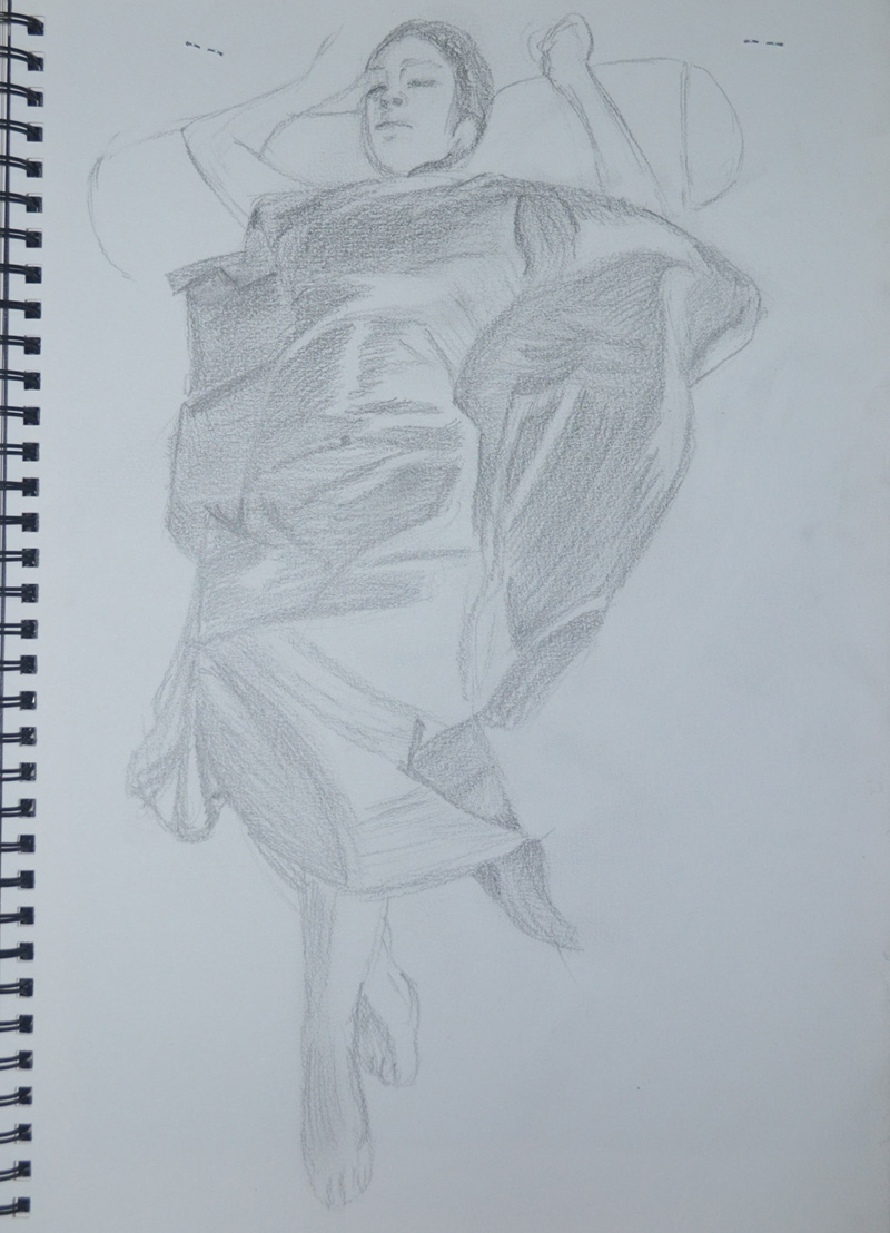
I spent a couple of days trying to find a white sheet for this exercise, which believe it or not is actually quite difficult in Thailand because all the bed clothes are usually a patterned quilt and sheet set. I thought about a towel but I didn’t think a towel would be crisp enough so I decided to go with the two orange pieces of cloth that I bought last year and had used in several exercises. Being the cloth that they use to make the monks robes out of and using the girlfriend as a model, this was always going to be controversial.
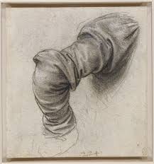
Leonardo da Vinci – The arm of Saint Peter
In the last research point an Anatomy Drawing I mentioned a free e-book I downloaded ‘Human Anatomy Drawing for Artists’, in it I came across ‘The Arm of Saint Peter’ by Leonardo da Vinci, where Leonardo ‘uses folds like curving cross-contour lines to describe the cylindrical forms of the arm’ – Dan Gheno, a study that was influential in the next three drawings.
1 – 6B Pencil in A4 Sketchbook
For the first drawing the model was laid on the floor, feet towards me with her head and hands on a bolster pillow, this helped me to draw a partial outline., curving from the elbow down to the waste ‘A figure drawing must first be outlined or suggested before it can be properly drawn’ – George Bridgman. After suggesting the figure, I drew in the outline of the cloth and began hatching with cross-contour lines to describe the box shapes of the chest, waste and hips.
2 – White Pastel on Black paper
The second drawing was a tonal study which I( drew from the first drawing not from life, in white pastel on black paper. I was going to draw over the top of this in orange pastel and decided I would do the next drawing in orange on coloured pastel paper…again.
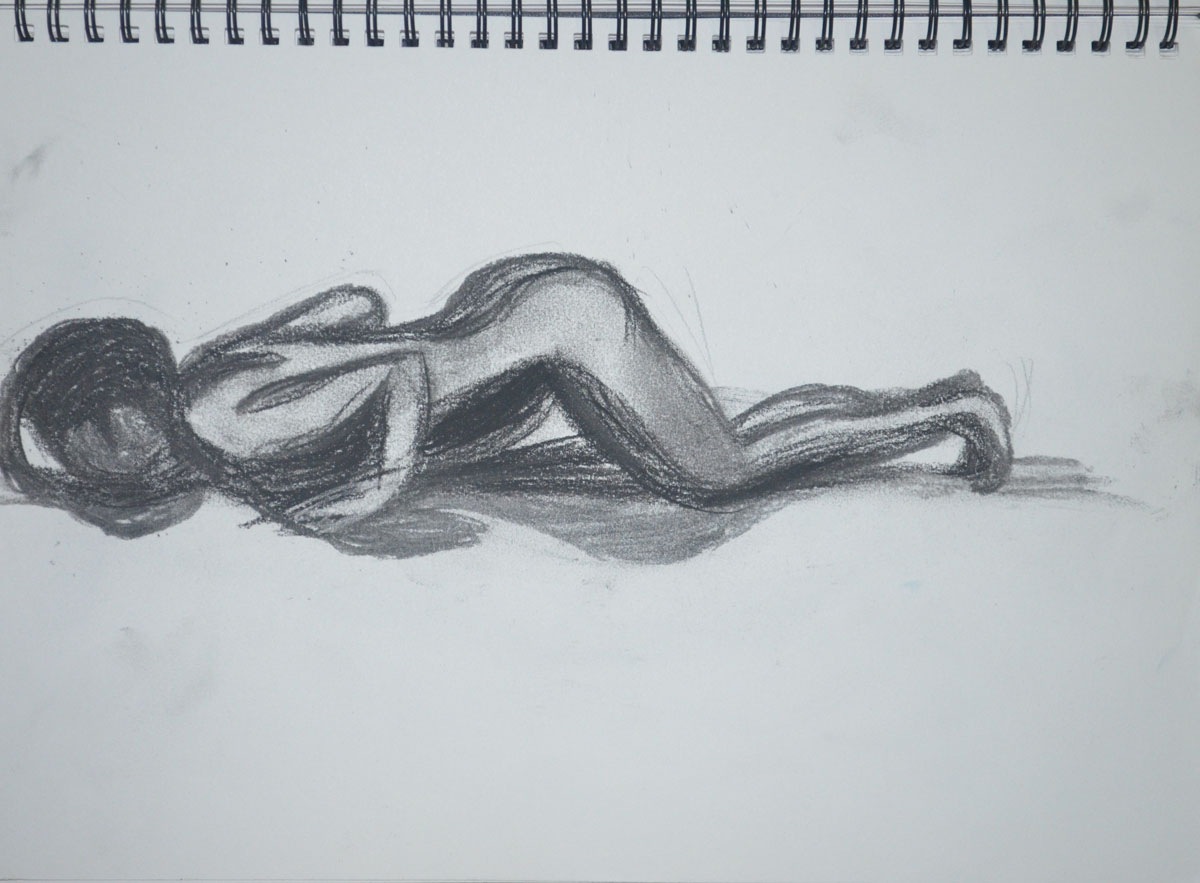
3 – Colour Pastel on Pastel Paper
The third and final drawing was in orange and brown pastel with the model in a sitting up position, which was not the best of drawings but it does show off the models figure under the robe cloth and like the other two drawings,
‘Fabric with line and form’, don’t know how I missed that bit. I read it several times as well as in the brief but when it came to the exercise I did two 15 minute sketches using hatching. I can see why we were asked to do it in ‘line only’, so that we would notice the patterns, repetitive folds and the types of folds appear in the cloth.
George Bridgman’s 7 Laws of Folds
In his book A Complete Guide to Drawing from life George Bridgman proposed that there are laws of folds, Diaper, Zig Zag, Pipe or Cord, Half Lock, Drop, Spiral and inert, several of which were quite noticeable in the 2 pieces of Monk’s robe cloth that I screwed up and placed on a stool on top of each other.
1 – Monk Robe Material in 3B Pencil
In the first drawing the types of folds that are most obvious are zig zag, half lock and spiral, with the Zig Zag’s repeating across the surface of the cloth.
2 – Monk Robe in Willow Charcoal
In the second drawing which I drew from the other side and at a distance in charcoal these folds were not that obvious and I found myself drawing the inert folds, and I think, half lock.
5 Minute Drawings
I kind of cheated for the next part of the exercise, the brief told us to make 5 minute drawings in 5 cm boxes mine were closer to ten centimetres. All of which were 5 minutes apart from the orange pastel on coloured paper which took just over 10, because I got carried away. Again you can see most of the folds that Bridgman described in his book including ‘Pipe’ in drawings 3 and 5 which are almost the same section of cloth.
How accurately did you depict the overall proportions of the figure?
There was only one drawing where the proportions weren’t that accurate and that was the first drawing for the standing pose in the Three Drawings Exercise. I made a second attempt at the drawing and was completely satisfied.
Standing Pose 1- Using Water soluble Pencils for the first time
For all the other drawings in this exercise, I feel that I managed to depict the overall proportions of the figure, very accurately.
Standing pose 2 – Water Soluble Pencils Better Proportions
Did you try to imagine the sitters skeletons and muscles?
Yes I did, but the skeleton and muscles weren’t that obvious in the the three drawings exercise, mainly because the figure was clothed. I have not had that much chance to draw nude figures as it’s the school holidays and the kids have been about while I am drawing but I have chose clothing that still allows me to see the shape and limbs of the subject, which has helped a lot.
1 – Sitting, Conte, Charcoal, Conte Pencil
Did imagining underlying anatomy help convey structure and form?
Yes, very much so, particularly in the shoulders, chest, hips and arms. Anatomy is a subject that I would really like to continue to learn about and I have enjoyed reading through books on the subject such as Bridgman – A Guide to Drawing From Life and Burne Hogarth – Dynamic Anatomy.
For this exercise I was to make three drawings, 1 seated, 1 Standing up and 1 laid down looking down the body at a slight angle from behind the head. I was to try and use a different medium for each drawing.
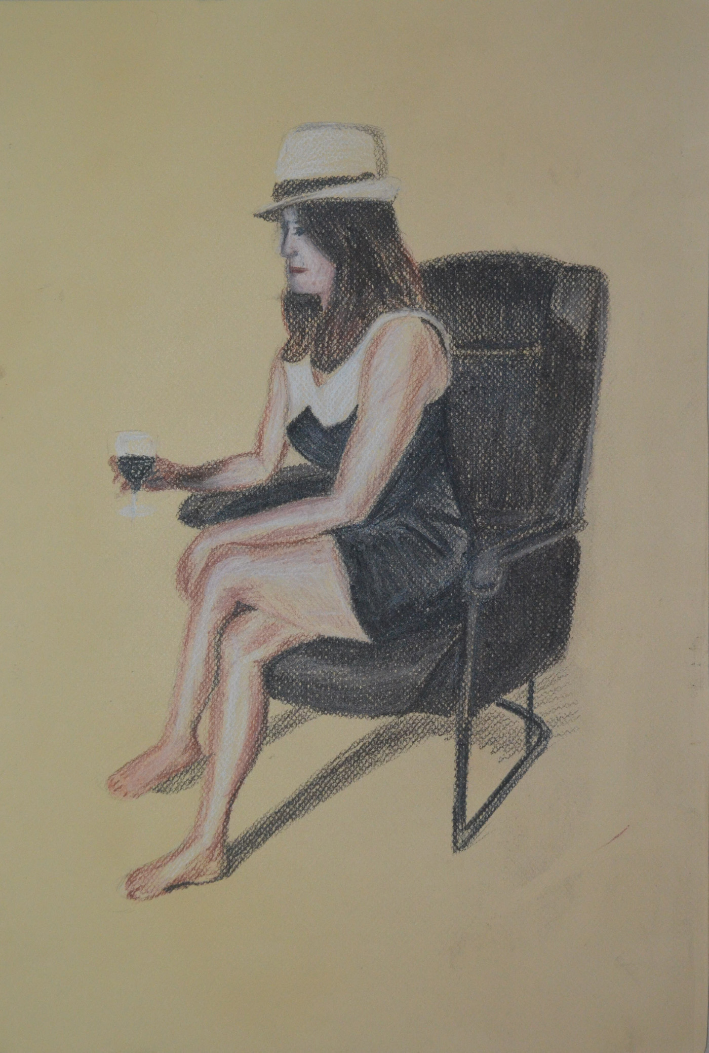
Again, my girlfriend volunteered to be my model for this exercise and for the first drawing, which I decided to do on the Canson pastel paper I had left over from my last research point, an anatomical drawing, she decided she needed some props, a glass of wine and her trilby.
1 – Sitting, Conte, Charcoal, Conte Pencil
I have had no success so far at drawing her profile and this drawing wasn’t any different. I really need to practise drawing profiles. The drawing is on A3 and the thing that consumed the most time was not drawing my girlfriend but the chair she was sat on. I moved around her before starting looking for the best position and even though drawing from the front may have been better for drawing her face, I think that the angle that I chose was the best or showing all the things we were asked to notice in the brief.
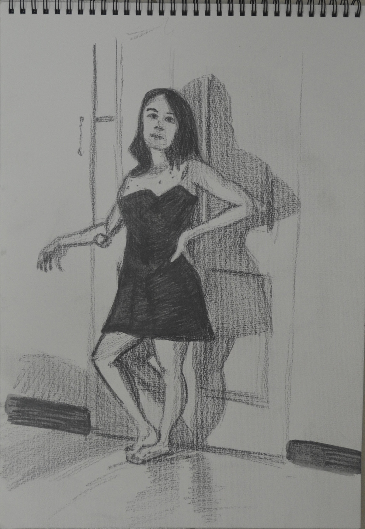
The next drawing was the standing pose and for this I really wish I had had some white charcoal, as my girlfriend in the lamp light against the door looked quite spooky.
2nd Pose 1 – Using Watersoluble Pencils for the first time
I made two attempts in a medium I hadn’t used since I bought them over a year ago, water-soluble pencils. I would have been happy with one but someone decided she looked ugly in the first drawing, the second however, looked a hell of a lot better in every way.
2nd Pose 2- Water Soluble Pencils Better Proportions
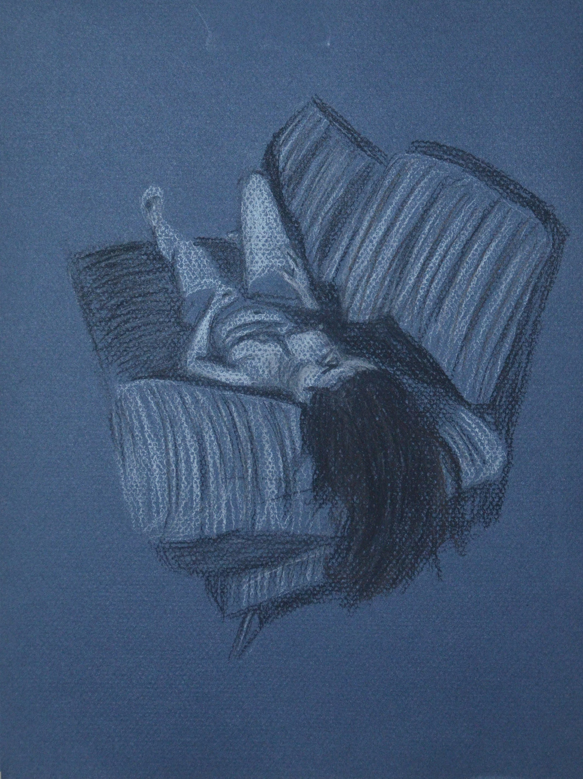
For me, the third drawing was the easiest drawing for just about everything. I know I was to try using different tools for each drawing, but I couldn’t think of any other drawing tool that would help me capture the mood as much as pastel on blue paper.
3 – Lying Down – Conte Stick and Compressed Charcoal
Just like the first drawing, I spent most of the 1 hour that it took me to draw in the sofa, I was very lucky to get the shadows across the belly, breasts and rib cage right, as they didn’t take much adjusting.
When I saw this research point coming up I already had ideas and when I finally got here everything started to fall into place. The human anatomy is such a massive subject and I knew that I wouldn’t be doing a full anatomical drawing as I didn’t want to get stuck in a hole researching for days, so I decided to focus on my favourite part of the human anatomy, the back.
While searching for ‘Anatomy Drawing’ on Google I came across a link on Artist’s Daily,
Anatomy Drawing for Artists: An Art Lesson on Studying & Drawing Anatomy . The free e-book, written by Dan Gheno has got some nice images in and it doesn’t give you any shortcuts but I did get some ideas from it.
Firstly, like anatomy drawings by Michelangelo and Leonardo da Vinci, a lot of the works by artists in the free e-book are on coloured paper and so I decided that this drawing would be a drawing in Conté Crayon on coloured pastel paper similar to the paper that I had used in Assignment 2 – Observations in Nature. I had used Conté pencils before but not the sticks that I had bought from Silpakorn University, over a year ago now, before I started this course.
I had to start somewhere and so the same night that I downloaded the free e-book I took my camera to my girlfriend’s apartment and after a short debate I decided that it would be my back that I would be drawing and so we did a session in the gym, followed by a dip in the pool to ‘get a pump on’ so that I could get some muscle definition showing in the photographs.
I had quite a few photographs taken in the gym and in the shower at different angles…from the left-hand side, from the right-hand side, arms stretched out at the side, arms at the front, arched back etc. Eventually I found the right photograph for the drawing, a photograph that would help me see where the main muscles and bones were.
1 – Photo with Best Muscle Definition
After choosing a good photograph for this research point I made a quick pencil sketch in my A4 sketchbook and then did a search for some anatomical drawings of muscles and bones. After discovering 2 great books ‘Grant’s Atlas of Anatomy‘ and ‘Bridgman’s Complete Guide To Drawing From Life‘ downloading them both in PDF format and having a quick browse through, I went back on line and looked for Anatomical Drawings of back muscles.
2 – Pencil on A4 Sketch Book Preliminary Drawing
I found a good image in a similar pose to mine depicting the major back Muscles – www.physioadvisor.com.auand then remembered a quote that I read in the free e-book by by Dan Gheno earlier ‘ A helpful exercise is to first draw the figure in simple, flat silhouette form. Then, try to superimpose your understanding of the bones within’. However, instead of trying to superimpose my understanding of the bones within I decided that I would try and superimpose my understanding of the major back muscles.
On a thick tracing paper I used black and sanguine Conte pencils as well as my Derwent Chinese white pencil to quickly sketch in the major muscles over the preliminary drawing below. The end drawing wasn’t perfect but it was a start. From here I enlarged my drawing onto the coloured pastel paper.
3 – Muscles, Conte Pencil on Tracing paper
The drawing on tracing paper looked more like a space suit from the ‘Riddick’ movies than anything else so before I committed myself to the final drawing, which actually at this point, I didn’t know would be an ‘in the flesh’ or muscle drawing, I had to do a bit more research.
Fortunately for me the back seems to be the anatomy artist’s favourite subject, as the back plays a significant part in human society and is the largest part of the human body and so finding good anatomical drawings of the back muscles in full display is not difficult, particularly the first layer of posterior torso muscles which is all I really wanted at this stage.
I found a great website www.medical-artist.com that had some great illustrations on so between the site and Grant’s Atlas of Anatomy I was able to check whether or not my earlier drawing and superimposed muscle drawing were correct.
It was time to start on the bigger drawing so I enlarged the smaller drawing onto an A2 sheet by drawing a grid and then drew my outline. I started on the left hand side with white and brown conte sticks, drawing the creases of the flesh by taking the colour off with a putty rubber to depict muscle tone.
4 – Finished Anatomical Drawing Half and Half
As I crossed over onto the left hand side it was easier to see how I would be able to work in the muscle lines in order to make it look like a dissection drawing. This time the muscle drawing was more anatomically correct but it took more colours than what I expected, working with brown and white Conte sticks plus Sanguine and Black Conte pencils.
When I finished the drawing, I thought maybe I should label the muscles by numbering the muscles and then writing the name of the muscles in a key, top left to show some understanding of the muscles drawn. However, so as not to ruin it, I decided to keep it as it is.
How well have you managed to capture the pose? what could be improved.
I think I did really well with capturing the pose throughout the project. However I do think that I could have done better to capture the feeling of the pose. Maybe experimenting with different mediums on different types of paper especially in the ‘Stance’ exercise. could have helped me do this. Since working on these two exercises I discovered ‘Bridgman’s Complete Guide to Drawing from Life’ by George W. Bridgman, which I will be reading and hopefully it will help me get more ‘drama’ into the pose.
Do you think the figures balance, if not where did you go wrong?
All but one of my figures balance and that is the first drawing of the model in tree pose, where I centered the entire model. I then redrew the model looking for areas where the model was balancing.
How did you go about conveying a sense of energy?
I explored a few different ways of conveying a sense of energy, I started by sketching really quickly with a 6B pencil and Conte pencil, focusing on poses that would help me capture the model in ‘action’. In went back to these and added swoosh lines as I wasn’t quite happy with them.
From there I went onto drawing the model in ballpoint pen going over and over the figure with more and more lines,
I experimented drawing moving body parts by hatching from side to side over where the body part should be in a rough blurred shape.
I roughly sketched the figure in a lighter felt tip pen and then went over in a black felt tip pen hoping to convey a sense of energy in that the model would look like she was in motion.
Last but not least I drew very quickly with a ballpoint pen in action poses.
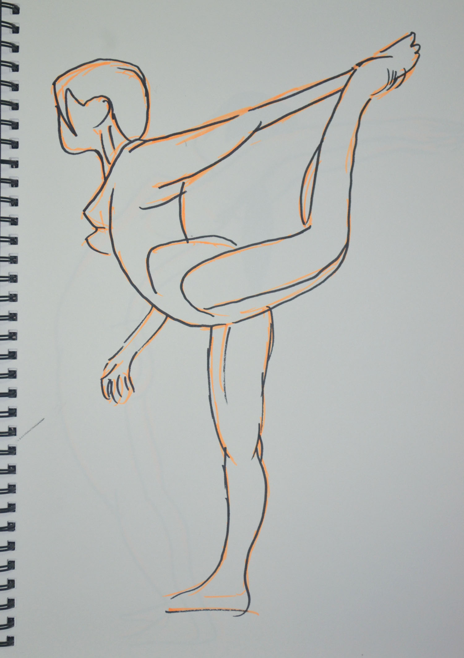
In the instructions for this exercise we were to ask the model to adopt a dynamic pose such as lifting an arm, twisting the hips, turning the head stretching the arms or walking. I had an idea of what I would be doing for this exercise from the start, so I asked my girlfriend to do the sun salutation for me and to hold certain poses that I thought may work well I stayed close with my A4 sketchpad.
Warrior 1 6B on A4
Warrior 1 was easy to draw with the 6B pencil on the textured paper and as can be seen in the enlarged photo . However, I can never seem to use long flowing lines but am really sketchy and use lots of broken lines when faced with the task of drawing quickly within a time frame. The drawing itself would probably would not have expressed energy that we’ll so i added more pencil lines to depict movement.
Warrior 2 in Conte on A4
This was the same for Warrior 2, which was drawn a lot faster and with more energy but I just think it needed a little something so spiced it up a bit.
Cobra Pose 1 Faber Castell Ballpoint on A4
The next pose was the Cobra Pose which after drawing the first one in Faber Castell Ballpoint I decided it was a pose that could be drawn with lots of energy and depict movement quite well if done right so with the girlfriend taking a short break after each one.
Cobra Pose 2 Faber Castell BallpointExploring Cobra Pose in ConteLarger Cobra Pose in Conte
There were a couple that were ok and a couple that were totally out of proportion. The thing about the Cobra Pose is that the legs look longer in the pose especially with mygirlfriend who has quite a short body, or high backside as can be seen in the upward salute below.
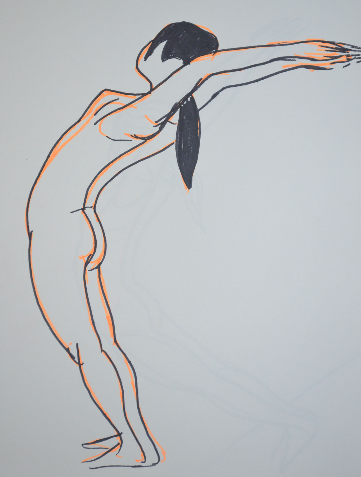
Upward salute 6B on A4
I did a quick sketch with my girlfriend in the ‘upward salute’ pose, starting from the waste I worked down to the feet. I should have done it the other way around and drawn the top first because by the time I got to drawing the top she had eased off the bent back position.
Upward salute Back Bent Further Back
The second drawing of the same pose was a lot easier for us both and this time I started with longer lines from the waist to the breast then from the breast to the wrist then worked my way down to the floor. Her hair flicked back gave me an idea and so i decided to add some trail lines to both drawings, successfully adding energy and movement to the drawings. For the next two drawings we chose the ‘Knees, chest and chin pose’ as I thought, like the Cobra Pose, drawing with energy I may be able to depict movement in the following sketches. This maybe true for the Conte sketch in two colours but not the drawing in charcoal.
Knees, chest and chin pose CharcoalKnees, chest and chin pose, Conte pencils
That was it for the first day but the next day I had some time to kill between lessons at the language centre, so I thought I would try something a bit different. With 6B pencil in my A4 sketch book and working from two photos I had taken from the bed with my tablet the night before I quickly sketched my girlfriend and then distorted the body parts that had been caught in action (moving) in the two photos.
Experimenting with Moving Limbs 1, 6B on A4
In the first photo from what I can remember she was on her way to the toilet lifting her left leg up and swishing her damp hair to one side after making a start on blow drying it. In the second photo she was cooking her log up, maybe scratching the back of the right leg with the top of her left foot.
Experimenting with Moving Limbs 2, 6B on A4
The next day I cycled back up to my girlfriend’s home sketchbook in bag but this time armed with my felt tip pens and my girlfriend went through a few more poses to see which would be best as drawings.
Felt Tip Pens Shiva dancing pose
Actually it doesn’t say felt tip pens on the box, it says wwatercolour Pens and the colours are far more vibrant than felt tip pens.
The Shiva Dancing Pose above is a very static pose but I thought by using the vibrant orange to sketch in the form first before I went over it in black it would give it some energy. I don’t think it does, my students think it does, nonetheless it does remind me of Degas’s ballerinas.
Felt Tip Pens standing salute pose
The last two drawings of my girlfriend were again of her in the ‘standing salute’ pose but drawn from a photo her back was bent so far back that I couldn’t ask her to stay like that for any length of time without her falling over especially with her hands together. The first drawing wasn’t in Proportion as her body ws too long and her arms were too short in order to fit her on the page.
The second drawing was drawn at an angle in order toner her in Proportion and git yer on the page.
Felt Tip Pens standing salute pose at an angle
At the end of our second session I got the girlfriend to take some shots of me in various poses, the following sketches drawn in ballpoint pen was the result. A quick sketch, full of energy and reminding me somewhat of a Scheile painting.